
Market heatmap
Every company sized by market cap and grouped by sector. Switch the universe and choose what drives the color — period return or a valuation metric. Click any tile for its quote.
- NVDA +9.59%
- AAPL +22.90%
- GOOGL +1.47%
- MSFT -19.28%
- AMZN +2.46%
- TSM +26.31%
- AVGO +9.87%
- SPCX -14.76%
- META -8.49%
- TSLA -28.55%
- BRK-B -0.39%
- LLY +10.71%
- MU +191.73%
- JPM +8.50%
- WMT -2.93%
- AMD +133.60%
- V +2.64%
- ASML +51.00%
- XOM +27.95%
- JNJ +27.04%
- MA -4.17%
- INTC +134.42%
- ABBV +13.04%
- CSCO +50.16%
- BAC +10.89%
- AMAT +99.46%
- COST +9.45%
- CAT +48.52%
- CVX +24.90%
- UNH +25.04%
- LRCX +65.03%
- GE +10.29%
- KO +19.00%
- PG +3.94%
- MS +17.89%
- HD -3.70%
- ORCL -41.24%
- MRK +23.15%
- GS +16.09%
- PM +20.39%
- PLTR -26.76%
- NFLX -22.96%
- RTX +13.67%
- DELL +242.18%
- ARM +126.39%
- KLAC +65.44%
- GEV +49.30%
- WFC -9.25%
- PANW +80.50%
- TXN +57.53%
- LIN +19.41%
- AXP -12.51%
- C +11.39%
- ANET +30.28%
- SNDK +421.32%
- TMO -4.09%
- AMGN +14.77%
- IBM -26.53%
- TMUS -9.77%
- VZ +14.57%
- STX +196.29%
- MCD -12.70%
- APH +9.28%
- NEE +10.92%
- PEP -3.92%
- CRWD +61.61%
- UNP +32.59%
- ADI +35.90%
- ABT -16.97%
- WDC +176.93%
- WELL +35.00%
- SCHW +0.39%
- QCOM -3.47%
- MRVL +117.27%
- BLK -2.71%
- TJX -0.06%
- DE +34.58%
- T -1.83%
- BA -7.97%
- DIS -15.20%
- GILD +6.34%
- BX -18.15%
- ETN +23.44%
- IBKR +36.46%
- COP +24.37%
- PLD +14.37%
- PFE -2.50%
- CB +16.02%
- BKNG -16.67%
- CVS +34.46%
- DHR -16.89%
- UBER -20.42%
- CRM -35.49%
- LMT +17.23%
- APP -36.59%
- BMY +16.14%
- SYK -5.15%
- SPGI -12.08%
- GLW +61.69%
- PH +10.46%
- COF -18.20%
- PGR +0.80%
- MO +27.36%
- VRTX +5.58%
- ISRG -39.95%
- SBUX +22.96%
- LOW -15.90%
- HWM +36.72%
- FTNT +95.62%
- VRT +65.38%
- BK +36.80%
- SO +11.59%
- EQIX +41.91%
- MDT -13.38%
- TT +20.85%
- GD +12.62%
- NOW -33.01%
- DUK +11.12%
- PNC +18.70%
- ADP -1.09%
- USB +18.63%
- NEM -7.94%
- CSX +46.73%
- MAR +19.46%
- MCK +2.10%
- CEG -25.08%
- UPS +13.63%
- WM +9.33%
- PWR +42.34%
- KKR -22.91%
- CME -5.33%
- CMI +27.29%
- MNST +22.77%
- WMB +21.64%
- MPC +87.28%
- FCX +20.59%
- CDNS +5.12%
- ACN -43.45%
- VLO +82.99%
- ADBE -32.46%
- MMM +6.66%
- DDOG +84.58%
- JCI +17.22%
- SPG +24.85%
- HOOD -17.63%
- HCA -18.73%
- ABNB +6.05%
- PSX +58.36%
- EMR +8.92%
- ICE -8.86%
- CTAS +11.39%
- MCO -5.52%
- ELV +6.57%
- ITW +13.44%
- INTU -52.93%
- TRV +35.79%
- CMCSA -19.45%
- NSC +21.86%
- RCL +3.63%
- SLB +30.49%
- SHW -3.11%
- EOG +36.52%
- MDLZ +12.82%
- AMT -4.64%
- AON +5.05%
- HON +24.12%
- NOC -7.37%
- ROST +30.81%
- CI +3.74%
- ECL +2.33%
- DASH -21.30%
- DLR +28.27%
- GM +2.05%
- FDX +33.34%
- HLT +10.92%
- AEP +17.05%
- KMI +18.57%
- CL +16.82%
- ORLY -3.22%
- URI +35.19%
- SNPS -22.27%
- APO -16.34%
- PCAR +18.55%
- MSI +9.66%
- TDG -8.98%
- MDLN -4.58%
- REGN -15.50%
- NXPI +21.69%
- ALL +27.55%
- RSG +3.20%
- APD +18.97%
- BSX -53.26%
- MPWR +42.18%
- GWW +37.70%
- WBD -9.58%
- AFL +13.93%
- AJG -3.22%
- TFC +4.09%
- HPE +97.46%
- D +20.00%
- TGT +36.11%
- NKE -34.24%
- O +14.45%
- MET +18.07%
- SRE +3.65%
- TRGP +50.72%
- COR -8.55%
- CTVA +31.74%
- TEL -13.01%
- OKE +25.32%
- FANG +34.44%
- F +7.61%
- CARR +28.76%
- OXY +35.19%
- BKR +21.47%
- PSA +24.82%
- NUE +46.16%
- DAL +23.15%
- LHX -1.41%
- AME +15.69%
- VST -1.11%
- TER +68.55%
- KEYS +54.29%
- ETR +23.52%
- FAST +16.25%
- CAH +10.86%
- EA +2.28%
- NDAQ -4.77%
- FITB +20.33%
- DVN +18.94%
- ROK +15.96%
- WAB +39.86%
- XEL +9.39%
- STT +43.63%
- ALAB +62.20%
- PYPL -3.42%
- VTR +30.00%
- EXC +8.20%
- EBAY +25.66%
- ODFL +46.36%
- AZO -10.55%
- EW -3.15%
- AMP +7.05%
- GRMN +20.00%
- HUM +47.19%
- XYZ +18.45%
- CBRS -36.00%
- ADSK -26.82%
- BDX +2.01%
- TTWO -7.93%
- IDXX -18.72%
- MCHP +21.28%
- AIG -6.18%
- COIN -33.07%
- PRU +5.33%
- ED +12.97%
- ADM +45.50%
- LYV +21.99%
- DHI +0.72%
- YUM -0.99%
- CBRE -12.91%
- CMG -15.18%
- AXON -10.80%
- PAYX +4.58%
- KDP +7.10%
- MSCI -2.64%
- PEG -1.45%
- SYY +14.45%
- PCG +9.77%
- CRWV -9.42%
- A +0.43%
- HIG +2.44%
- UAL +4.69%
- IRM +54.20%
- WEC +8.74%
- ROP -15.44%
- KVUE +11.20%
- WAT -1.90%
- KMB +8.20%
- VMC -4.43%
- MTB +22.33%
- ACGL +10.12%
- CCL -14.81%
- STLD +40.37%
- HSY -4.45%
- HBAN -0.72%
- KR -9.67%
- IQV -7.74%
- TKO -12.68%
- ON +53.12%
- MLM -11.79%
- WDAY -34.23%
- EQT -0.79%
- EME +16.54%
- IR +5.82%
- RJF +3.50%
- NTAP +57.58%
- JBL +30.03%
- CCI -15.56%
- EXR +12.77%
- ZTS -40.16%
- AEE +12.79%
- CNC +51.77%
- EXPE -8.14%
- DTE +14.65%
- EIX +30.87%
- LVS -29.31%
- KHC +5.33%
- CFG +21.04%
- TDY +26.32%
- ATO +5.79%
- BIIB +13.70%
- CBOE +15.21%
- NRG -15.12%
- VICI -5.01%
- CNP +15.07%
- EL -24.80%
- TPL +40.77%
- FE +10.30%
- TPR +10.51%
- FICO -24.68%
- XYL -12.65%
- RMD -20.22%
- CINF +13.20%
- ES +10.08%
- WRB +8.79%
- WTW -9.53%
- HAL +12.70%
- DXCM +7.51%
- OTIS -18.60%
- GEHC -26.84%
- PPL +3.18%
- DOV +3.29%
- AVB +5.03%
- JBHT +46.52%
- MTD -5.92%
- WSM +20.70%
- VRSK -8.90%
- RF +11.92%
- AWK +3.34%
- EQR +9.44%
- CPRT -26.04%
- DG -14.33%
- PPG +11.16%
- HUBB +4.98%
- VRSN +16.51%
- SW +22.65%
- DGX +31.15%
- TROW +11.36%
- PHM +8.21%
- LH +17.92%
- KEY +7.94%
- L +12.66%
- CPAY +23.26%
- SYF -13.87%
- PFG +22.36%
- BG +31.20%
- HPQ +16.46%
- INCY +16.02%
- FOXA -25.01%
- WST +18.67%
- DLTR -5.72%
- CHD +18.16%
- CMS +6.13%
- BRO -12.81%
- EXPD +15.43%
- OMC -2.03%
- PKG +20.53%
- VLTO -6.58%
- DRI +4.94%
- NI +10.73%
- IP +4.75%
- RL +3.03%
- STZ -7.81%
- NTRS +29.63%
- GPN +7.19%
- FFIV +52.91%
- LUV +9.13%
- CHRW +13.91%
- EXE -16.63%
- FSLR -26.06%
- DOW +22.97%
- CTSH -44.09%
- FIS -36.71%
- MRNA +75.15%
- SNA +15.24%
- STE -14.38%
- AMCR +5.93%
- ULTA -23.35%
- LEN -18.77%
- EFX -19.39%
- TSN -1.00%
- ESS +14.24%
- EVRG +19.31%
- VTRS +38.44%
- SMCI -2.75%
- LYB +35.91%
- IFF +11.64%
- LNT +14.26%
- CHTR -41.08%
- GIS -21.17%
- CF +56.15%
- FTV +12.49%
- LII +8.51%
- DD +12.27%
- ROL -34.52%
- SBAC -9.85%
- BBY +23.49%
- INVH +7.41%
- ZBH +1.48%
- KIM +30.13%
- NVR -11.85%
- WY +0.65%
- BR -32.41%
- GPC +0.17%
- CDW +0.50%
- HST +34.91%
- BALL +19.66%
- BEN +36.51%
- AKAM +35.51%
- TXT +9.75%
- IEX +24.66%
- NDSN +22.67%
- TSCO -38.94%
- MAS +22.99%
- MAA -3.77%
- J -0.58%
- GEN -0.81%
- REG +20.89%
- DOC +37.47%
- EG +15.14%
- DVA +105.63%
- UDR +7.90%
- NWSA +2.21%
- SWK +19.34%
- LDOS -38.86%
- HRL +8.21%
- AIZ +16.50%
- COO -13.32%
- PTC -30.34%
- ALB -20.24%
- SOLV -1.28%
- GL +25.37%
- MKC -25.74%
- DECK -10.02%
- IVZ +11.14%
- ALLE -4.72%
- LULU -45.79%
- PNW +20.33%
- APA +42.63%
- SJM +22.45%
- HAS +7.03%
- ZBRA +4.68%
- GDDY -21.40%
- TRMB -32.45%
- RVTY +12.55%
- BXP +1.90%
- AVY -11.82%
- TYL -31.82%
- BF-B -0.23%
- APTV -27.89%
- ALGN +7.01%
- GNRC +43.25%
- ERIE -19.53%
- MGM +24.77%
- BAX +14.87%
- CLX -5.26%
- HII -17.77%
- PODD -42.28%
- CSGP -57.90%
- CPT +3.24%
- TECH +20.03%
- DPZ -21.71%
- FRT +27.35%
- CRL +11.99%
- JKHY -15.57%
- AES +0.10%
- MOH +10.81%
- PNR -40.37%
- WYNN -20.91%
- HSIC +11.25%
- UHS -29.16%
- IT -40.72%
- PSKY -37.78%
- SWKS -6.52%
- FDS -10.70%
- NCLH -14.90%
- ARE +4.08%
- MTCH +19.47%
- AOS -11.02%
- KMX +48.33%
- TTD -54.11%
- BLDR -30.34%
- EMN +6.00%
- TAP -13.59%
- MOS -10.81%
- CAG -14.56%
- MHK +3.43%
- LW +17.38%
- PAYC -4.56%
Tiles sized by market cap (ETFs: net assets). Font size scales with size; color shows YTD %.
Data refreshed daily; intraday moves use delayed bars. For informational purposes only; not investment advice.
FAQ
- What is a stock market heatmap?
- A stock market heatmap shows every company as a tile sized by market cap and grouped by sector, with color encoding a chosen metric — so you can scan the whole market at a glance and see which sectors and megacaps are driving it.
- What do the tile colors and sizes mean?
- Tile size is market capitalization — bigger companies are bigger tiles. Color is the metric you pick: green-to-red for gains and losses on a return view, or a scale for dividend yield, beta, or valuation percentile. Valuation percentiles compare each stock with its own 10-year P/E, P/S, P/B, or P/FCF history.
- Which stocks are included?
- You can switch the universe: the top 500 US stocks by market cap, all US stocks we track, the S&P 500, the Nasdaq 100, or the top 100 ETFs. Click any tile to open that company's quote page.
More visualizations
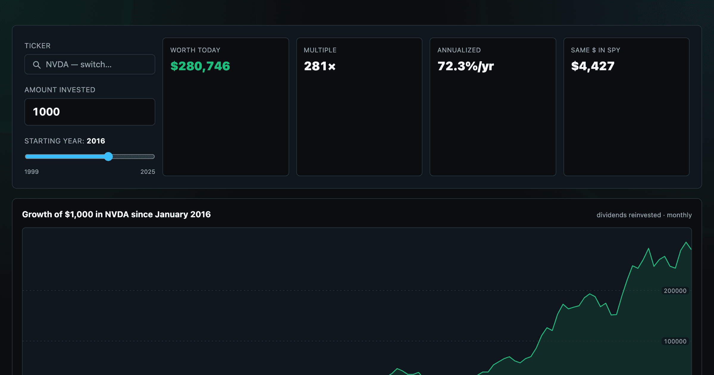
What $1,000 in any stock or ETF would be worth today.
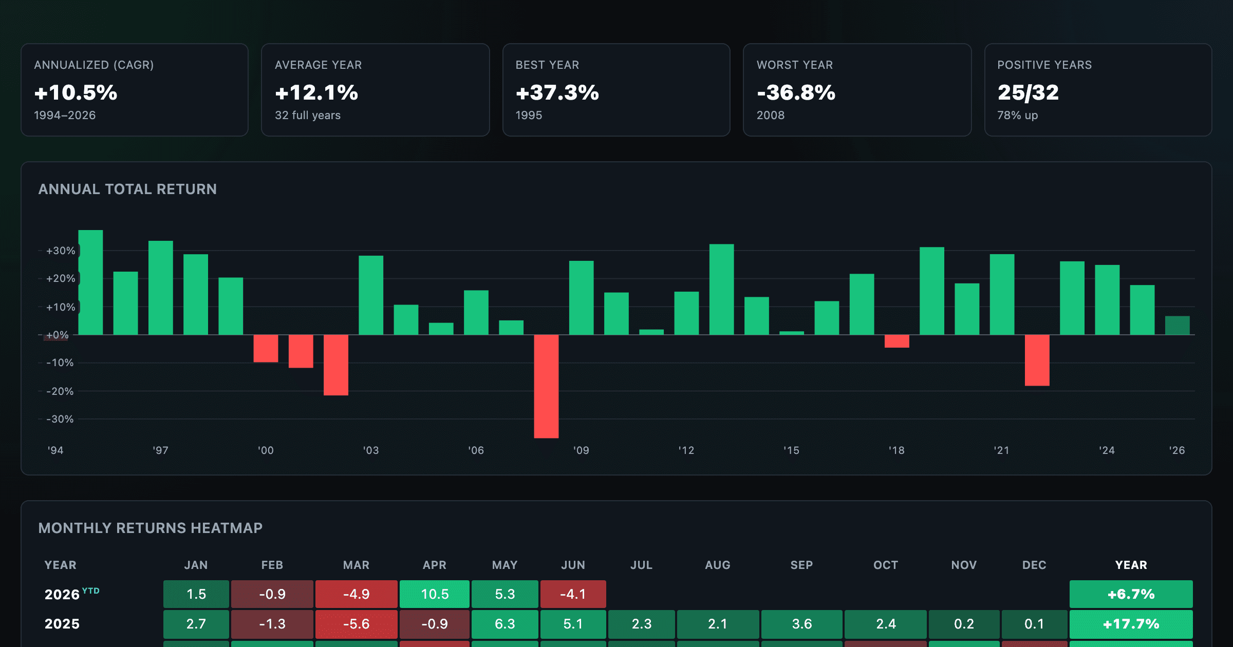
S&P 500 returns by year, month, week and trailing period — total or price return.
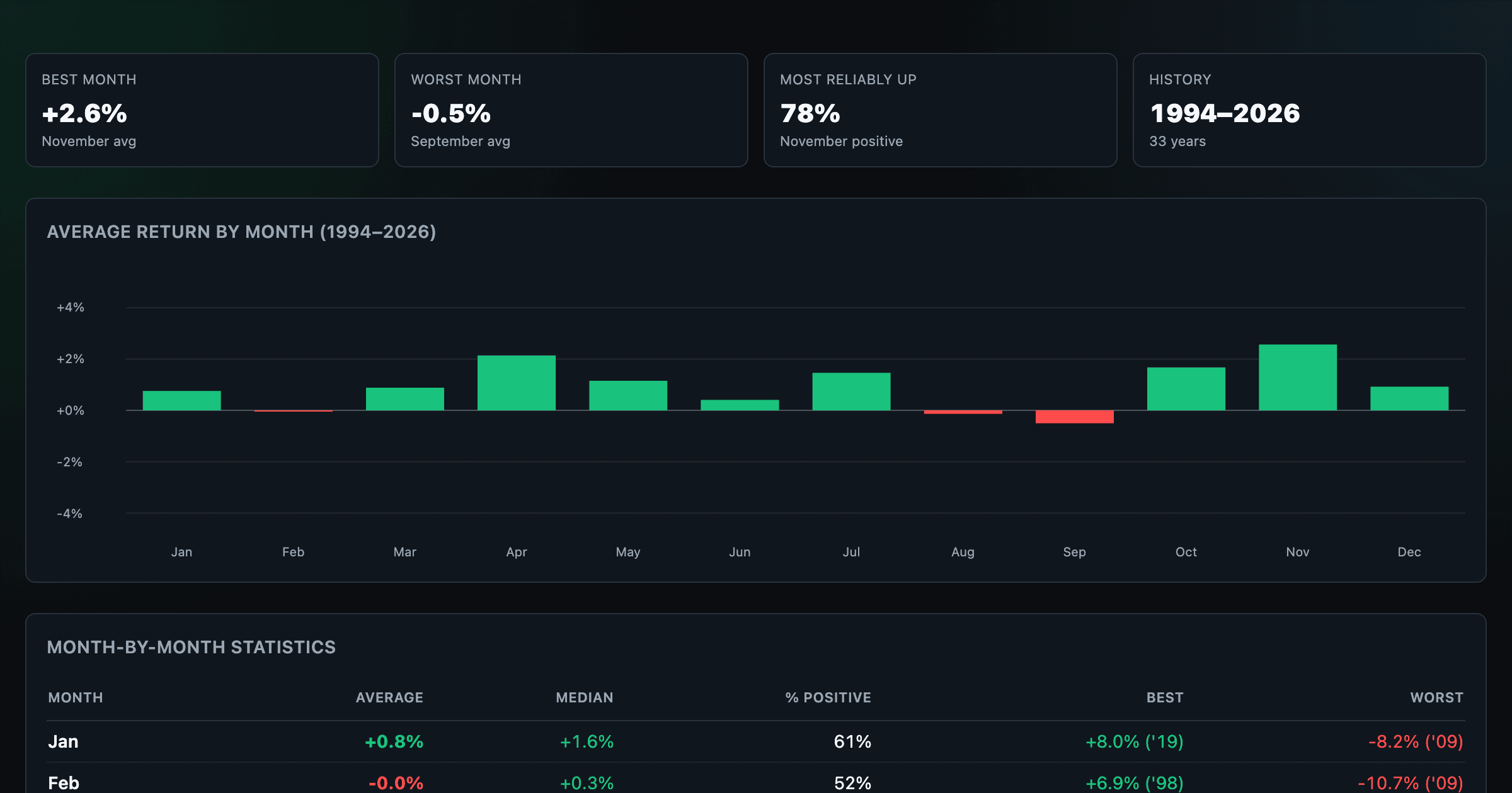
Which month is best for stocks? Average return of every calendar month, for any ticker.
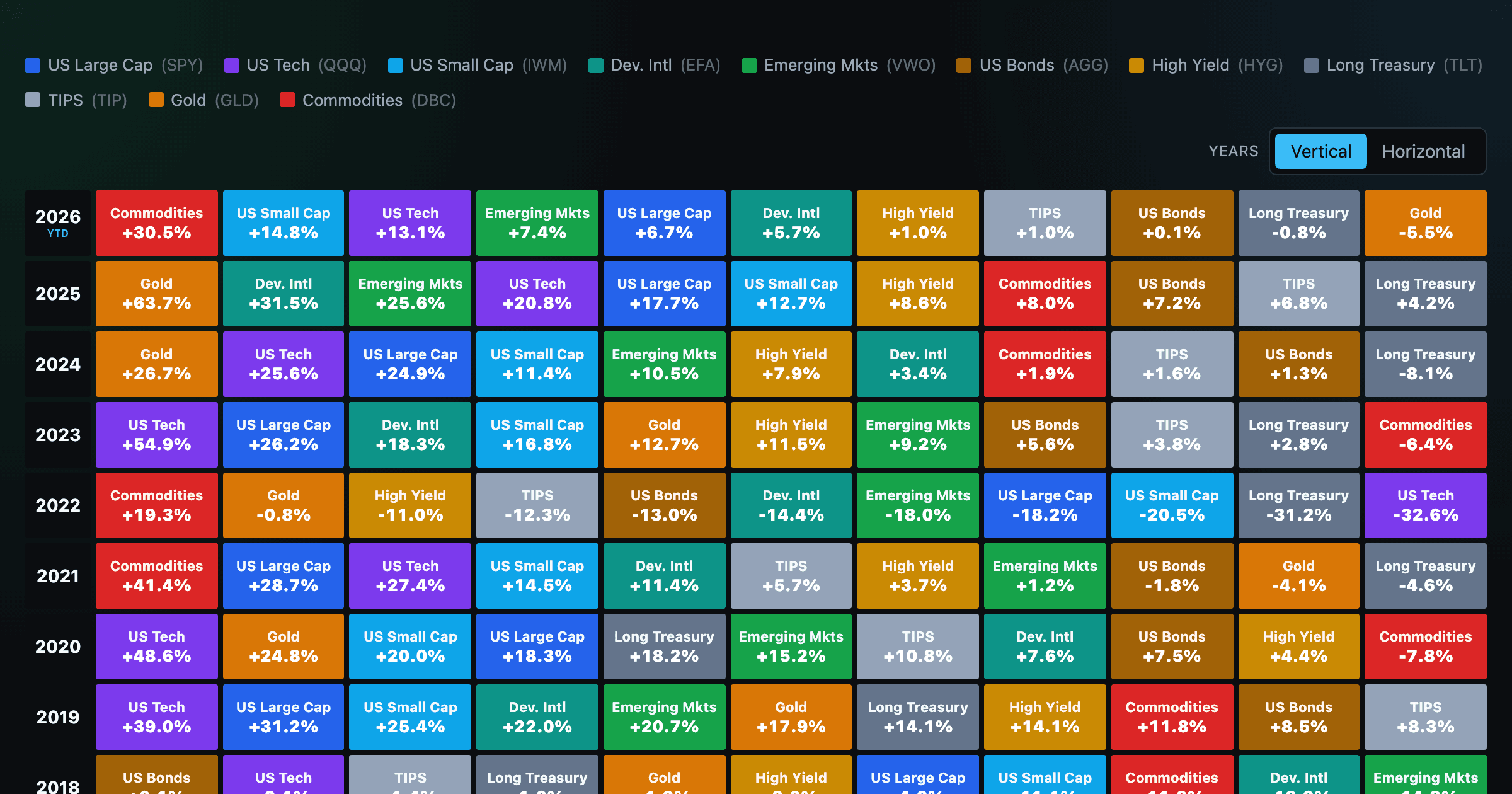
Asset-class returns ranked year by year — the Callan chart / asset allocation quilt.
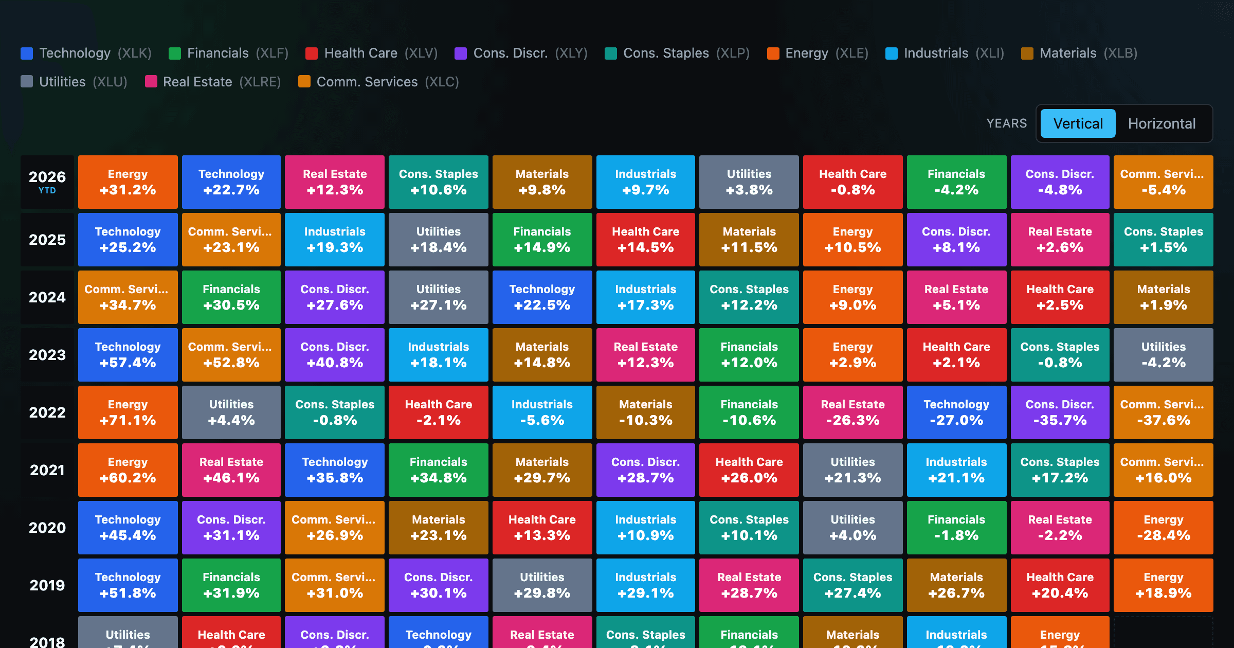
The 11 S&P 500 sectors ranked year by year — a sector quilt chart, back to 1999.
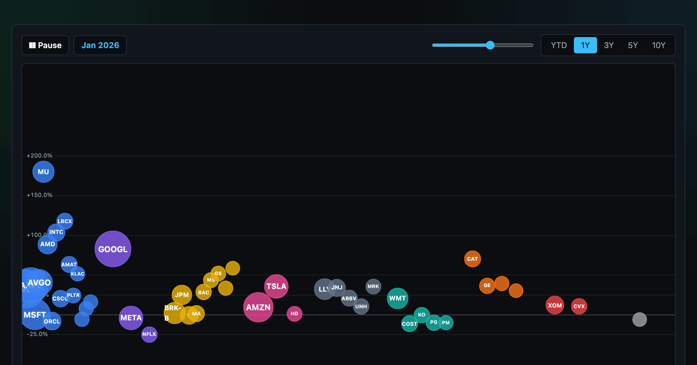
The biggest US companies as animated bubbles, rising and falling with their total return over time.
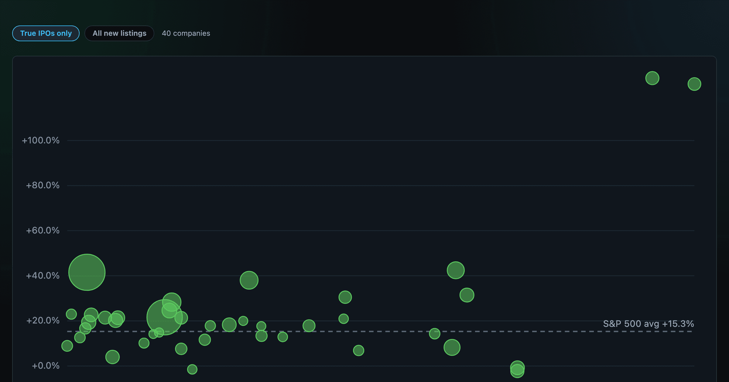
How recent stock-market debuts have performed since listing — annualized, vs the S&P 500, by IPO vs spin-off.
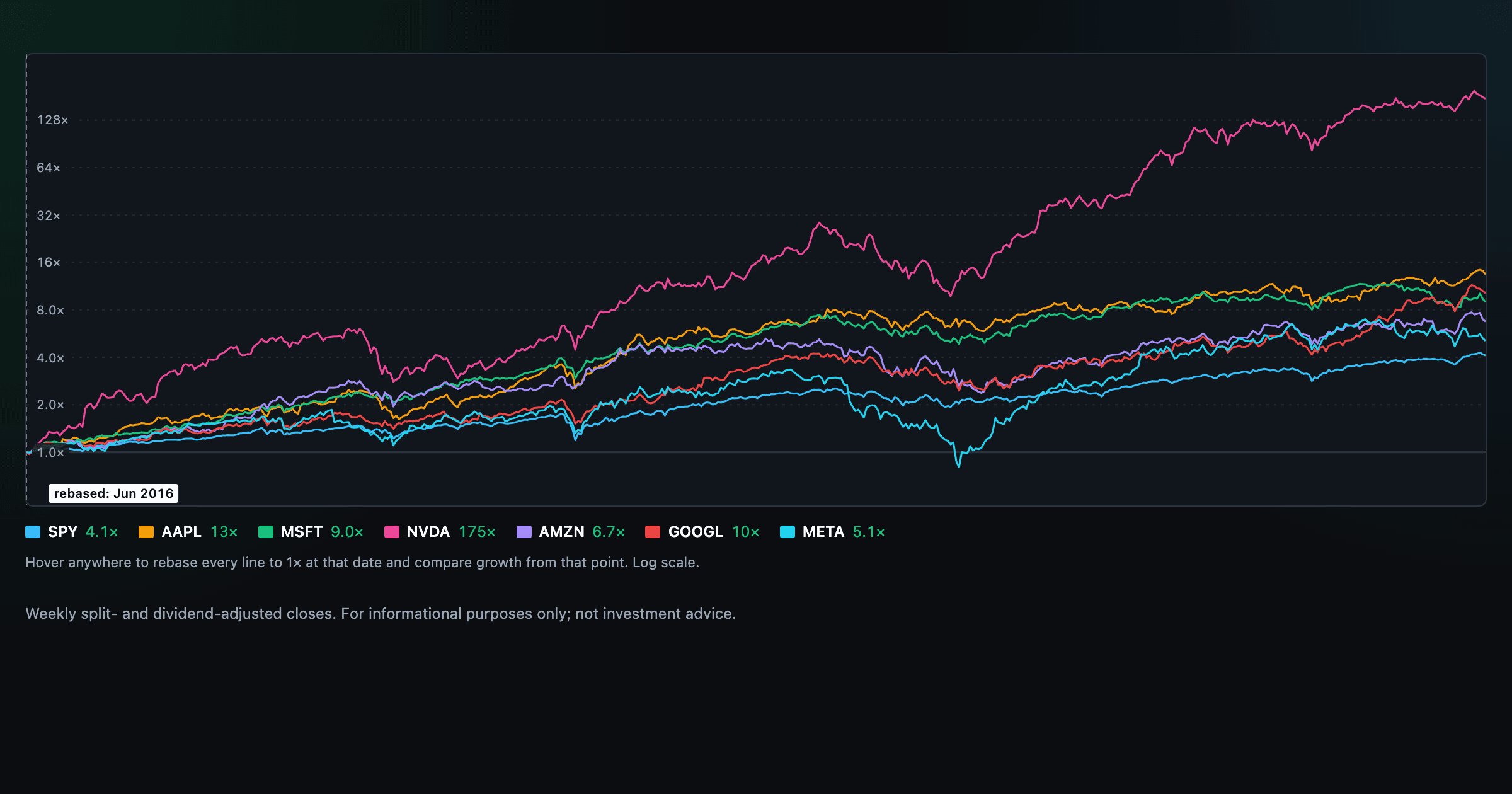
Compare megacaps vs the S&P 500, rebased to 1× at any date you hover.
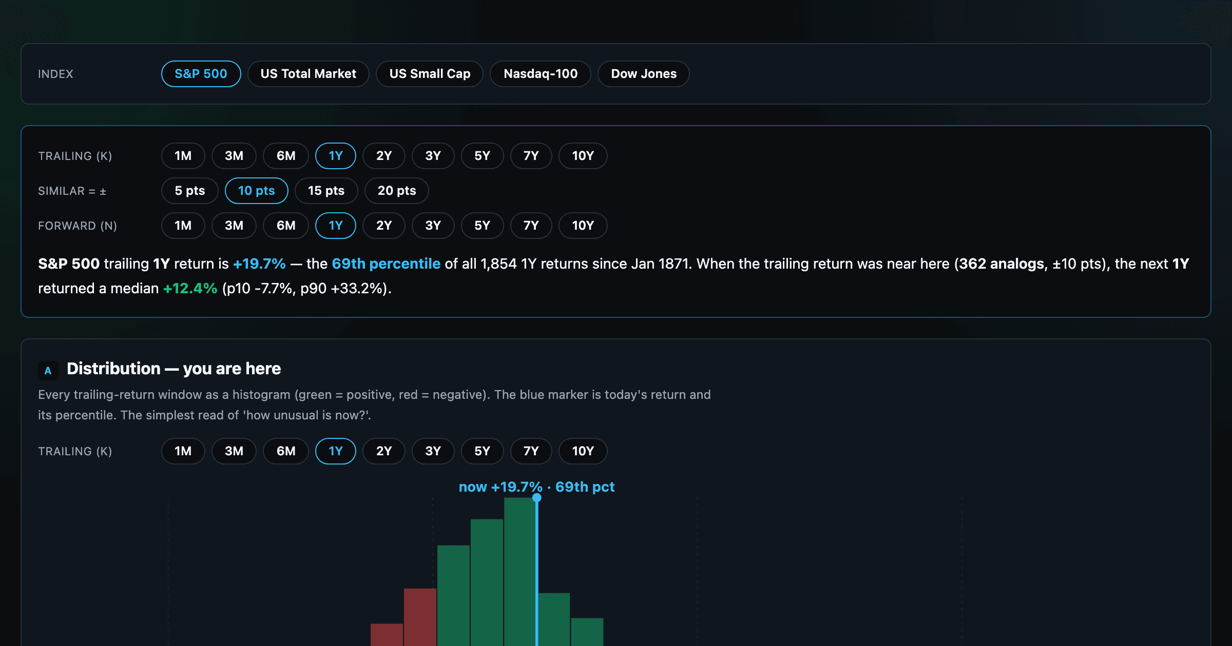
Where today's S&P 500 return ranks against all history — and the forward returns that followed similar moments.
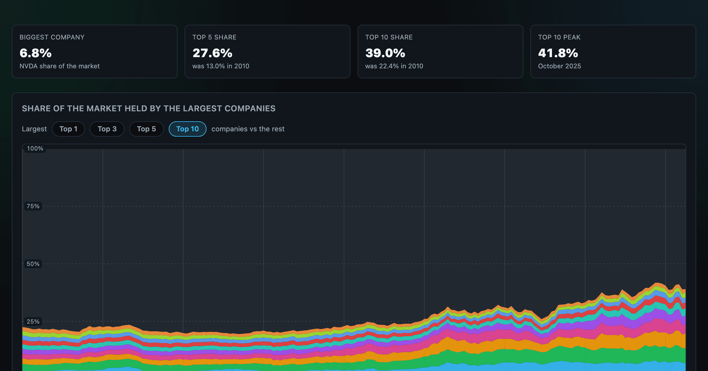
How top-heavy is the market? The top 1–10 companies' share of total market value, month by month since 2010.
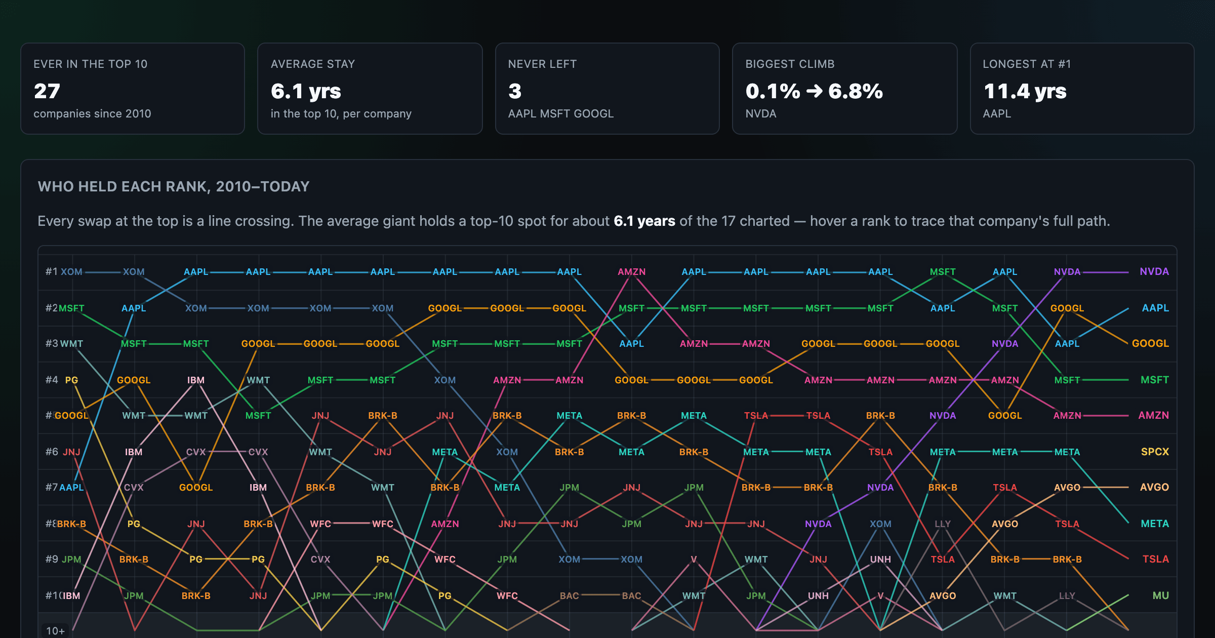
Every company that ever cracked the market's top 10 since 2010 — who climbed, who faded, who never left.
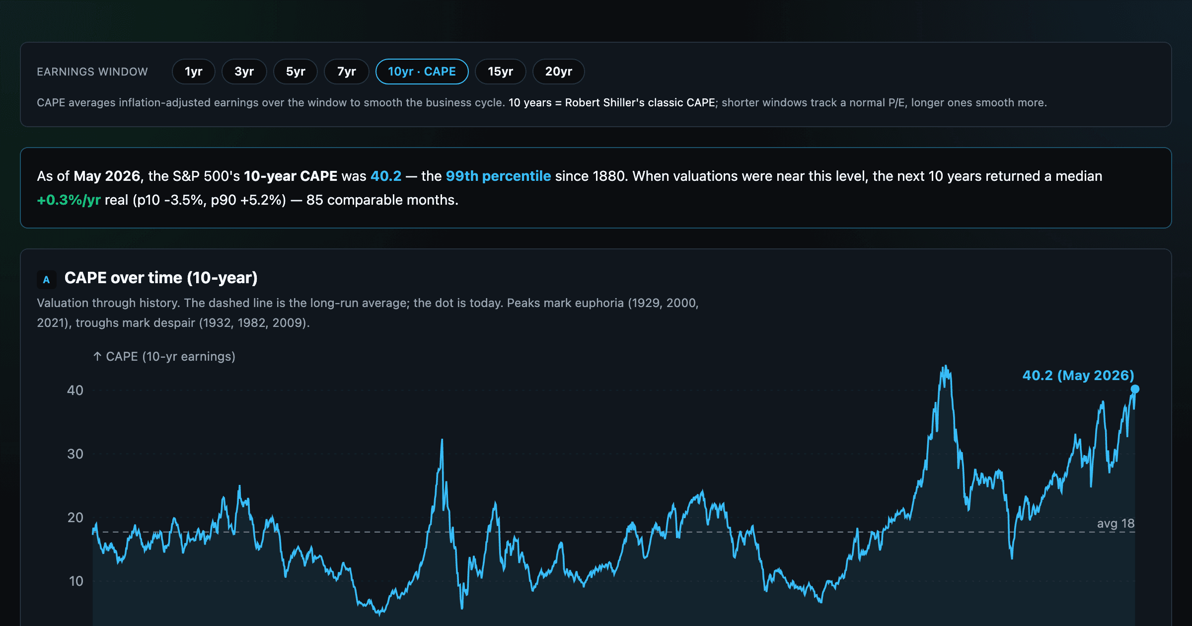
Is the market expensive? The Shiller CAPE back to 1871 and what valuations have meant for the next decade.
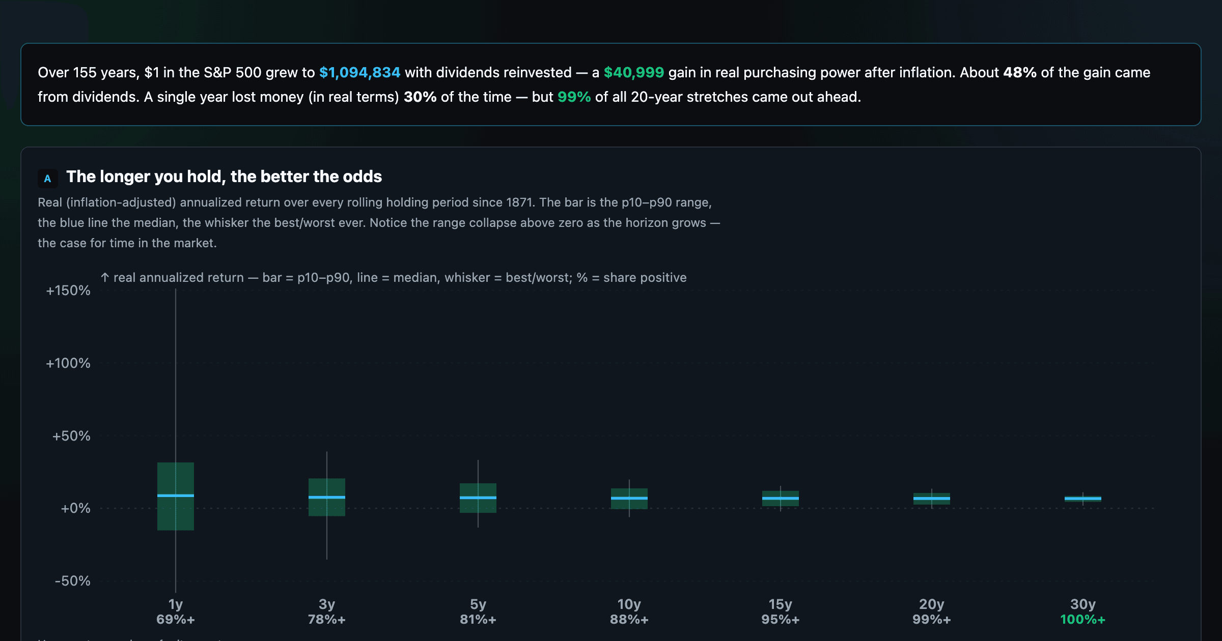
The S&P 500 since 1871 — odds of gain by holding period, real drawdowns, and the growth of $1.
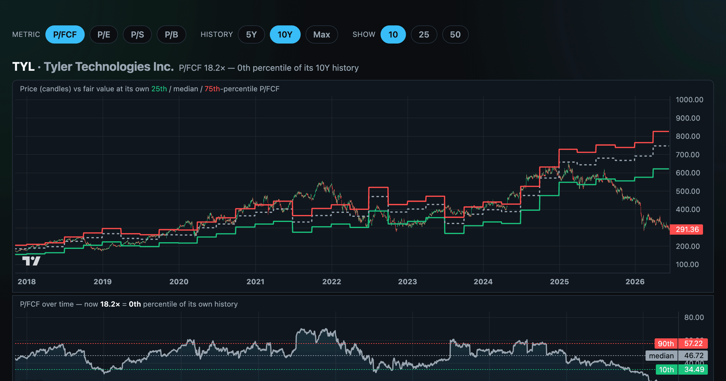
Stocks trading cheapest relative to their own P/E, P/FCF, P/S, or P/B history — with fair-value bands.
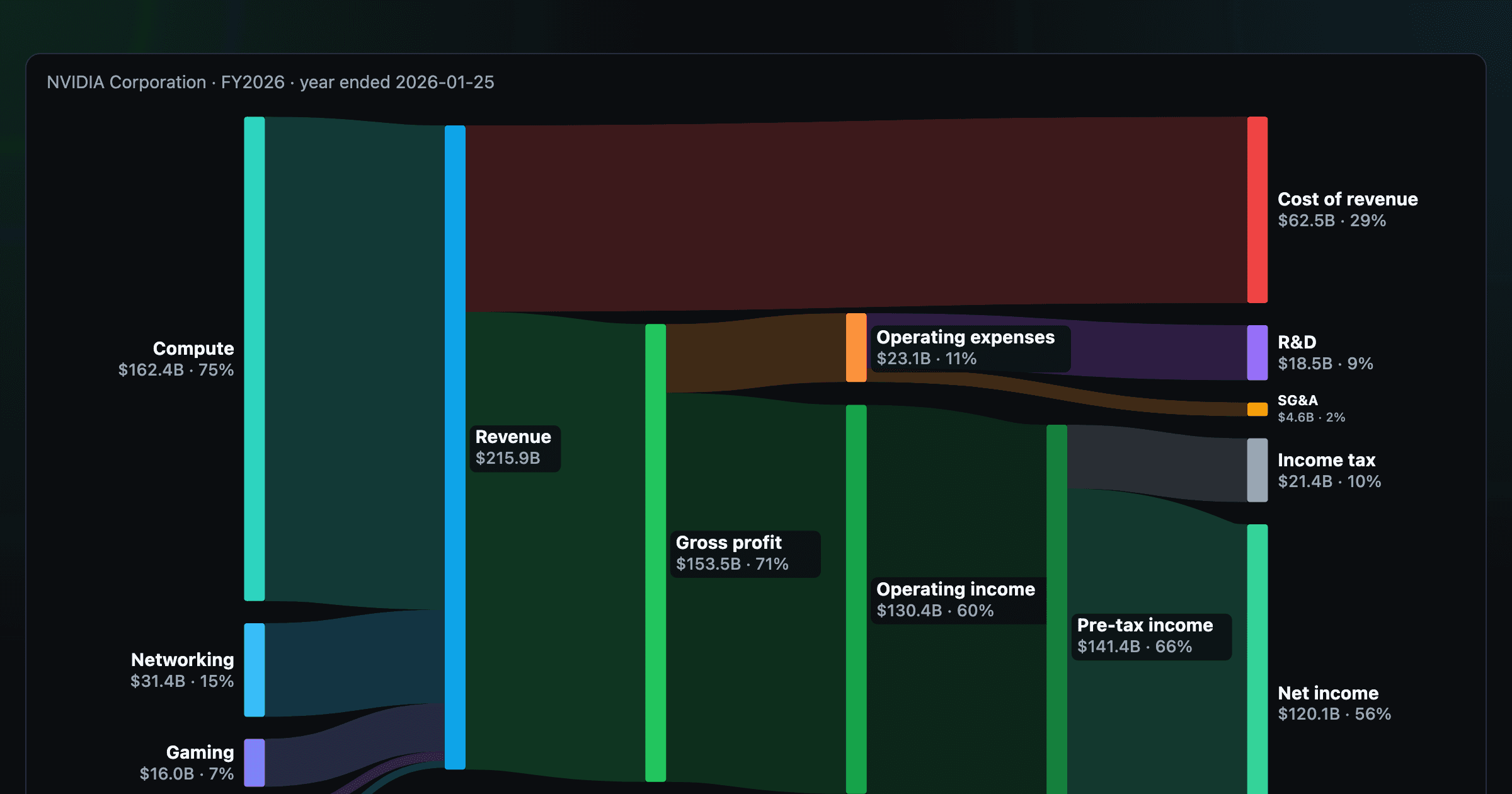
Follow a company's revenue through its income statement as a Sankey — costs, taxes, and profit.
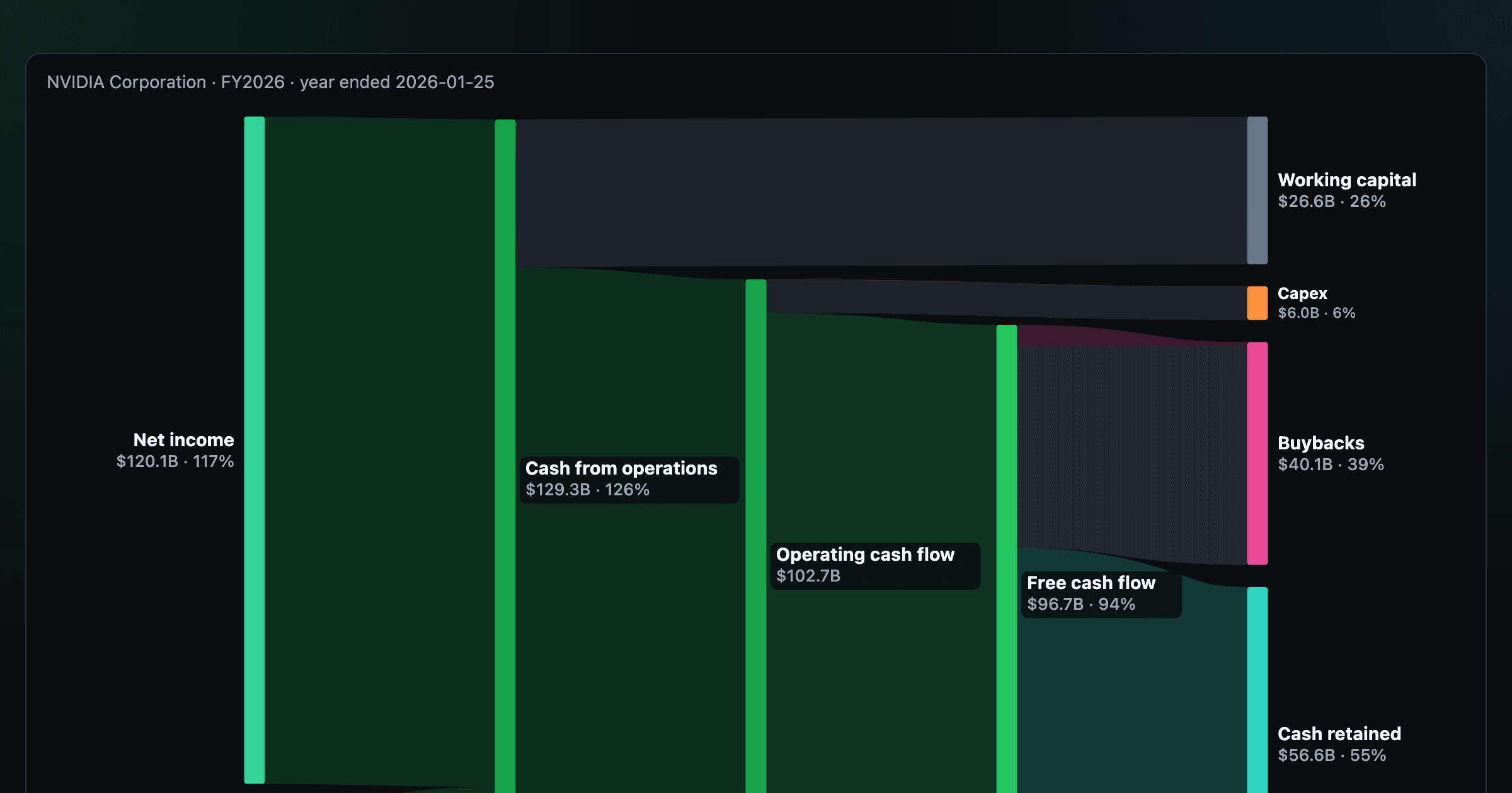
Follow a company's cash from net income through operating cash flow into capex, buybacks, and dividends.
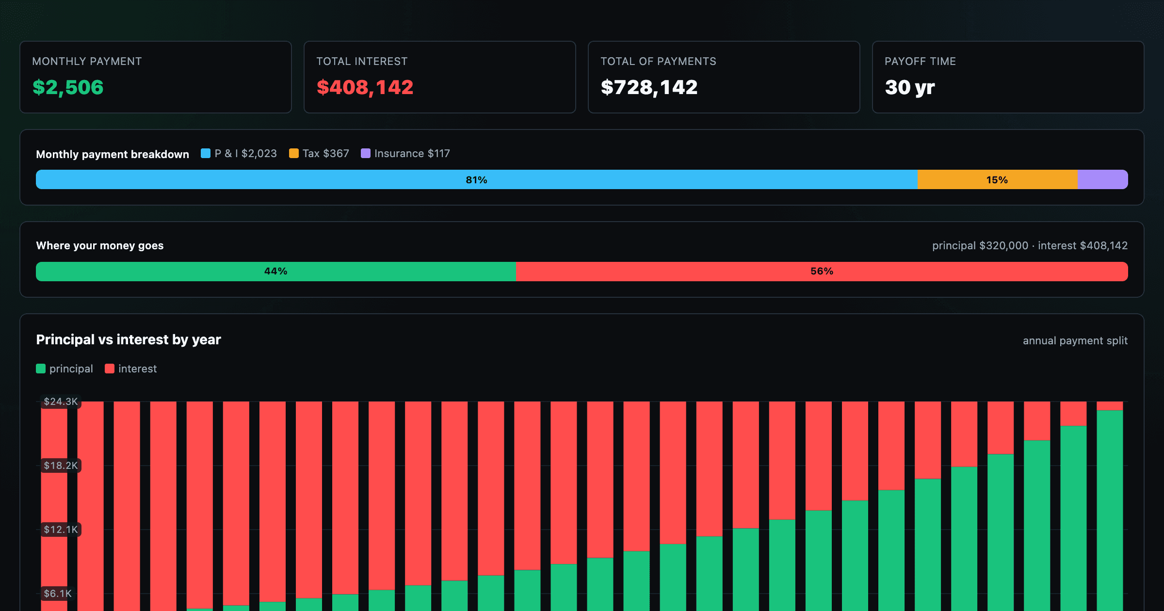
Monthly payment, principal vs interest by year, and the balance paydown — with extra-payment savings.
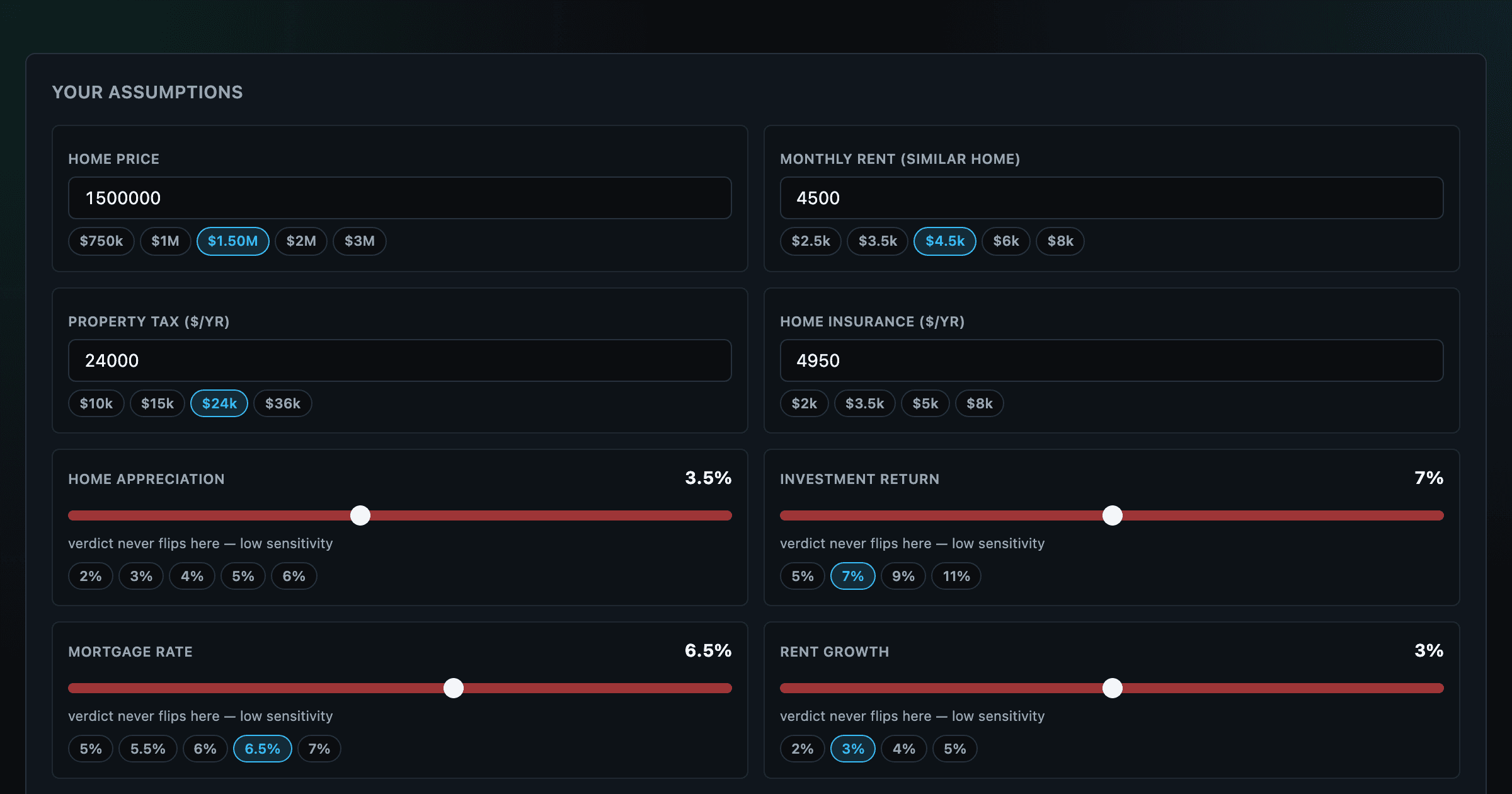
Should you rent or buy? Net-wealth verdict with sensitivity analysis of every assumption.
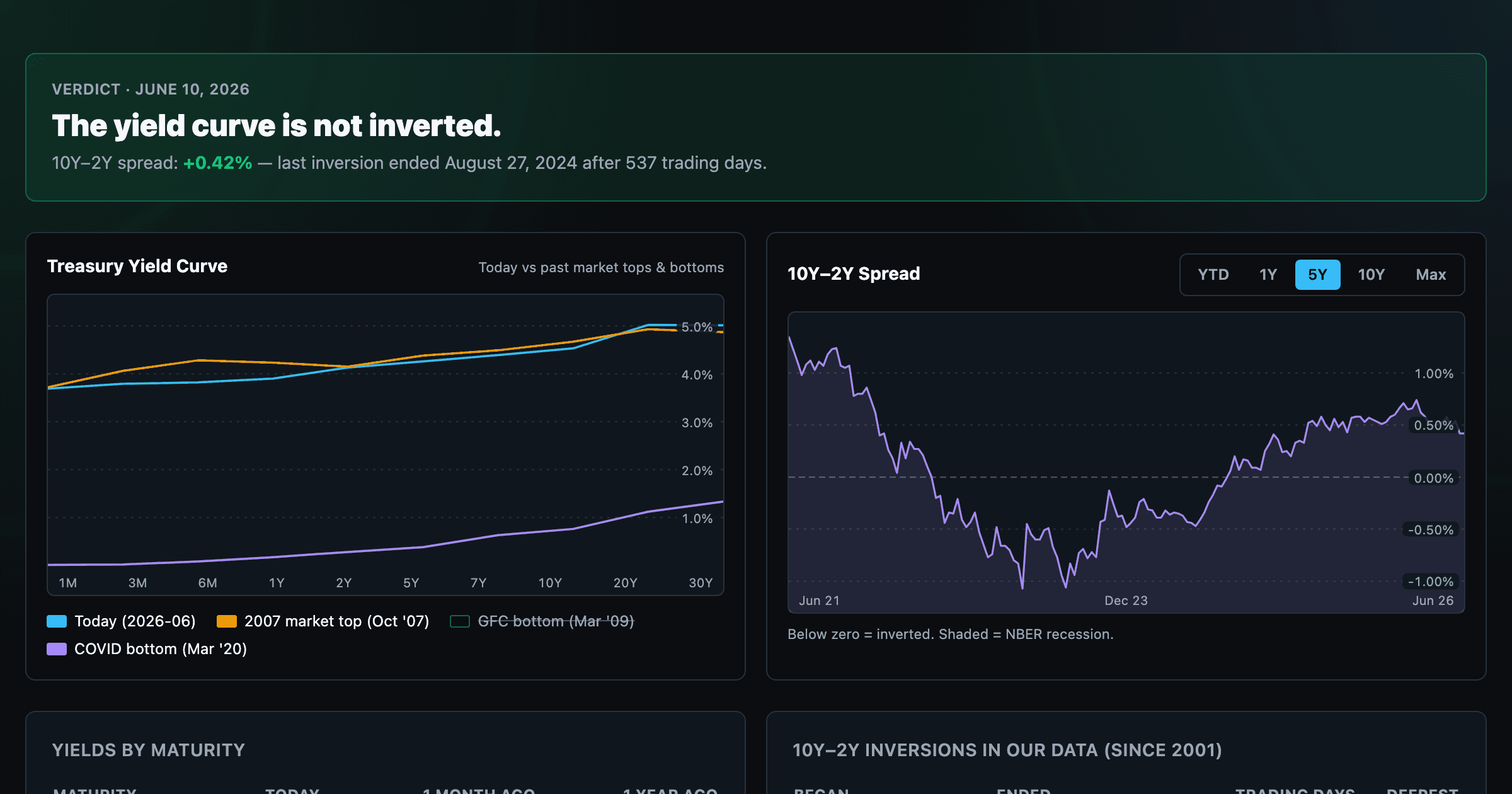
Live term structure, the 10Y–2Y spread, and every inversion episode.