
How surviving IPOs stack up against the S&P 500
Every US stock that first listed since 2010, plotted by its annualized total return since the first close — each compared to the S&P 500 over the exact same window. Filter to true IPOs, or include spin-offs and direct listings.
Just listed · under 1 year
too new to annualize — total return since first close| Ticker | Listed | Days | Since debut | S&P 500 same window |
|---|---|---|---|---|
| SPCX | 2026-06-11 | 8 | +37.0% | +1.2% |
Alpha vs S&P 500 (annualized)
$1,000 at first close → today
| Ticker | Listed | Now worth ▼ | vs S&P 500 |
|---|---|---|---|
| TSLA | 2010 | $251.4k | $9.4k |
| ANET | 2014 | $49.4k | $4.7k |
| PANW | 2012 | $32.5k | $6.9k |
| GNRC | 2010 | $30.5k | $9.2k |
| NXPI | 2010 | $25.3k | $8.7k |
| TRGP | 2010 | $20.0k | $8.0k |
| NOW | 2012 | $19.3k | $6.9k |
| APO | 2011 | $19.2k | $7.3k |
| KKR | 2010 | $16.5k | $9.0k |
| HCA | 2011 | $16.0k | $7.5k |
| META | 2012 | $15.2k | $7.3k |
| VST | 2016 | $14.1k | $4.0k |
| FANG | 2012 | $13.7k | $6.6k |
| CRWD | 2019 | $11.8k | $2.9k |
| CBOE | 2010 | $10.0k | $8.8k |
| PAYC | 2014 | $8.3k | $5.0k |
| HLT | 2013 | $8.2k | $5.2k |
| CDW | 2013 | $8.1k | $5.8k |
| ENPH | 2012 | $7.1k | $6.7k |
| ALAB | 2024 | $6.7k | $1.5k |
| CZR | 2014 | $6.7k | $4.5k |
| LYB | 2010 | $6.5k | $8.3k |
| TTD | 2016 | $6.1k | $4.0k |
| DDOG | 2019 | $5.9k | $2.7k |
| XYZ | 2015 | $5.7k | $4.3k |
| EPAM | 2012 | $5.5k | $7.0k |
| CFG | 2014 | $4.3k | $4.5k |
| IQV | 2013 | $4.0k | $5.7k |
| GDDY | 2015 | $3.9k | $4.3k |
| APTV | 2011 | $3.8k | $7.8k |
| CHTR | 2010 | $3.6k | $8.7k |
| MRNA | 2018 | $3.4k | $3.2k |
| CRWV | 2025 | $3.0k | $1.4k |
| WDAY | 2012 | $2.4k | $6.6k |
| KMI | 2011 | $1.8k | $7.3k |
| INVH | 2017 | $1.8k | $3.8k |
| UBER | 2019 | $1.7k | $2.9k |
| ABNB | 2020 | $984 | $2.2k |
| DASH | 2020 | $915 | $2.2k |
| NCLH | 2013 | $824 | $6.3k |
FAQ
- What does this page show?
- For every US stock that first listed since 2010, it shows the annualized total return since its first closing price, compared to the S&P 500 over the same window. You can filter to true IPOs or include spin-offs, direct listings, and mergers.
- Why do almost all of these beat or track the market?
- Survivorship bias. The companies shown are current S&P 500 members and a few large recent listings, so they are by definition the IPOs that succeeded. IPOs that failed or were delisted are not in the dataset, which makes IPO performance look far better than it was across all IPOs.
- Is this the IPO offer price?
- No. Returns start from the first closing price in our data, not the underwriter's offer price, so the first-day pop from offer price to first close is not included.
- What's the difference between an IPO, a spin-off, and a direct listing?
- An IPO sells new shares to the public through underwriters. A spin-off distributes shares of a unit carved out of an existing parent company (for example GE HealthCare from GE). A direct listing lists existing shares without raising new capital (for example Coinbase and Palantir). We tag mergers and renames too, since their price history starts at the deal rather than a real debut.
More visualizations
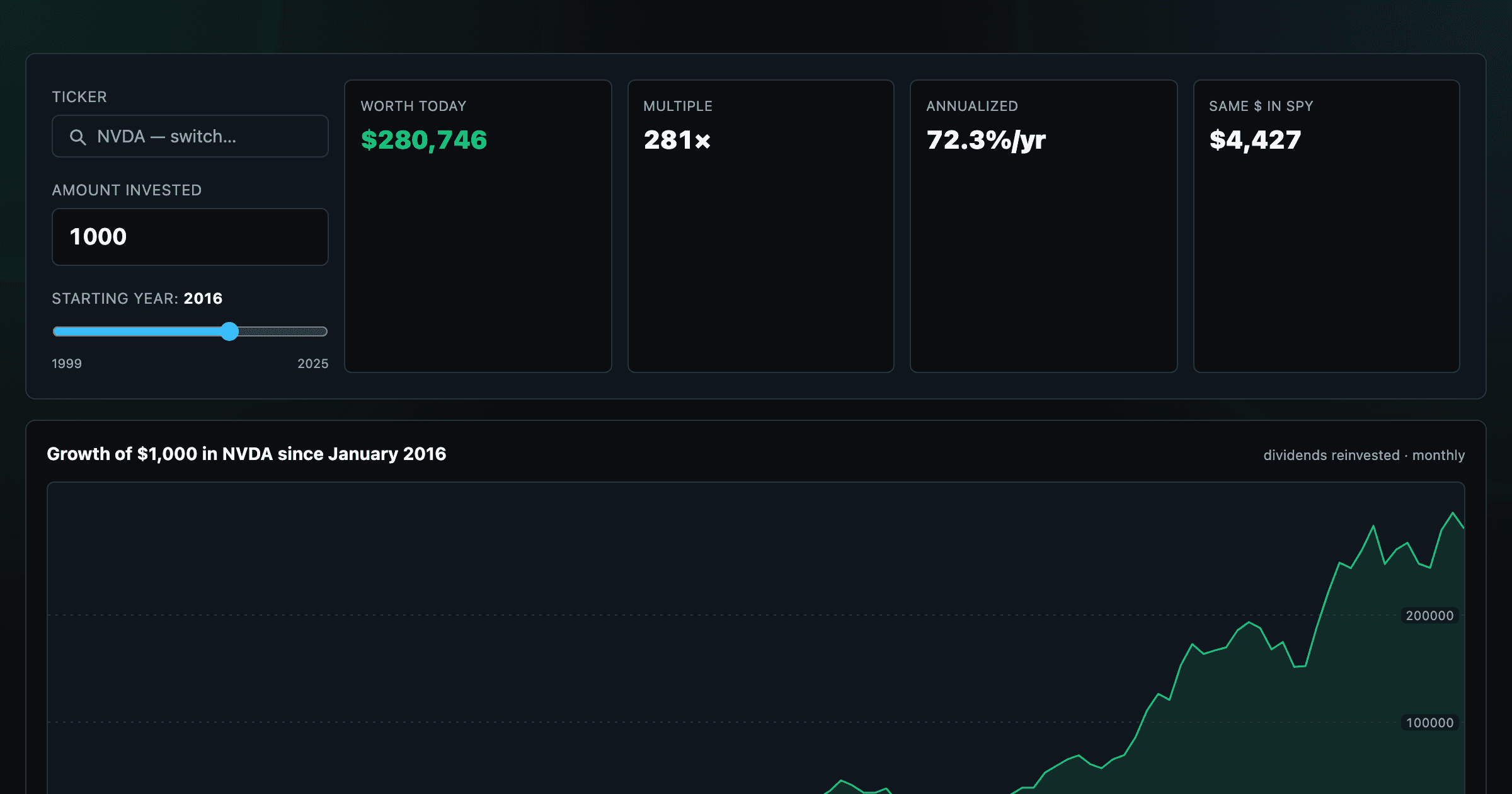
What $1,000 in any stock or ETF would be worth today.
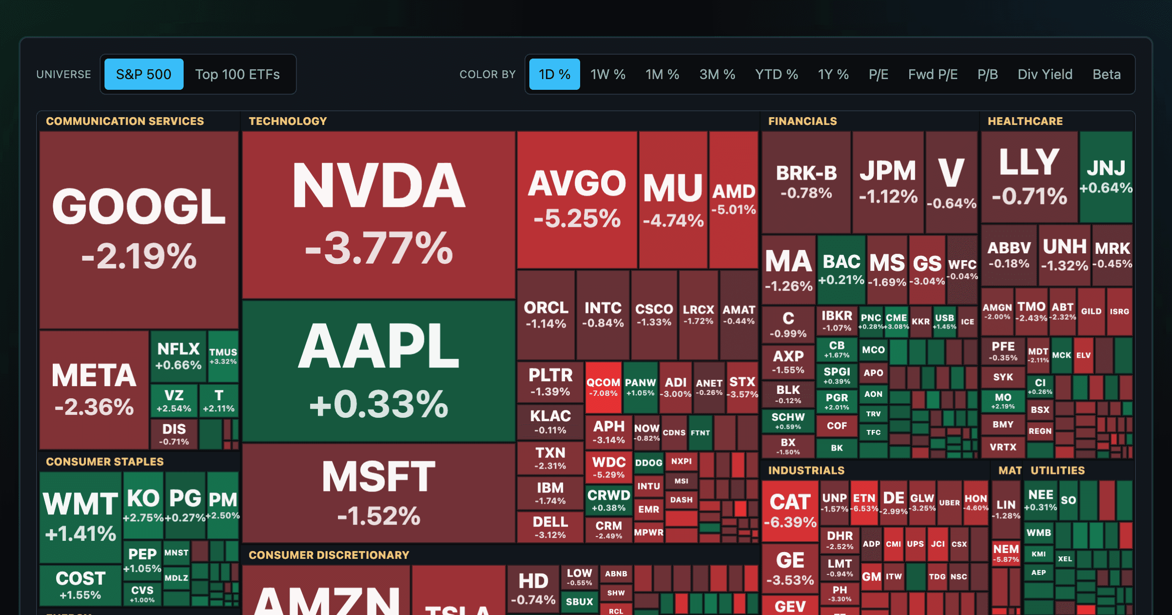
Every S&P 500 company sized by market cap — color by return or valuation.
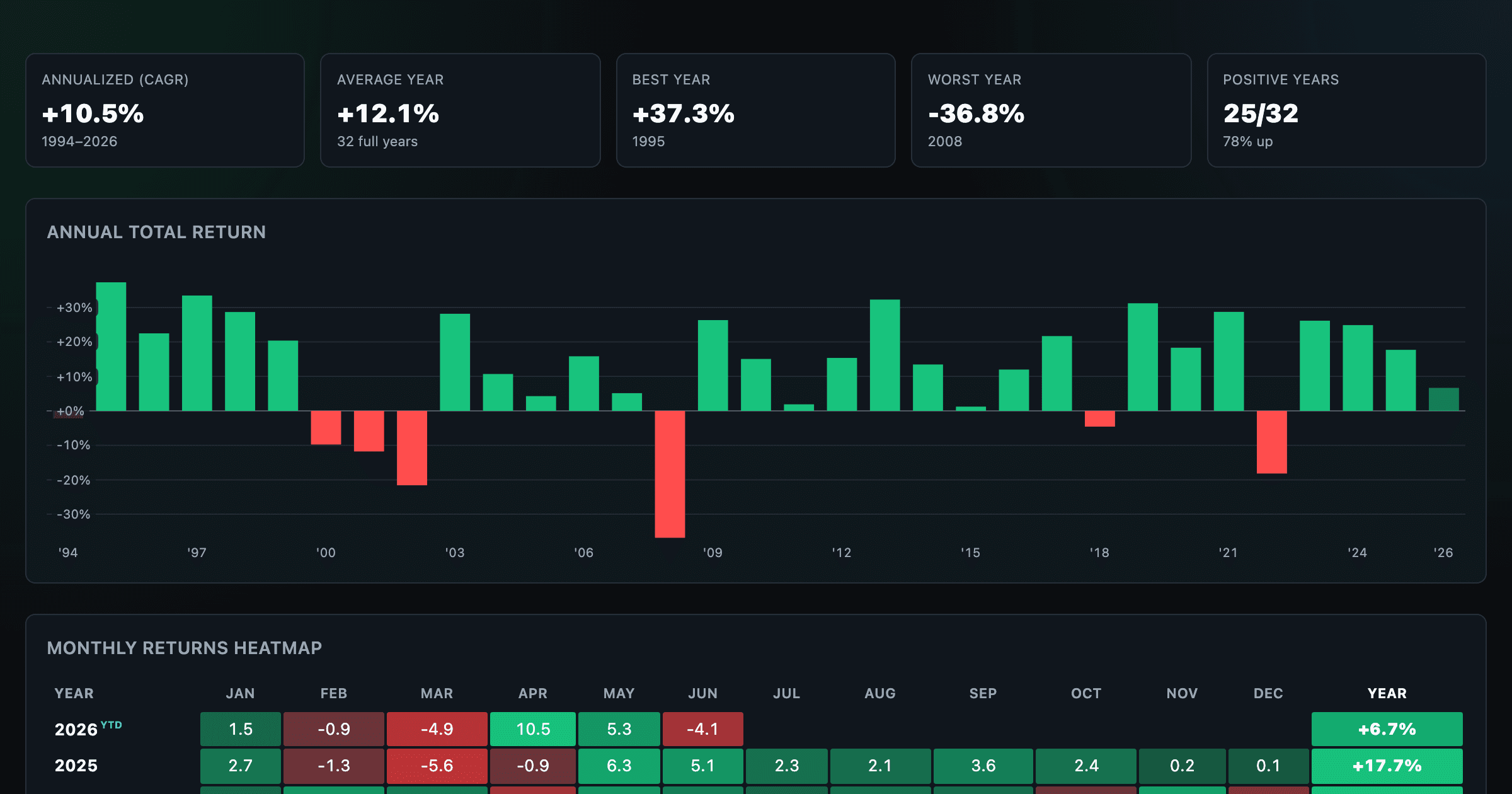
S&P 500 annual and monthly returns — every year, every month.
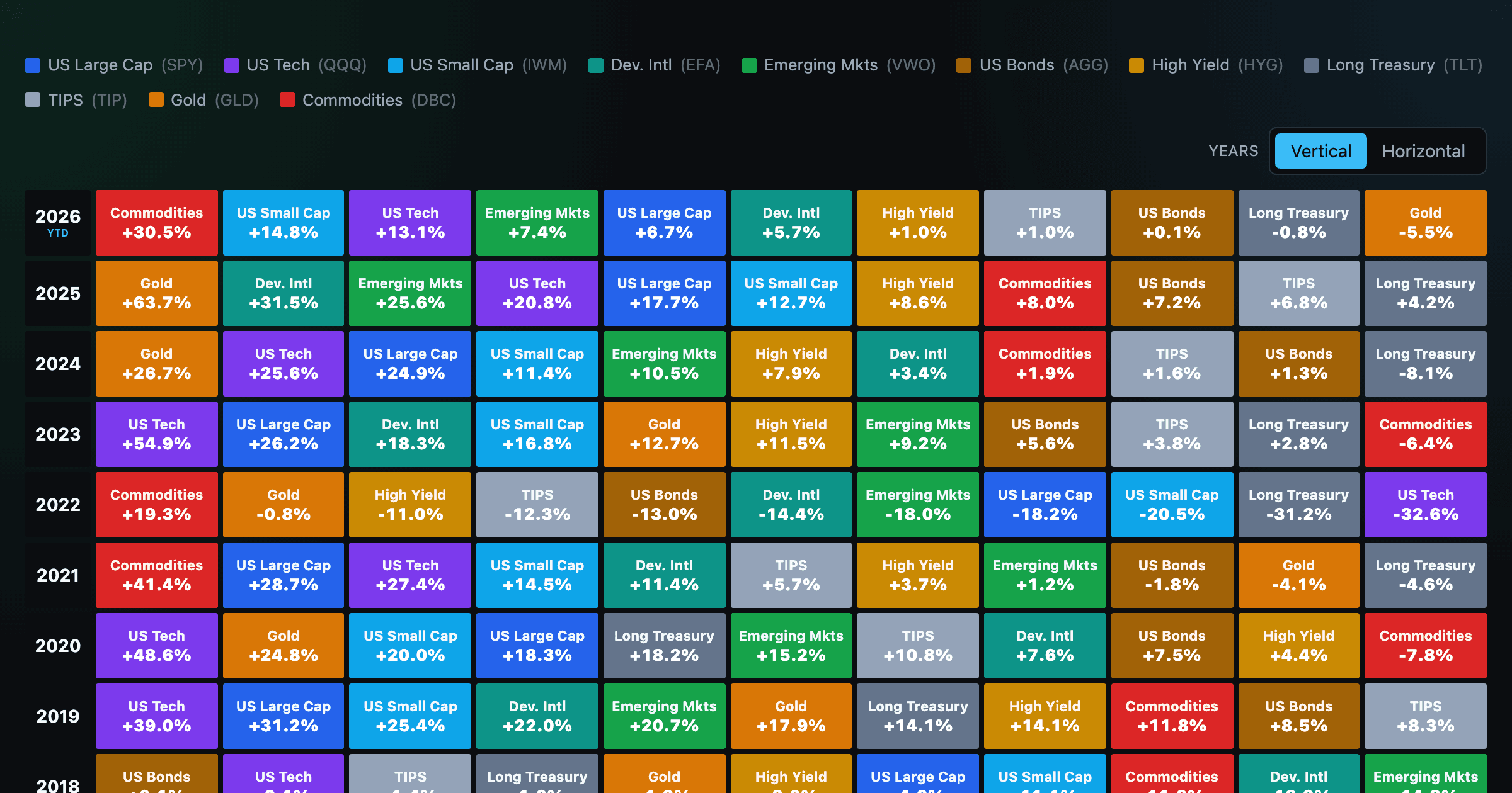
Asset-class returns ranked year by year — the Callan chart / asset allocation quilt.
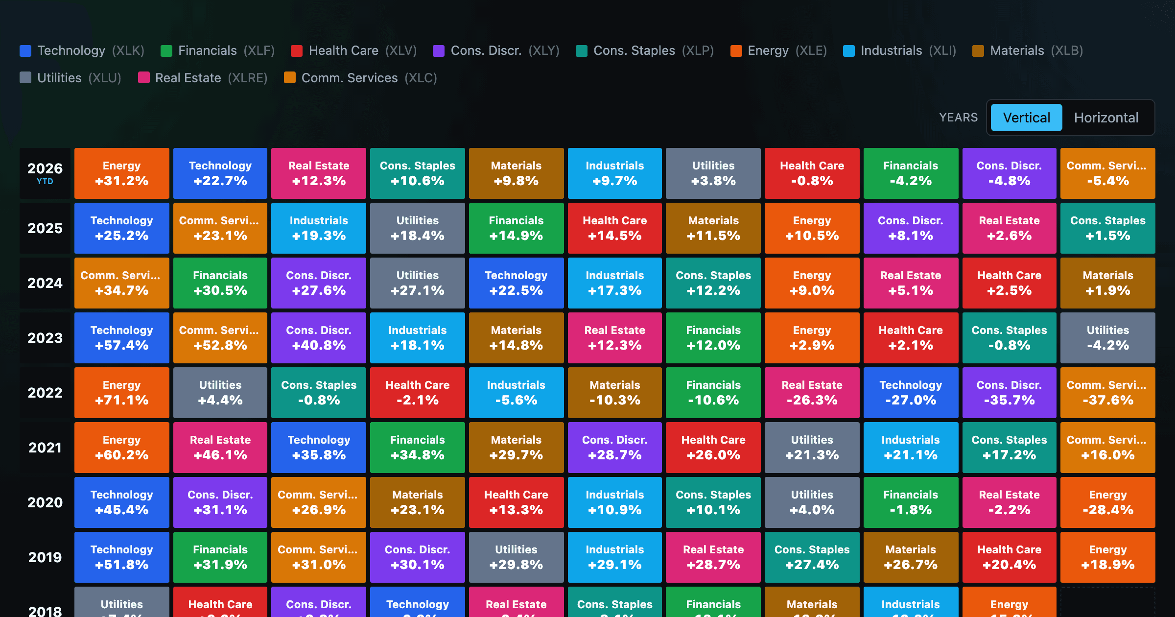
The 11 S&P 500 sectors ranked year by year — a sector quilt chart, back to 1999.
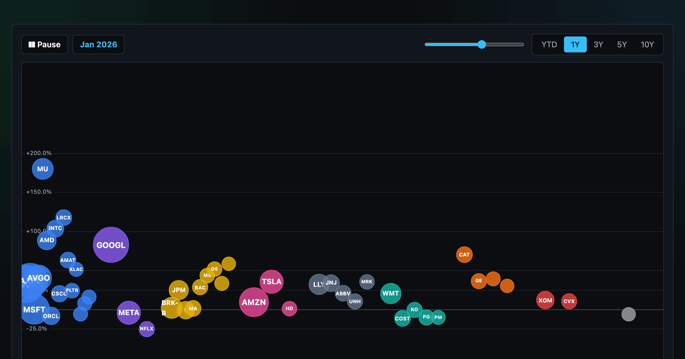
The biggest US companies as animated bubbles, rising and falling with their total return over time.
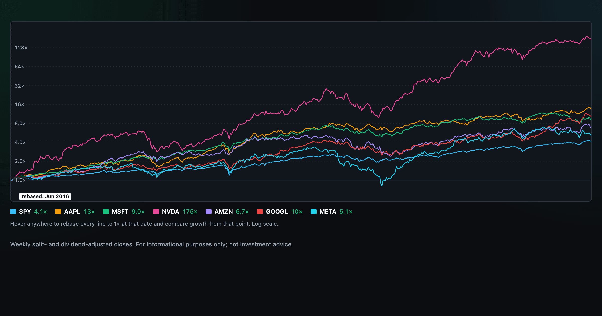
Compare megacaps vs the S&P 500, rebased to 1× at any date you hover.

Stocks trading cheapest relative to their own P/E, P/FCF, P/S, or P/B history — with fair-value bands.

Follow a company's revenue through its income statement as a Sankey — costs, taxes, and profit.

Follow a company's cash from net income through operating cash flow into capex, buybacks, and dividends.

Monthly payment, principal vs interest by year, and the balance paydown — with extra-payment savings.
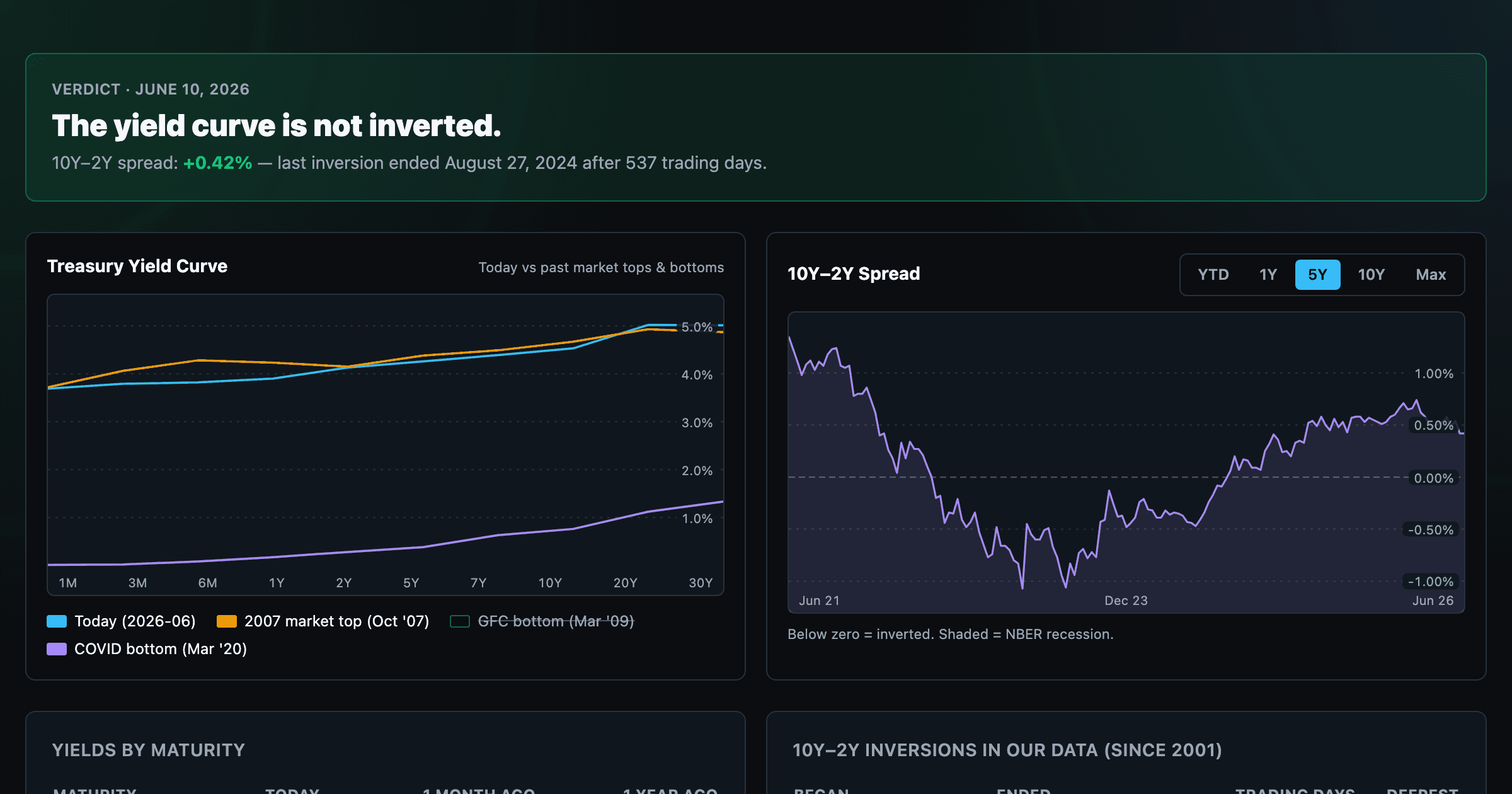
Live term structure, the 10Y–2Y spread, and every inversion episode.