
Index chart
Compare growth from any starting point. Every line is rebased to 1× at the date you hover, so you can see who compounded fastest from that moment — not just over a fixed window. Megacaps vs the S&P 500 over the last 10 years.
Hover anywhere to rebase every line to 1× at that date and compare growth from that point — or pick a year above, which is the same thing with an address. Log scale.
Weekly split- and dividend-adjusted closes. For informational purposes only; not investment advice.
FAQ#
- What is an index chart?
- An index chart normalizes several investments to the same starting value (1×) so you can compare their growth on one scale, regardless of share price. Each line shows how $1 invested at the start would have grown.
- How does rebasing on hover work?
- Every line is rebased to 1× at whatever date you hover, so you can see who compounded fastest from that exact moment — not just over a fixed window. Move the cursor to change the starting point, or pick a year to get a link to that view.
- What's being compared?
- The largest US megacap stocks against the S&P 500 over the last 10 years, on a log scale, using weekly split- and dividend-adjusted closes (total return).
More visualizations
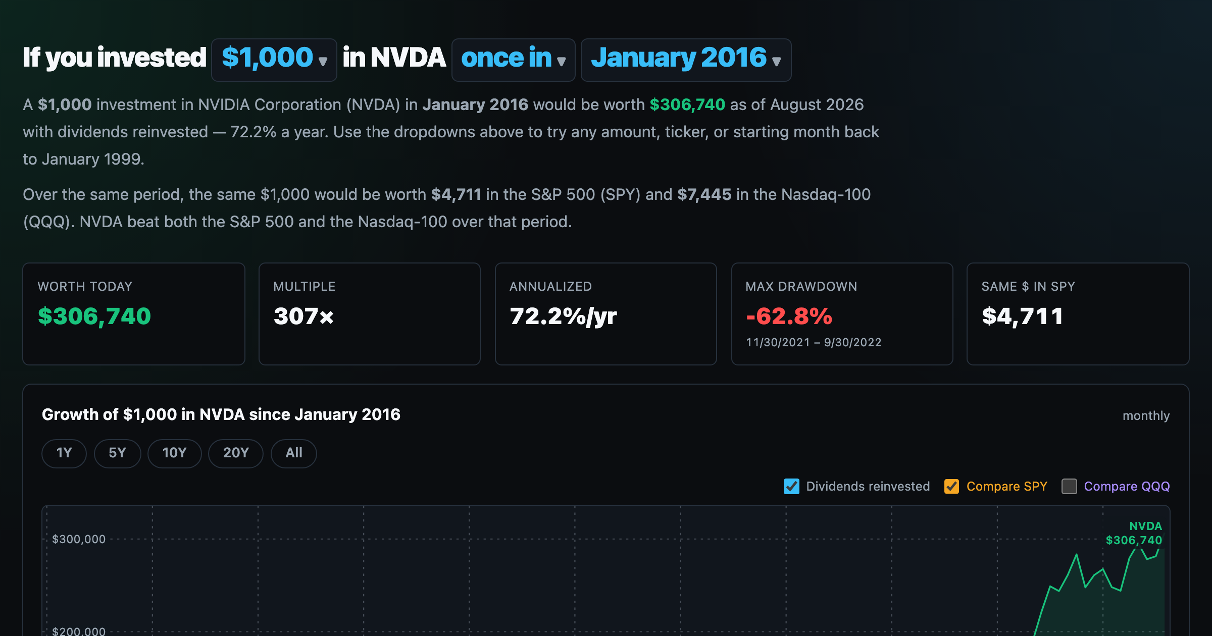
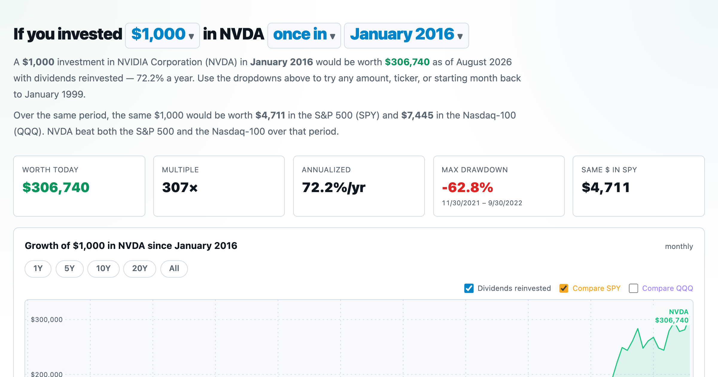
What $1,000 in any stock or ETF would be worth today.
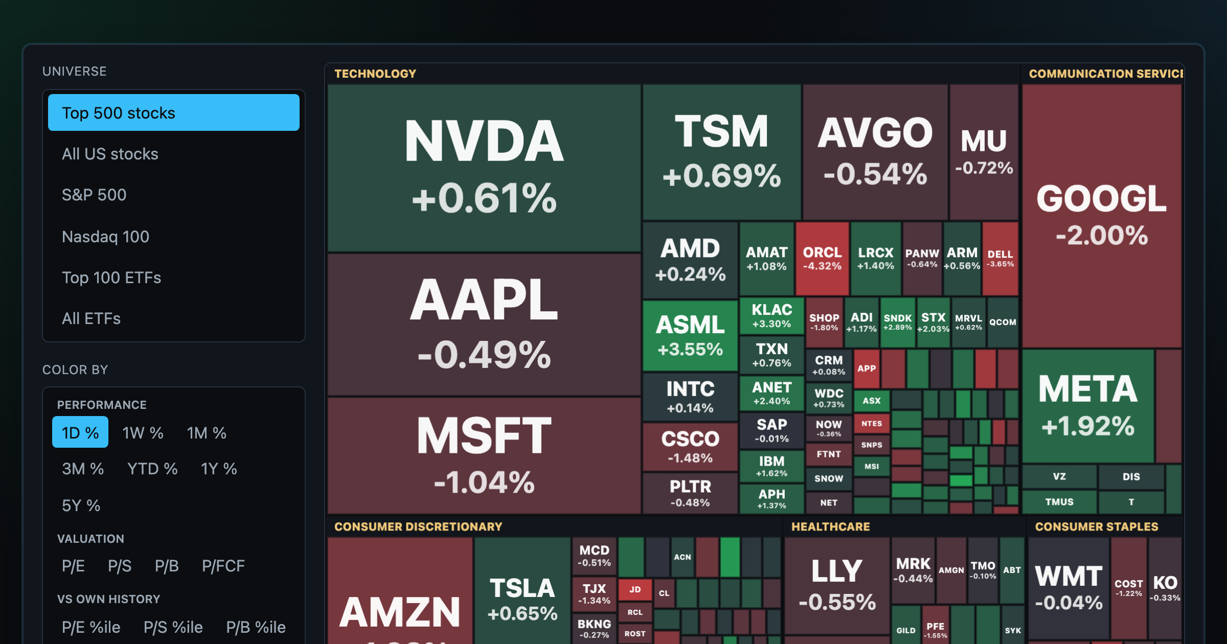
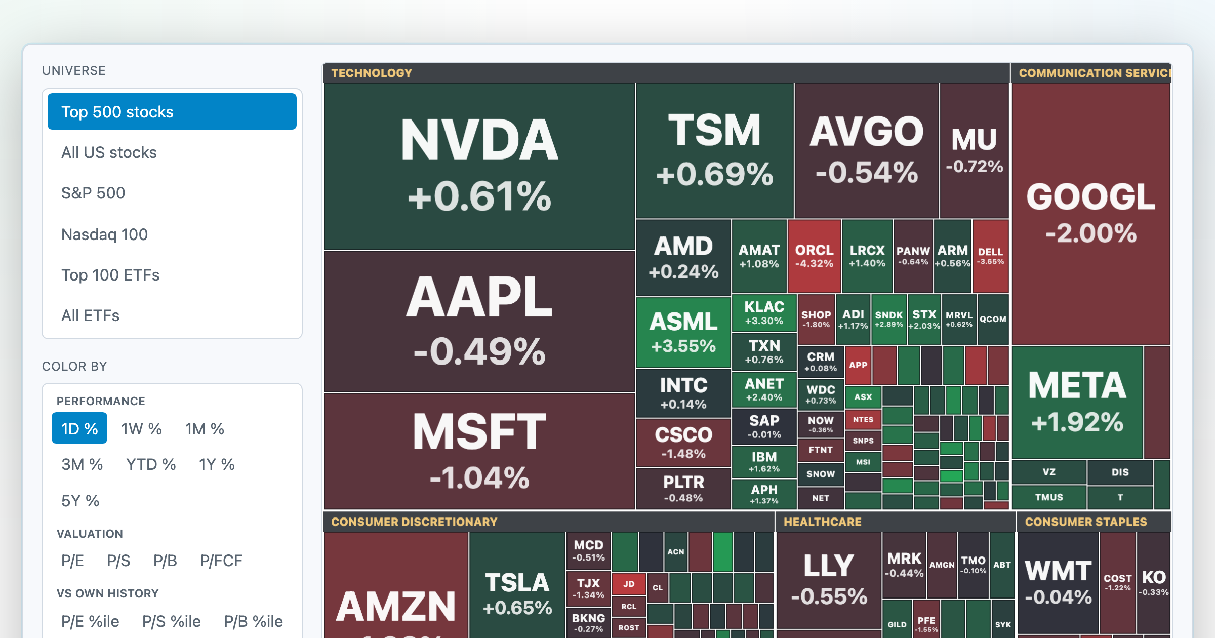
Every S&P 500 company sized by market cap — color by return or valuation.
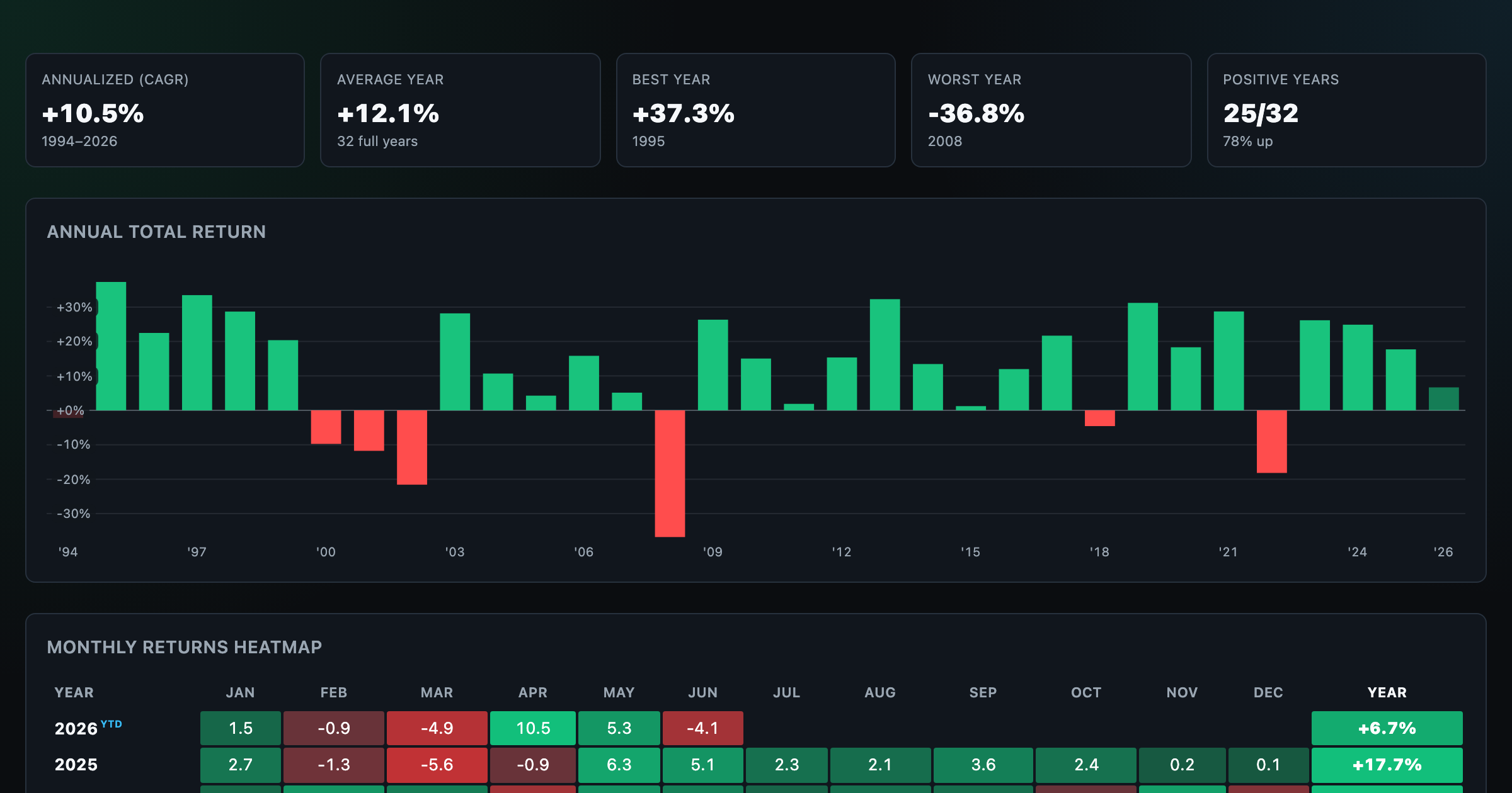
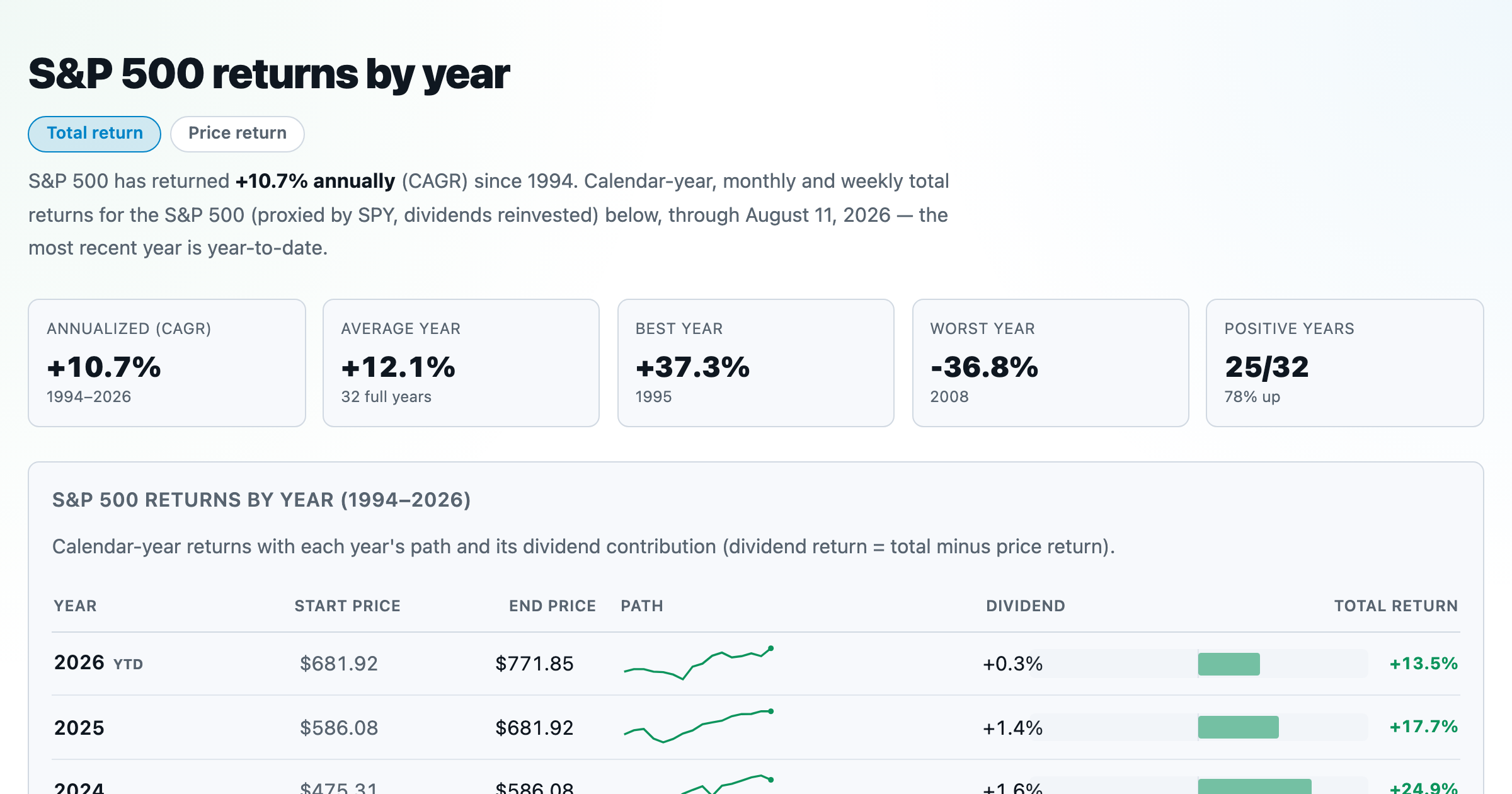
S&P 500 returns by year, month, week and trailing period — total or price return.
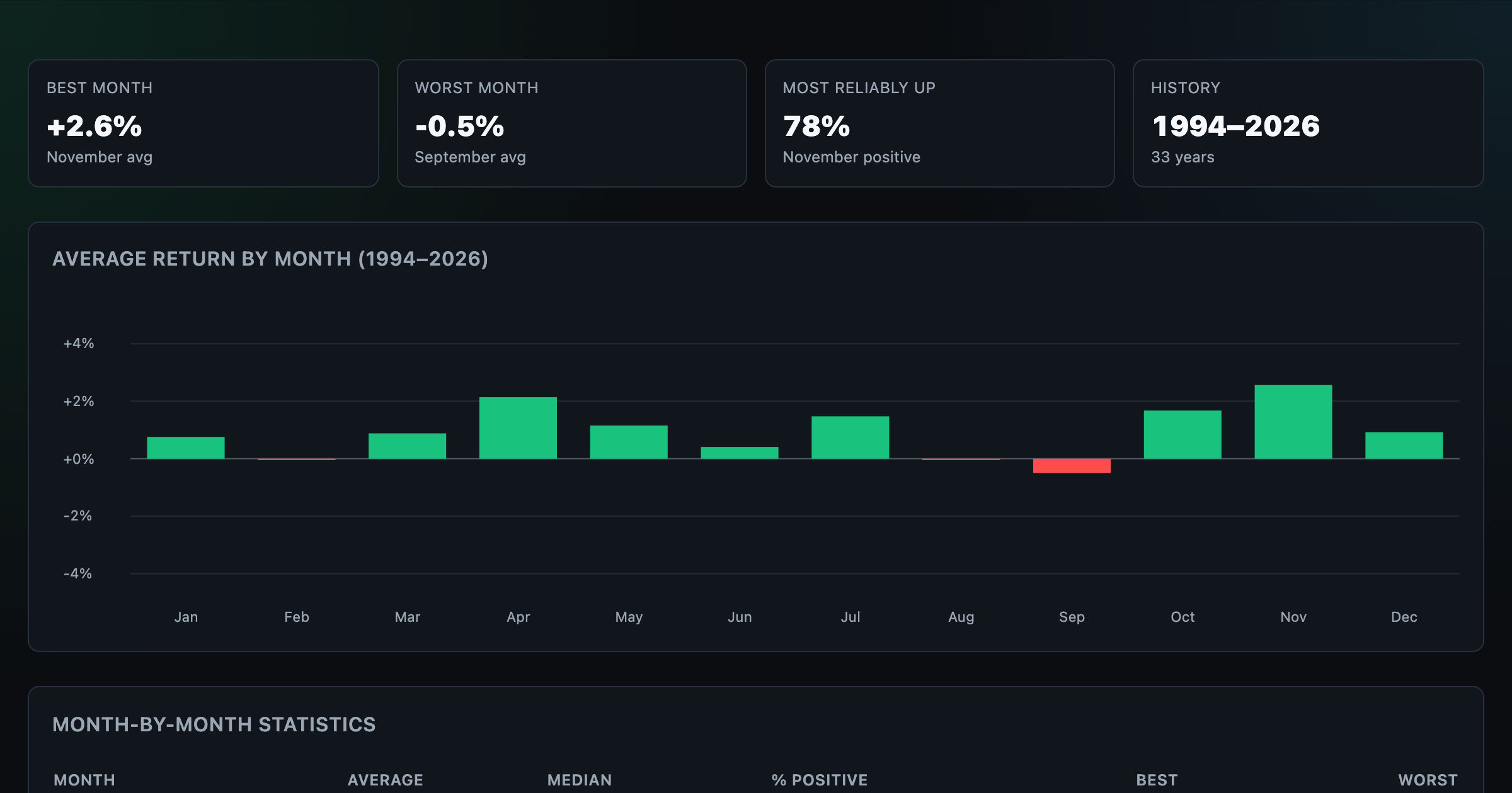
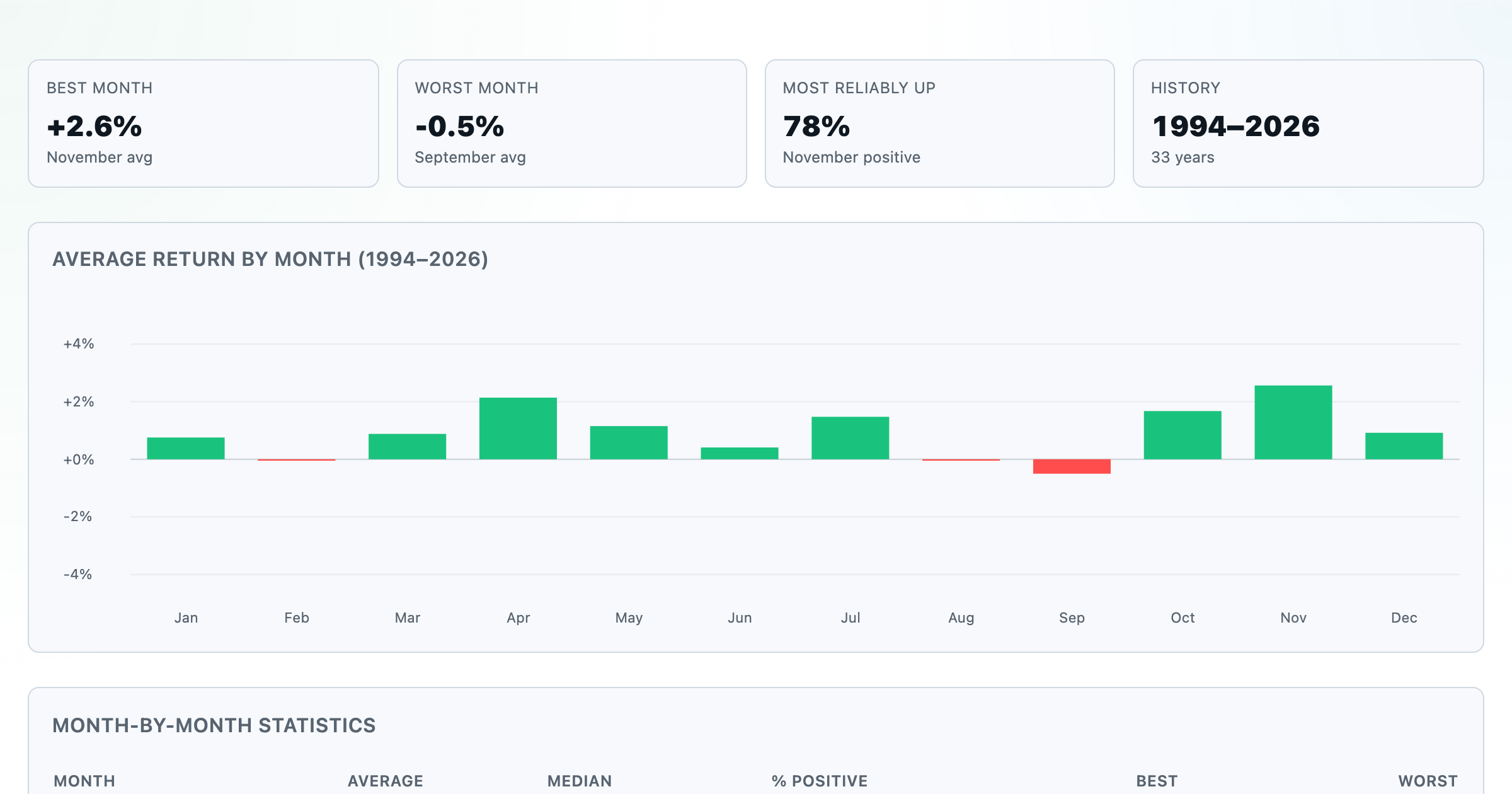
Which month is best for stocks? Average return of every calendar month, for any ticker.
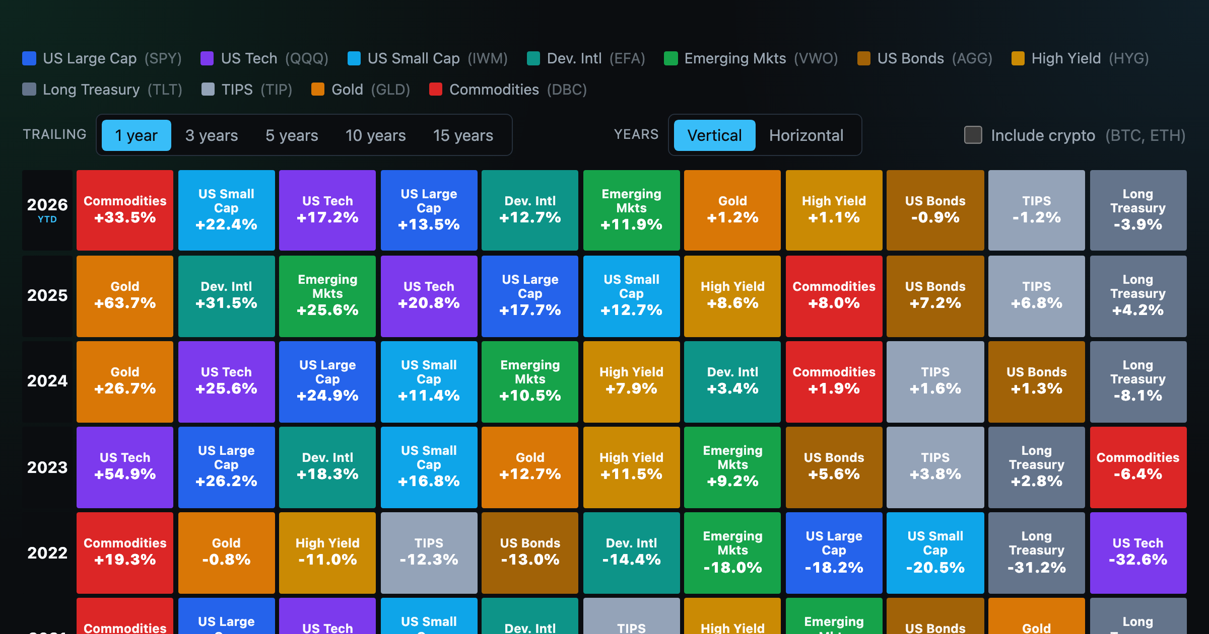
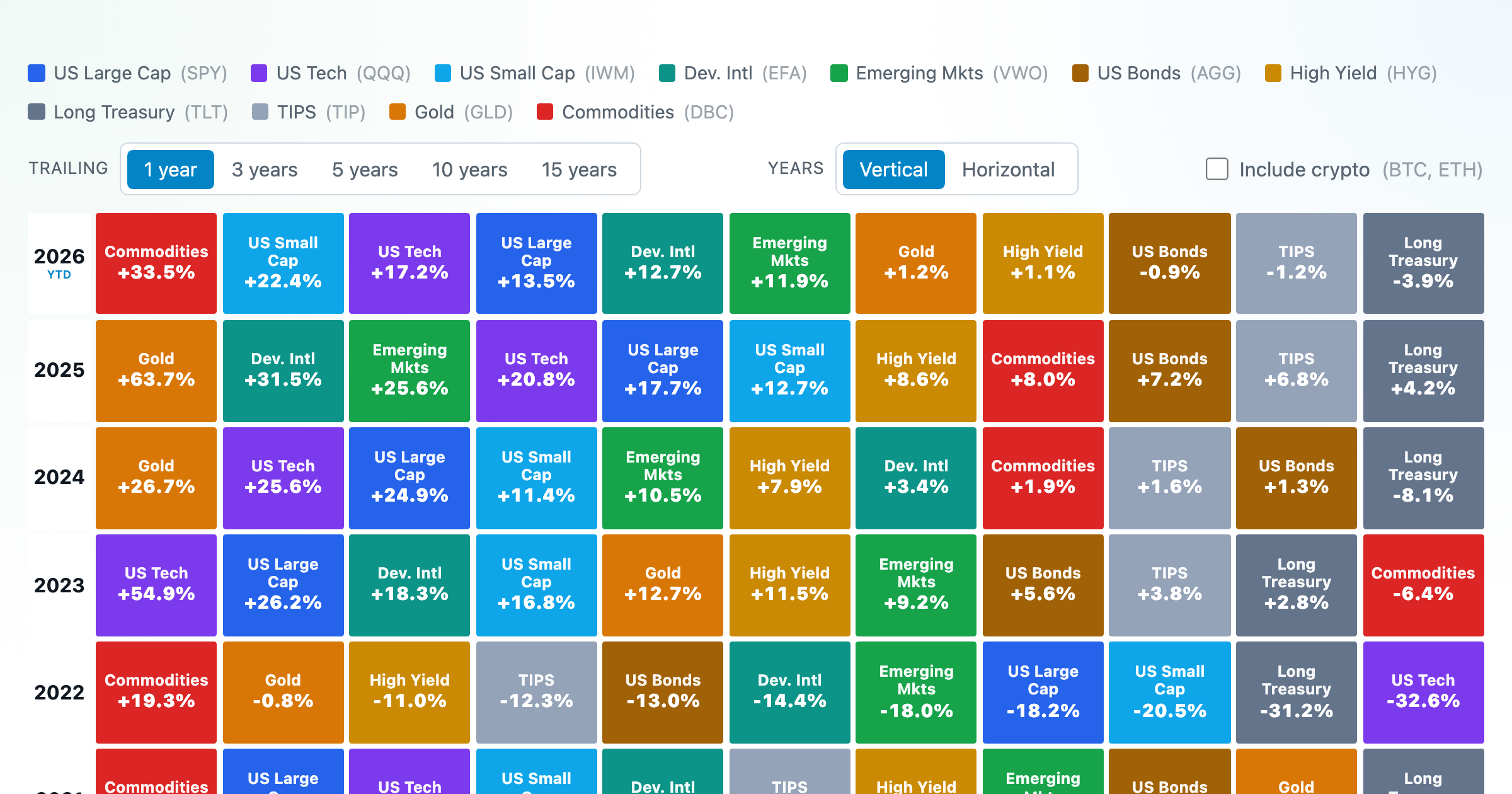
Asset-class returns ranked year by year — the Callan chart / asset allocation quilt.
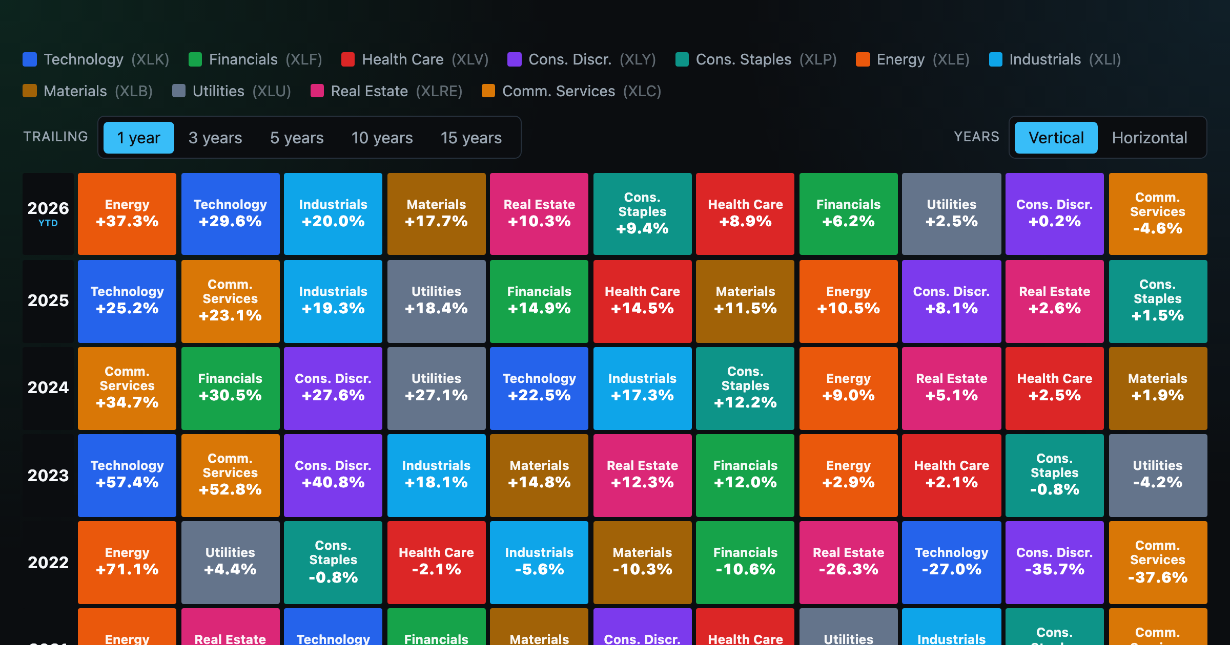
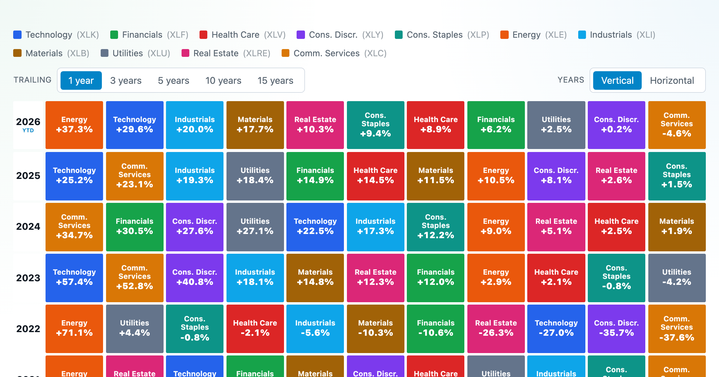
The 11 S&P 500 sectors ranked year by year — a sector quilt chart, back to 1999.

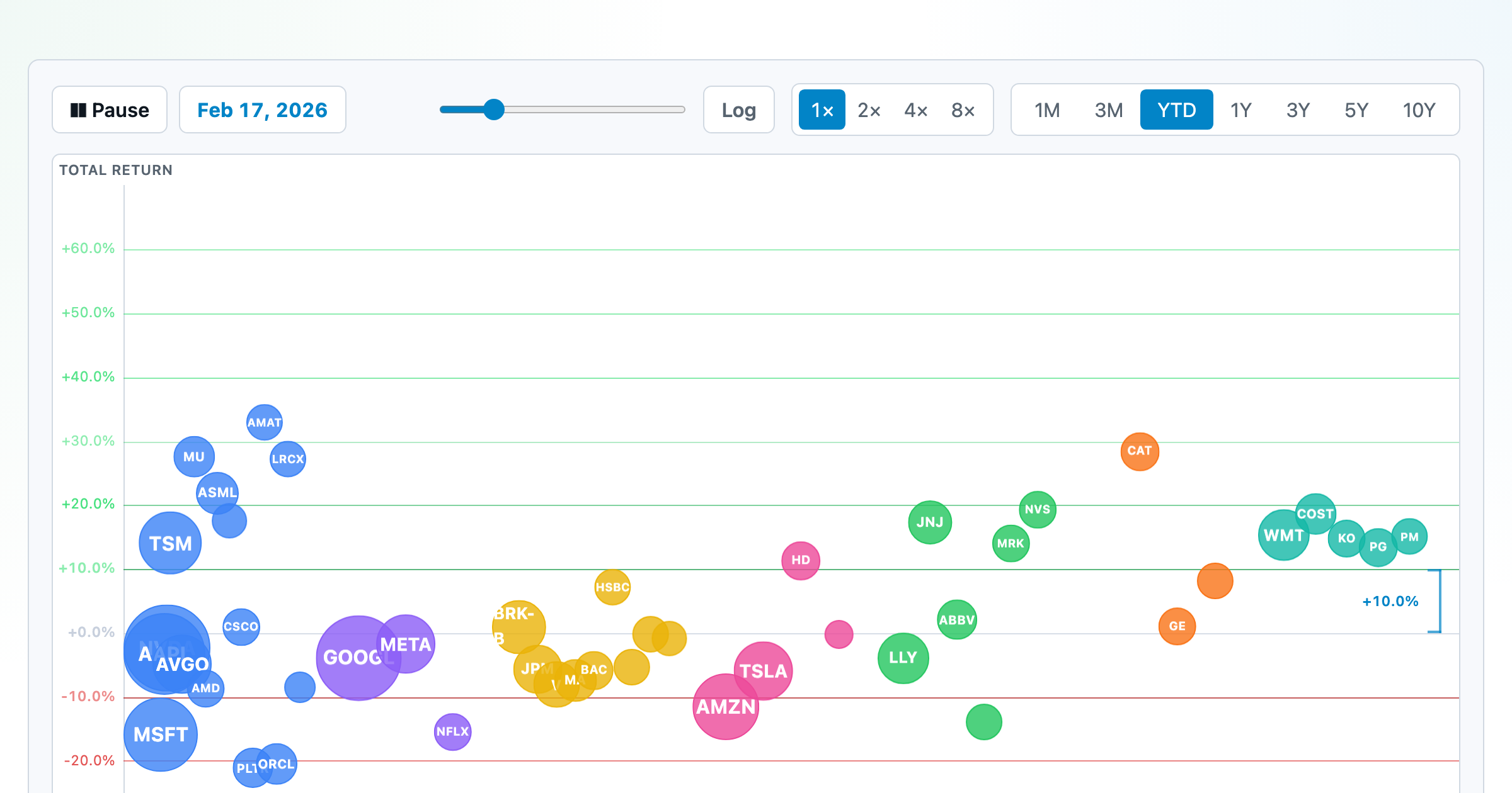
The biggest US companies as animated bubbles, rising and falling with their total return over time.
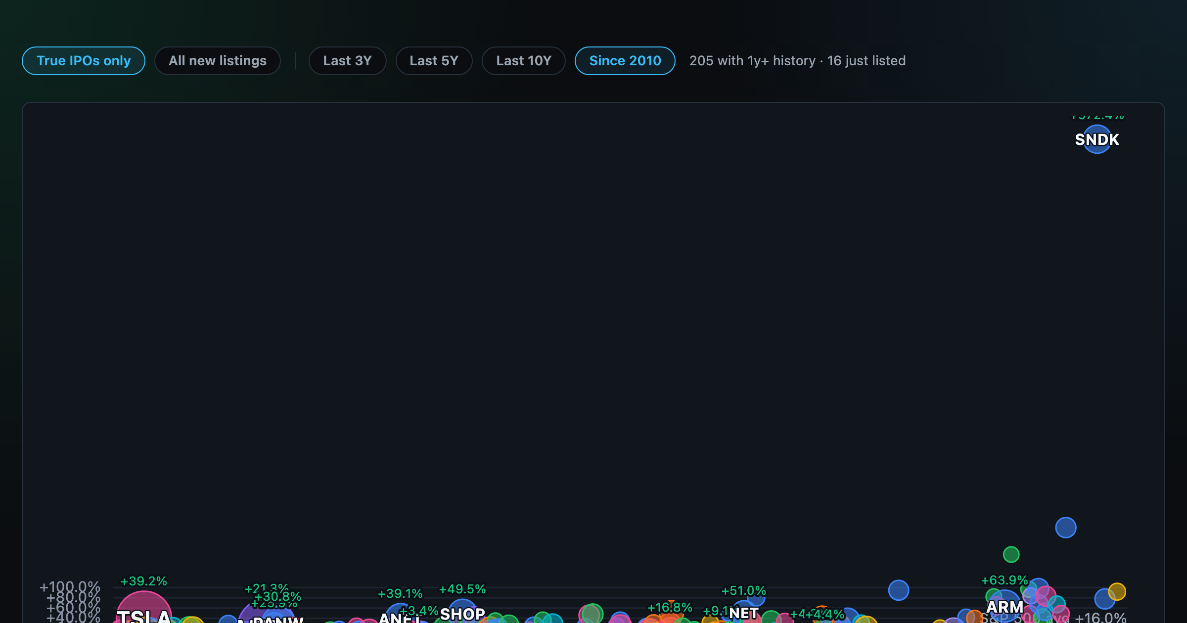
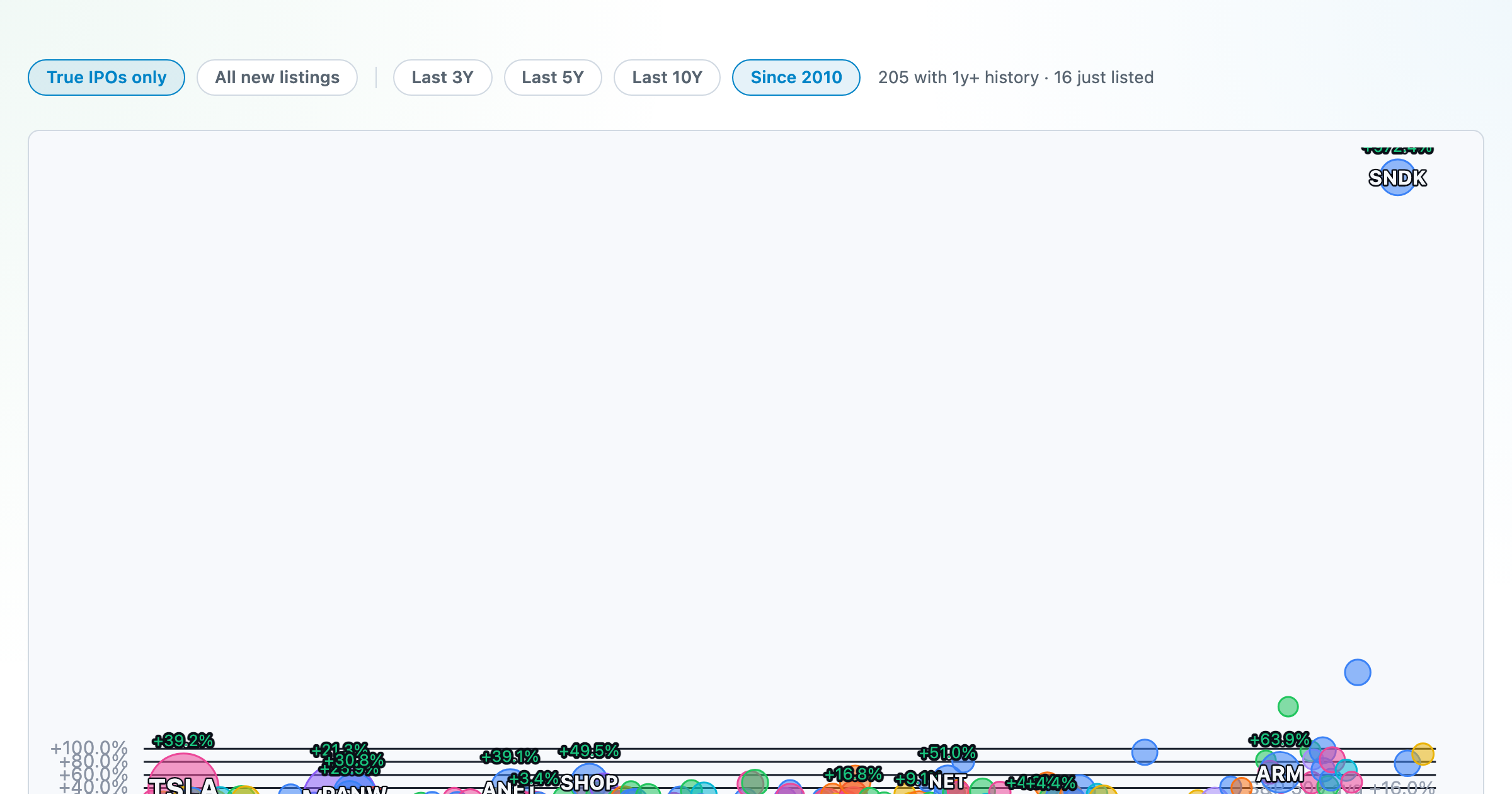
How recent stock-market debuts have performed since listing — annualized, vs the S&P 500, by IPO vs spin-off.

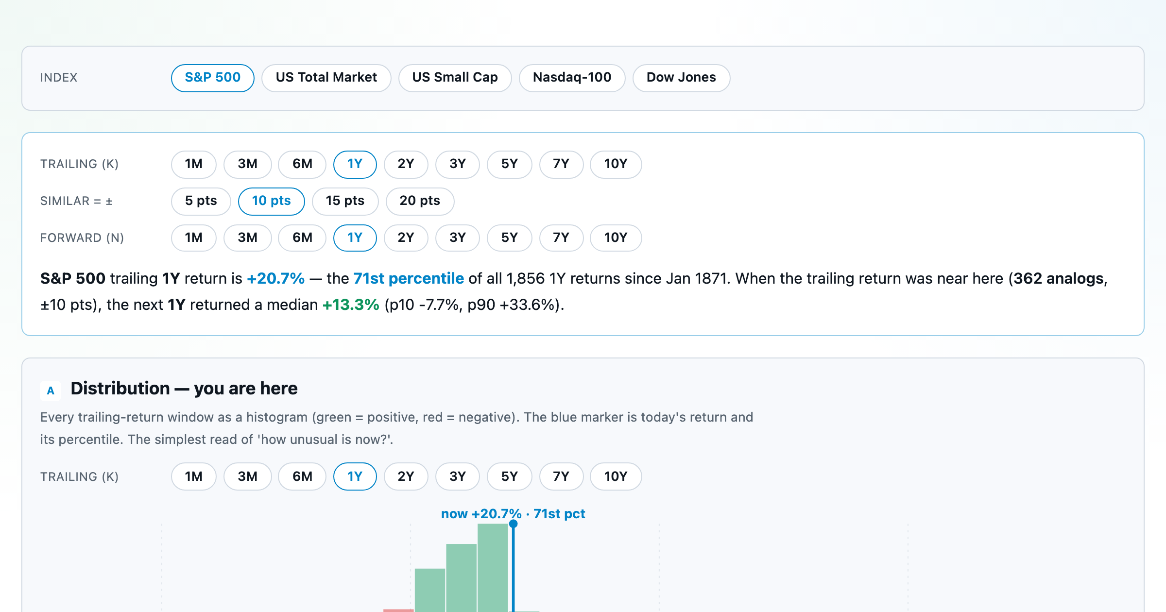
Where today's S&P 500 return ranks against all history — and the forward returns that followed similar moments.
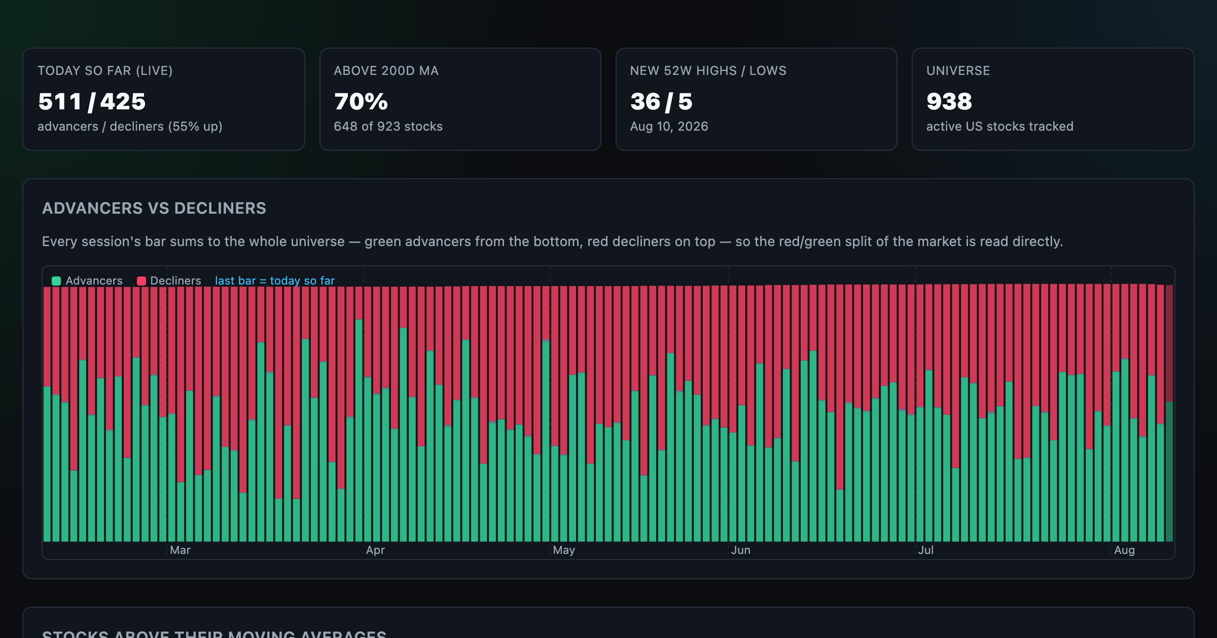
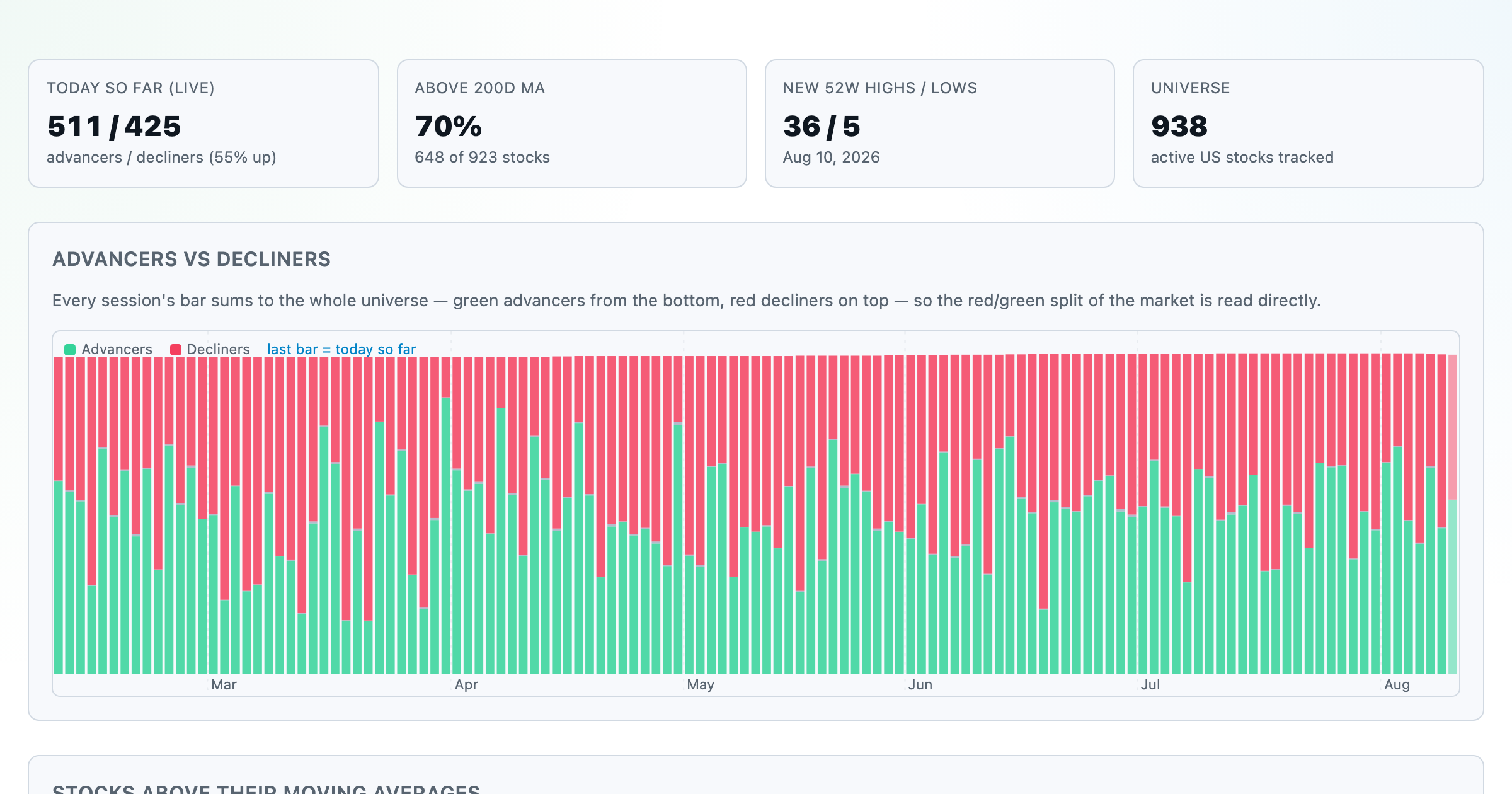
Advancers vs decliners over time, % of stocks above their moving averages, new highs vs lows, and breadth across every trailing window.
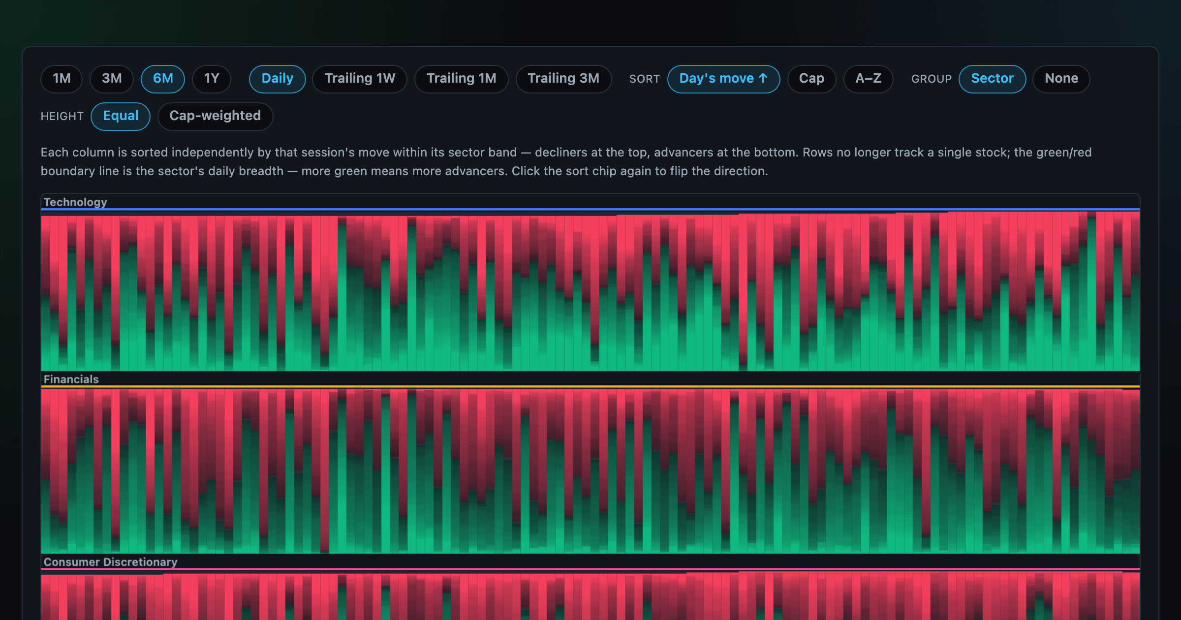
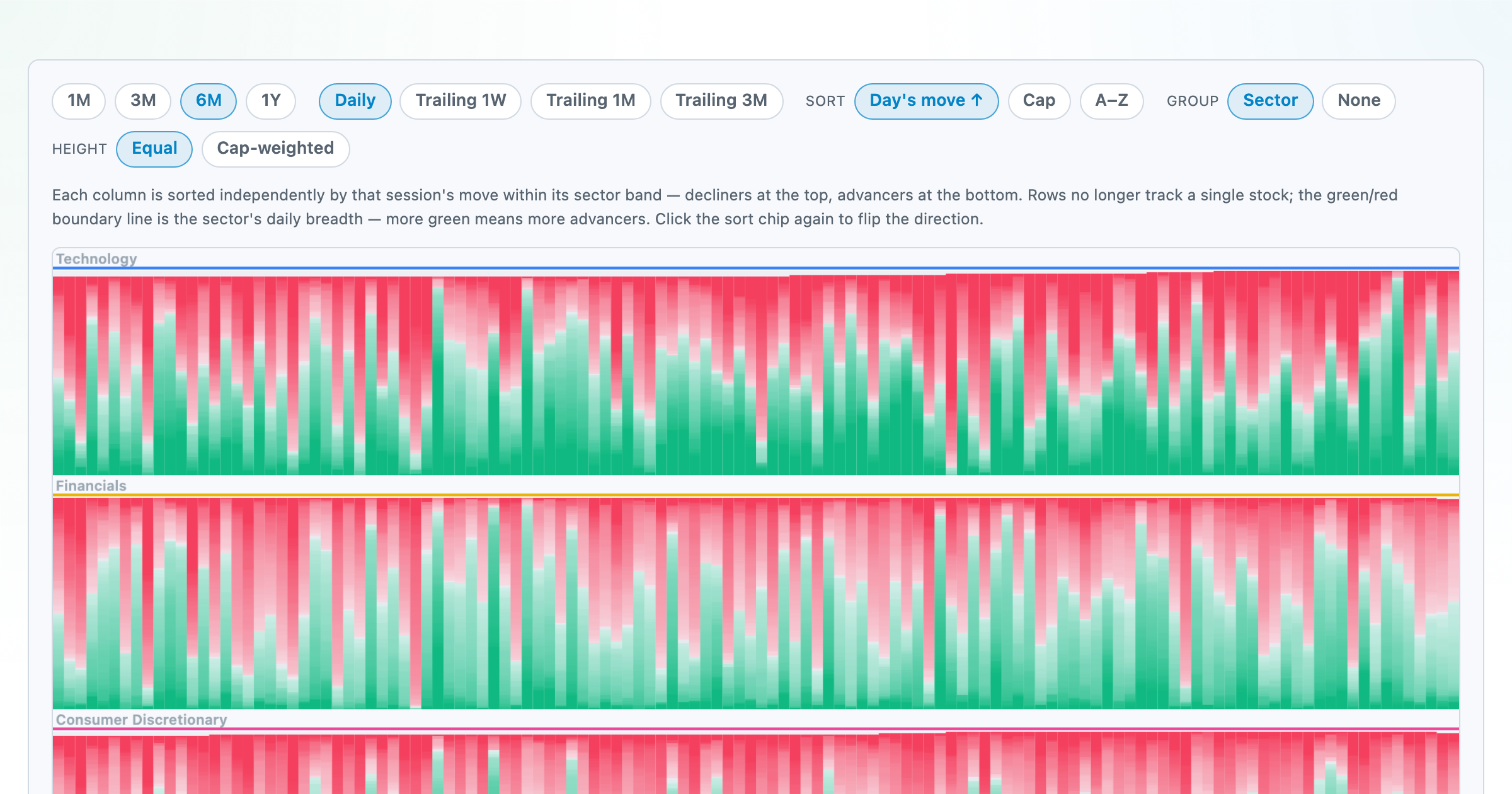
Every stock as a row, every day as a column — market selloffs are vertical stripes, sector routs are blocks.
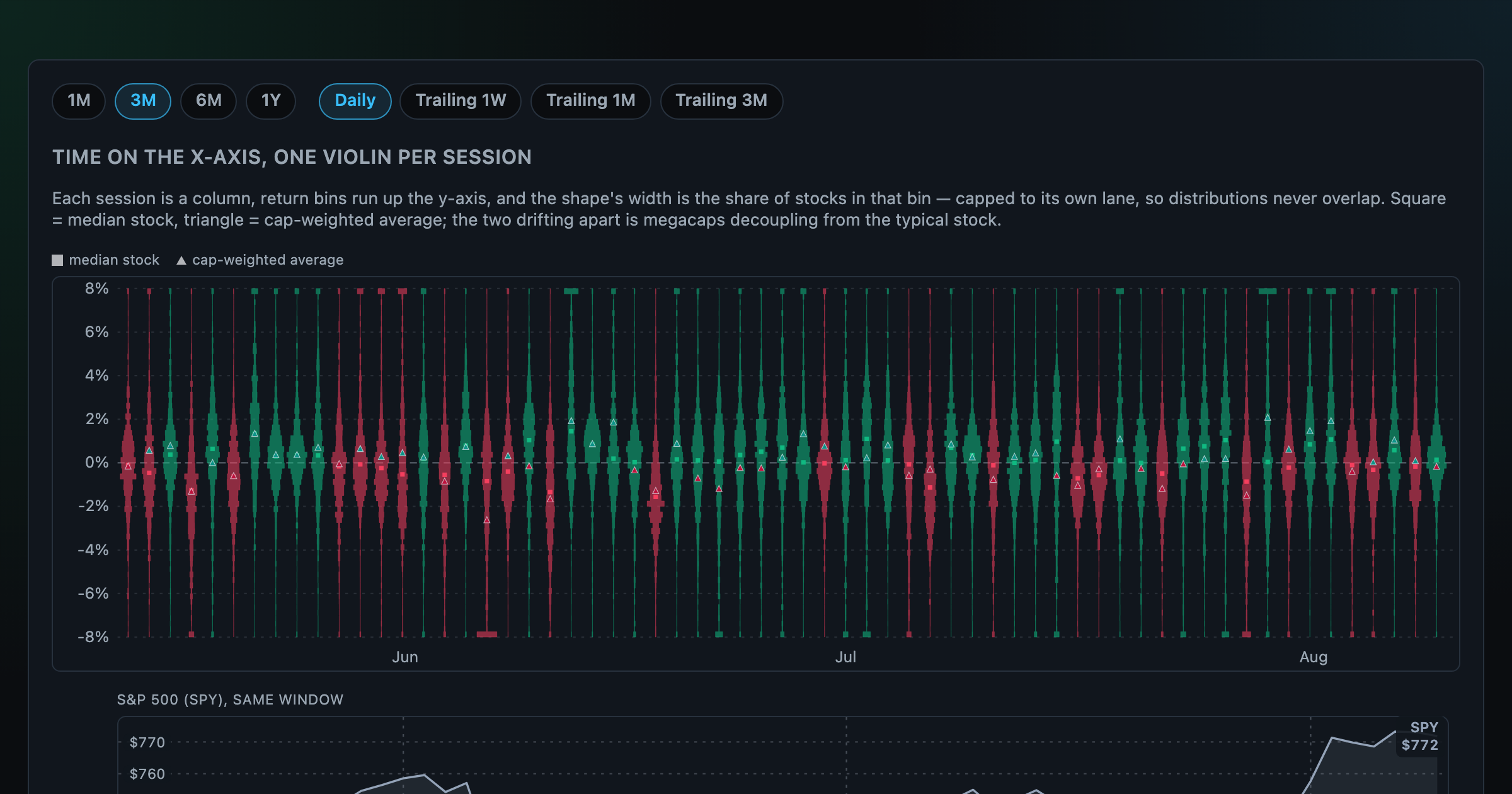
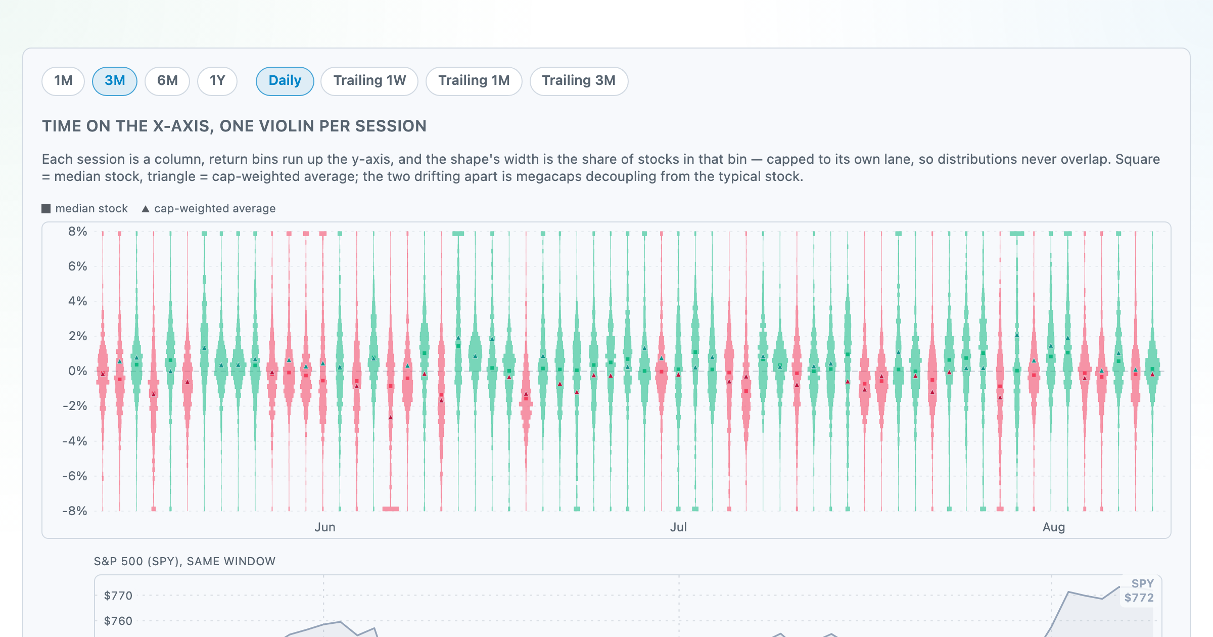
Each session's full distribution of stock returns as an upright violin, with the S&P 500 on the same axis — shifts, dispersion, and fat tails at a glance.
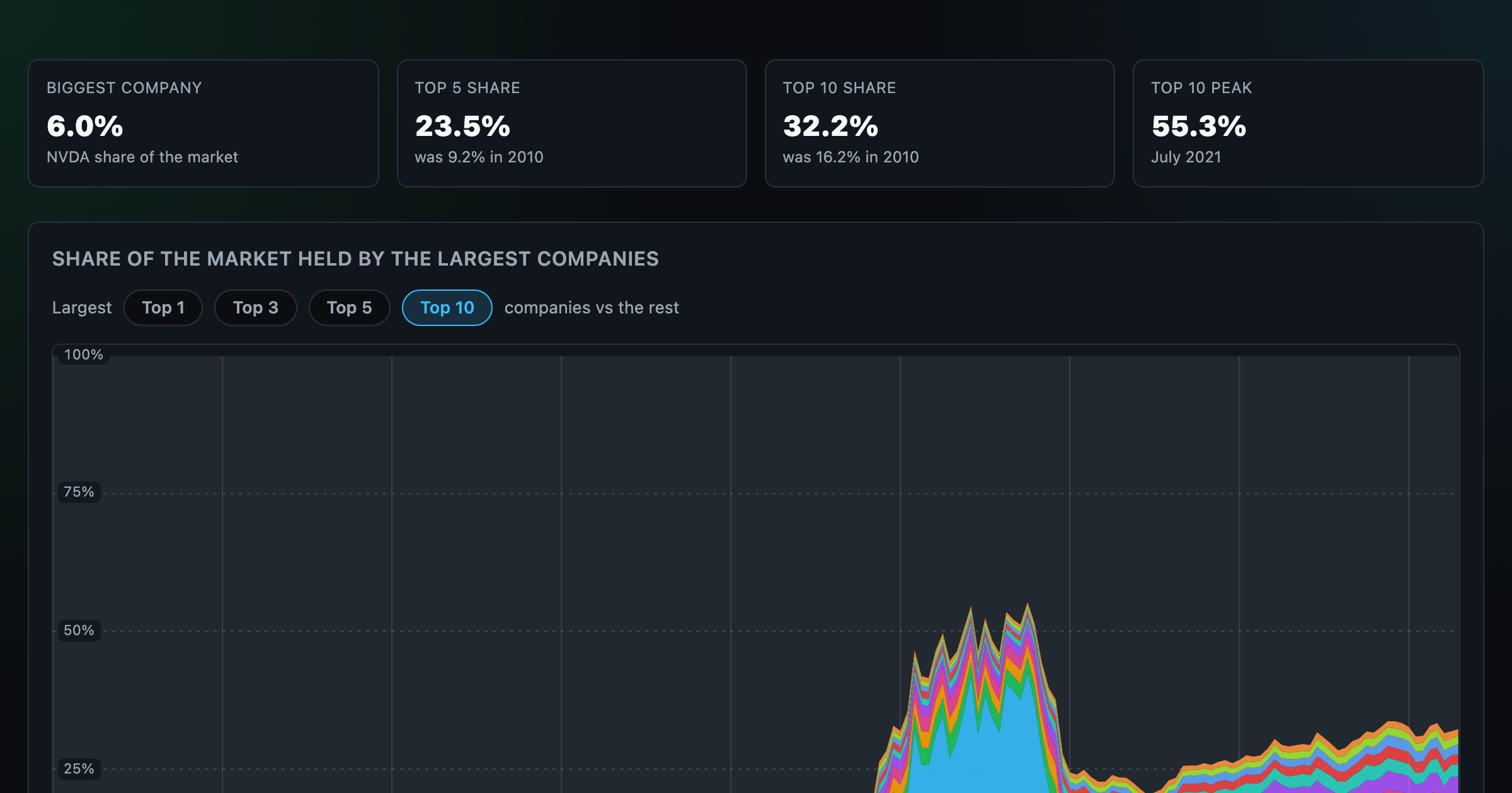
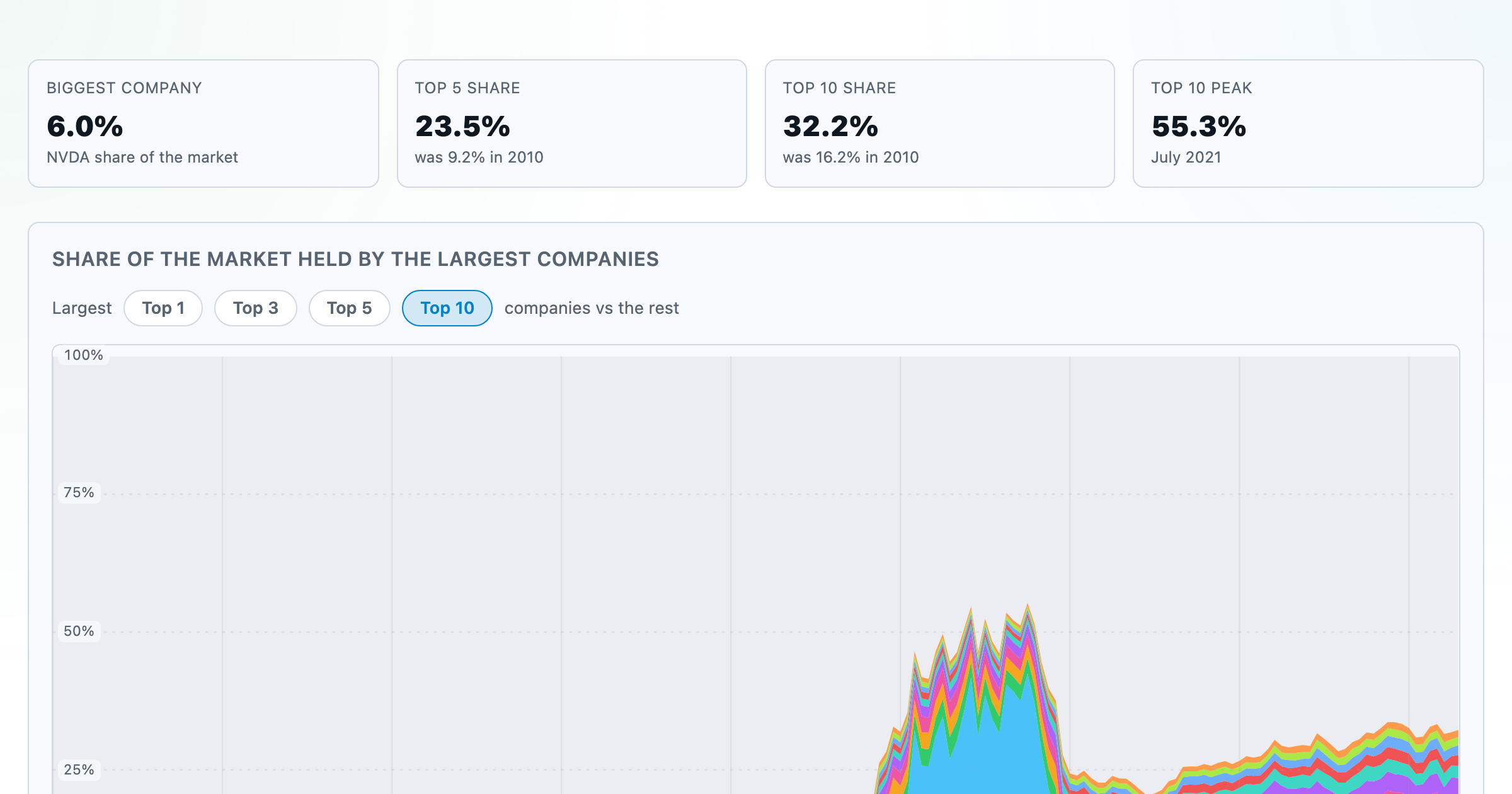
How top-heavy is the market? The top 1–10 companies' share of total market value, month by month since 2010.
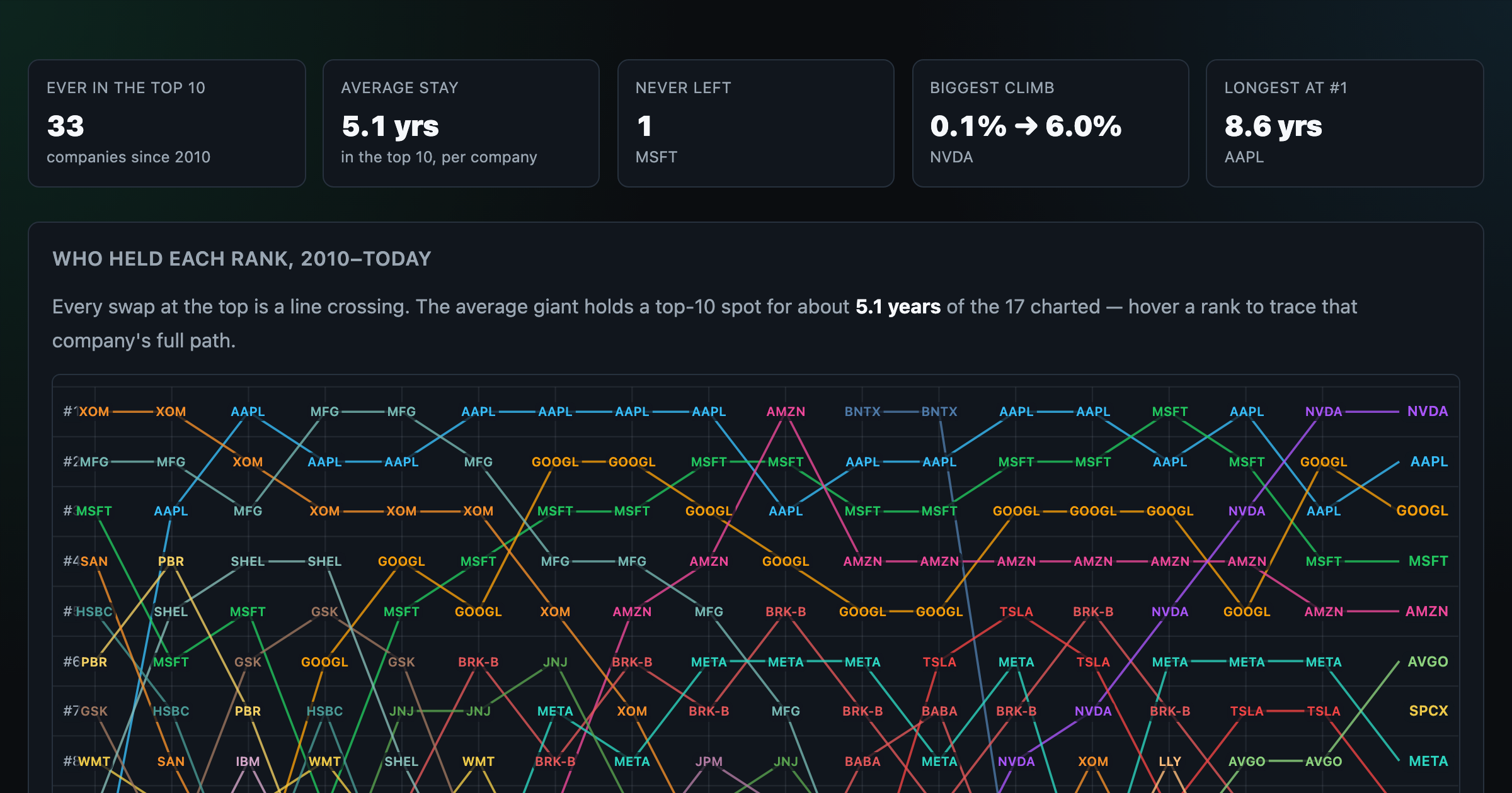
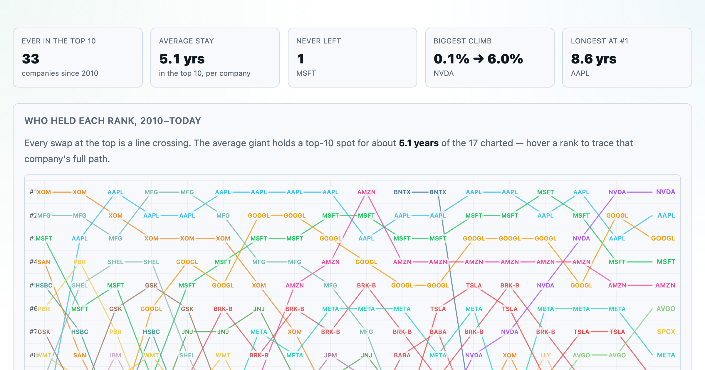
Every company that ever cracked the market's top 10 since 2010 — who climbed, who faded, who never left.
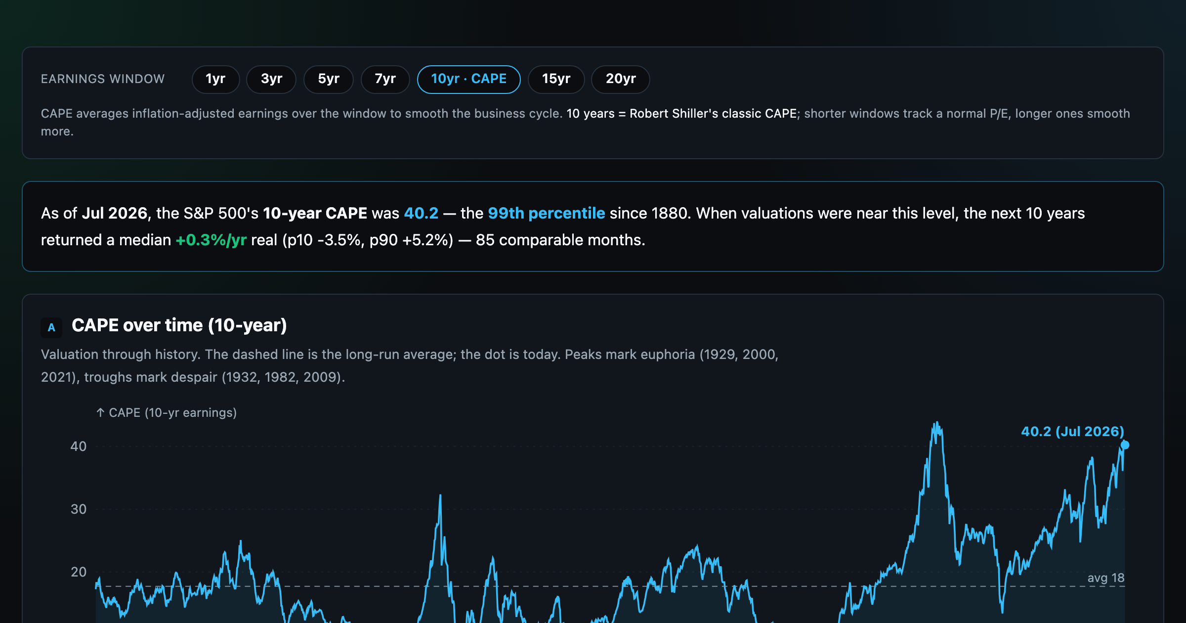
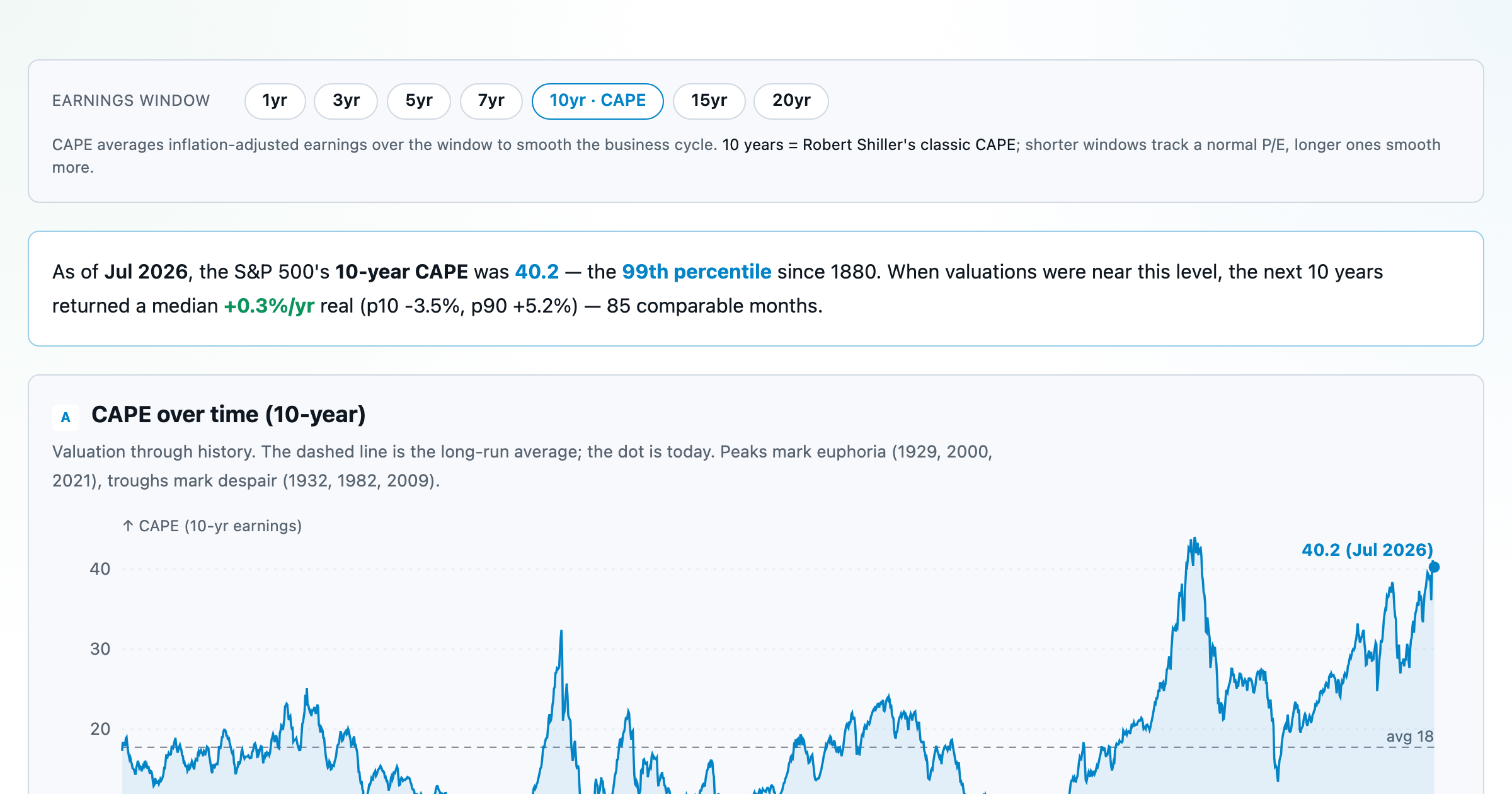
Is the market expensive? The Shiller CAPE back to 1871 and what valuations have meant for the next decade.
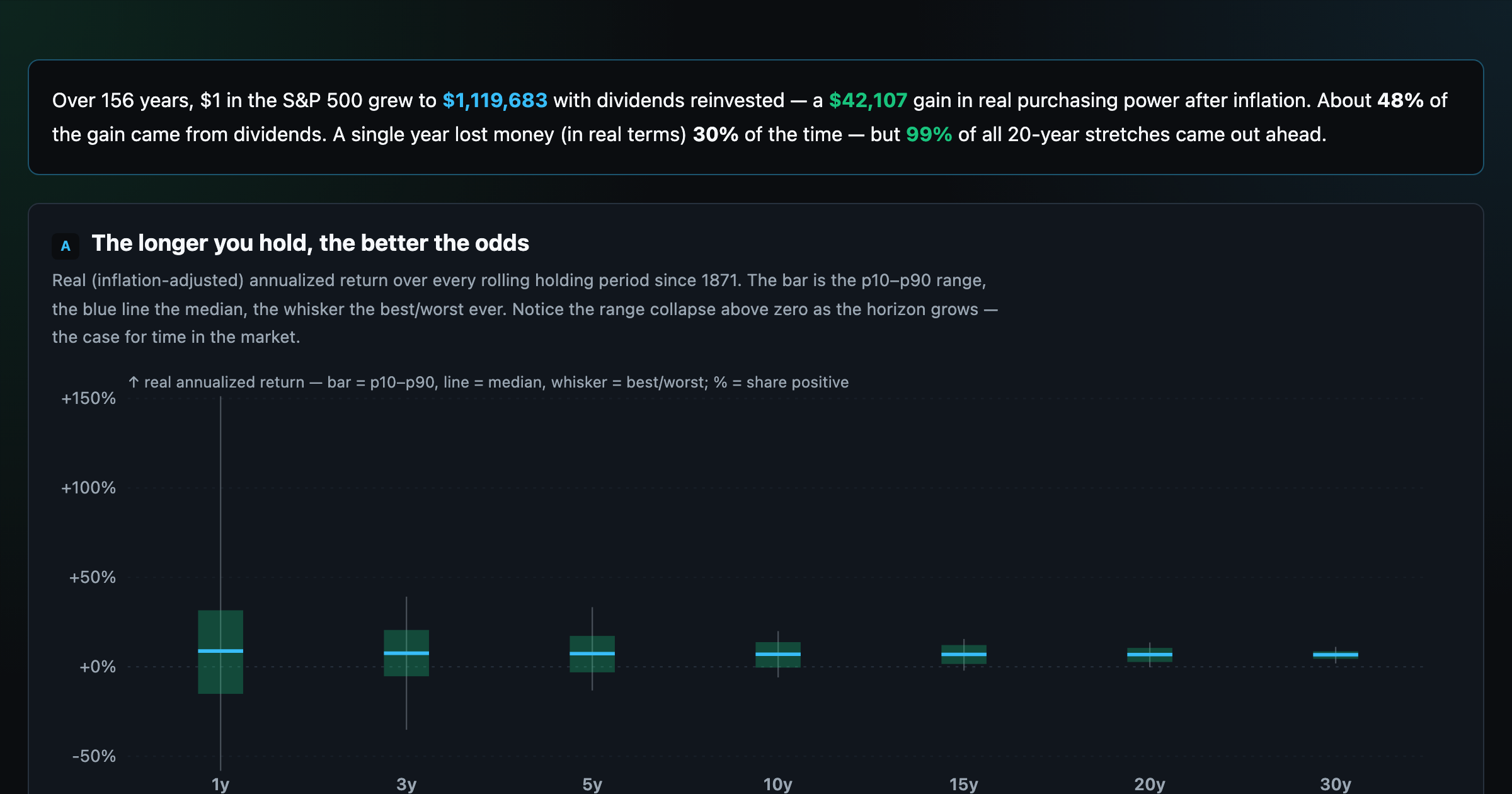
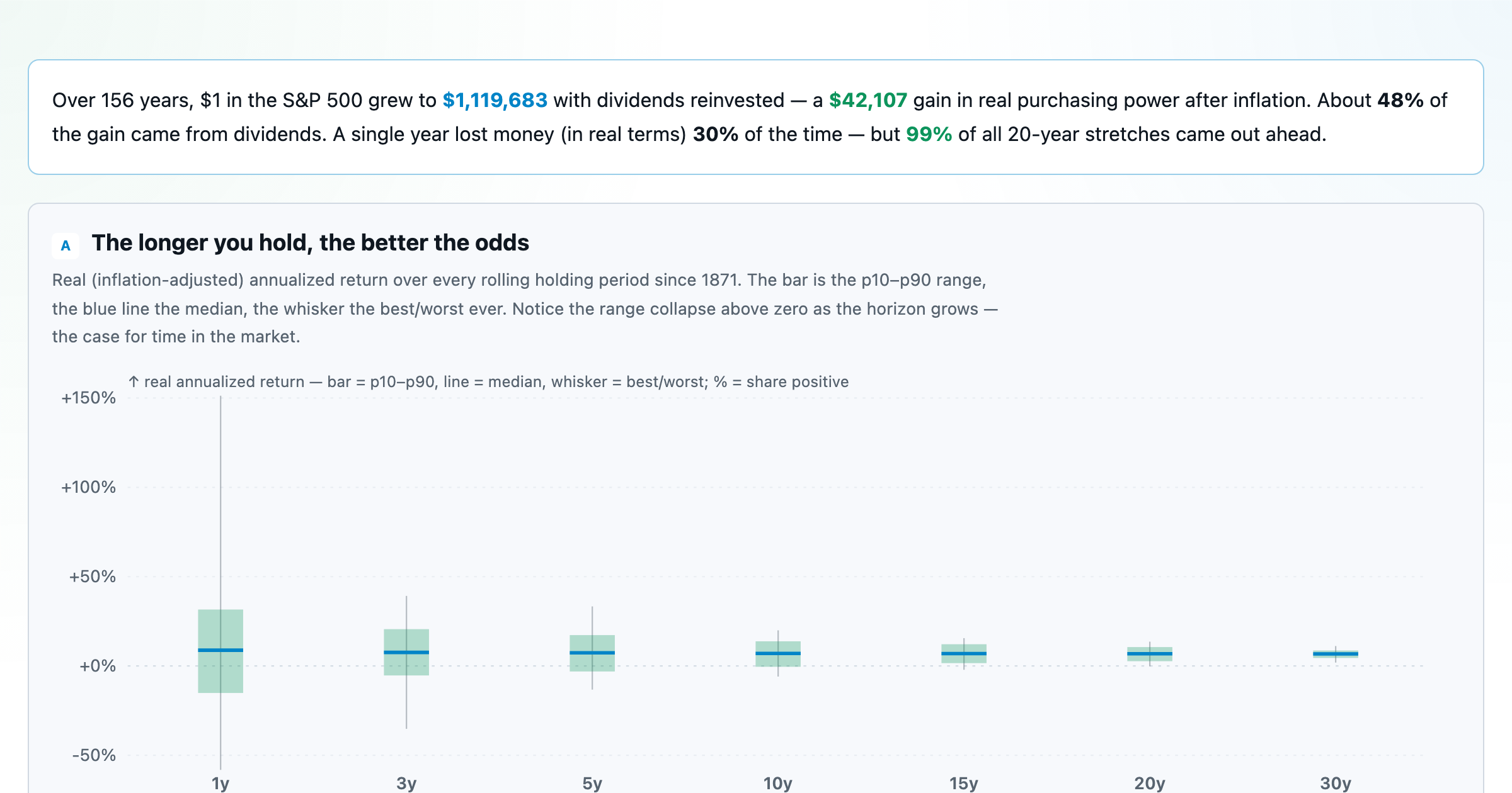
The S&P 500 since 1871 — odds of gain by holding period, real drawdowns, and the growth of $1.
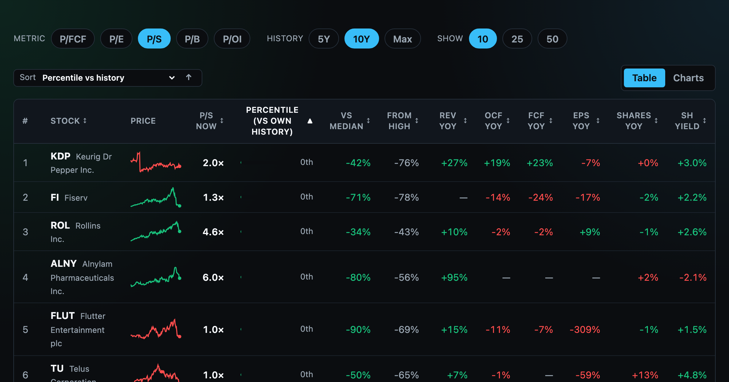
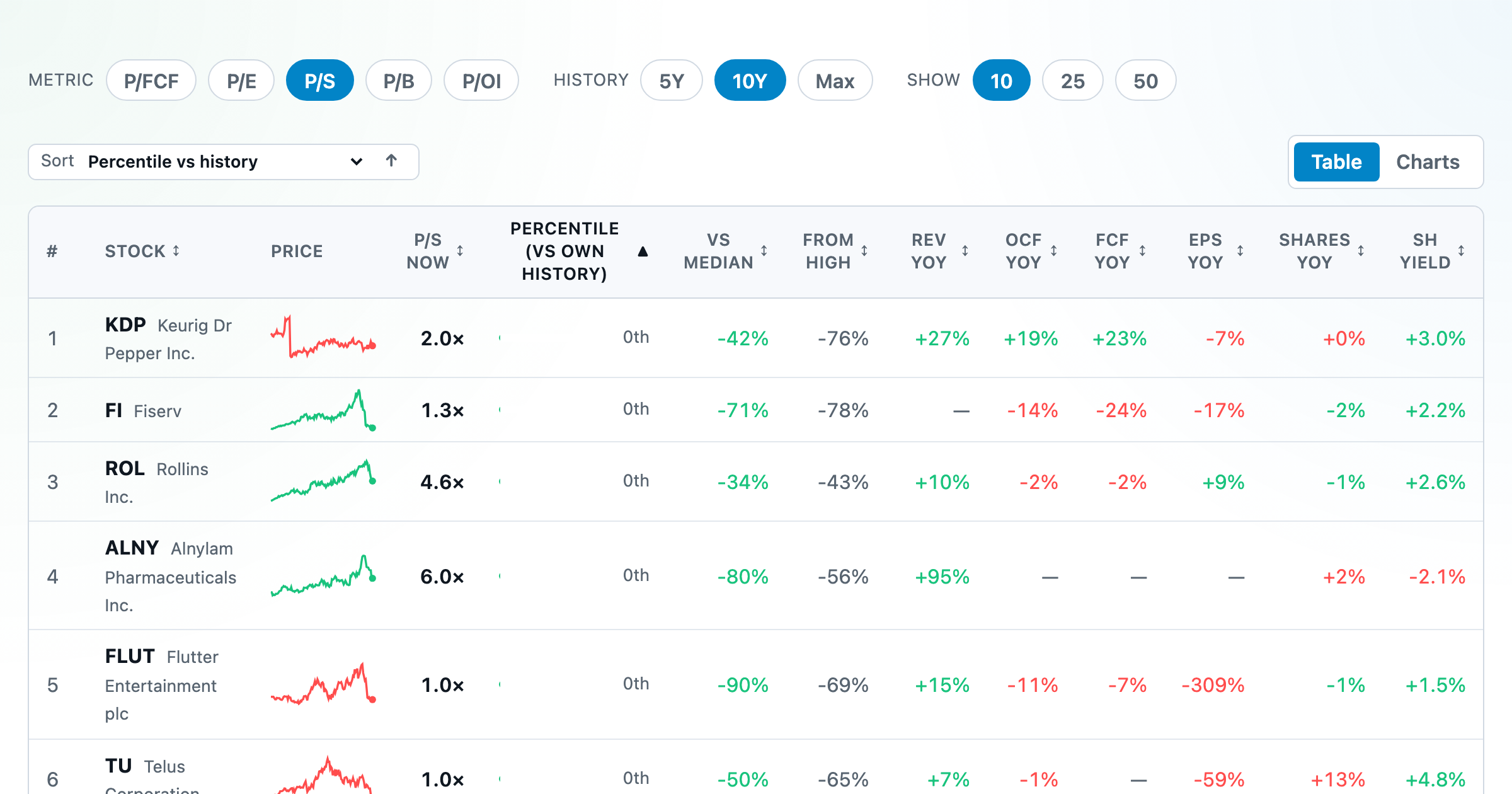
Stocks trading cheapest relative to their own P/E, P/FCF, P/S, or P/B history — with fair-value bands.
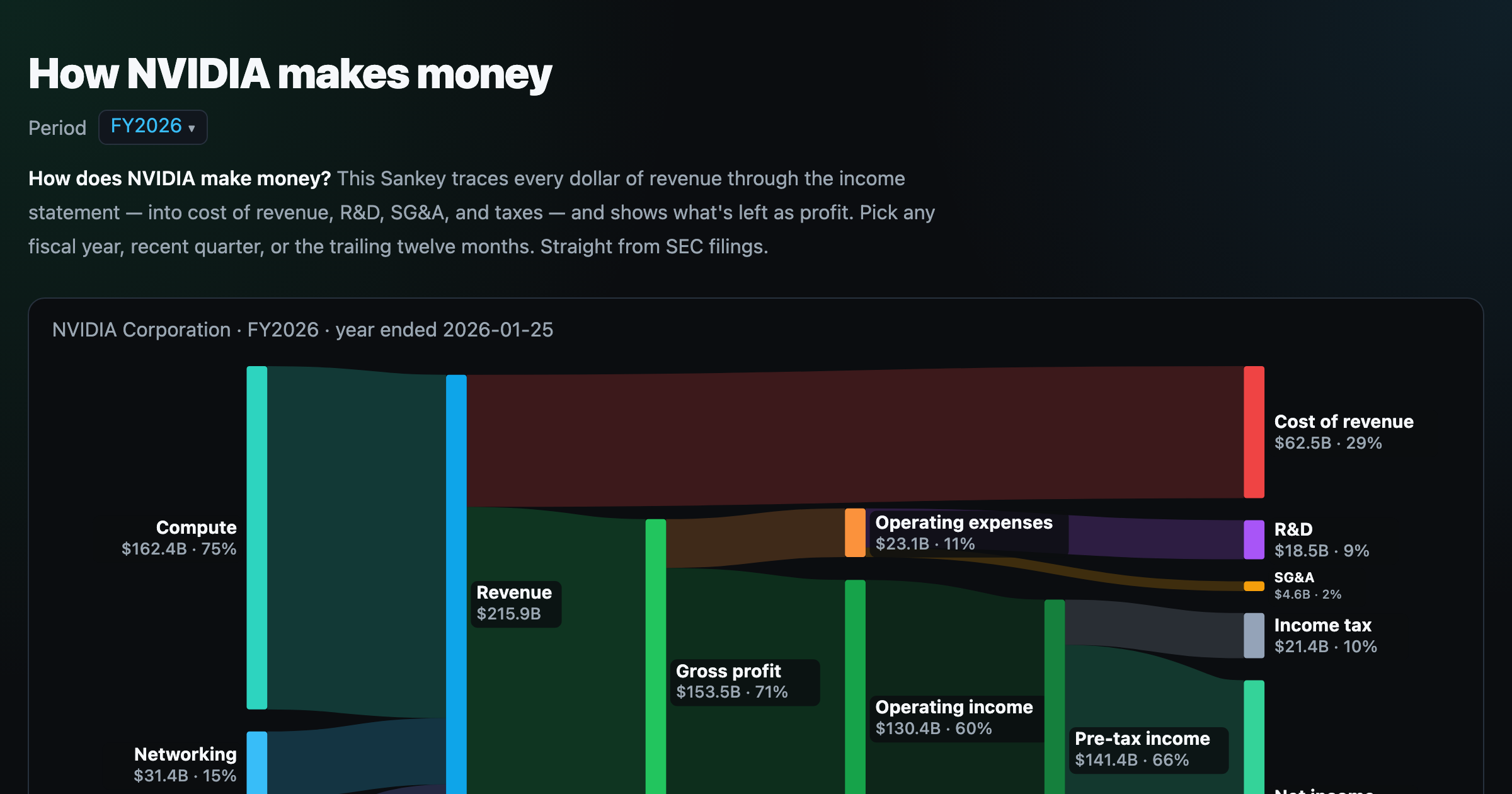
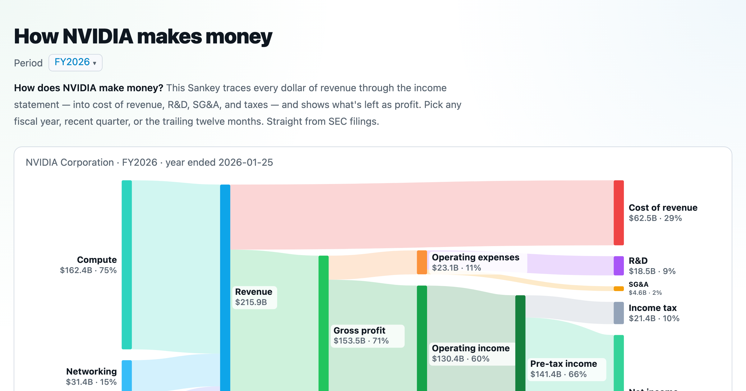
Follow a company's revenue through its income statement as a Sankey — costs, taxes, and profit.
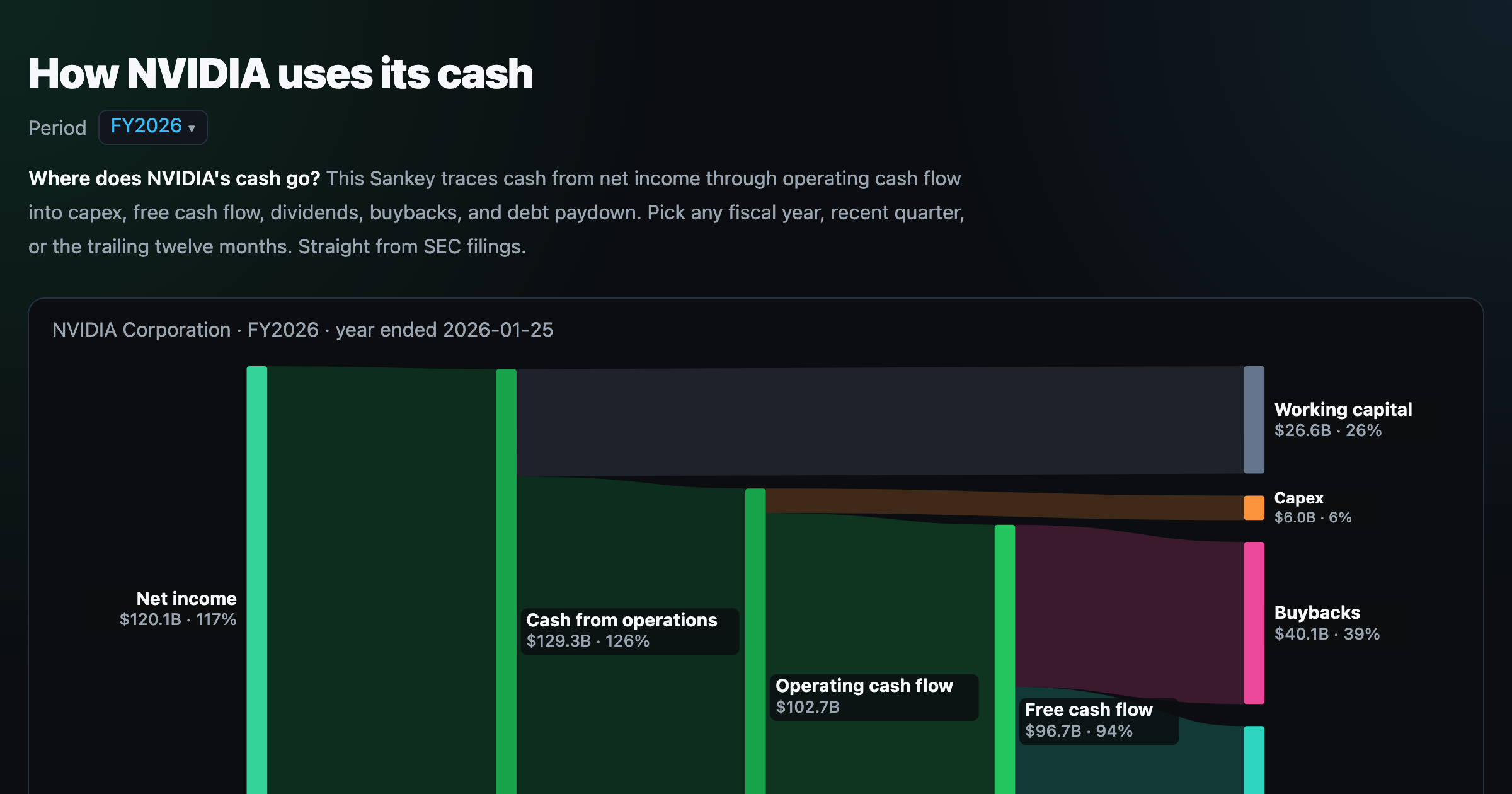
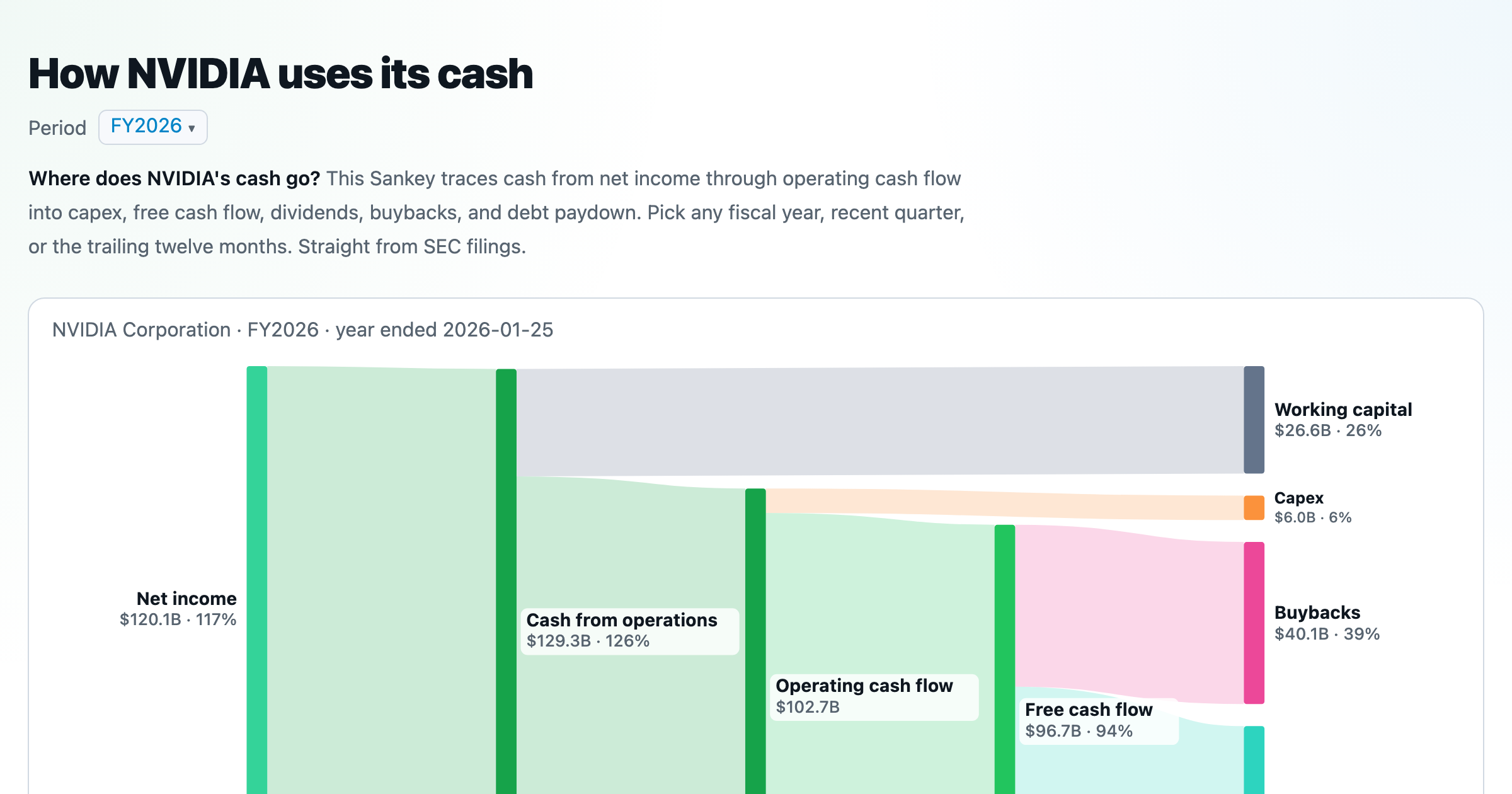
Follow a company's cash from net income through operating cash flow into capex, buybacks, and dividends.
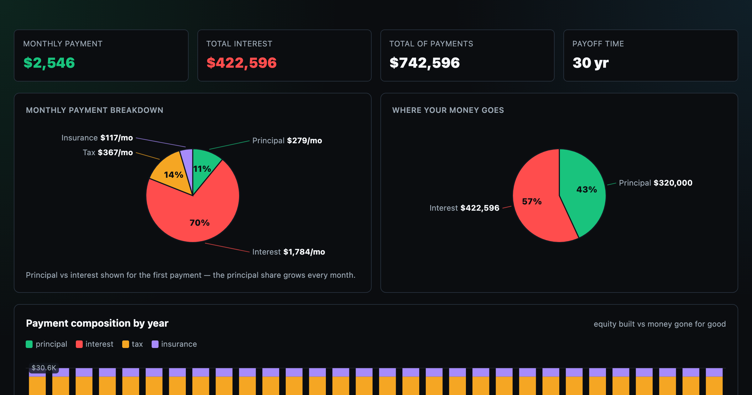
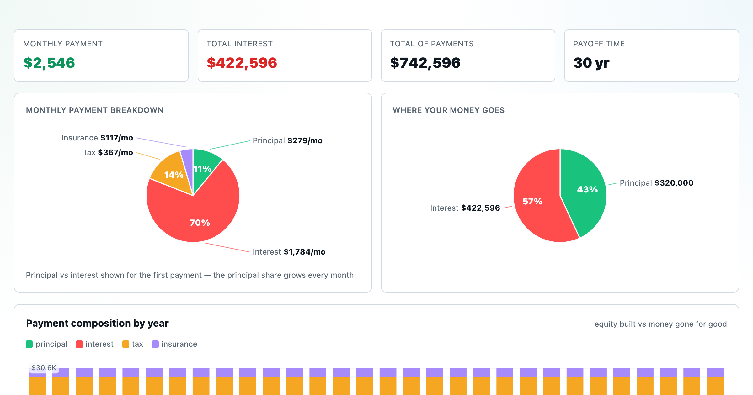
Monthly payment, principal vs interest by year, and the balance paydown — with extra-payment savings.
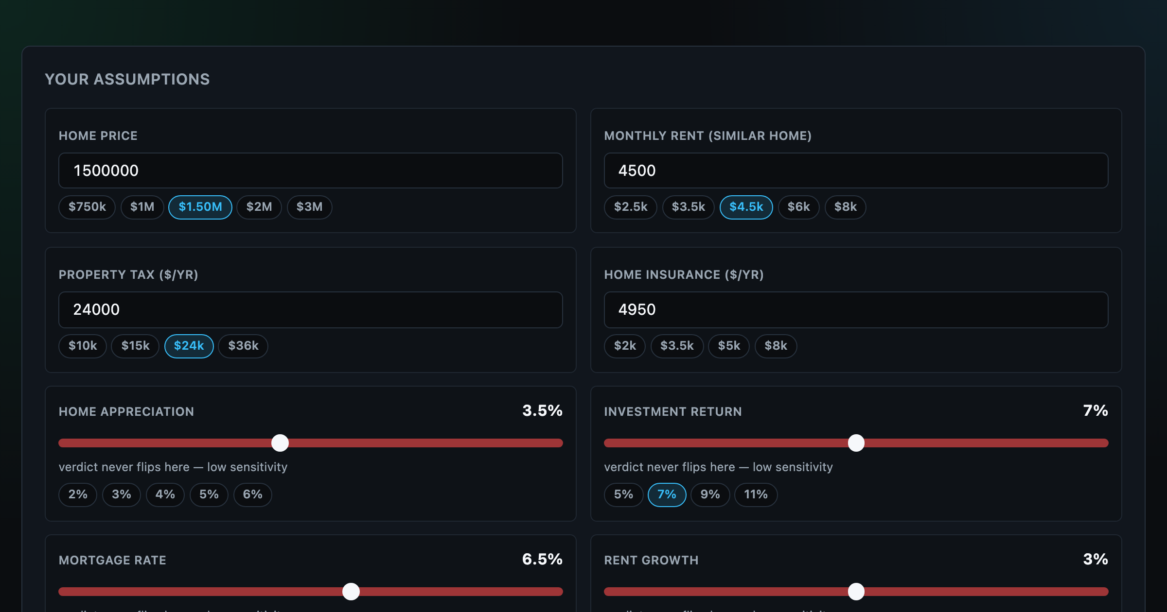
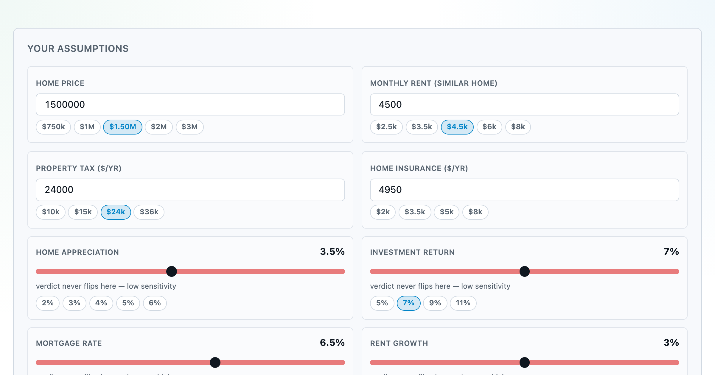
Should you rent or buy? Net-wealth verdict with sensitivity analysis of every assumption.
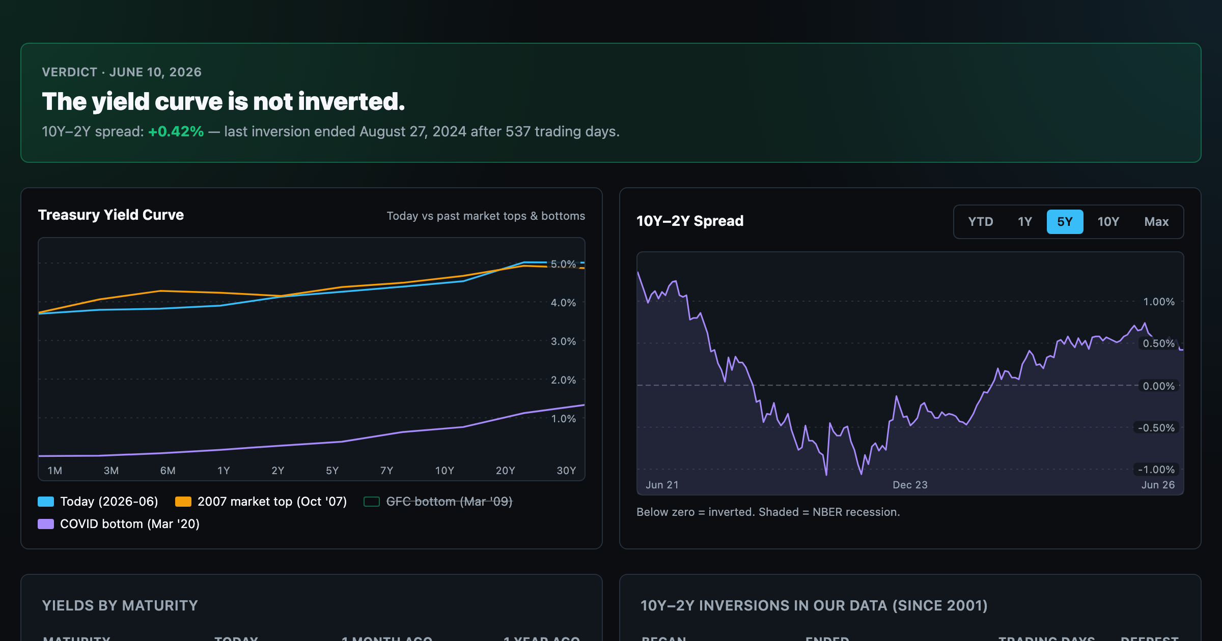
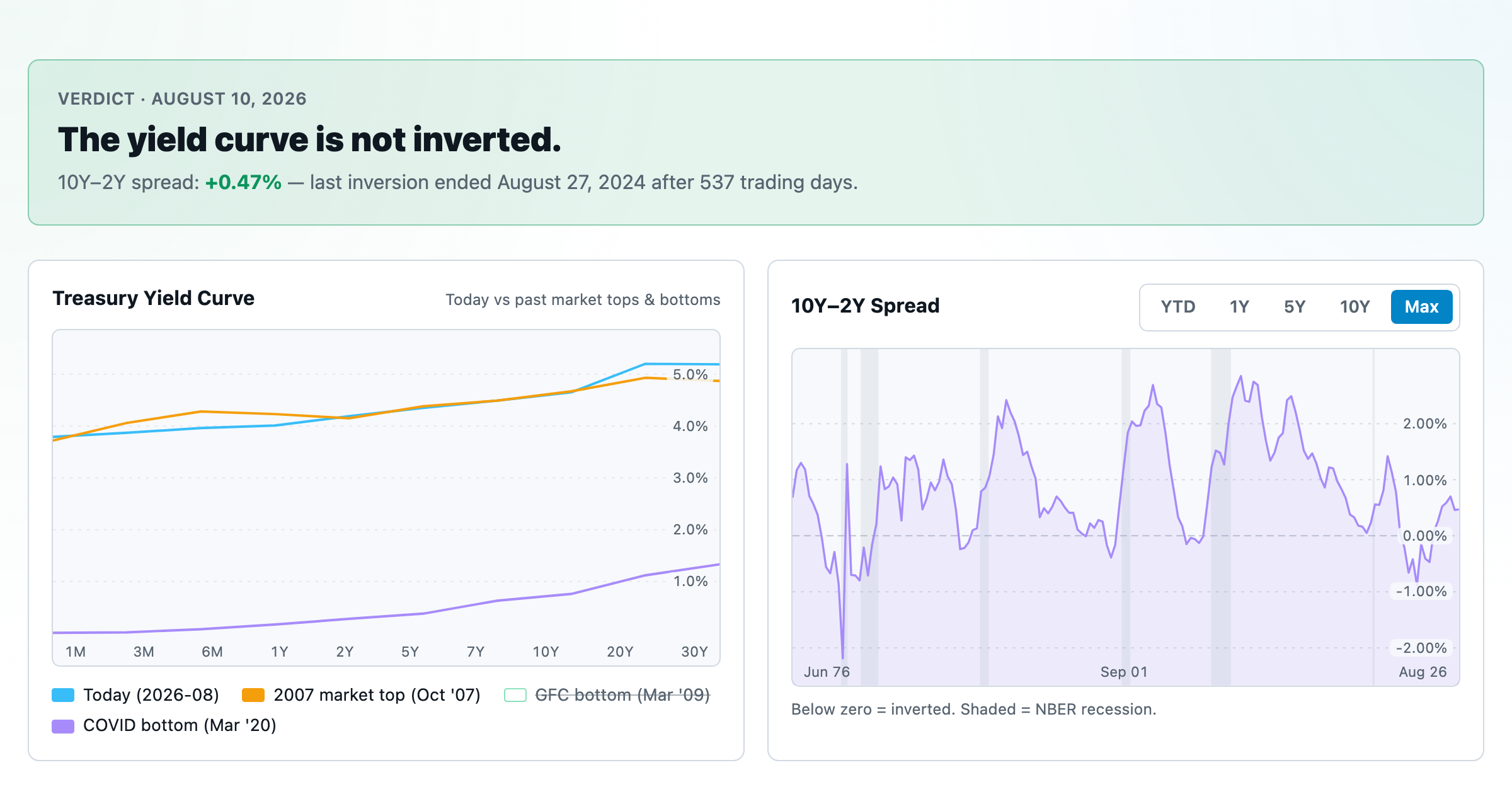
Live term structure, the 10Y–2Y spread, and every inversion episode.