
How top-heavy is the stock market?
As of October 2026, the 5 largest US companies make up 25.1% of total large-cap market value, and the top 10 make up 33.8% — up from about 9.3% and 15.9% in 2010. The biggest single weight is NVIDIA Corporation (NVDA) at 6.6%. The chart shows that share month by month — switch between the top 1, 3, 5 and 10.
Share of the market held by the largest companies#
Share of total market value of the ~500 US large caps we track (approximately the S&P 500, equal to its full market-cap weight rather than float weight).
The top 10 today#
| # | Company | Market cap | Weight |
|---|---|---|---|
| 1 | NVIDIA Corporation (NVDA) | $5.72T | 6.6% |
| 2 | Apple Inc. (AAPL) | $4.91T | 5.7% |
| 3 | Alphabet Inc. Class A (GOOGL) | $4.29T | 5.0% |
| 4 | Microsoft Corporation (MSFT) | $3.93T | 4.6% |
| 5 | Amazon.com Inc. (AMZN) | $2.80T | 3.3% |
| 6 | Meta Platforms Inc. (META) | $1.84T | 2.1% |
| 7 | Broadcom Inc. (AVGO) | $1.80T | 2.1% |
| 8 | Tesla Inc. (TSLA) | $1.49T | 1.7% |
| 9 | Micron Technology Inc. (MU) | $1.23T | 1.4% |
| 10 | Berkshire Hathaway Inc. (BRK-B) | $1.08T | 1.3% |
Methodology#
Best-effort reconstruction from month-end prices and SEC-filed share counts for the ~500 US large caps we track (approximately the current S&P 500 membership, plus a few large US listings outside the index — foreign ADRs excluded). Weights are shares of that universe's total market value using full market cap, so they run slightly below official S&P float-adjusted weights, and the denominator uses today's membership rather than each month's historical roster. Share counts come from our SEC EDGAR fundamentals pipeline normalized for splits; companies with heavy spin-off histories (GE, AT&T) are undercounted in early years because their price history is spin-off adjusted. Data since 2010 — the start of reliable structured SEC share-count filings. Not investment advice.
FAQ#
- How much of the S&P 500 is the top 10 stocks?
- As of October 2026, the 10 largest companies account for about 33.8% of total US large-cap market value, versus roughly 15.9% in 2010. By full market cap the current top 10 is NVDA, AAPL, GOOGL, MSFT, AMZN, META, AVGO, TSLA, MU, BRK-B.
- Is the stock market more concentrated than ever?
- Within this chart's window (since 2010) the top-10 share peaked at 55.5% in July 2021. Longer-run studies show comparable concentration in the early 1930s and the Nifty Fifty era, but today's level is extreme by half-century standards — in the 2010s the top 10 hovered near 15.9%.
- Why does index concentration matter?
- When a handful of stocks dominate the index, its return and risk increasingly ride on those few names: diversification quietly shrinks, sector weights tilt toward whatever the giants do (mostly tech), and cap-weighted index investors hold much more of the leaders than an equal-weighted portfolio would. It isn’t automatically bad — the giants earn a large share of all profits — but it changes what owning "the market" means.
More visualizations
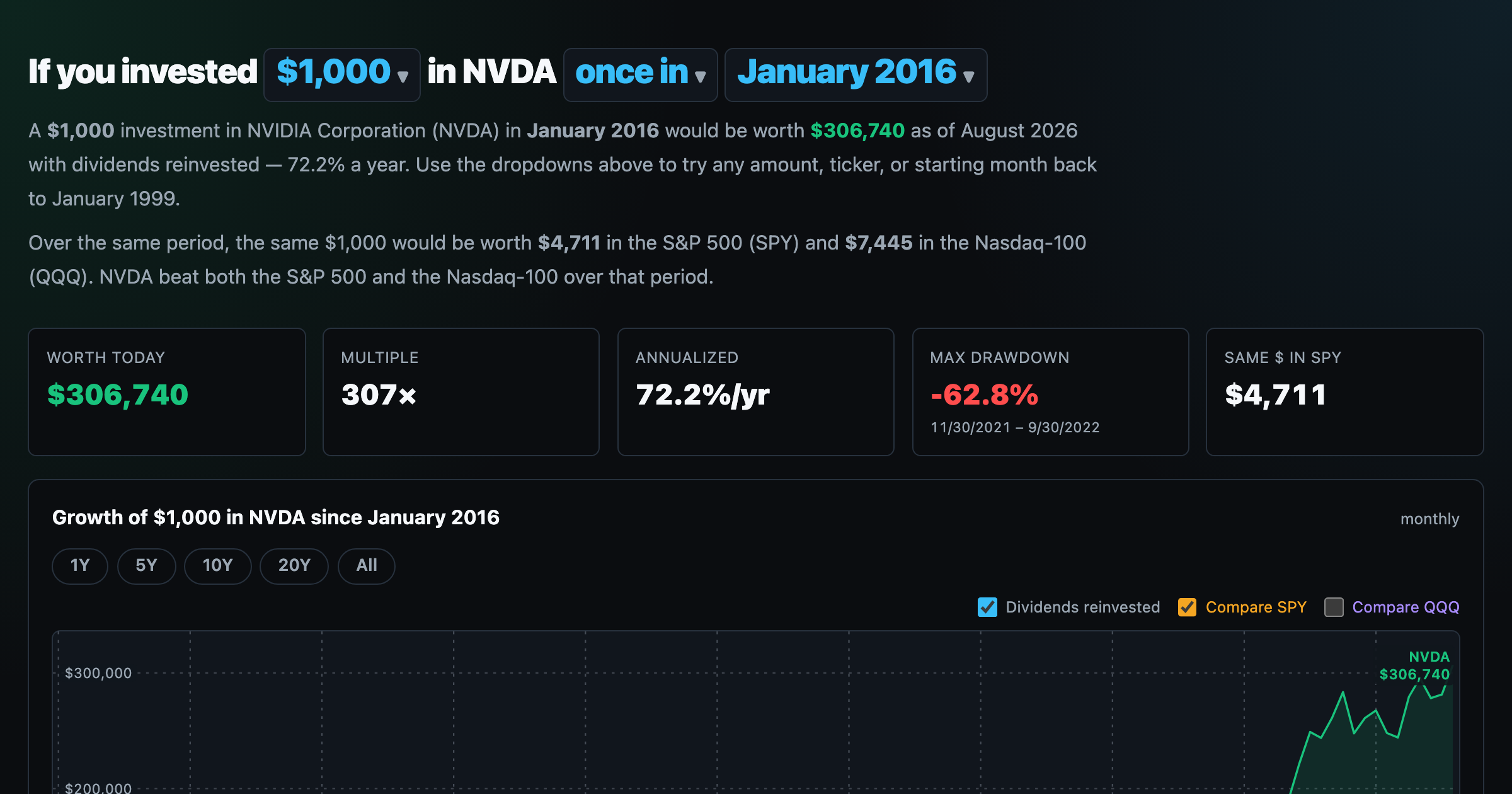
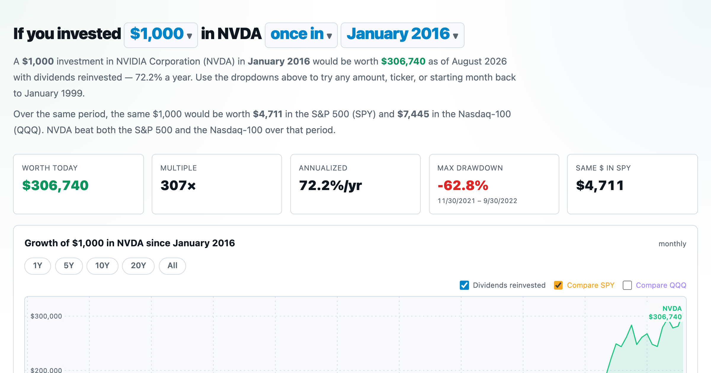
What $1,000 in any stock or ETF would be worth today.
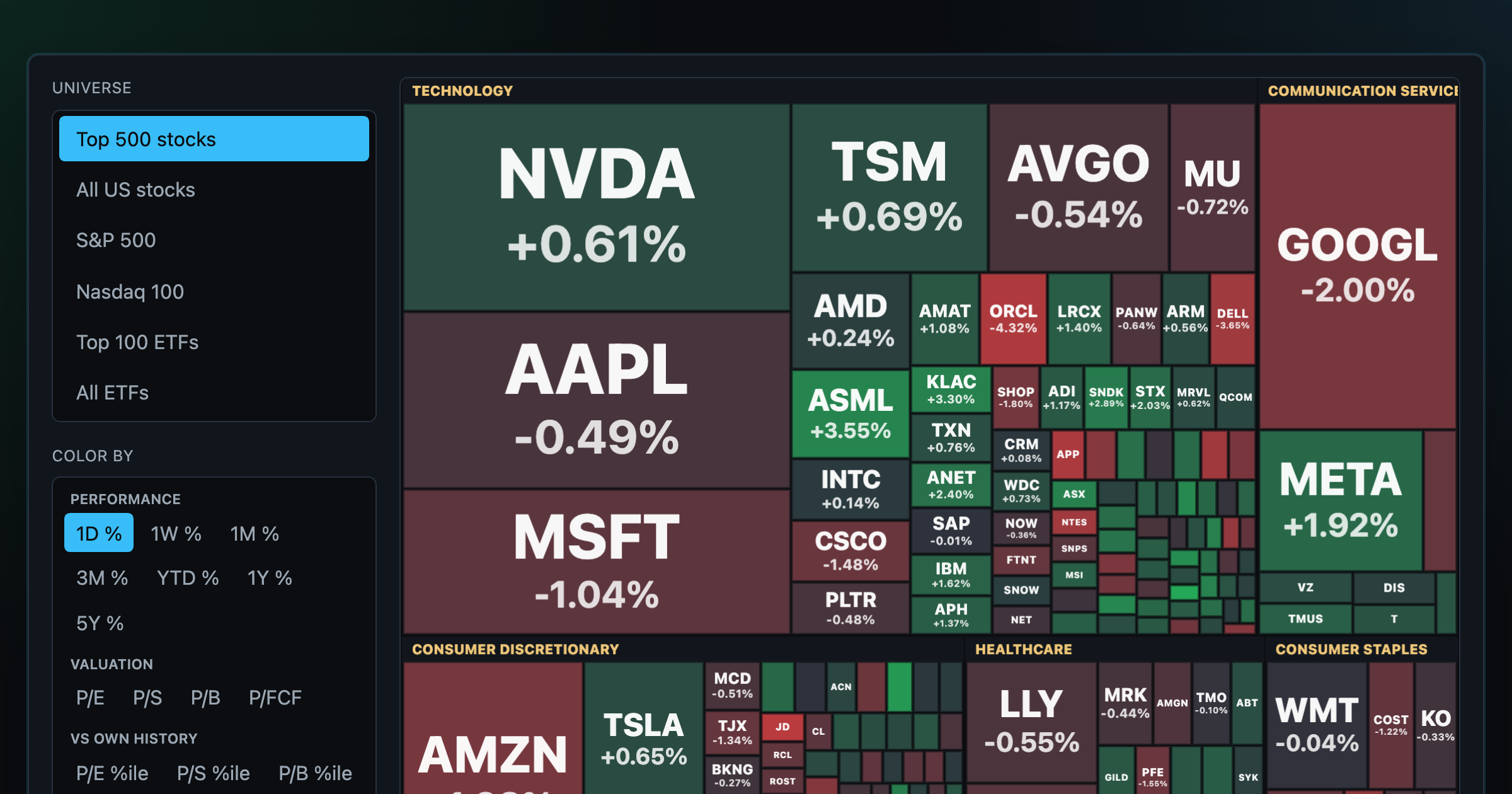
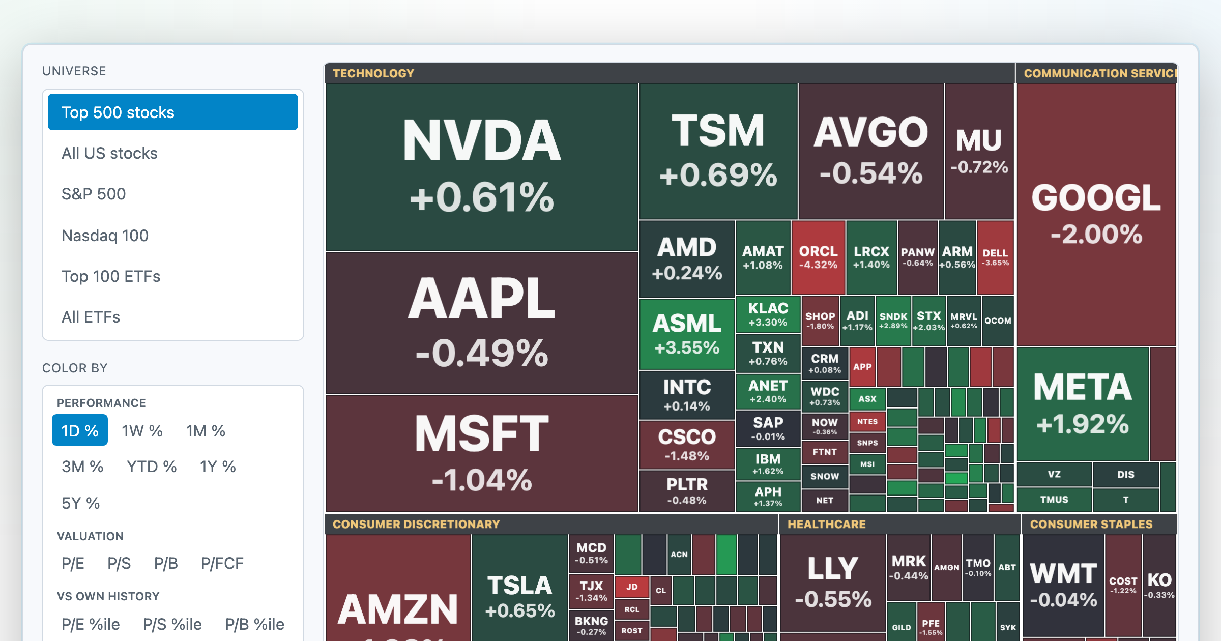
Every S&P 500 company sized by market cap — color by return or valuation.
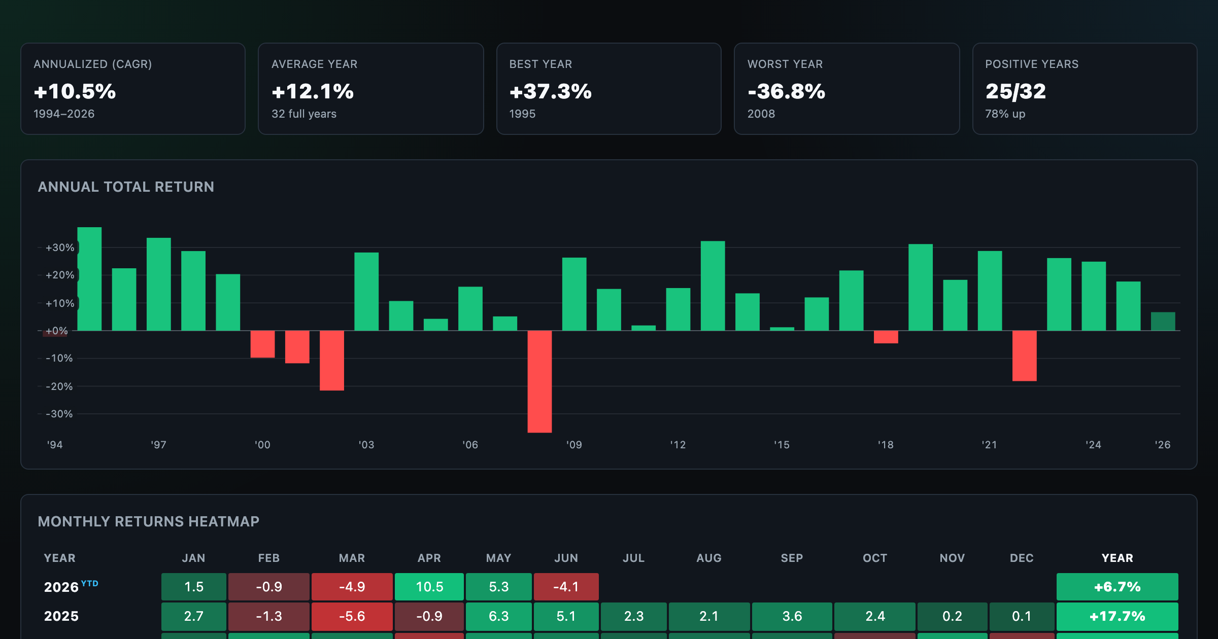
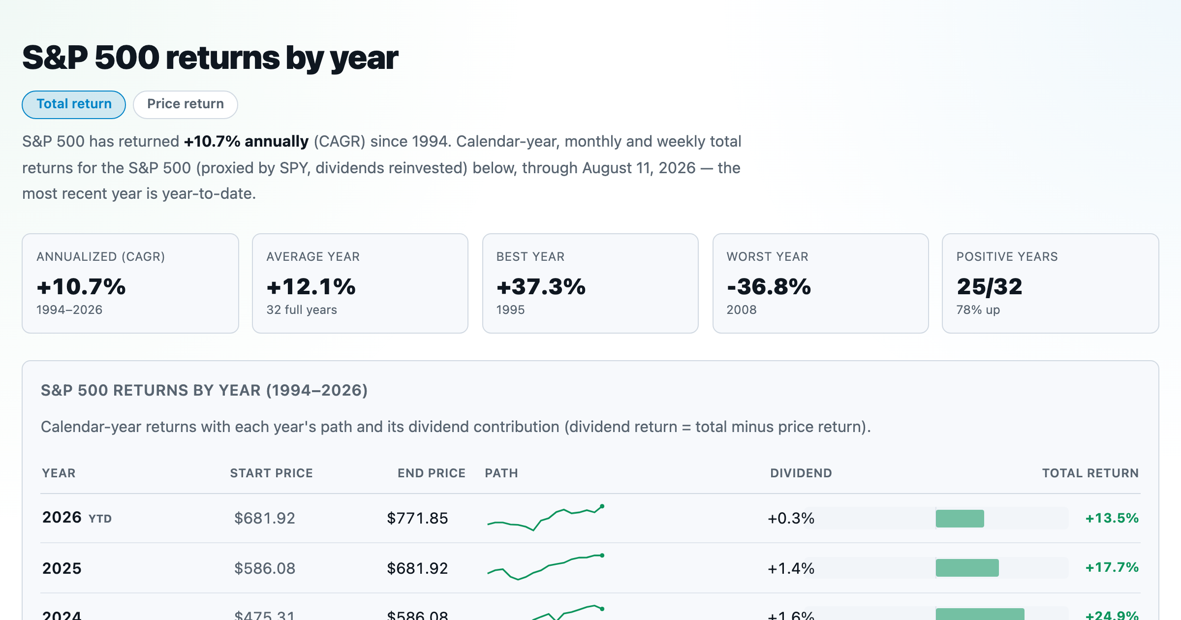
S&P 500 returns by year, month, week and trailing period — total or price return.
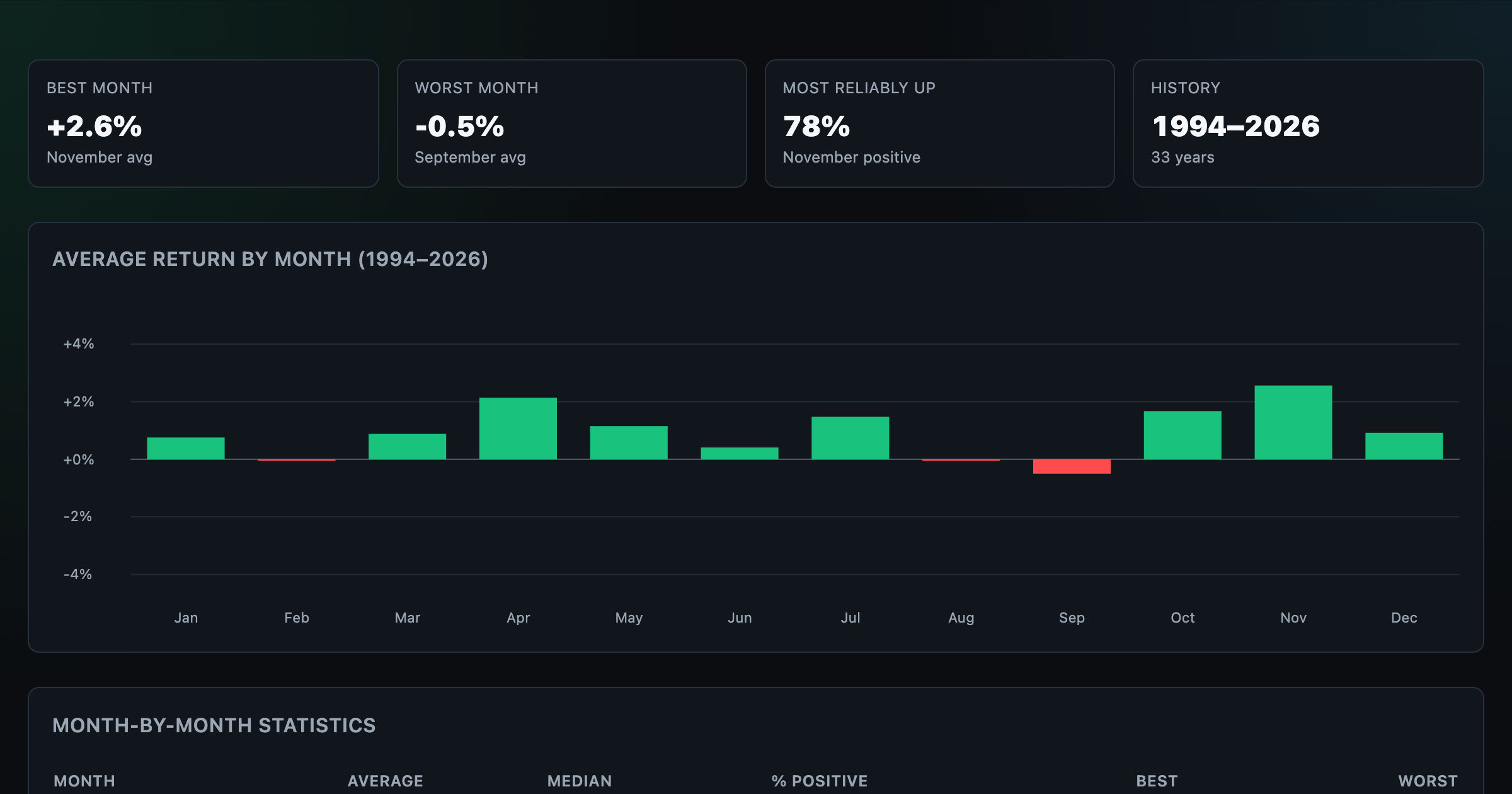
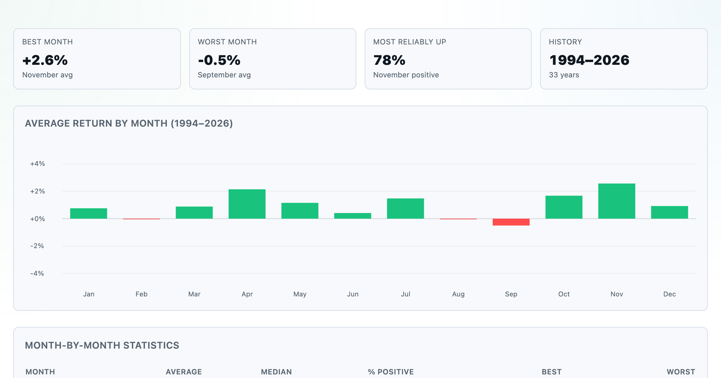
Which month is best for stocks? Average return of every calendar month, for any ticker.
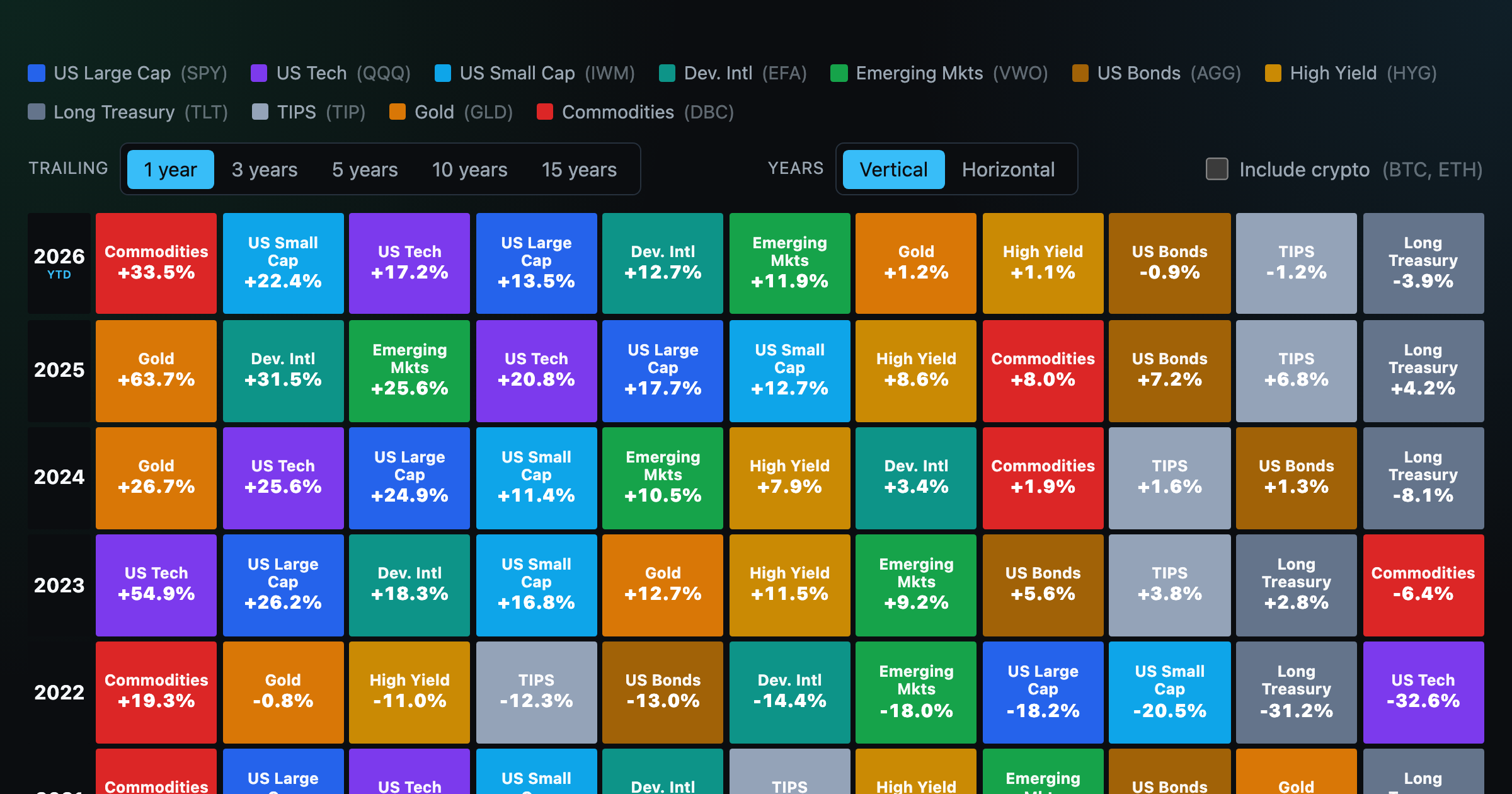
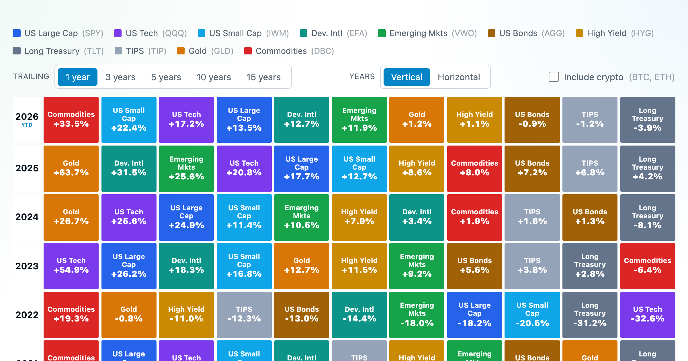
Asset-class returns ranked year by year — the Callan chart / asset allocation quilt.
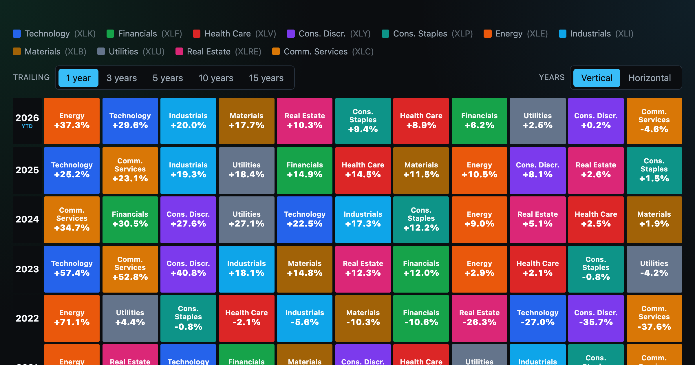
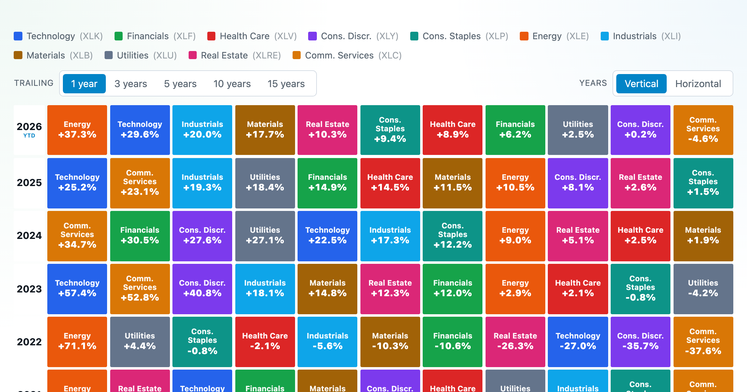
The 11 S&P 500 sectors ranked year by year — a sector quilt chart, back to 1999.

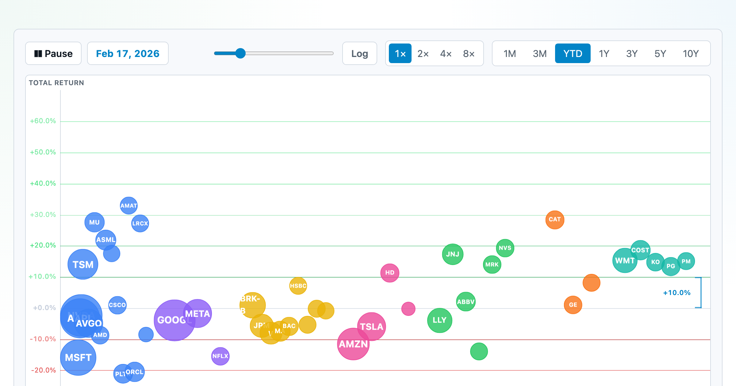
The biggest US companies as animated bubbles, rising and falling with their total return over time.
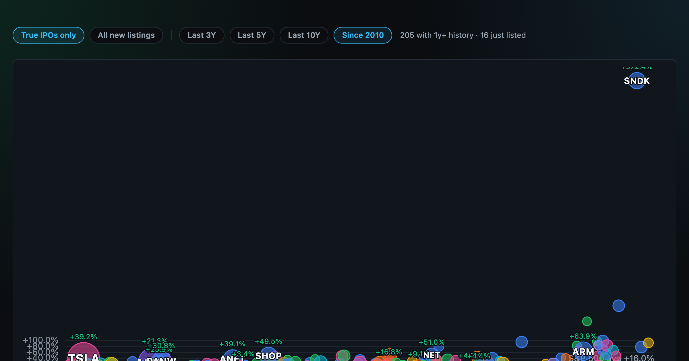
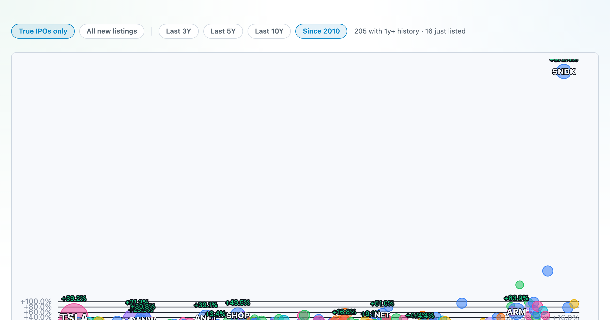
How recent stock-market debuts have performed since listing — annualized, vs the S&P 500, by IPO vs spin-off.
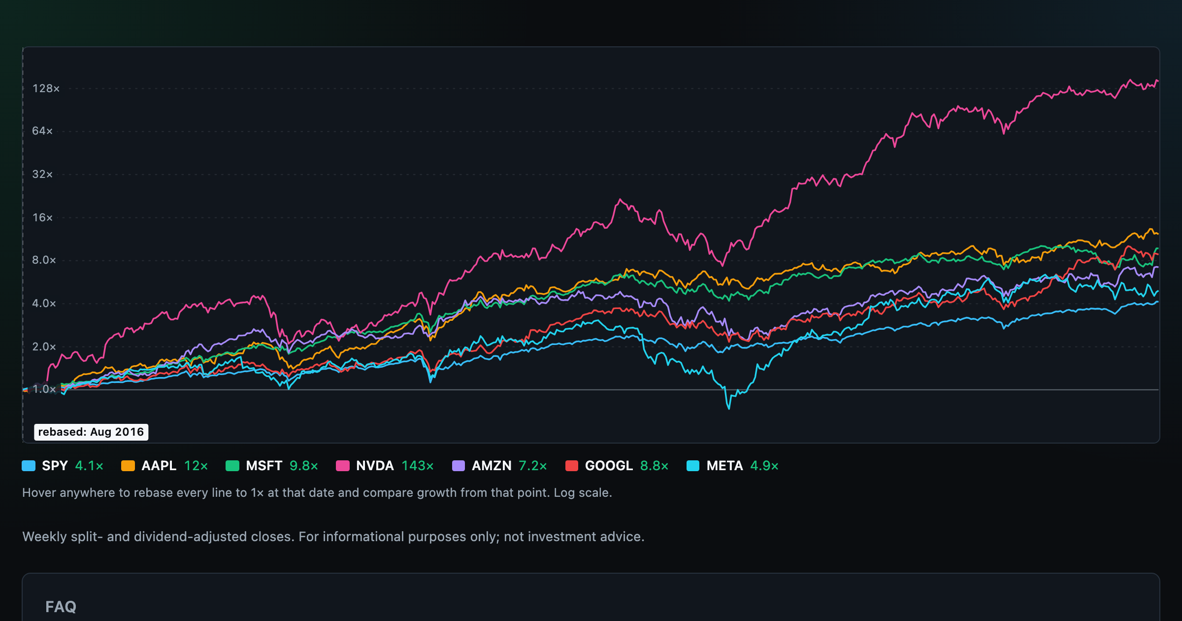
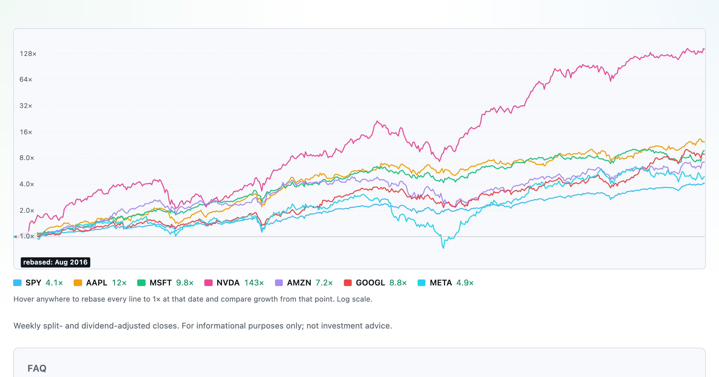
Compare megacaps vs the S&P 500, rebased to 1× at any date you hover.

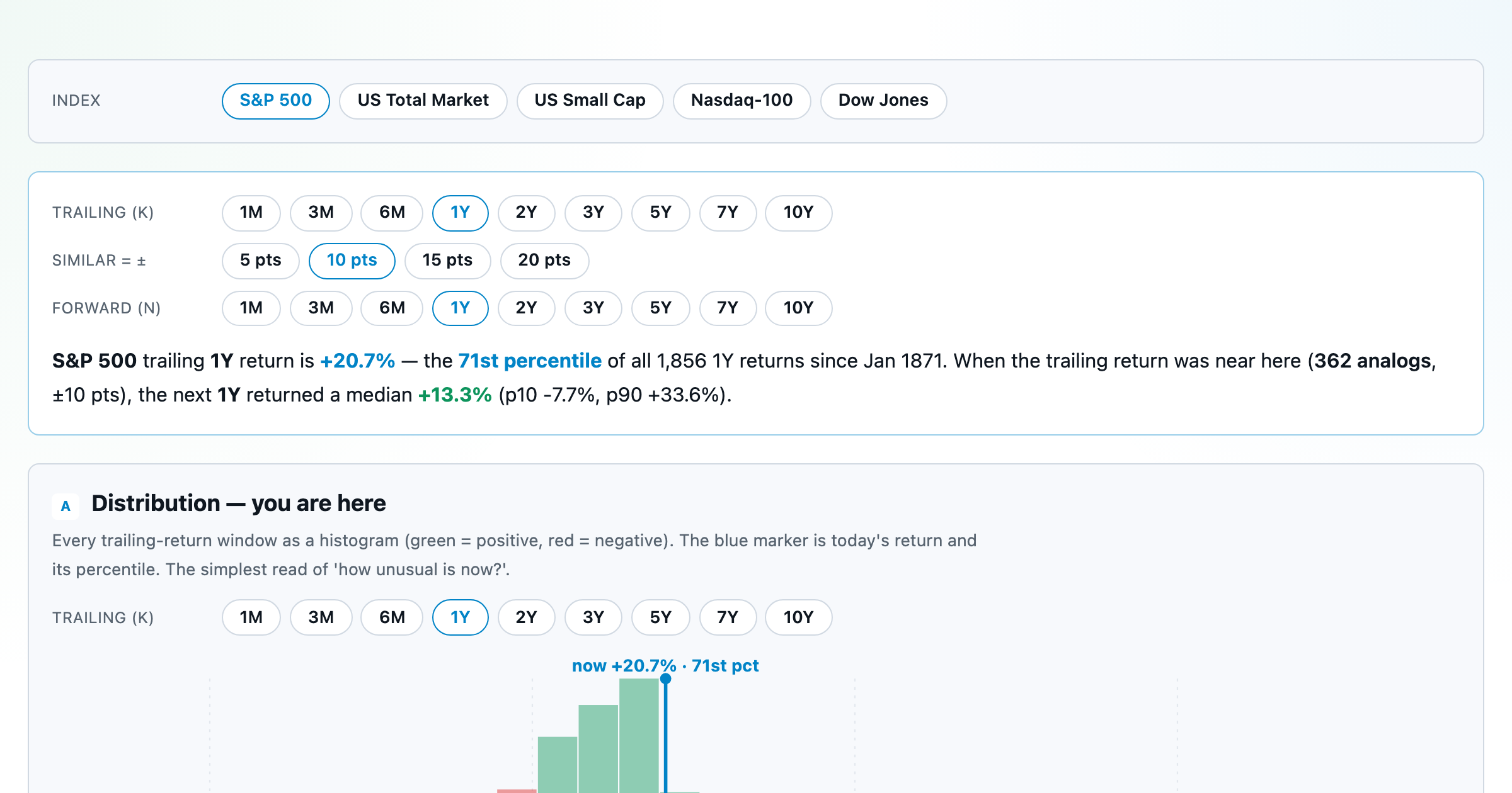
Where today's S&P 500 return ranks against all history — and the forward returns that followed similar moments.
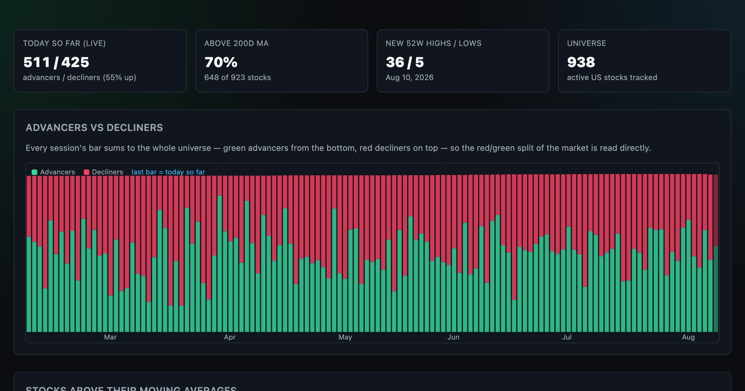
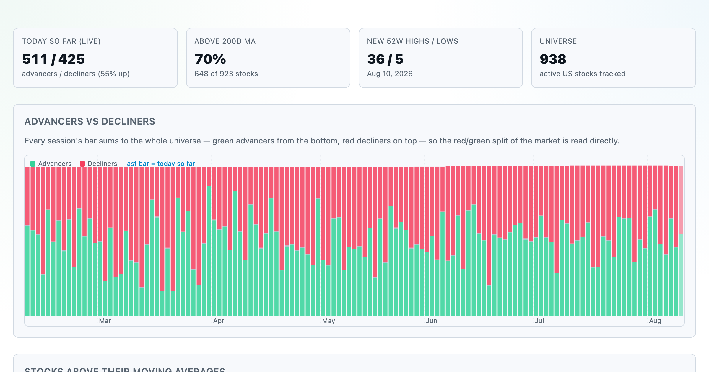
Advancers vs decliners over time, % of stocks above their moving averages, new highs vs lows, and breadth across every trailing window.
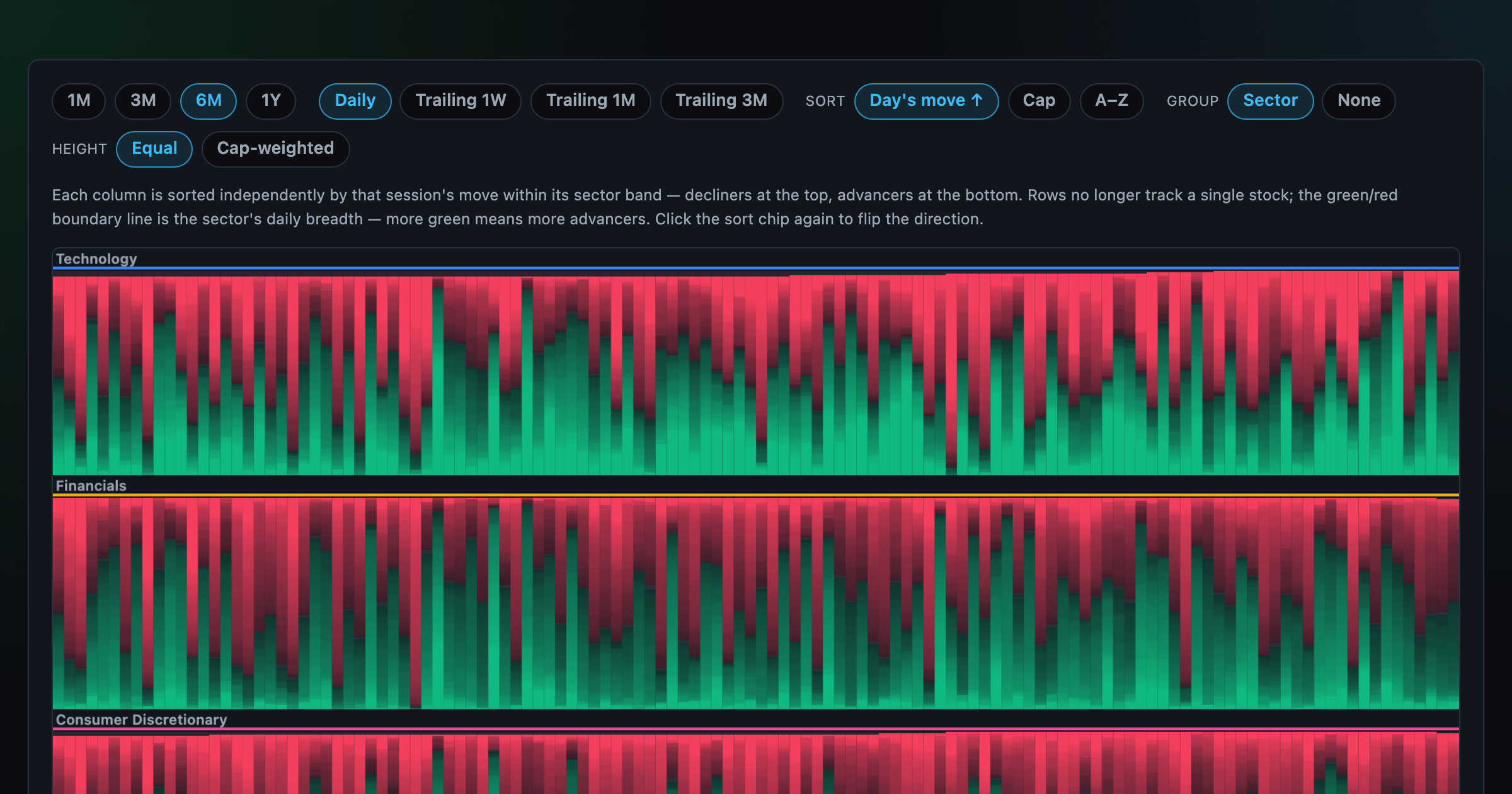
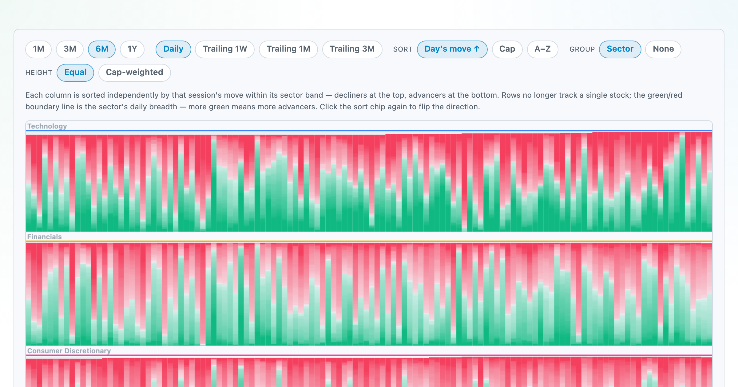
Every stock as a row, every day as a column — market selloffs are vertical stripes, sector routs are blocks.
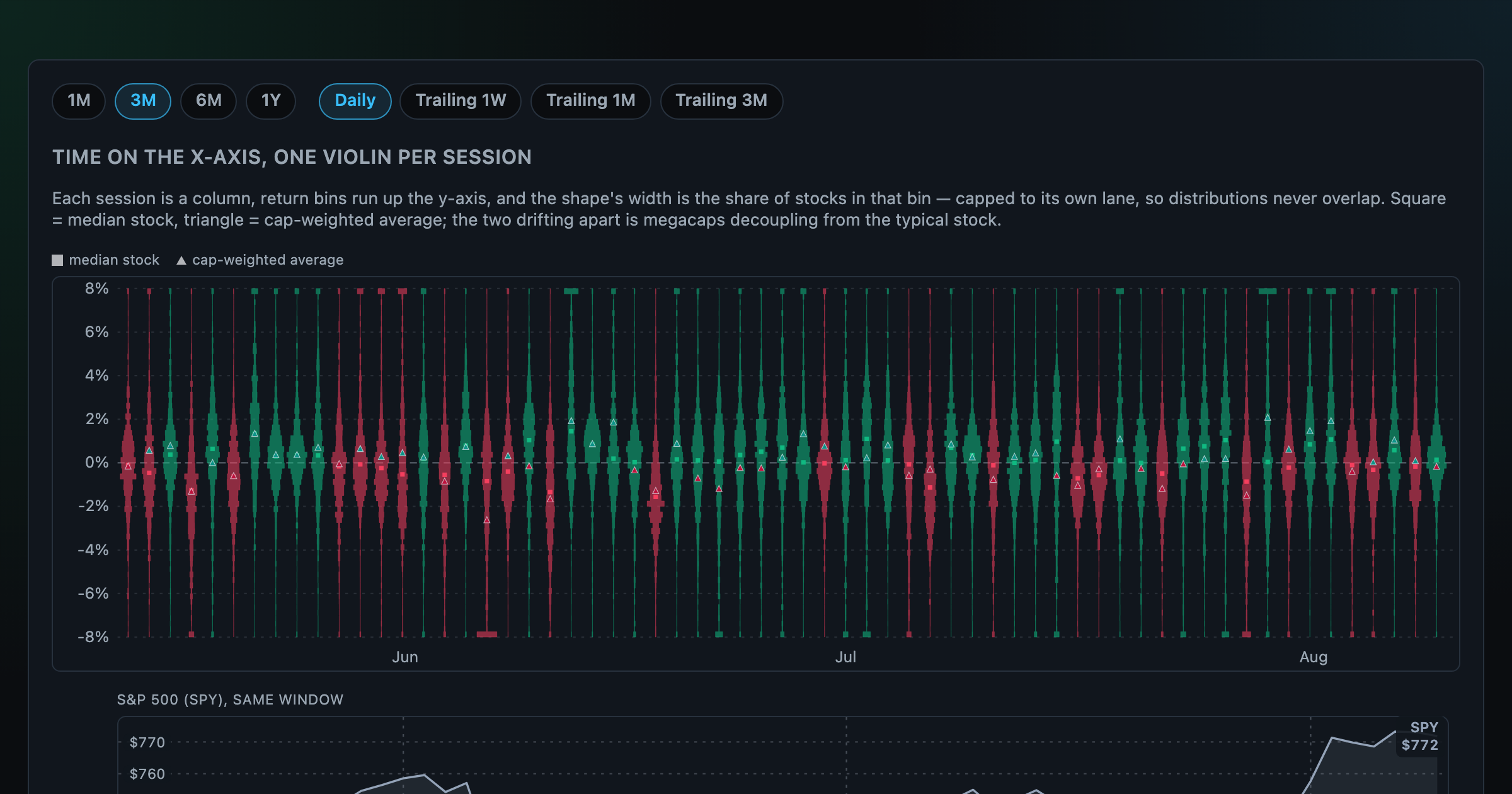
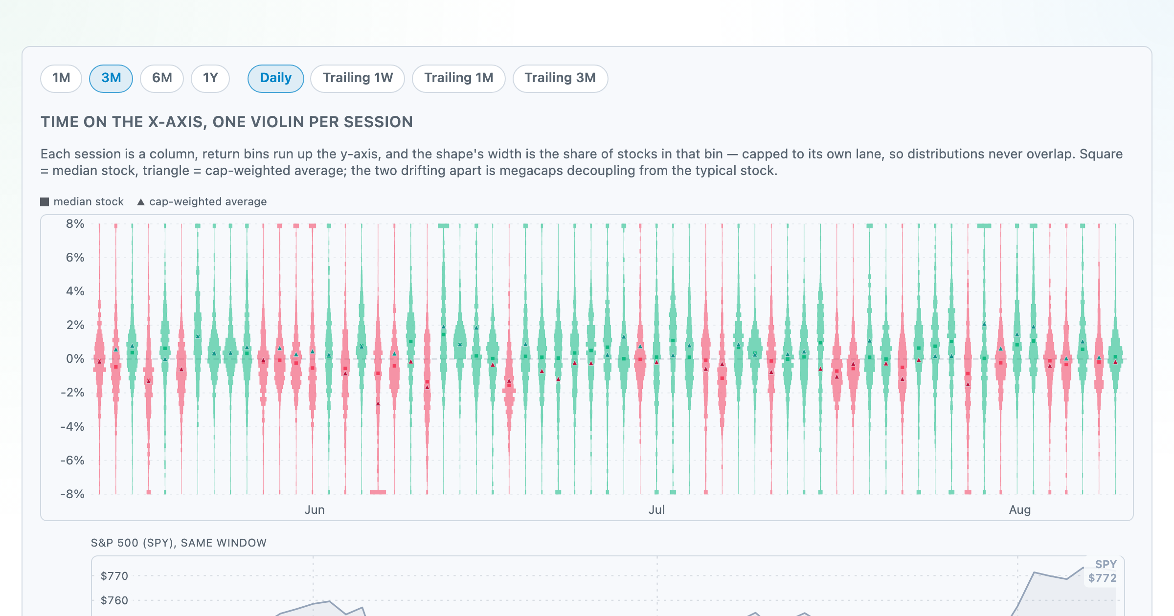
Each session's full distribution of stock returns as an upright violin, with the S&P 500 on the same axis — shifts, dispersion, and fat tails at a glance.
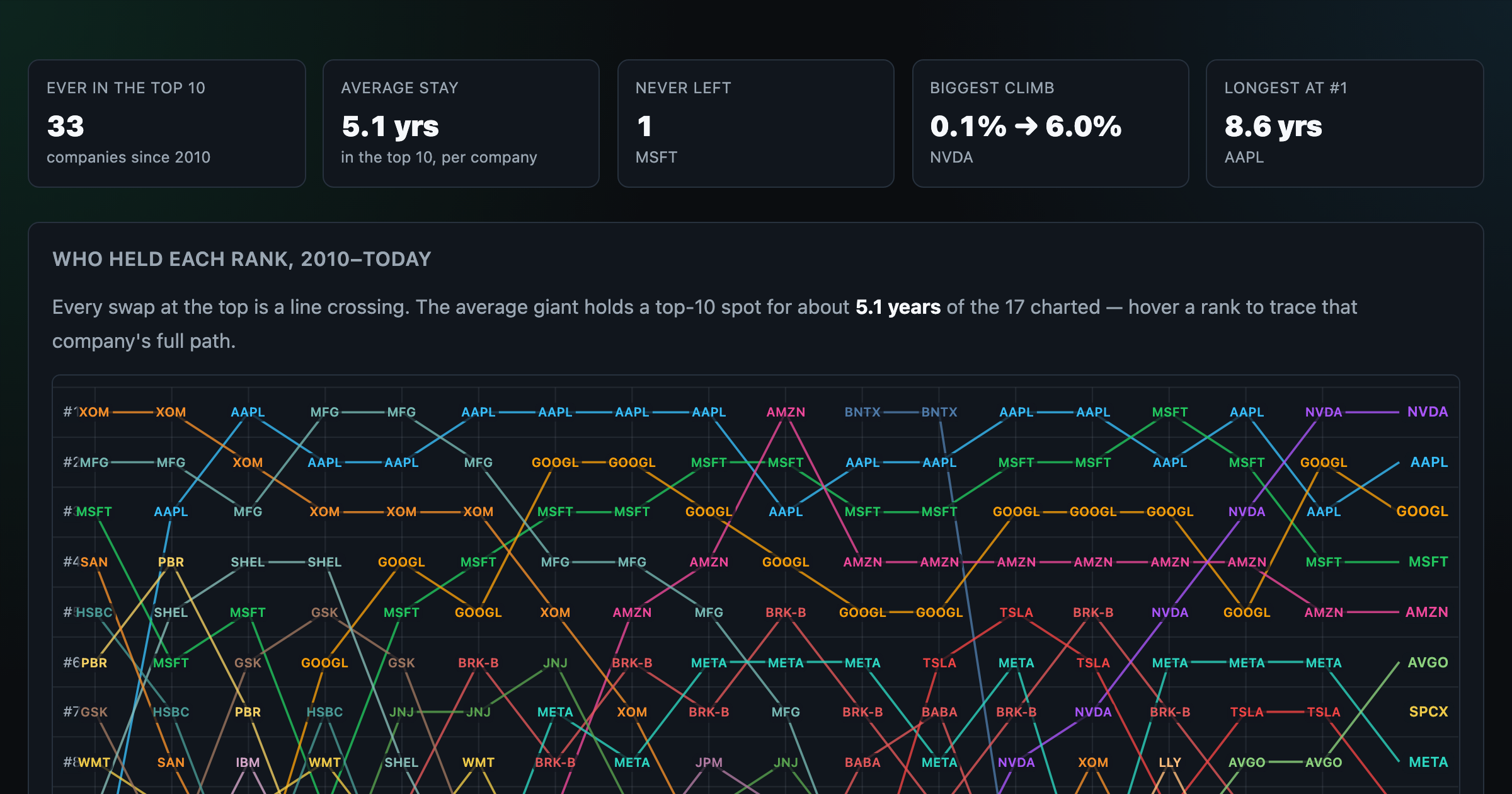
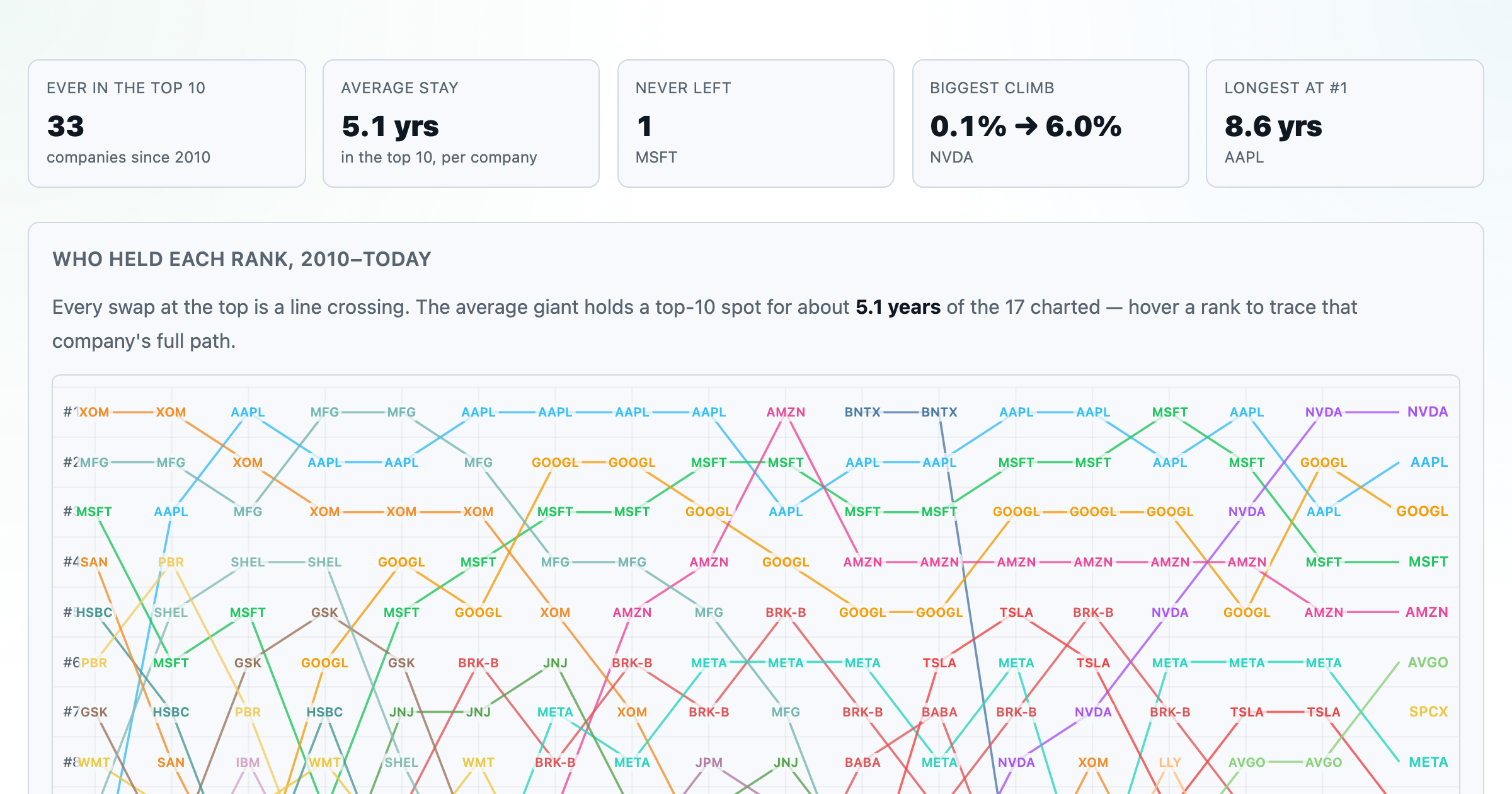
Every company that ever cracked the market's top 10 since 2010 — who climbed, who faded, who never left.
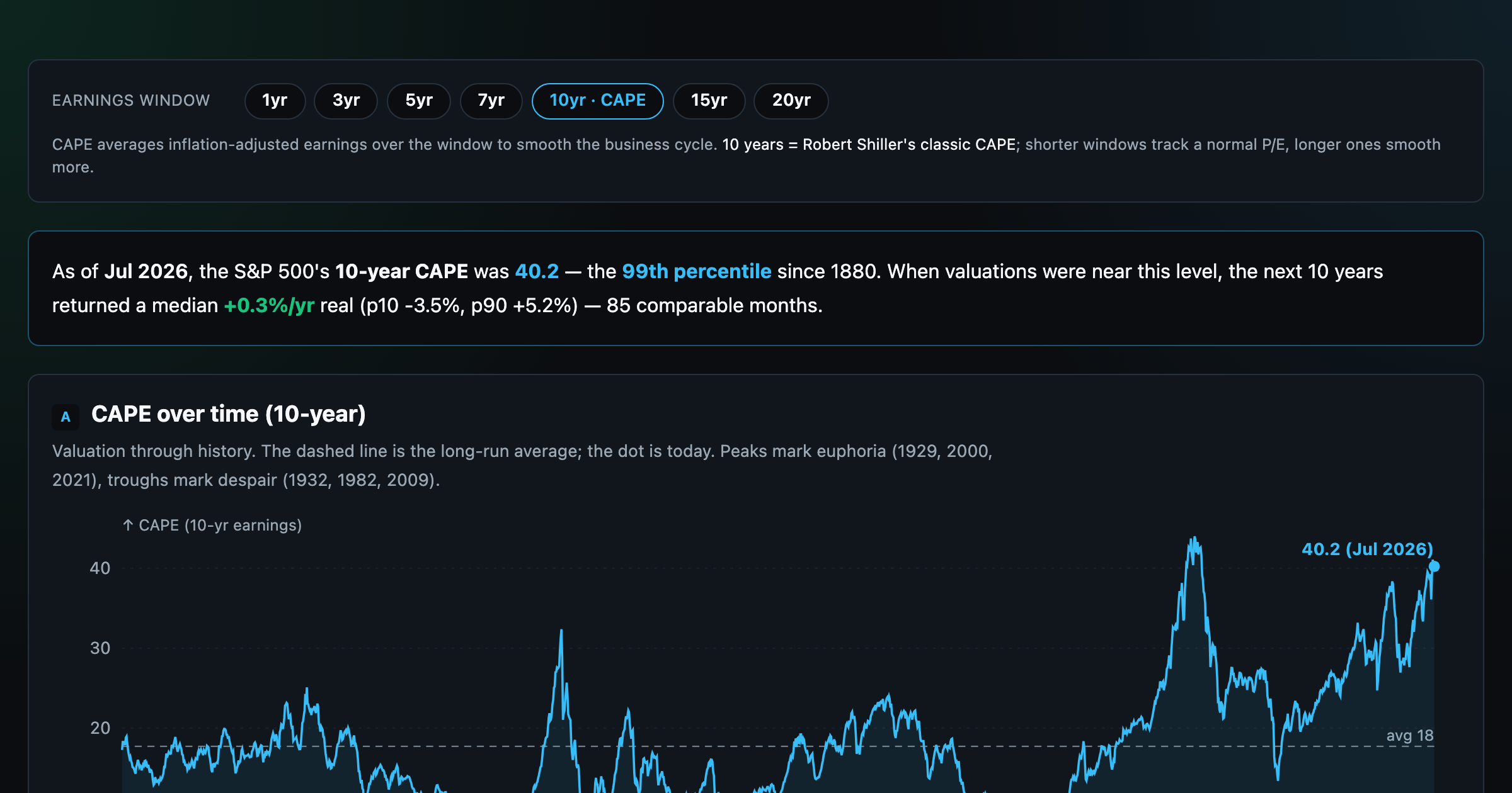
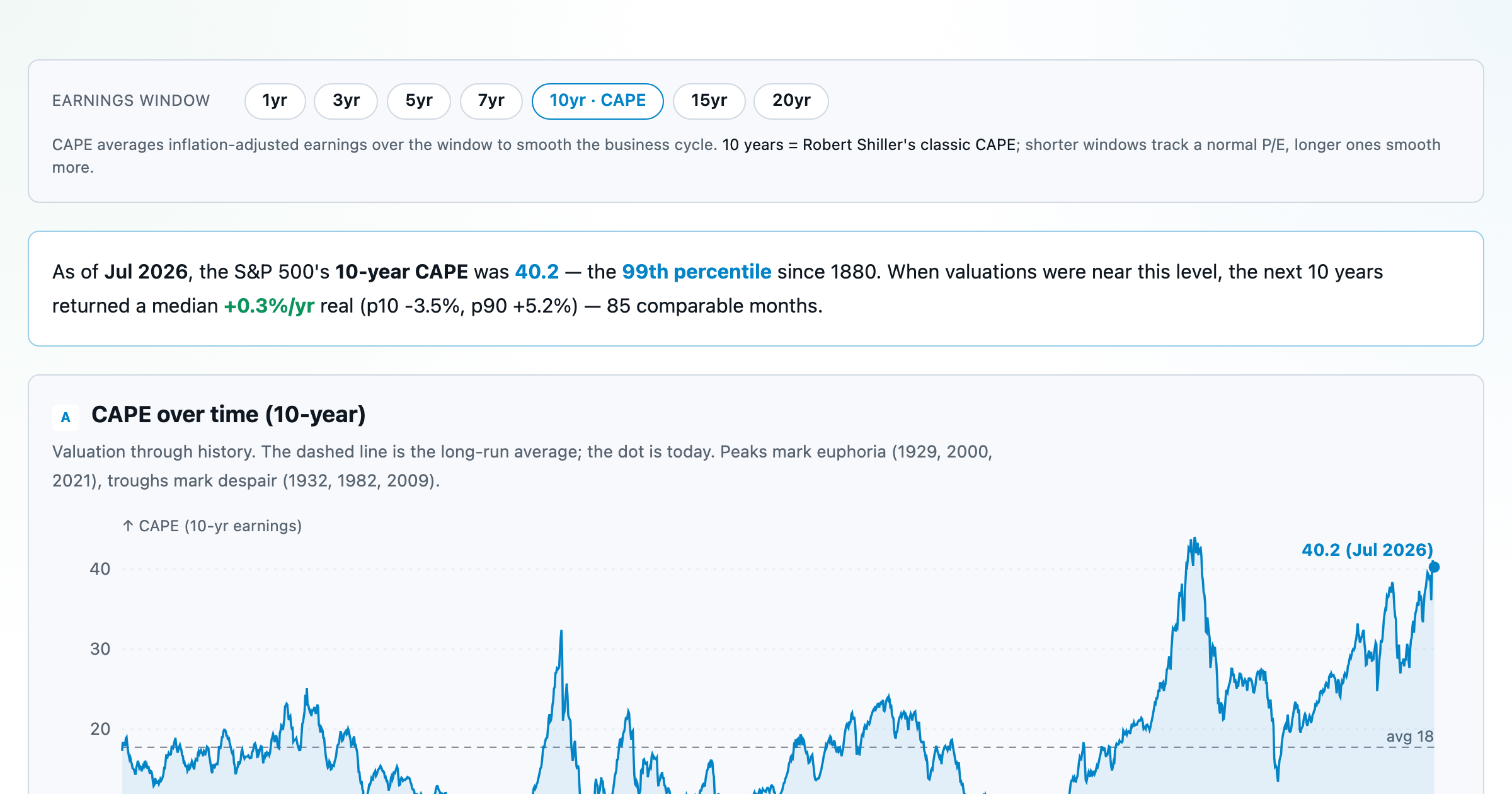
Is the market expensive? The Shiller CAPE back to 1871 and what valuations have meant for the next decade.
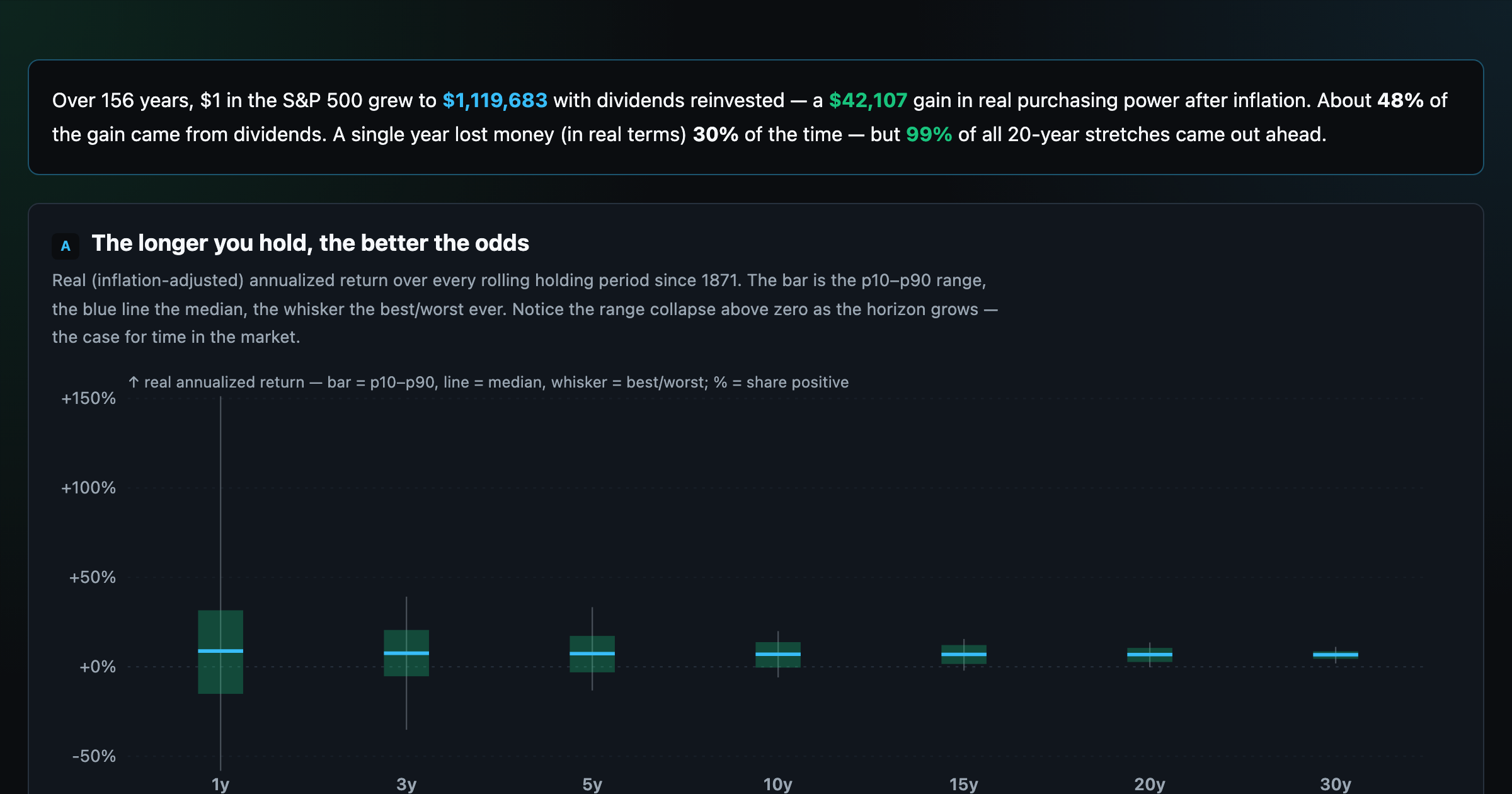
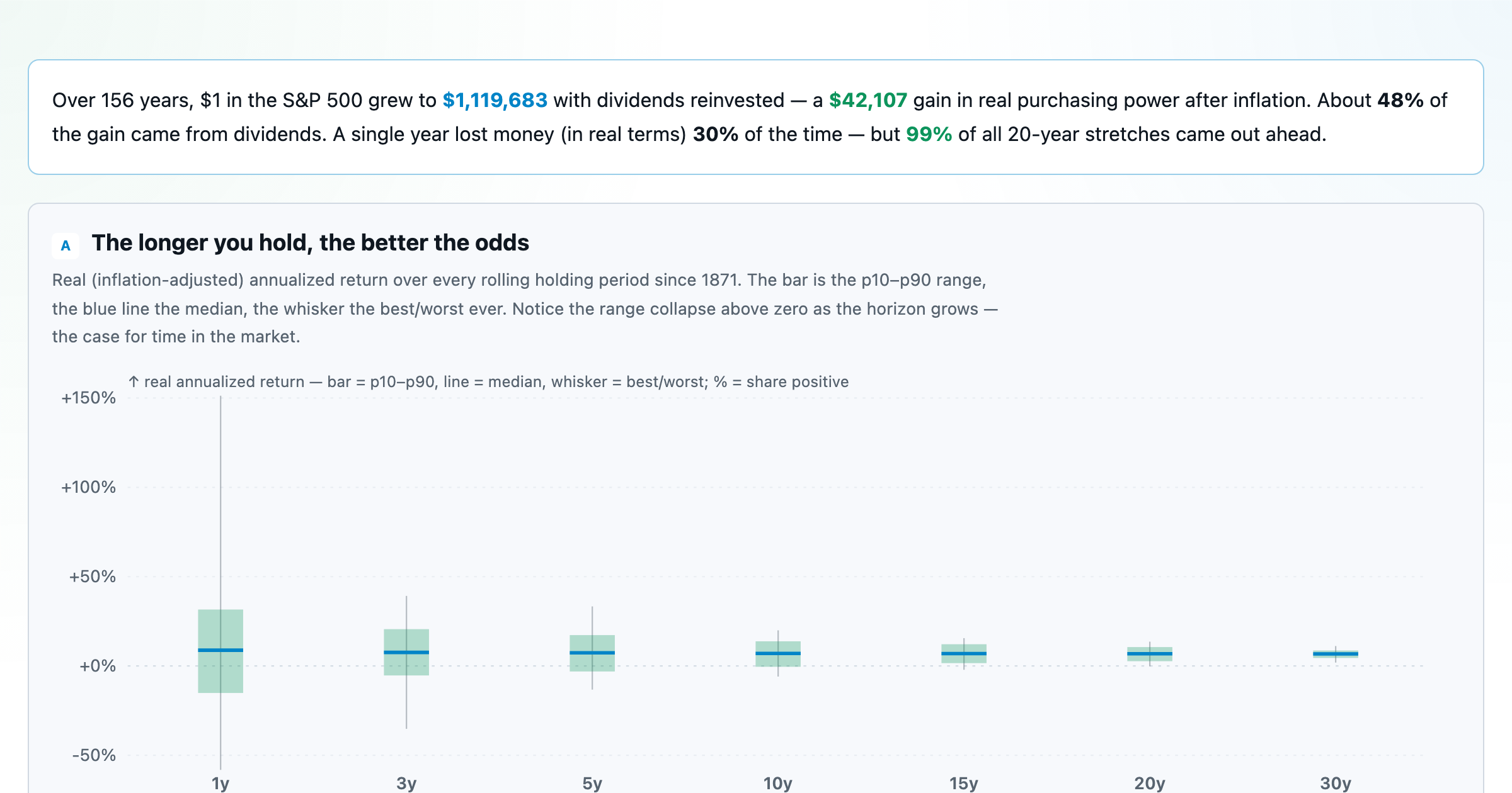
The S&P 500 since 1871 — odds of gain by holding period, real drawdowns, and the growth of $1.
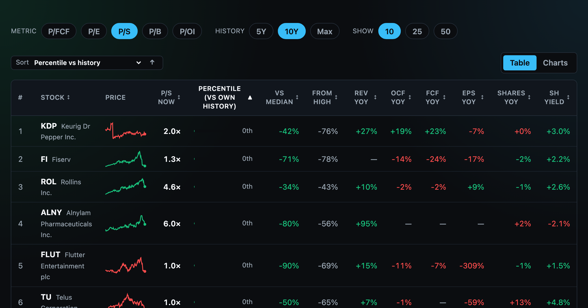
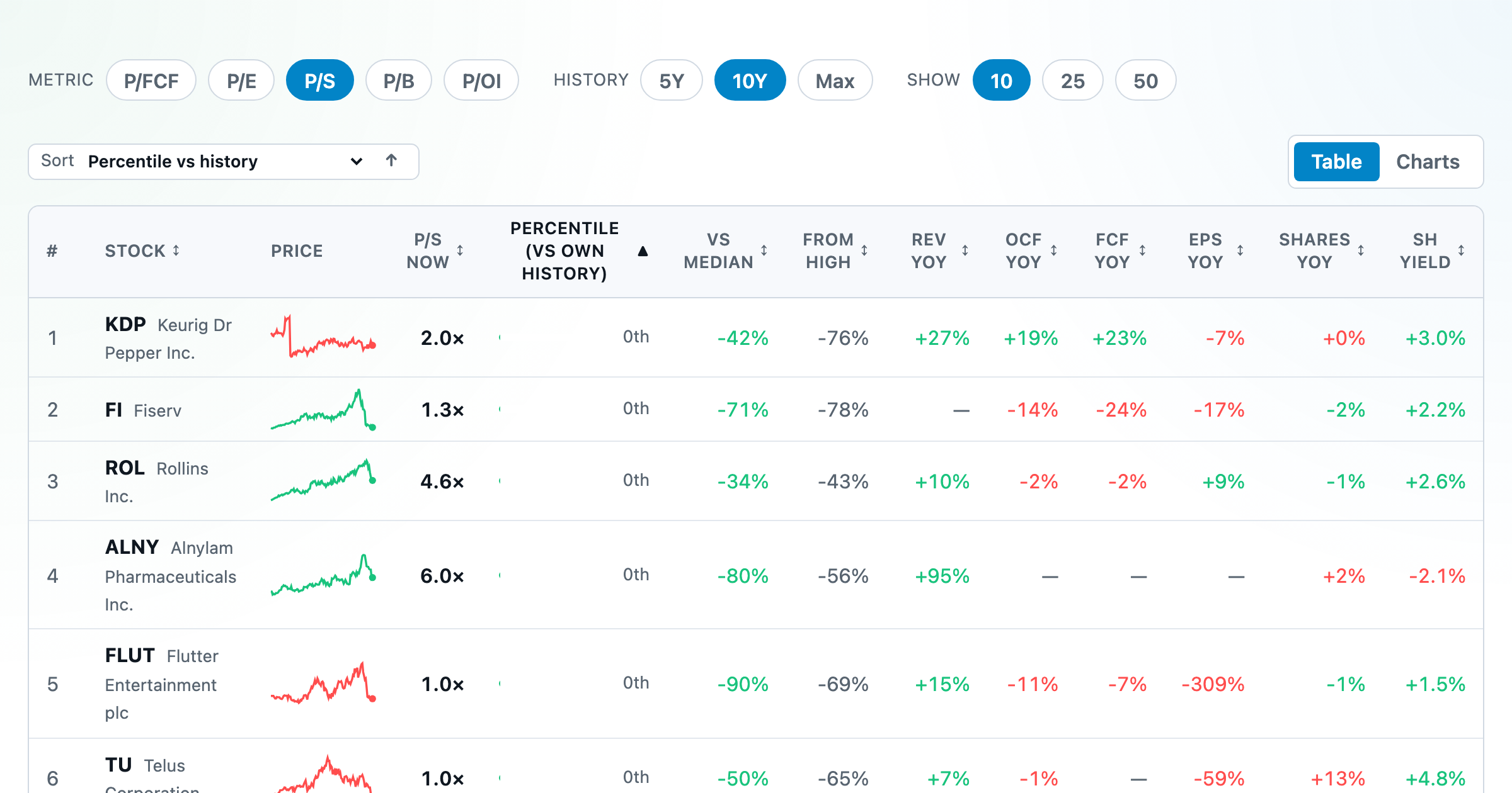
Stocks trading cheapest relative to their own P/E, P/FCF, P/S, or P/B history — with fair-value bands.
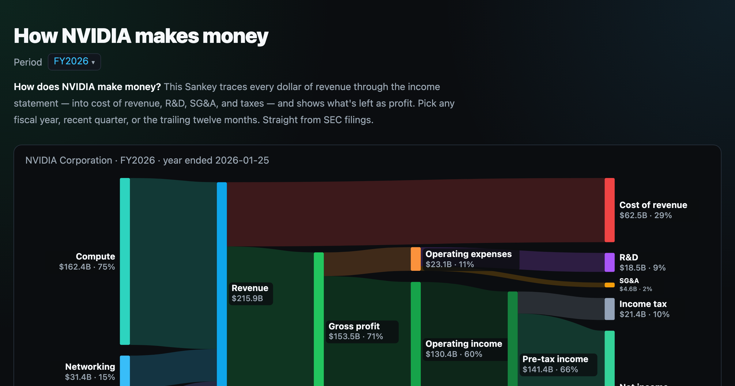
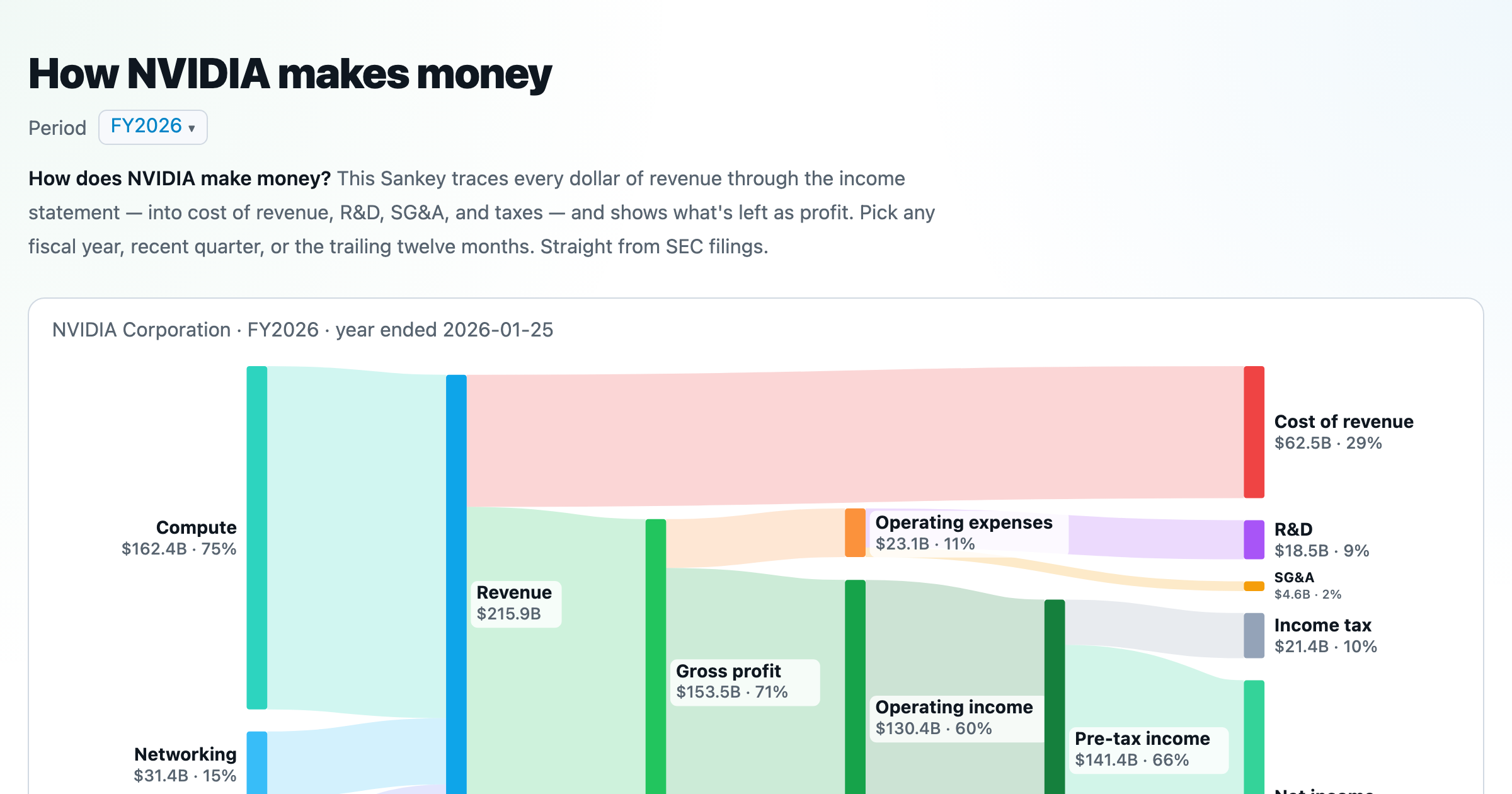
Follow a company's revenue through its income statement as a Sankey — costs, taxes, and profit.
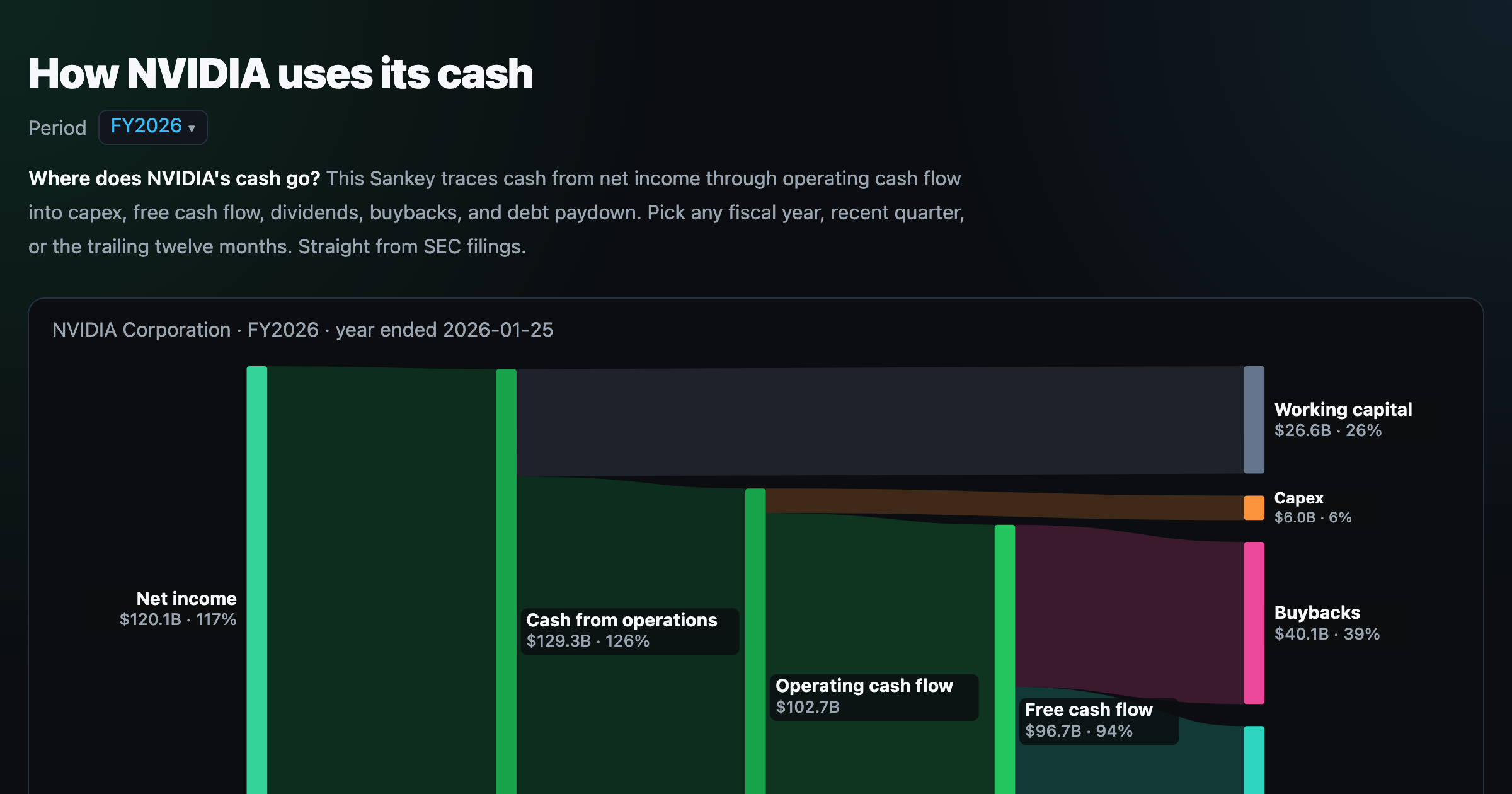
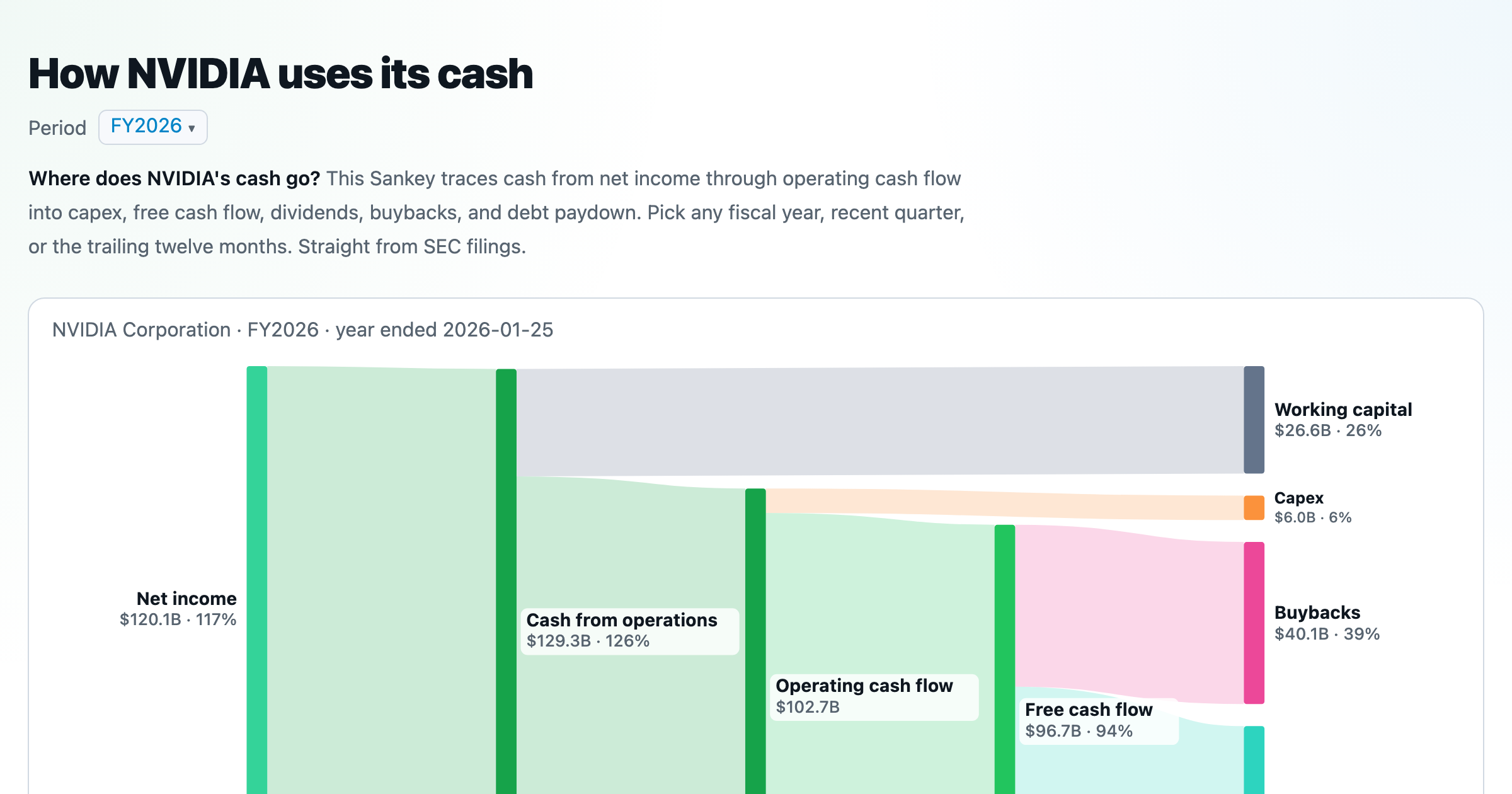
Follow a company's cash from net income through operating cash flow into capex, buybacks, and dividends.
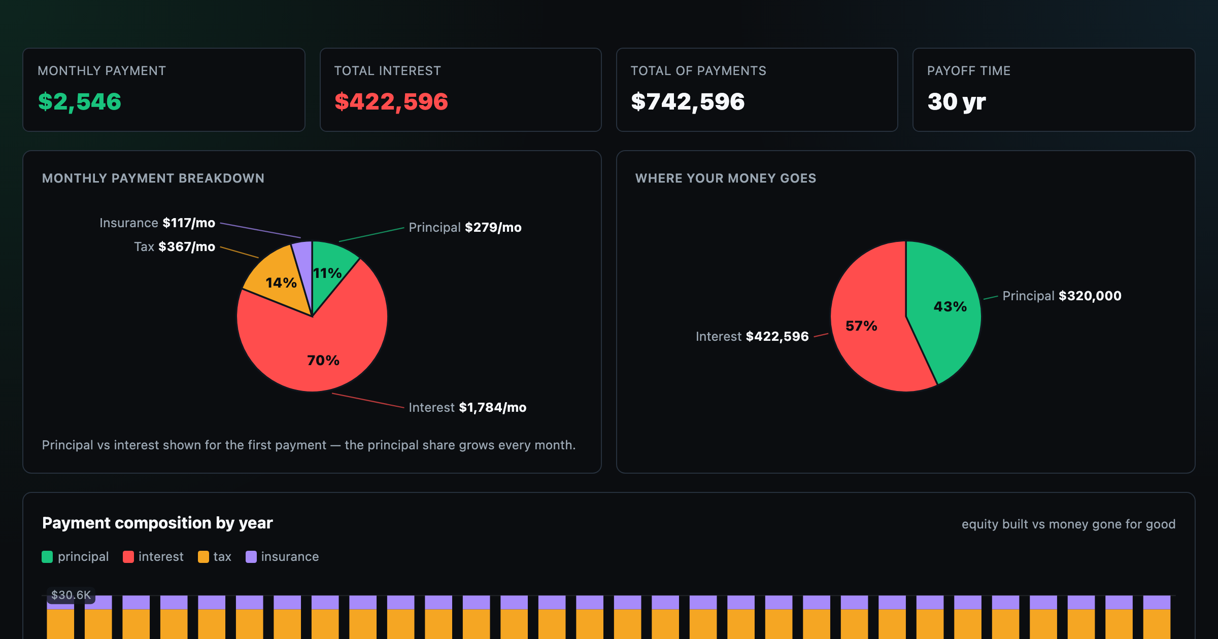
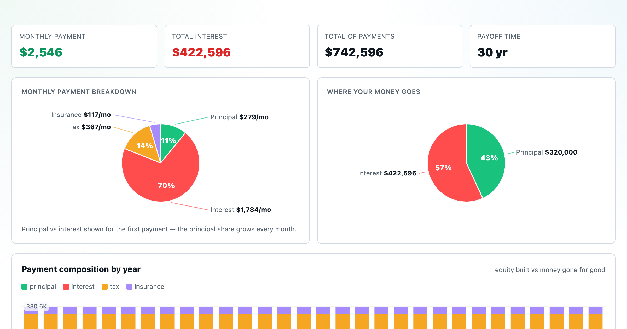
Monthly payment, principal vs interest by year, and the balance paydown — with extra-payment savings.
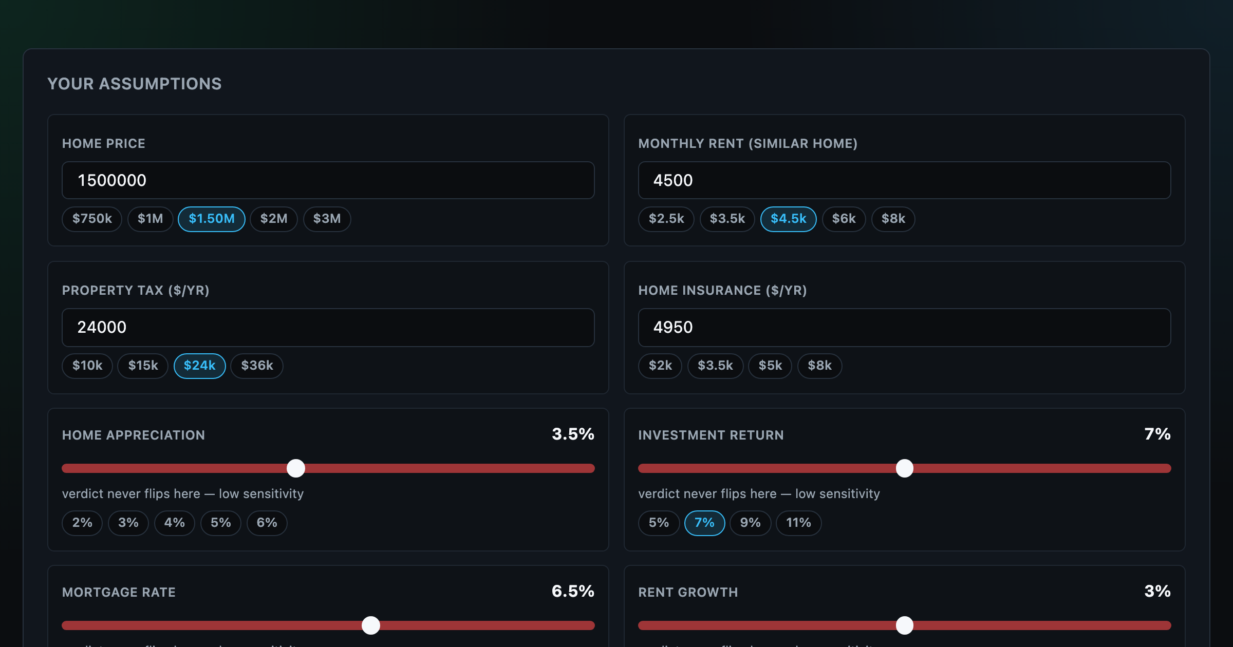
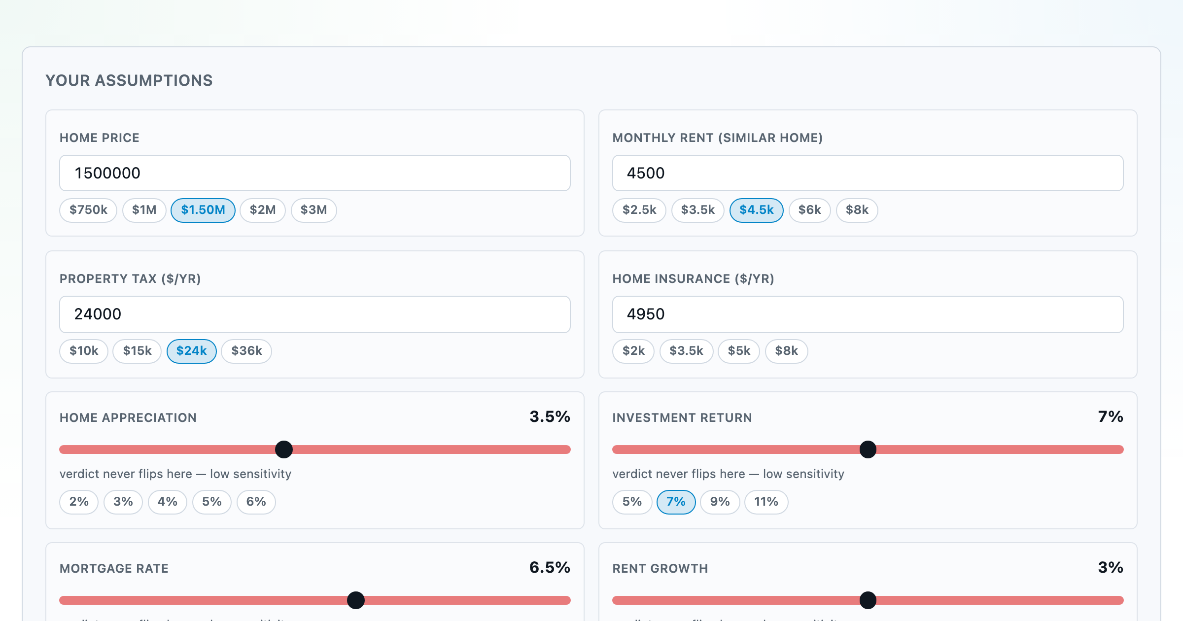
Should you rent or buy? Net-wealth verdict with sensitivity analysis of every assumption.
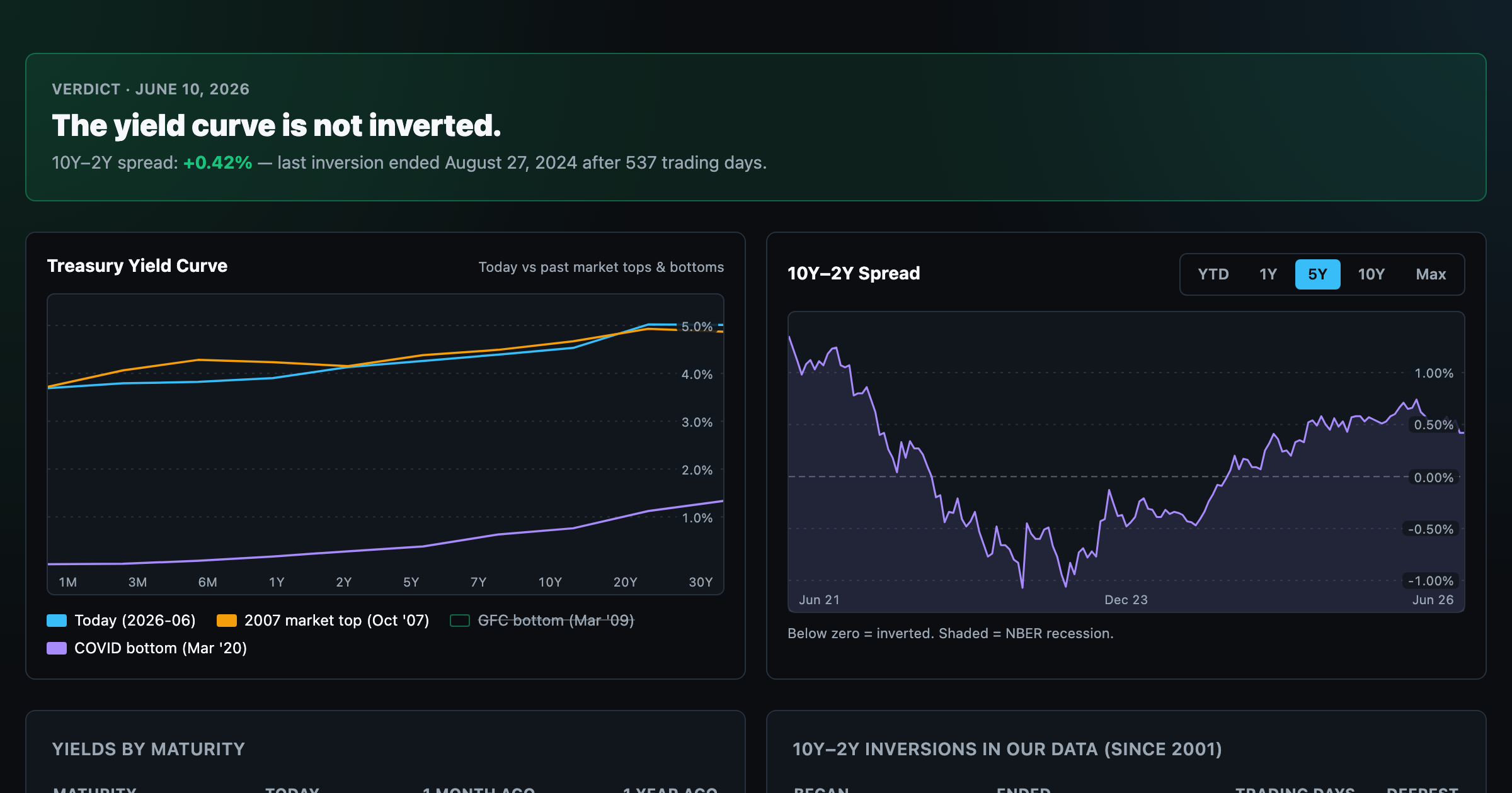
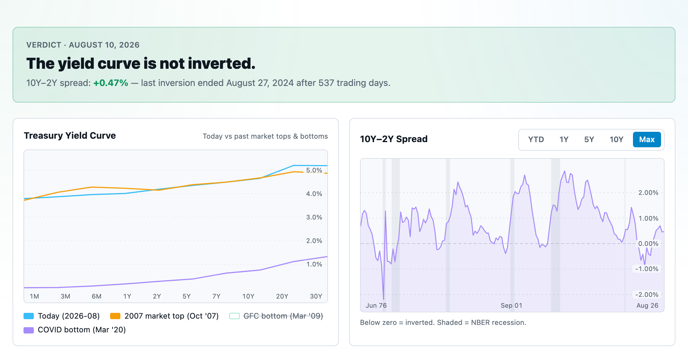
Live term structure, the 10Y–2Y spread, and every inversion episode.