
Where are we?
Take an index's trailing return over the last K months, and ask: how does it rank against every K-month return in history — and when the market looked like this before, what did the next N months bring? The S&P 500 reaches back to 1871, so even decade-long windows have a century of precedent.
S&P 500 trailing 1Y return is +21.8% — the 73rd percentile of all 1,854 1Y returns since Jan 1871. When the trailing return was near here (366 analogs, ±10 pts), the next 1Y returned a median +13.6% (p10 -7.7%, p90 +33.2%).
Every trailing-return window as a histogram (green = positive, red = negative). The blue marker is today's return and its percentile. The simplest read of 'how unusual is now?'.
Take every month whose trailing return looked like today's (the analogs), and plot their forward paths rebased to 0. Faint lines are individual analogs; the blue line is the median; bands are p10–p90 and p30–p70. The 'given we're here, where do we go?' view.
Hover any faint line to see which period it was. 366 analog paths shown.
Each dot is one historical window: x = its trailing return, y = the forward return that followed. Blue dots are the analogs near today (dashed line = now). The correlation r tells you how much signal there really is — often honestly weak.
Hover a dot for its exact period. 1842 windows; forward 1Y periods end Jan 1873–Jun 2026.
Today's percentile in historical context — we've been this 'extreme' before. The line is the trailing return's percentile through history; the dot is now.
Does being at this percentile actually change the forward odds? Grey outline = forward returns across all history; blue = only the analogs near today. If blue shifts left/right of grey, the current regime matters; if they overlap, it doesn't.
Monthly split- and dividend-adjusted closes (total return), month-end aligned. Conditional forward estimates are descriptive history over a small analog sample — not a forecast. Markets have fat tails and regime change; treat the bands as 'what has happened', not 'what will'. For informational purposes only; not investment advice.
FAQ
- What is a return percentile?
- It ranks today's trailing return against every same-length return in the index's history. An 80th-percentile 12-month return means the last year beat 80% of all rolling 12-month periods on record.
- How are the forward returns estimated?
- We find historical months whose trailing return was near today's (within a percentile band you choose), then look at what the index did over the following N months. The spread of those outcomes is the forward distribution. It is descriptive history over a small sample, not a forecast.
- What data is used?
- Month-end split- and dividend-adjusted closes (total return) for index-proxy ETFs — SPY for the S&P 500 (since 1993), QQQ for the Nasdaq-100, DIA, IWM, and VTI. Returns are aligned to month boundaries.
More visualizations
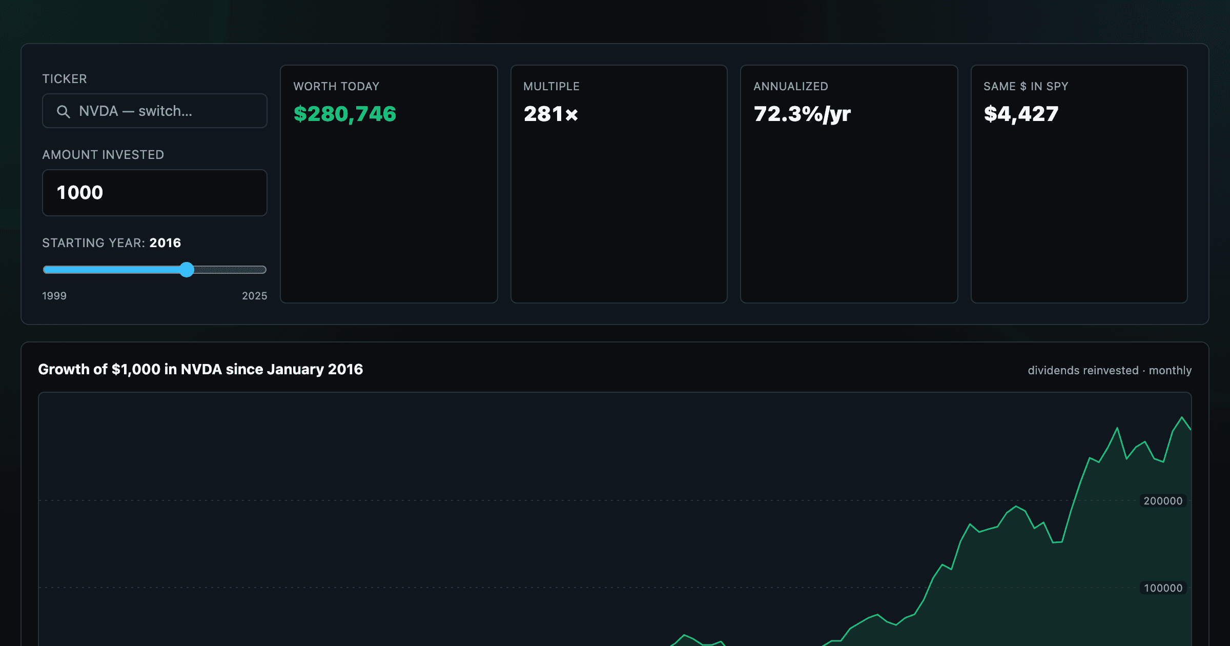
What $1,000 in any stock or ETF would be worth today.
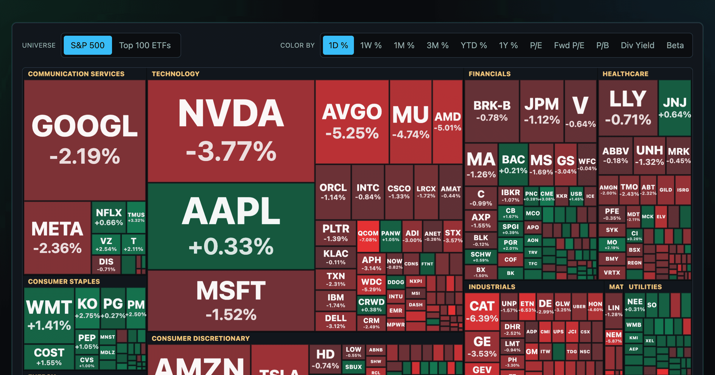
Every S&P 500 company sized by market cap — color by return or valuation.
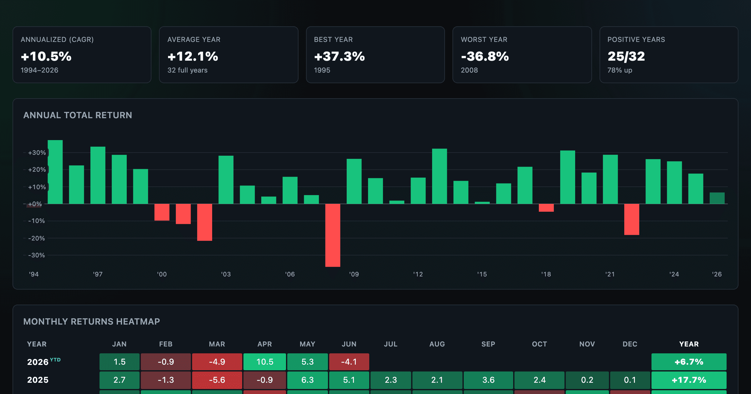
S&P 500 returns by year, month, week and trailing period — total or price return.
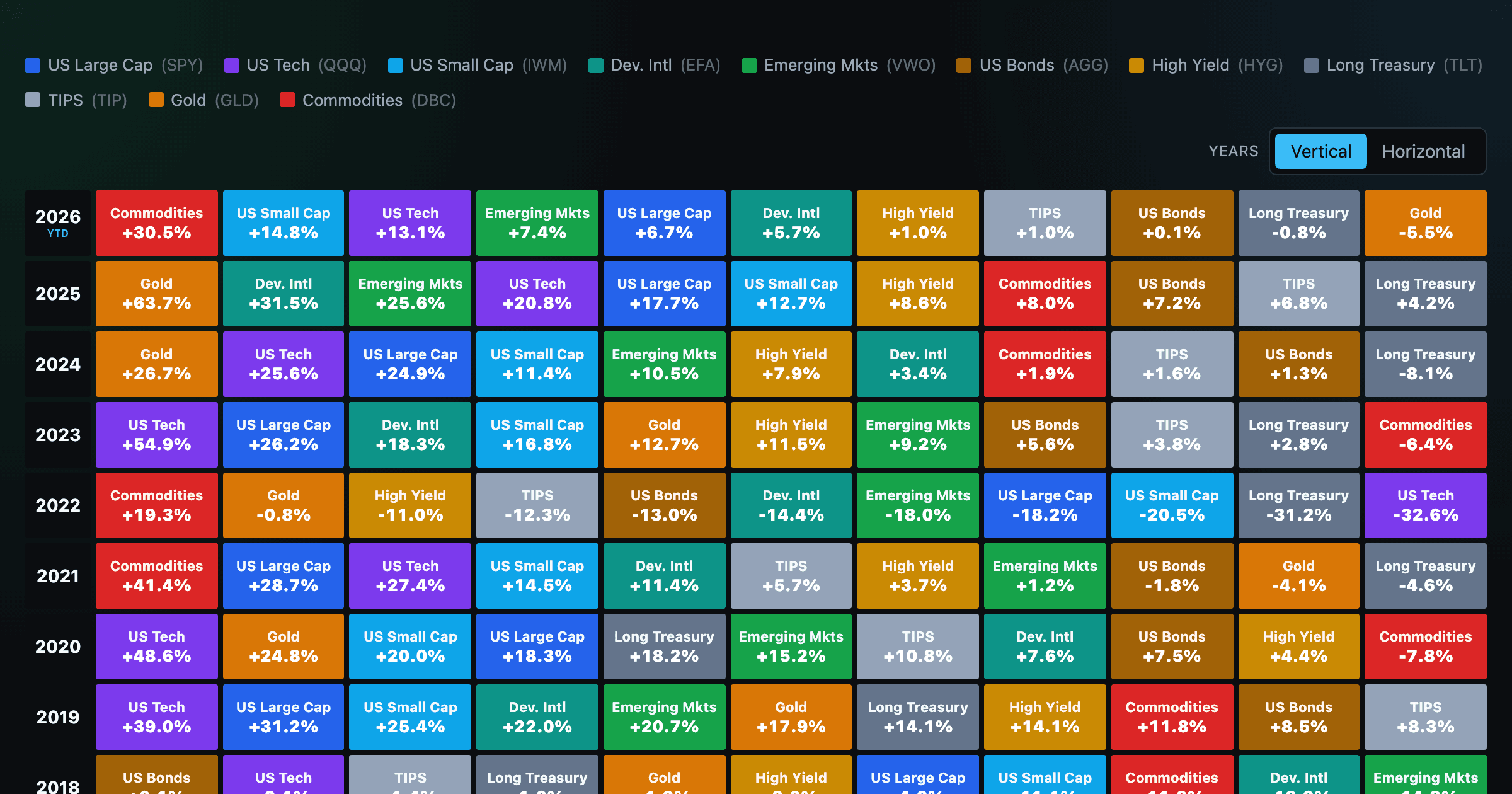
Asset-class returns ranked year by year — the Callan chart / asset allocation quilt.
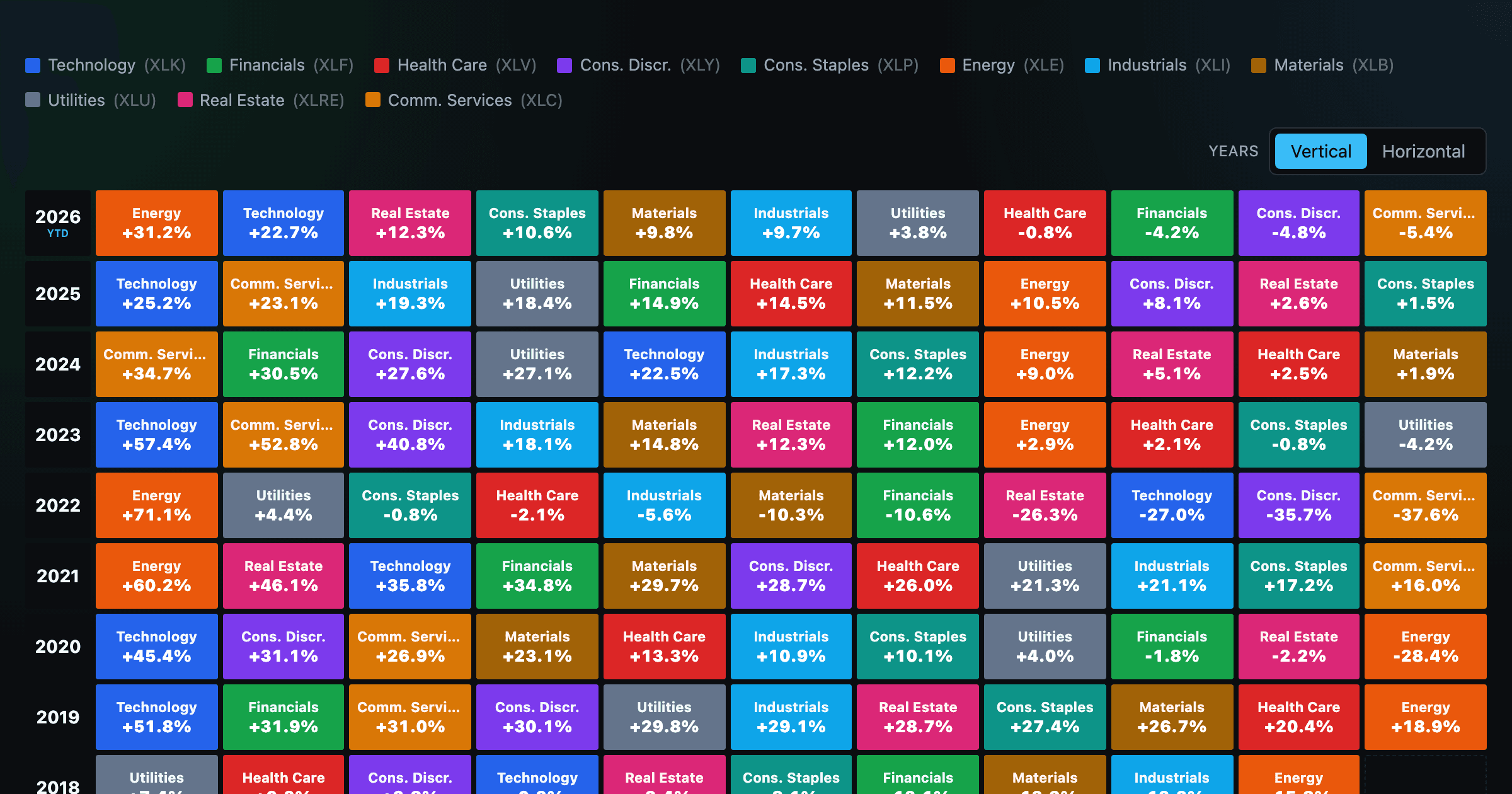
The 11 S&P 500 sectors ranked year by year — a sector quilt chart, back to 1999.
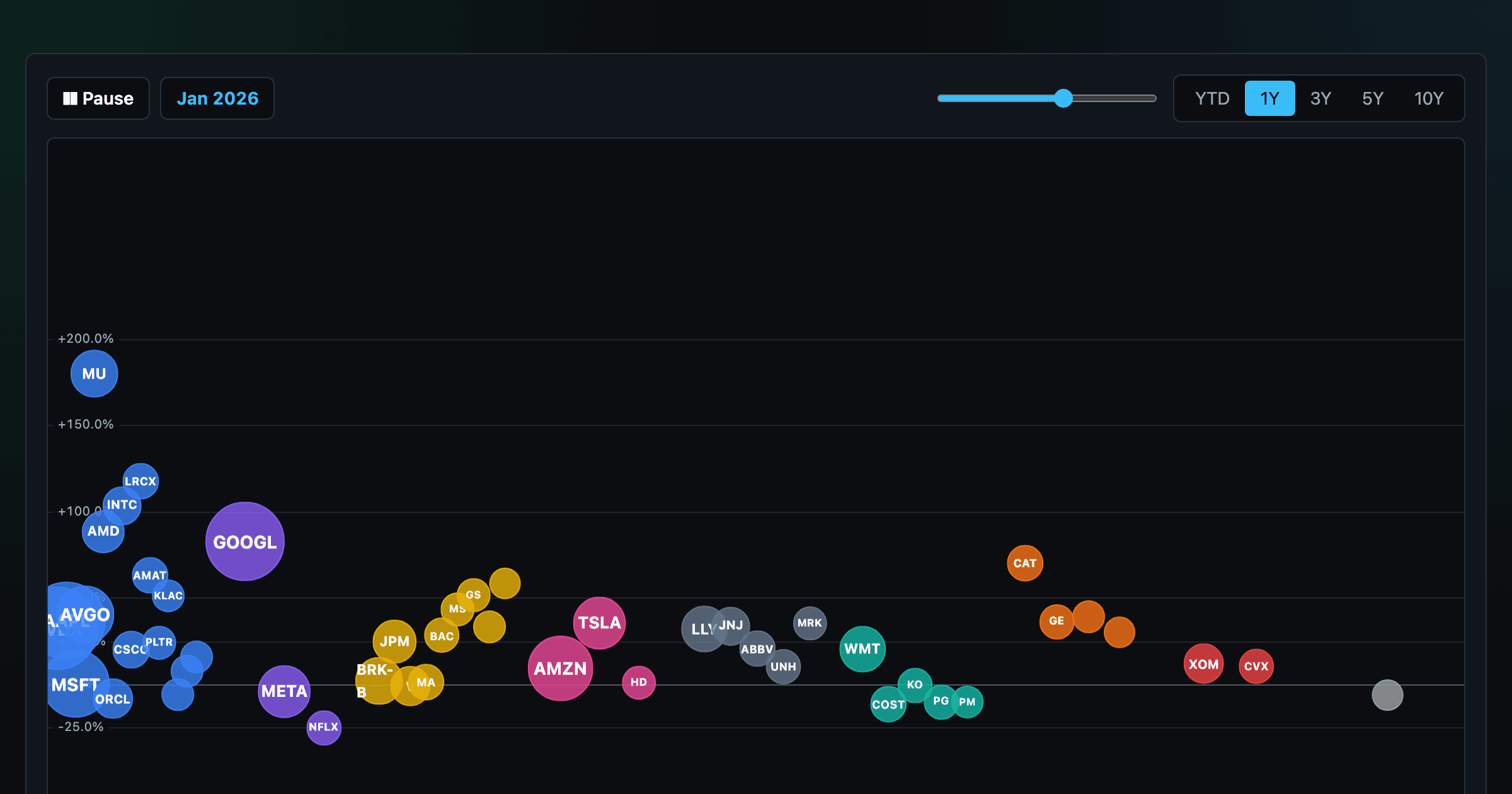
The biggest US companies as animated bubbles, rising and falling with their total return over time.

How recent stock-market debuts have performed since listing — annualized, vs the S&P 500, by IPO vs spin-off.
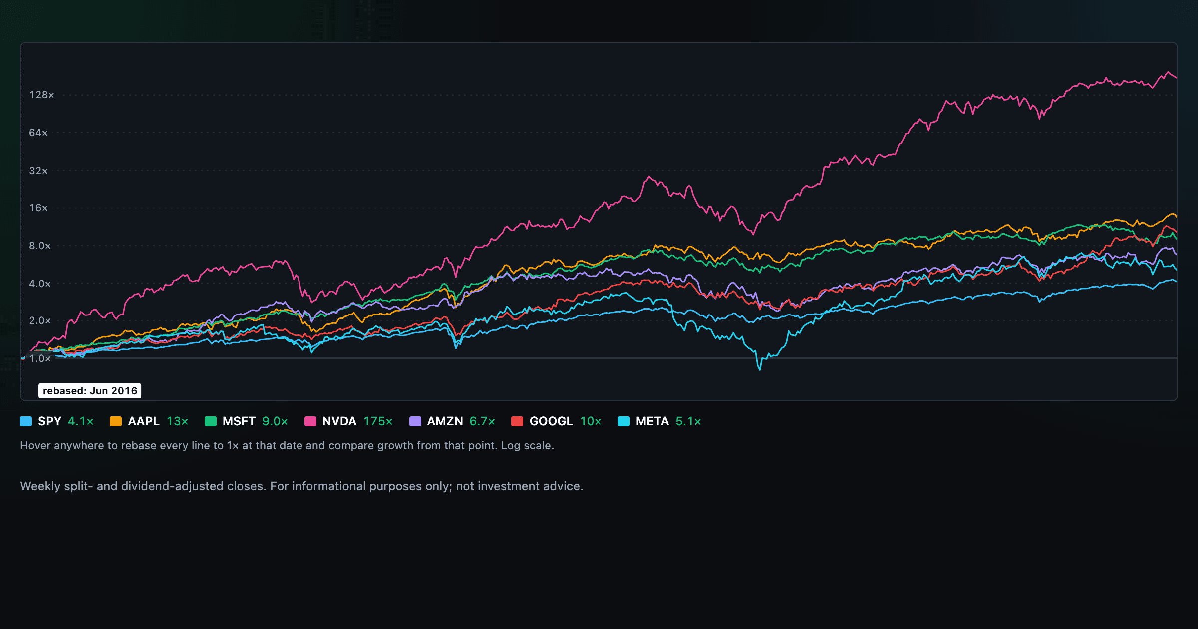
Compare megacaps vs the S&P 500, rebased to 1× at any date you hover.

Is the market expensive? The Shiller CAPE back to 1871 and what valuations have meant for the next decade.

The S&P 500 since 1871 — odds of gain by holding period, real drawdowns, and the growth of $1.

Stocks trading cheapest relative to their own P/E, P/FCF, P/S, or P/B history — with fair-value bands.

Follow a company's revenue through its income statement as a Sankey — costs, taxes, and profit.

Follow a company's cash from net income through operating cash flow into capex, buybacks, and dividends.

Monthly payment, principal vs interest by year, and the balance paydown — with extra-payment savings.
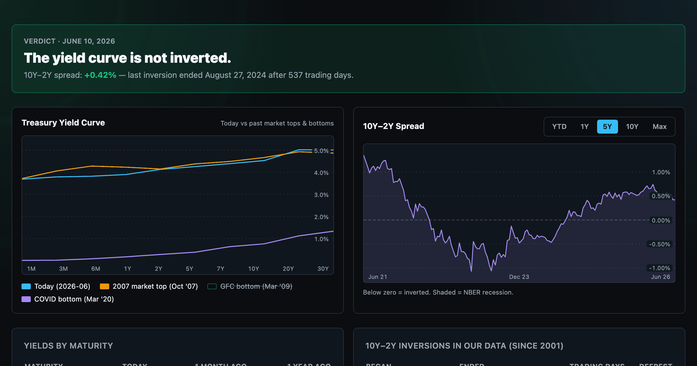
Live term structure, the 10Y–2Y spread, and every inversion episode.