
US Treasury Yield Curve
The yield curve plots US Treasury yields across maturities (1 month to 30 years). When short-term yields rise above long-term yields — an inversion — it has historically preceded recessions. Data from the St. Louis Fed (FRED), refreshed daily.
10Y−2Y spread: +0.36% — last inversion ended August 27, 2024 after 537 trading days.
Yields by maturity
| Maturity | Today | 1 month ago | 1 year ago |
|---|---|---|---|
| 1M | 3.82% | 3.70% | 4.37% |
| 3M | 3.95% | 3.83% | 4.42% |
| 6M | 4.09% | 3.94% | 4.31% |
| 1Y | 4.15% | 3.94% | 4.09% |
| 2Y | 4.37% | 4.07% | 3.91% |
| 5Y | 4.46% | 4.12% | 3.95% |
| 7Y | 4.58% | 4.23% | 4.15% |
| 10Y | 4.71% | 4.38% | 4.40% |
| 20Y | 5.20% | 4.87% | 4.92% |
| 30Y | 5.17% | 4.87% | 4.92% |
10Y–2Y inversions in our data (since 2001)
| Began | Ended | Trading days | Deepest |
|---|---|---|---|
| July 6, 2022 | August 27, 2024 | 537 | -1.08% |
| May 30, 2007 | June 6, 2007 | 5 | -0.04% |
| May 3, 2007 | May 22, 2007 | 13 | -0.06% |
| August 17, 2006 | March 21, 2007 | 147 | -0.19% |
| June 30, 2006 | July 27, 2006 | 18 | -0.07% |
| June 8, 2006 | June 29, 2006 | 15 | -0.06% |
| March 21, 2006 | March 30, 2006 | 7 | -0.05% |
| January 31, 2006 | March 8, 2006 | 25 | -0.16% |
Episodes of 5+ consecutive trading days below zero.
Methodology & sources
Yields are constant-maturity US Treasury rates published by the Federal Reserve (FRED series DGS1MO–DGS30); the spread is FRED's T10Y2Y (10-year minus 2-year). An "inversion" here means the 10Y–2Y spread closed below zero. Our data begins in 2001, so earlier inversions (e.g. 1989, 2000) are not listed. Updated twice daily. See the broader Market Valuation & Macro dashboard for rates, inflation, volatility, and more.
Source: U.S. Federal Reserve (FRED). For informational purposes only; not investment advice.
FAQ
- What is the US Treasury yield curve?
- The yield curve plots US Treasury yields across maturities, from 1 month to 30 years. Its shape reflects the market's expectations for growth and interest rates — normally longer maturities pay more than shorter ones.
- Is the yield curve inverted right now?
- As of July 24, 2026, the 10-year minus 2-year Treasury spread is +0.36%, so the yield curve is not inverted.
- Why does an inverted yield curve matter?
- The curve inverts when short-term yields rise above long-term yields. Historically, a sustained 10Y–2Y inversion has preceded every US recession in recent decades, which is why it's watched closely as a recession warning — though the lead time varies.
More visualizations
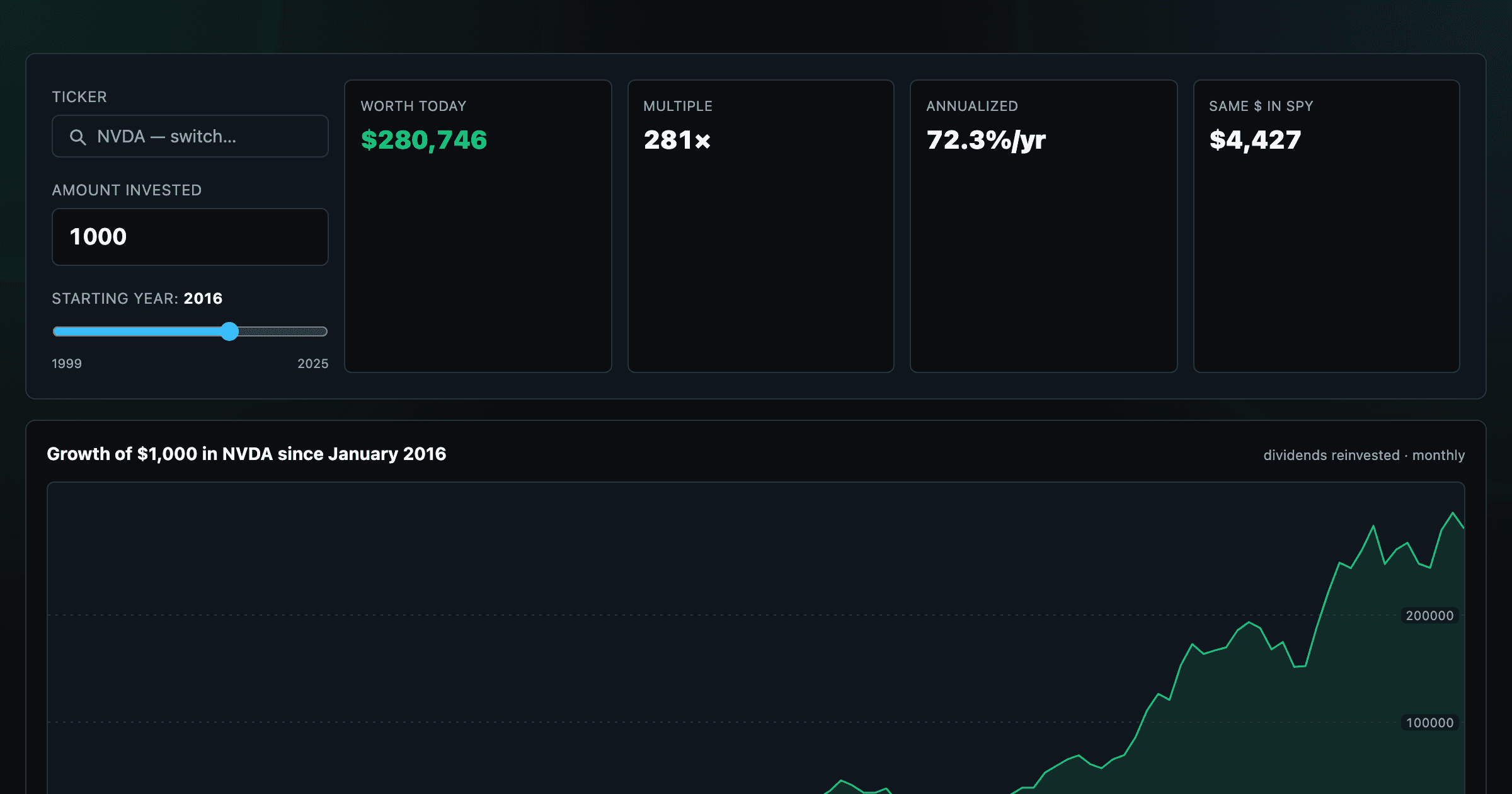
What $1,000 in any stock or ETF would be worth today.
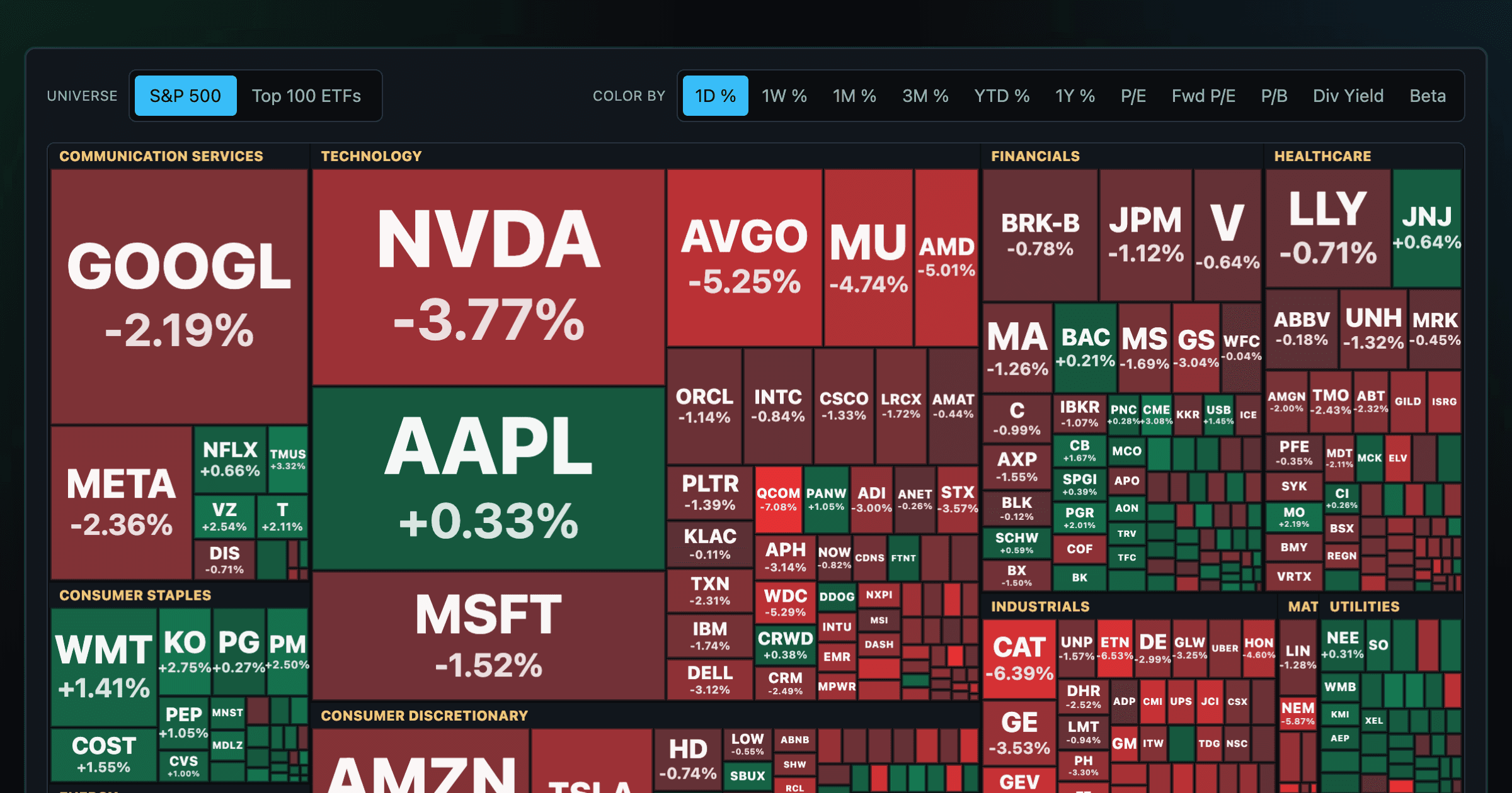
Every S&P 500 company sized by market cap — color by return or valuation.
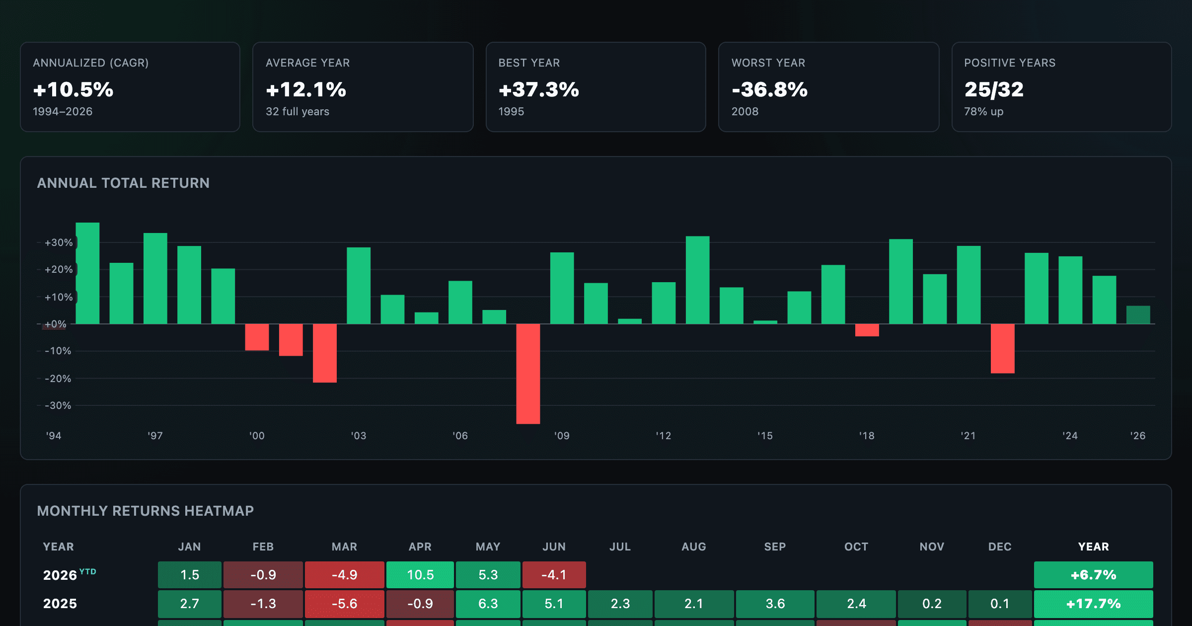
S&P 500 returns by year, month, week and trailing period — total or price return.
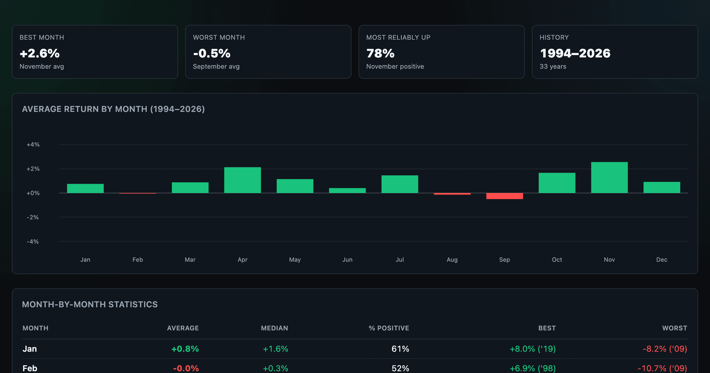
Which month is best for stocks? Average return of every calendar month, for any ticker.
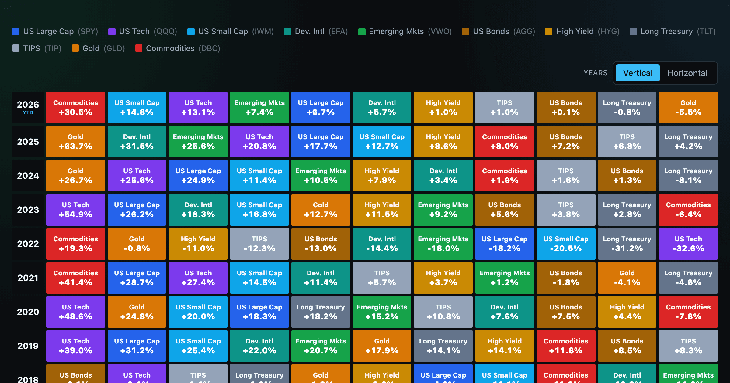
Asset-class returns ranked year by year — the Callan chart / asset allocation quilt.
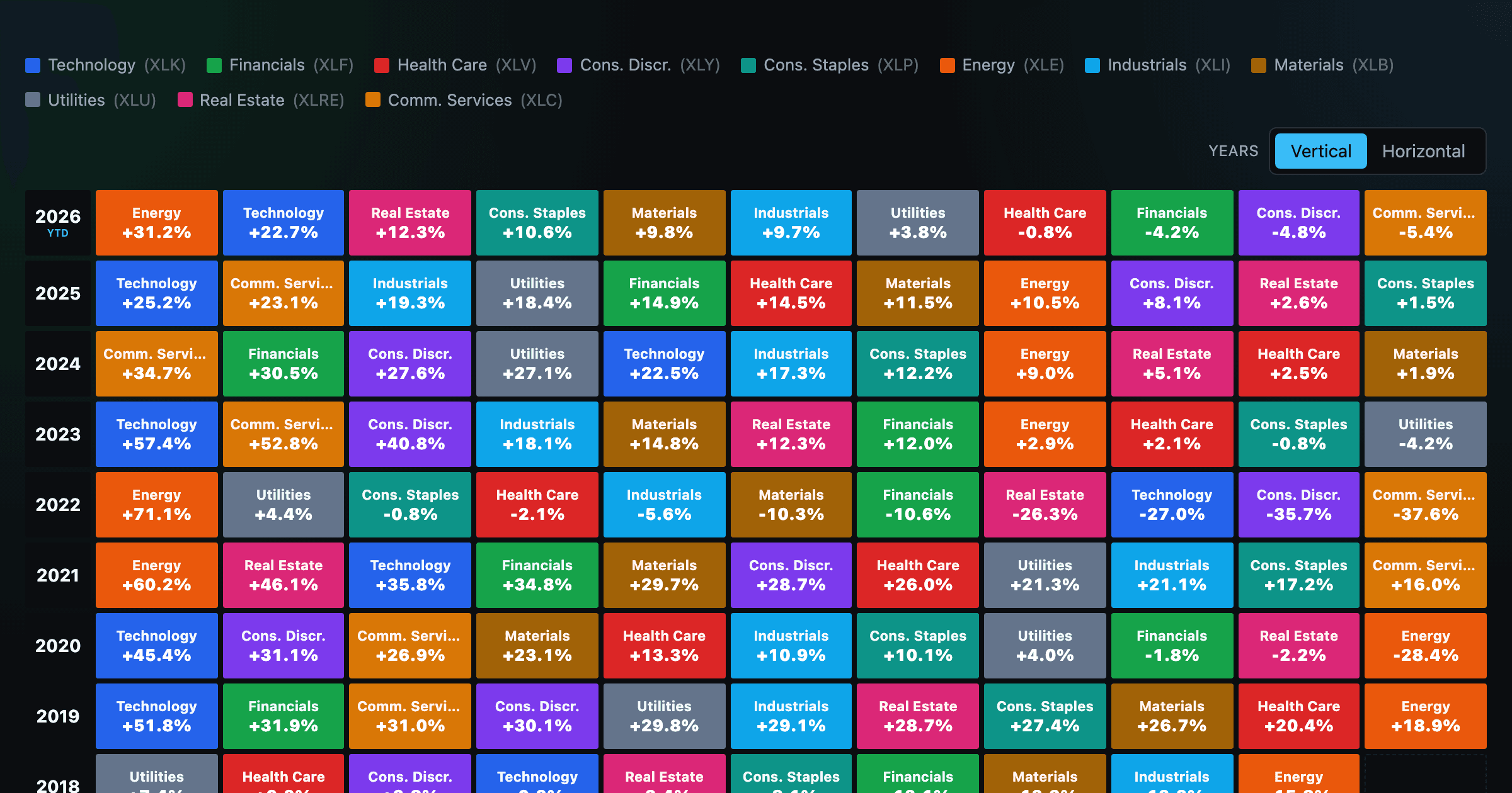
The 11 S&P 500 sectors ranked year by year — a sector quilt chart, back to 1999.
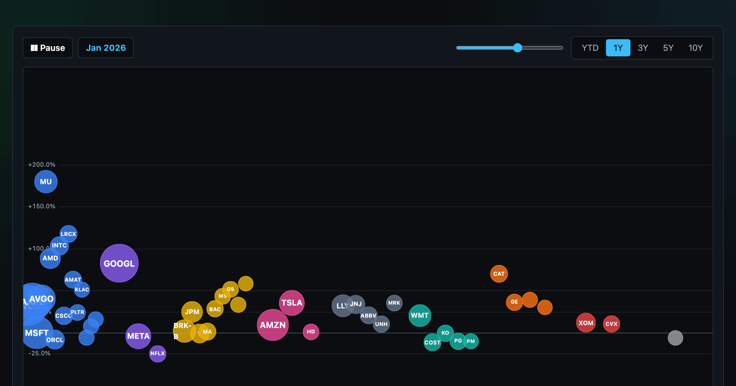
The biggest US companies as animated bubbles, rising and falling with their total return over time.

How recent stock-market debuts have performed since listing — annualized, vs the S&P 500, by IPO vs spin-off.
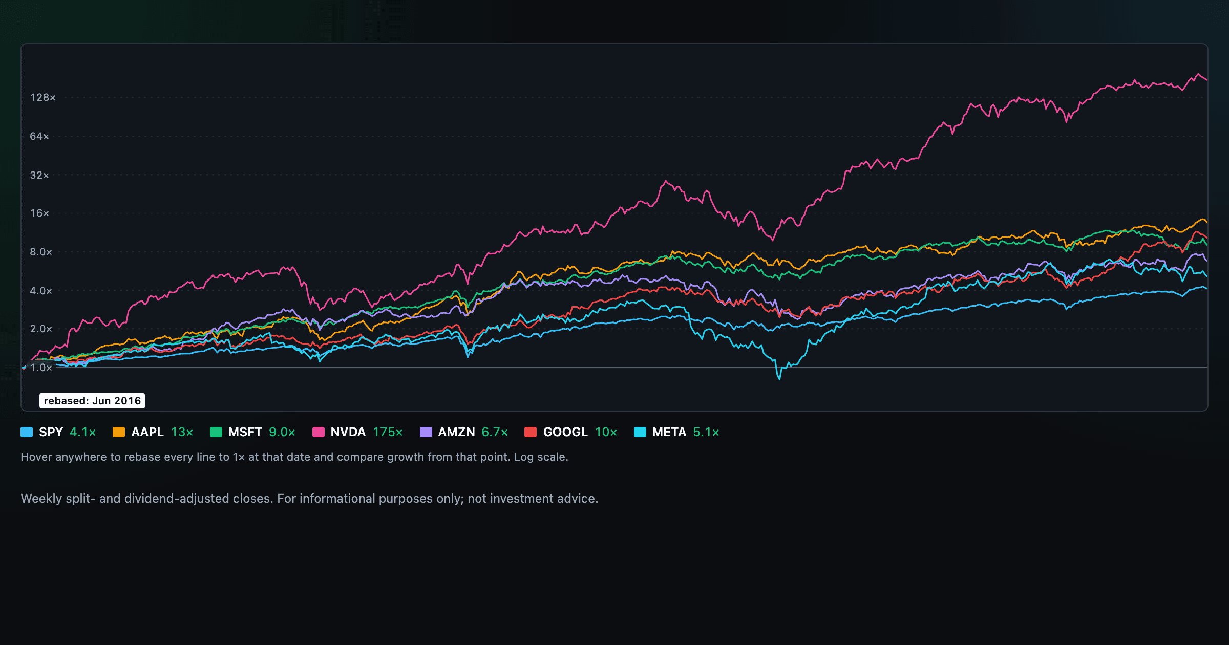
Compare megacaps vs the S&P 500, rebased to 1× at any date you hover.

Where today's S&P 500 return ranks against all history — and the forward returns that followed similar moments.
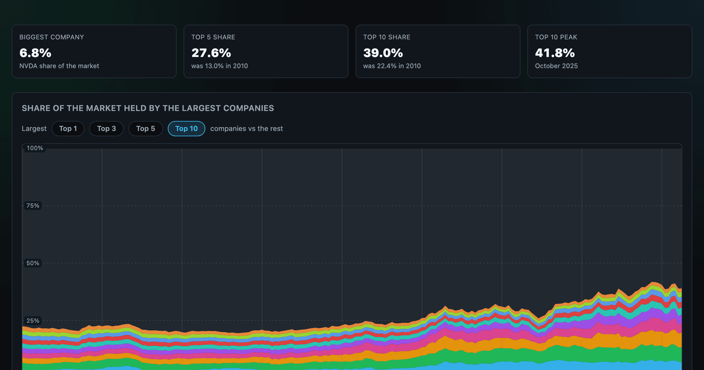
How top-heavy is the market? The top 1–10 companies' share of total market value, month by month since 2010.

Every company that ever cracked the market's top 10 since 2010 — who climbed, who faded, who never left.

Is the market expensive? The Shiller CAPE back to 1871 and what valuations have meant for the next decade.

The S&P 500 since 1871 — odds of gain by holding period, real drawdowns, and the growth of $1.

Stocks trading cheapest relative to their own P/E, P/FCF, P/S, or P/B history — with fair-value bands.

Follow a company's revenue through its income statement as a Sankey — costs, taxes, and profit.

Follow a company's cash from net income through operating cash flow into capex, buybacks, and dividends.

Monthly payment, principal vs interest by year, and the balance paydown — with extra-payment savings.
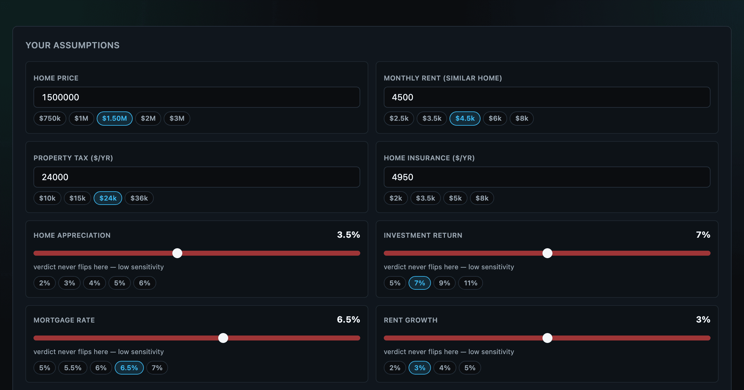
Should you rent or buy? Net-wealth verdict with sensitivity analysis of every assumption.