
Rent vs buy
For a $1,500,000 home (20% down, 6.5% mortgage) vs renting at $4,500/mo — assuming 3.5% home appreciation and 7% investment returns — after 5 years renting comes out ahead by about $392k. Renting wins if a similar home rents for under $9,865/mo. Adjust everything below — and see which assumptions actually move the answer.
Your assumptions
1.6% of value
0.33% of value
More assumptions (usually matter less)
Buyer's equity (net of selling costs): $551k · Renter's portfolio (upfront cash + differences, invested): $943k. Renting wins if you can rent a similar home for under $9,865/mo · renting wins at every horizon up to 40 years under these assumptions.
Net worth over time
The buyer's walk-away equity (home value net of selling costs, minus the loan) vs the renter's portfolio, year by year.
Advantage over time
Buyer's wealth minus renter's wealth if you cashed out after each year.
The two variables that decide it
Home appreciation vs investment return, everything else at your assumptions. The dot is you — point at a cell to test another combination.
What matters most
How far the verdict swings as each variable crosses a plausible range, the rest held at your assumptions. Hover a bar for the endpoints.
Methodology
The comparison follows the standard "invest the difference" approach: the renter invests the buyer's upfront cash (down payment + closing costs) and, each year, the difference between the buyer's total cost of ownership (mortgage payment, property tax, insurance, maintenance) and rent — in whichever direction it runs. The buyer's wealth is home equity net of selling costs; the renter's is the portfolio. Annual compounding; mortgage amortized monthly. Simplifications: no mortgage-interest tax deduction (the post-2017 standard deduction makes it irrelevant for most households), no capital-gains taxes on either side, no PMI or HOA (add them to maintenance if relevant), and constant rates throughout. The point of the sensitivity views is precisely that these second-order terms matter far less than the appreciation-vs-returns spread. Estimates for planning, not financial advice.
FAQ#
- Is it better to rent or buy?
- It depends almost entirely on four things: how fast the home appreciates, what your investments would earn instead, how long you stay, and the rent-to-price ratio of your market. Under these assumptions (3.5% appreciation, 7% investment returns, staying 5 years), renting comes out ahead for a $1,500,000 home vs $4,500/mo rent — but small changes in those inputs flip the answer, which is what the sensitivity charts on this page show.
- What is the most important variable in rent vs buy?
- The spread between home-price appreciation and what your invested money would earn otherwise. A house is a leveraged bet on home prices funded by cash that could compound elsewhere — if stocks outrun your home by a few points a year, renting usually wins; if the home keeps pace (with leverage), buying does. Mortgage rate, rent growth and how long you stay come next; insurance, taxes and closing costs rarely change the verdict.
- How long do I need to stay for buying to make sense?
- Upfront costs (closing, then ~6% selling costs) mean buying starts several tens of thousands behind and catches up over time. Under these assumptions the breakeven is beyond 40 years — but check the "Advantage over time" chart with your own numbers.
More visualizations
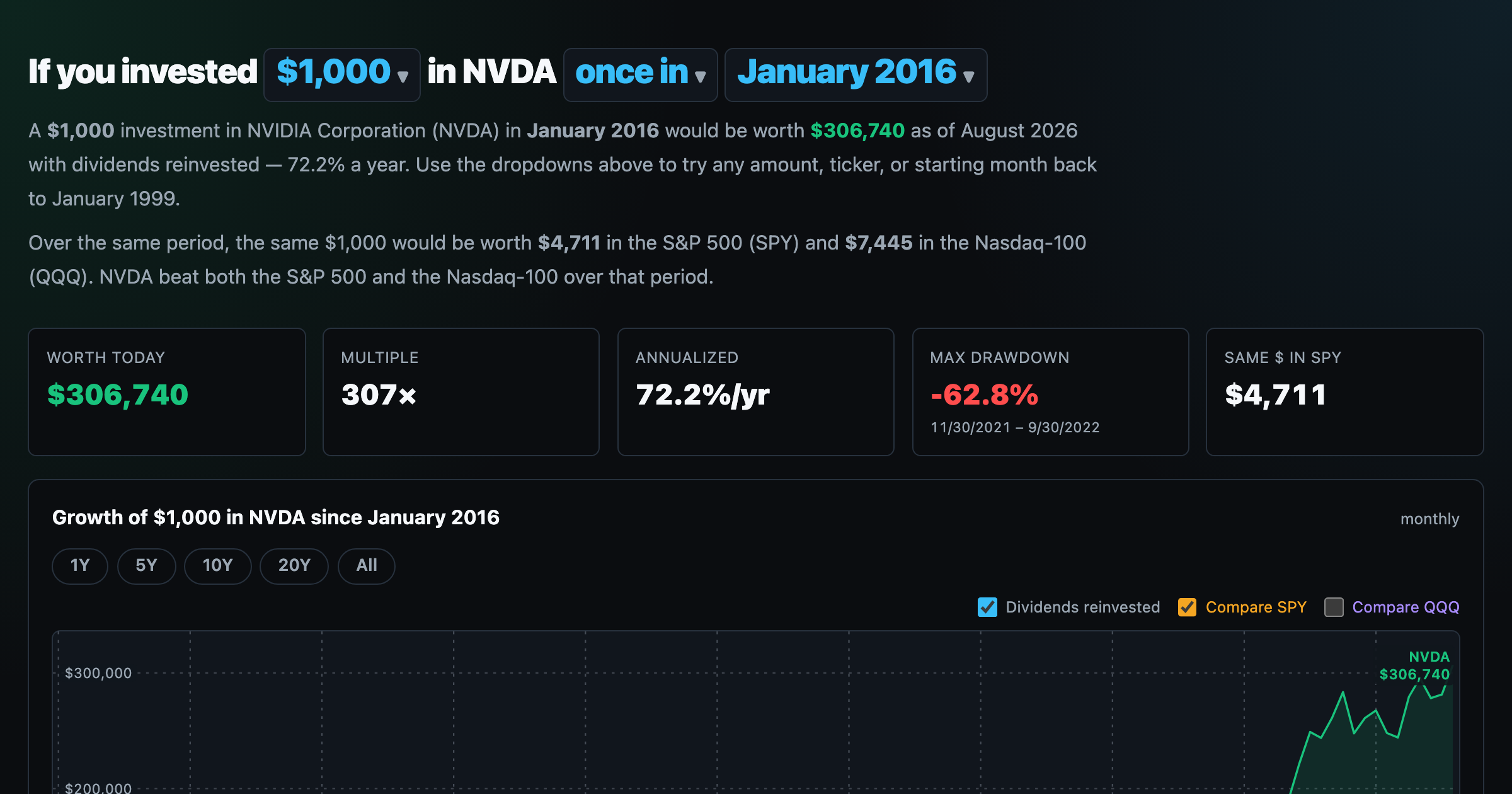
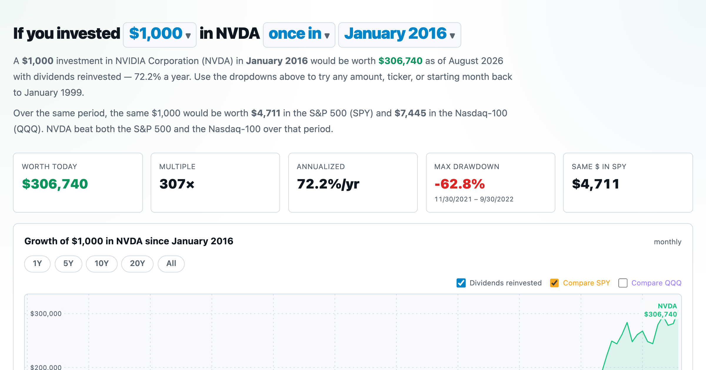
What $1,000 in any stock or ETF would be worth today.
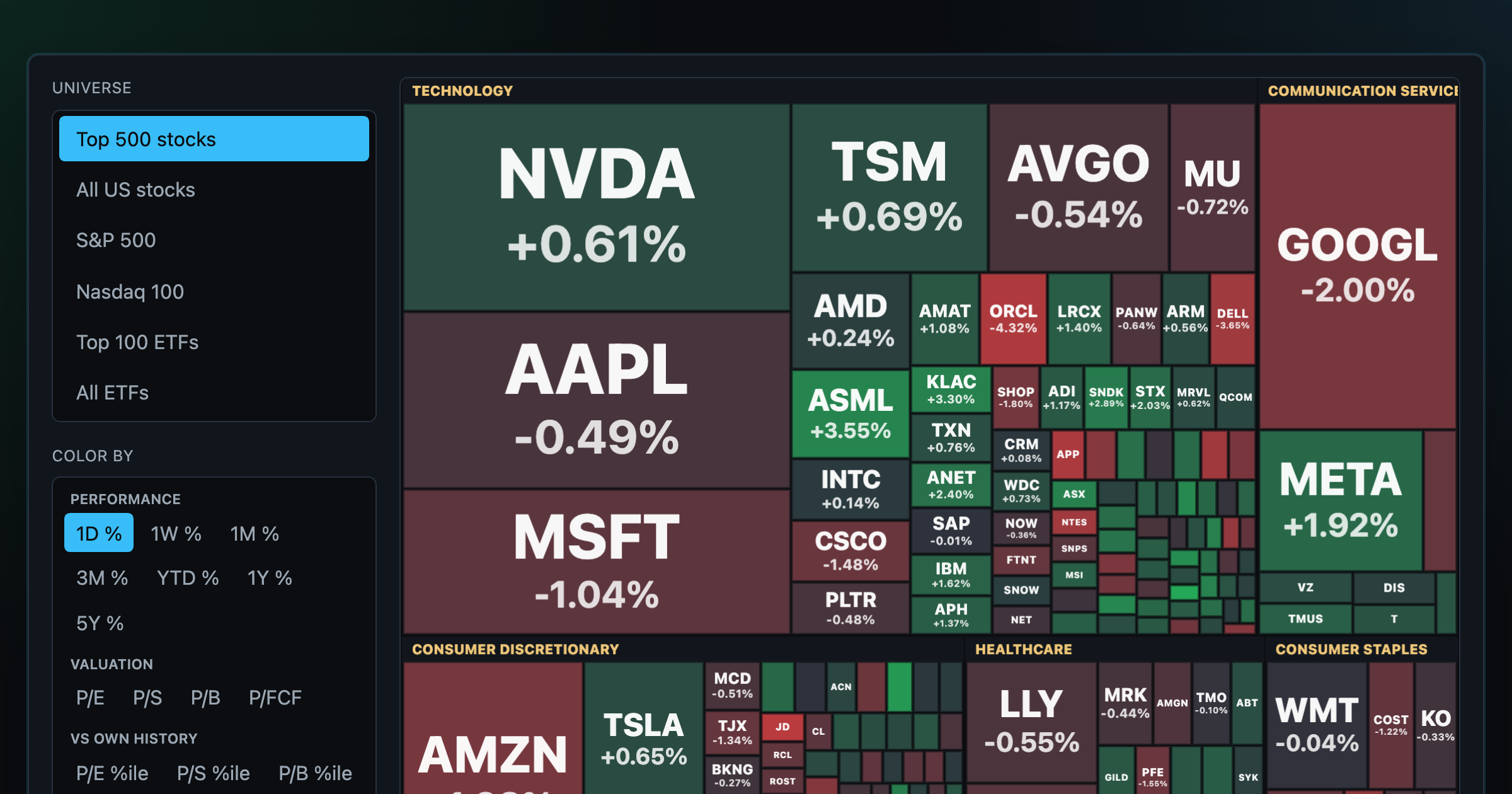
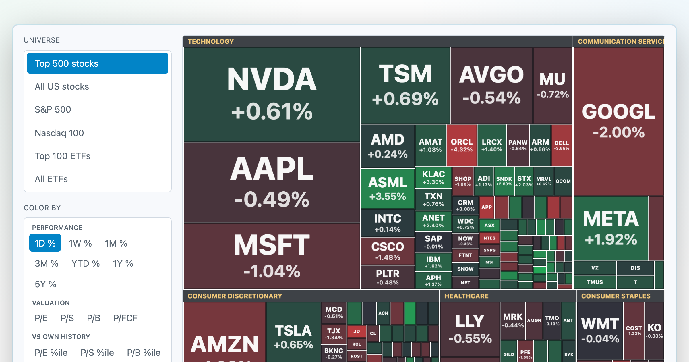
Every S&P 500 company sized by market cap — color by return or valuation.
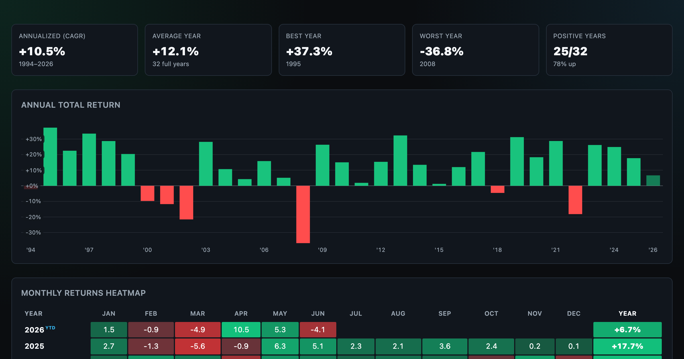
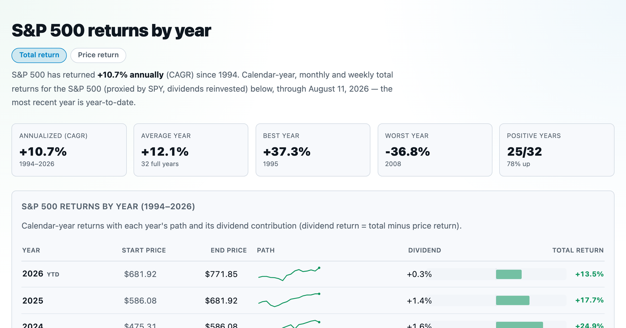
S&P 500 returns by year, month, week and trailing period — total or price return.
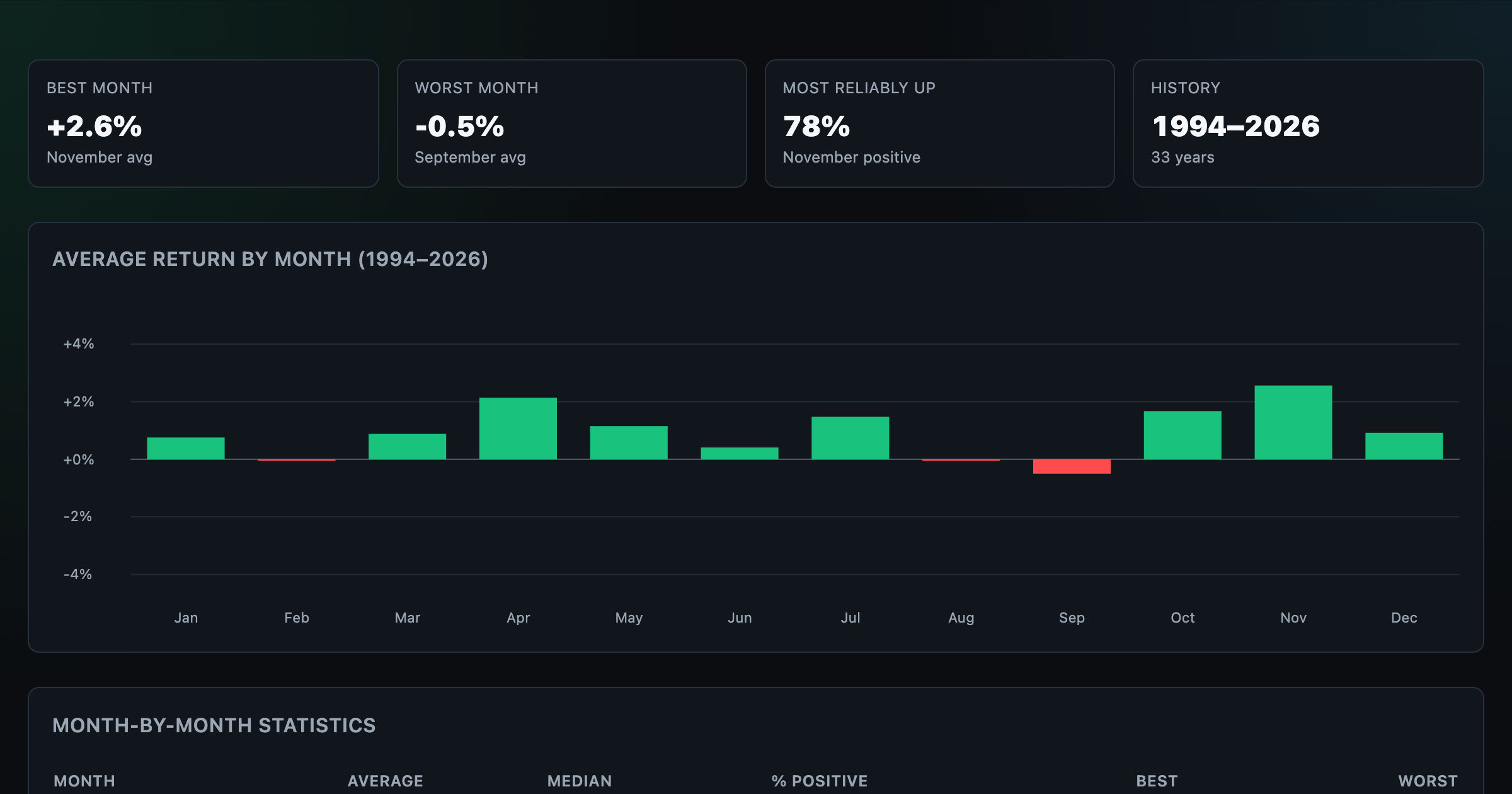
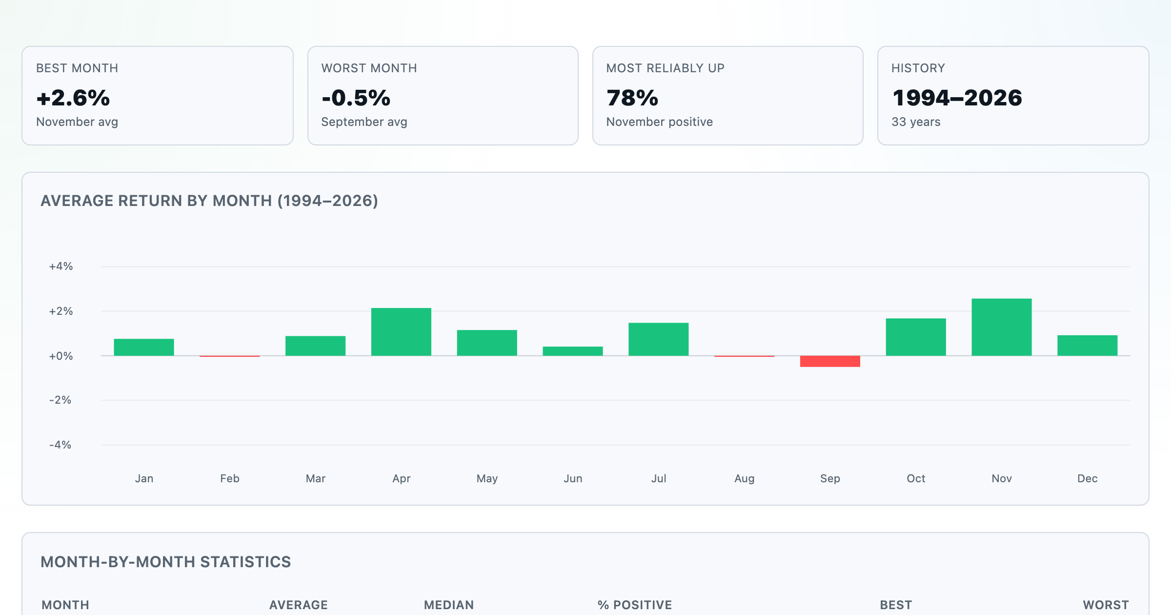
Which month is best for stocks? Average return of every calendar month, for any ticker.
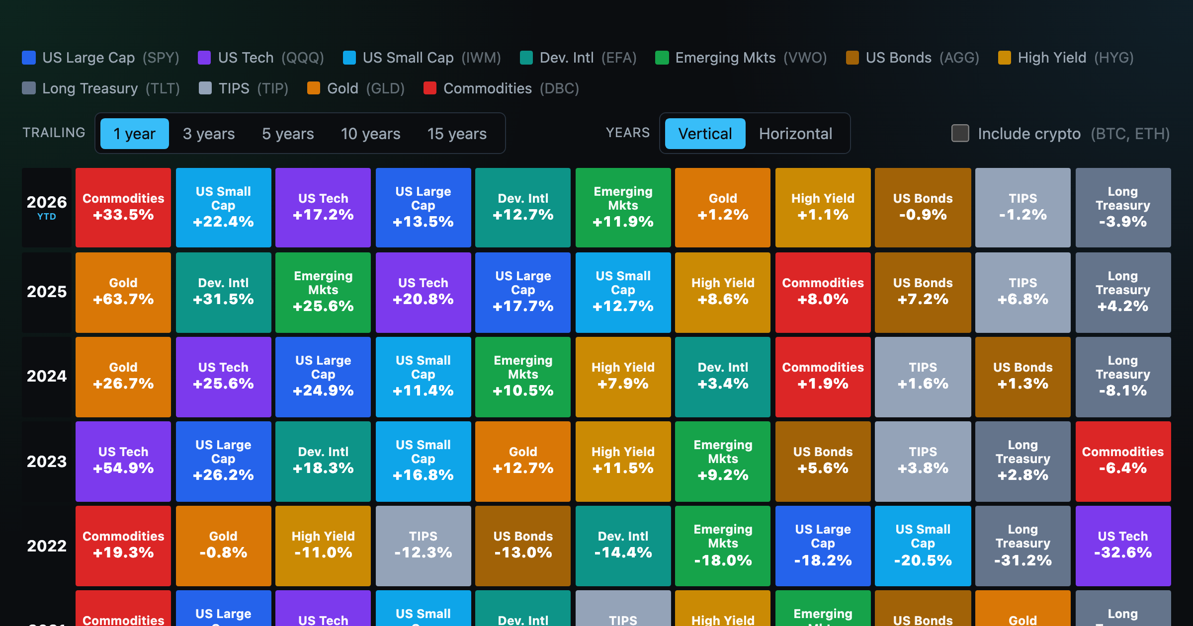
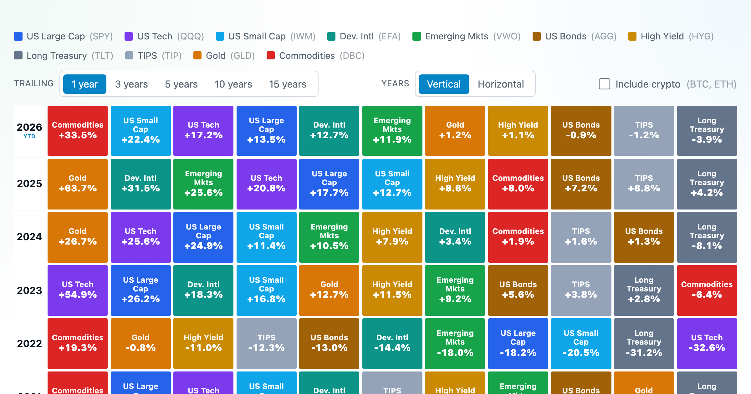
Asset-class returns ranked year by year — the Callan chart / asset allocation quilt.
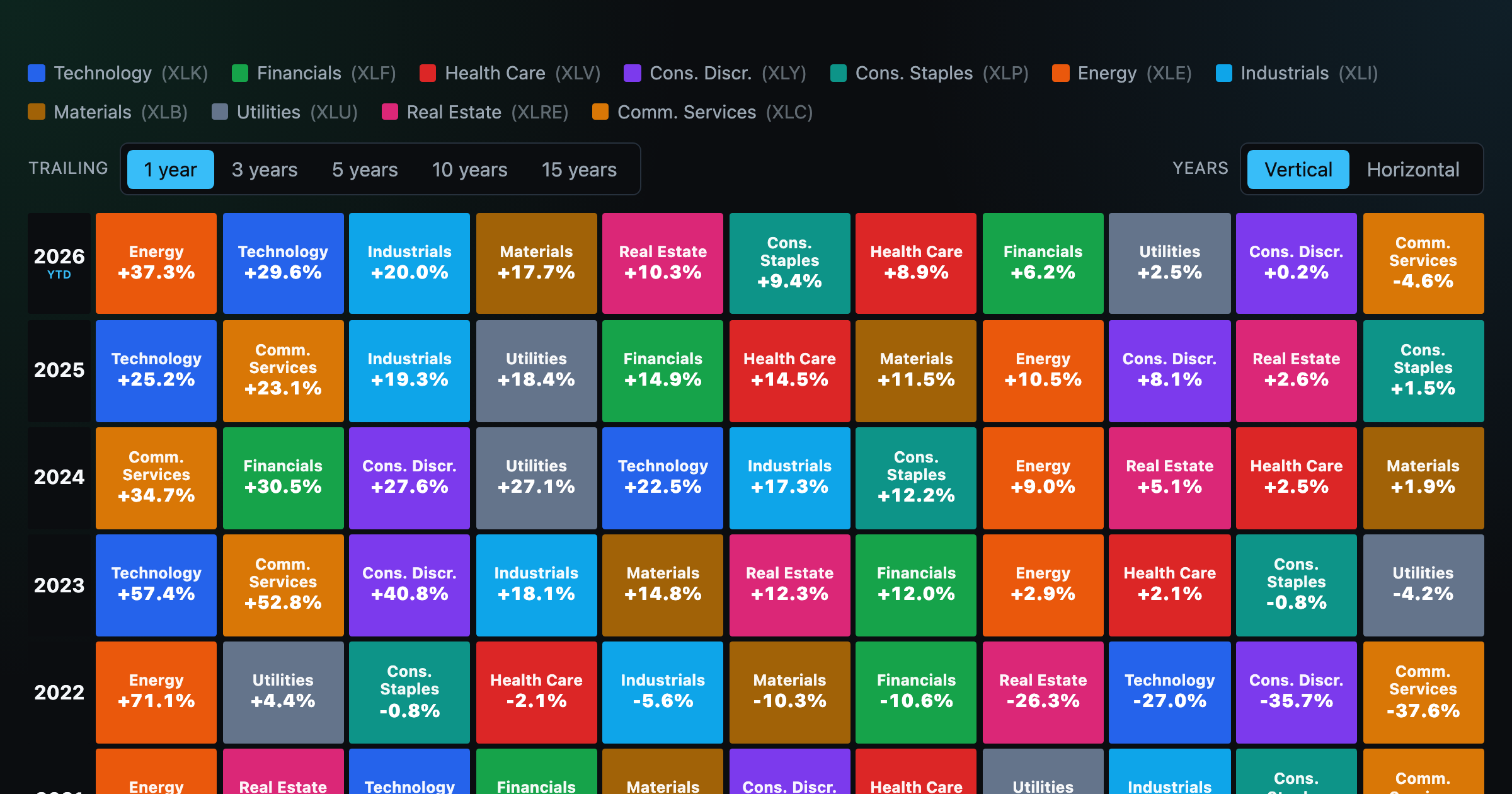
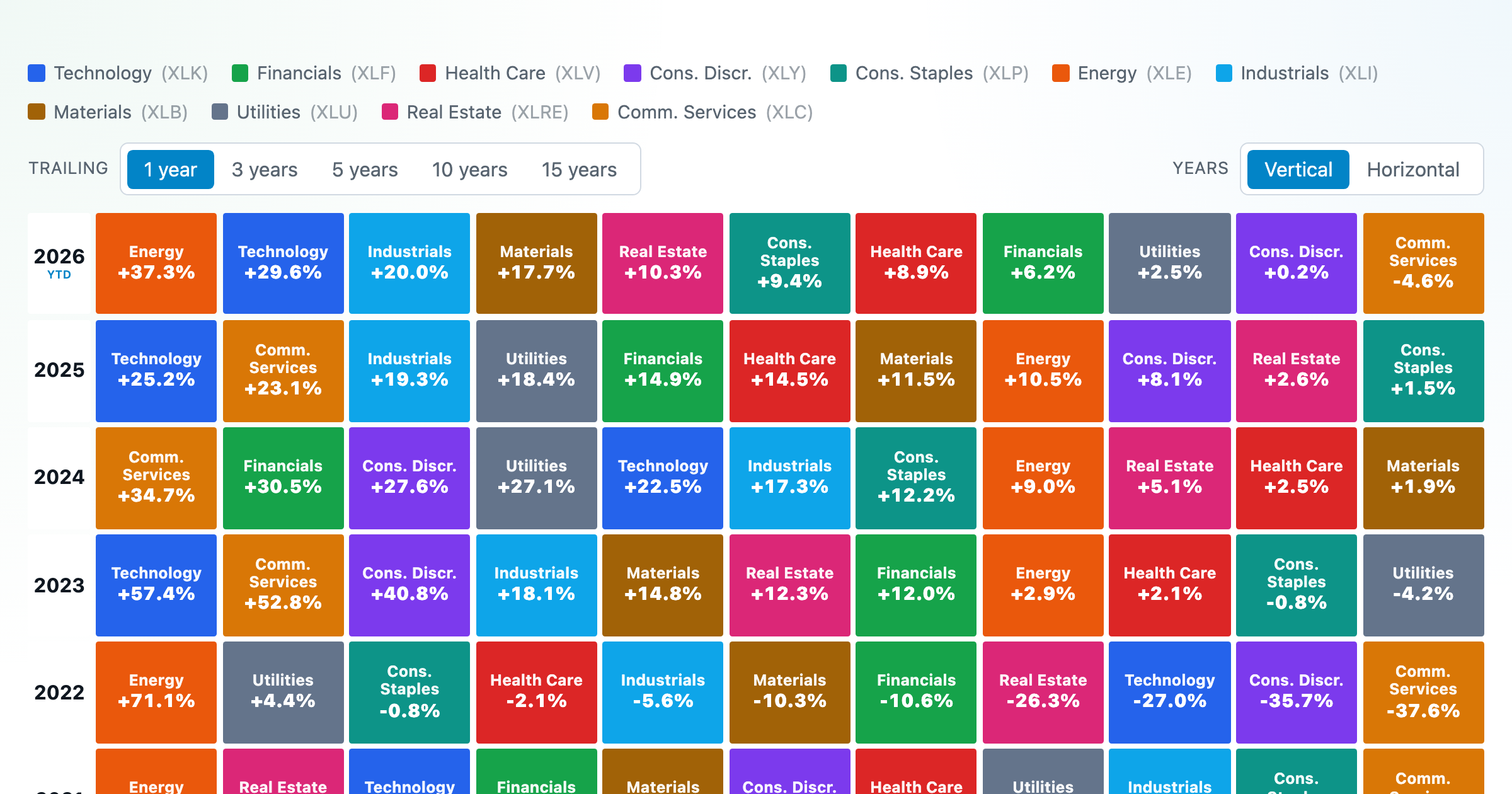
The 11 S&P 500 sectors ranked year by year — a sector quilt chart, back to 1999.

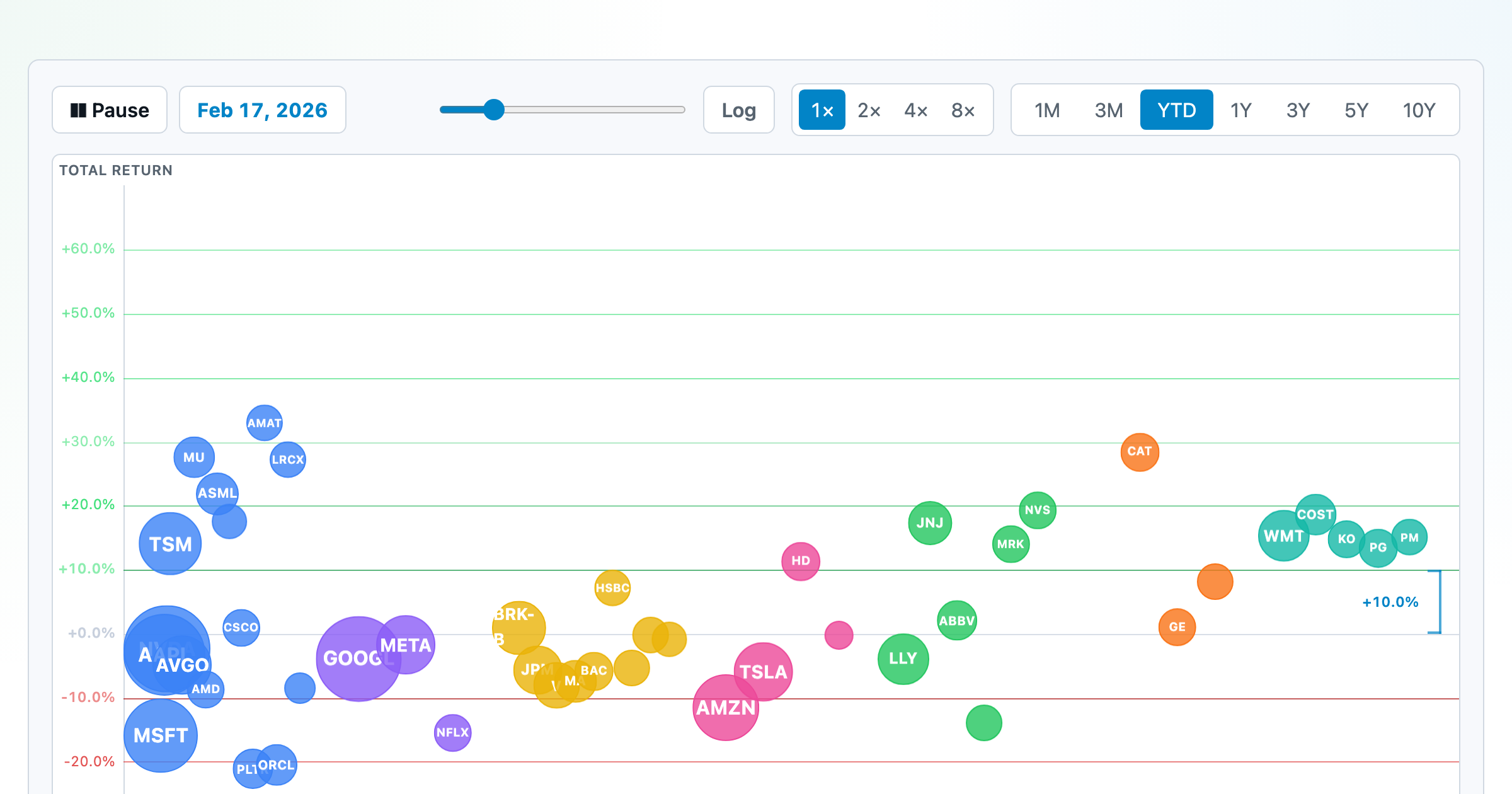
The biggest US companies as animated bubbles, rising and falling with their total return over time.
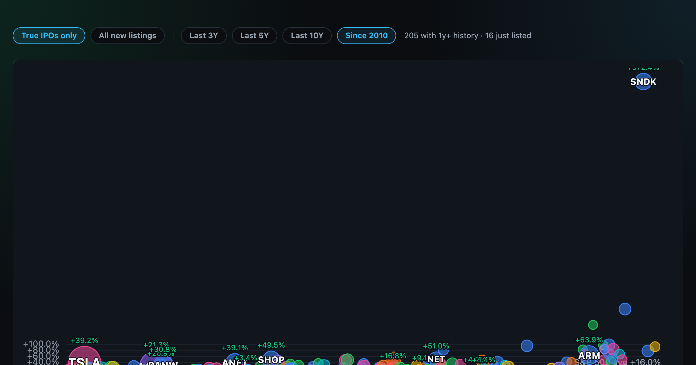
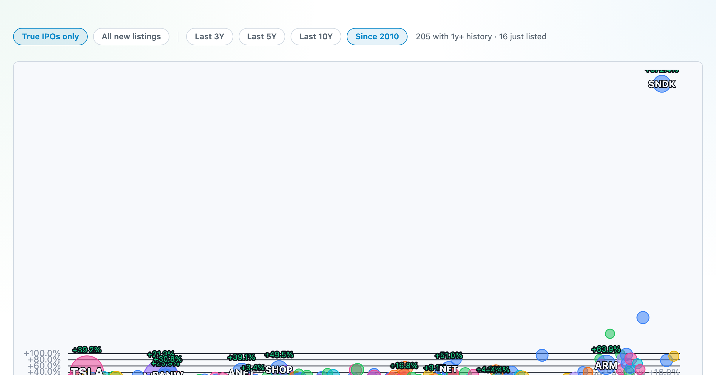
How recent stock-market debuts have performed since listing — annualized, vs the S&P 500, by IPO vs spin-off.
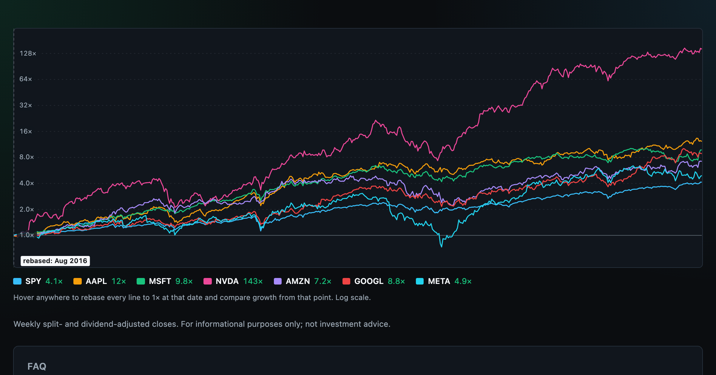
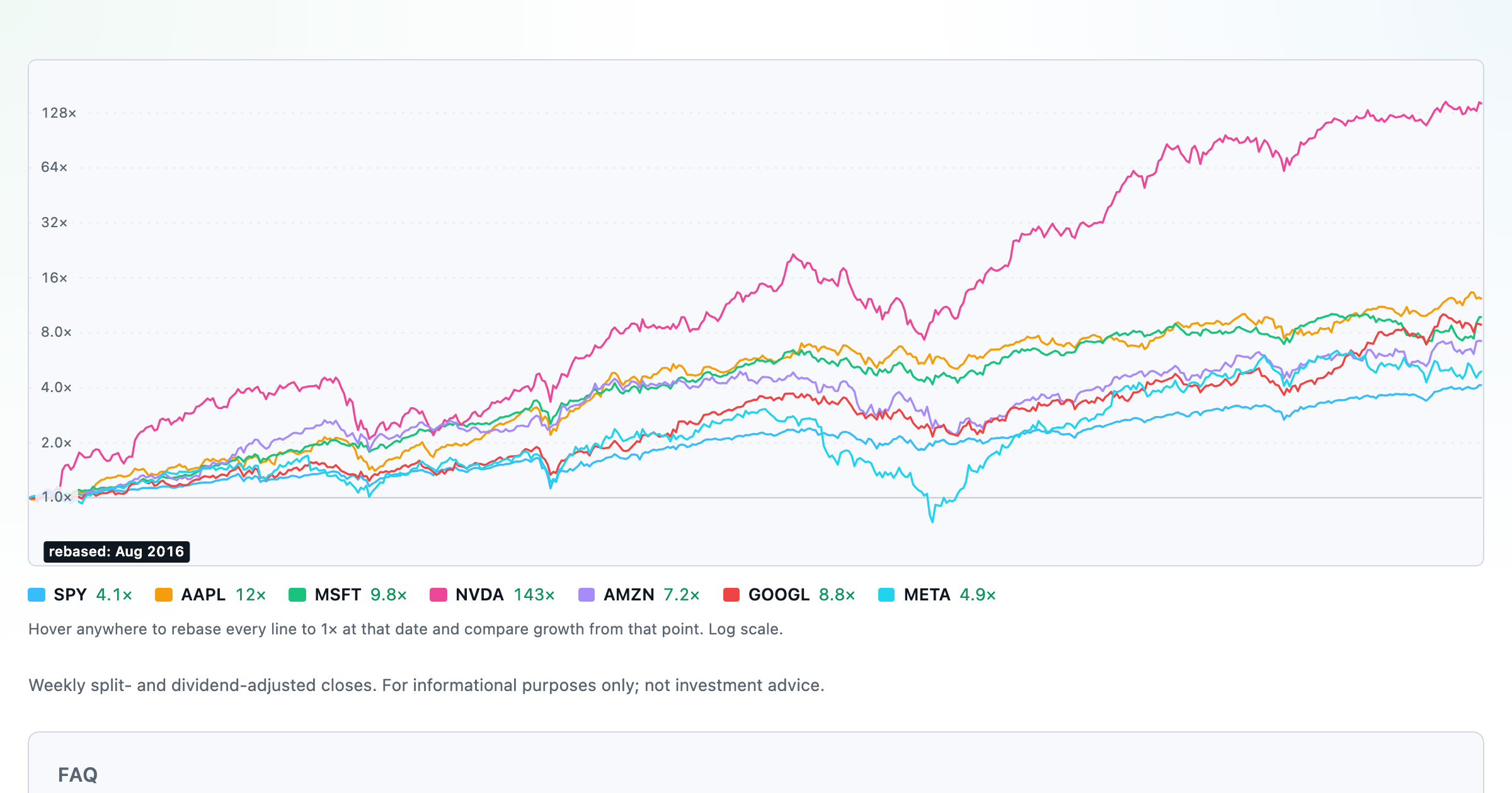
Compare megacaps vs the S&P 500, rebased to 1× at any date you hover.

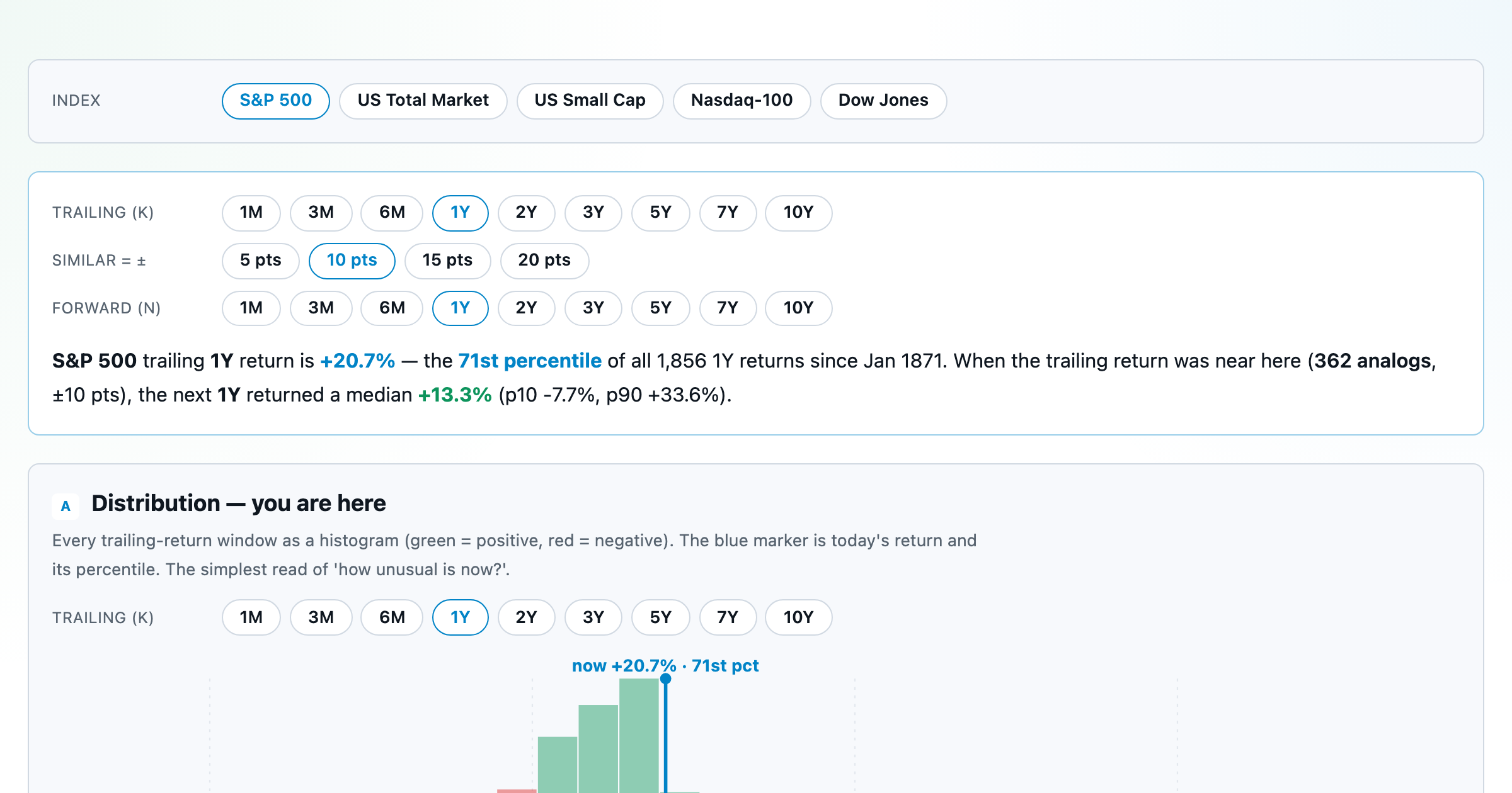
Where today's S&P 500 return ranks against all history — and the forward returns that followed similar moments.
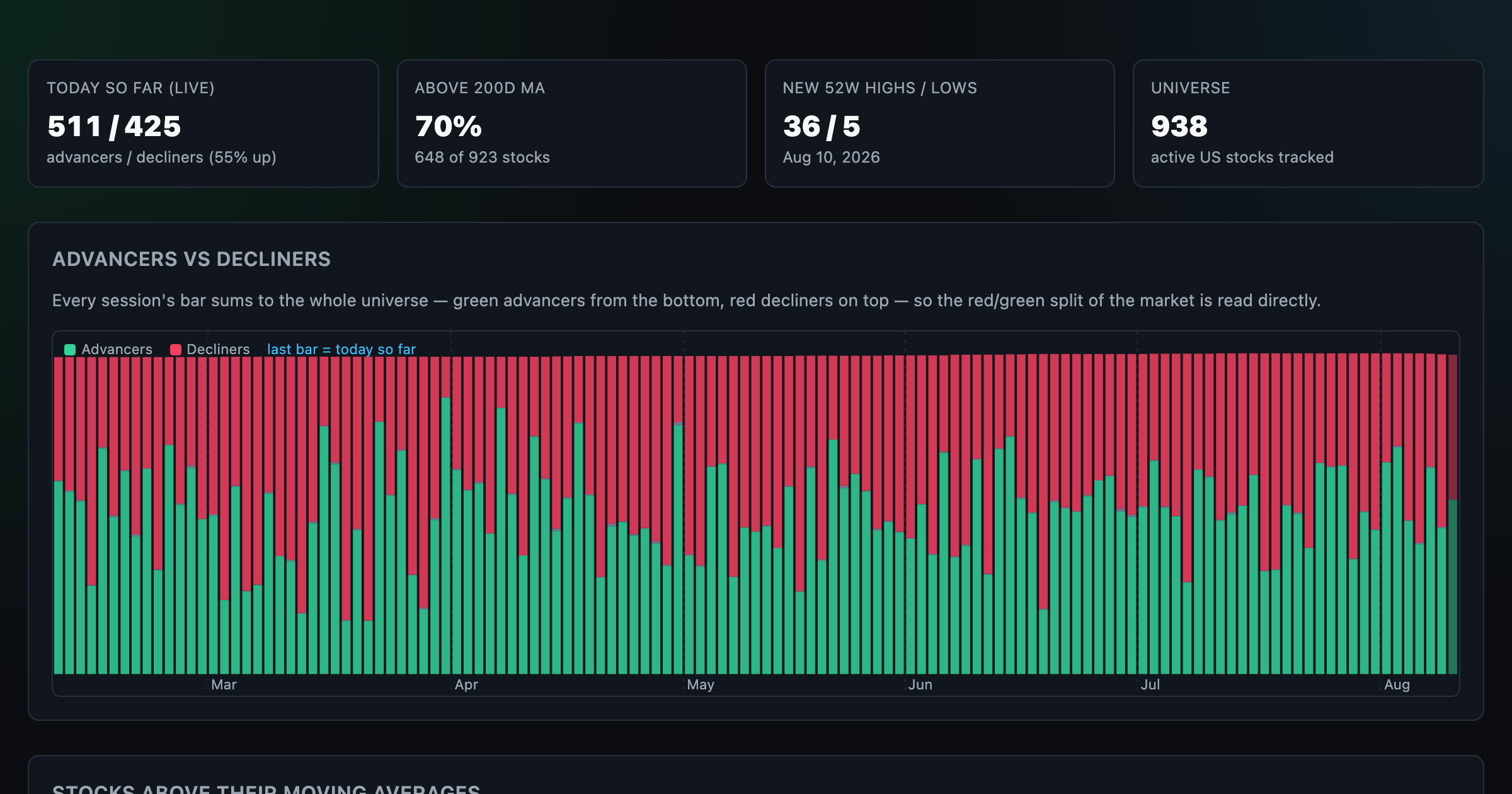
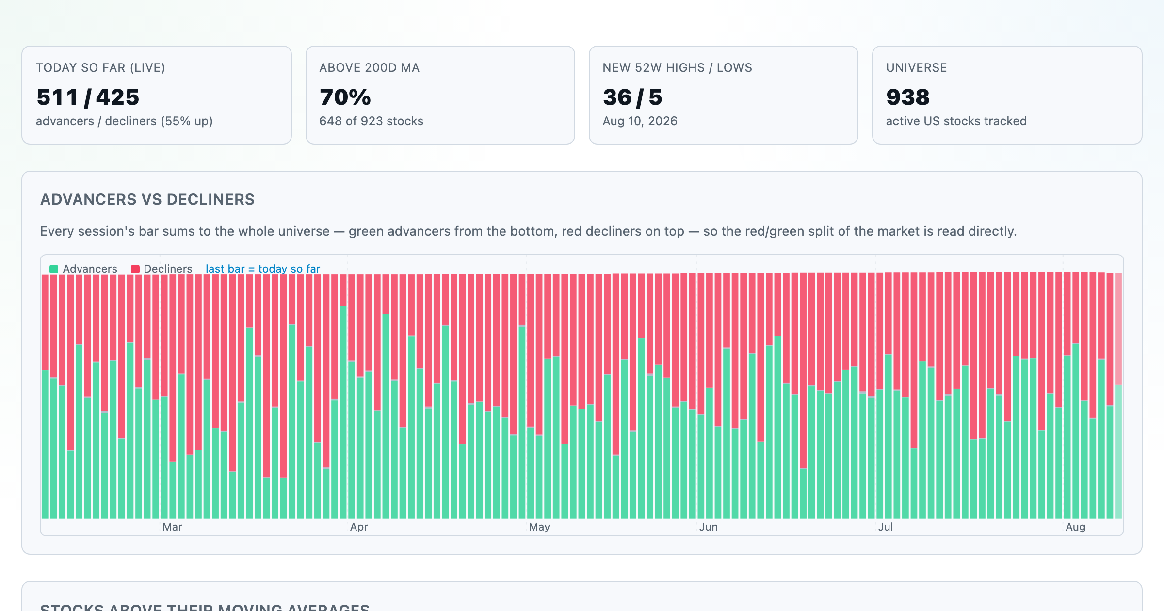
Advancers vs decliners over time, % of stocks above their moving averages, new highs vs lows, and breadth across every trailing window.
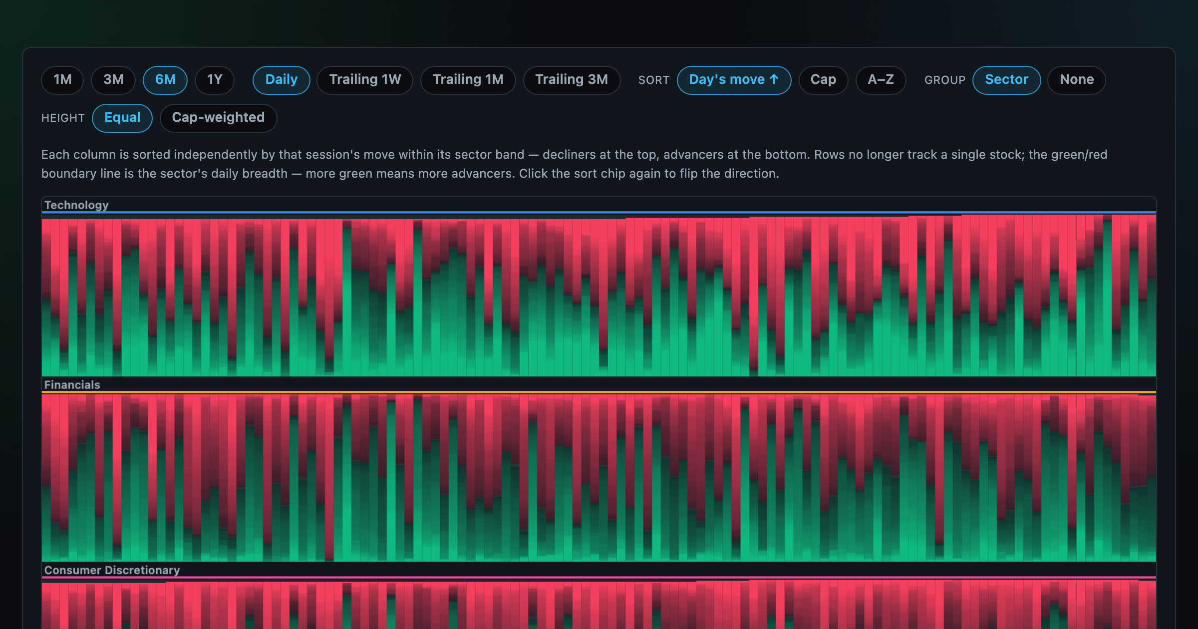
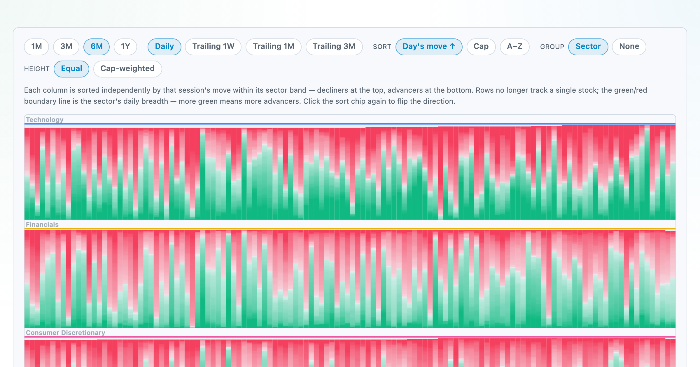
Every stock as a row, every day as a column — market selloffs are vertical stripes, sector routs are blocks.
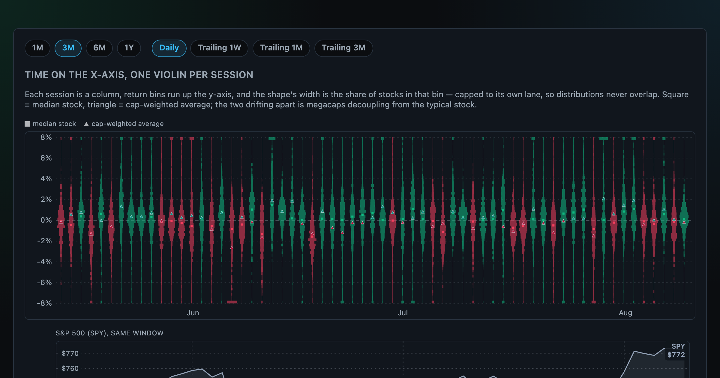
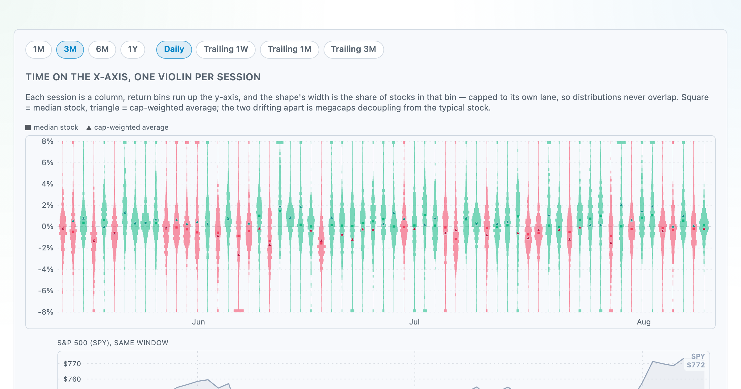
Each session's full distribution of stock returns as an upright violin, with the S&P 500 on the same axis — shifts, dispersion, and fat tails at a glance.
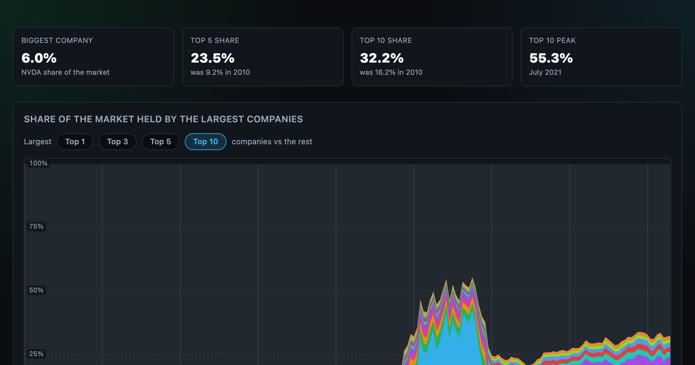
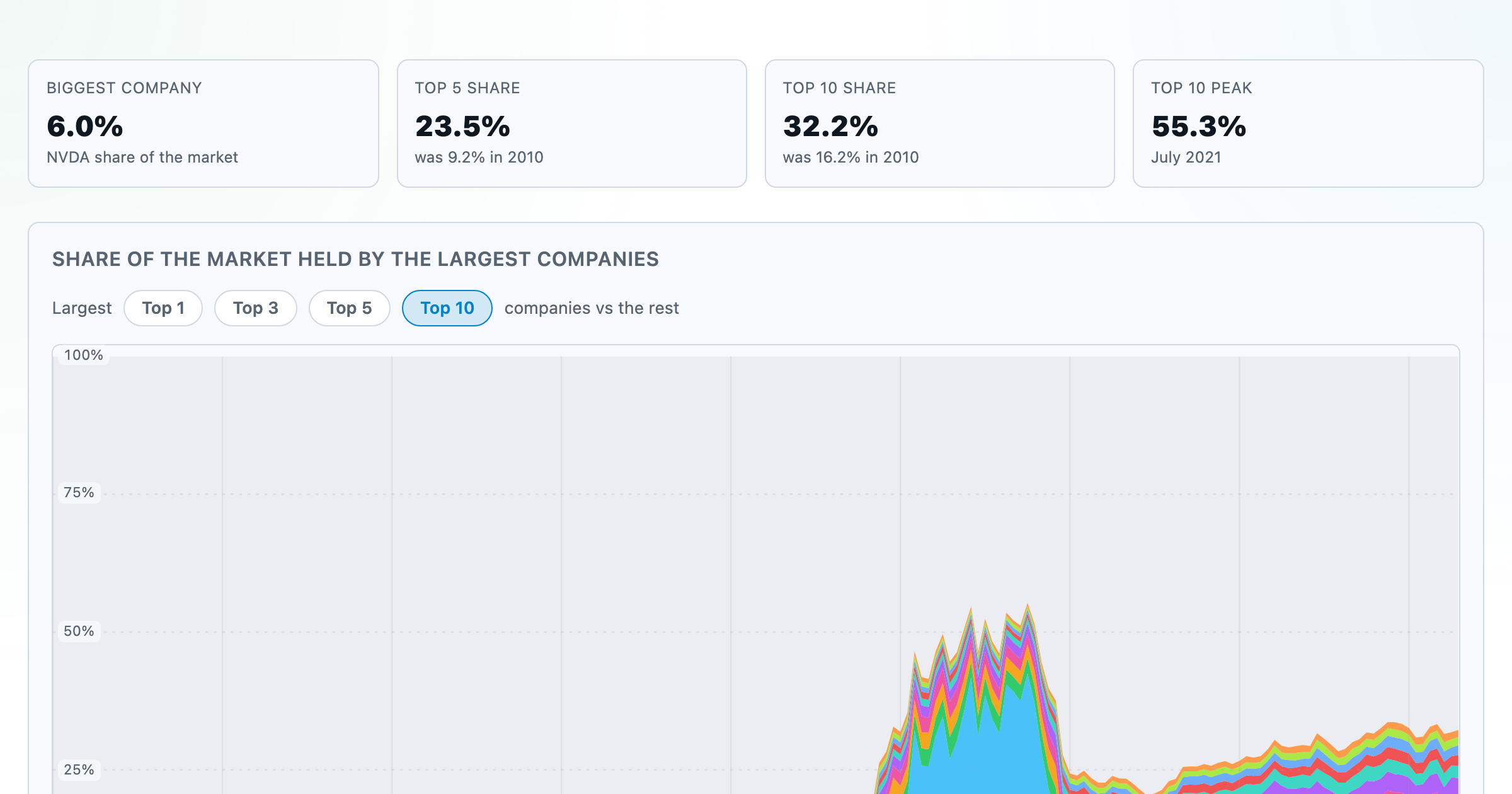
How top-heavy is the market? The top 1–10 companies' share of total market value, month by month since 2010.
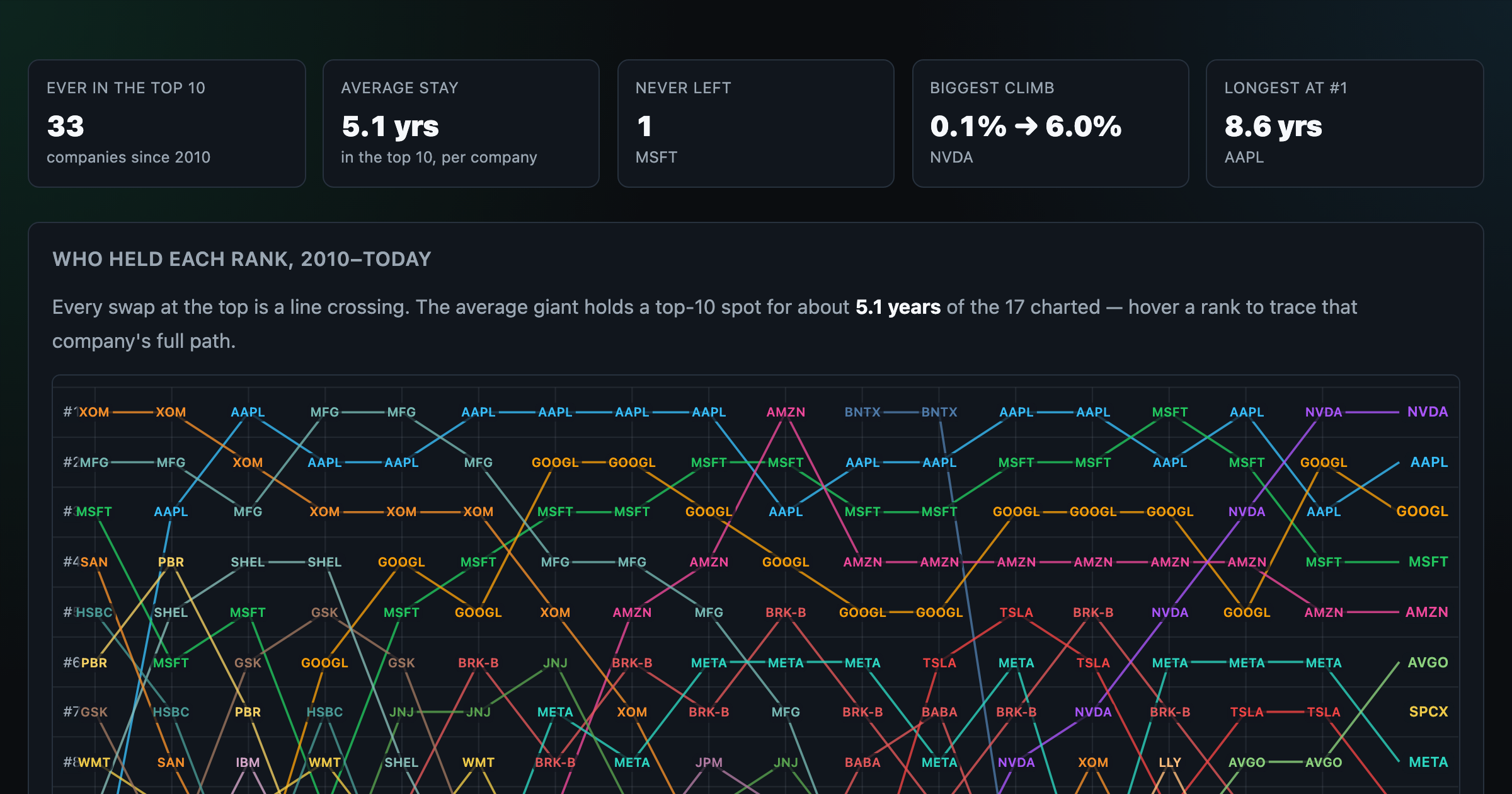
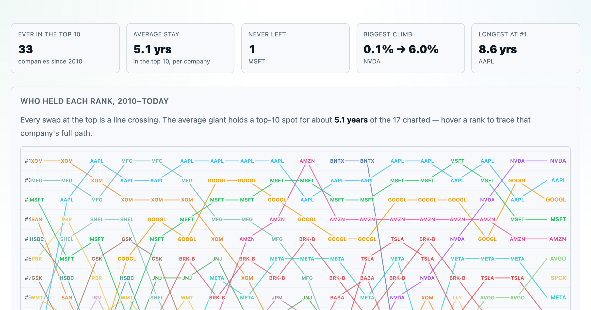
Every company that ever cracked the market's top 10 since 2010 — who climbed, who faded, who never left.
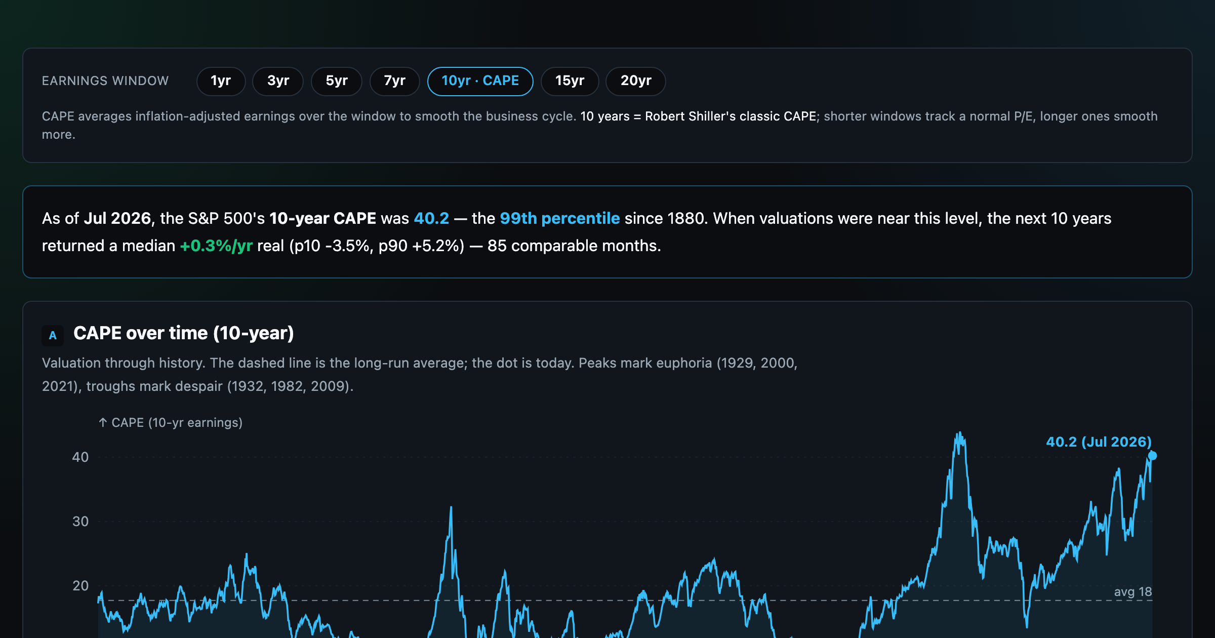
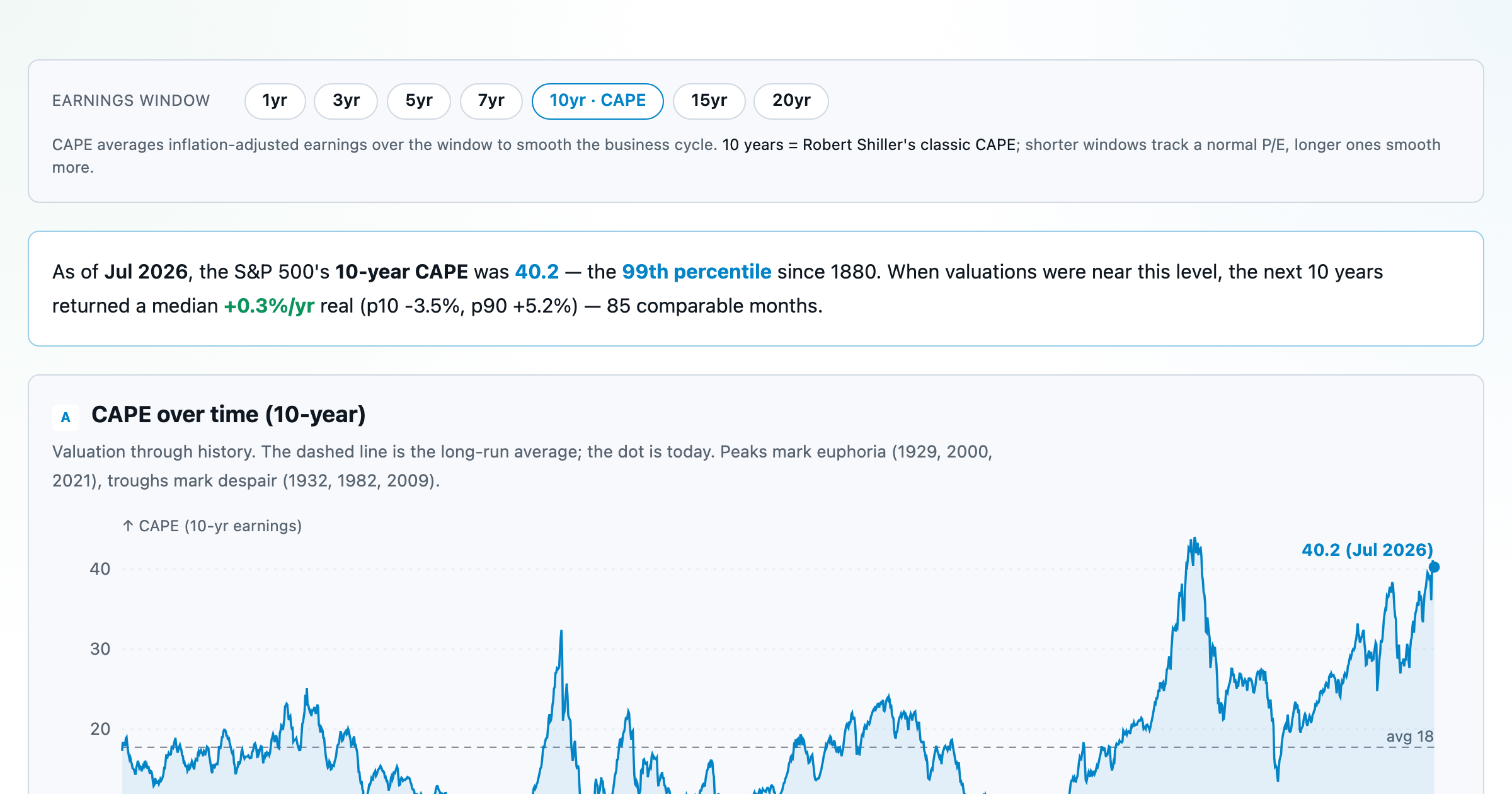
Is the market expensive? The Shiller CAPE back to 1871 and what valuations have meant for the next decade.
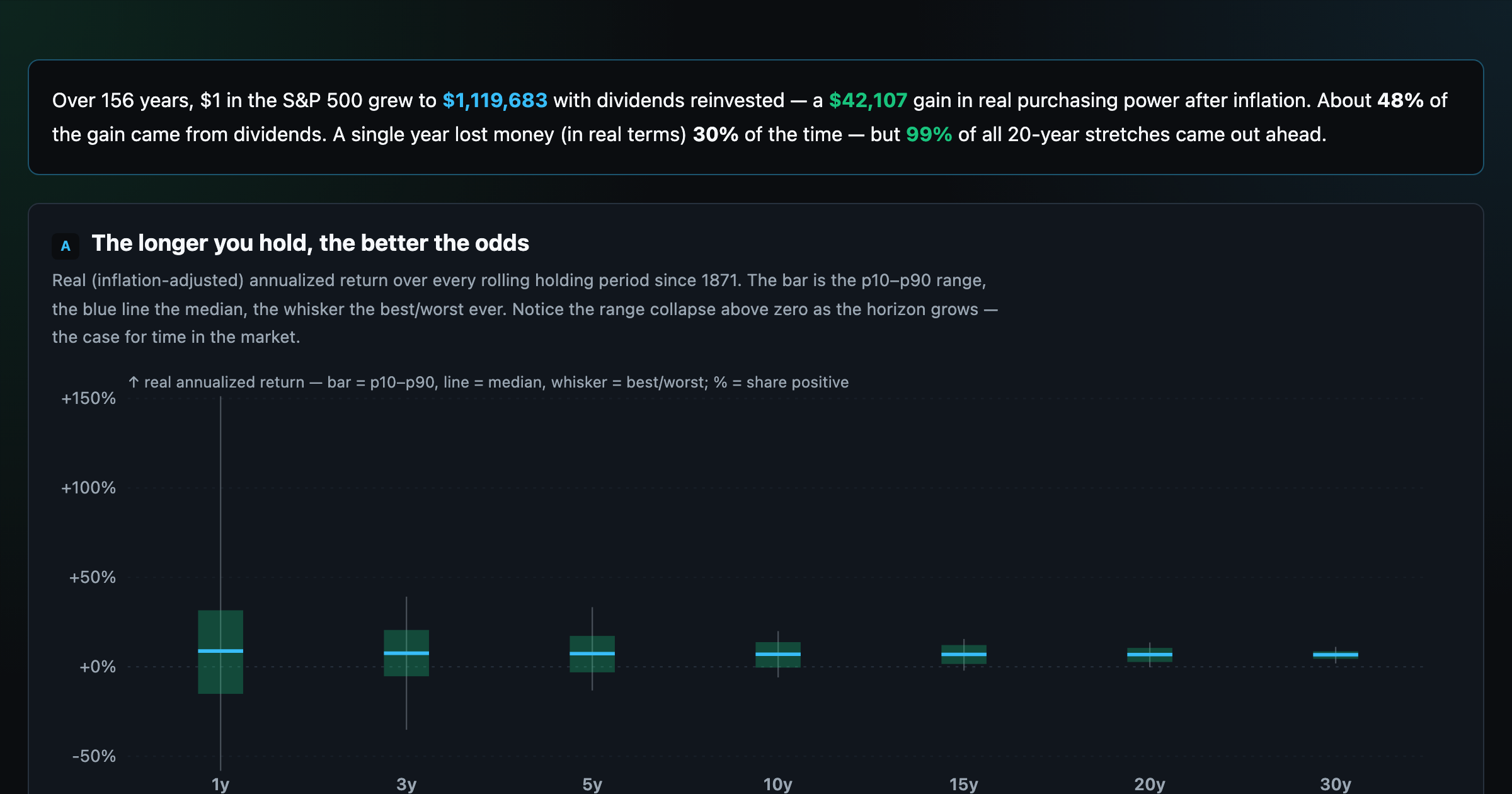
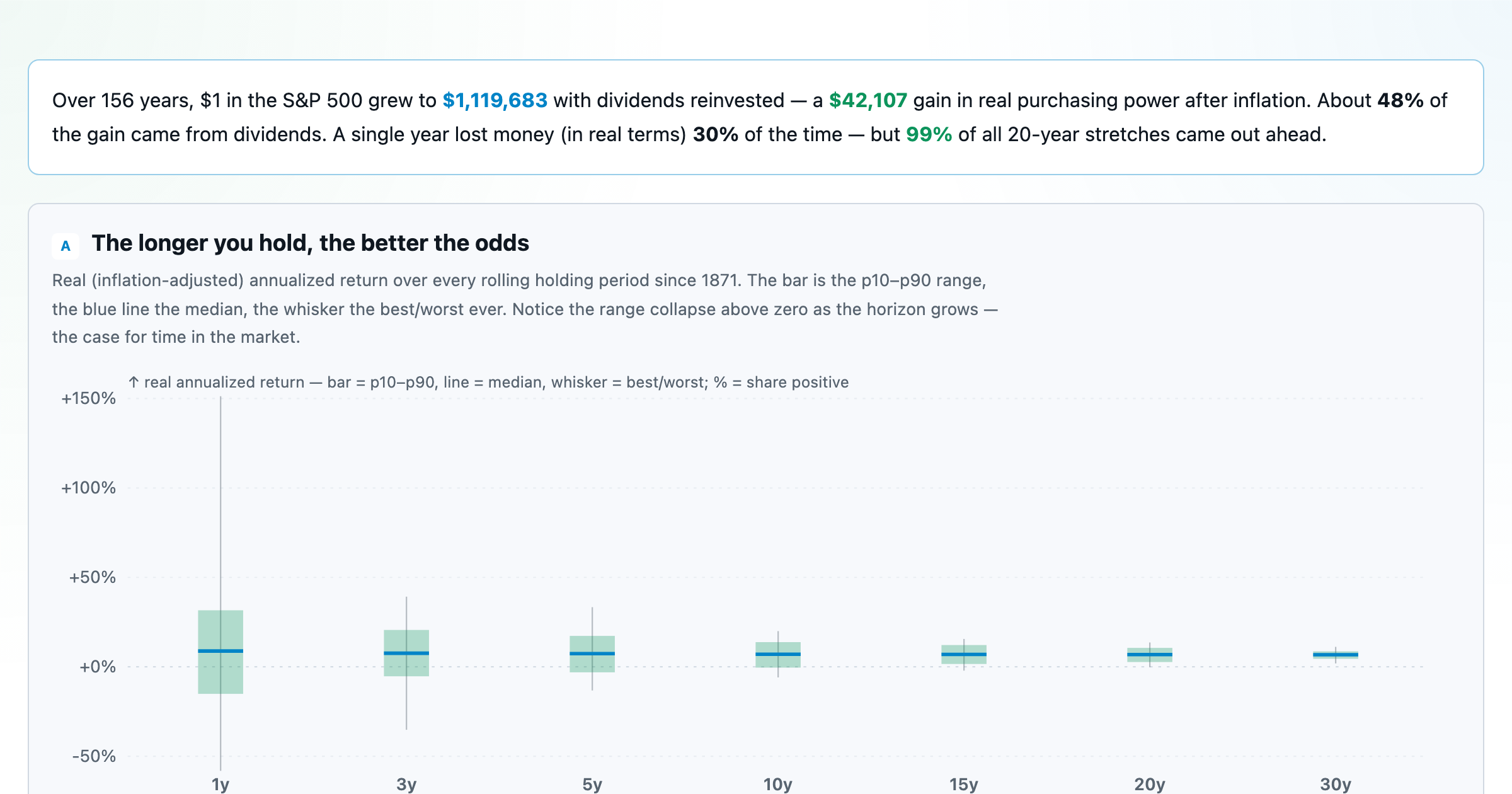
The S&P 500 since 1871 — odds of gain by holding period, real drawdowns, and the growth of $1.
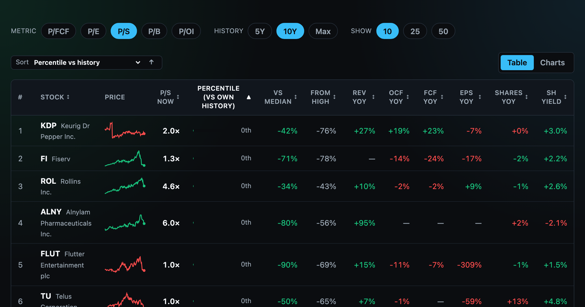
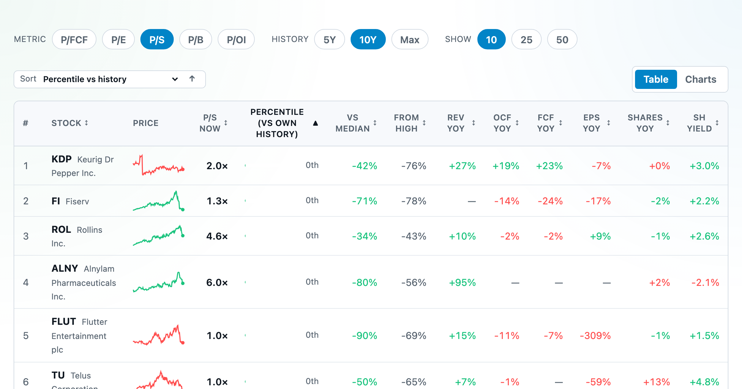
Stocks trading cheapest relative to their own P/E, P/FCF, P/S, or P/B history — with fair-value bands.
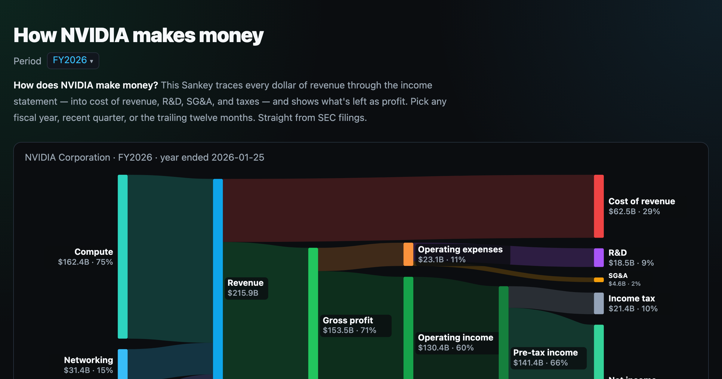
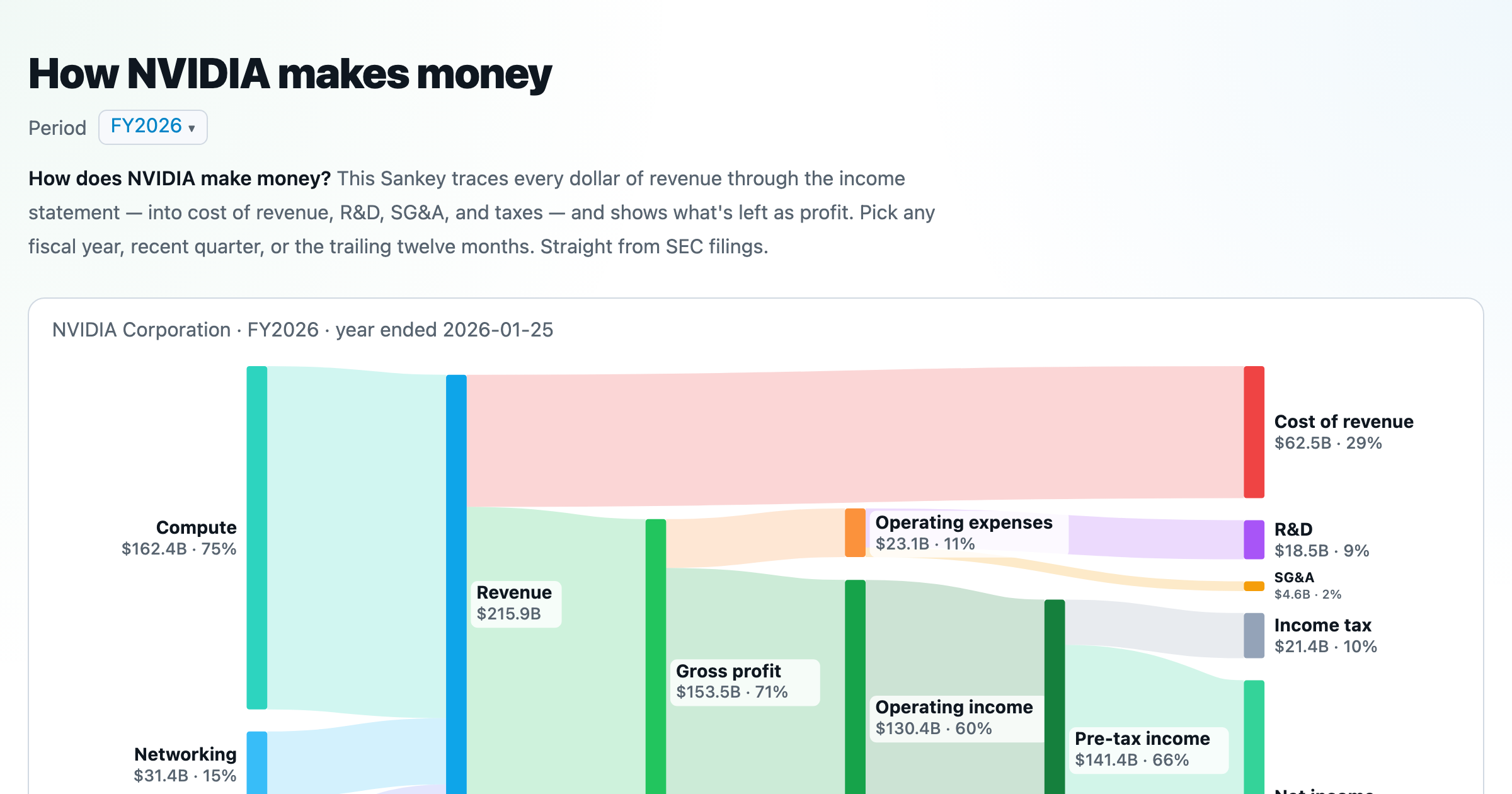
Follow a company's revenue through its income statement as a Sankey — costs, taxes, and profit.
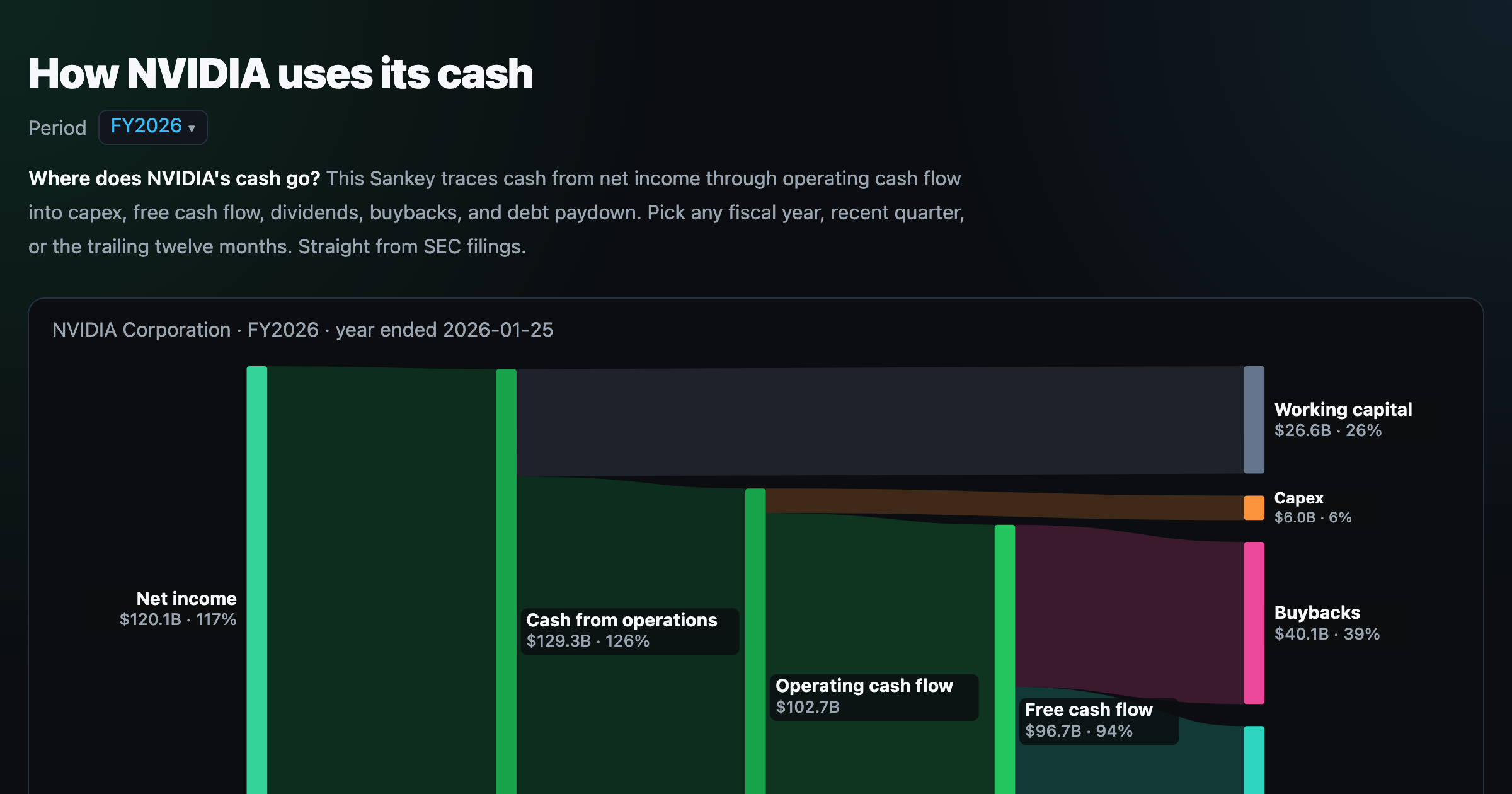
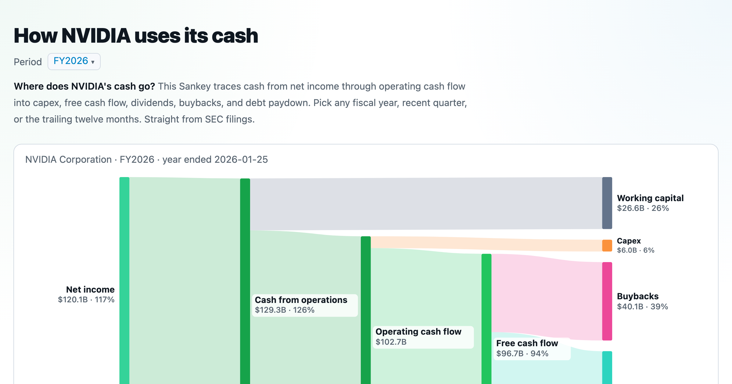
Follow a company's cash from net income through operating cash flow into capex, buybacks, and dividends.
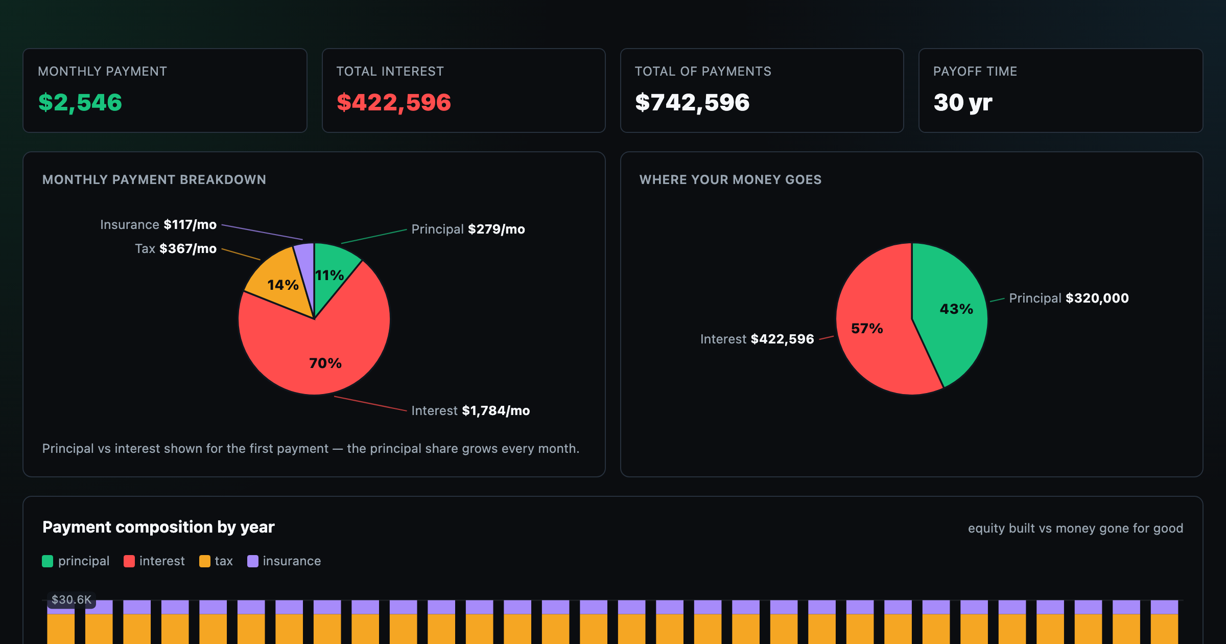
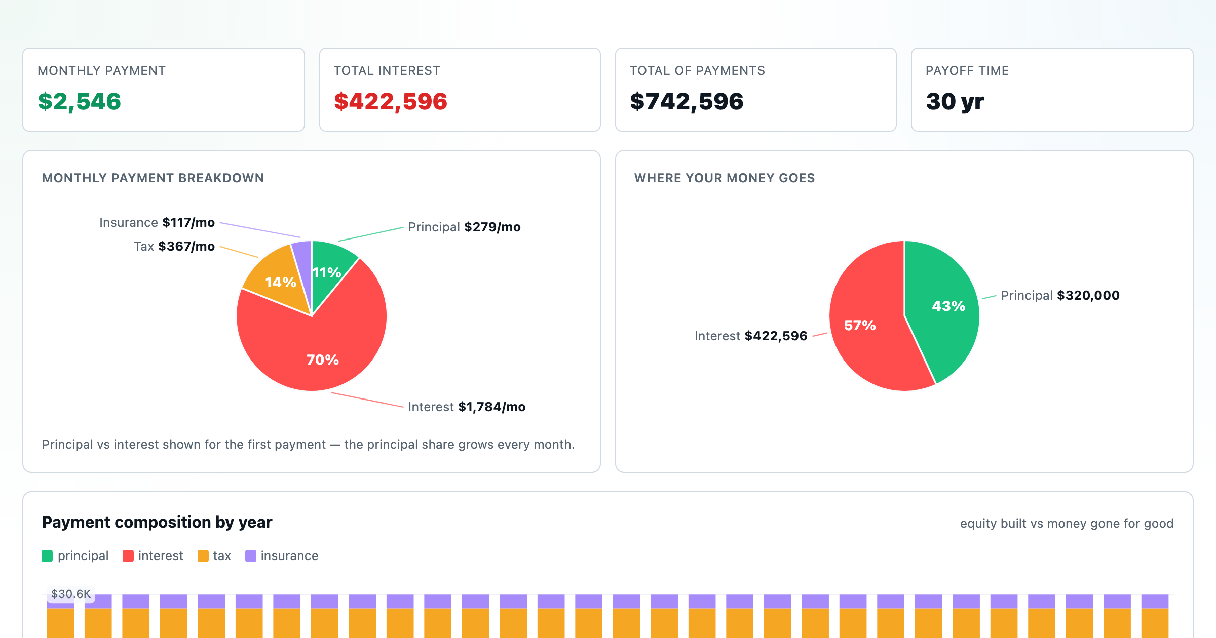
Monthly payment, principal vs interest by year, and the balance paydown — with extra-payment savings.
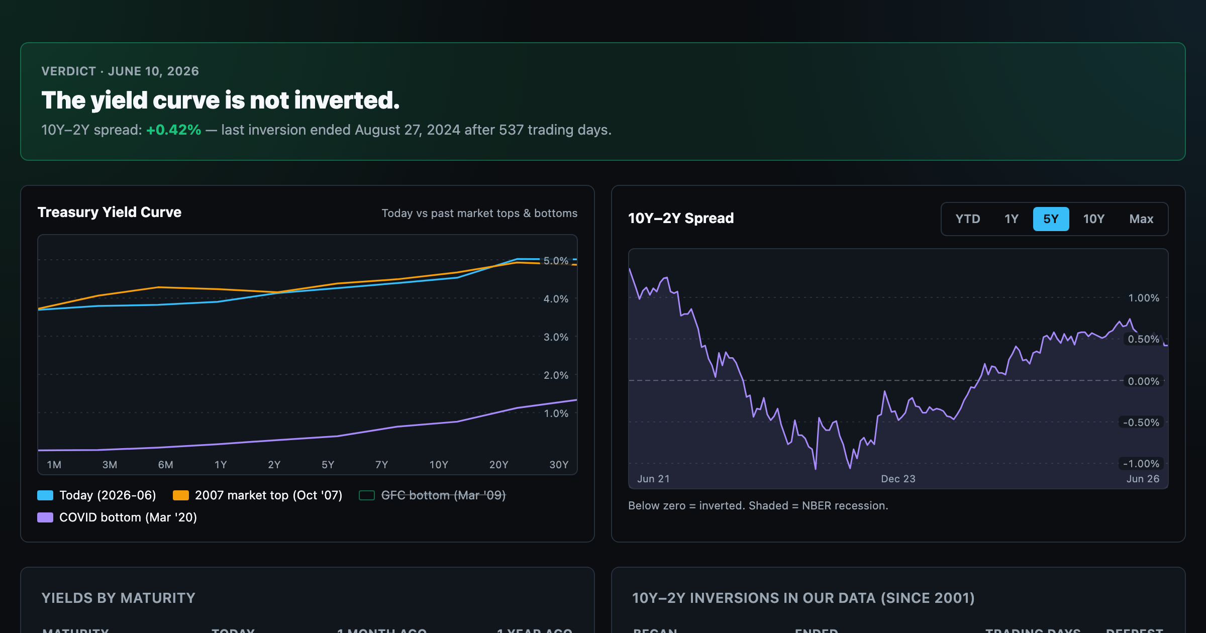
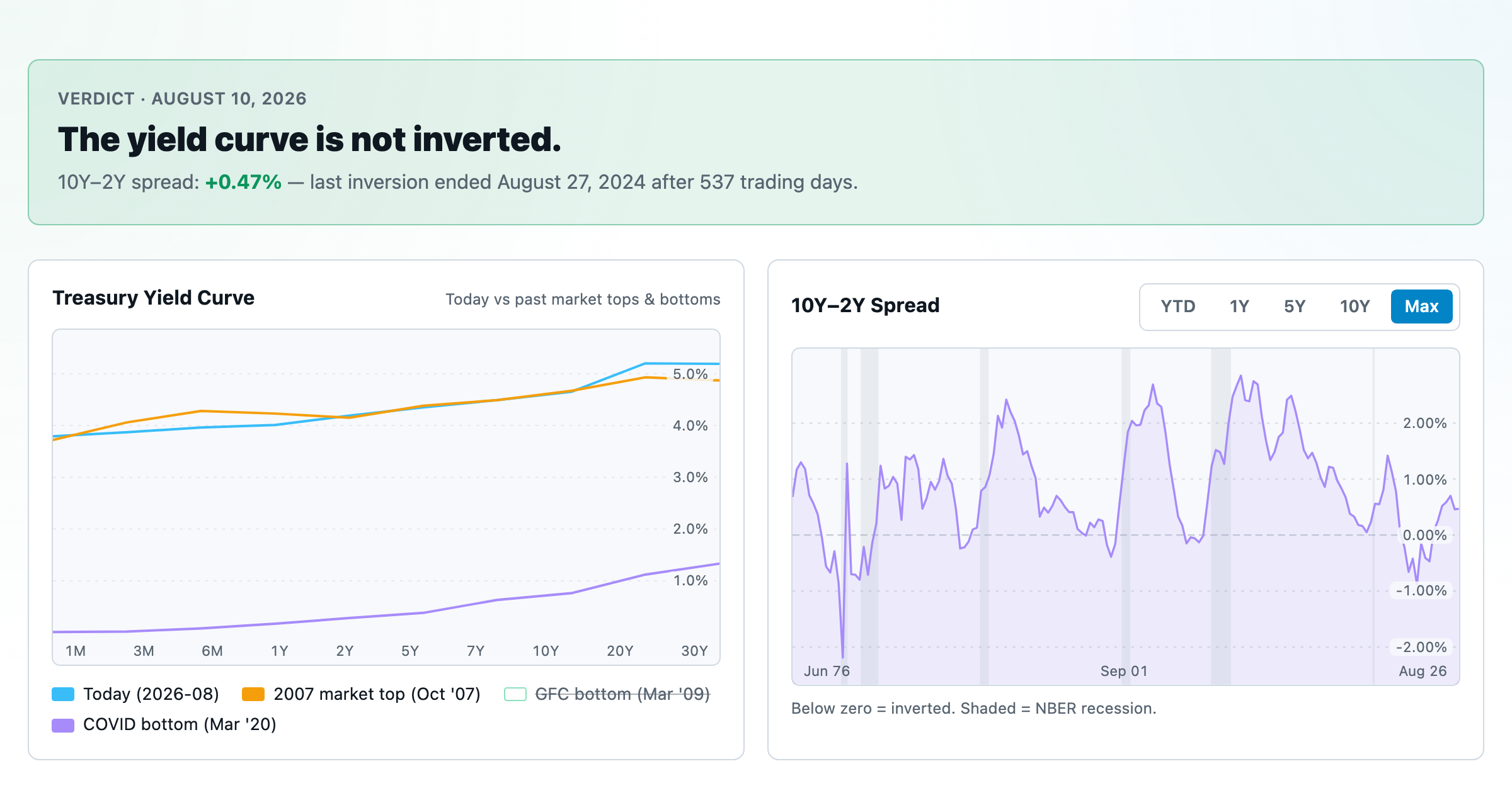
Live term structure, the 10Y–2Y spread, and every inversion episode.