
150 years of stock returns
Zoom all the way out. The S&P 500 back to 1871 — what your odds of making money have been at every holding period, how deep the real crashes ran, and where the growth of $1 actually came from. The long view that a decade of charts can't show.
Over 155 years, $1 in the S&P 500 grew to $1,094,834 with dividends reinvested — a $40,999 gain in real purchasing power after inflation. About 48% of the gain came from dividends. A single year lost money (in real terms) 30% of the time — but 99% of all 20-year stretches came out ahead.
Real (inflation-adjusted) annualized return over every rolling holding period since 1871. The bar is the p10–p90 range, the blue line the median, the whisker the best/worst ever. Notice the range collapse above zero as the horizon grows — the case for time in the market.
Hover or tap a column for its exact ranges.
Pick a holding period. Each line is an ACTUAL historical window, rebased to 0 — the worst and best you'd ever have lived through (the full cone of outcomes), plus the 25th, 50th and 75th percentiles. The legend names the exact periods. Real, dividends reinvested.
Drawdown from the prior inflation-adjusted peak, dividends reinvested. The deepest scars: 1929–32, the long 1966–82 real grind, 2000–02, and 2007–09. Real losses ran deeper and lasted longer than nominal charts admit.
$1 invested, on a log scale. The gap between the blue (nominal total return) and grey (price only) line is dividends compounding; the gap to green is inflation quietly eating a chunk of it.
S&P 500 monthly total return reconstructed from Robert Shiller's data (price + dividends), 1871–, with CPI for real returns. Holding-period and drawdown figures are real (inflation-adjusted), dividends reinvested. History, not a forecast. Not investment advice.
FAQ
- Has the stock market ever lost money over the long run?
- Over one year, the S&P 500 has posted a real (inflation-adjusted) loss roughly a quarter of the time since 1871. As the holding period lengthens the odds improve sharply: nearly every 20-year stretch came out ahead in real terms — the rare exceptions were high-inflation windows around World War I (e.g. 1901–1921), which dipped slightly negative. In nominal terms no 20-year period has lost money. Time in the market, not timing, is what has mattered.
- What was the worst stock market crash?
- In real, dividends-reinvested terms the worst was 1929–1932 (down around 80%), followed by the long 1966–1982 grind where inflation ate returns, the 2000–2002 dot-com bust, and 2007–2009. Real drawdowns ran deeper and lasted longer than nominal price charts suggest.
- How much of stock returns come from dividends?
- Historically a large share — roughly a third to a half of the S&P 500's long-run total return has come from dividends and their reinvestment, which is why the total-return line towers over the price-only line over a century-plus.
More visualizations
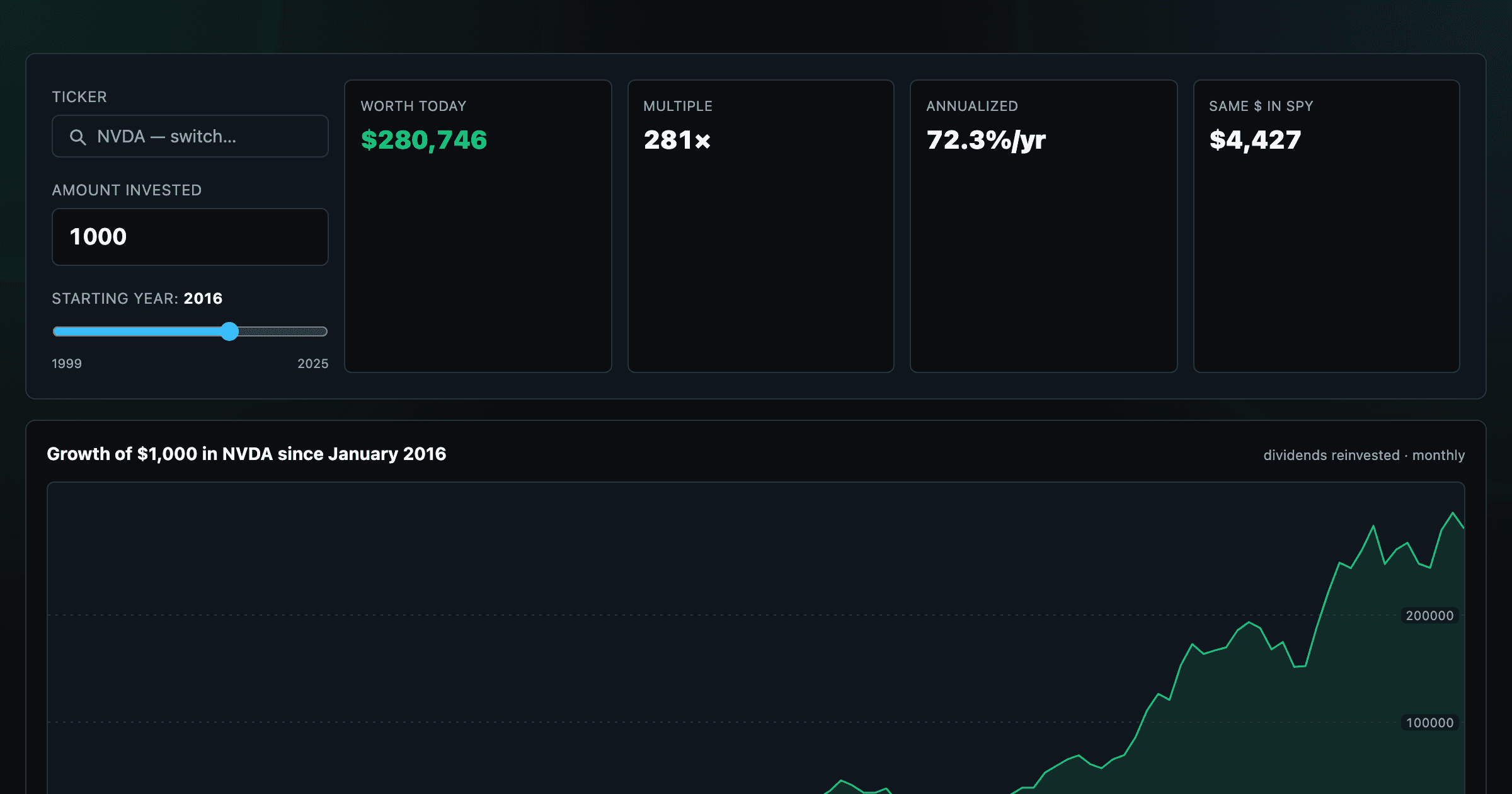
What $1,000 in any stock or ETF would be worth today.
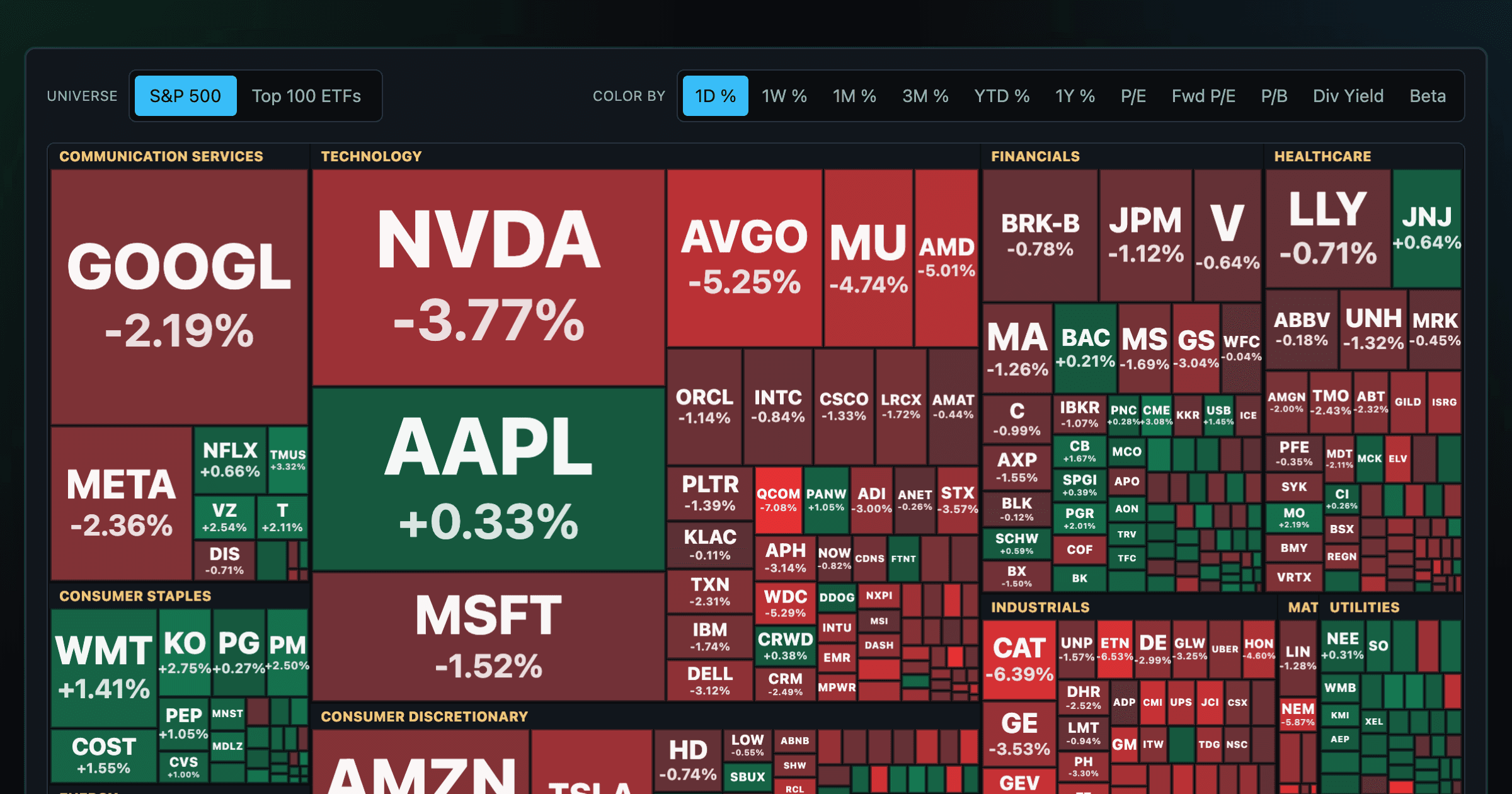
Every S&P 500 company sized by market cap — color by return or valuation.
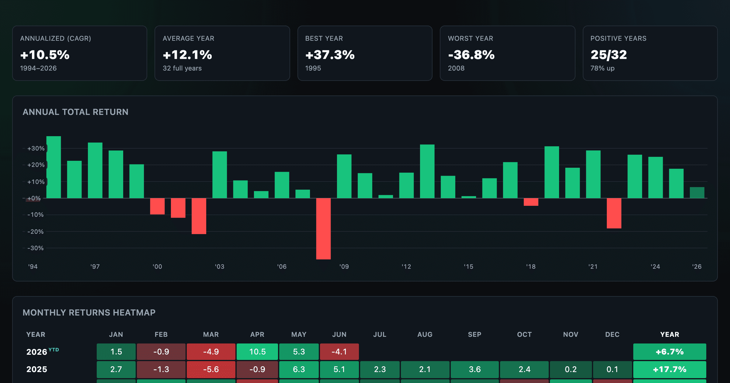
S&P 500 returns by year, month, week and trailing period — total or price return.
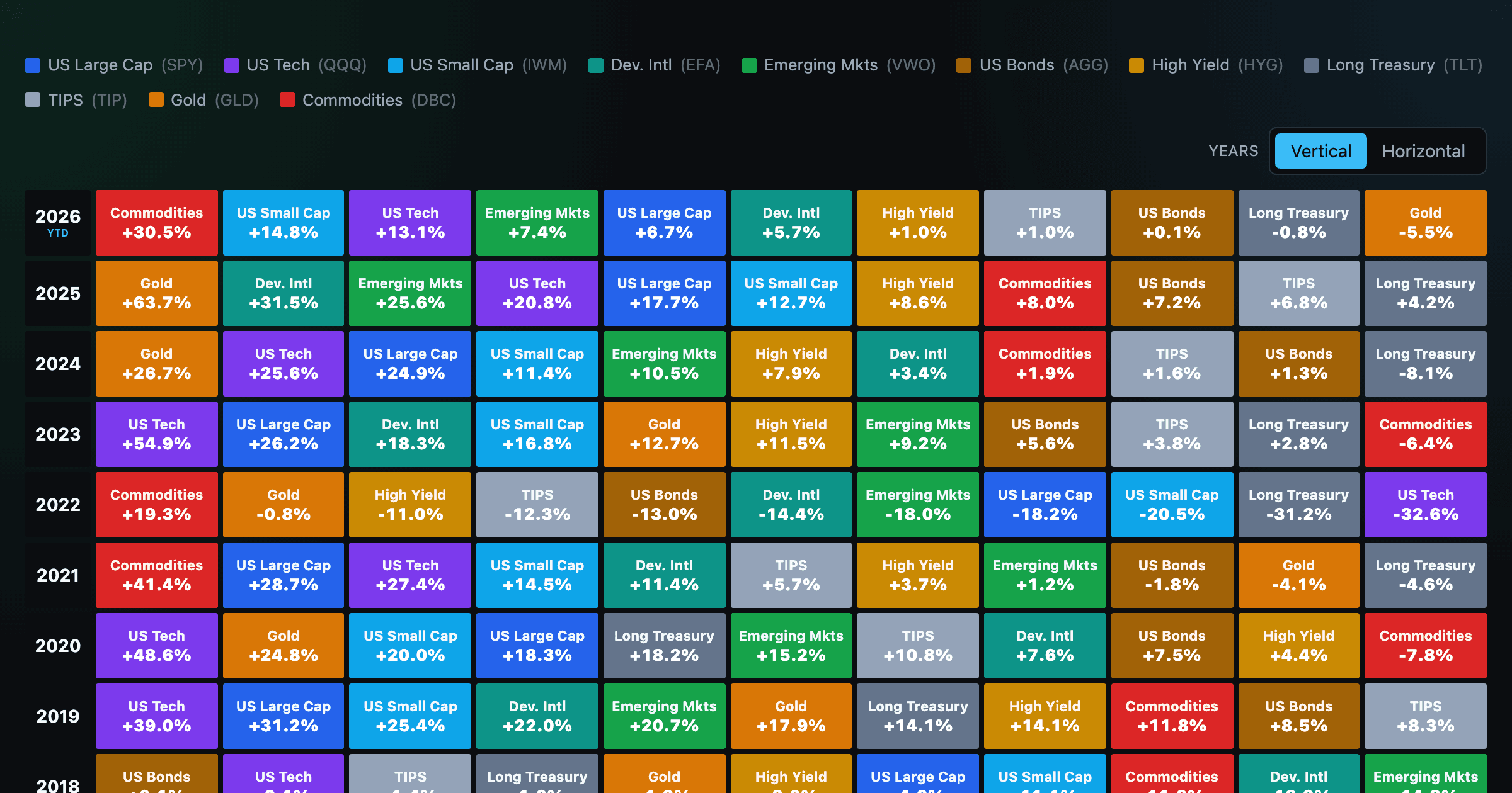
Asset-class returns ranked year by year — the Callan chart / asset allocation quilt.
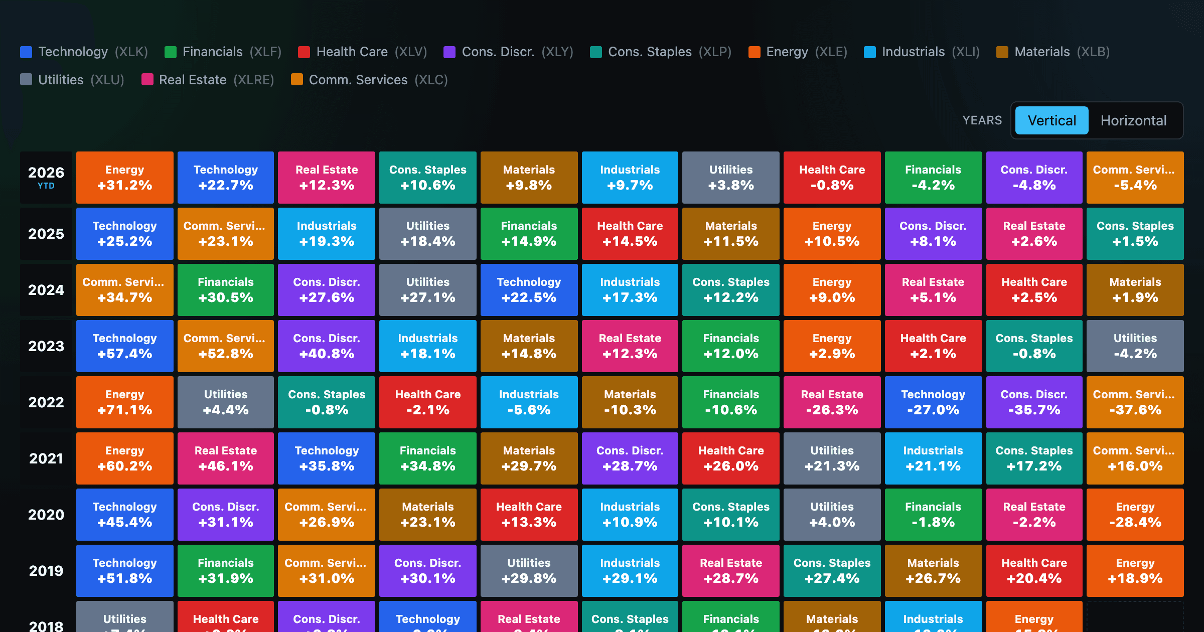
The 11 S&P 500 sectors ranked year by year — a sector quilt chart, back to 1999.
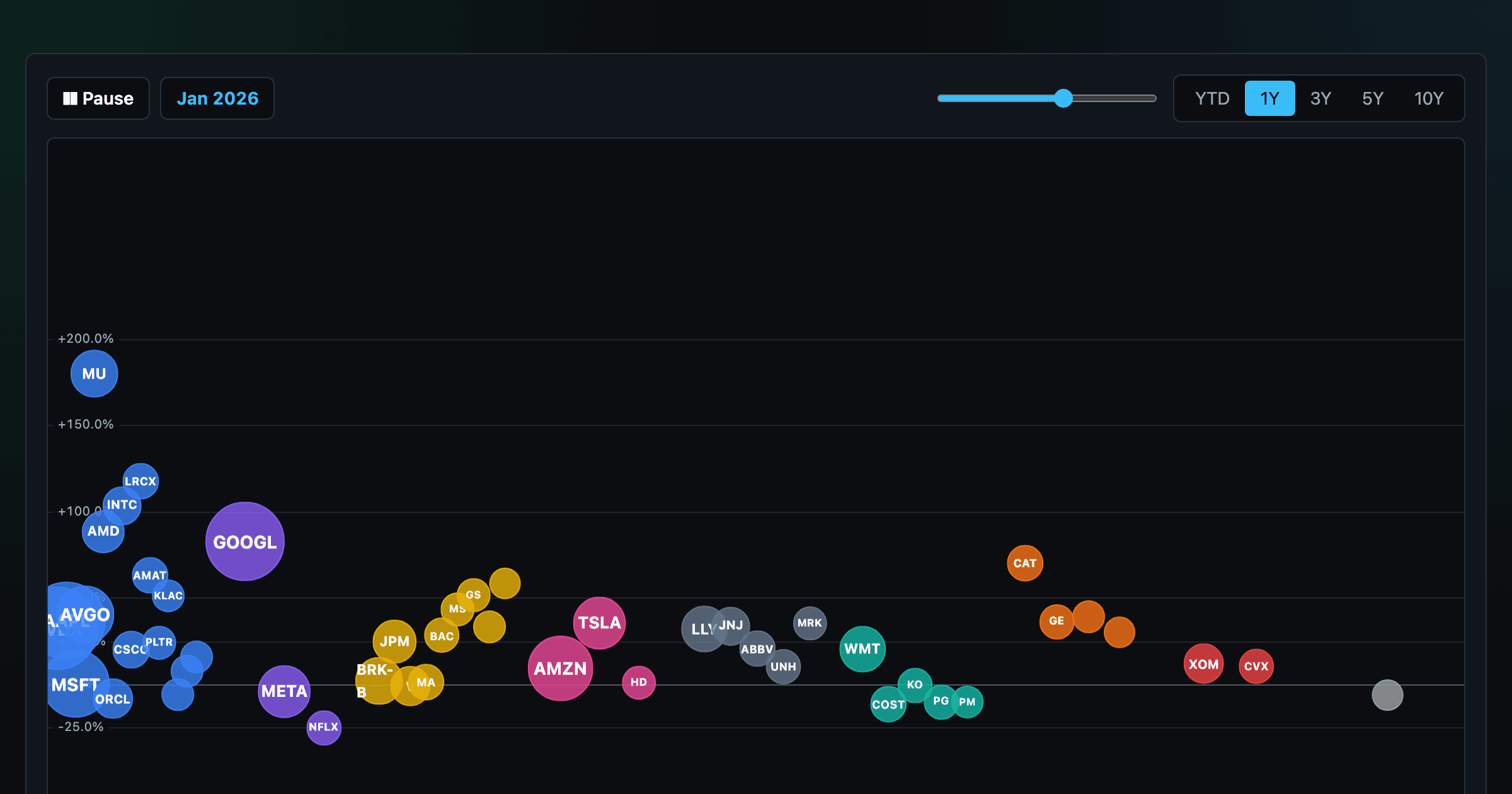
The biggest US companies as animated bubbles, rising and falling with their total return over time.

How recent stock-market debuts have performed since listing — annualized, vs the S&P 500, by IPO vs spin-off.
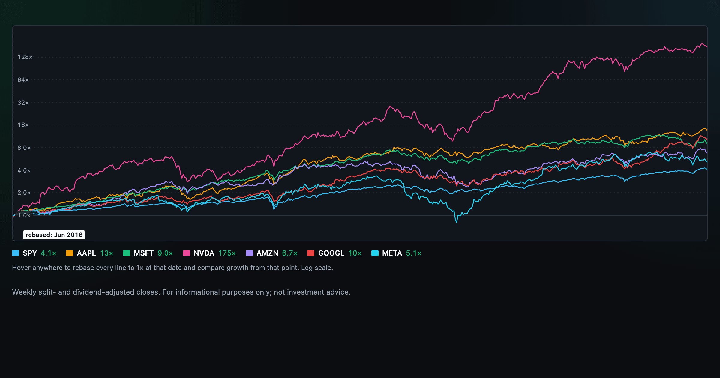
Compare megacaps vs the S&P 500, rebased to 1× at any date you hover.

Where today's S&P 500 return ranks against all history — and the forward returns that followed similar moments.

Is the market expensive? The Shiller CAPE back to 1871 and what valuations have meant for the next decade.

Stocks trading cheapest relative to their own P/E, P/FCF, P/S, or P/B history — with fair-value bands.

Follow a company's revenue through its income statement as a Sankey — costs, taxes, and profit.

Follow a company's cash from net income through operating cash flow into capex, buybacks, and dividends.

Monthly payment, principal vs interest by year, and the balance paydown — with extra-payment savings.
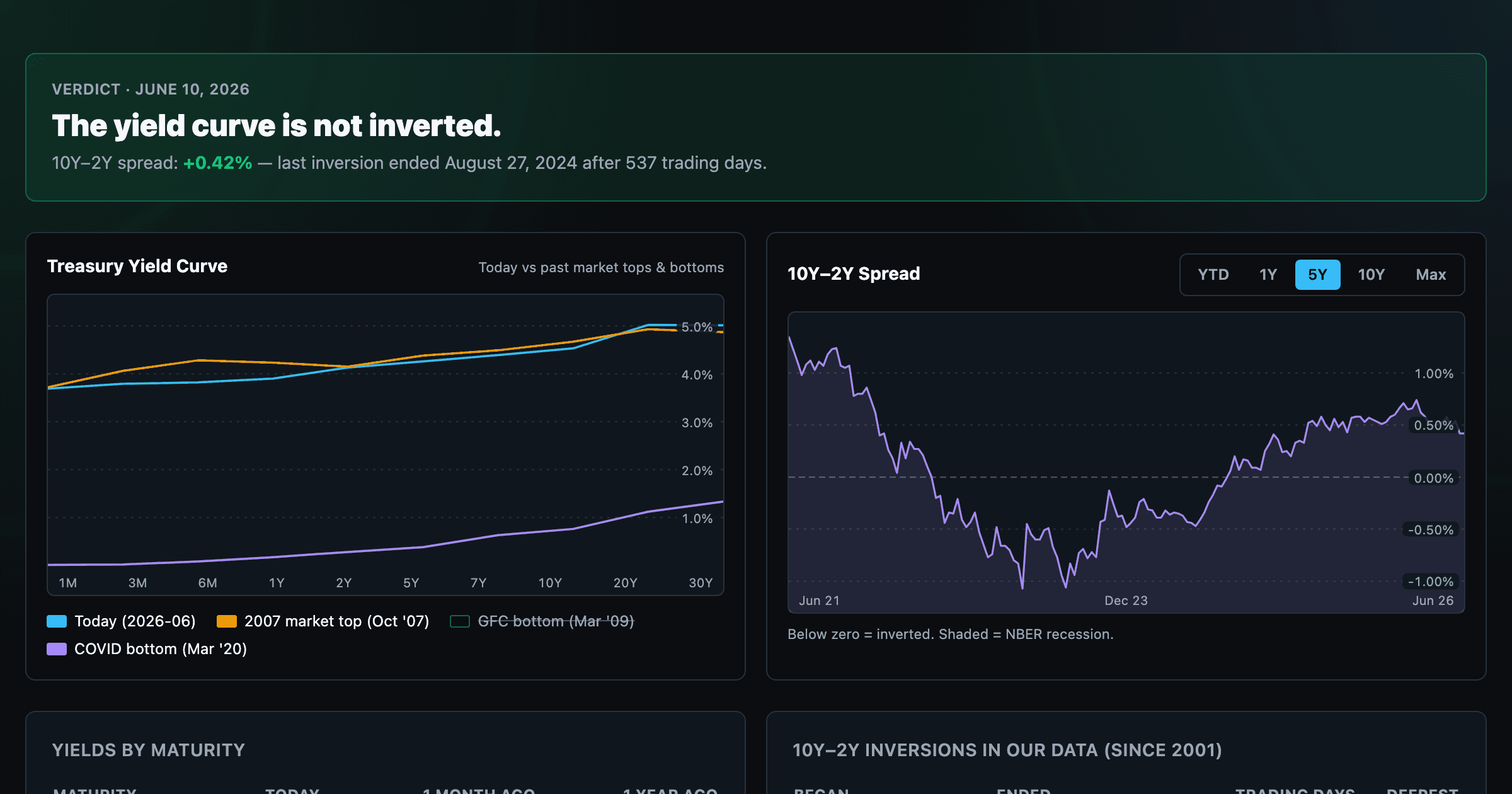
Live term structure, the 10Y–2Y spread, and every inversion episode.