
Market valuation
Is the market expensive? The clearest gauge is CAPE — price divided by a decade of inflation-adjusted earnings, so a single good or bad year can't distort it. Here it is for the S&P 500 back to 1871, with what each valuation level has historically meant for the next ten years. Pick the earnings window below.
CAPE averages inflation-adjusted earnings over the window to smooth the business cycle. 10 years = Robert Shiller's classic CAPE; shorter windows track a normal P/E, longer ones smooth more.
As of May 2026, the S&P 500's 10-year CAPE was 40.2 — the 99th percentile since 1880. When valuations were near this level, the next 10 years returned a median +0.3%/yr real (p10 -3.5%, p90 +5.2%) — 85 comparable months.
Valuation through history. The dashed line is the long-run average; the dot is today. Peaks mark euphoria (1929, 2000, 2021), troughs mark despair (1932, 1982, 2009).
Each dot is one month: its CAPE (x) vs the real return that followed over the chosen horizon (y). The blue line is the average by valuation level — historically the strongest cheap-vs-expensive signal there is. The dashed line is today.
The other side of valuation: what the index pays out. Yields were 4–6% for most of the 20th century and have compressed as prices rose and buybacks replaced dividends.
How these numbers are put together — and where ours differs from the canonical figure.
CAPE = the S&P 500's real (inflation-adjusted) price ÷ its average real earnings over the chosen window. A 10-year window is Robert Shiller's classic CAPE; we let you pick others. Forward returns are real total returns (dividends reinvested).
Data. Price, earnings, dividends and CPI back to 1871 come from Shiller's public dataset. Because the free feed's earnings and CPI lag by a couple of years, we extend them to the present seamlessly: recent earnings from our own aggregate of S&P 500 members' trailing net income (SEC EDGAR filings, deduplicated for dual-class shares), and CPI from the Federal Reserve (FRED). Each is chained to Shiller's series at the overlap so the line never jumps.
Caveat. This is our reconstruction — close to, but not identical to, the official Shiller CAPE (our aggregate earnings differ slightly in method and timing from the index's as-reported figure). Treat it as directionally accurate, not the canonical decimal. Latest complete window: May 2026 (bounded by company filing lag).
Valuation is a long-horizon signal with wide error bars — useless for timing, informative for expectations. For informational purposes only; not investment advice.
FAQ
- What is the CAPE ratio?
- CAPE (cyclically-adjusted price-to-earnings), also called the Shiller P/E or PE10, divides the S&P 500's price by the average of its inflation-adjusted earnings over the past 10 years. Averaging a decade of earnings smooths out the business cycle so booms and busts don't distort the ratio.
- Does a high CAPE mean a crash is coming?
- No. CAPE has essentially no power to predict short-term moves or time the market — expensive markets can stay expensive for years. What it has historically tracked is the next 10–15 years of real returns: higher starting valuations have, on average, been followed by lower long-run returns, with wide error bars.
- Why let me change the earnings window?
- Shiller's CAPE uses a 10-year earnings average. A 1-year window is essentially a normal trailing P/E; longer windows (15–20 years) smooth even more. Comparing windows shows how much the smoothing choice matters to the picture.
More visualizations
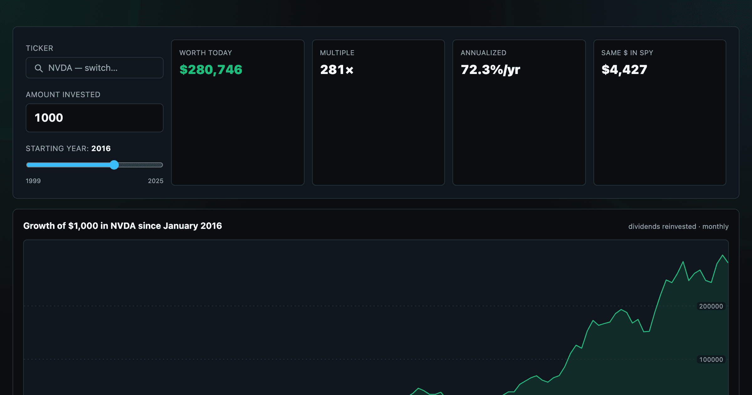
What $1,000 in any stock or ETF would be worth today.
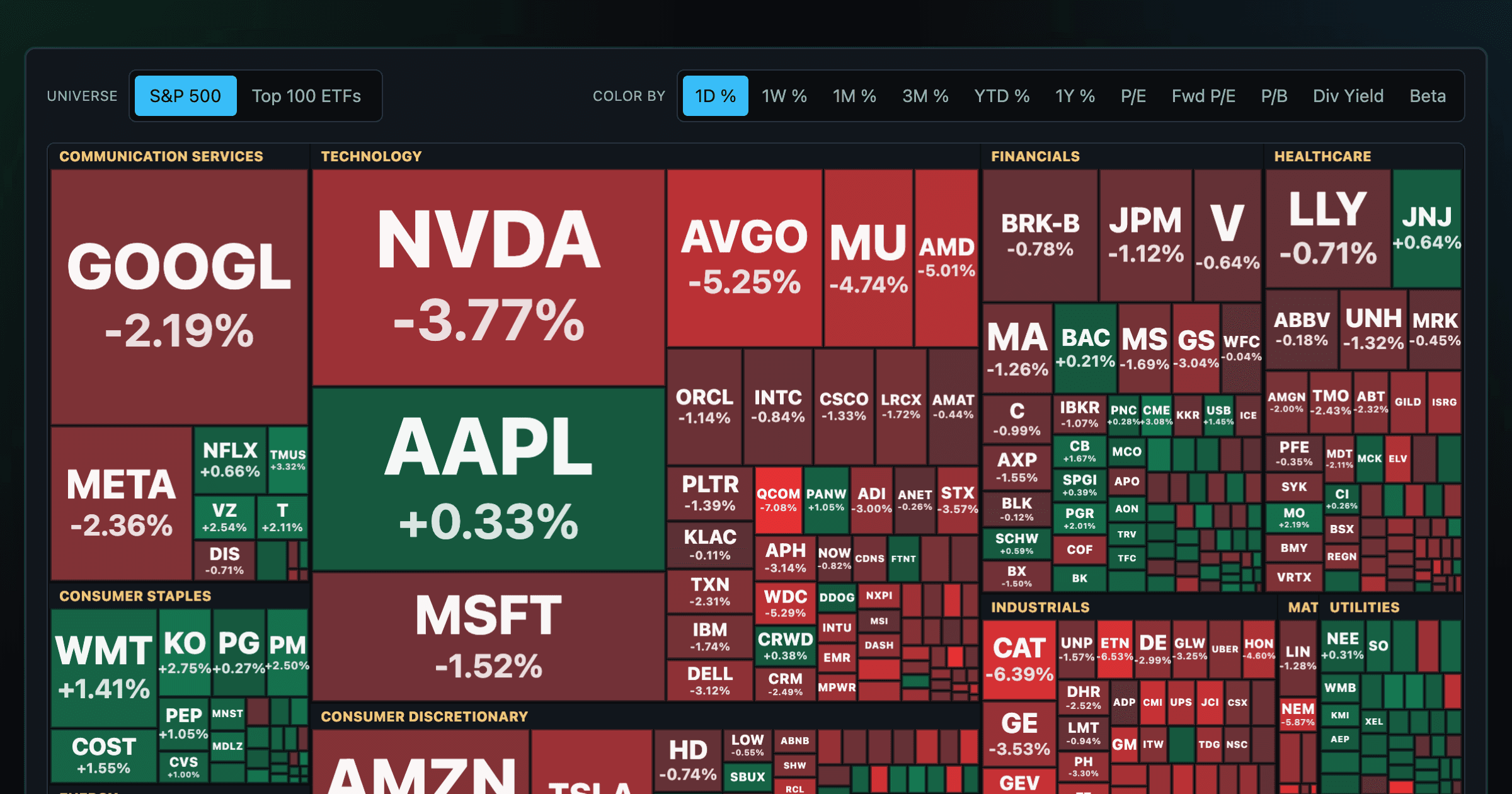
Every S&P 500 company sized by market cap — color by return or valuation.
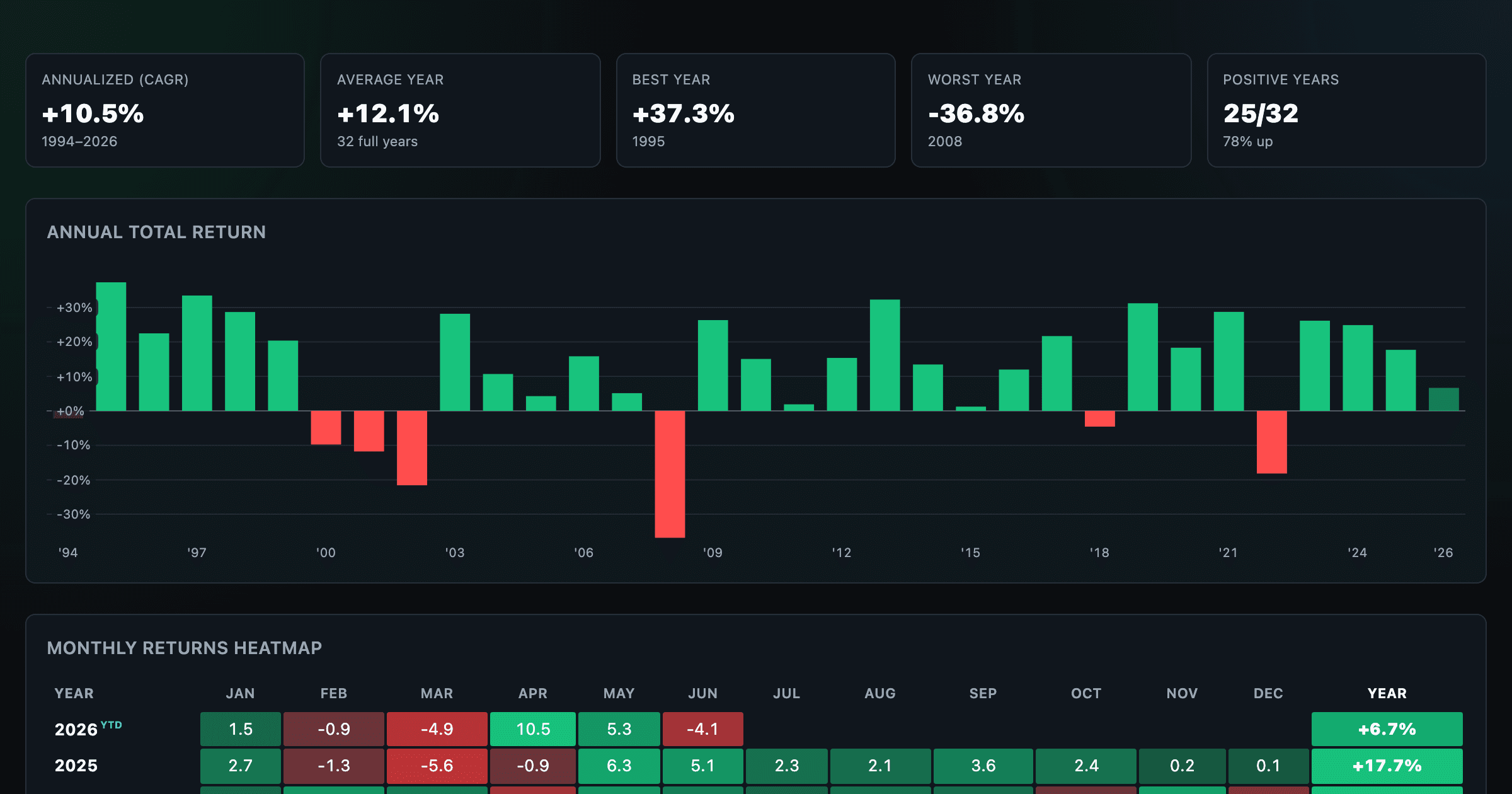
S&P 500 returns by year, month, week and trailing period — total or price return.
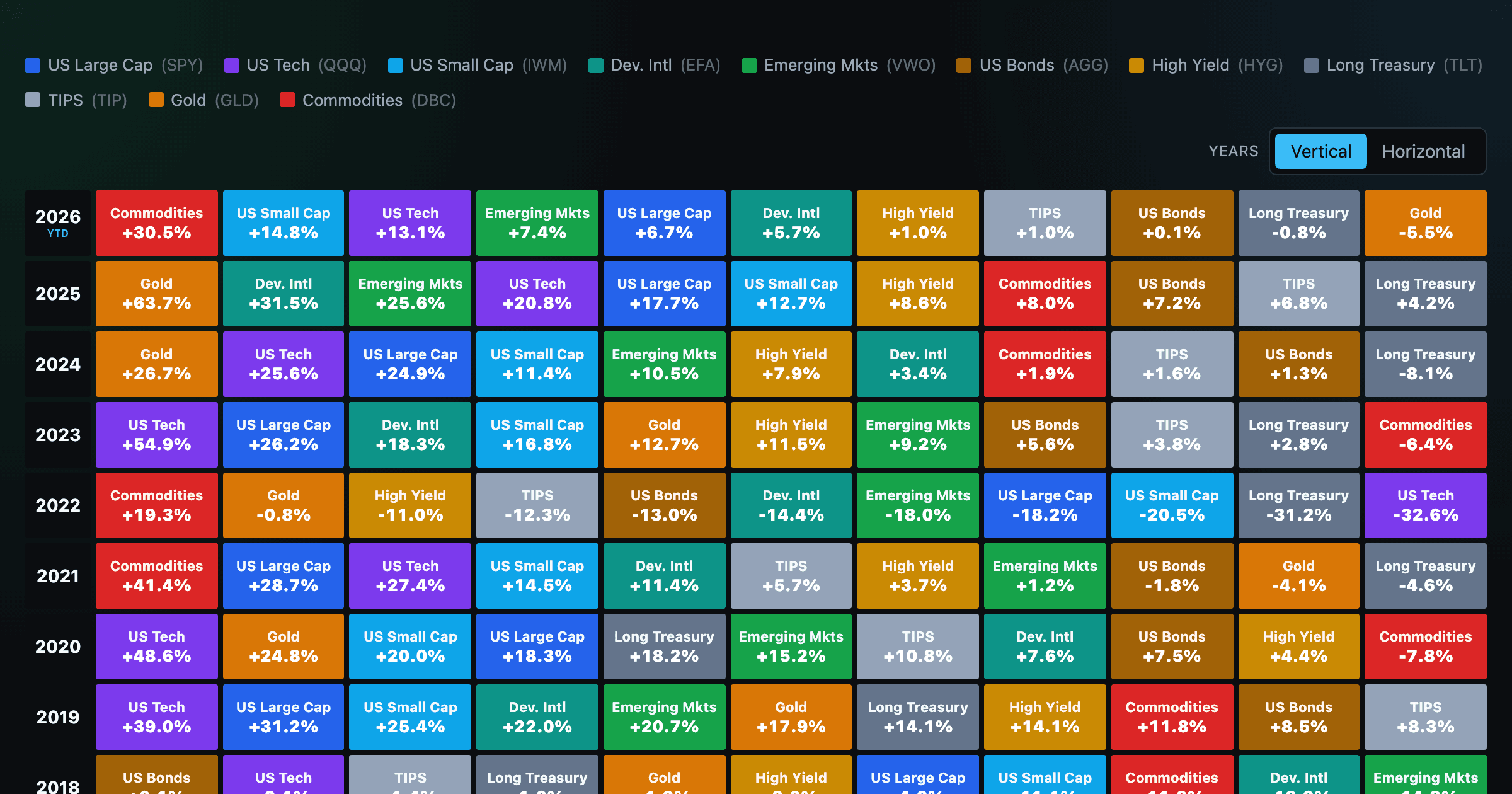
Asset-class returns ranked year by year — the Callan chart / asset allocation quilt.
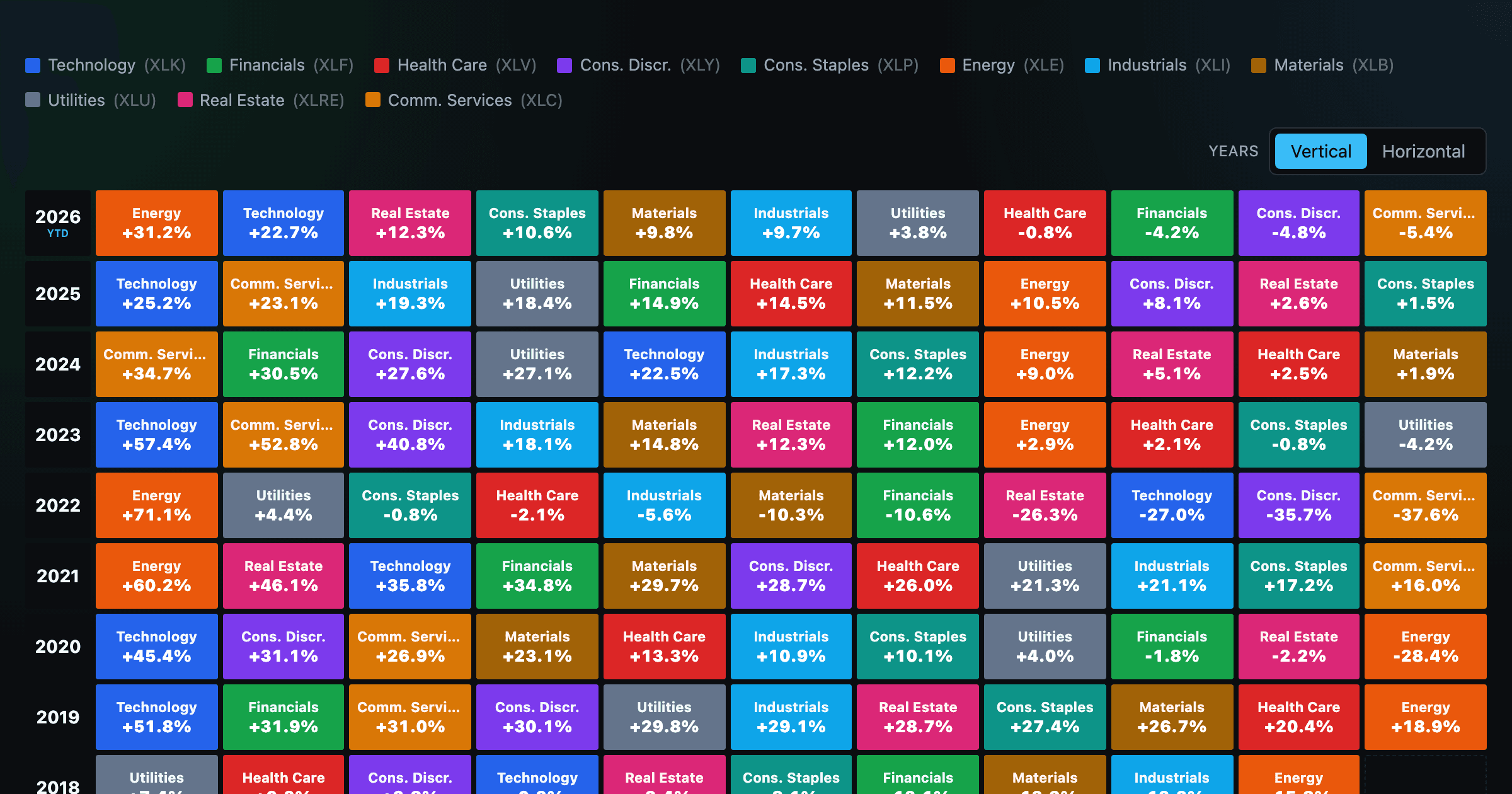
The 11 S&P 500 sectors ranked year by year — a sector quilt chart, back to 1999.
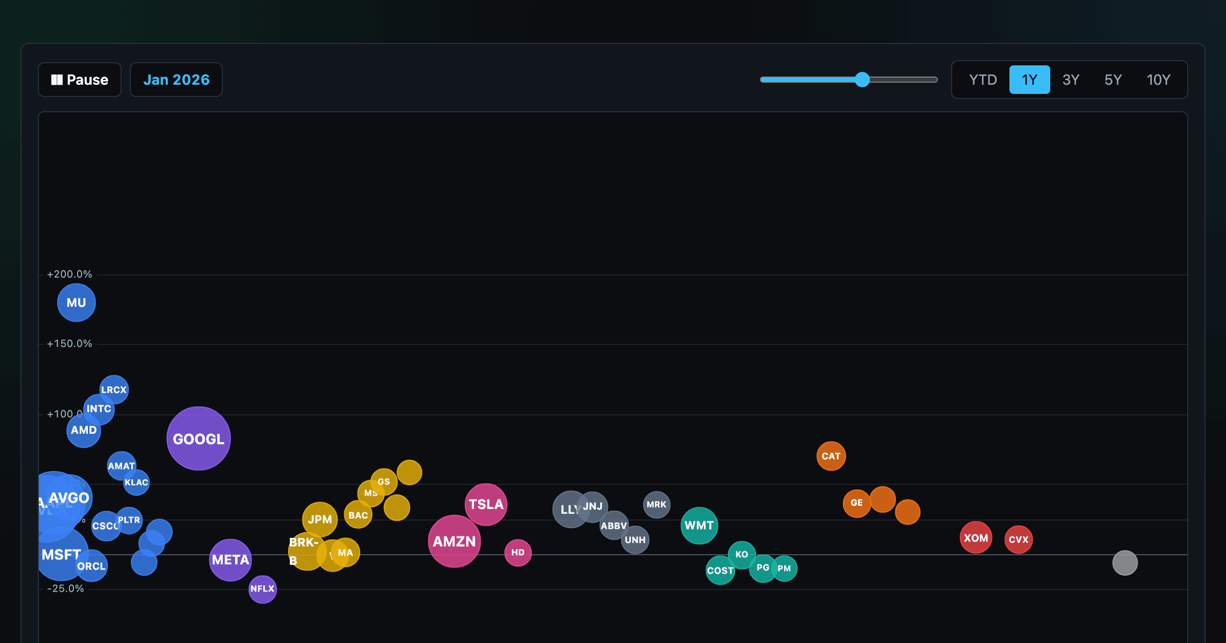
The biggest US companies as animated bubbles, rising and falling with their total return over time.

How recent stock-market debuts have performed since listing — annualized, vs the S&P 500, by IPO vs spin-off.
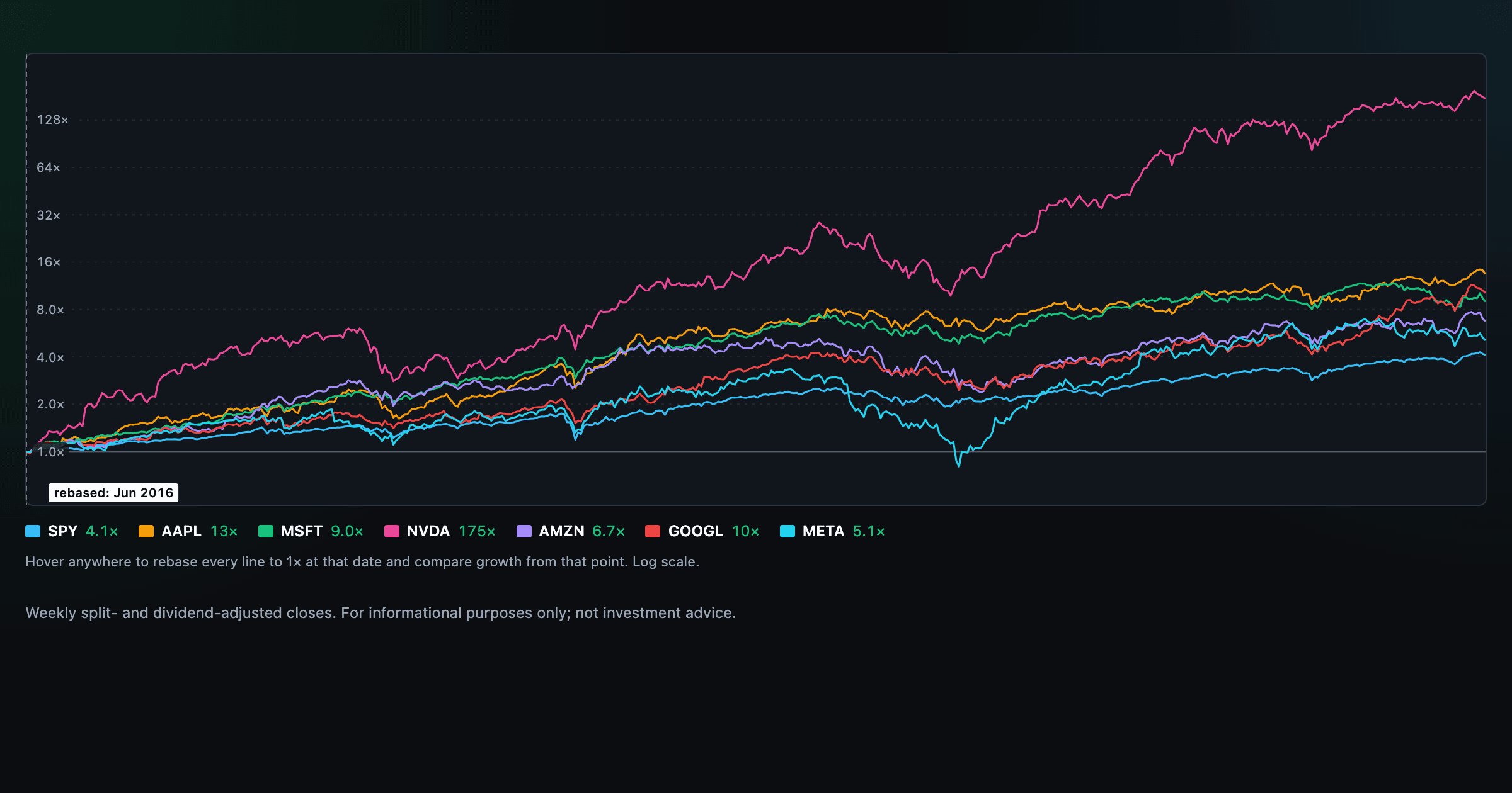
Compare megacaps vs the S&P 500, rebased to 1× at any date you hover.

Where today's S&P 500 return ranks against all history — and the forward returns that followed similar moments.

The S&P 500 since 1871 — odds of gain by holding period, real drawdowns, and the growth of $1.

Stocks trading cheapest relative to their own P/E, P/FCF, P/S, or P/B history — with fair-value bands.

Follow a company's revenue through its income statement as a Sankey — costs, taxes, and profit.

Follow a company's cash from net income through operating cash flow into capex, buybacks, and dividends.

Monthly payment, principal vs interest by year, and the balance paydown — with extra-payment savings.
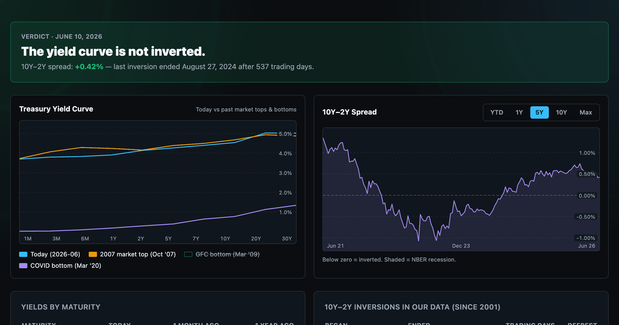
Live term structure, the 10Y–2Y spread, and every inversion episode.