
The rise and fall of market giants
30 companies have held a top-10 spot in the US stock market since 2010 — and only AAPL and MSFT never left. Below, every giant's top-10 rank year by year, then each one's share of total large-cap market value: watch NVDA swell from 0.1% to 6.6% while MFG fades from 2.1% to 0.2%.
Who held each rank, 2010–today#
Every swap at the top is a line crossing. The average giant holds a top-10 spot for about 5.6 years of the 17 charted — hover a ticker to trace that company's full path.
Each line is one company's market-cap rank, sampled every January (last column = the latest month). Ranks below #10 collapse into the shaded "10+" bucket. Hover a ticker to trace that company's full path, including the years it spent outside the top ten.
Every giant's share of the market#
The same story as weights instead of ranks: each band is one giant's share of total large-cap market value, month by month. Hover a band to isolate it — and hold for its arc: when it first reached the top ten, its peak share, and where it stands now.
Methodology#
A company qualifies as a "giant" if it ranked among the 10 largest US-listed companies by full market cap in any month since 2010. Caps are reconstructed from month-end prices and SEC-filed share counts (normalized for splits) across the ~500 US large caps we track — approximately the current S&P 500 membership plus a few large US listings outside the index, foreign ADRs excluded. Weights divide by that universe's total market value, so they sit slightly below official float-adjusted index weights, and heavy spin-off histories (GE, AT&T) are undercounted in early years. See how top-heavy the market is for the concentration view of the same data. Not investment advice.
FAQ#
- Which companies have been in the stock market's top 10 the longest?
- Apple Inc. (AAPL) and Microsoft Corporation (MSFT) have held a top-10 spot in every single month since 2010. AAPL has spent the most time as the single largest company — about 9 of the last 17 years.
- Which giants dropped out of the top 10?
- 30 different companies have held a top-10 spot since 2010; as of October 2026, 20 of them are no longer there, including BNTX, XOM, MFG, JNJ, WMT, JPM, PG, CVX. The classic fades: Mizuho Financial Group Inc. Sponosred ADR (Japan) went from 2.1% of the market in 2010 to 0.2% today.
- Do the biggest stocks stay on top?
- Rarely for long — that’s the point of this chart. Of the top 10 of 2010 (Exxon, Microsoft, Walmart, Google, IBM, Chevron, GE and peers) only a few remain, and the energy-and-industrials heavyweights gave way almost entirely to technology. Academic work on the "biggest stock" effect finds the #1 company has historically underperformed the market over the following decade — size is easier to reach than to defend.
More visualizations
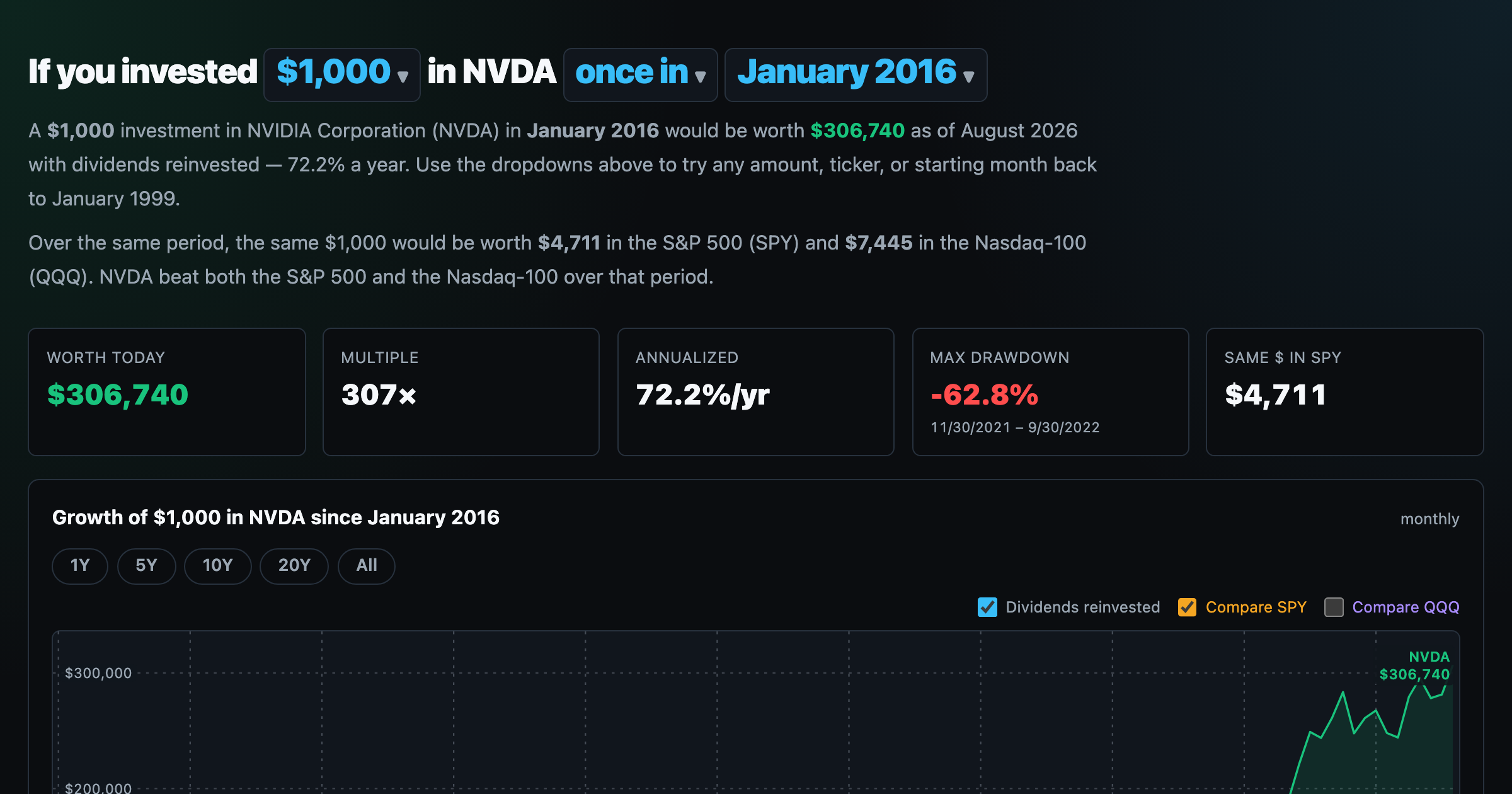
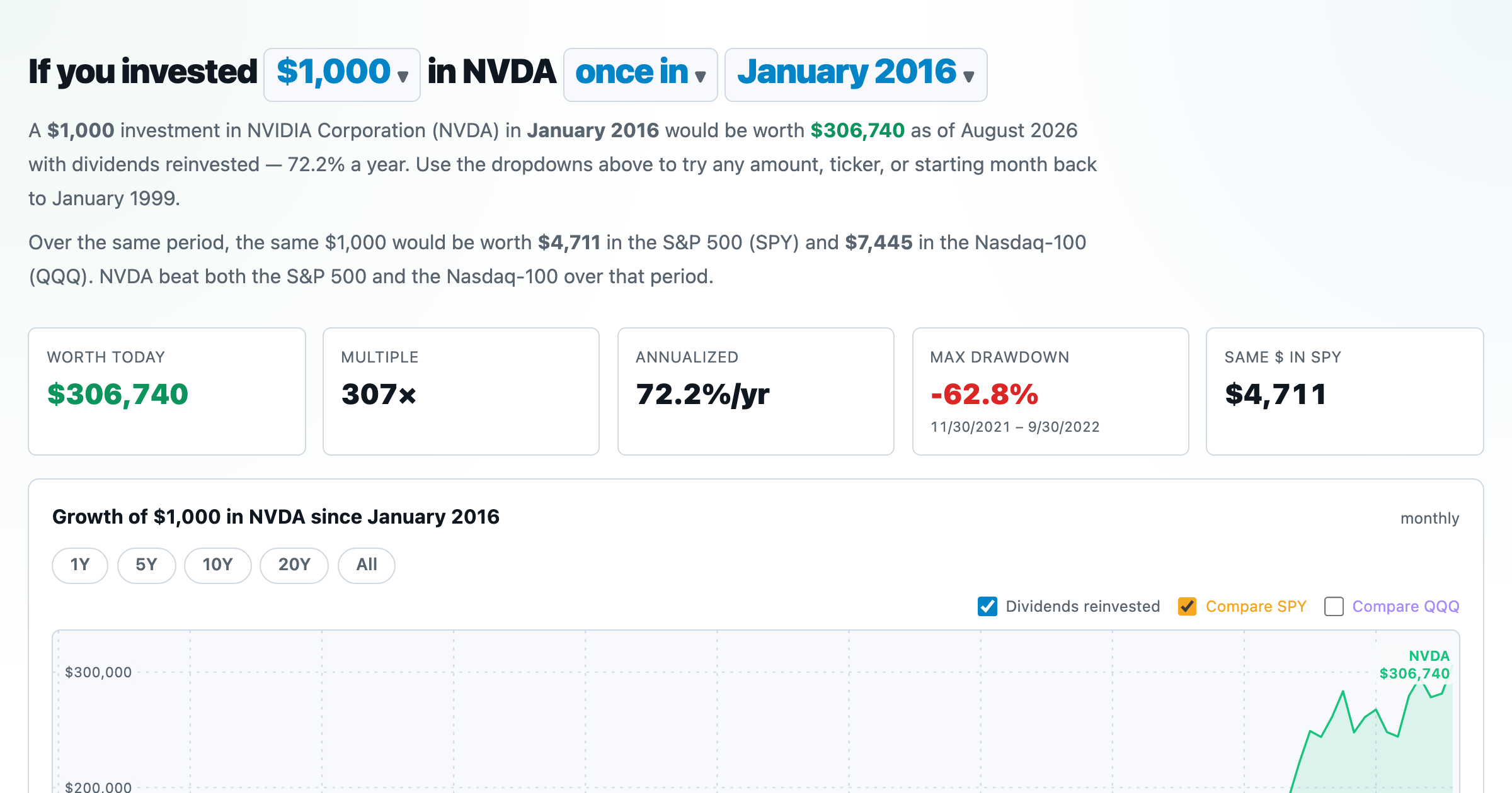
What $1,000 in any stock or ETF would be worth today.
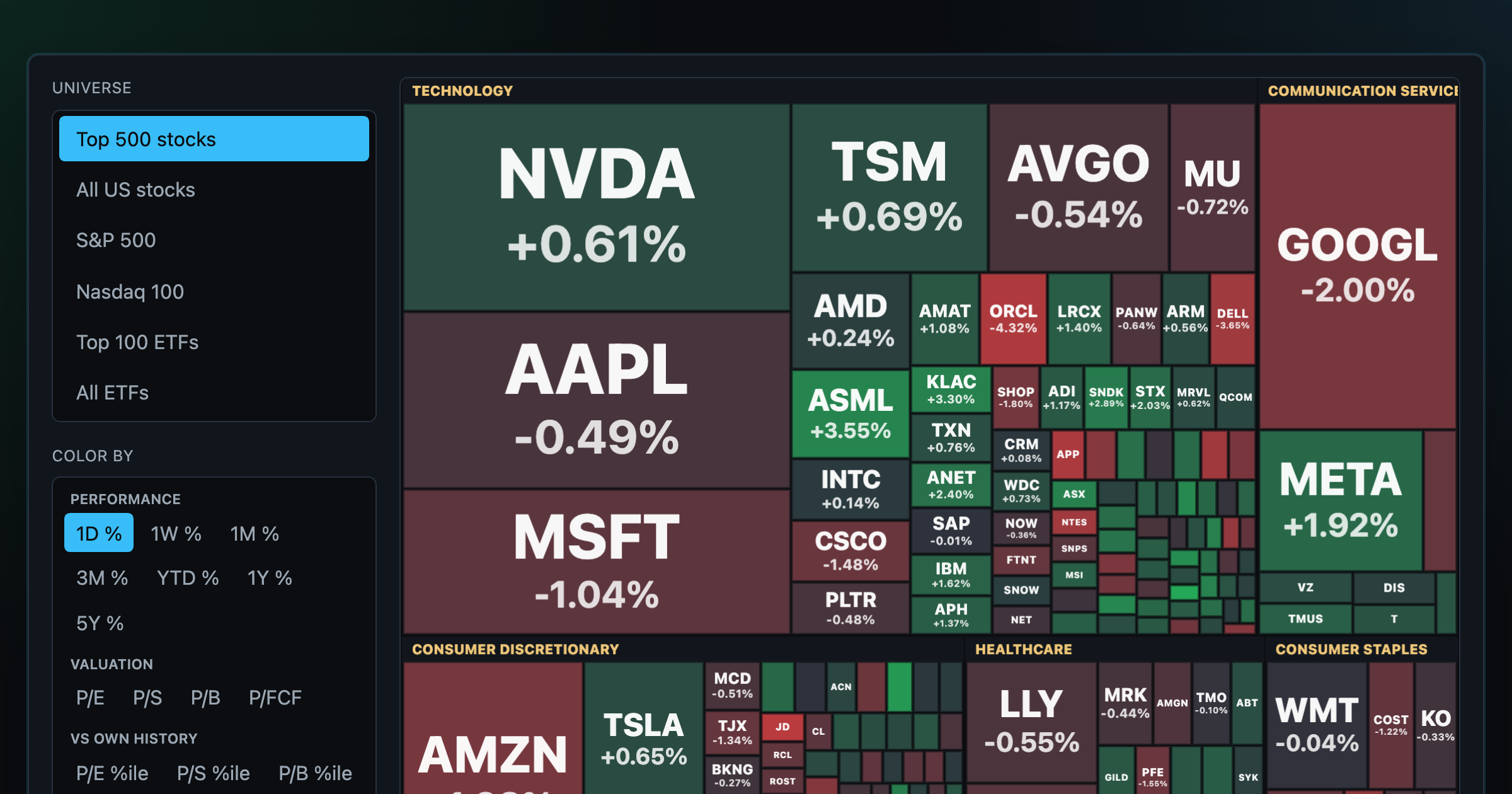
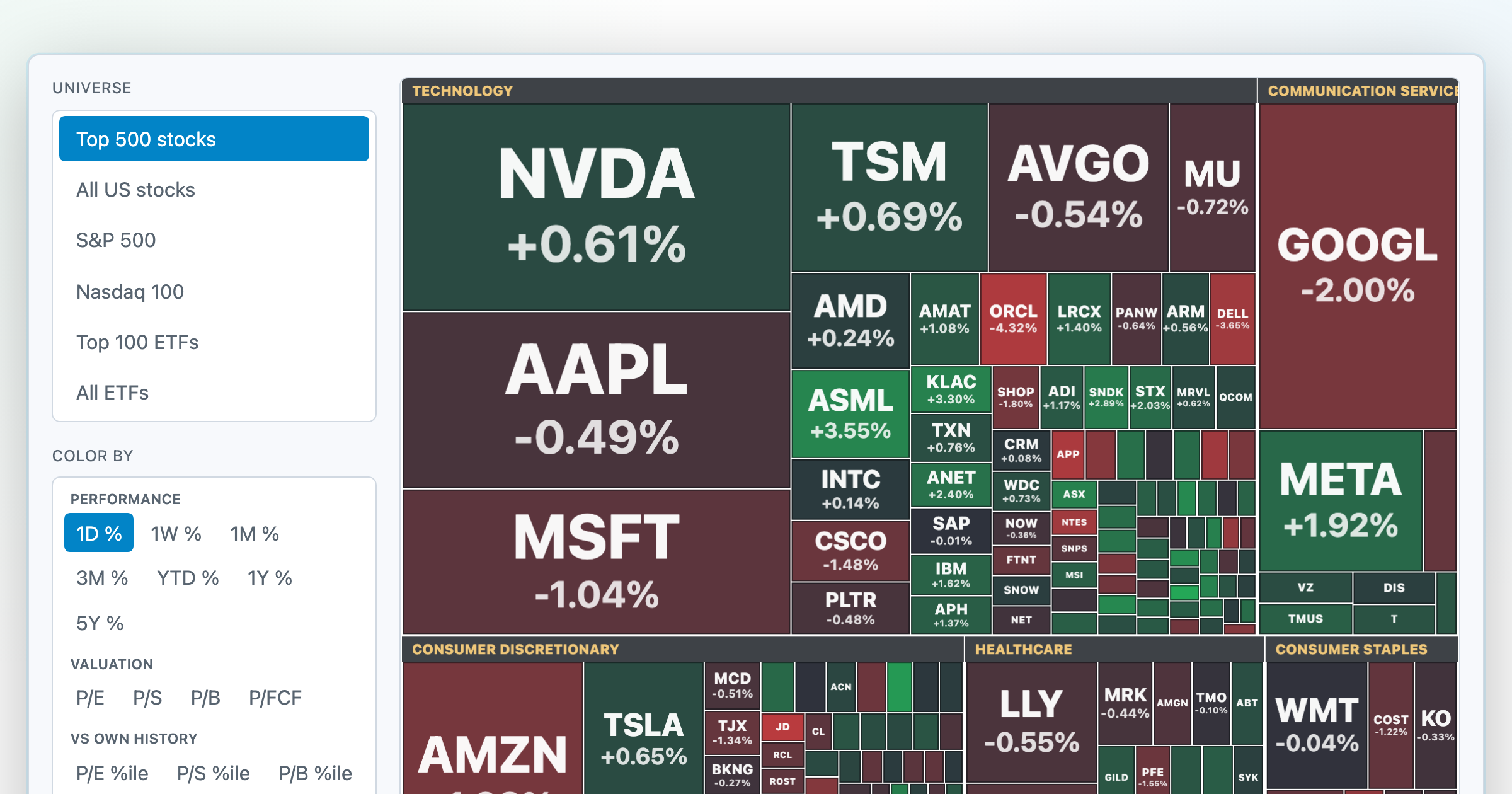
Every S&P 500 company sized by market cap — color by return or valuation.
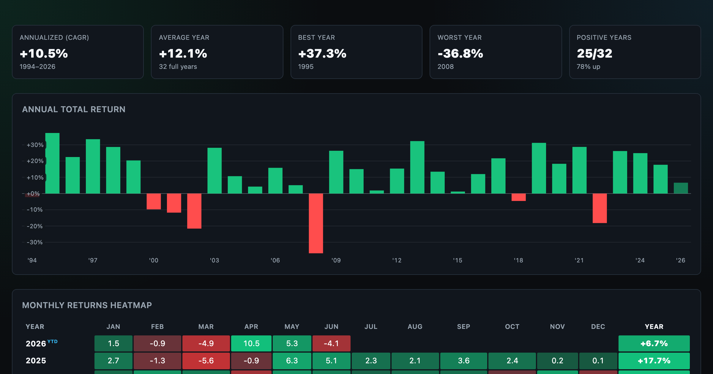
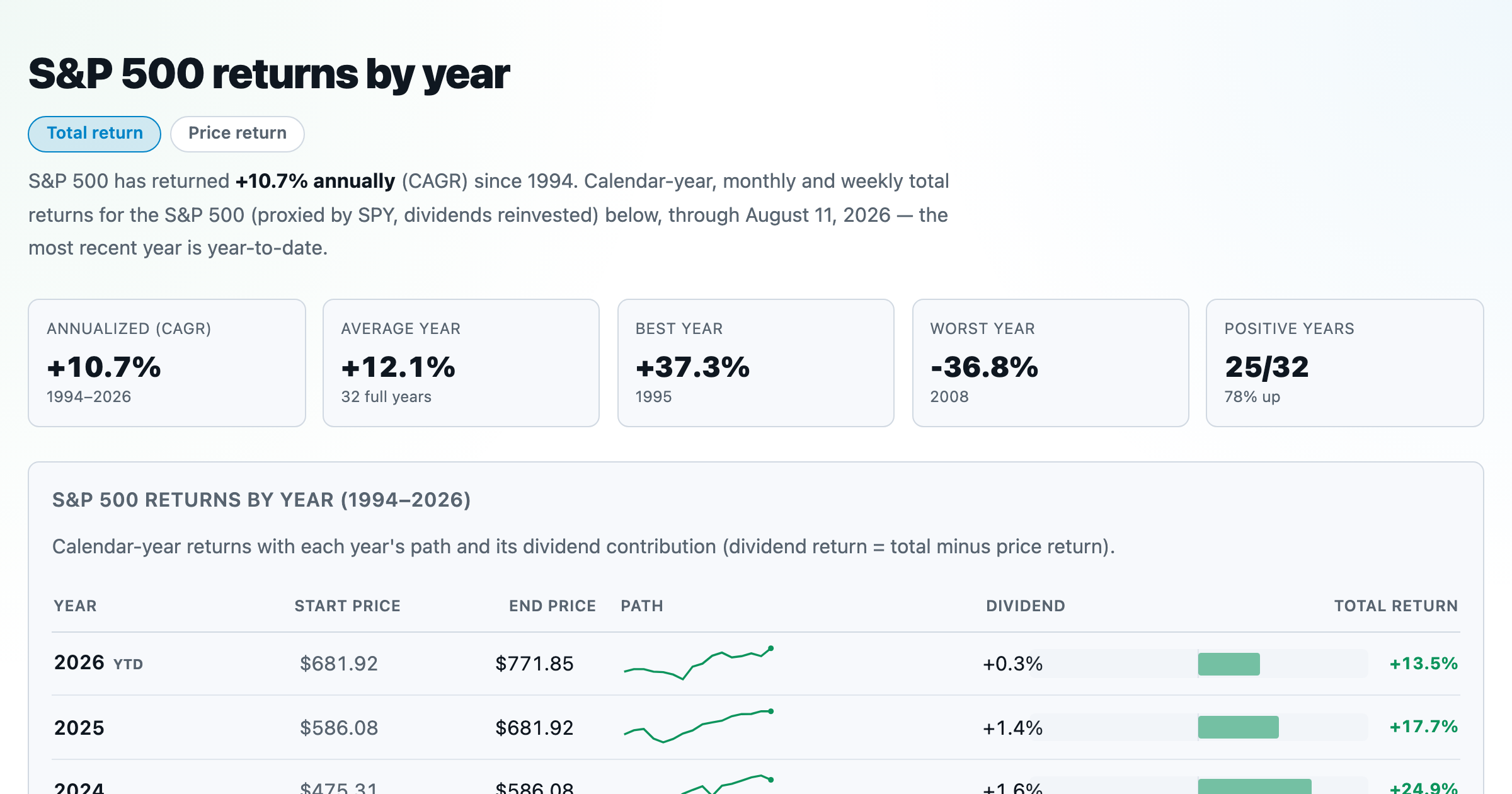
S&P 500 returns by year, month, week and trailing period — total or price return.
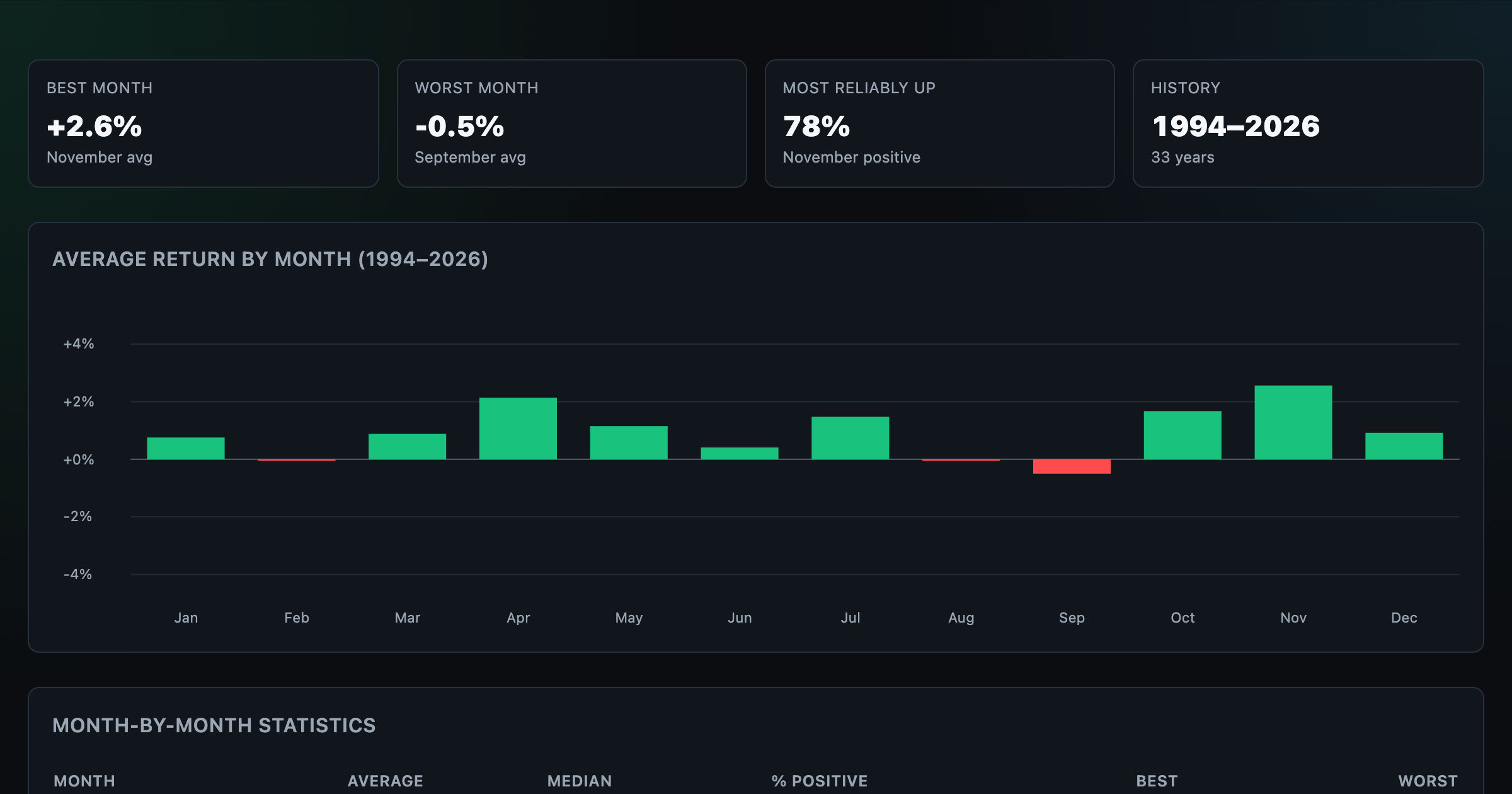
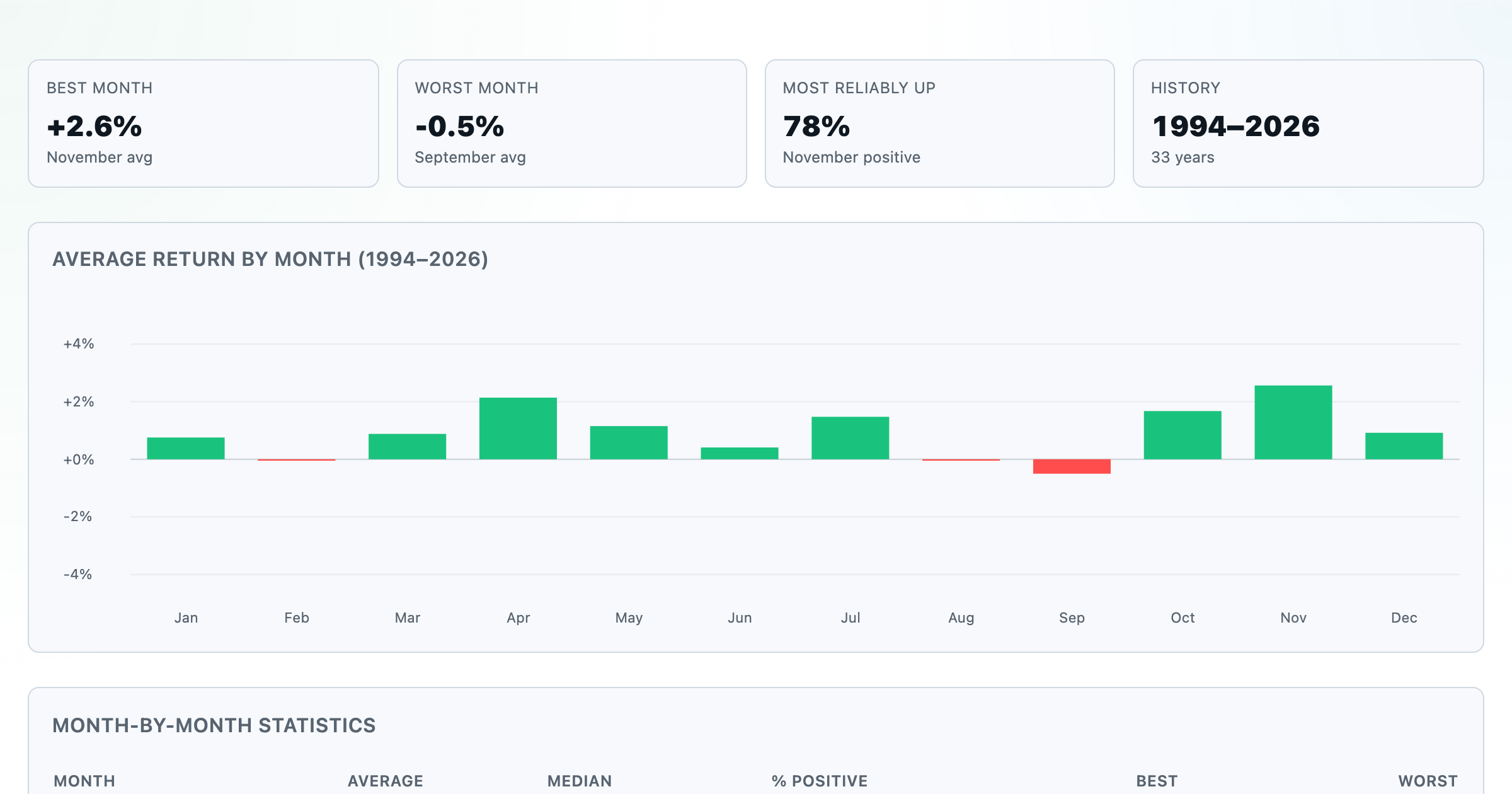
Which month is best for stocks? Average return of every calendar month, for any ticker.
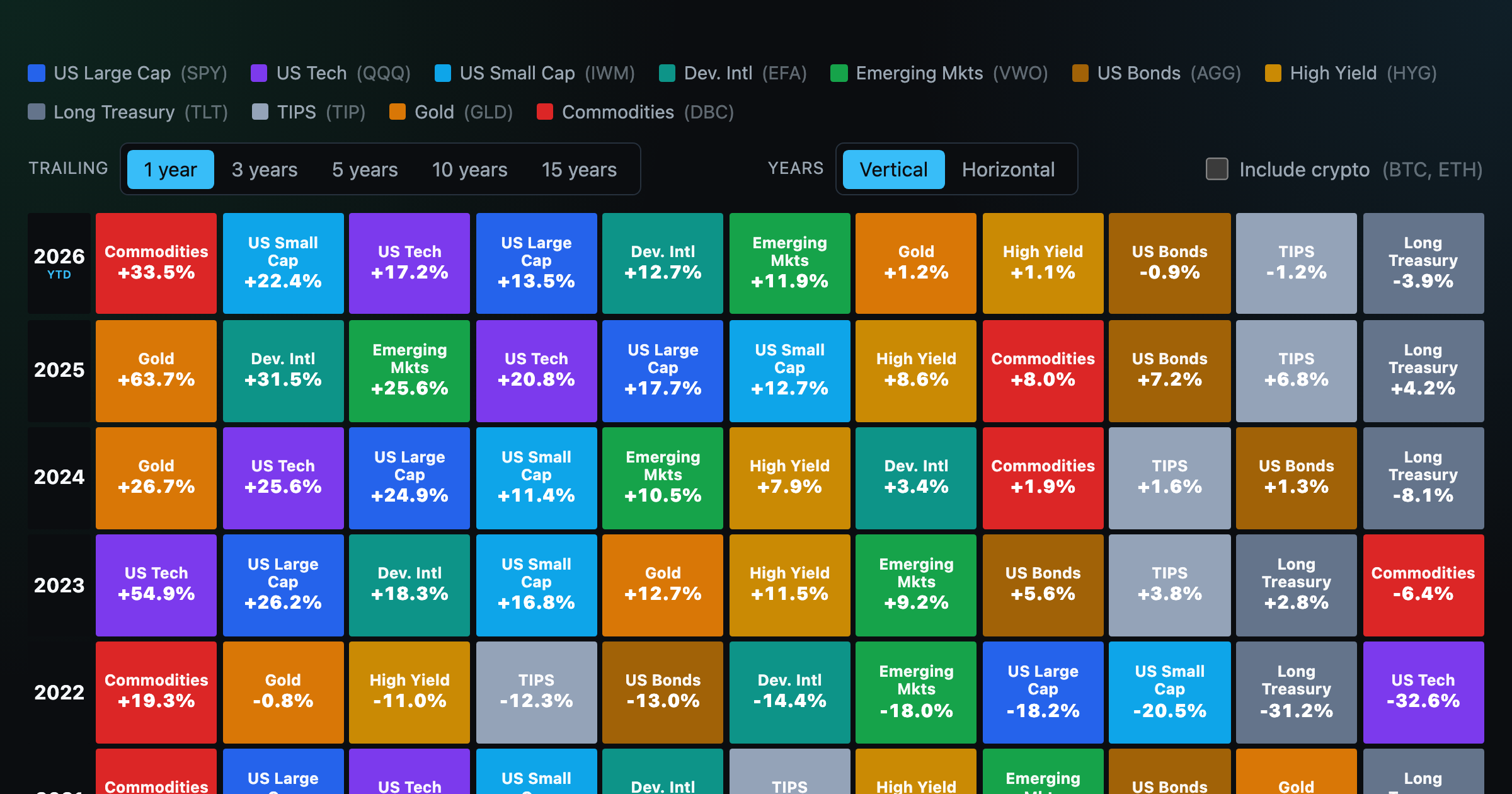
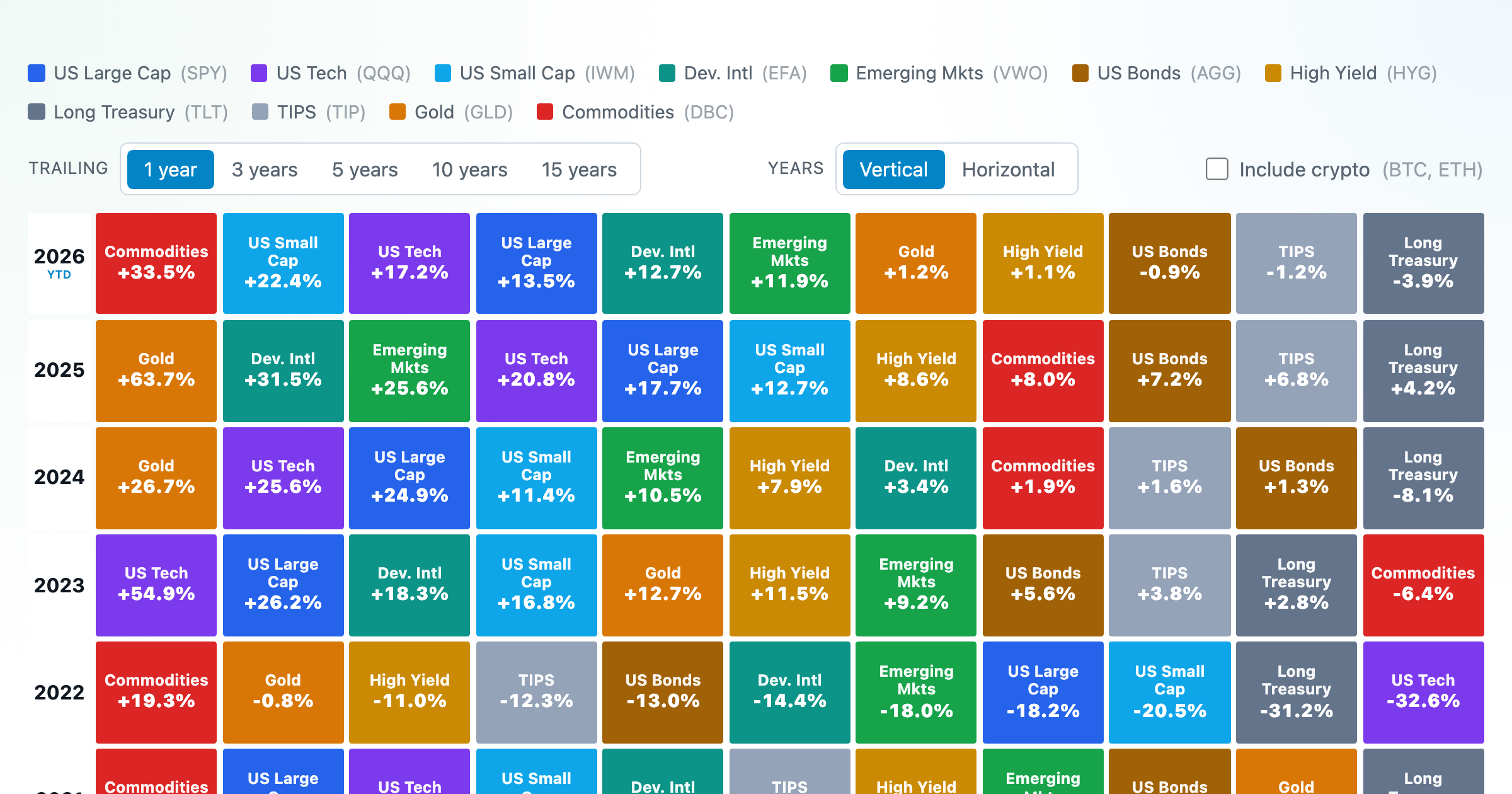
Asset-class returns ranked year by year — the Callan chart / asset allocation quilt.
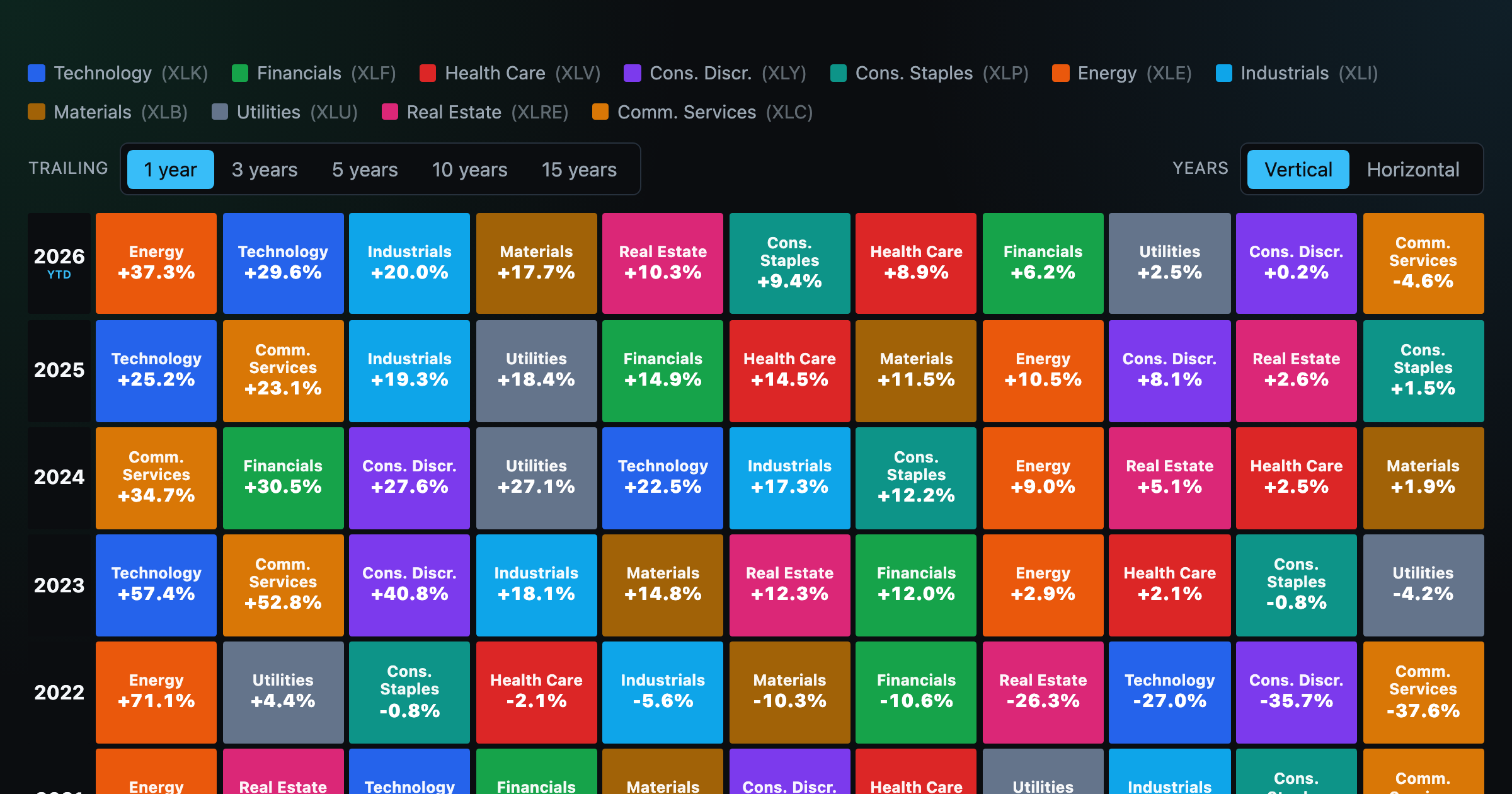
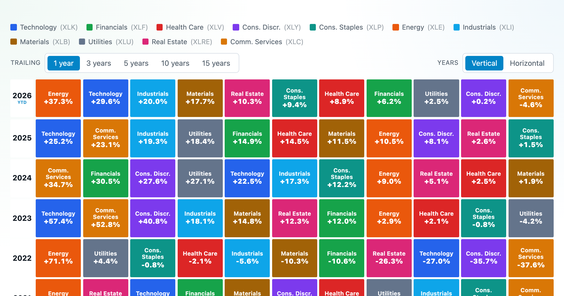
The 11 S&P 500 sectors ranked year by year — a sector quilt chart, back to 1999.

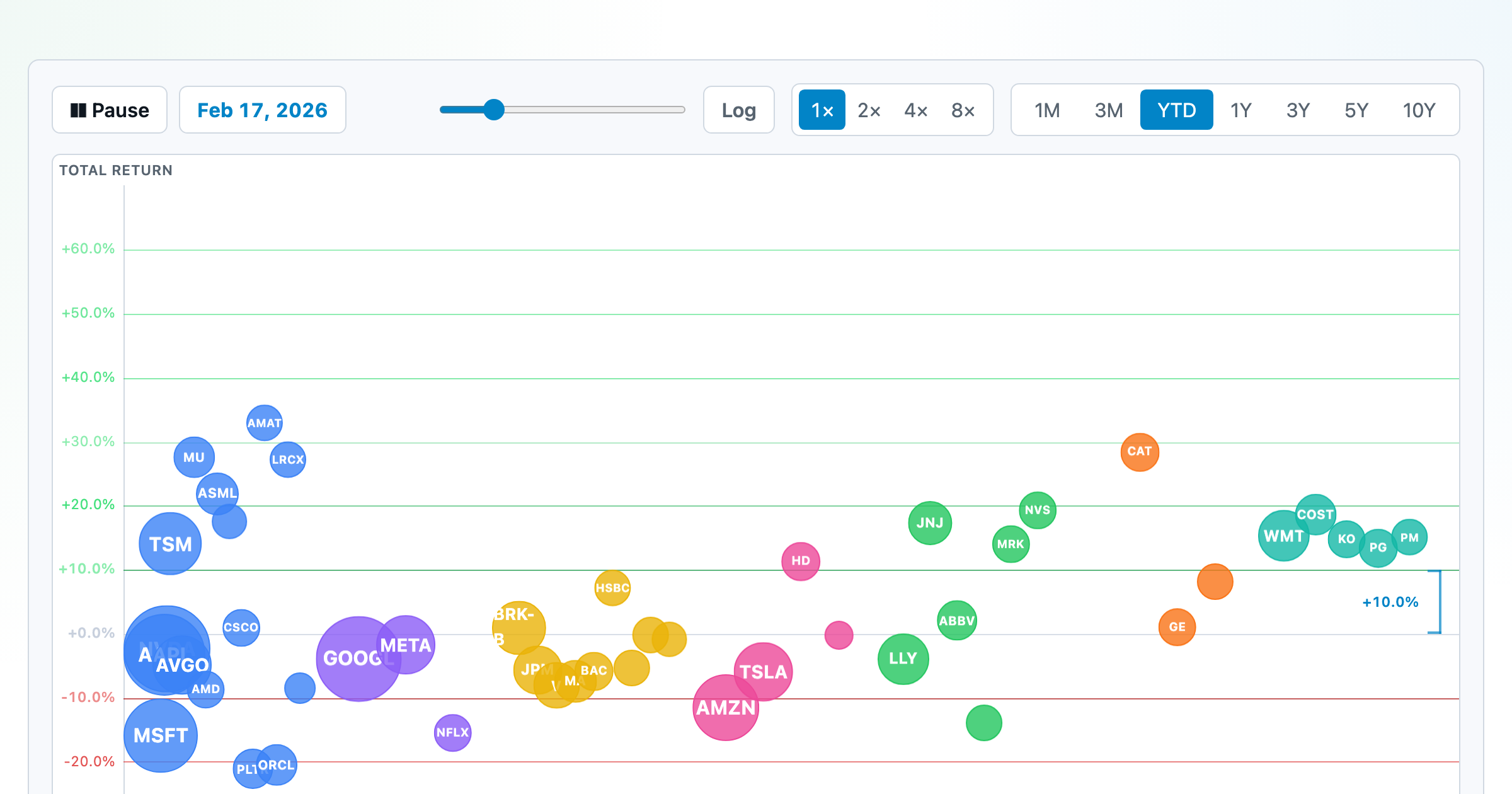
The biggest US companies as animated bubbles, rising and falling with their total return over time.
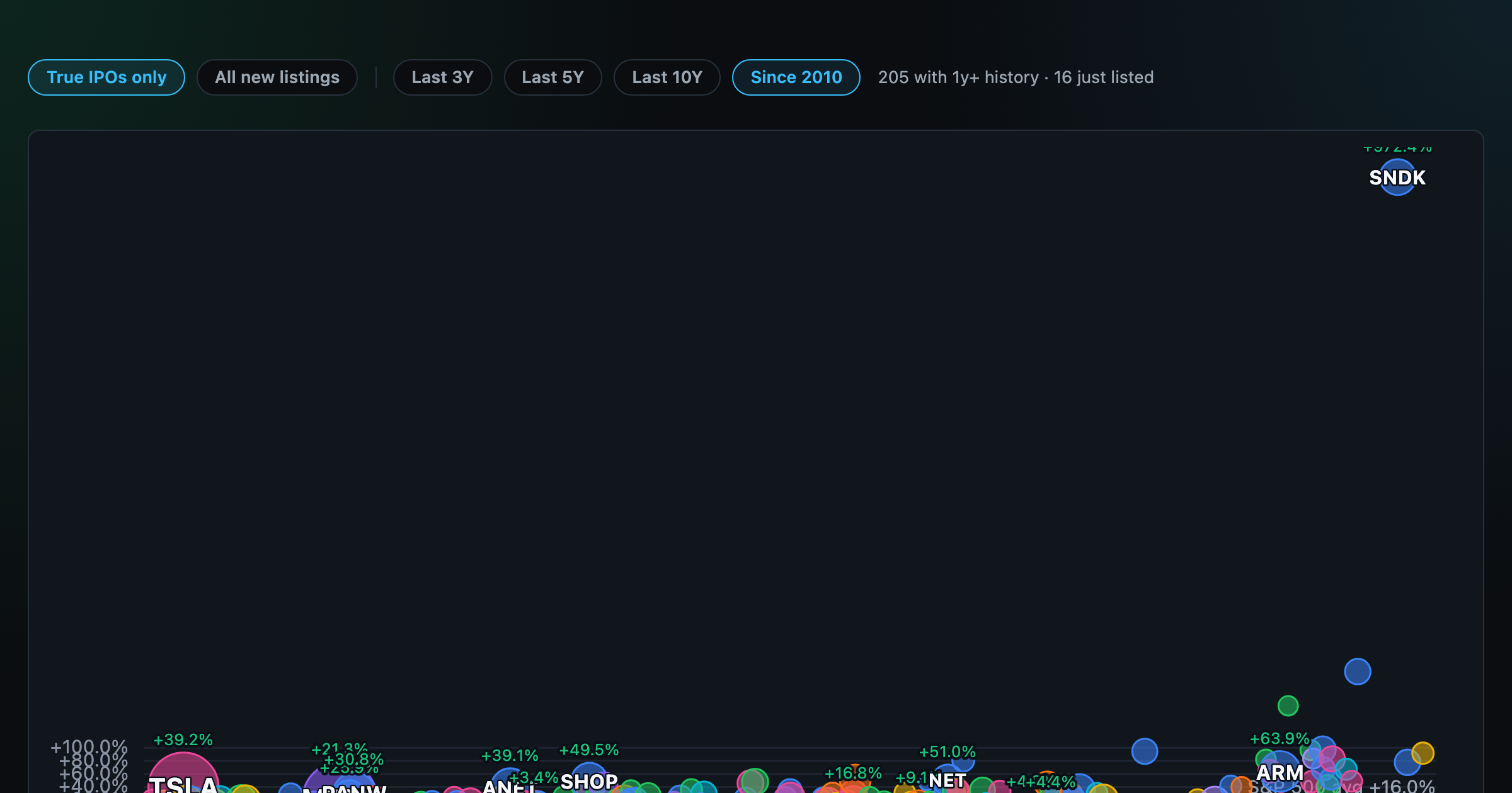
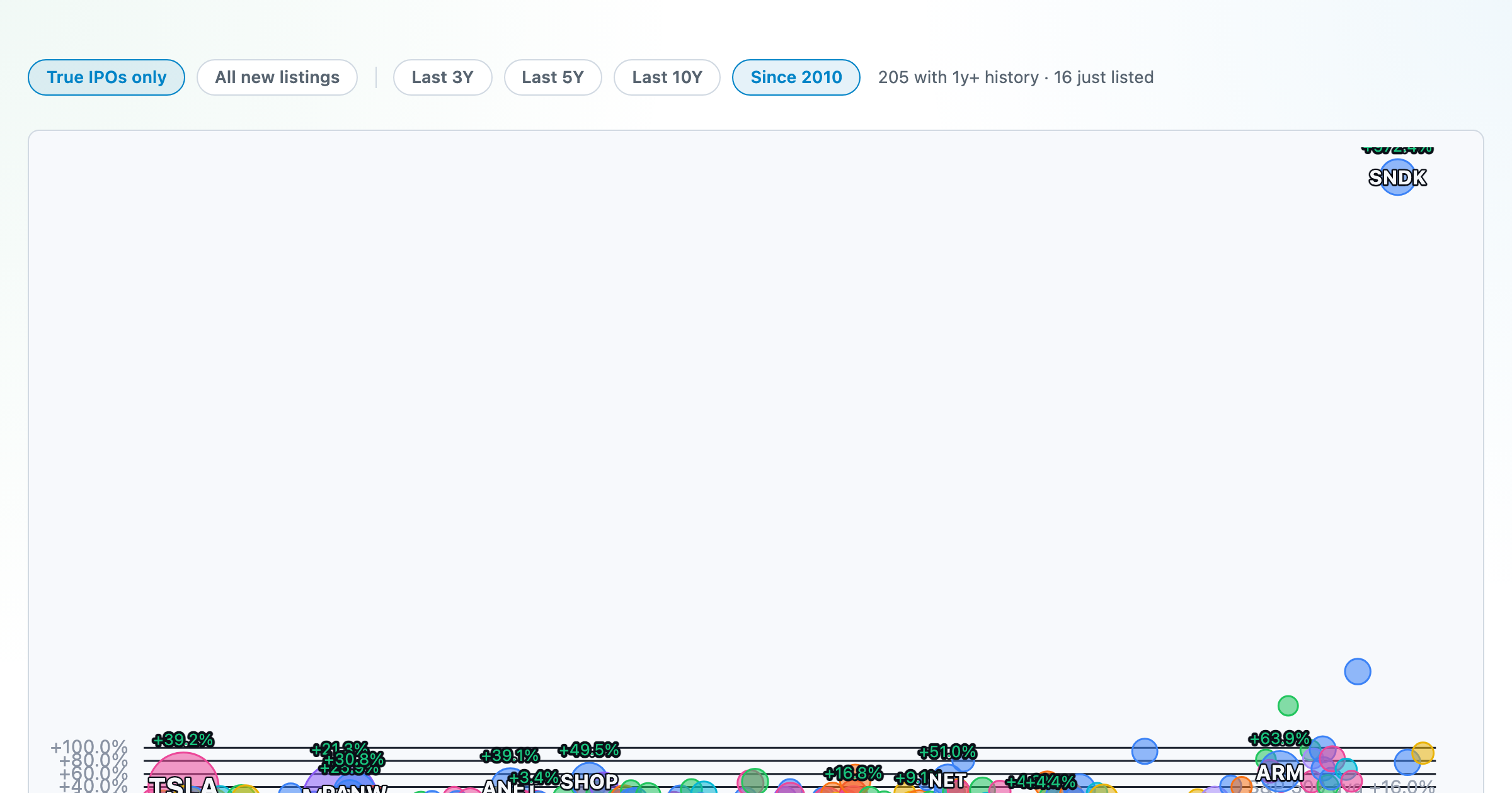
How recent stock-market debuts have performed since listing — annualized, vs the S&P 500, by IPO vs spin-off.
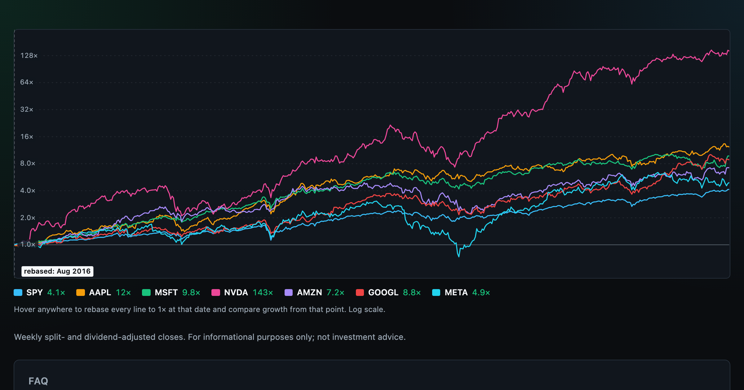
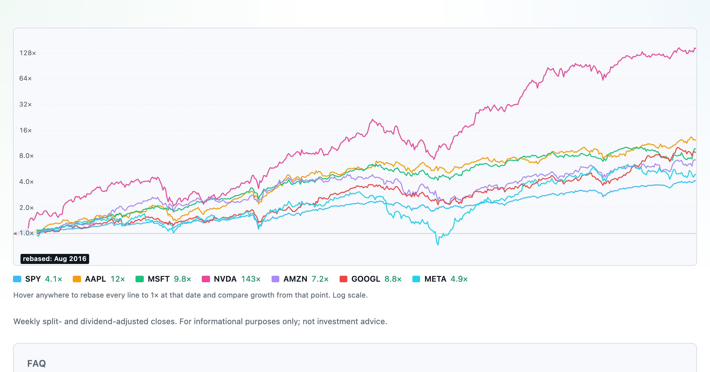
Compare megacaps vs the S&P 500, rebased to 1× at any date you hover.

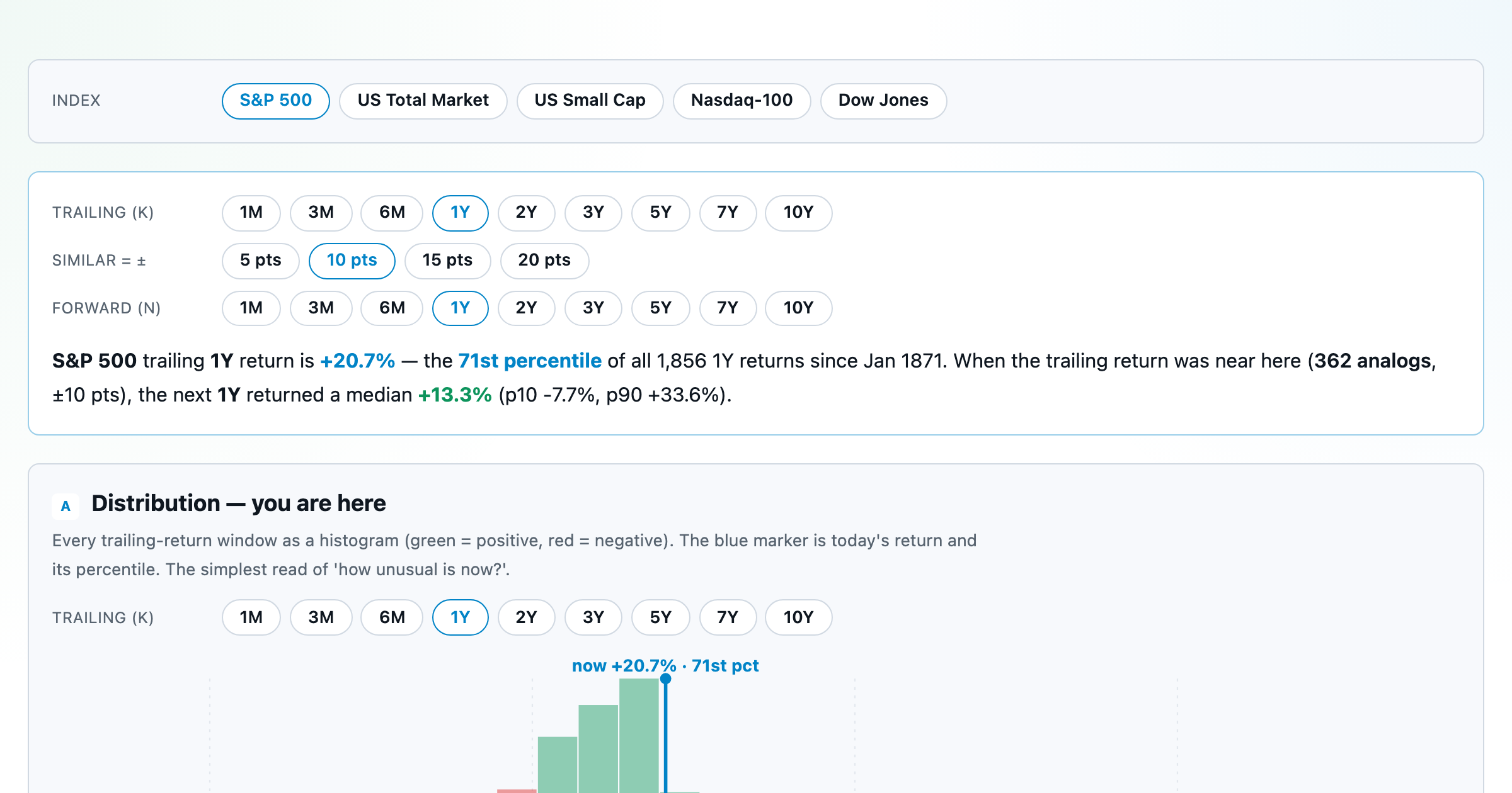
Where today's S&P 500 return ranks against all history — and the forward returns that followed similar moments.
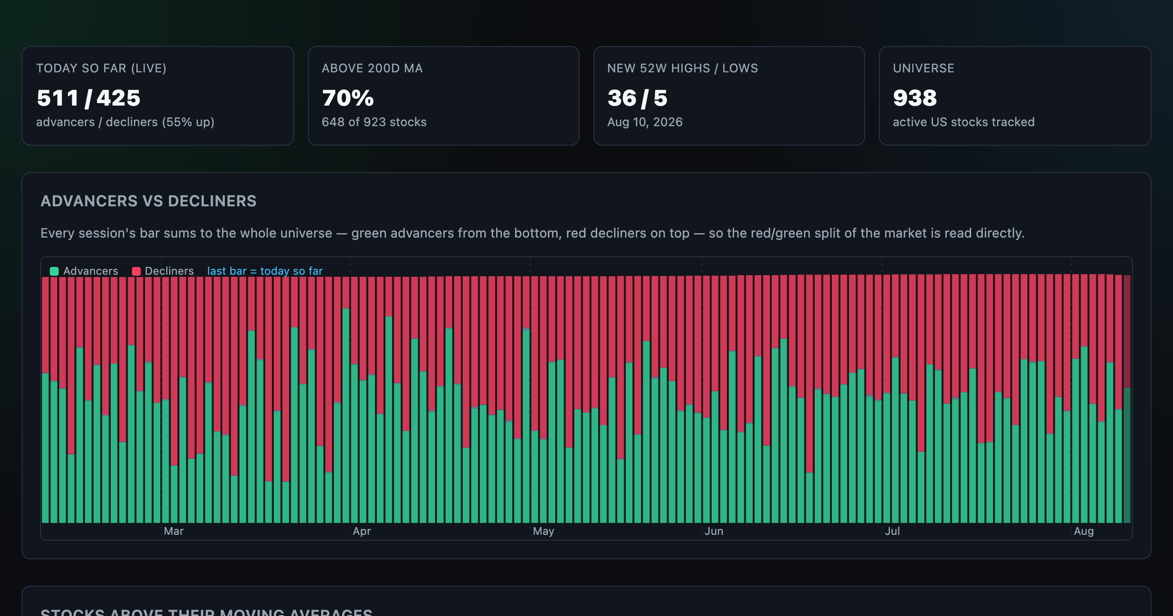
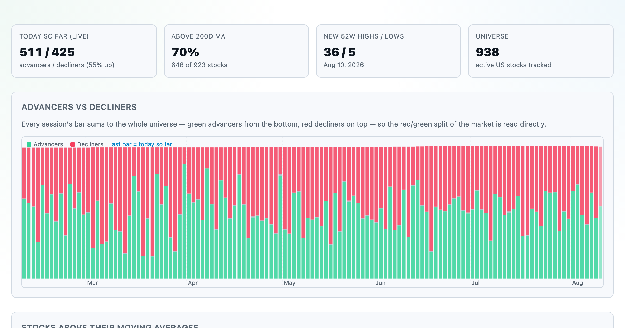
Advancers vs decliners over time, % of stocks above their moving averages, new highs vs lows, and breadth across every trailing window.
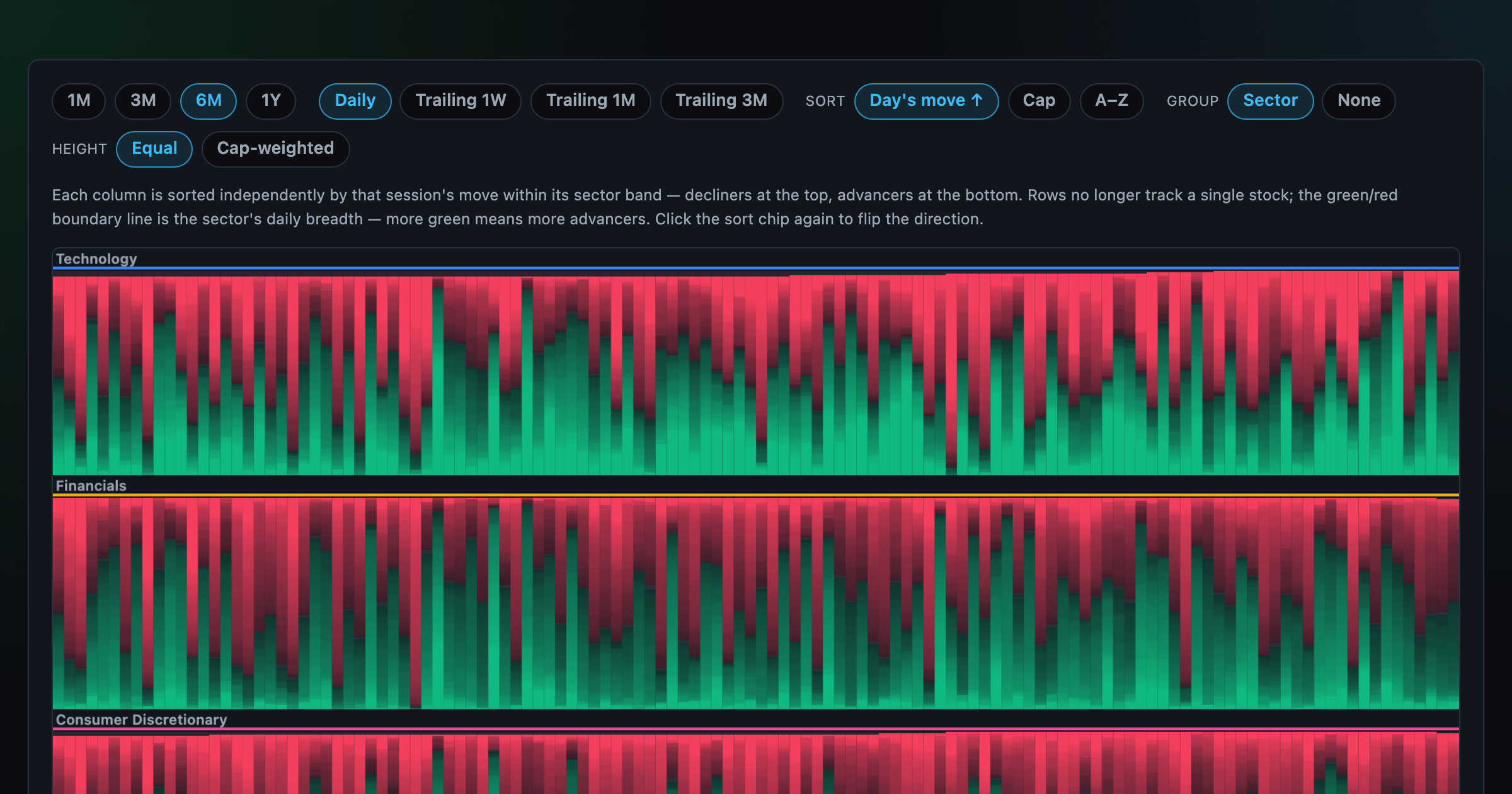
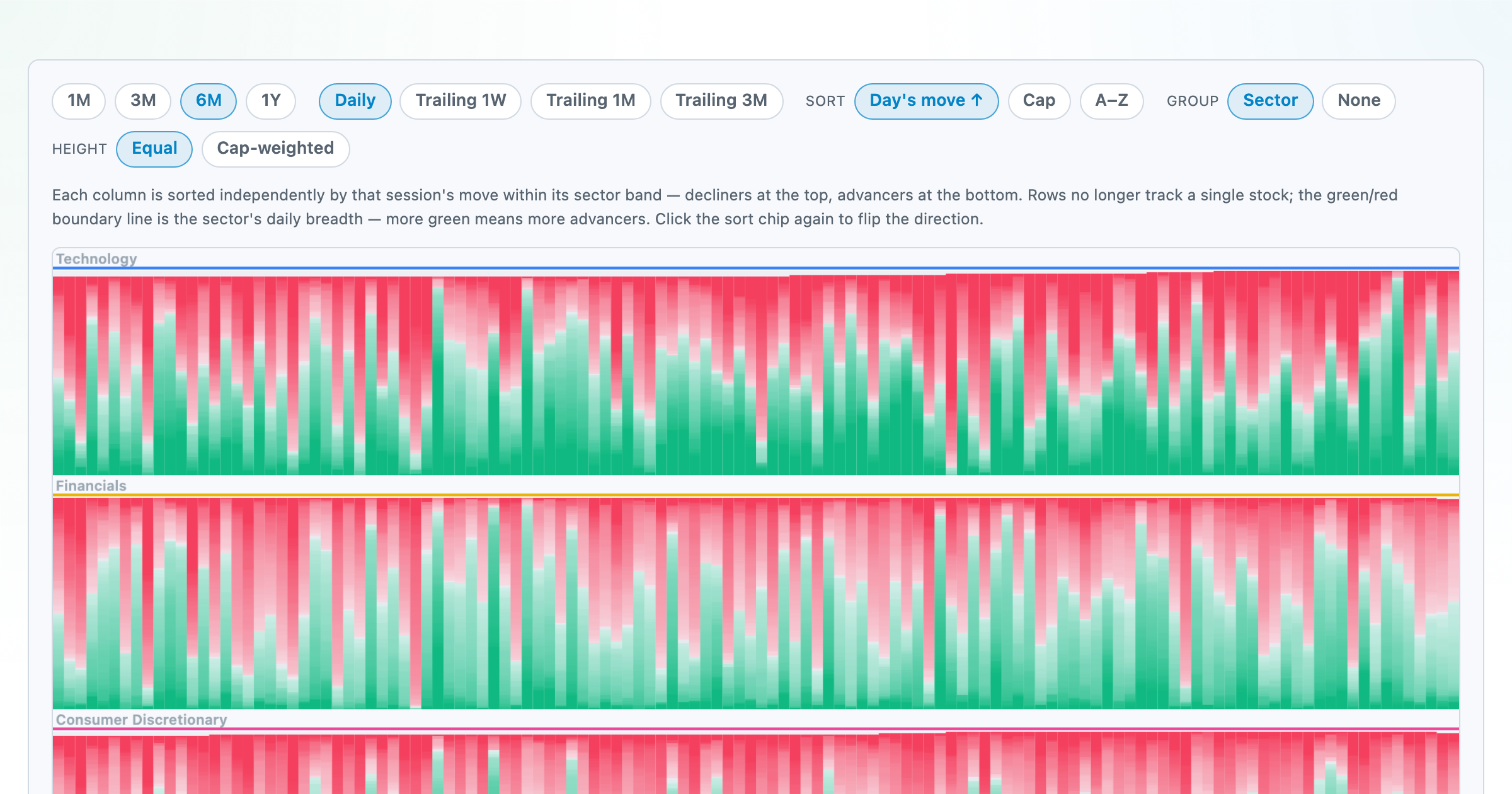
Every stock as a row, every day as a column — market selloffs are vertical stripes, sector routs are blocks.
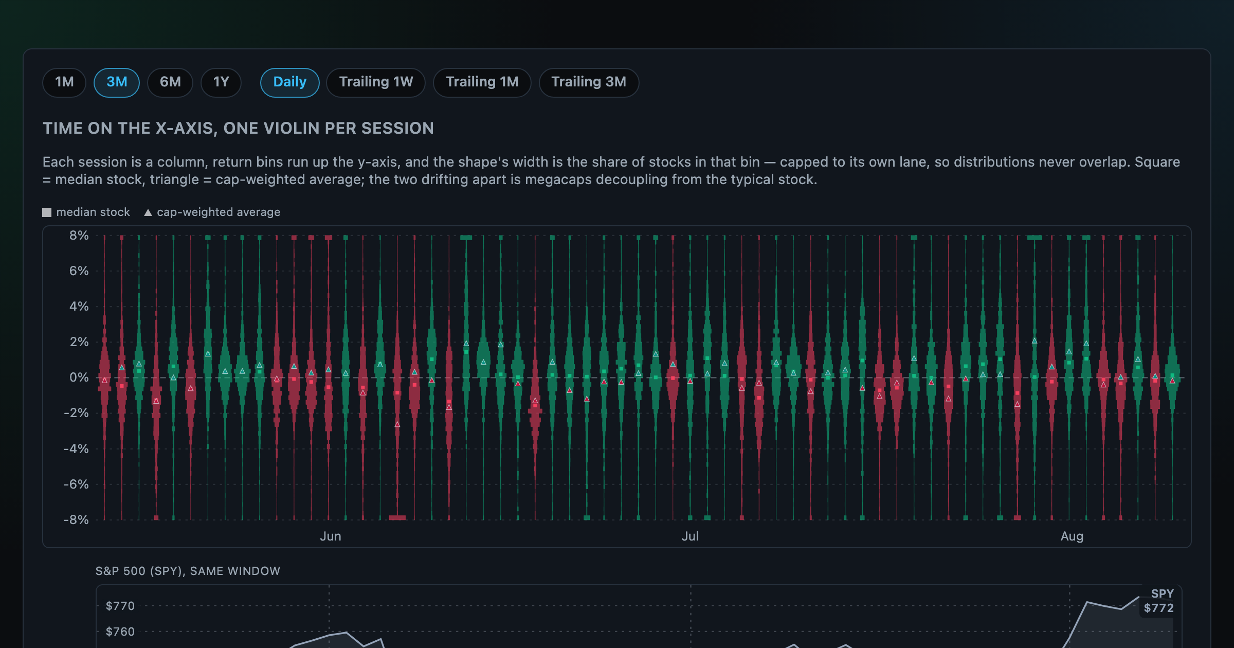
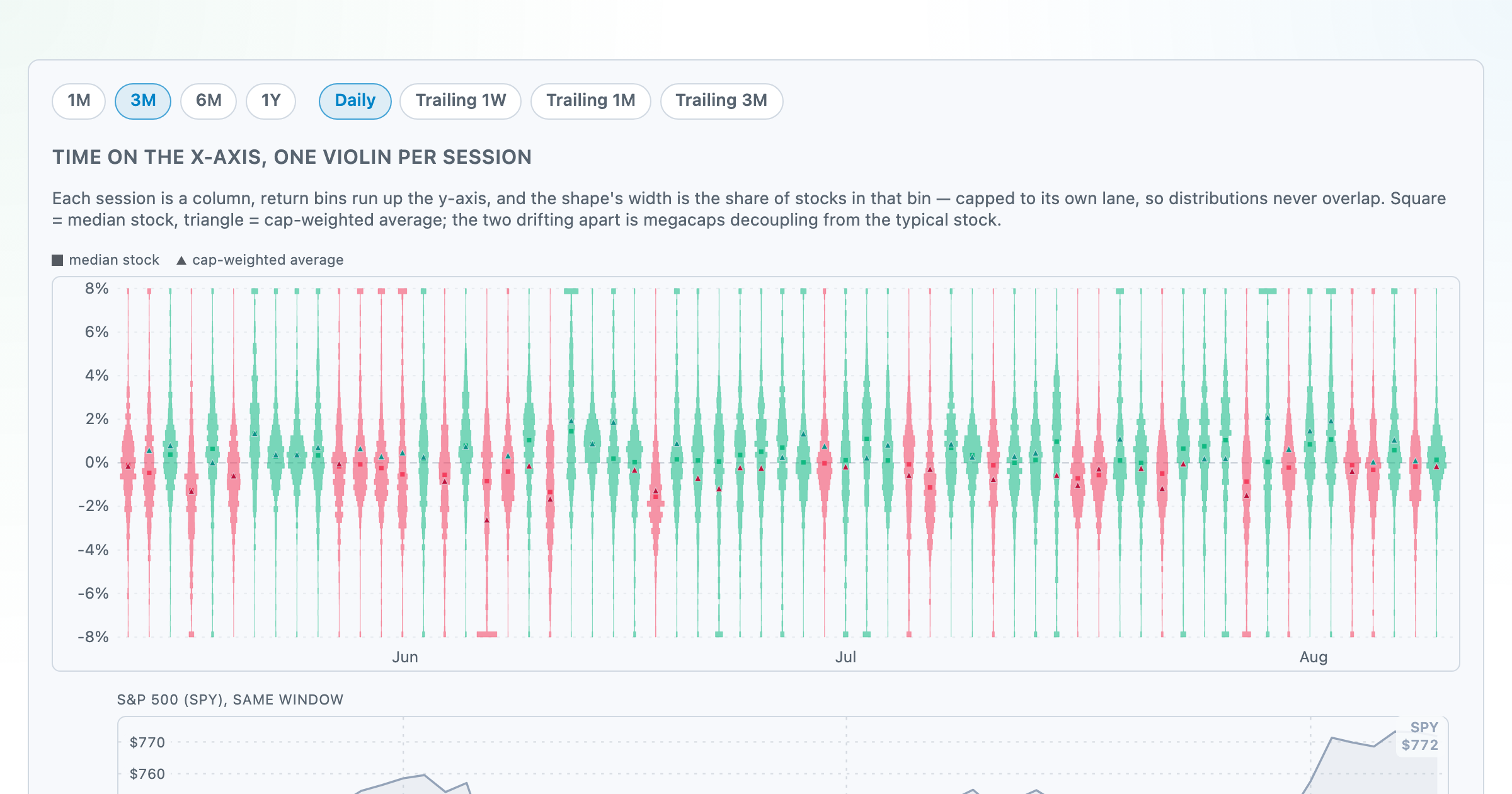
Each session's full distribution of stock returns as an upright violin, with the S&P 500 on the same axis — shifts, dispersion, and fat tails at a glance.
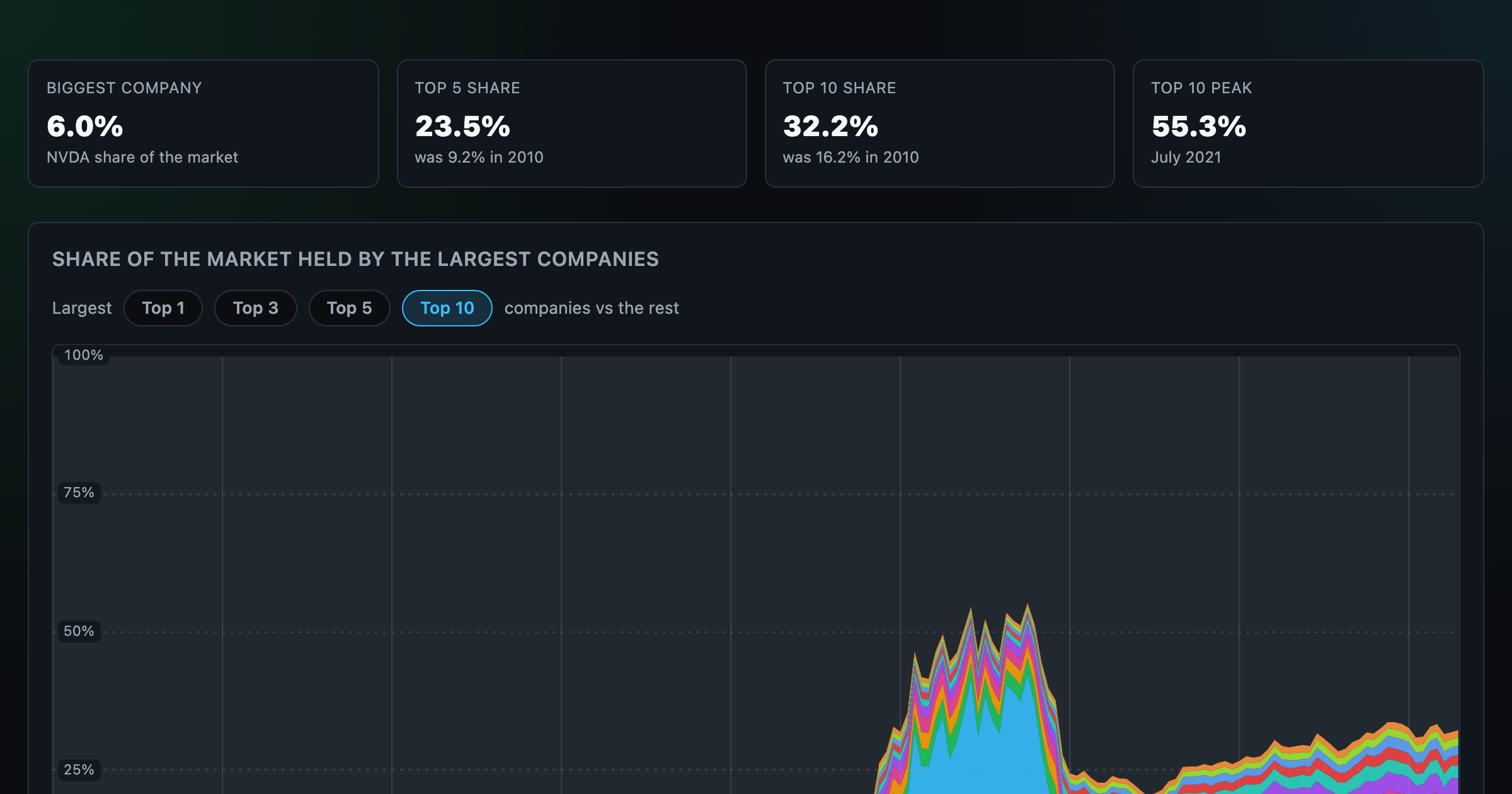
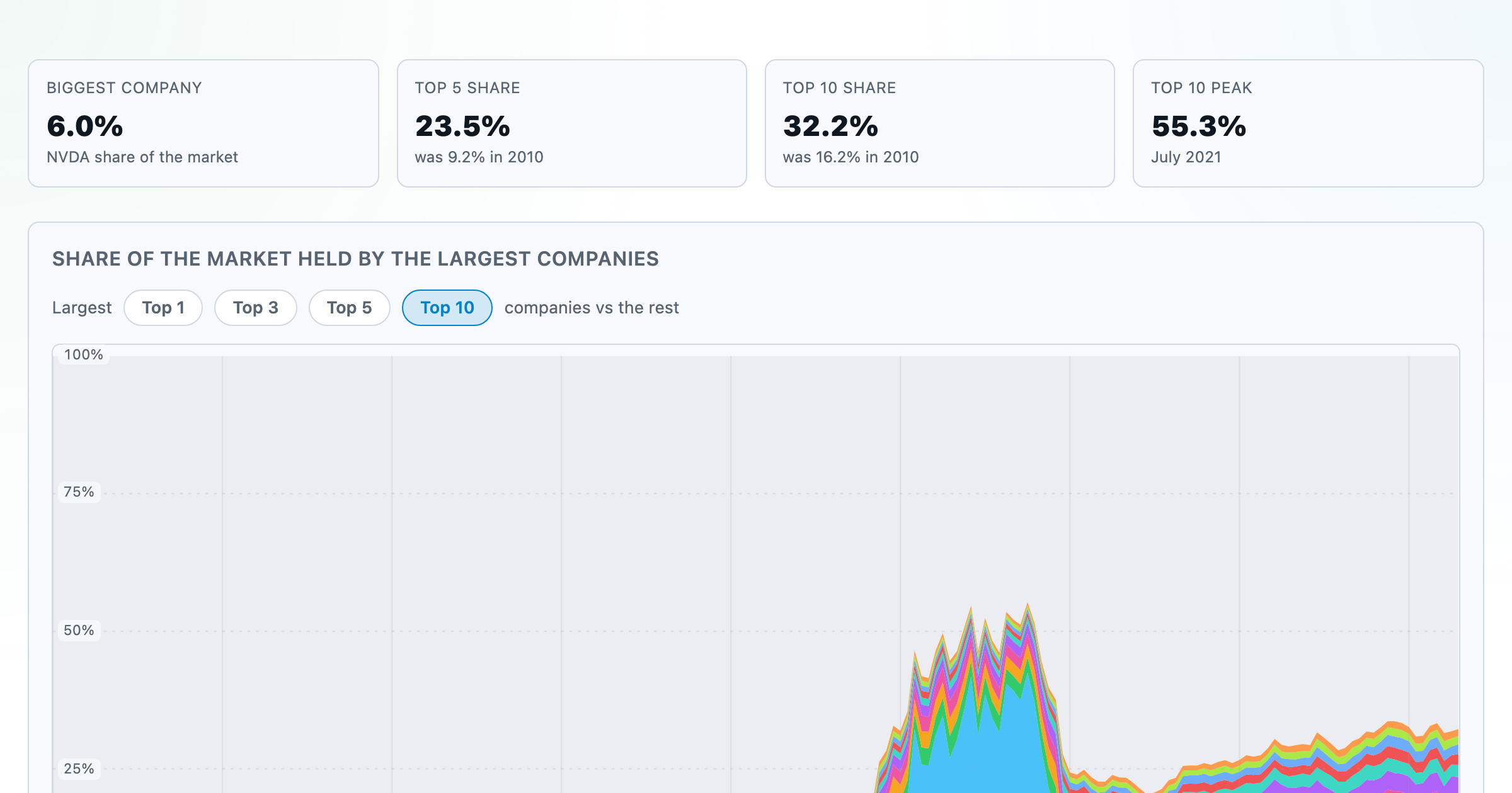
How top-heavy is the market? The top 1–10 companies' share of total market value, month by month since 2010.
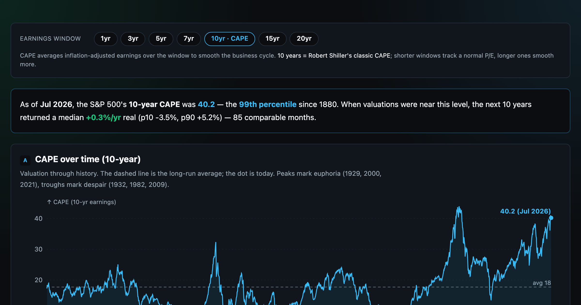
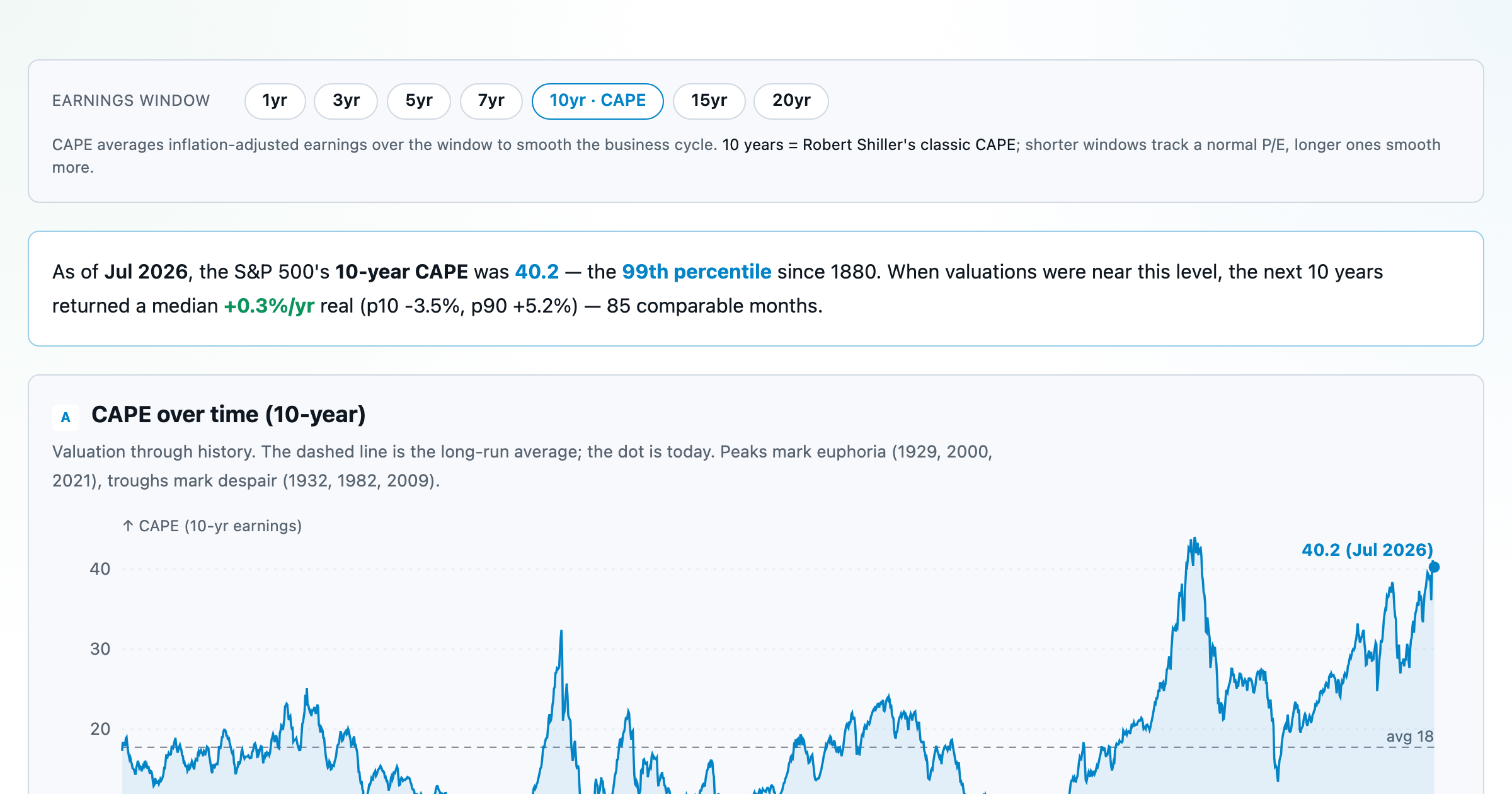
Is the market expensive? The Shiller CAPE back to 1871 and what valuations have meant for the next decade.
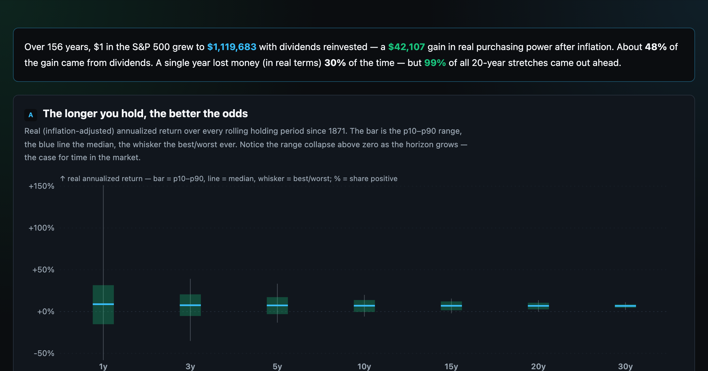
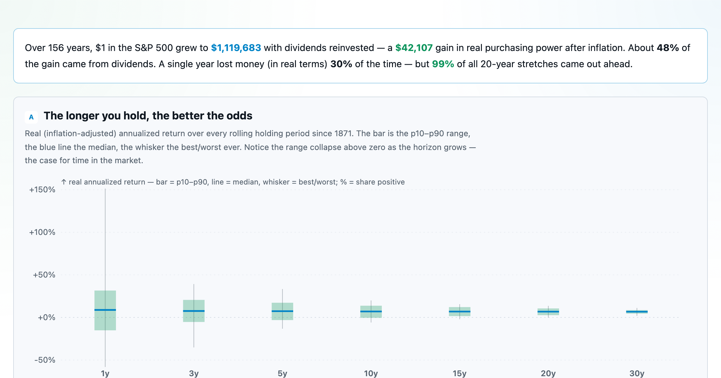
The S&P 500 since 1871 — odds of gain by holding period, real drawdowns, and the growth of $1.
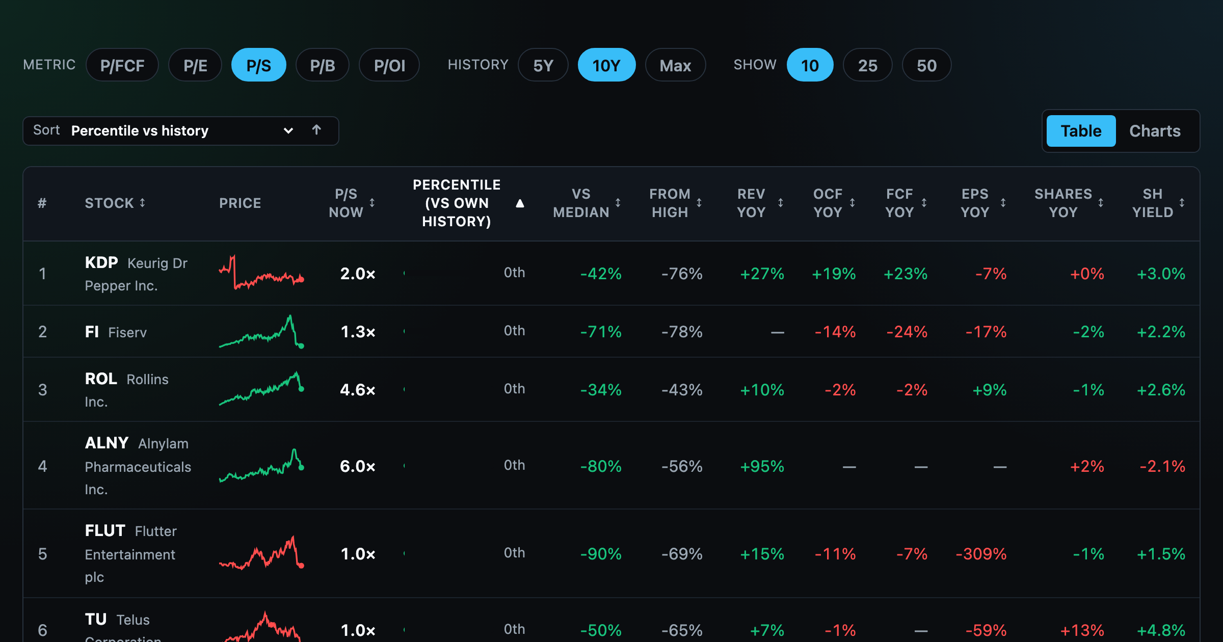
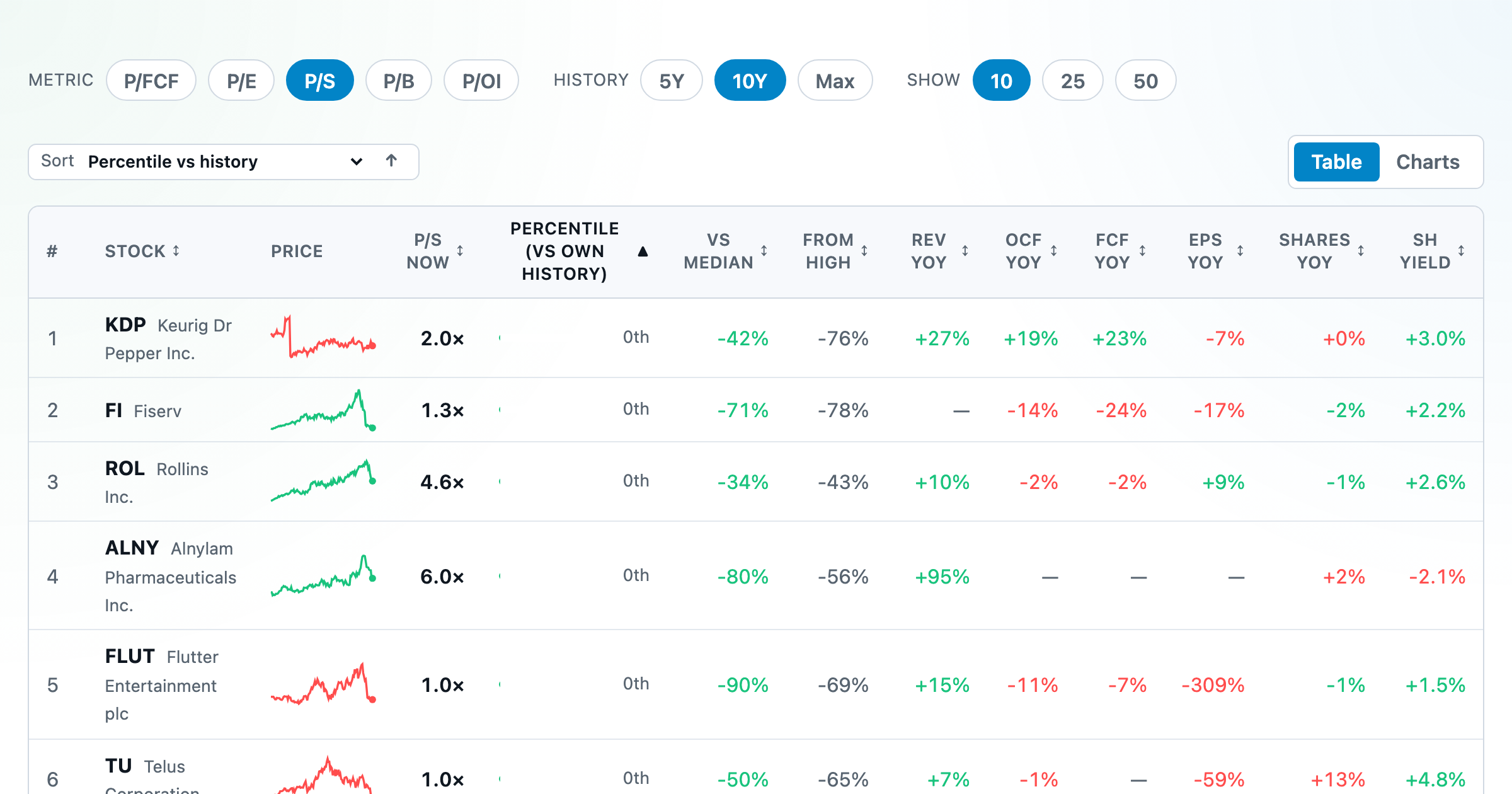
Stocks trading cheapest relative to their own P/E, P/FCF, P/S, or P/B history — with fair-value bands.
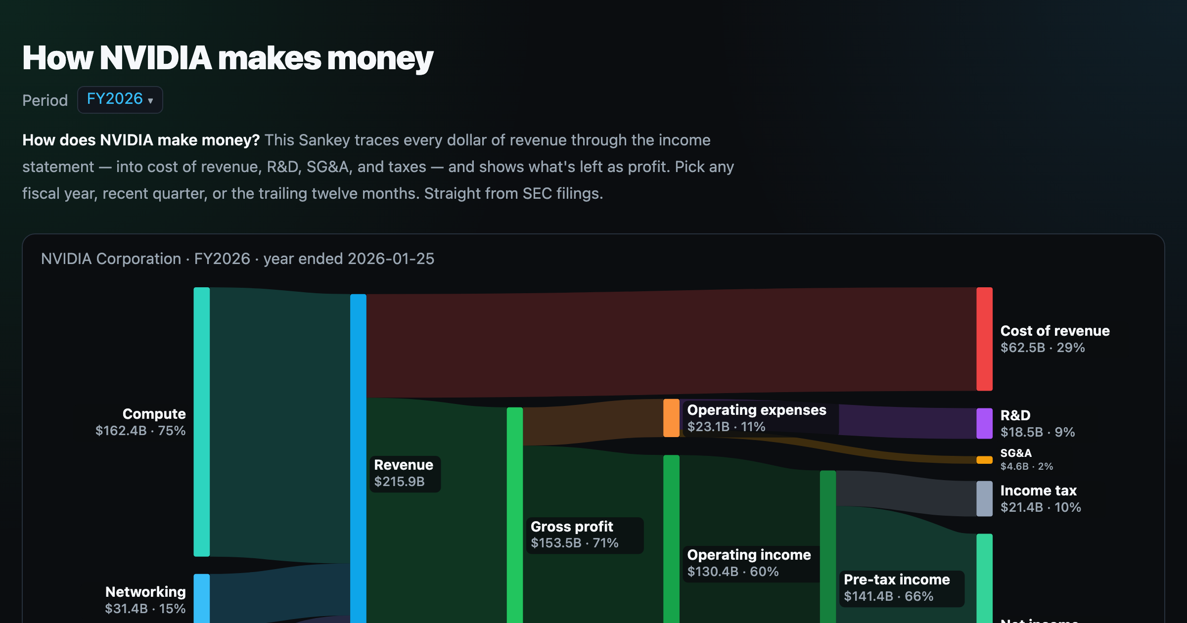
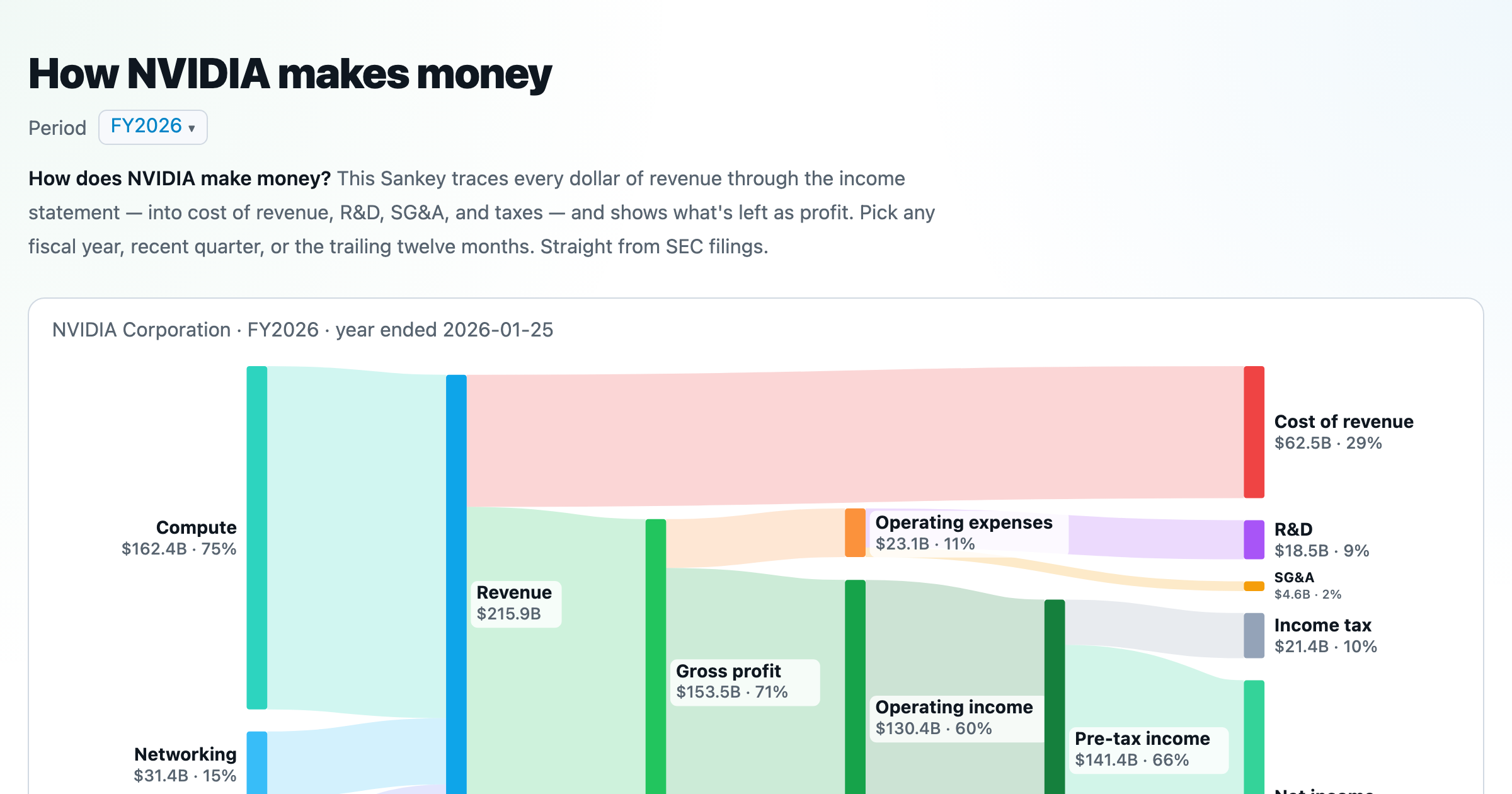
Follow a company's revenue through its income statement as a Sankey — costs, taxes, and profit.
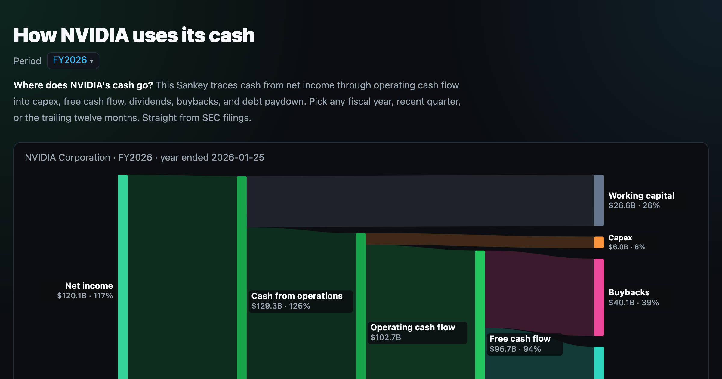
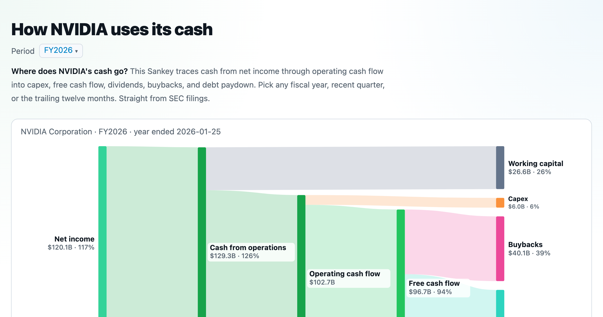
Follow a company's cash from net income through operating cash flow into capex, buybacks, and dividends.
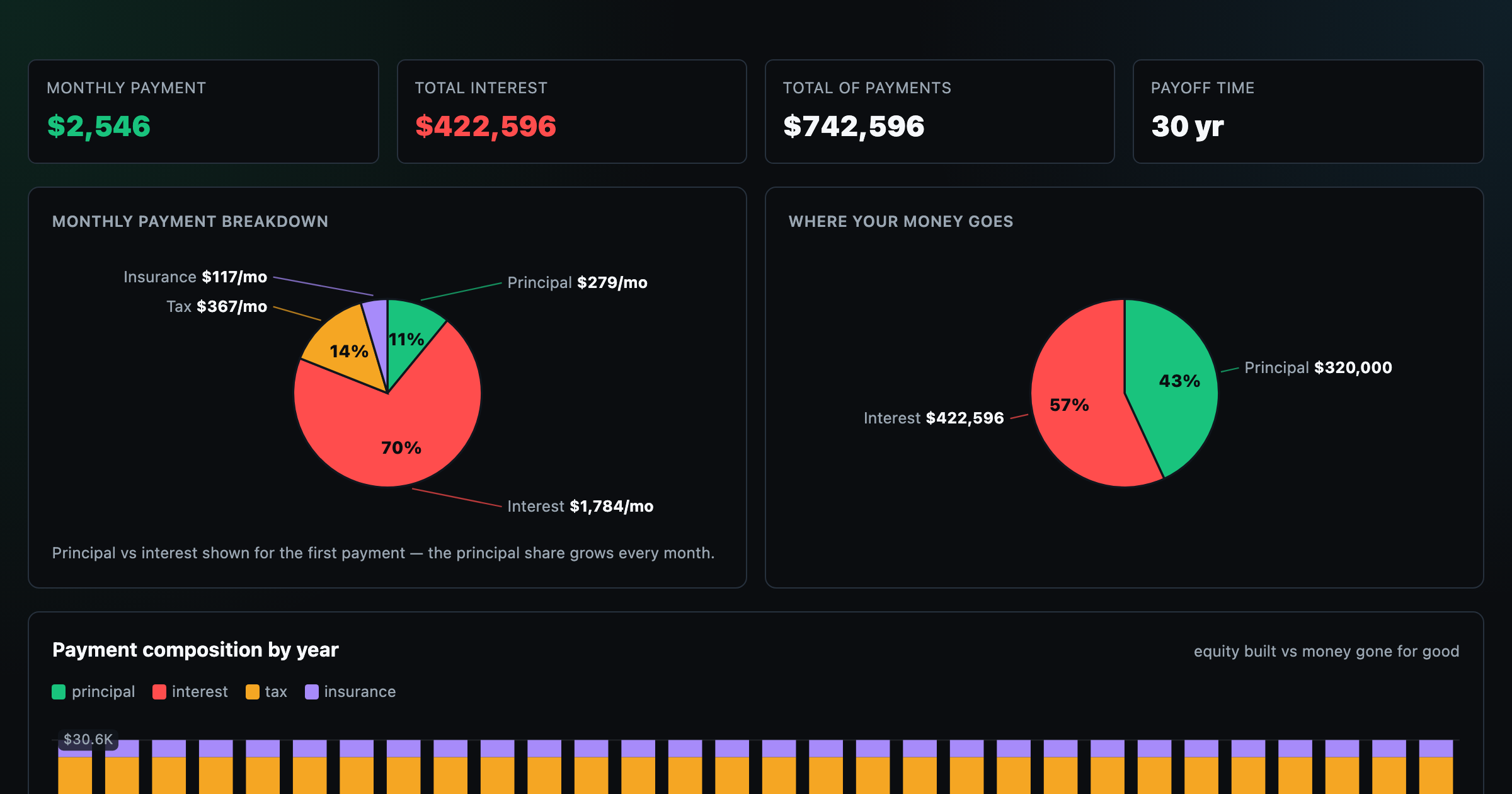
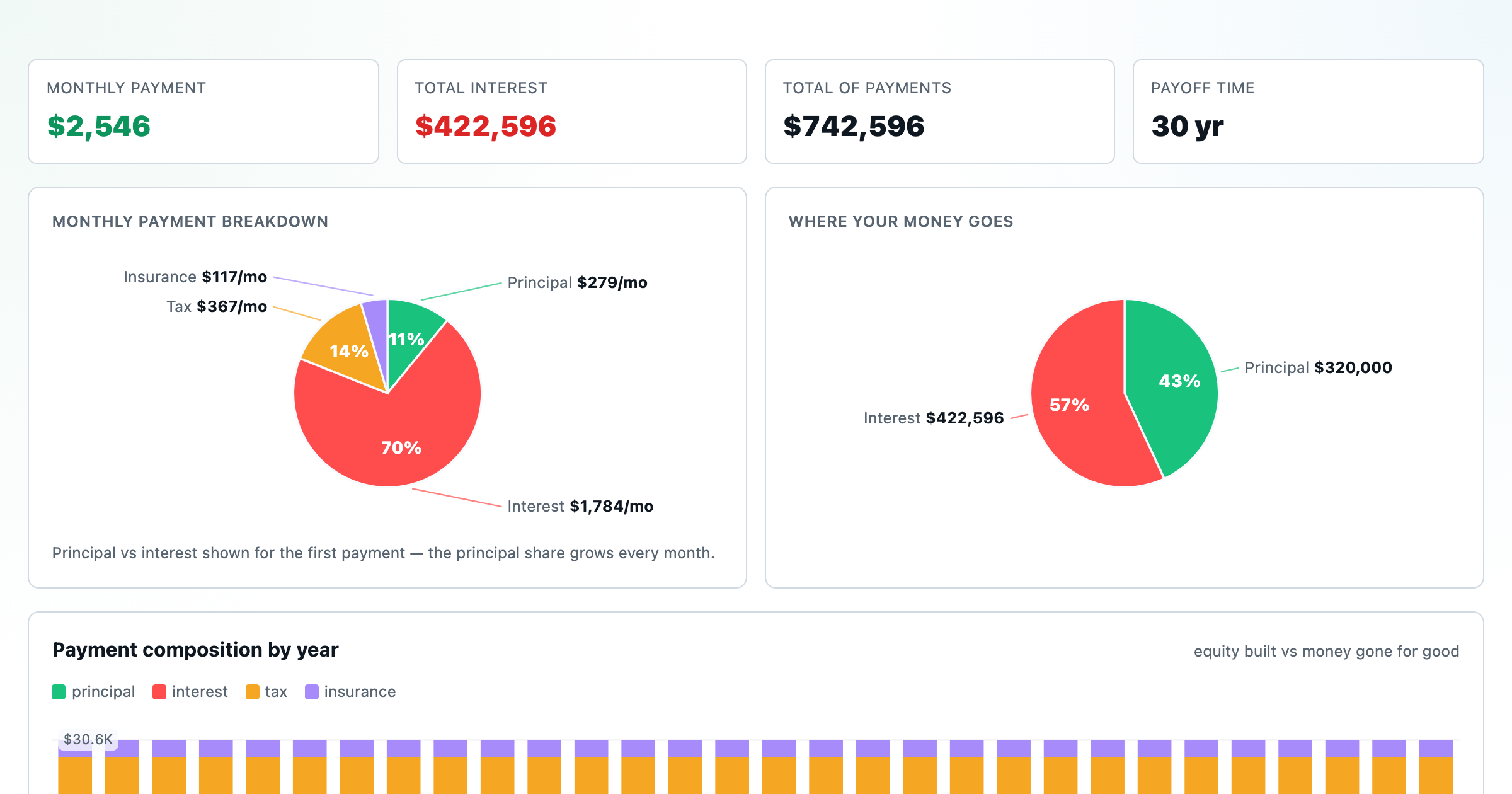
Monthly payment, principal vs interest by year, and the balance paydown — with extra-payment savings.
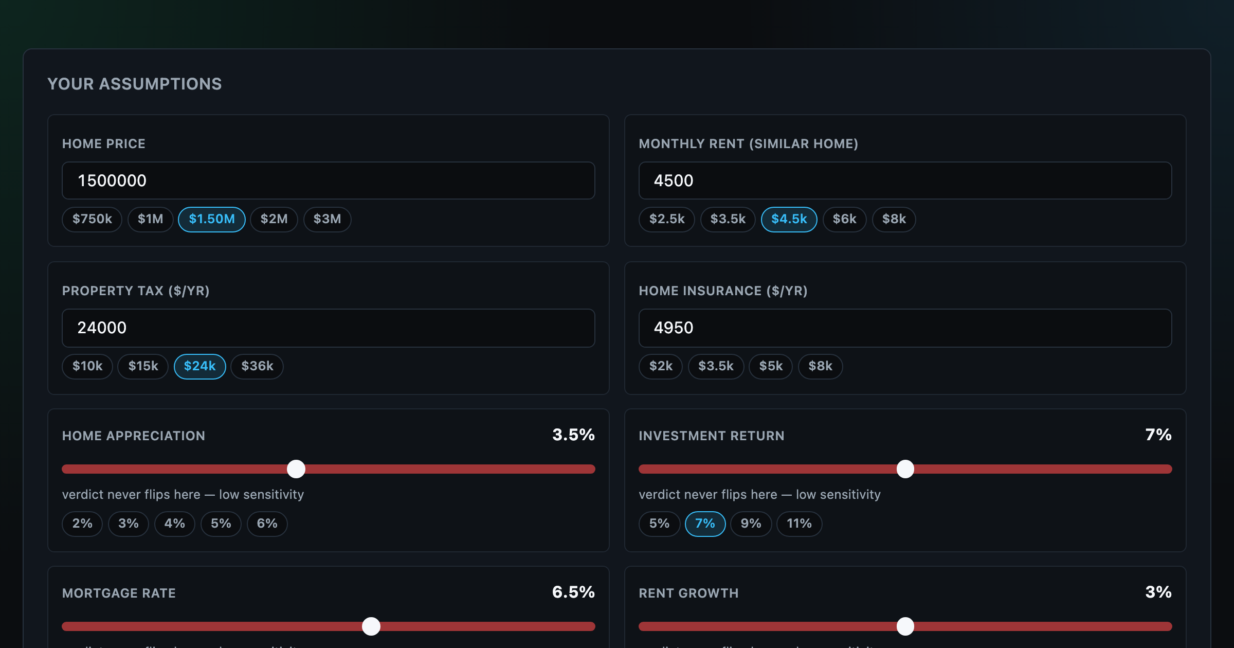
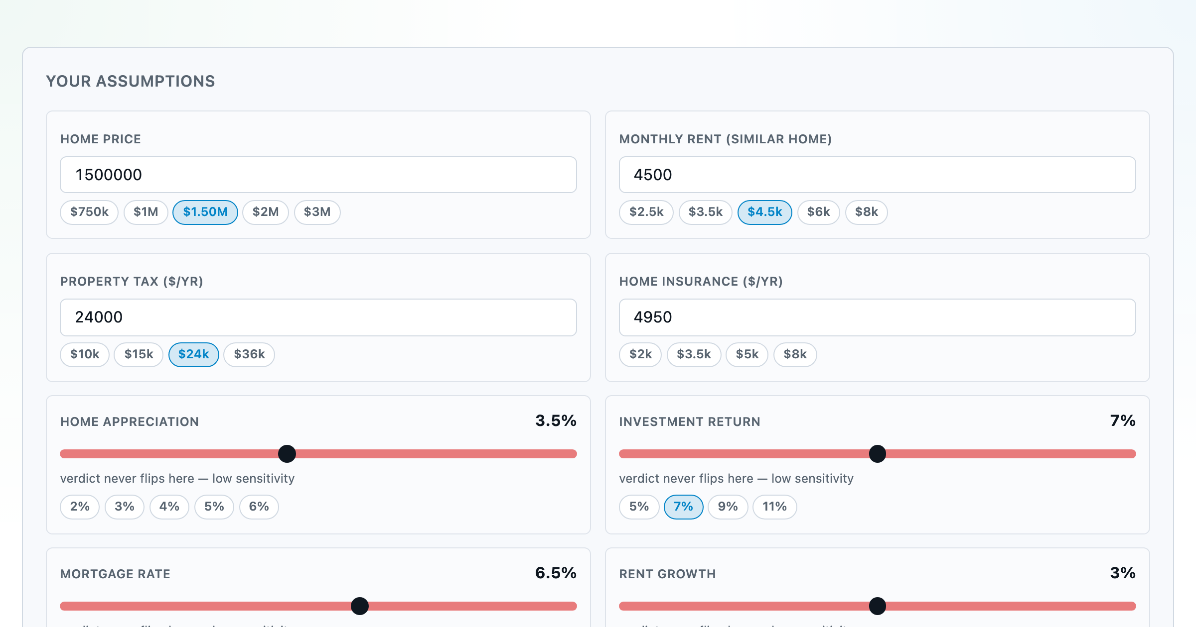
Should you rent or buy? Net-wealth verdict with sensitivity analysis of every assumption.
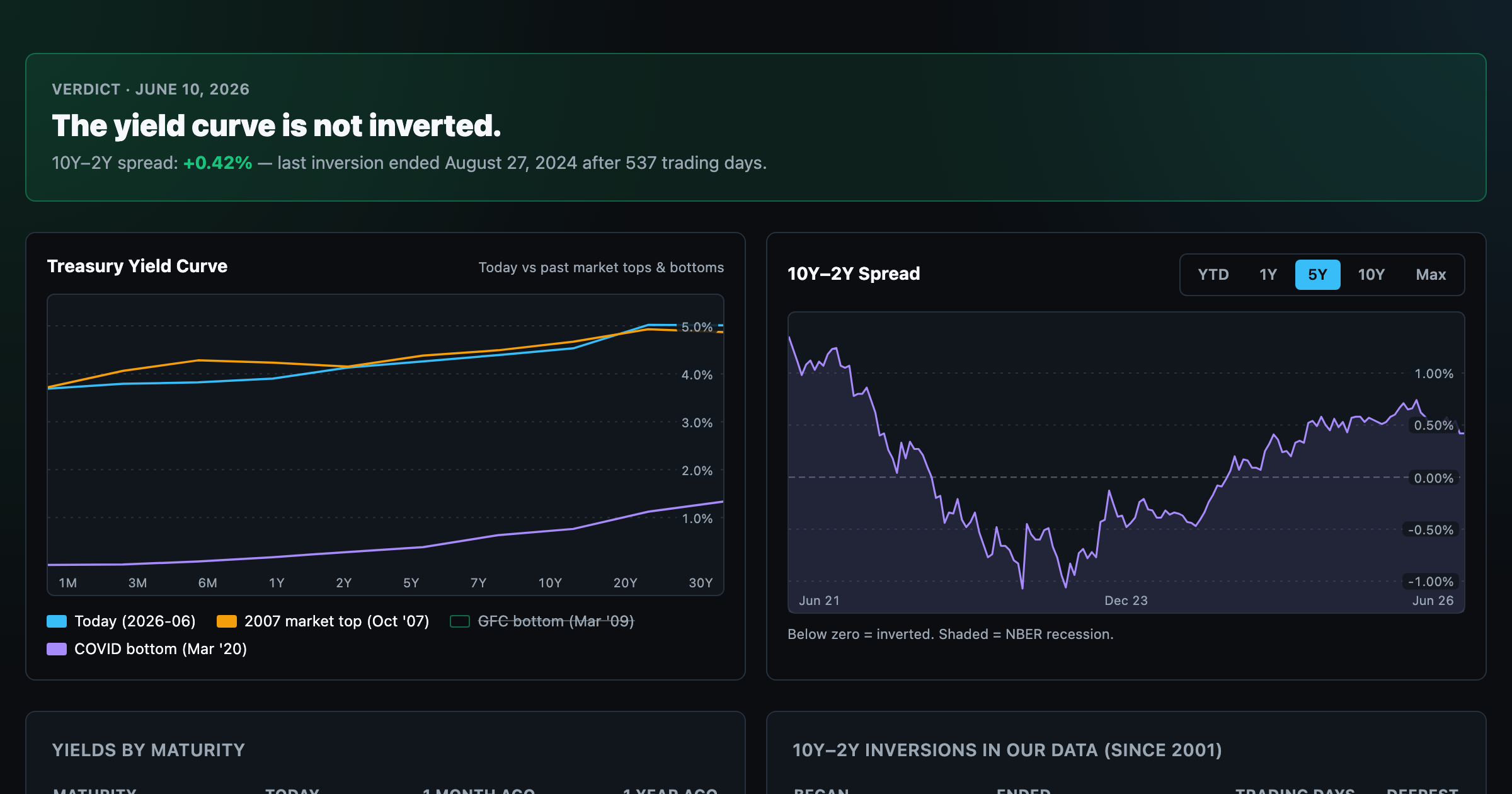
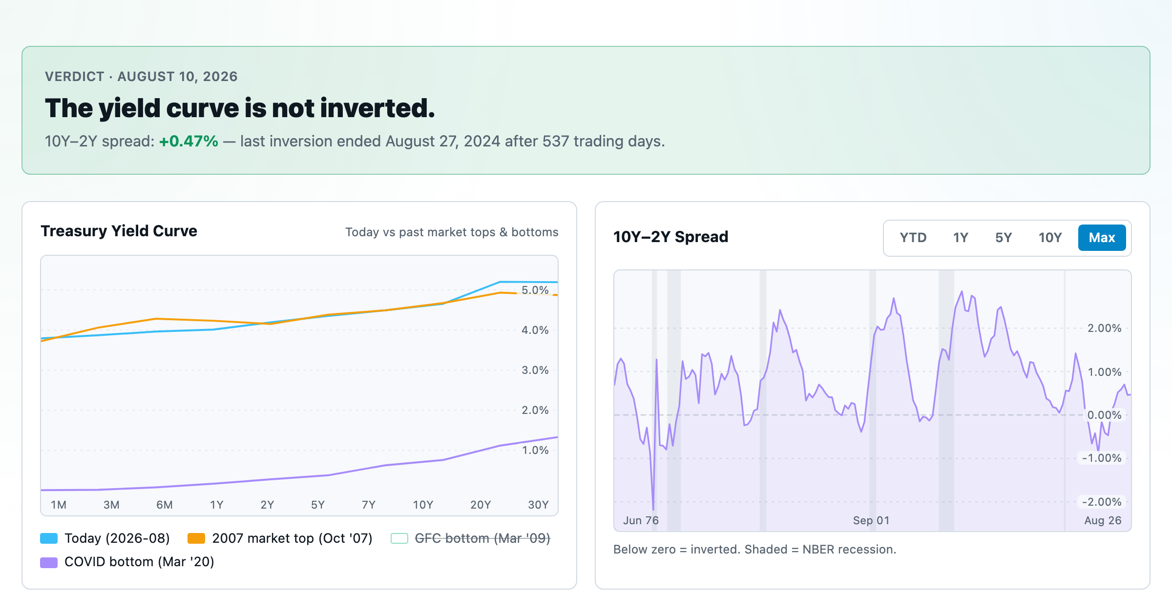
Live term structure, the 10Y–2Y spread, and every inversion episode.