Market visualizations
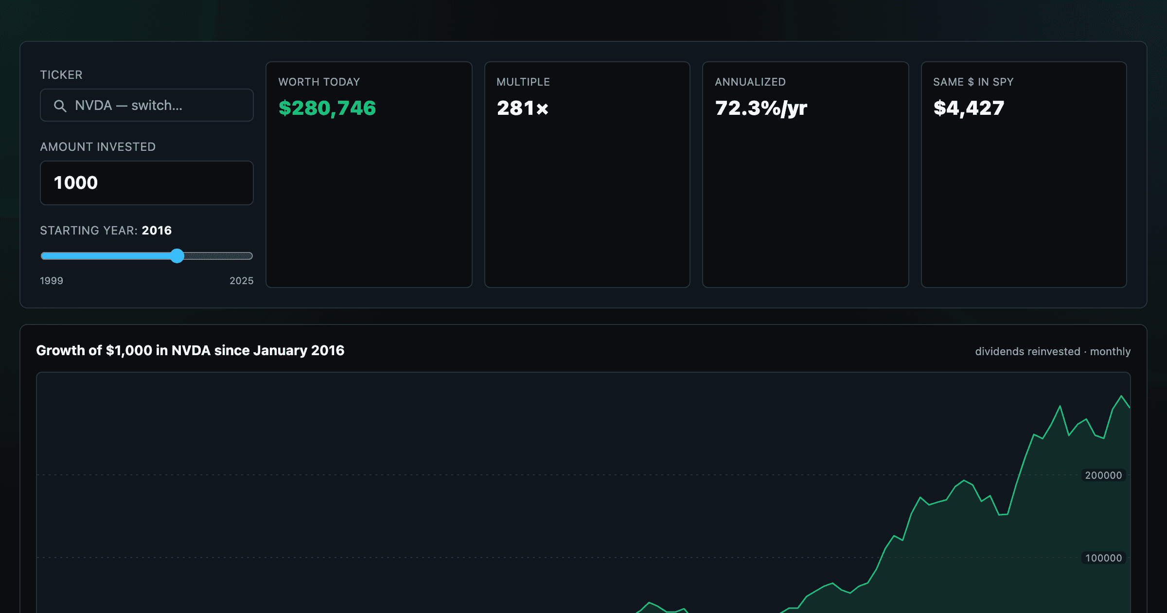
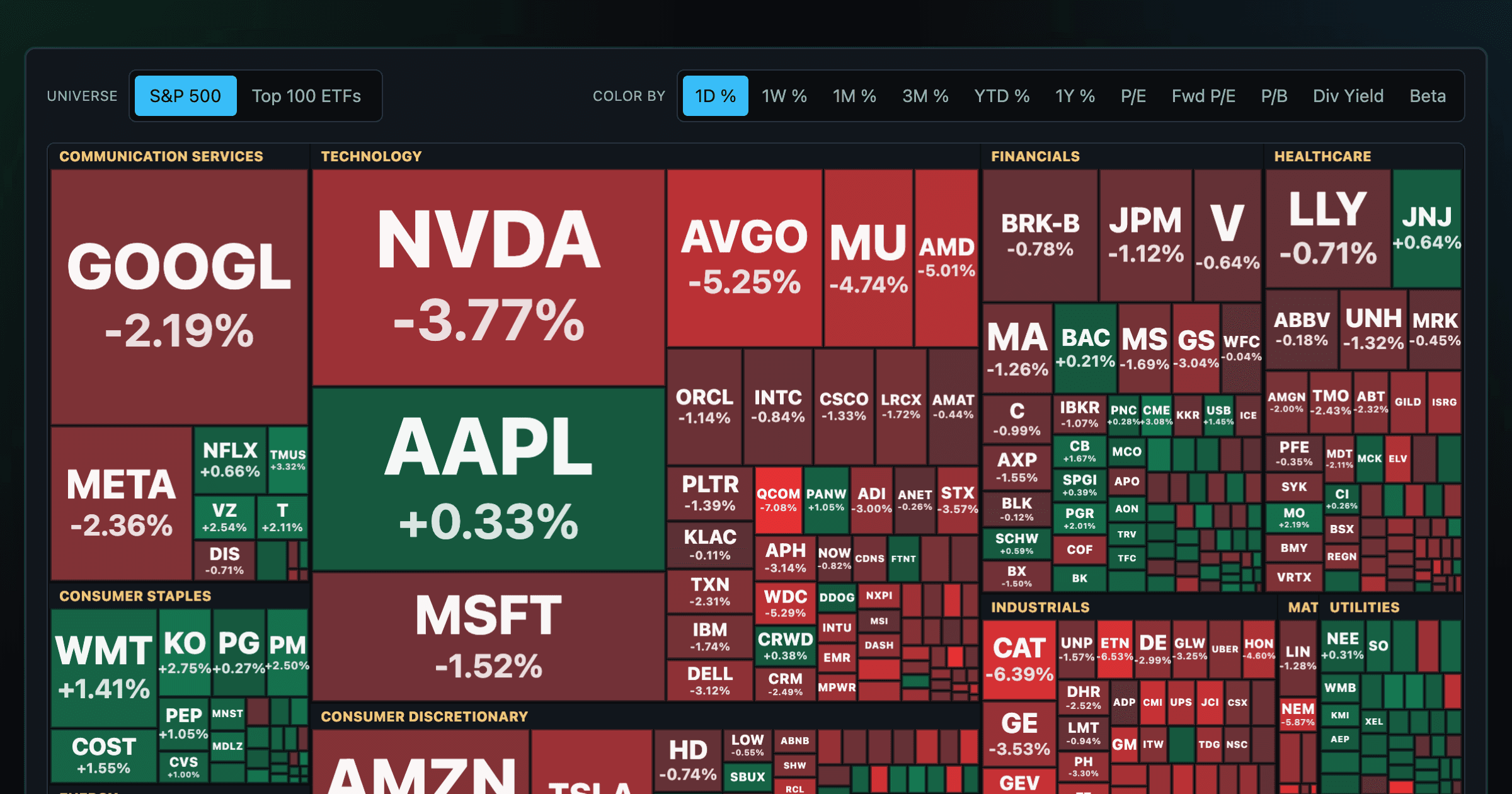
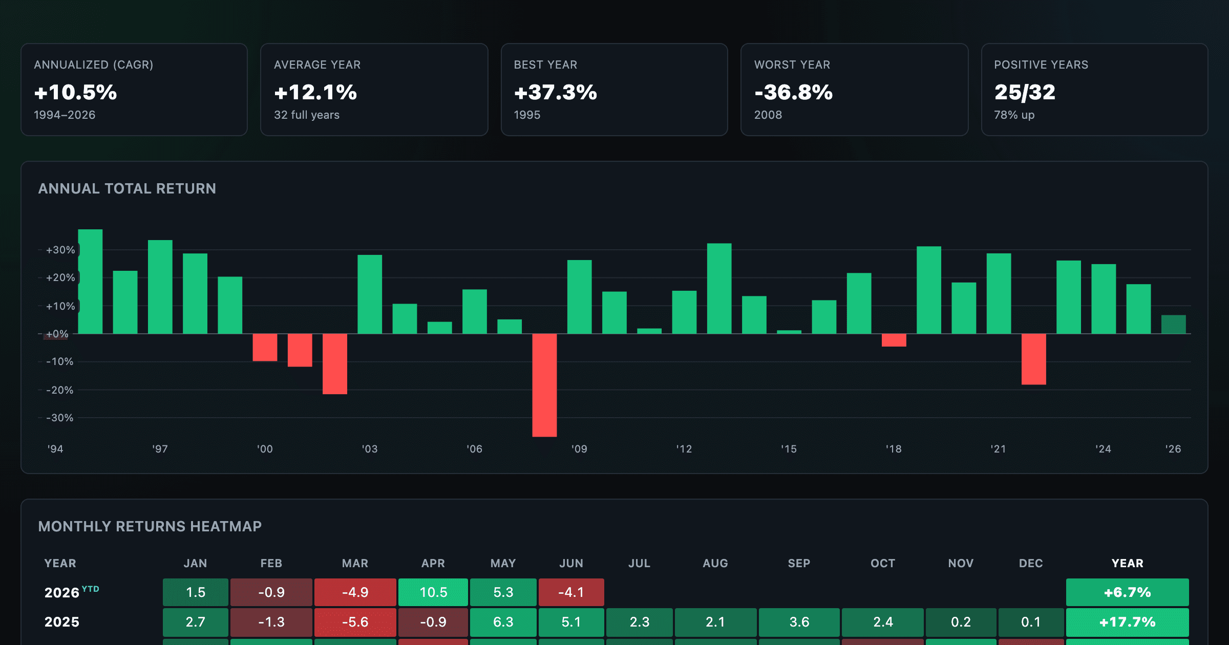
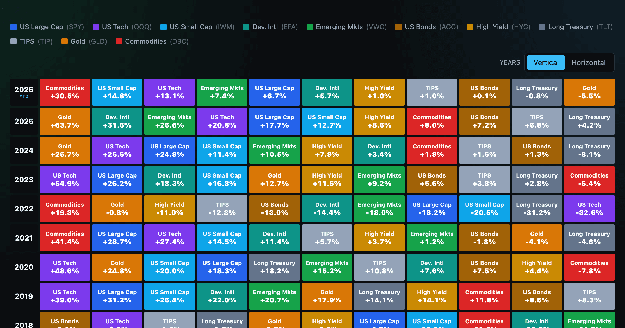
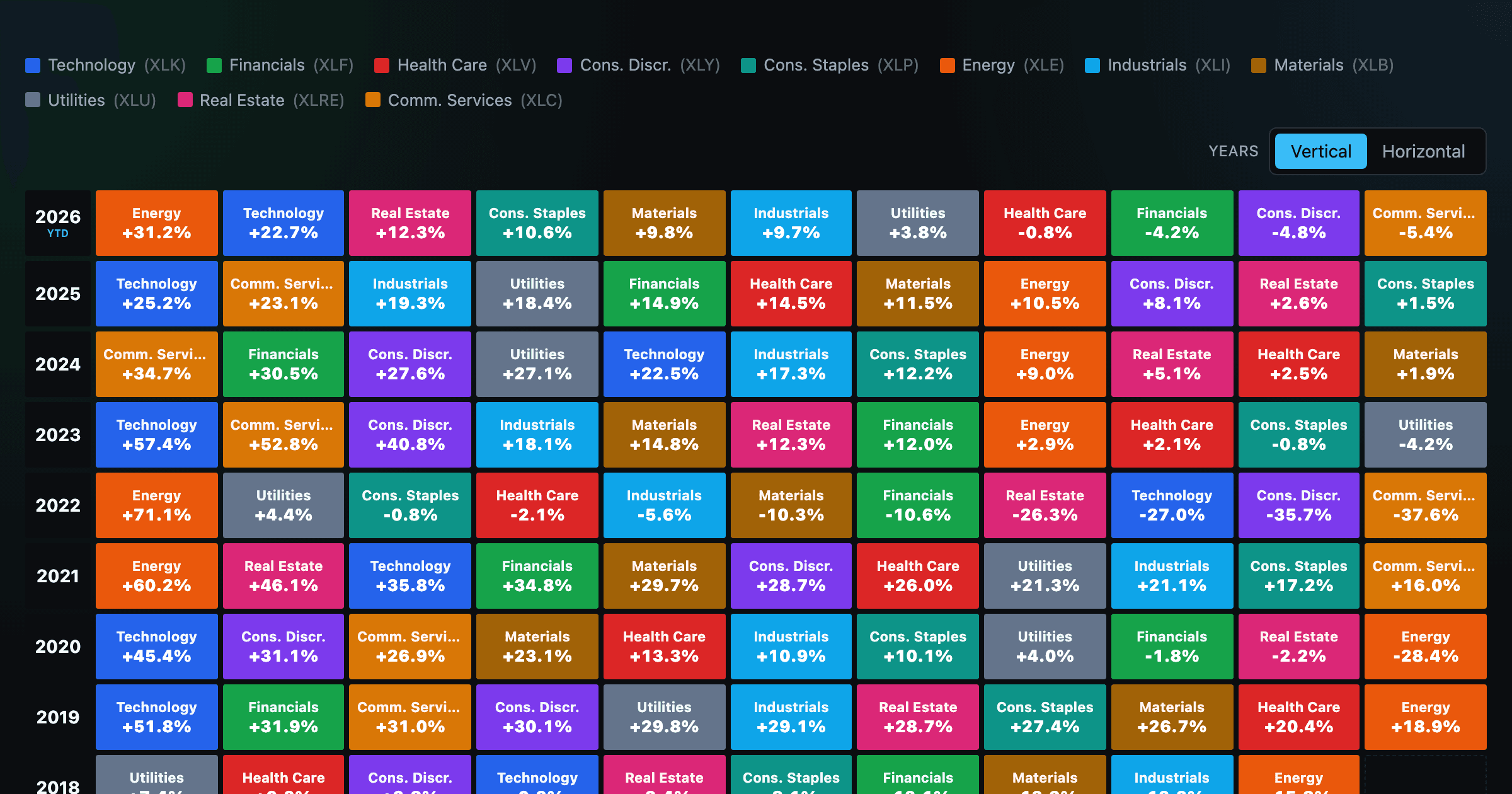
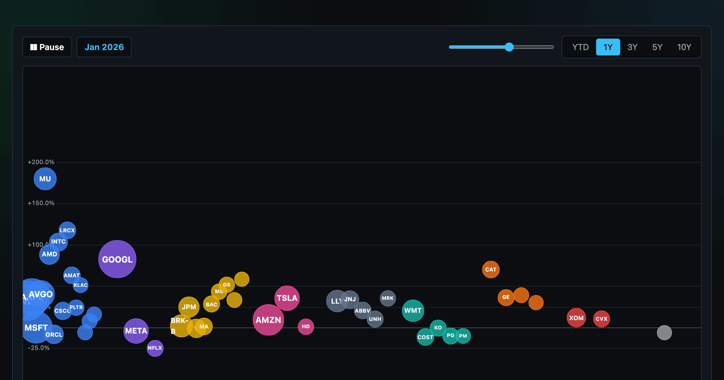
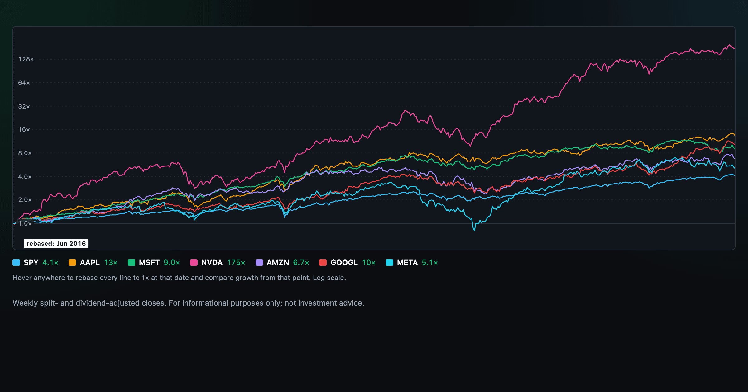
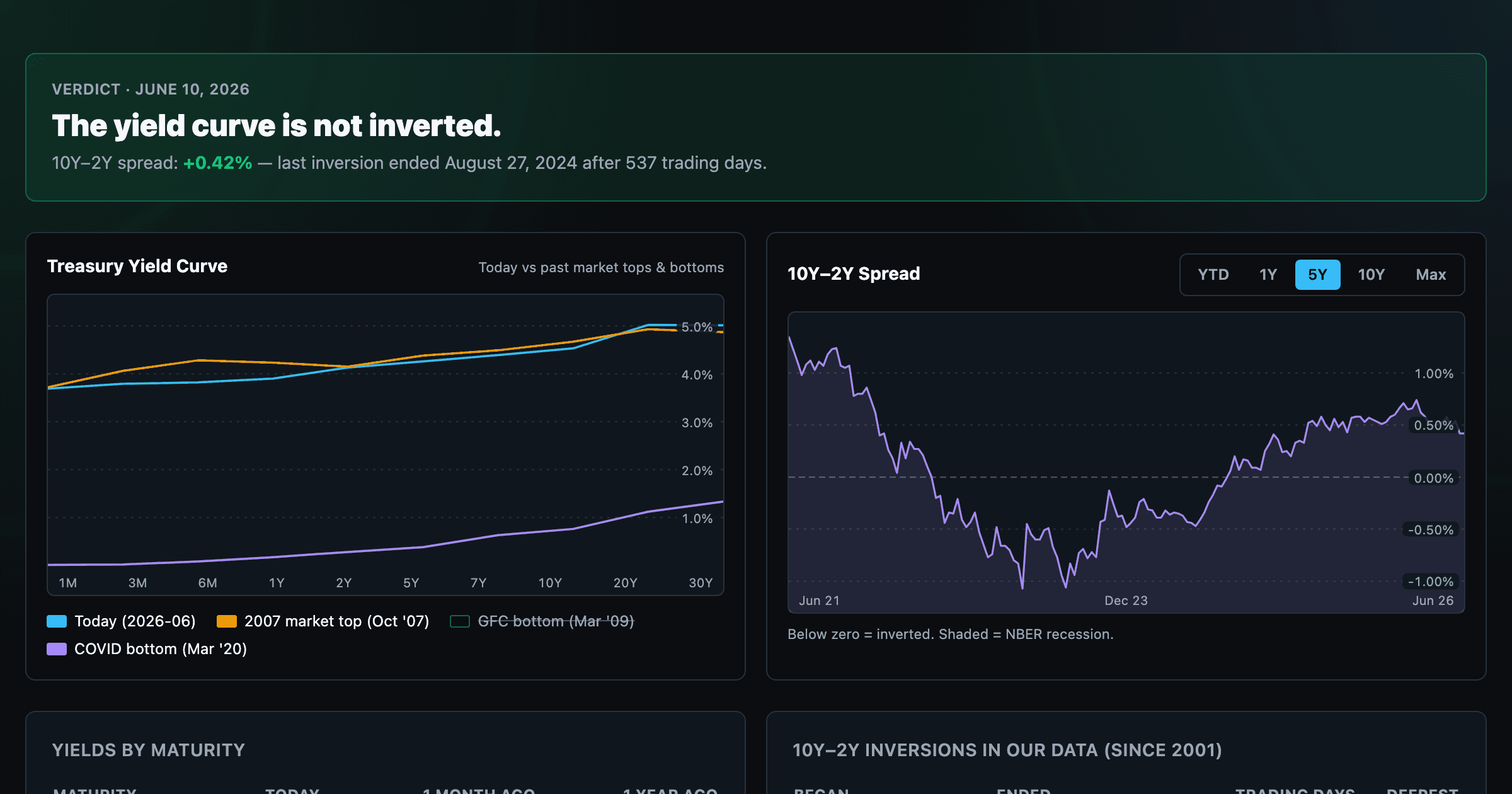
Interactive charts built on daily market and macro data. New visualizations ship regularly — the grayed-out ones are in the works.

US Treasury Yield Curve
Is the curve inverted? Live term structure, the 10Y–2Y spread, and every inversion episode.

Growth of $1,000
What a $1,000 investment in any stock or ETF would be worth today — drag the starting year.

S&P 500 Heatmap
Every S&P 500 company sized by market cap — color by return or valuation (P/E, P/B, yield).

S&P 500 Returns by Year
Annual and calendar returns of the S&P 500 — every year, every month.

Periodic Table of Returns
Asset-class returns ranked year by year — the classic Callan chart.

Sector Periodic Table of Returns
The 11 S&P 500 sectors ranked year by year, back to 1999.

Animated Sector Bubbles
The biggest stocks as bubbles by sector — press play to watch them rise and fall over time.

Index Chart
Compare megacaps vs the S&P 500 — rebased to 1× at any date you hover. Who compounded fastest?
How Top-Heavy Is the Market? soon
The weight of the largest companies in the index versus history.
The Rise and Fall of Giants soon
Every company that ever cracked the S&P 500 top 10 — how it climbed, and what came after.
