
How the biggest stocks performed through Sep 11, 2026
Any session between Sep 15, 2016 and Sep 11, 2026. The window ends there; bubble SIZES stay scaled to today's largest company, so past frames are comparable with the present.
Sep 11, 2026
Any session between Sep 15, 2016 and Sep 11, 2026. The window ends there; bubble SIZES stay scaled to today's largest company, so past frames are comparable with the present.The largest US companies as bubbles — grouped by sector, sized by market cap. Press play to watch each bubble climb or sink with its 5-year total return, or pick another window.
Top 48 S&P 500 companies by market cap, grouped into sector lanes and sized by market cap. Vertical position = total return since Sep 13, 2021. Press play to animate; click a bubble to pin its tooltip and follow it through playback. With JavaScript off the chart shows the finished window.
Total return from split- and dividend-adjusted closes. For informational purposes only; not investment advice.
FAQ#
- What does this bubble chart show?
- It plots the largest US companies as bubbles, grouped by sector and sized by market capitalization. Press play and each bubble climbs or sinks with its total return over the period you choose.
- What do the bubble size and position mean?
- Size is market cap — bigger companies are bigger bubbles. A bubble's height is its total return, so higher means a larger gain over the selected window. Color groups companies by sector.
- What time periods can I view?
- 1 month, 3 months, year-to-date, 1, 3, 5 or 10 years, or any custom end date. Returns are total returns computed from split- and dividend-adjusted closes.
More visualizations
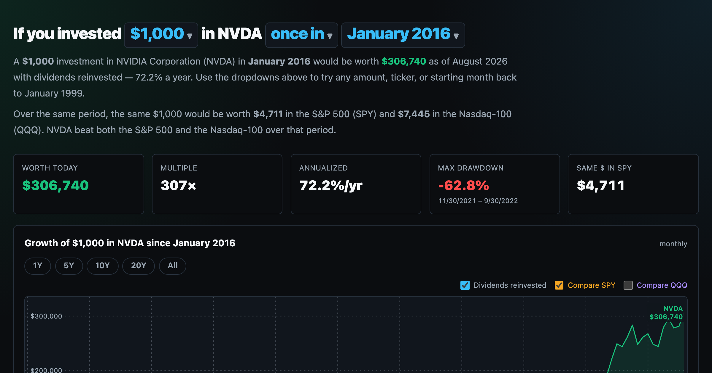
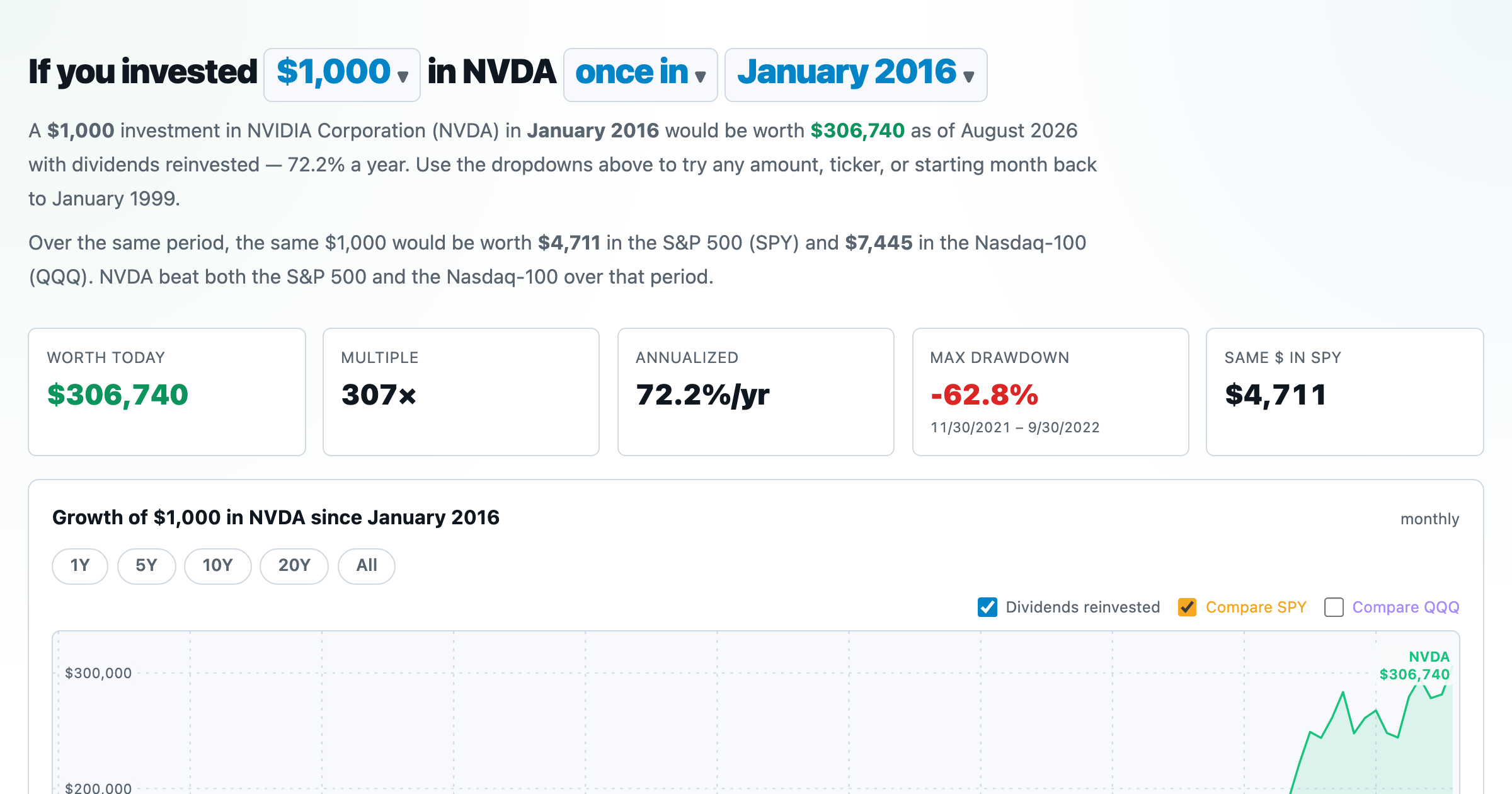
What $1,000 in any stock or ETF would be worth today.
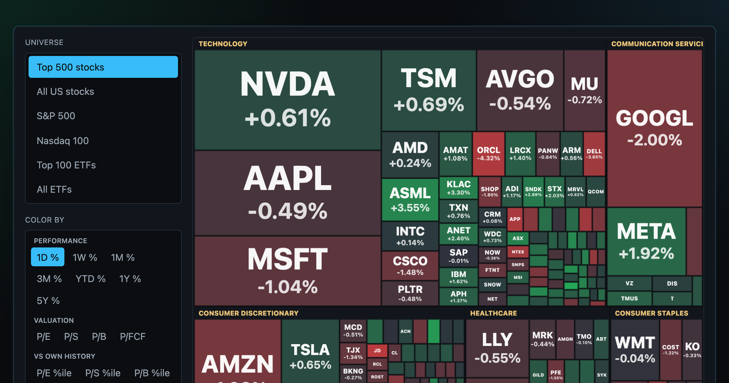
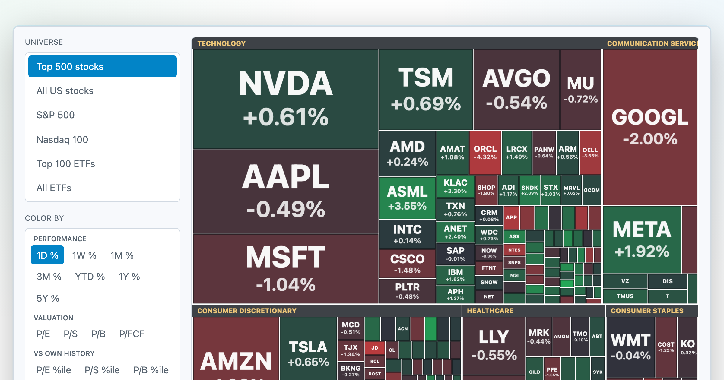
Every S&P 500 company sized by market cap — color by return or valuation.
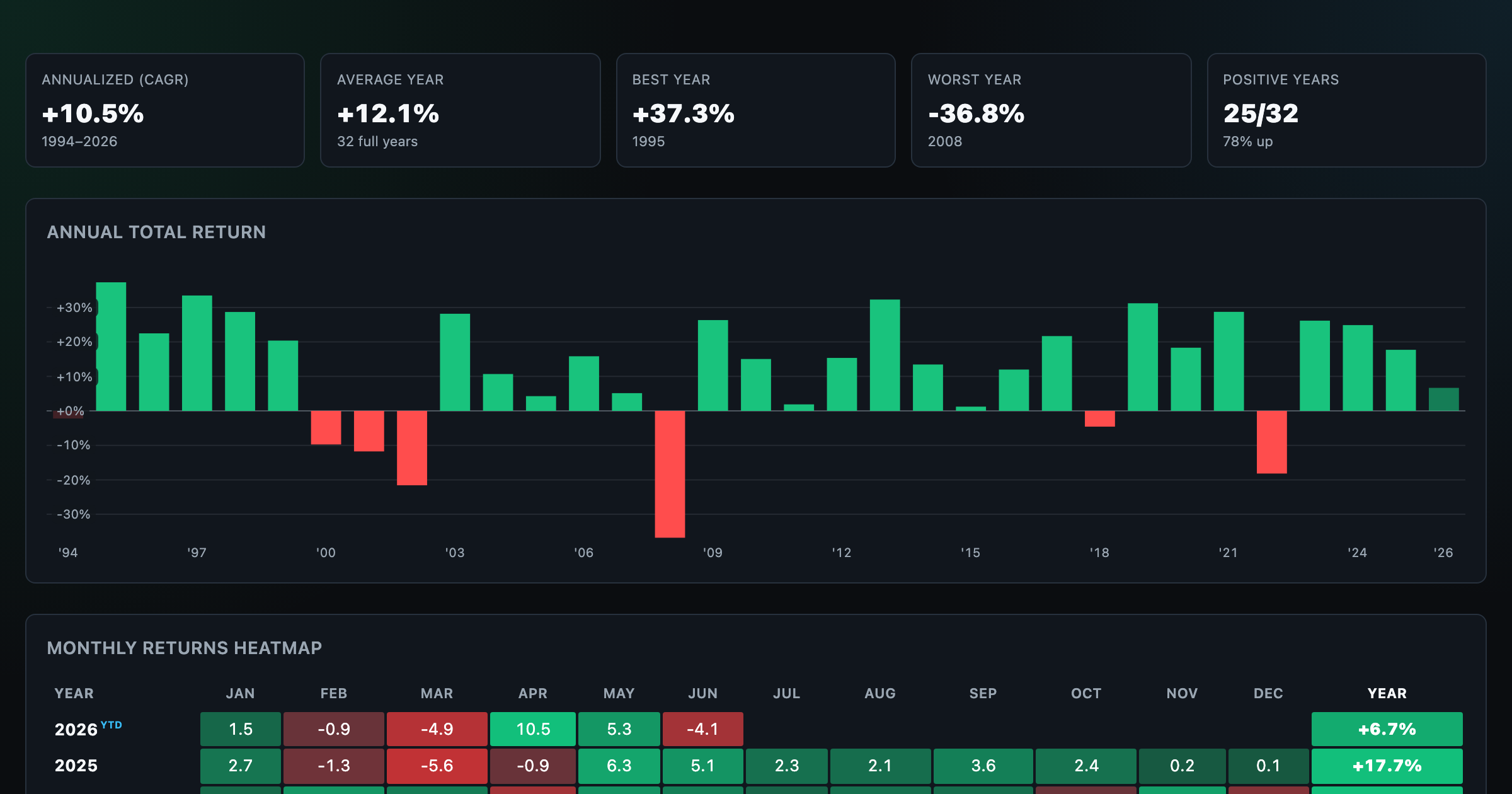
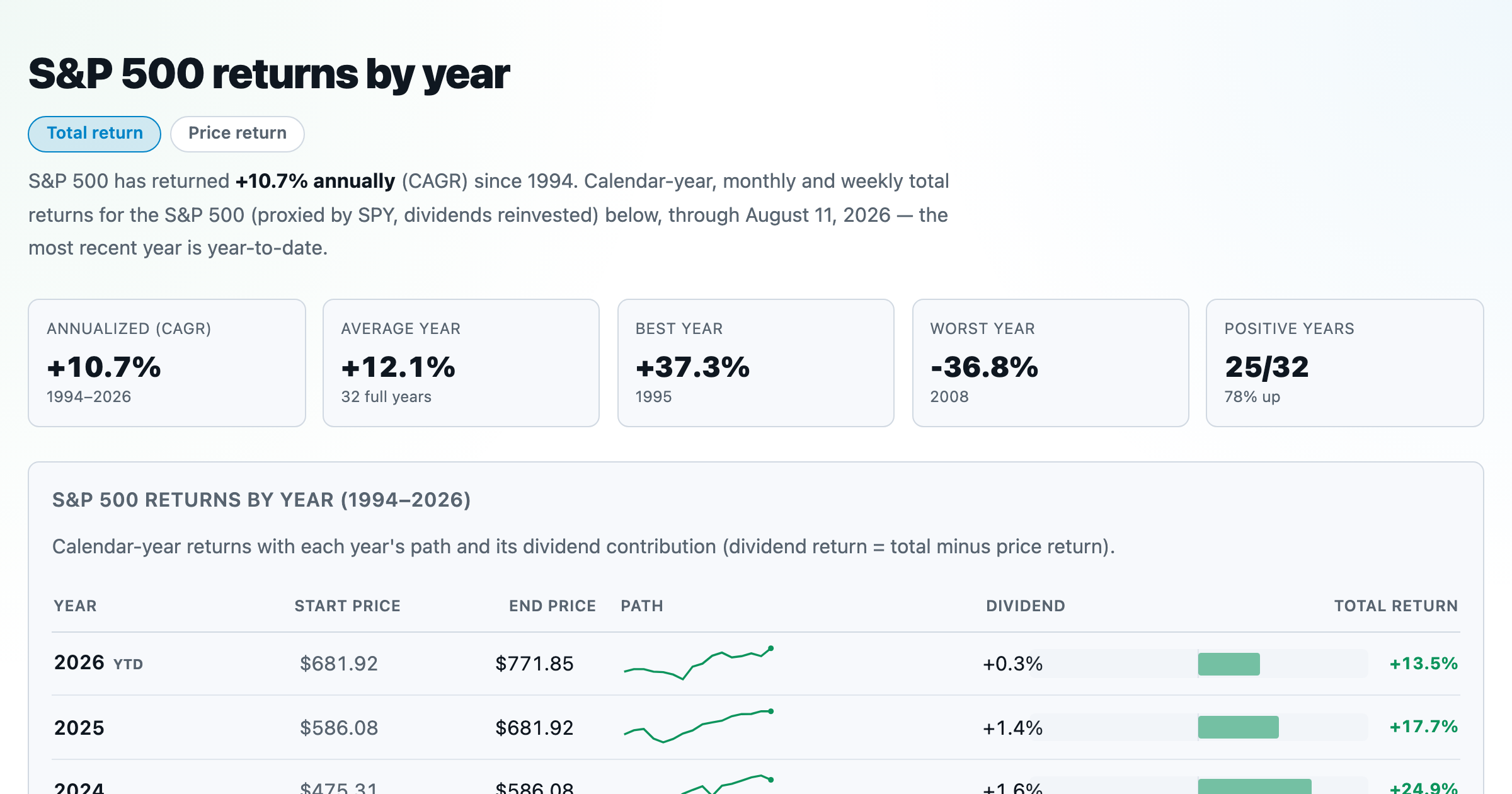
S&P 500 returns by year, month, week and trailing period — total or price return.
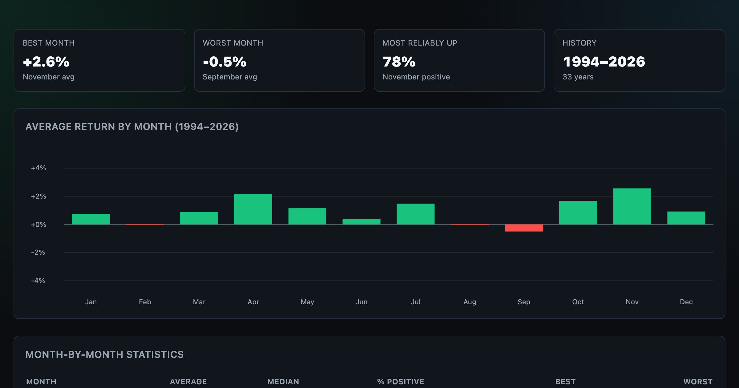
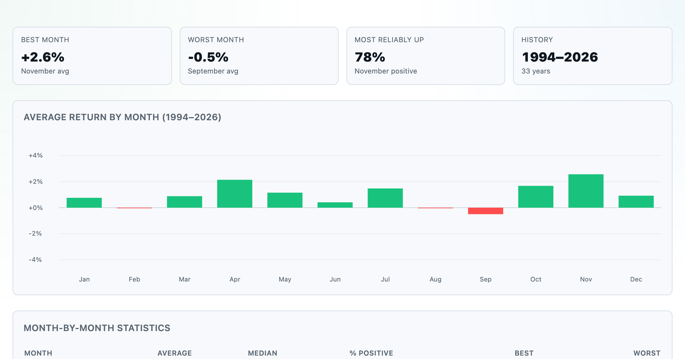
Which month is best for stocks? Average return of every calendar month, for any ticker.
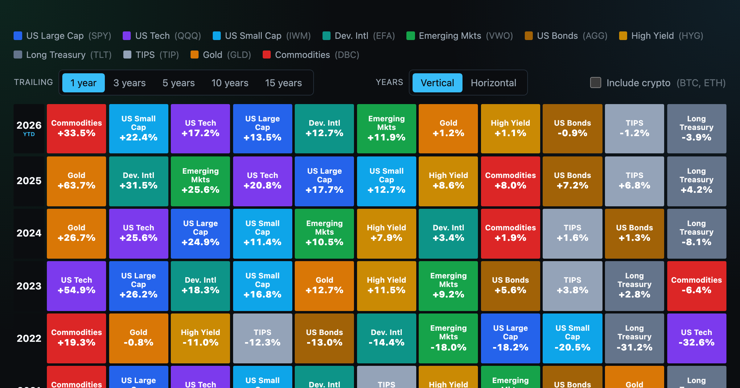
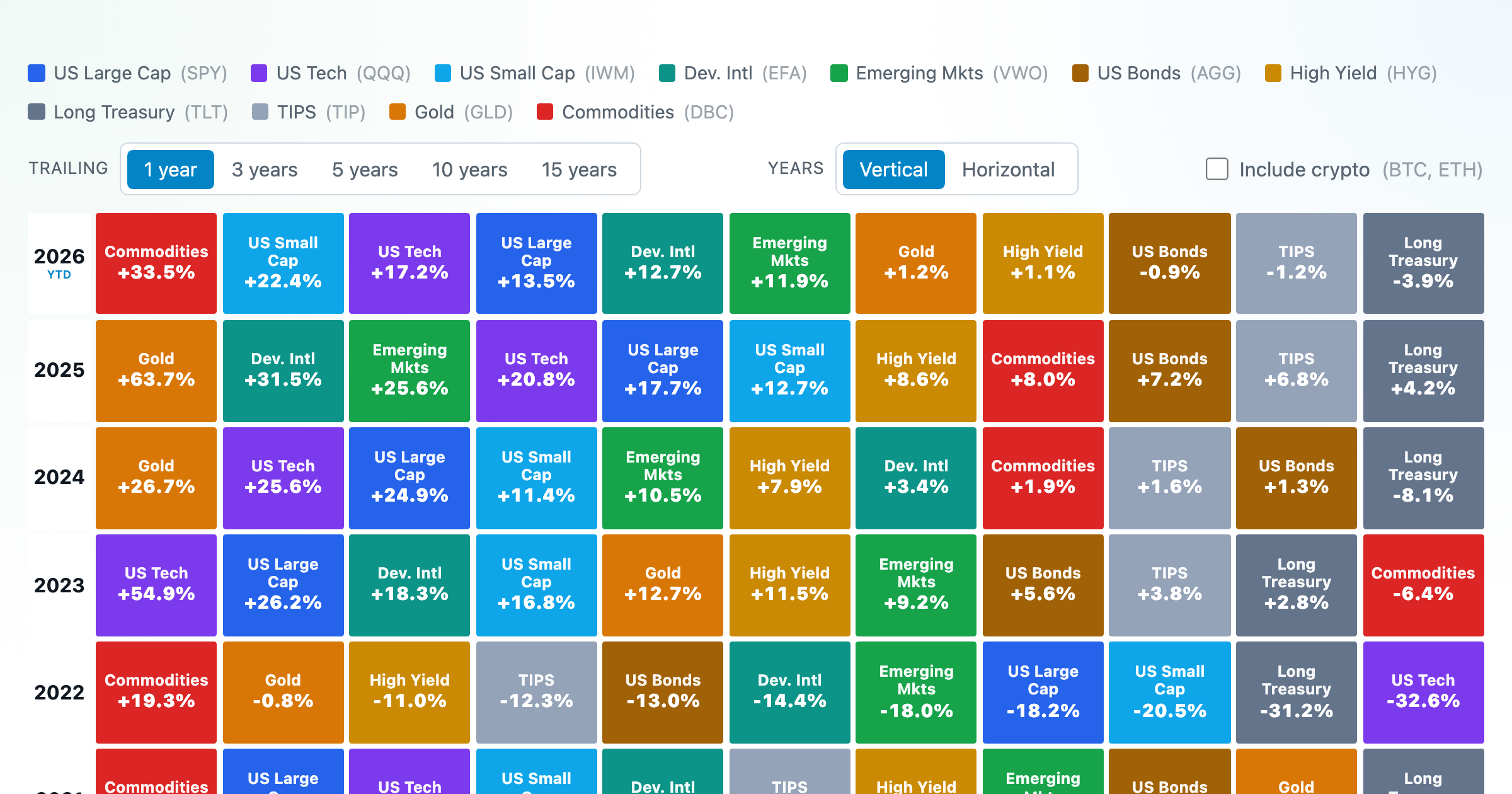
Asset-class returns ranked year by year — the Callan chart / asset allocation quilt.
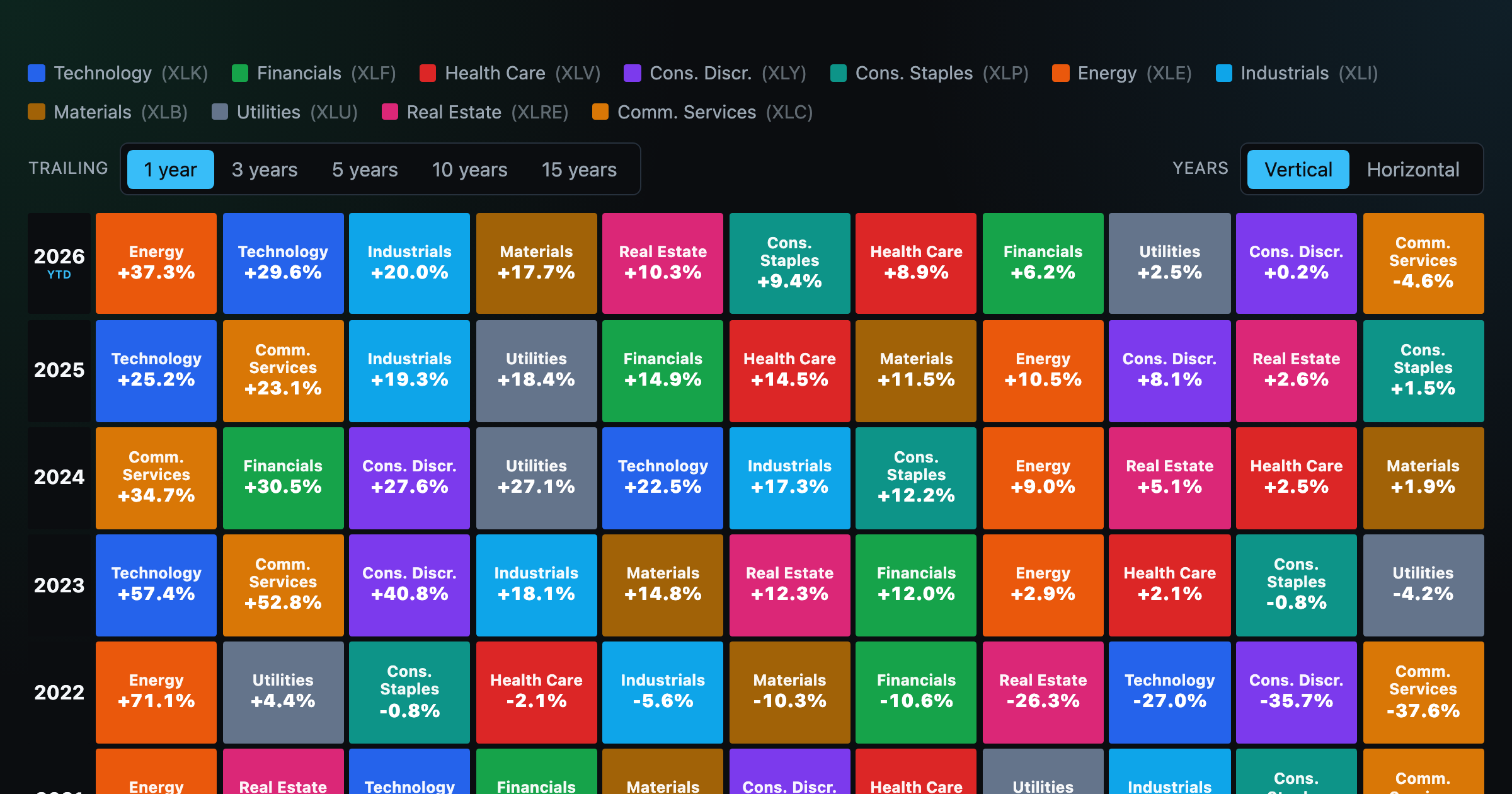
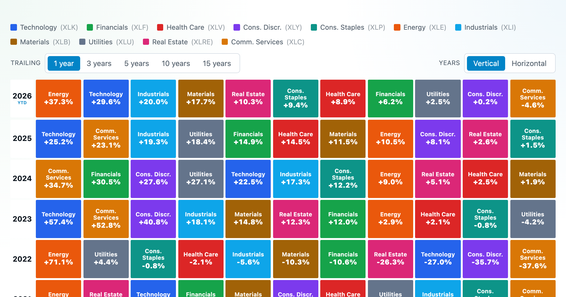
The 11 S&P 500 sectors ranked year by year — a sector quilt chart, back to 1999.
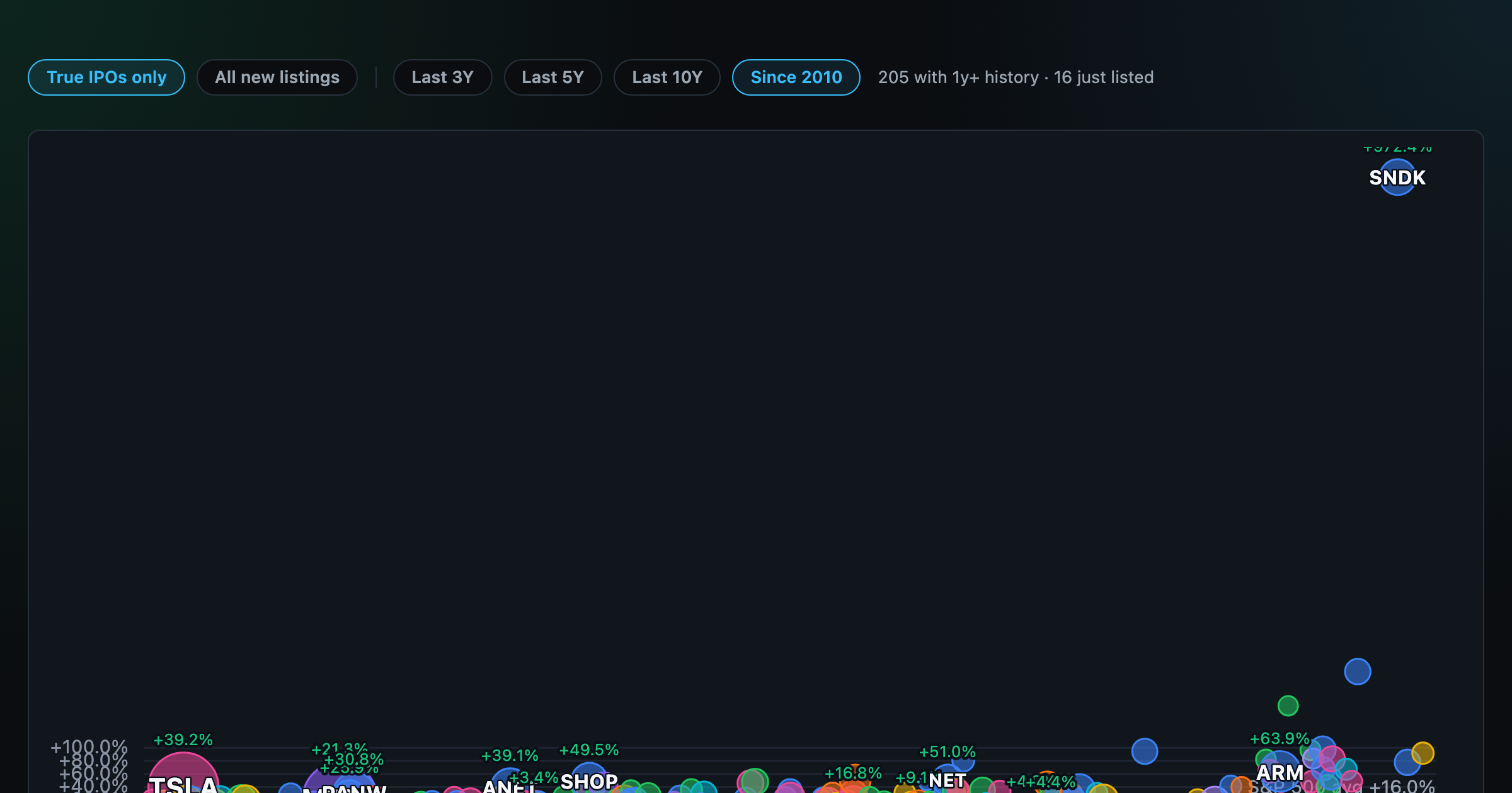
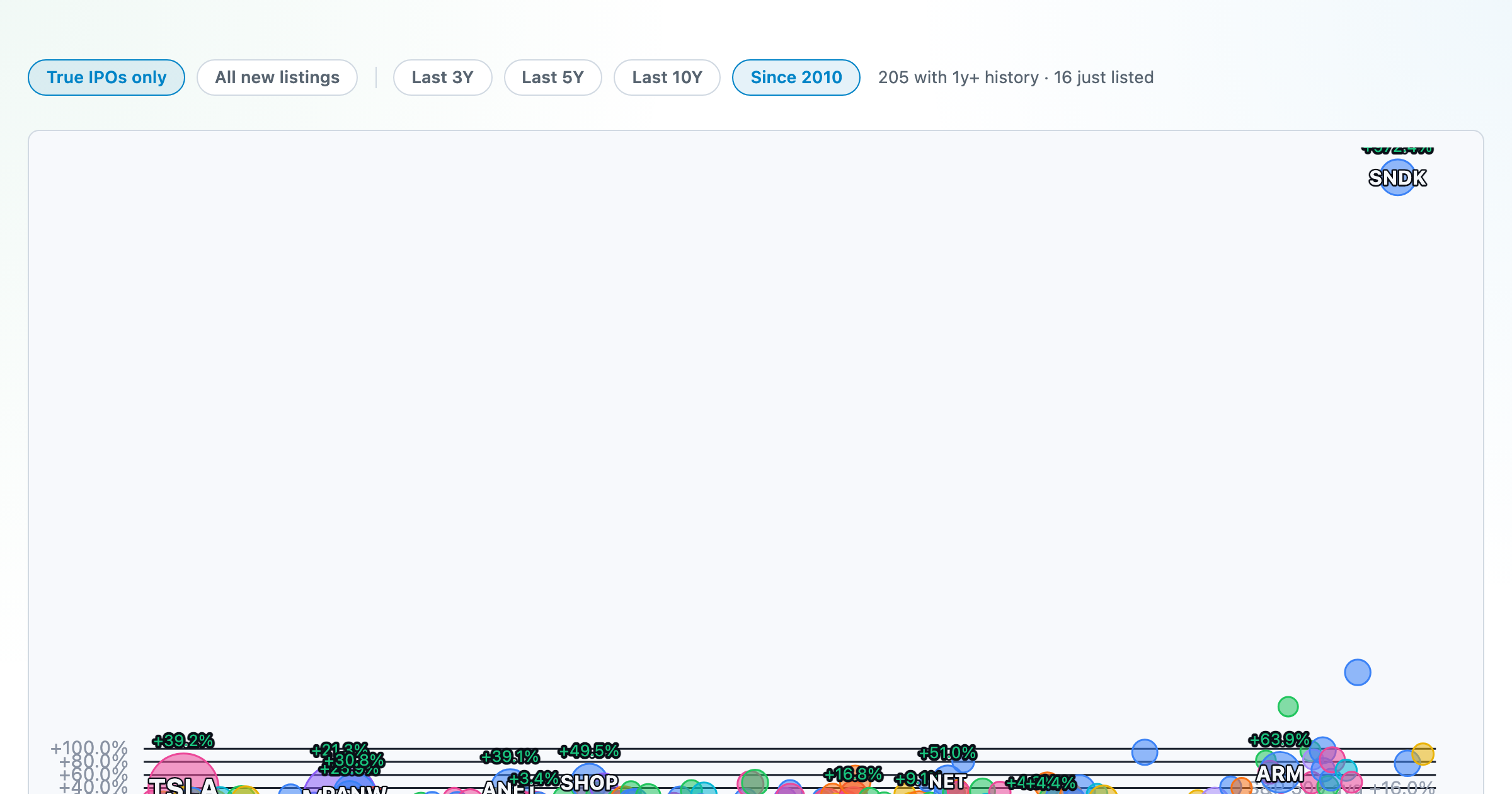
How recent stock-market debuts have performed since listing — annualized, vs the S&P 500, by IPO vs spin-off.
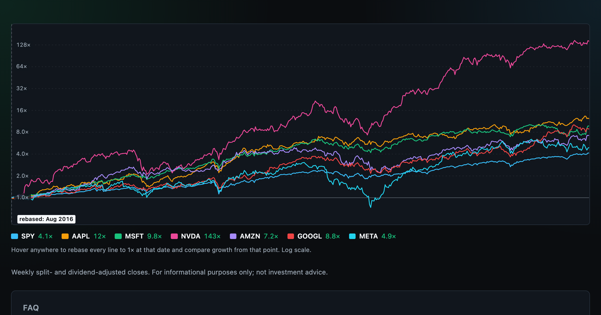
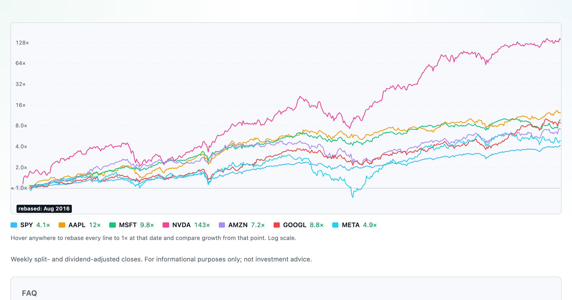
Compare megacaps vs the S&P 500, rebased to 1× at any date you hover.

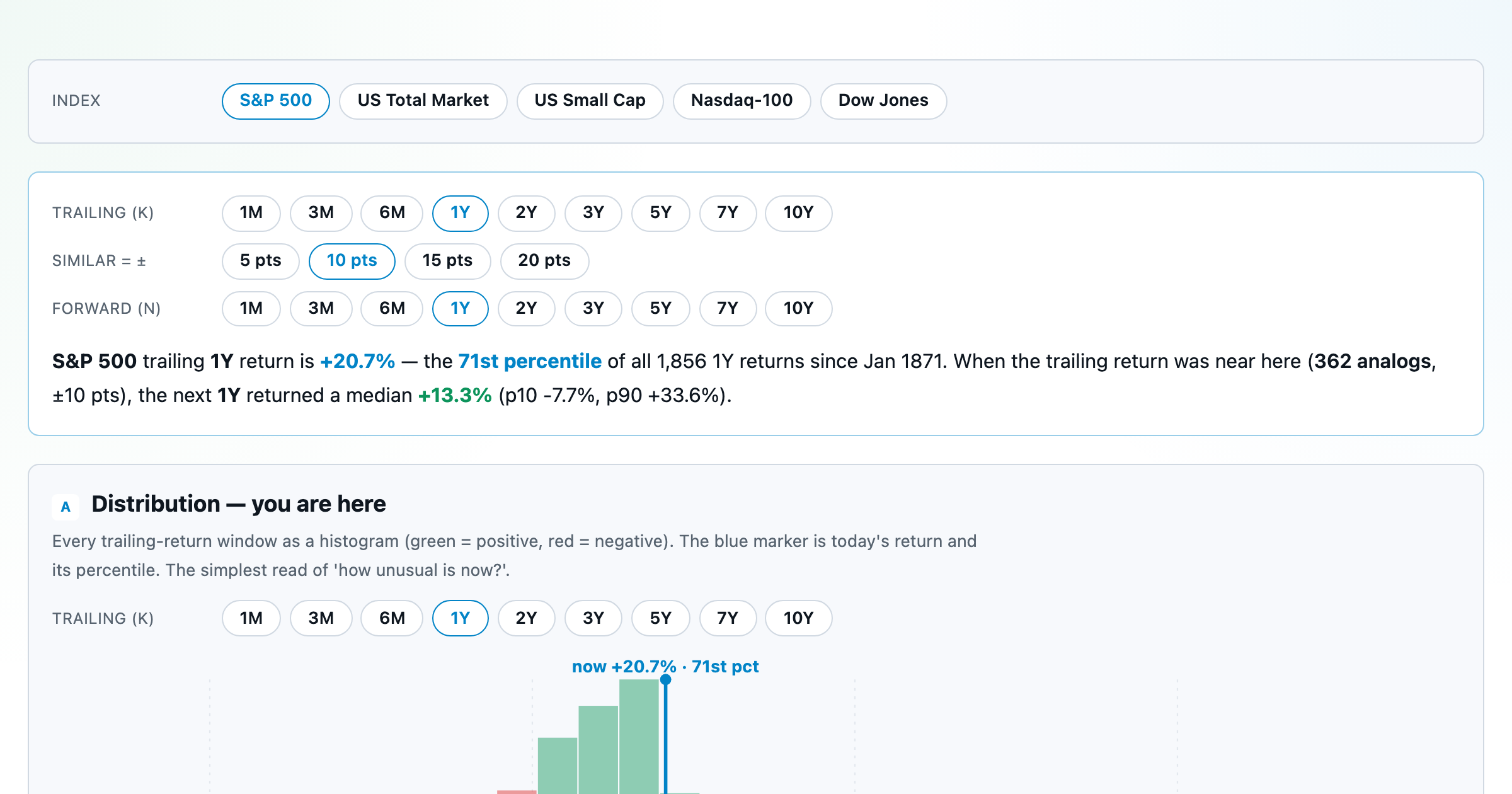
Where today's S&P 500 return ranks against all history — and the forward returns that followed similar moments.
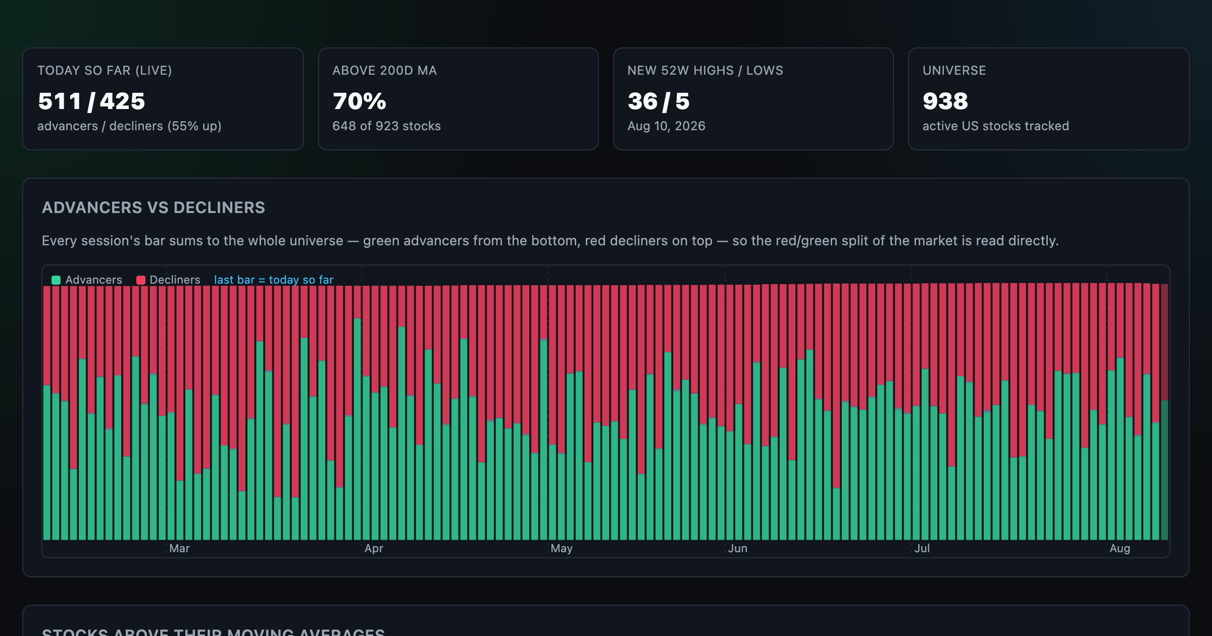
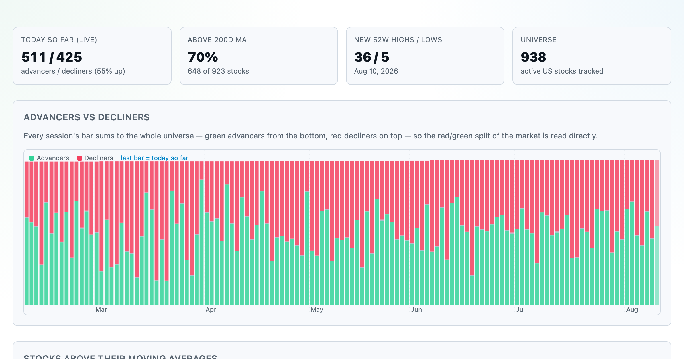
Advancers vs decliners over time, % of stocks above their moving averages, new highs vs lows, and breadth across every trailing window.
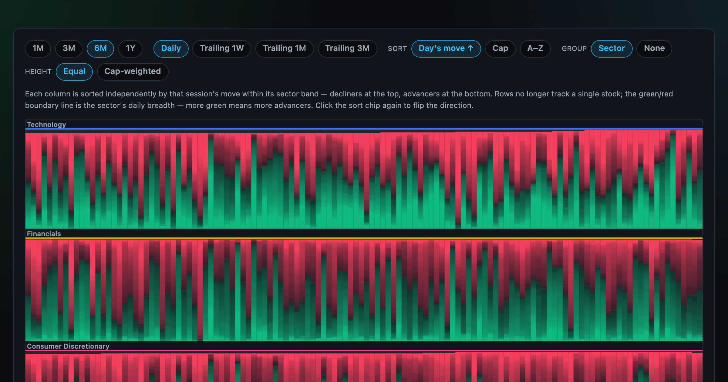
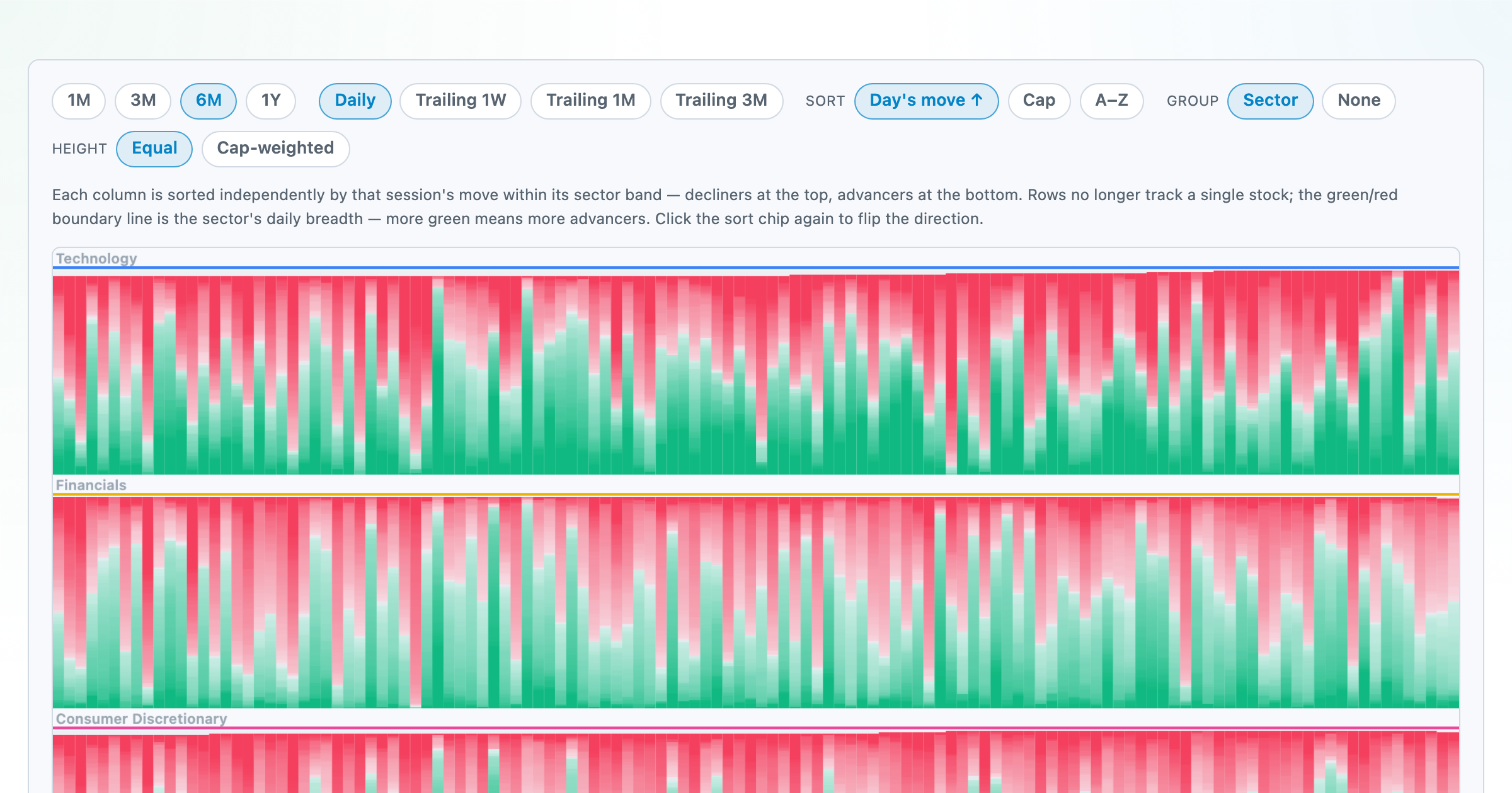
Every stock as a row, every day as a column — market selloffs are vertical stripes, sector routs are blocks.
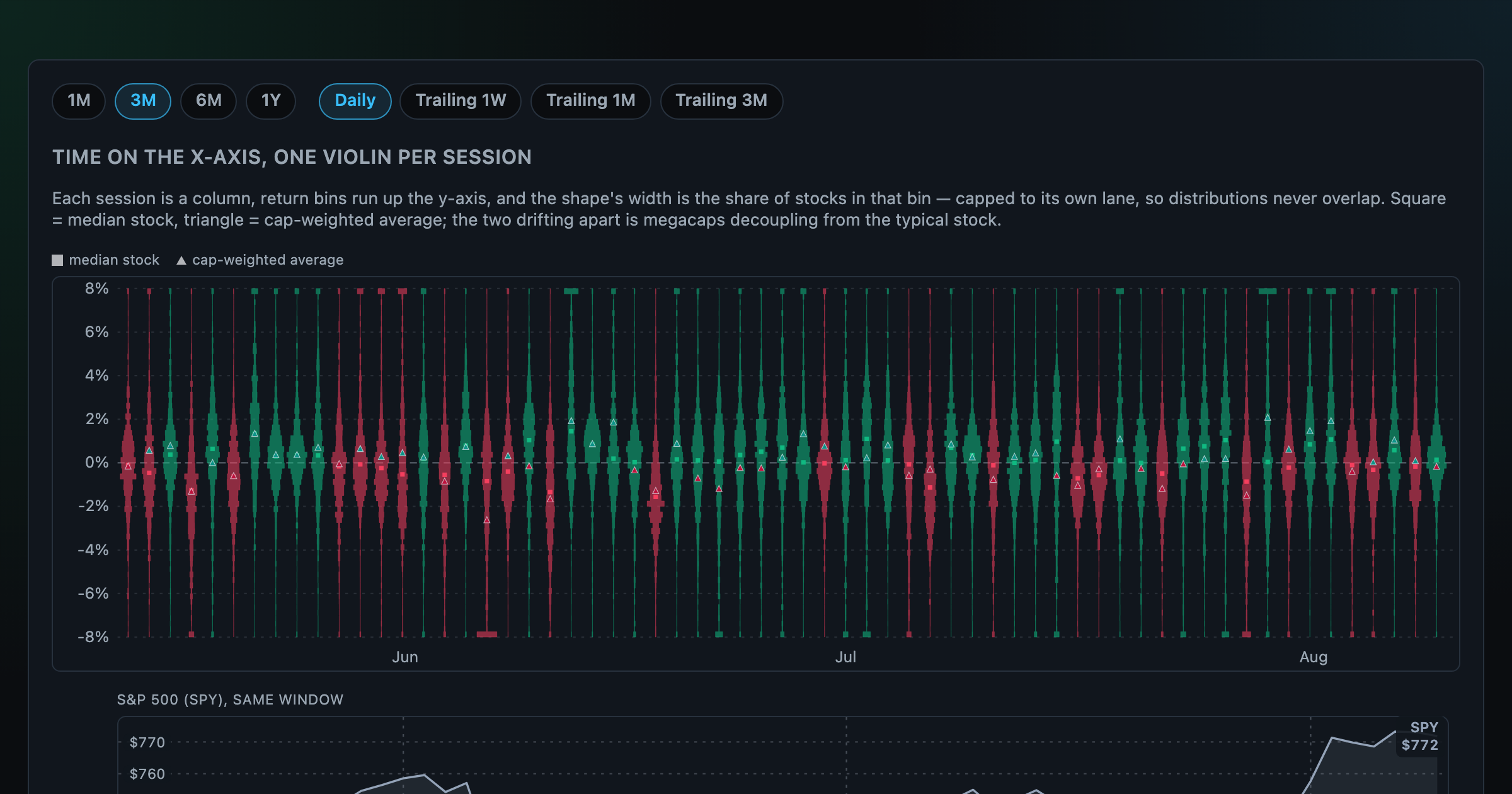
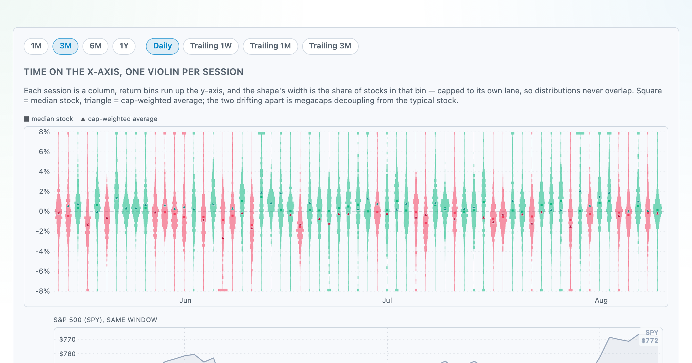
Each session's full distribution of stock returns as an upright violin, with the S&P 500 on the same axis — shifts, dispersion, and fat tails at a glance.
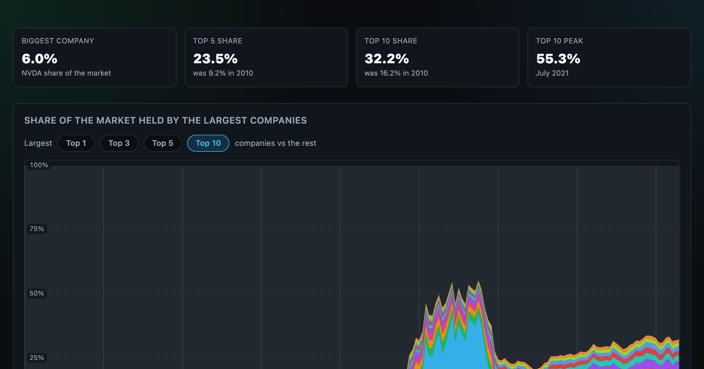
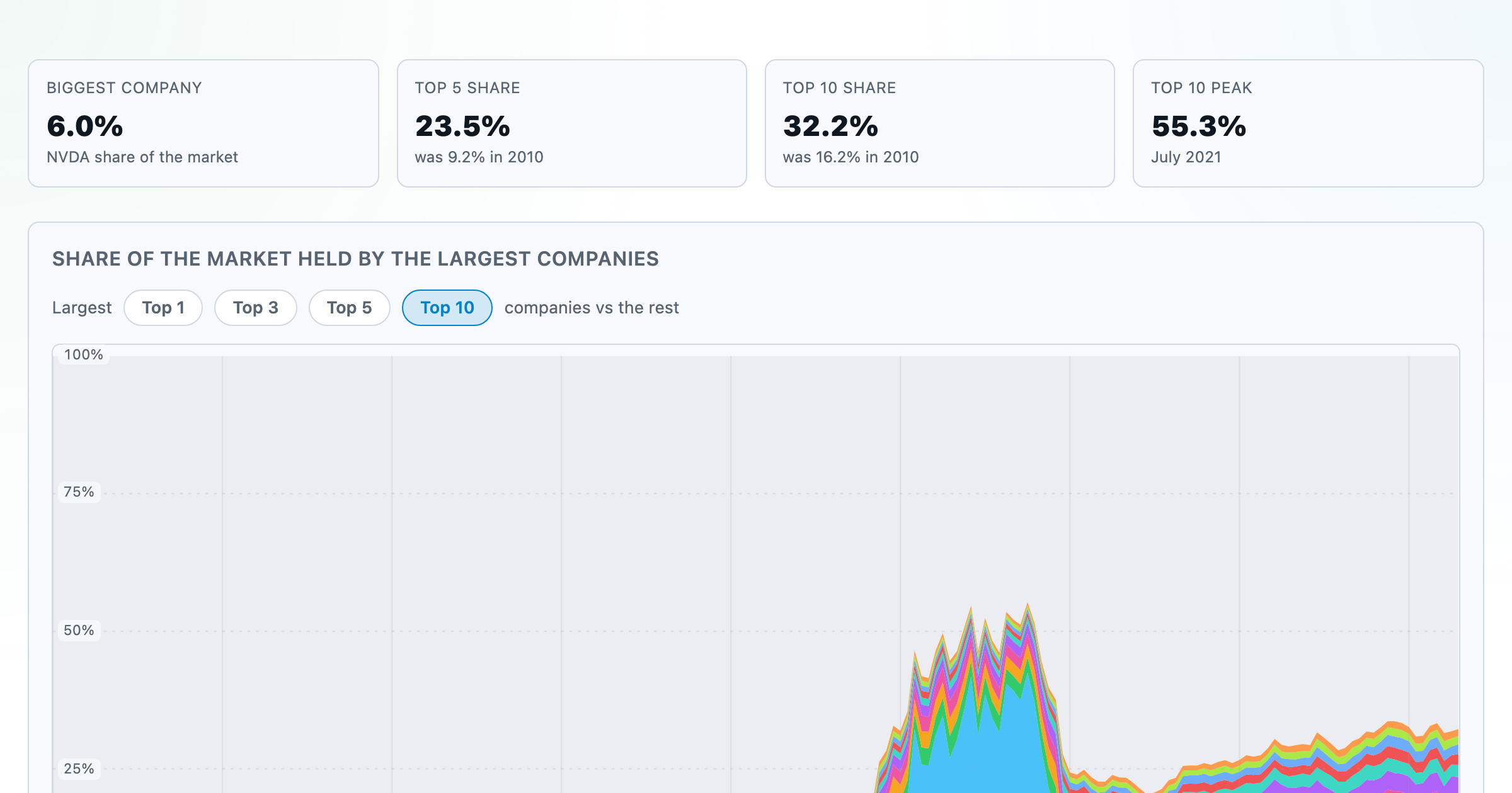
How top-heavy is the market? The top 1–10 companies' share of total market value, month by month since 2010.
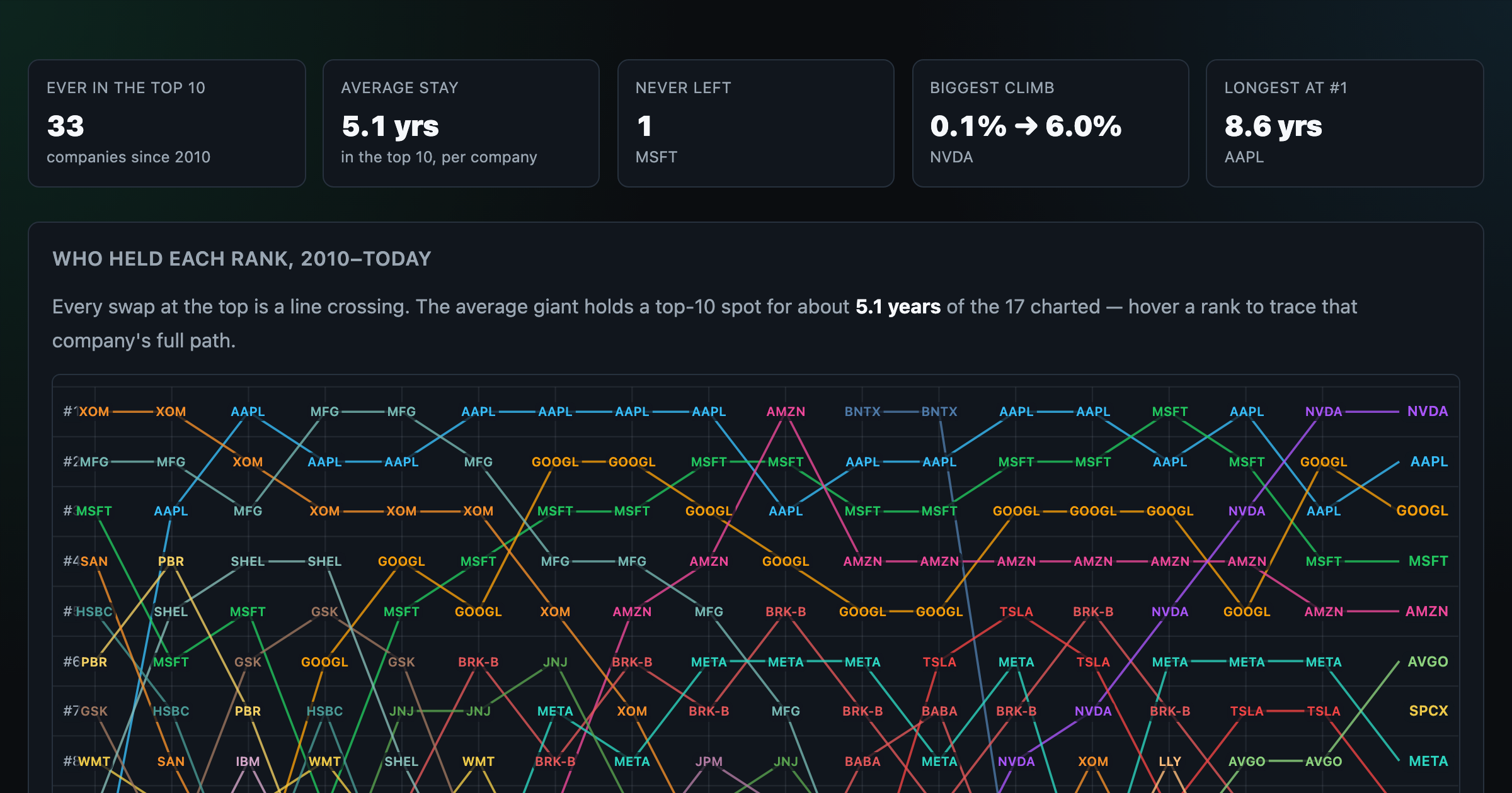
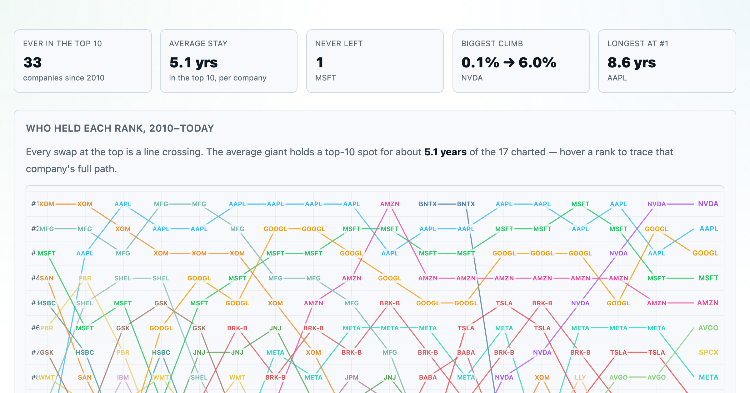
Every company that ever cracked the market's top 10 since 2010 — who climbed, who faded, who never left.
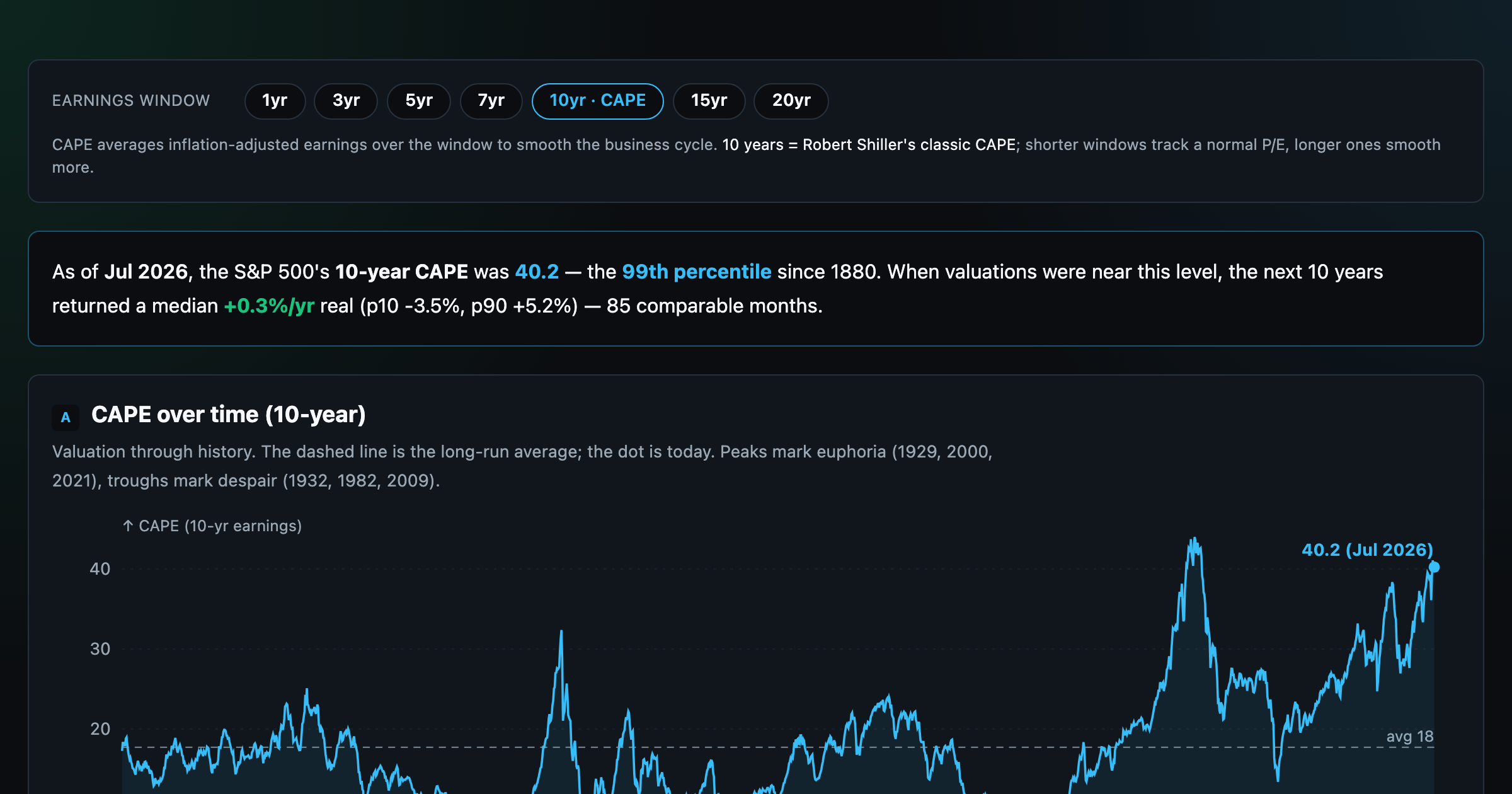
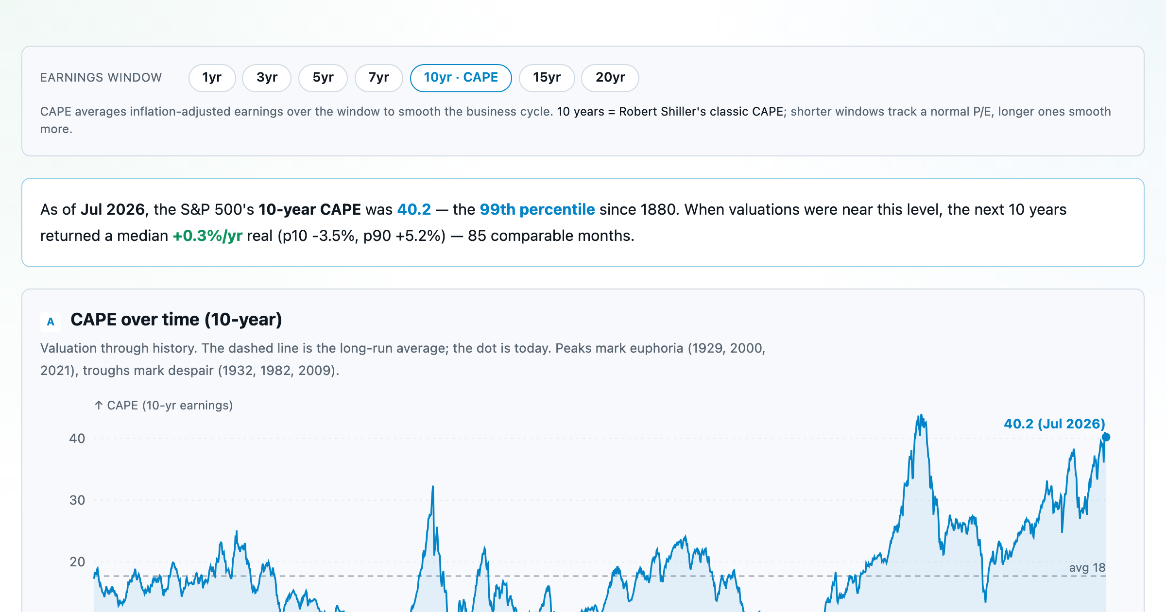
Is the market expensive? The Shiller CAPE back to 1871 and what valuations have meant for the next decade.
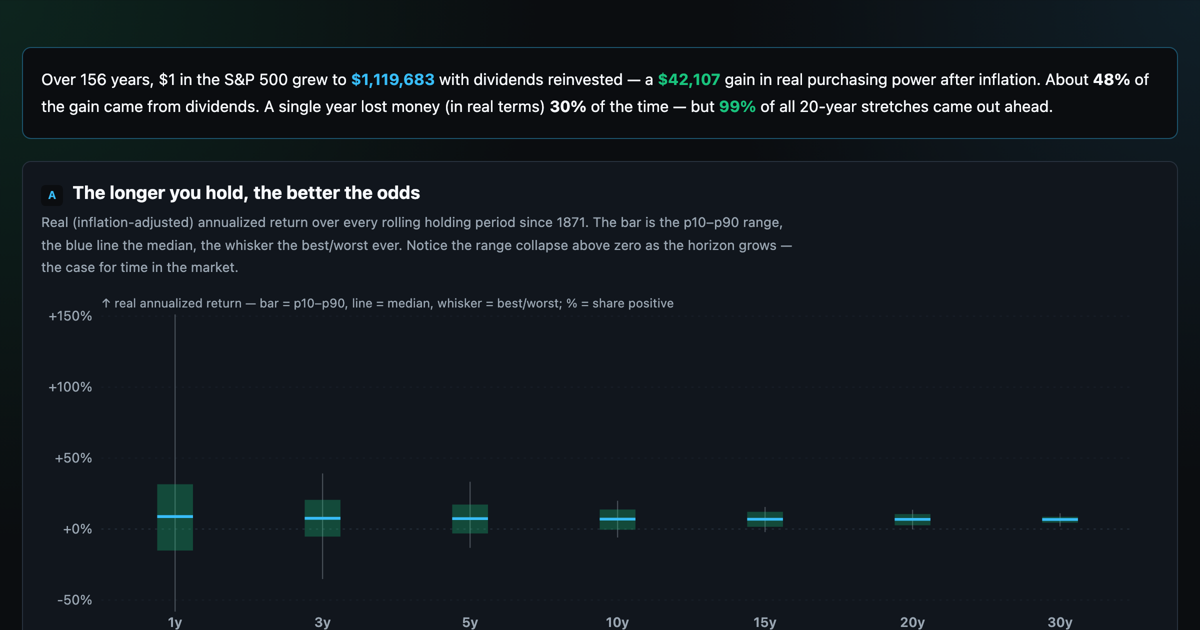
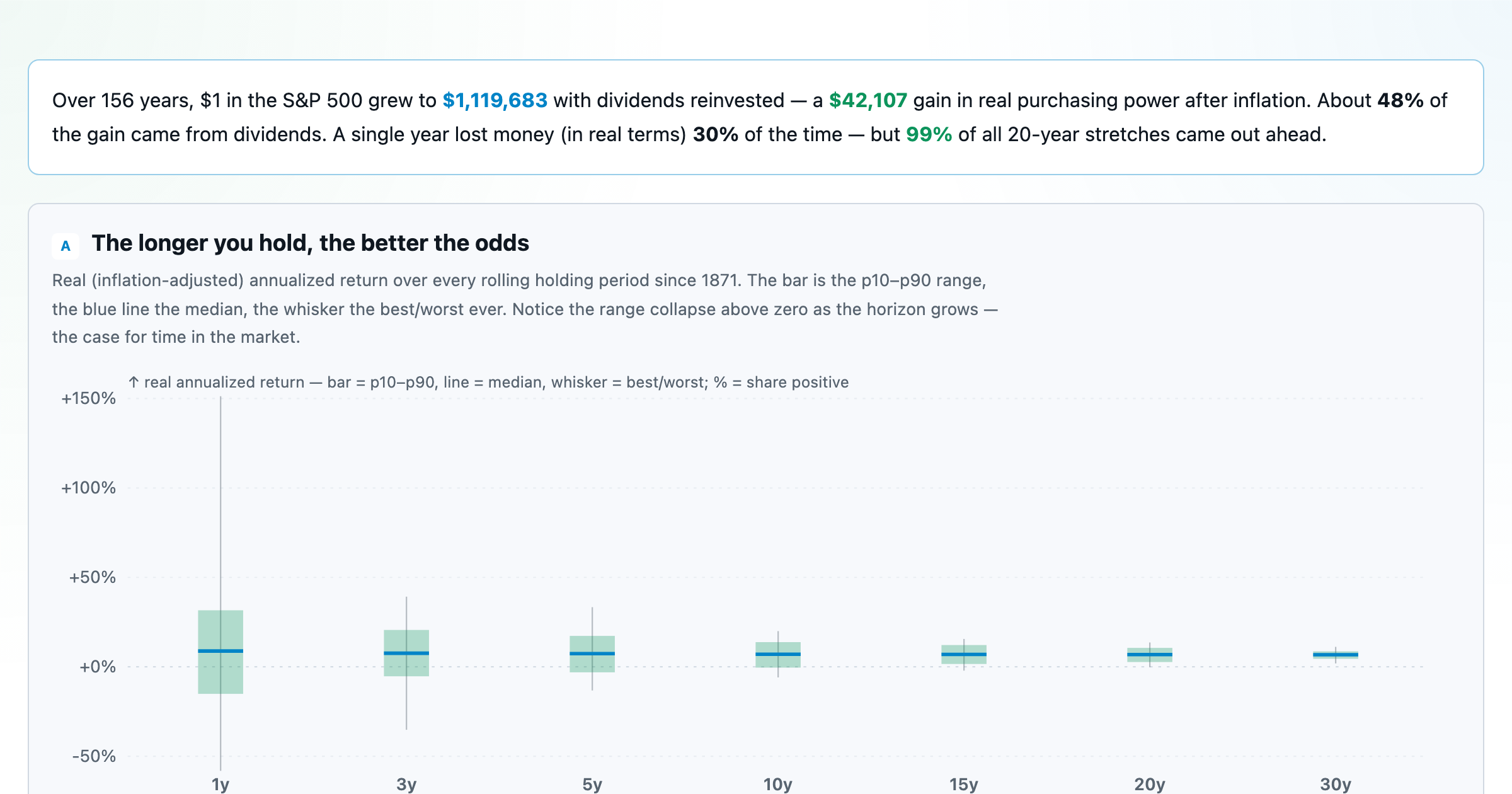
The S&P 500 since 1871 — odds of gain by holding period, real drawdowns, and the growth of $1.
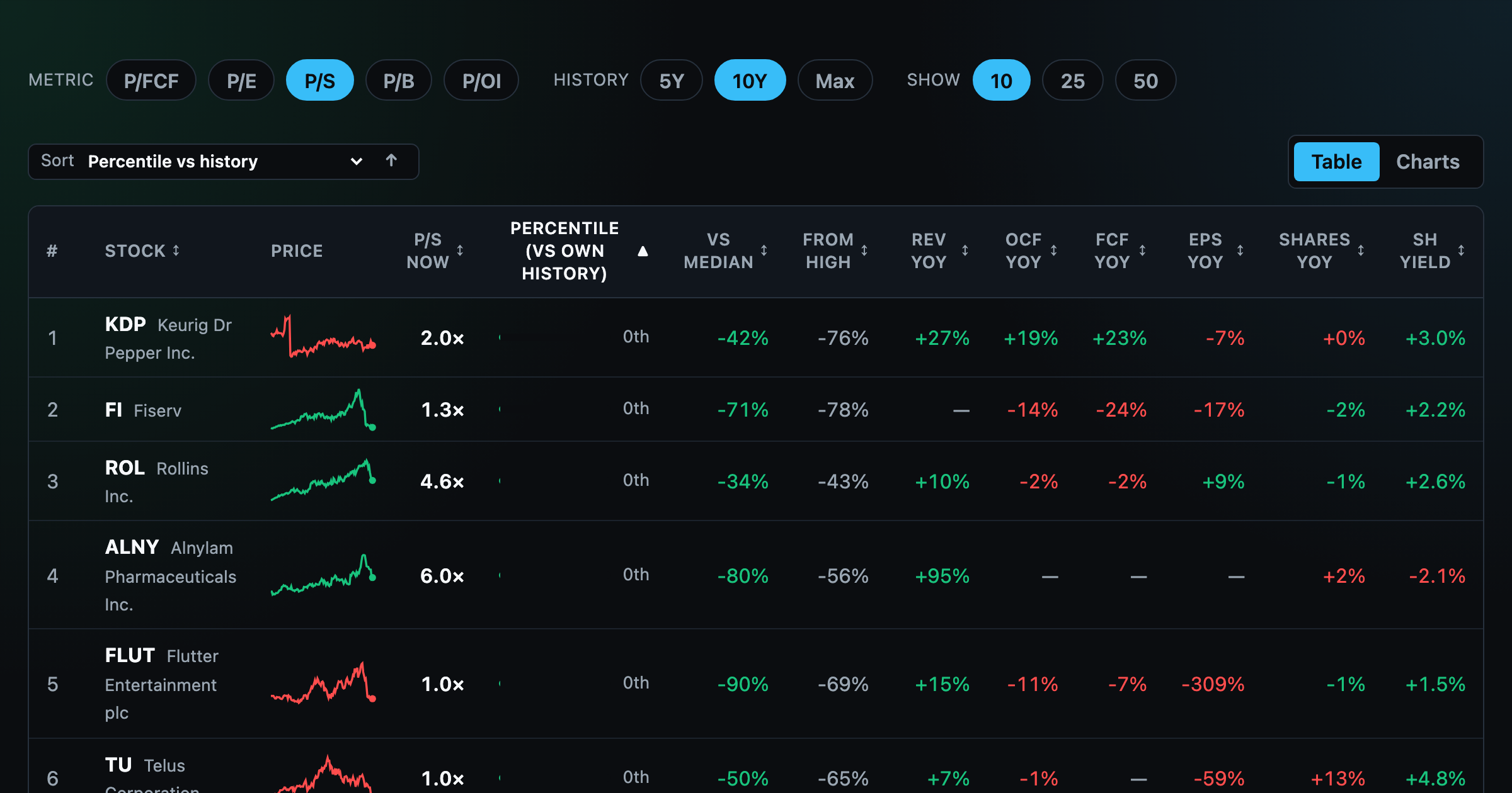
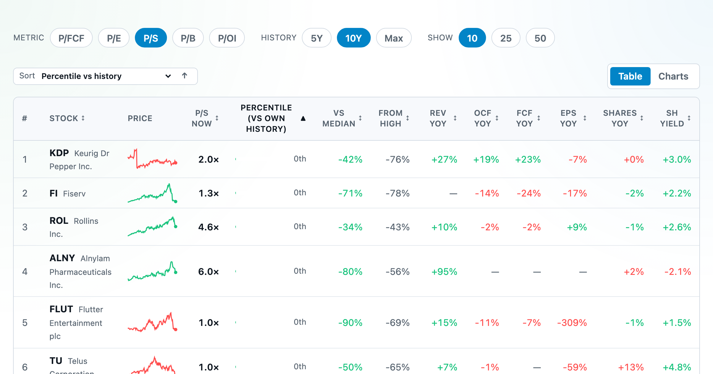
Stocks trading cheapest relative to their own P/E, P/FCF, P/S, or P/B history — with fair-value bands.
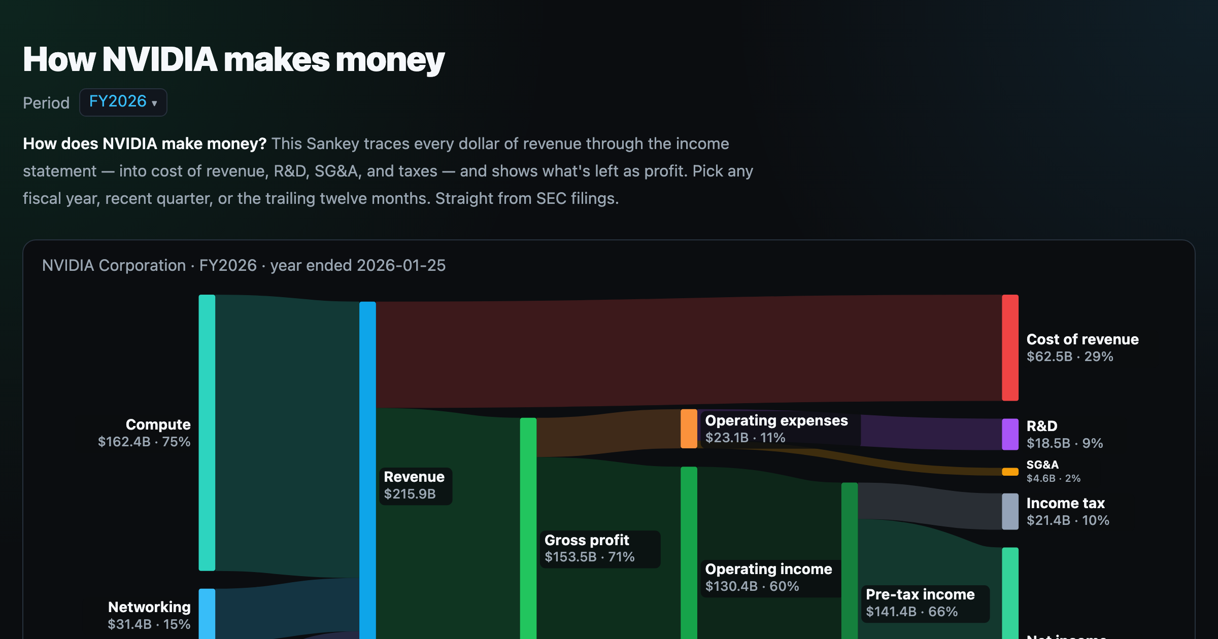
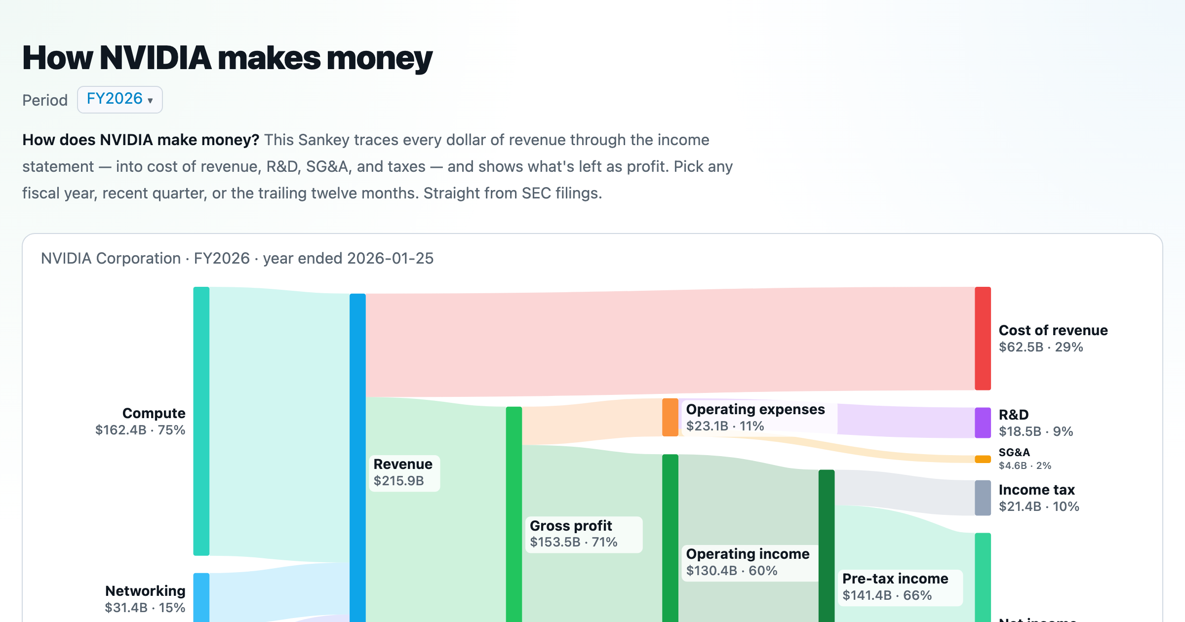
Follow a company's revenue through its income statement as a Sankey — costs, taxes, and profit.
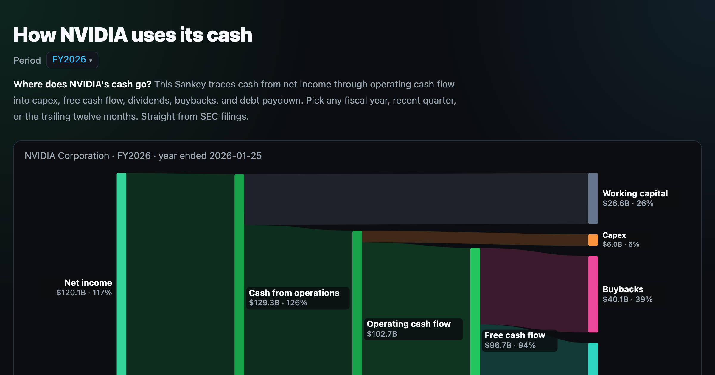
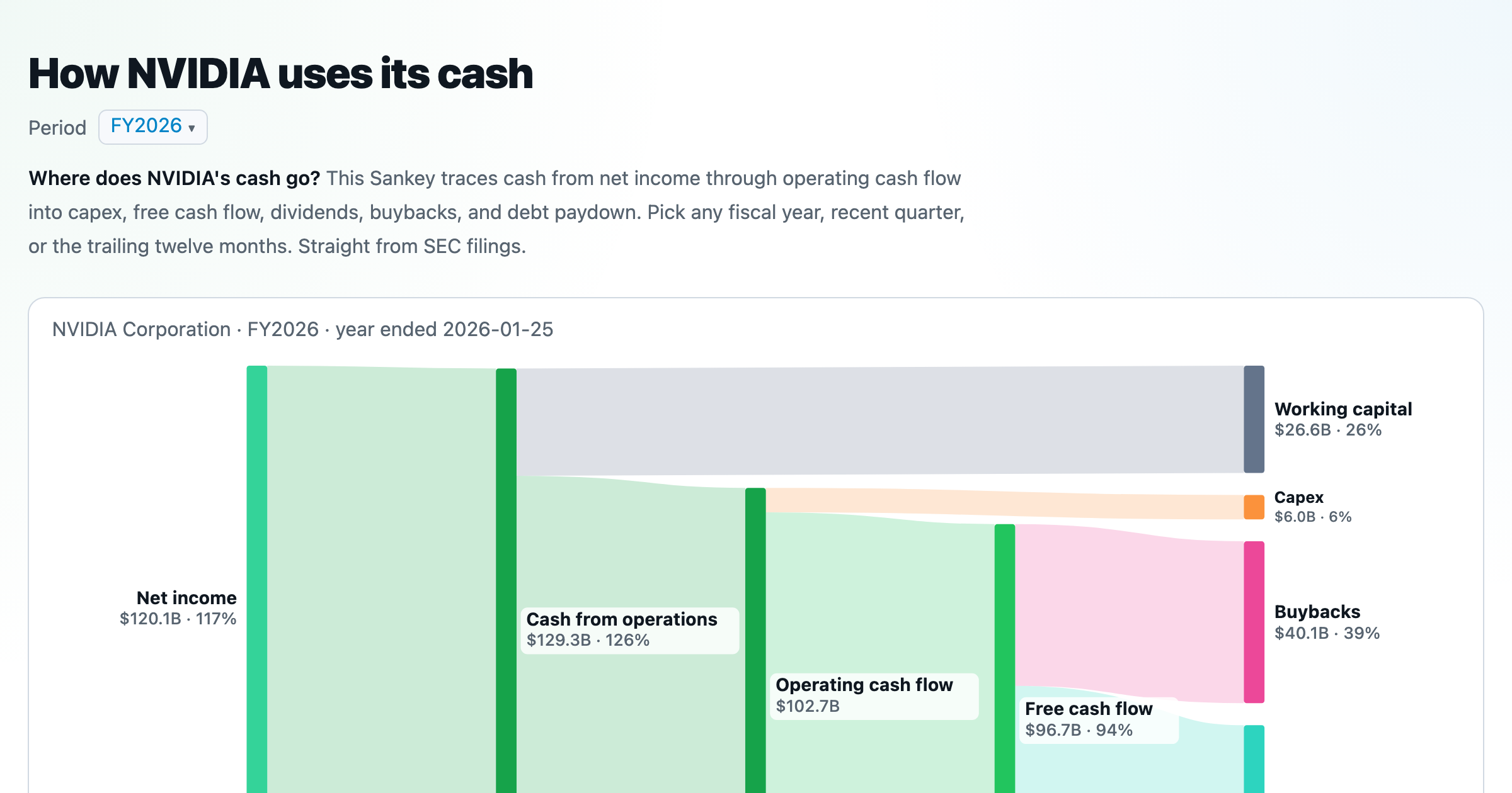
Follow a company's cash from net income through operating cash flow into capex, buybacks, and dividends.
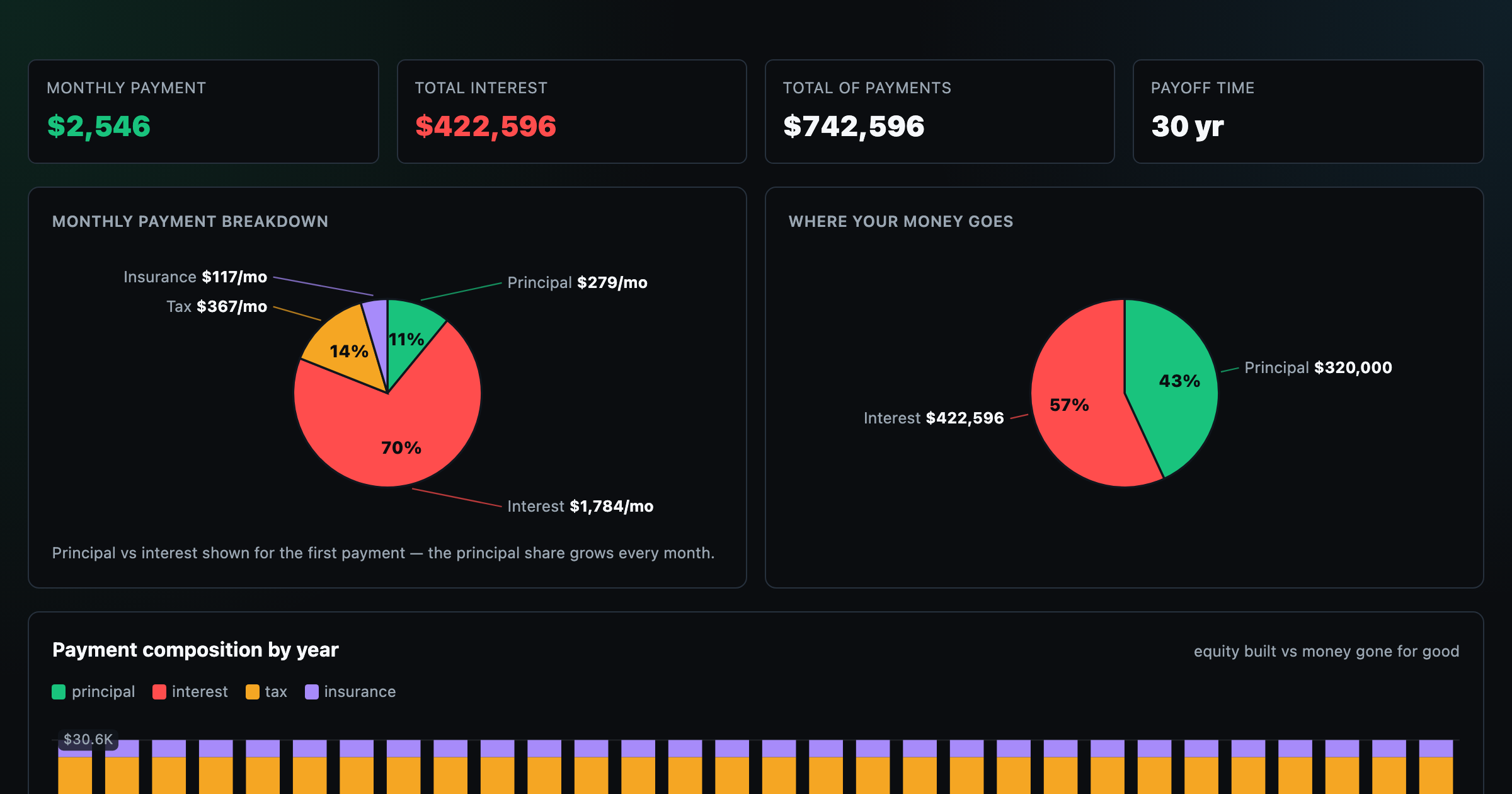
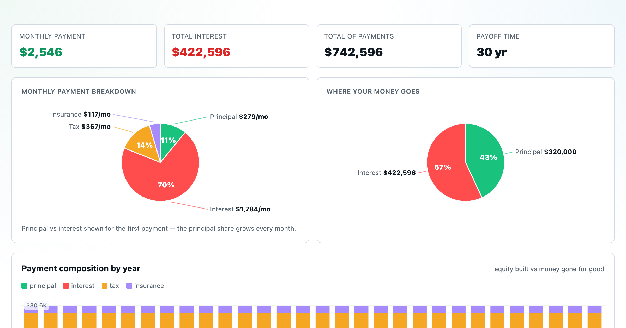
Monthly payment, principal vs interest by year, and the balance paydown — with extra-payment savings.
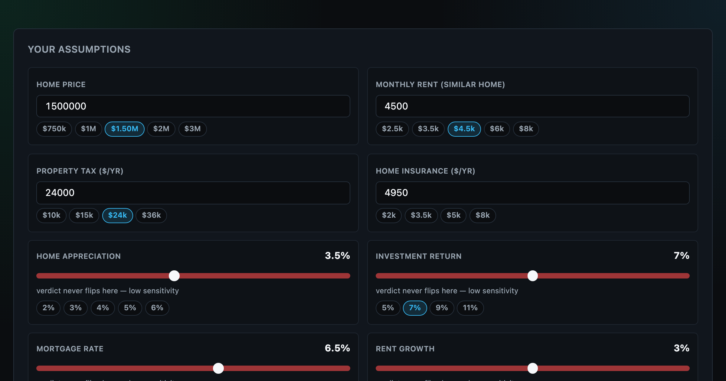
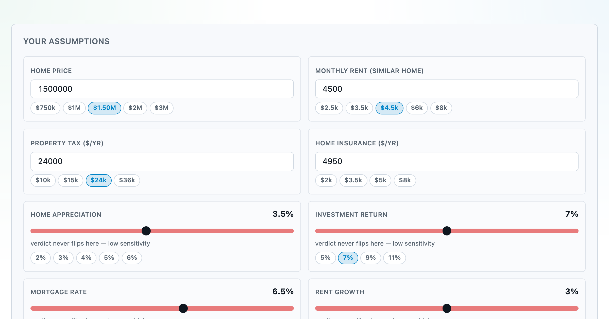
Should you rent or buy? Net-wealth verdict with sensitivity analysis of every assumption.
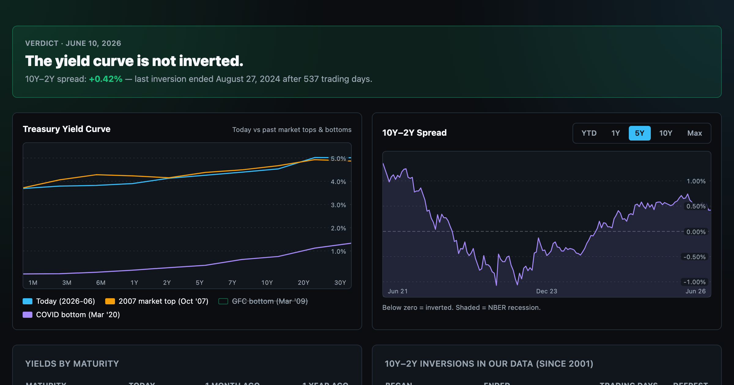
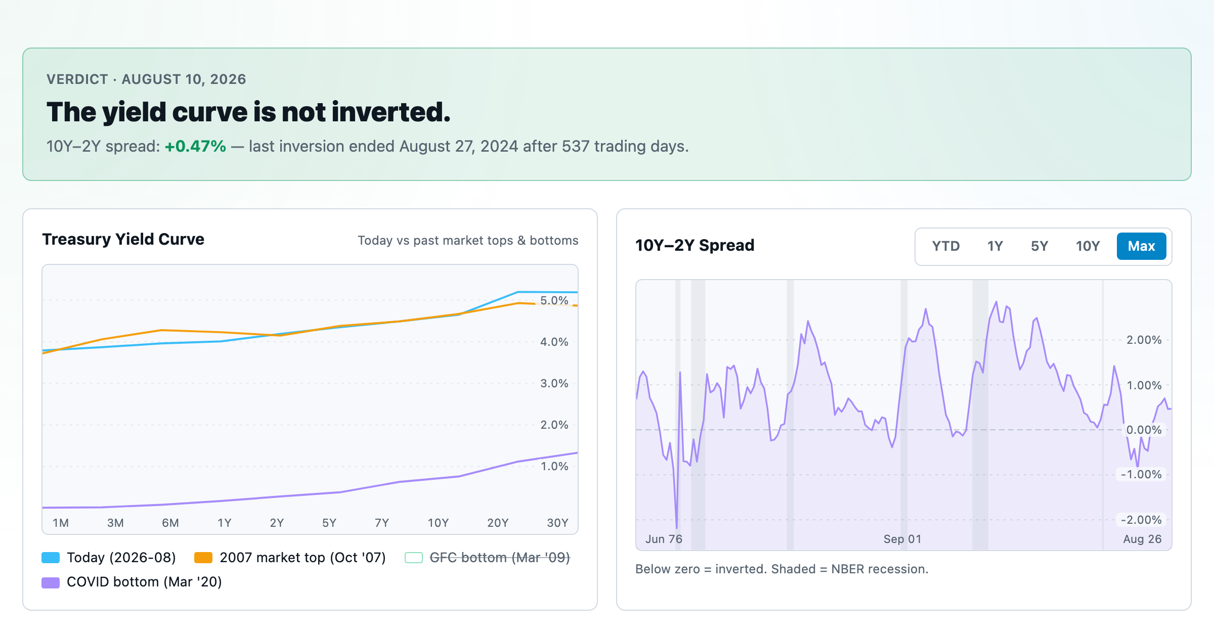
Live term structure, the 10Y–2Y spread, and every inversion episode.