
How the biggest stocks performed through
The largest US companies as bubbles — grouped by sector, sized by market cap. Press play to watch each bubble climb or sink with its 1-year total return, or pick another window.
Top 48 S&P 500 companies by market cap, grouped into sector lanes and sized by market cap. Vertical position = total return since Jun 2025. Daily steps; press play to animate. Click a bubble to pin its tooltip and follow it through playback.
Total return from split- and dividend-adjusted weekly closes. For informational purposes only; not investment advice.
FAQ
- What does this bubble chart show?
- It plots the largest US companies as bubbles, grouped by sector and sized by market capitalization. Press play and each bubble climbs or sinks with its total return over the period you choose.
- What do the bubble size and position mean?
- Size is market cap — bigger companies are bigger bubbles. A bubble's height is its total return, so higher means a larger gain over the selected window. Color groups companies by sector.
- What time periods can I view?
- Year-to-date, 3, 5, or 10 years, or any custom end date. Returns are total returns computed from split- and dividend-adjusted weekly closes.
More visualizations
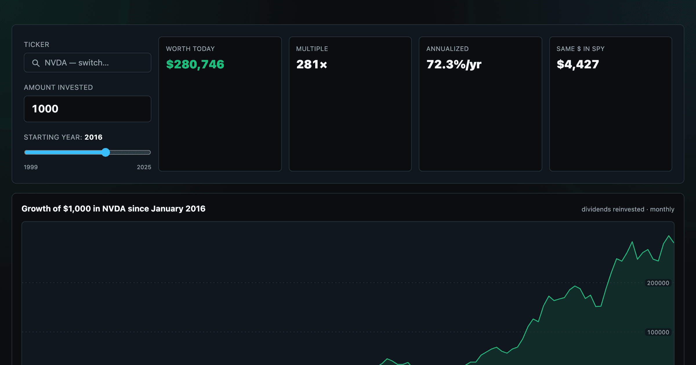
What $1,000 in any stock or ETF would be worth today.
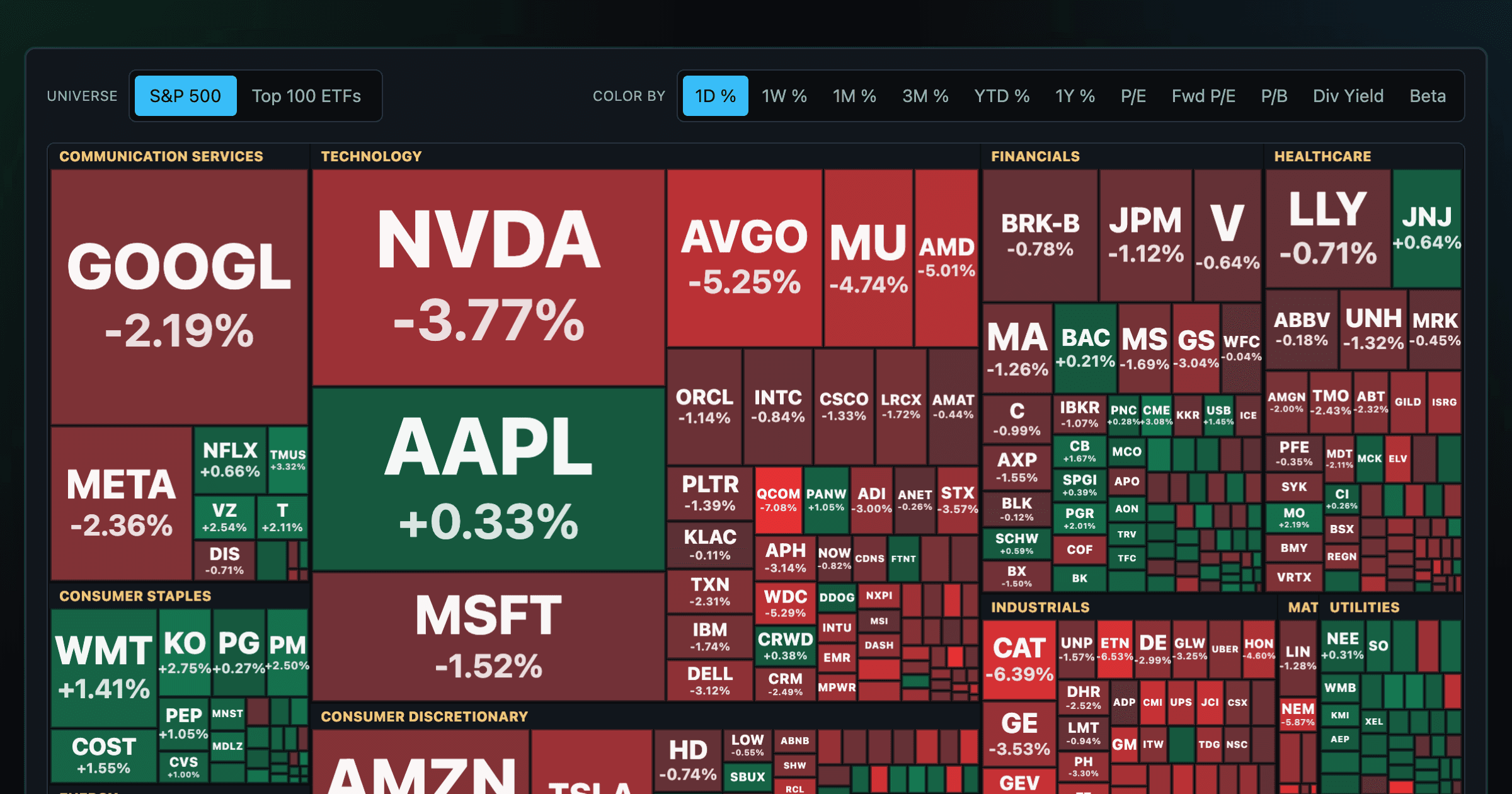
Every S&P 500 company sized by market cap — color by return or valuation.
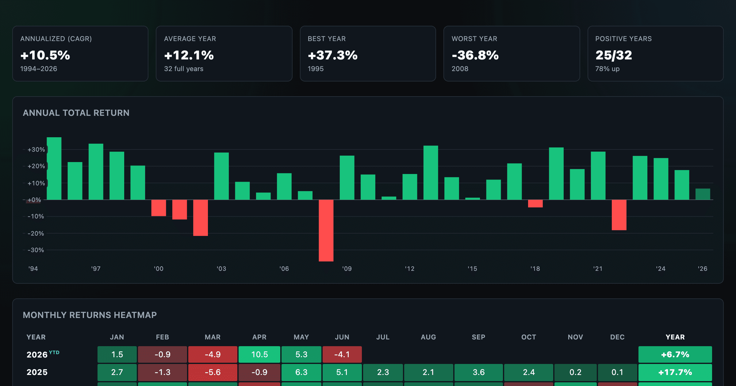
S&P 500 annual and monthly returns — every year, every month.
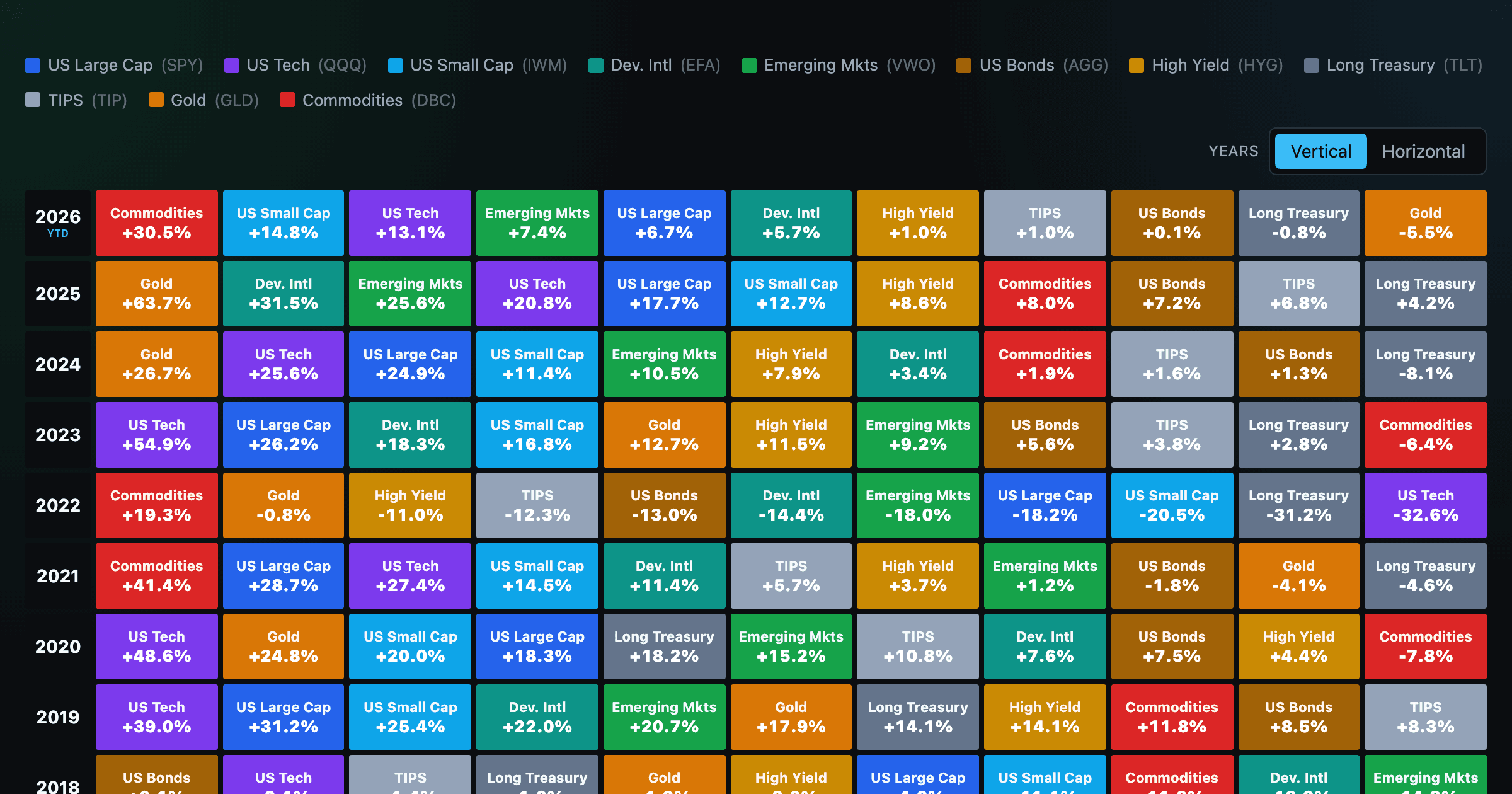
Asset-class returns ranked year by year — the Callan chart / asset allocation quilt.
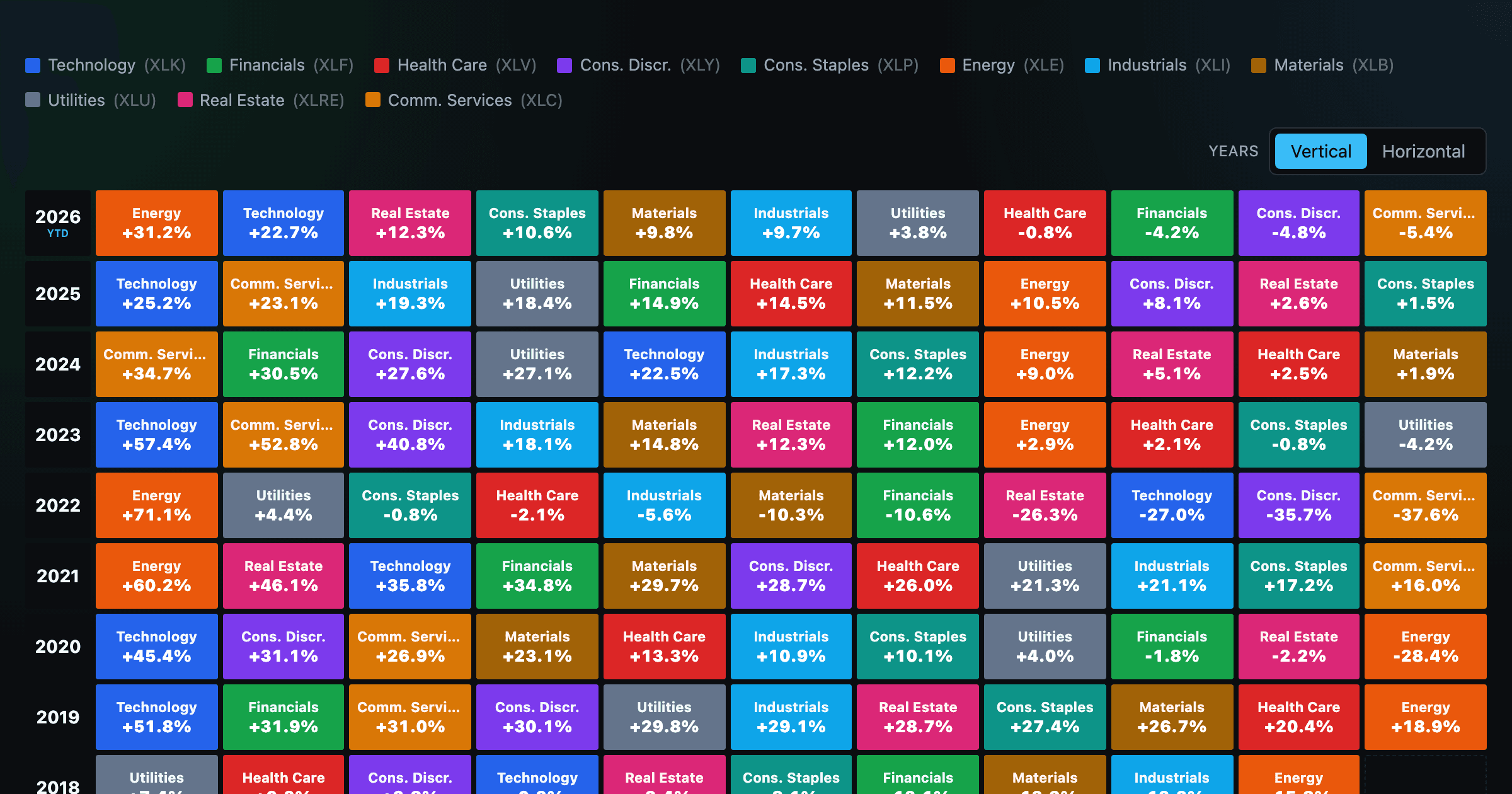
The 11 S&P 500 sectors ranked year by year — a sector quilt chart, back to 1999.
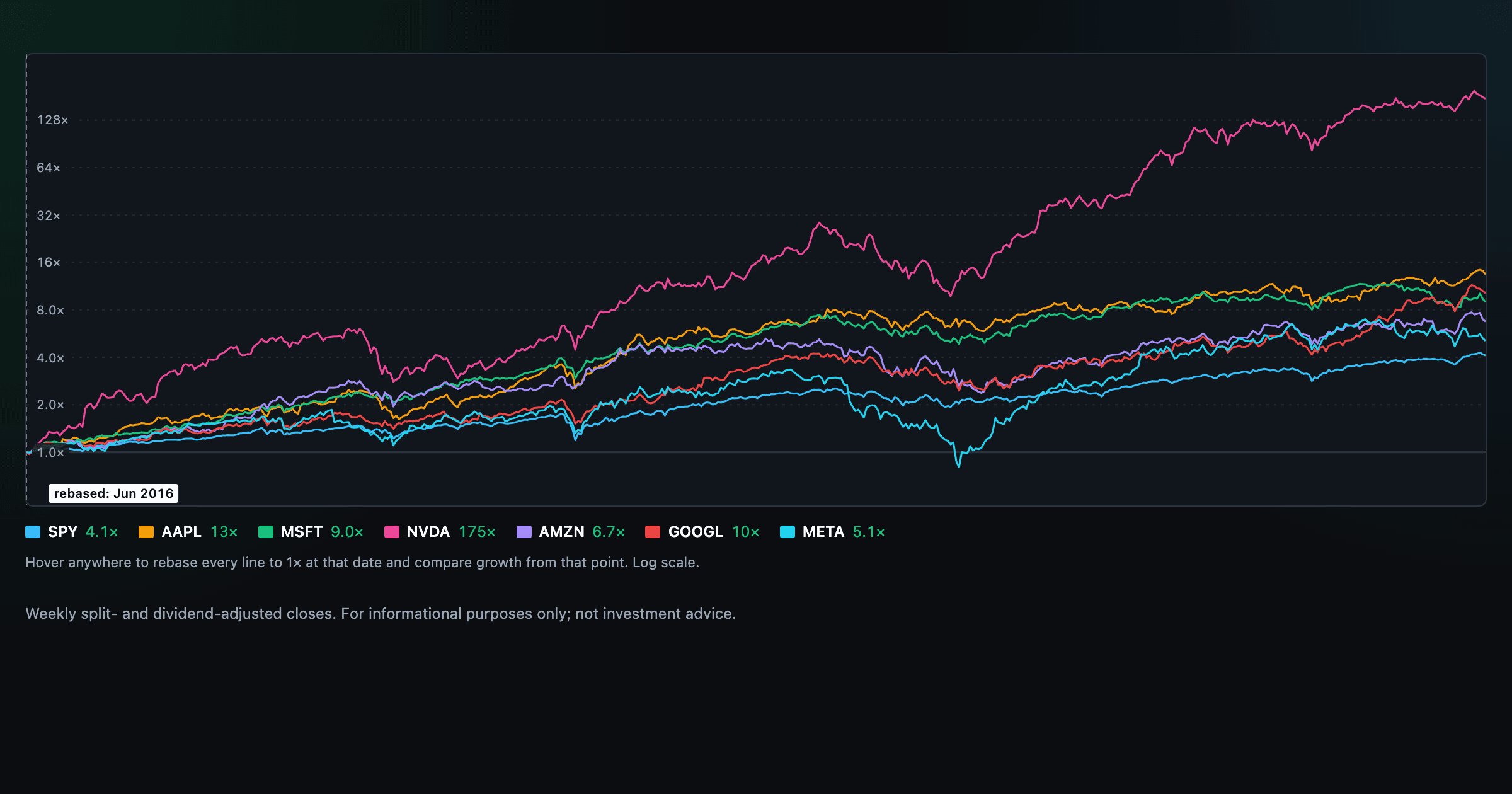
Compare megacaps vs the S&P 500, rebased to 1× at any date you hover.

Stocks trading cheapest relative to their own P/E, P/FCF, P/S, or P/B history — with fair-value bands.

Follow a company's revenue through its income statement as a Sankey — costs, taxes, and profit.

Follow a company's cash from net income through operating cash flow into capex, buybacks, and dividends.

Monthly payment, principal vs interest by year, and the balance paydown — with extra-payment savings.
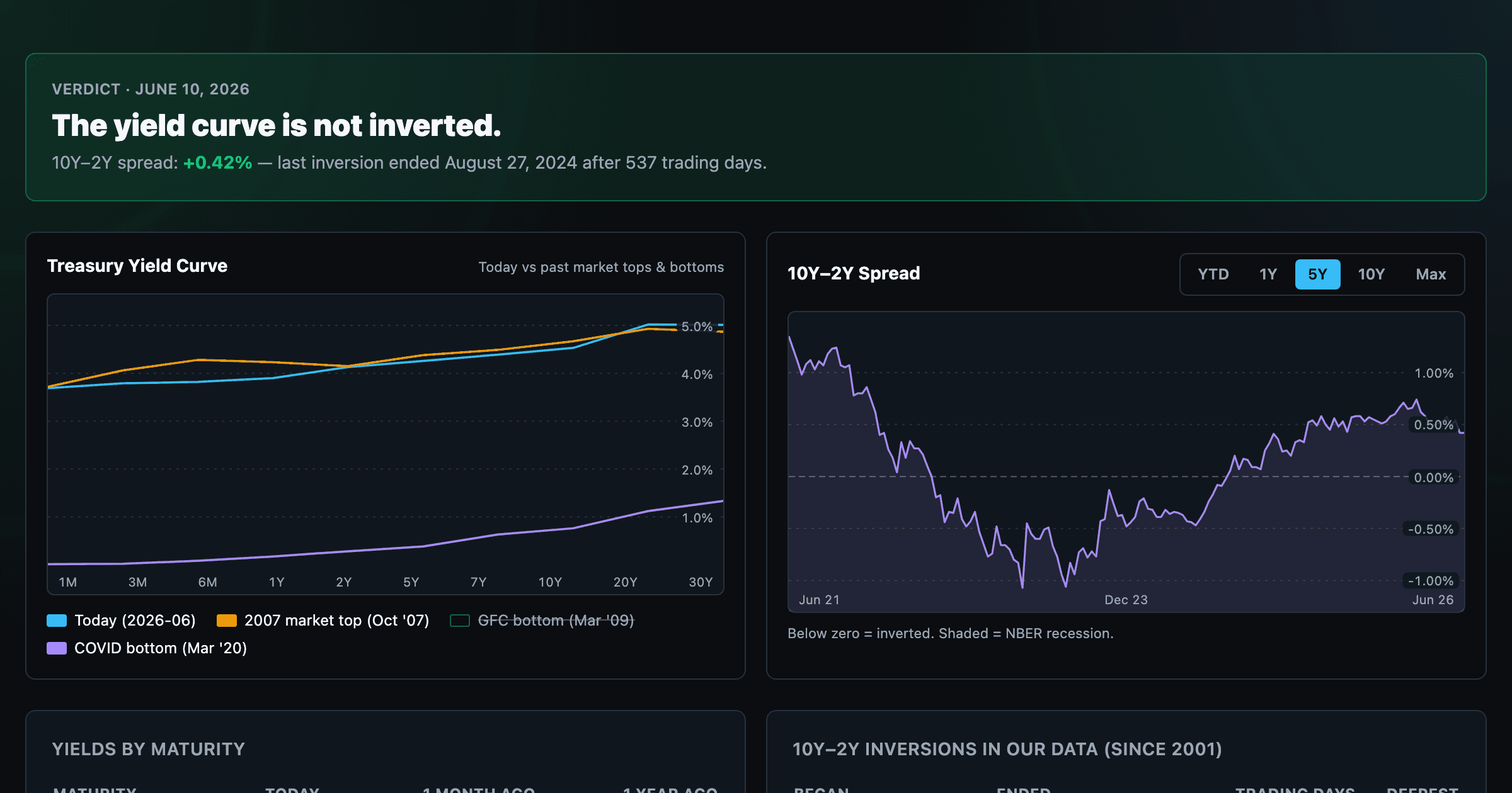
Live term structure, the 10Y–2Y spread, and every inversion episode.