
Market breadth
How many stocks are actually going up? Advancers vs decliners each session, the share of stocks above their own moving averages, fresh 52-week highs and lows, and how breadth stacks up across every trailing window — for all 953 US stocks we track. Go deeper with the stock-by-stock breadth heatmap and the daily return distributions.
Advancers vs decliners#
Every session's bar sums to the whole universe — green advancers from the bottom, red decliners on top — so the red/green split of the market is read directly.
Stocks above their moving averages#
Share of stocks trading above their own 20-, 50- and 200-day moving averages. Short windows swing with every pullback; the 200-day line is the slow-moving health check — readings under ~20% have marked washouts, over ~80% broad strength.
New 52-week highs and lows#
Stocks closing at a fresh 52-week high (up) vs a fresh 52-week low (down). Persistent new-low expansion is the classic stress signal; simultaneous highs and lows mark a split market.
Where stocks sit in their 52-week range#
Every stock placed inside its own 52-week range — 0% = at the 52-week low, 100% = at the high, in 5% buckets (live prices during market hours). A right-heavy pile means most stocks trade near their highs; a left-heavy one marks broad damage the index level can hide. Hover a bar for the bucket's biggest names by market cap.
Cumulative advance–decline line vs SPY#
The running sum of each day's net advancers, next to SPY over the same window. When SPY climbs but the A/D line stalls, fewer stocks are carrying the advance.
Breadth by trailing window#
Share of stocks with a positive return over each window, as of now (1D uses live prices during market hours). A weak 1M row under a strong 1Y row = recent deterioration.
Breadth by sector#
| Sector | 1D | 5D | 1M | 3M | YTD | 1Y | # |
|---|---|---|---|---|---|---|---|
| All stocks | 33% | 28% | 29% | 52% | 60% | 61% | 953 |
| Technology | 44% | 45% | 47% | 51% | 69% | 60% | 154 |
| Financials | 39% | 22% | 25% | 75% | 59% | 59% | 153 |
| Industrials | 48% | 25% | 16% | 36% | 60% | 63% | 150 |
| Consumer Discretionary | 31% | 17% | 13% | 32% | 38% | 43% | 128 |
| Healthcare | 21% | 52% | 40% | 74% | 68% | 74% | 108 |
| Utilities | 18% | 6% | 12% | 22% | 53% | 62% | 51 |
| Energy | 32% | 23% | 49% | 74% | 96% | 96% | 47 |
| Consumer Staples | 15% | 33% | 35% | 54% | 52% | 48% | 46 |
| Materials | 18% | 18% | 55% | 66% | 73% | 80% | 44 |
| Real Estate | 14% | 12% | 9% | 19% | 51% | 44% | 43 |
| Communication Services | 19% | 15% | 30% | 52% | 44% | 44% | 27 |
| Other | 100% | 0% | 0% | 50% | 50% | 50% | 2 |
Cell = % of the group's stocks with a positive return over the window (green > 50% positive, red < 50%).
Methodology#
Universe: all actively tracked US stocks (currently 953; dual share classes deduplicated) — today's membership walked back through history, so early years cover fewer names and carry survivorship bias. Daily advances/declines use dividend-adjusted closes (an ex-dividend gap is not a decline). Moving averages and 52-week extremes use split-adjusted closes, and each stock only counts toward a measure once it has enough trading history (200 sessions for the 200-day MA, 252 for highs/lows). Historical rows are end-of-day; during market hours the advancer/decliner charts append a provisional "today so far" bar from live intraday prices (refreshed every ~10 minutes), and the trailing-window panel's 1D column reflects the same live prices. Not investment advice.
FAQ#
- What is market breadth?
- Market breadth measures how many stocks participate in a move, rather than how far a cap-weighted index travels. An index can rise on a handful of megacaps while most stocks fall — breadth metrics like advancers vs decliners, % of stocks above their moving averages, and new highs vs lows make that visible.
- What is a breadth divergence?
- When the index makes new highs but the cumulative advance–decline line (or % of stocks above their 200-day average) does not, the advance is narrowing — fewer stocks are carrying it. Divergences don't time tops, but historically broad advances have been more durable than narrow ones.
More visualizations
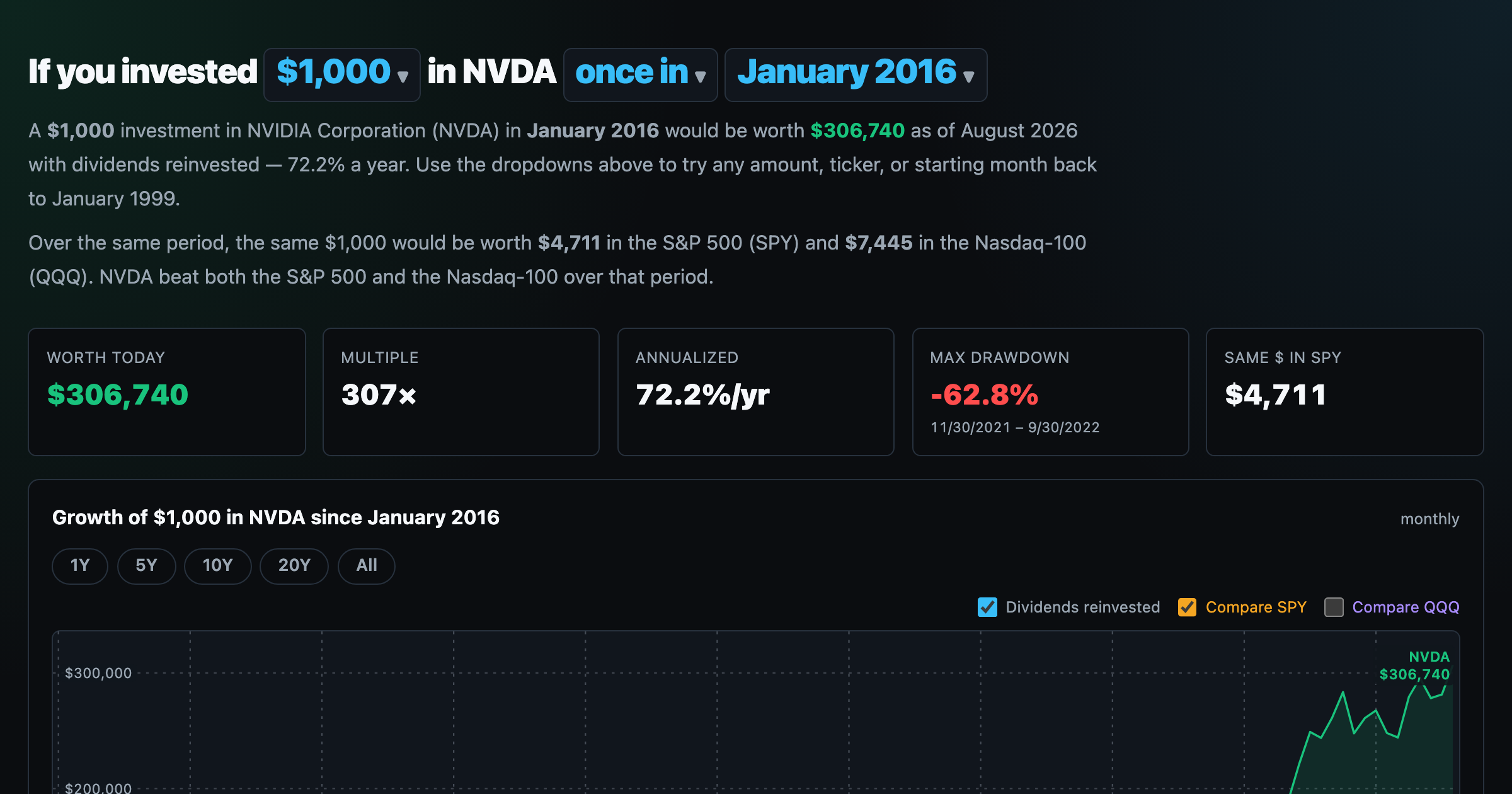
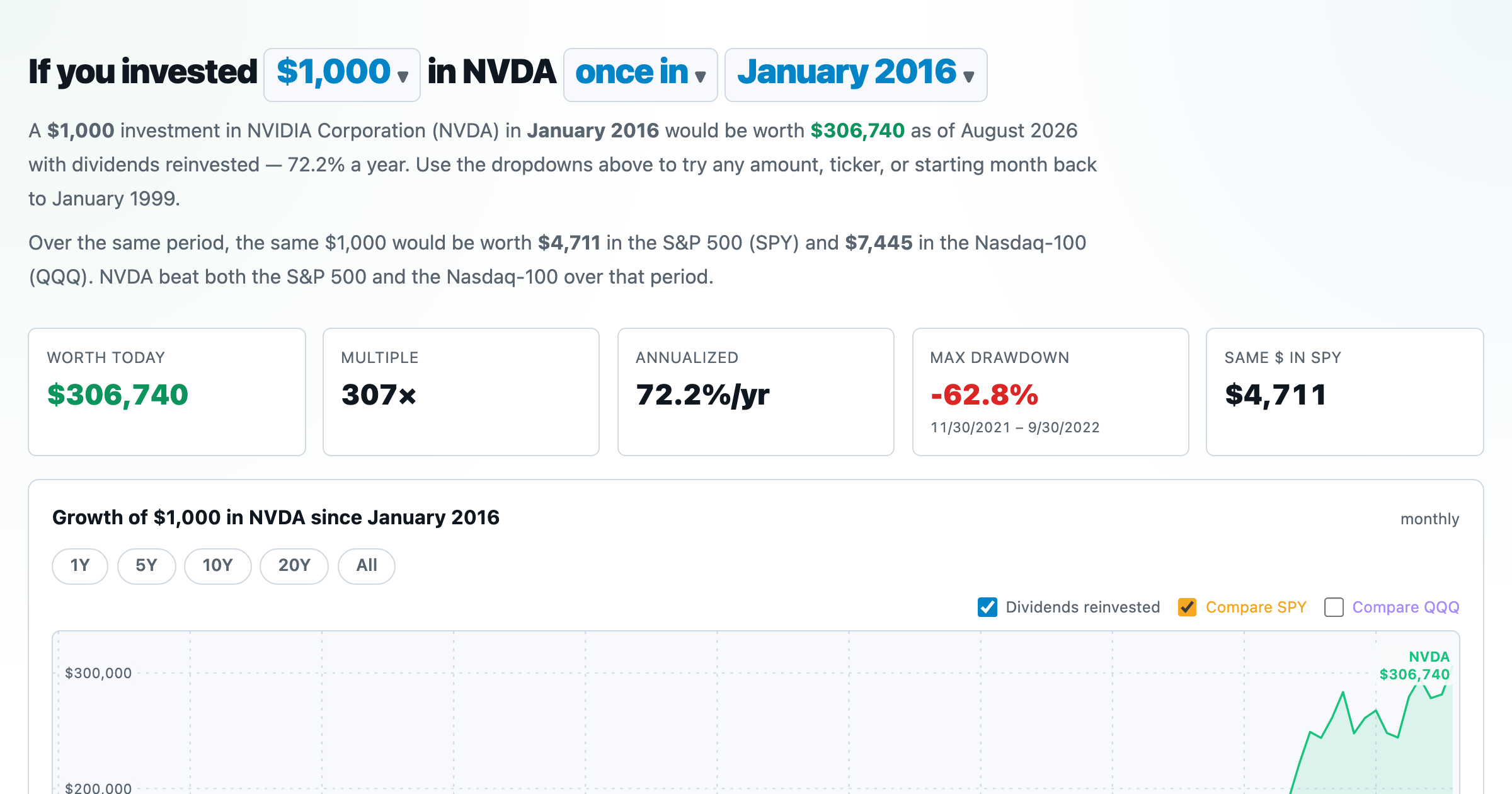
What $1,000 in any stock or ETF would be worth today.
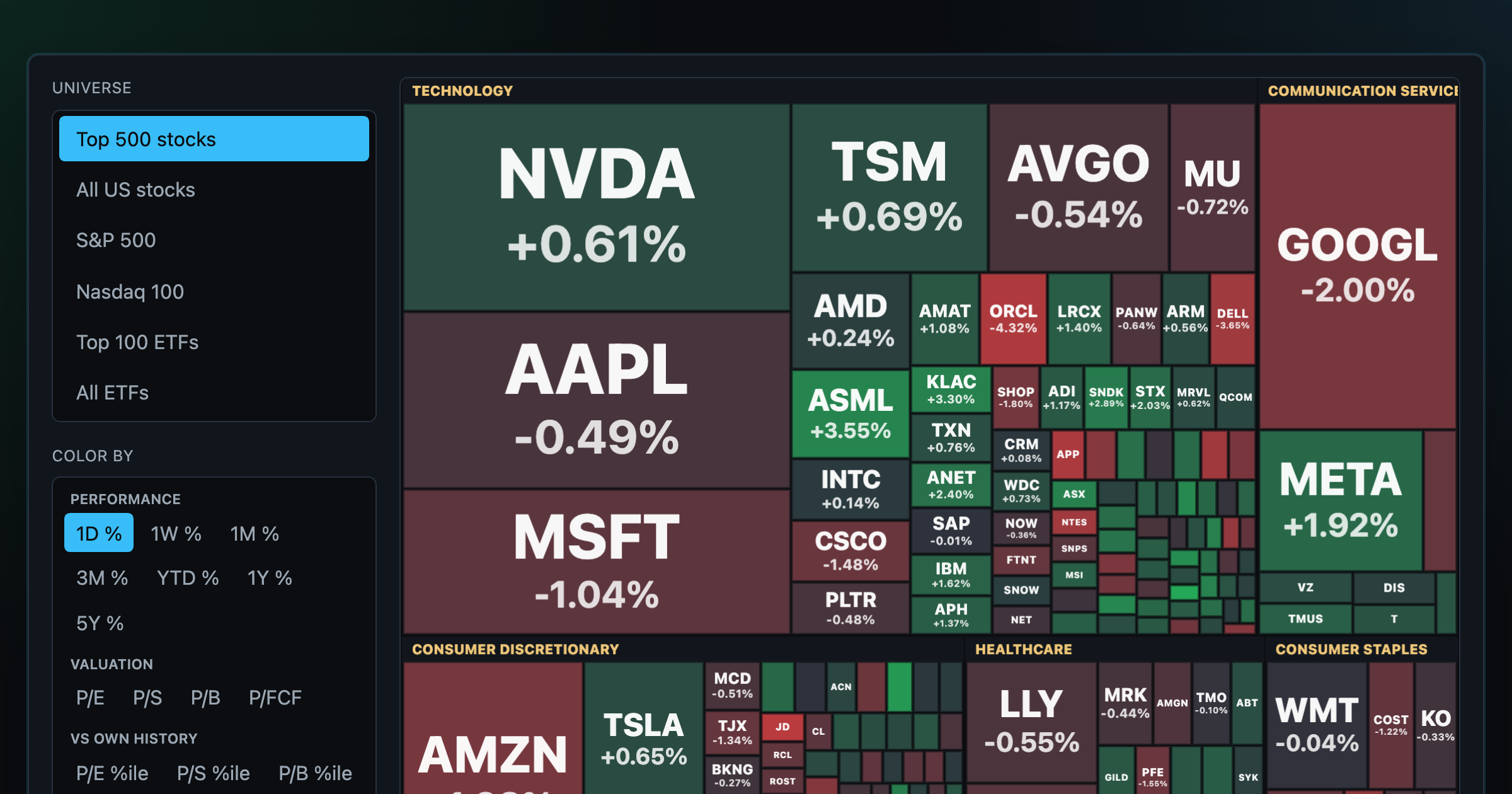
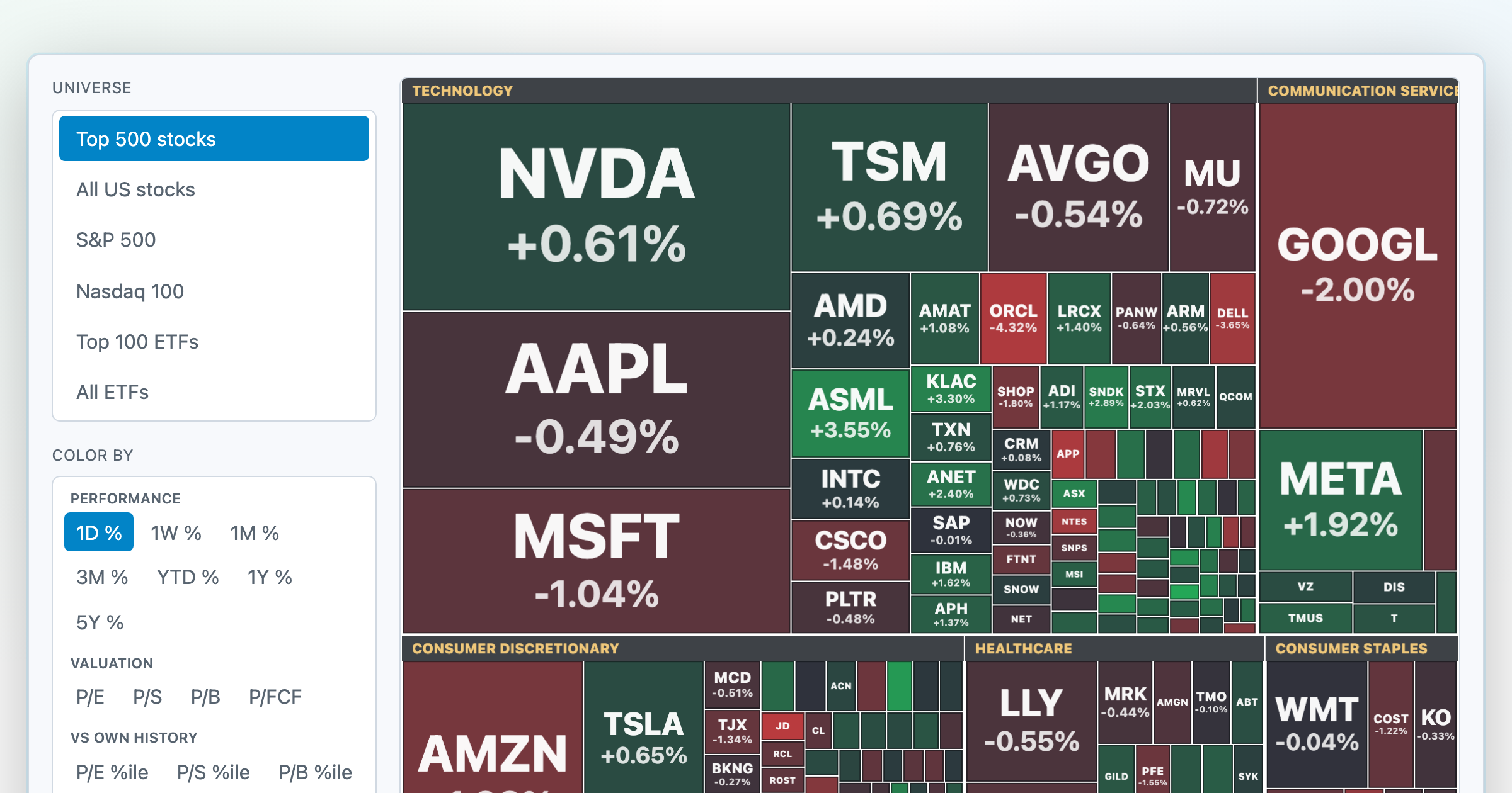
Every S&P 500 company sized by market cap — color by return or valuation.
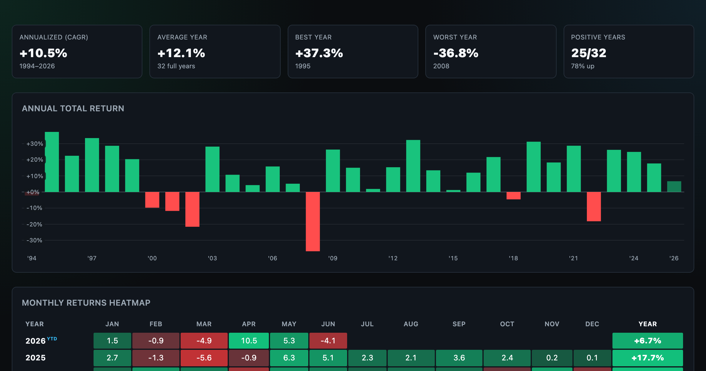
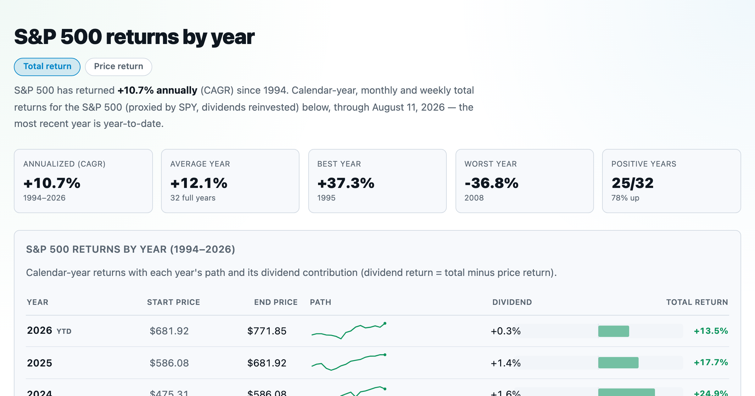
S&P 500 returns by year, month, week and trailing period — total or price return.
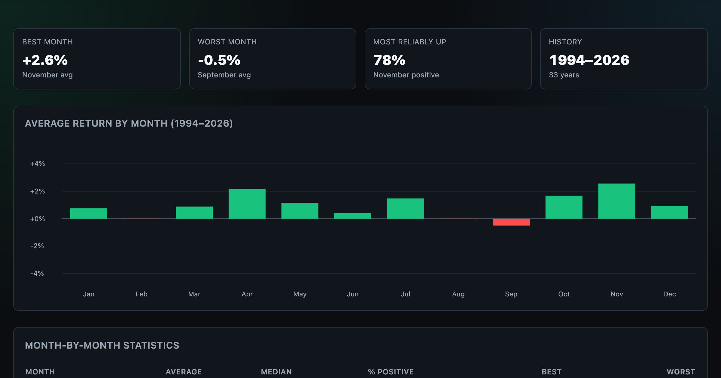
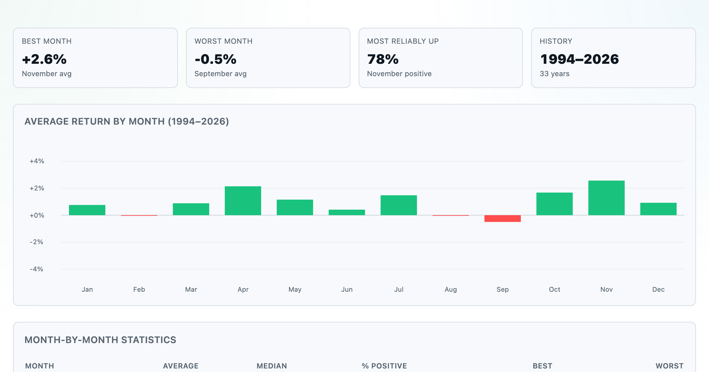
Which month is best for stocks? Average return of every calendar month, for any ticker.
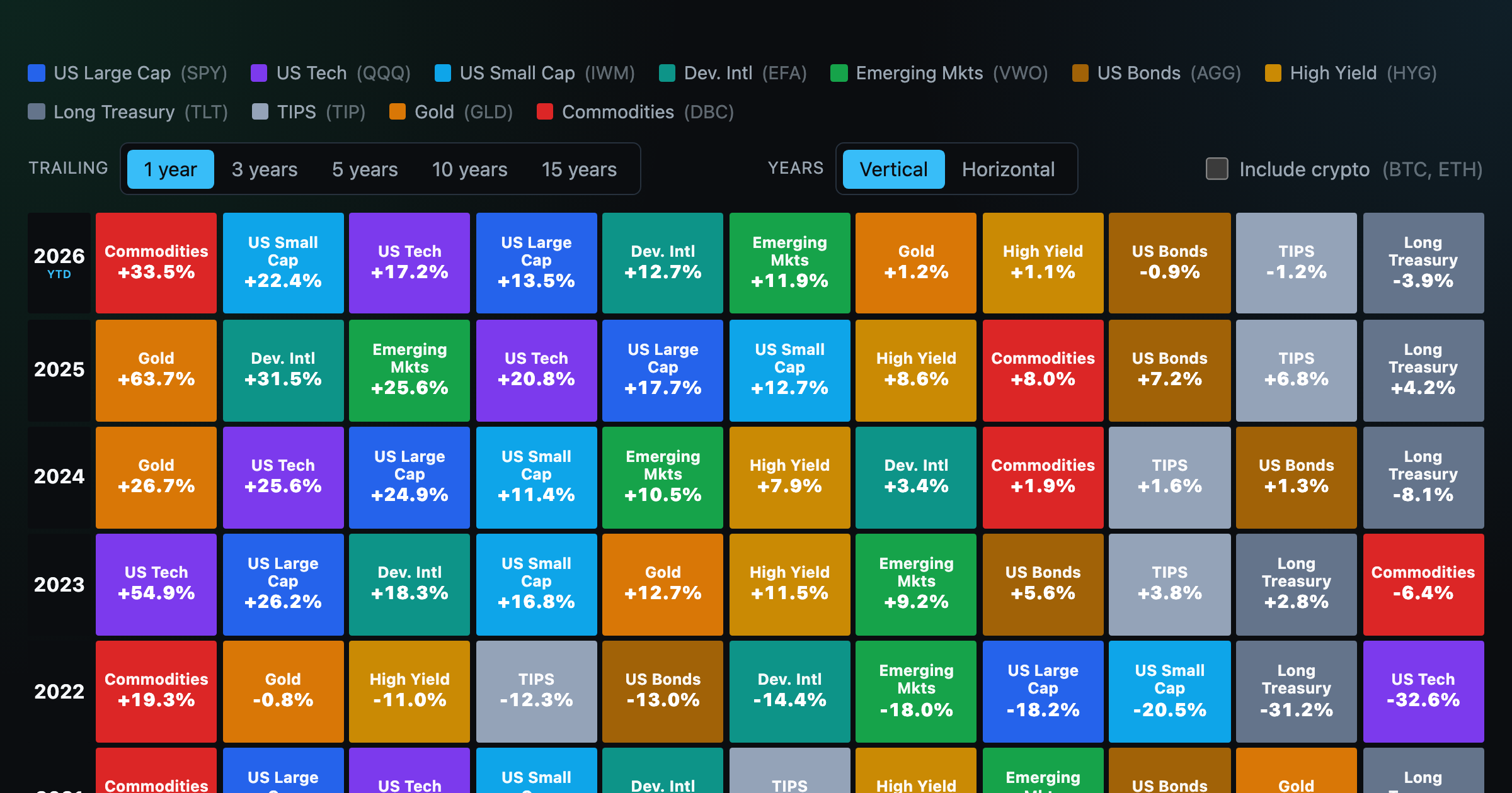
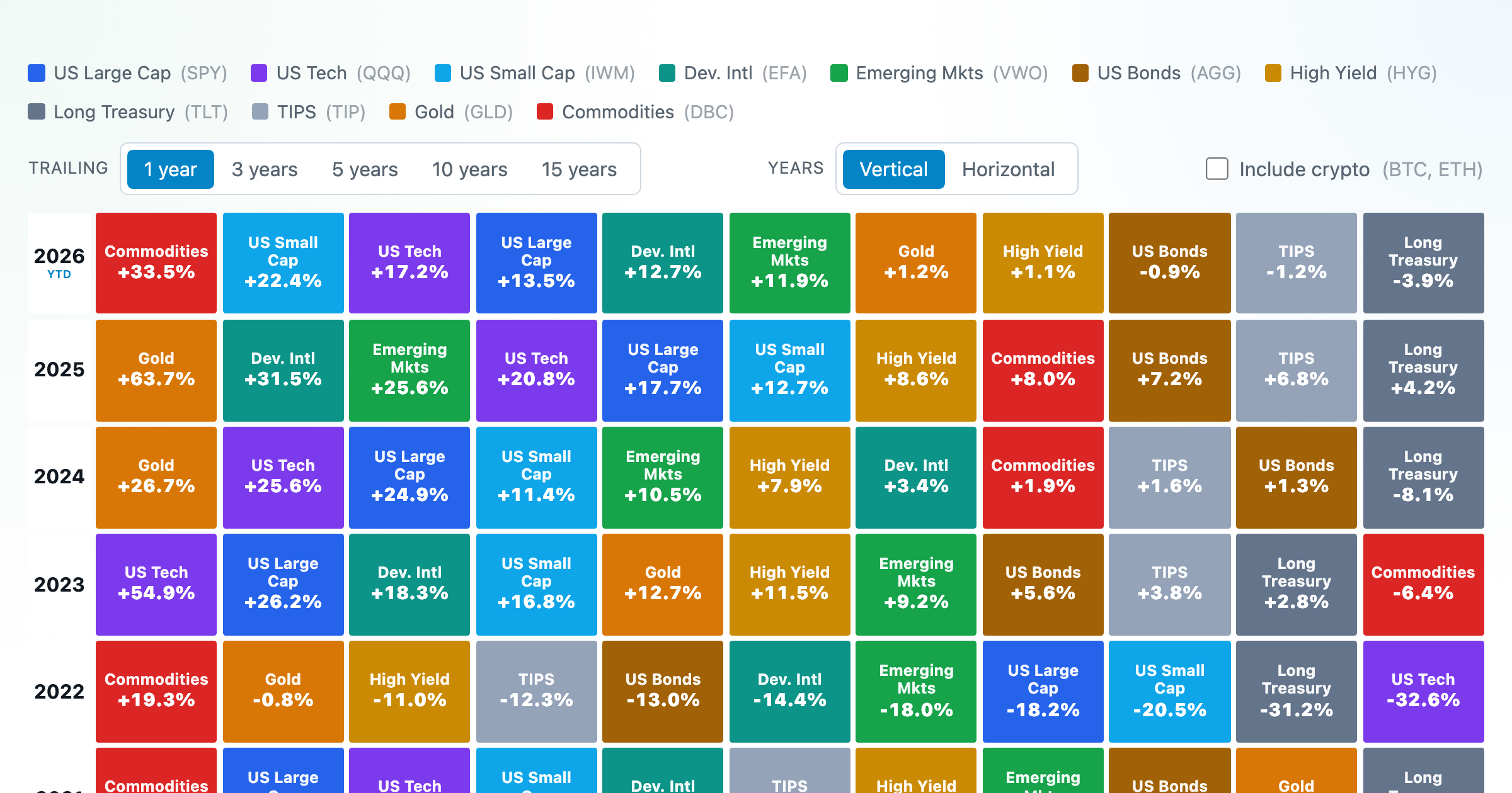
Asset-class returns ranked year by year — the Callan chart / asset allocation quilt.
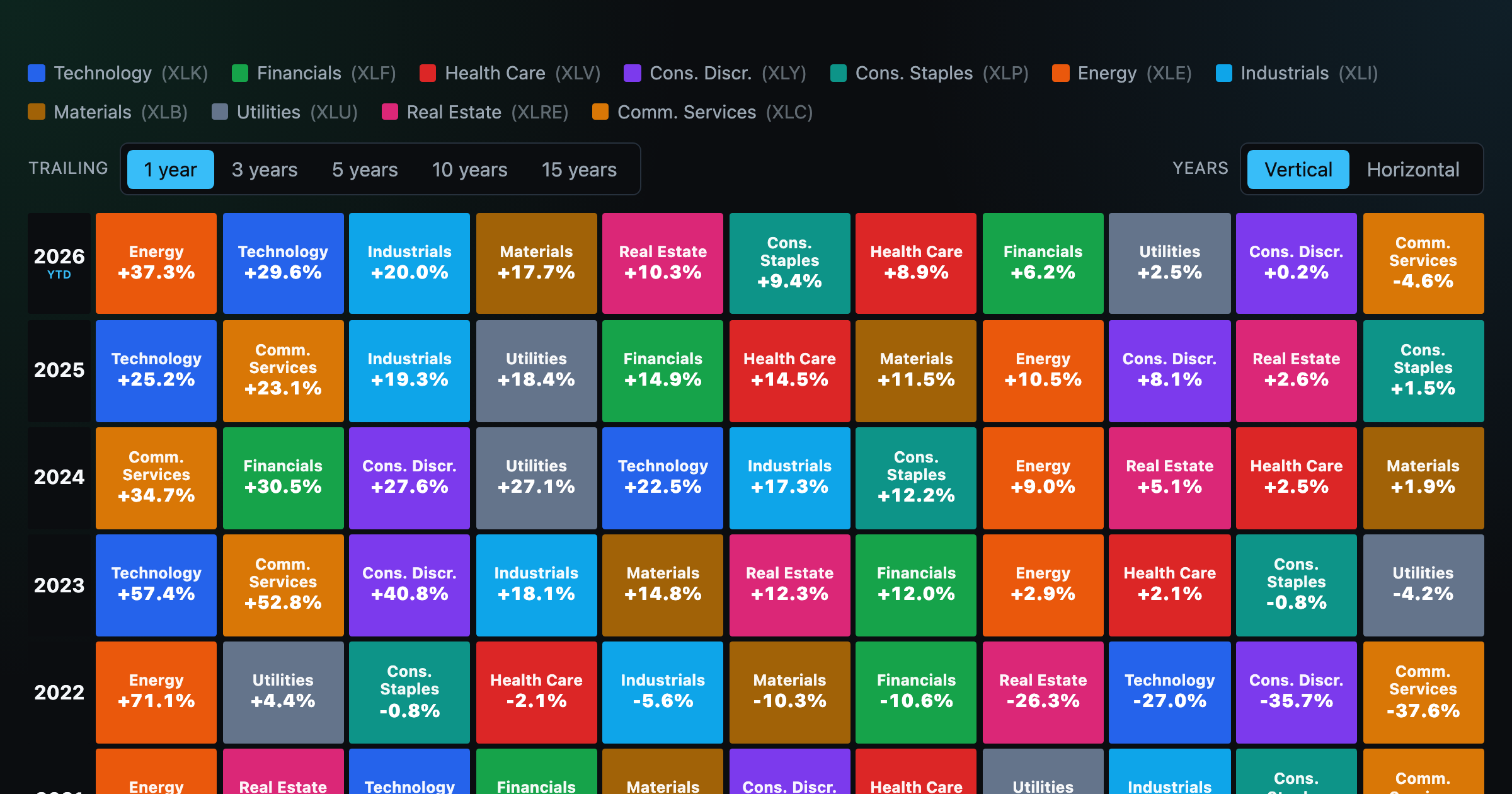
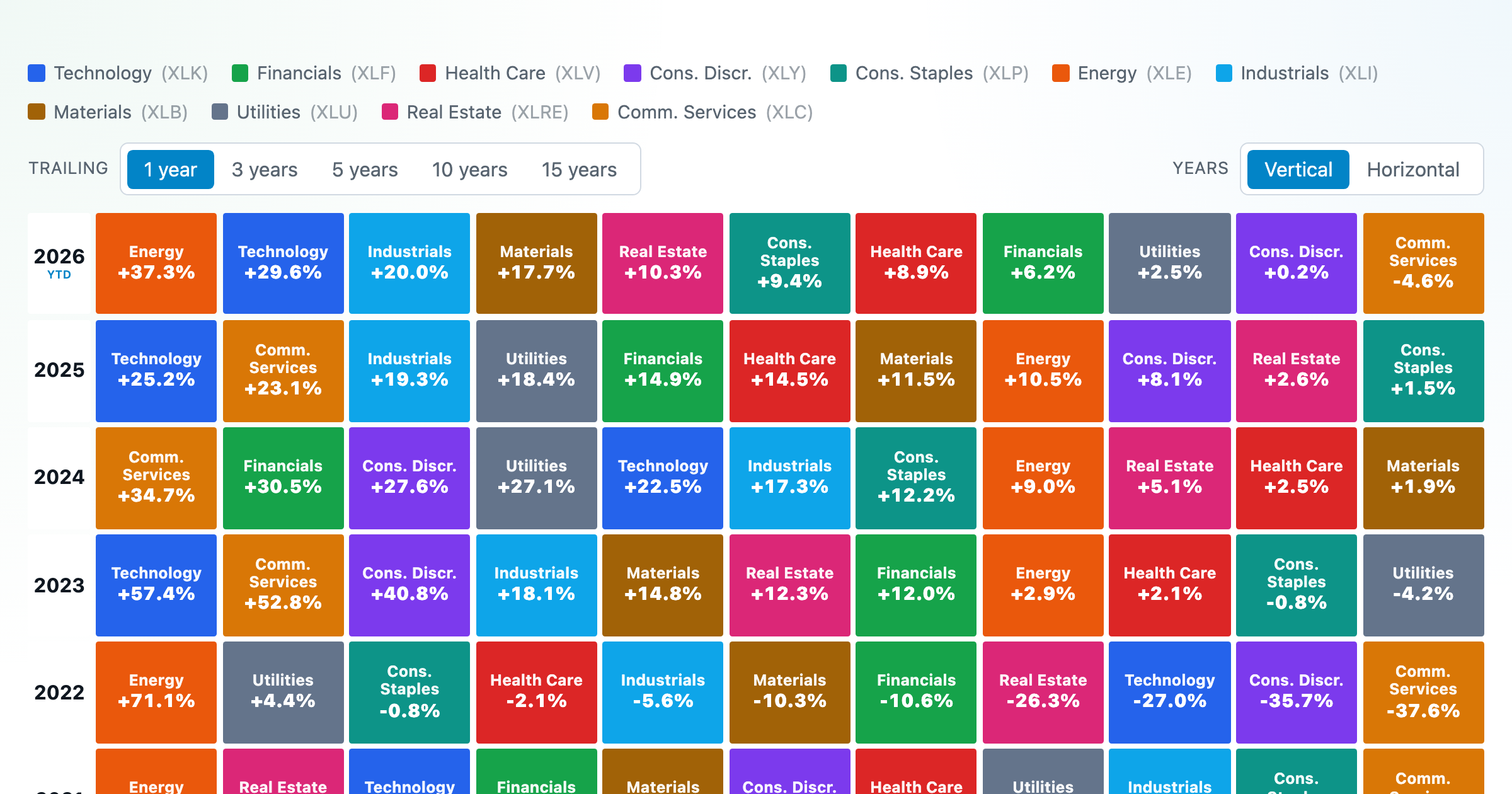
The 11 S&P 500 sectors ranked year by year — a sector quilt chart, back to 1999.

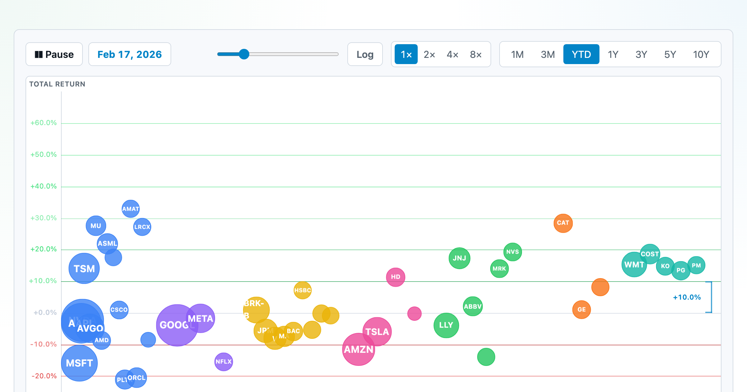
The biggest US companies as animated bubbles, rising and falling with their total return over time.
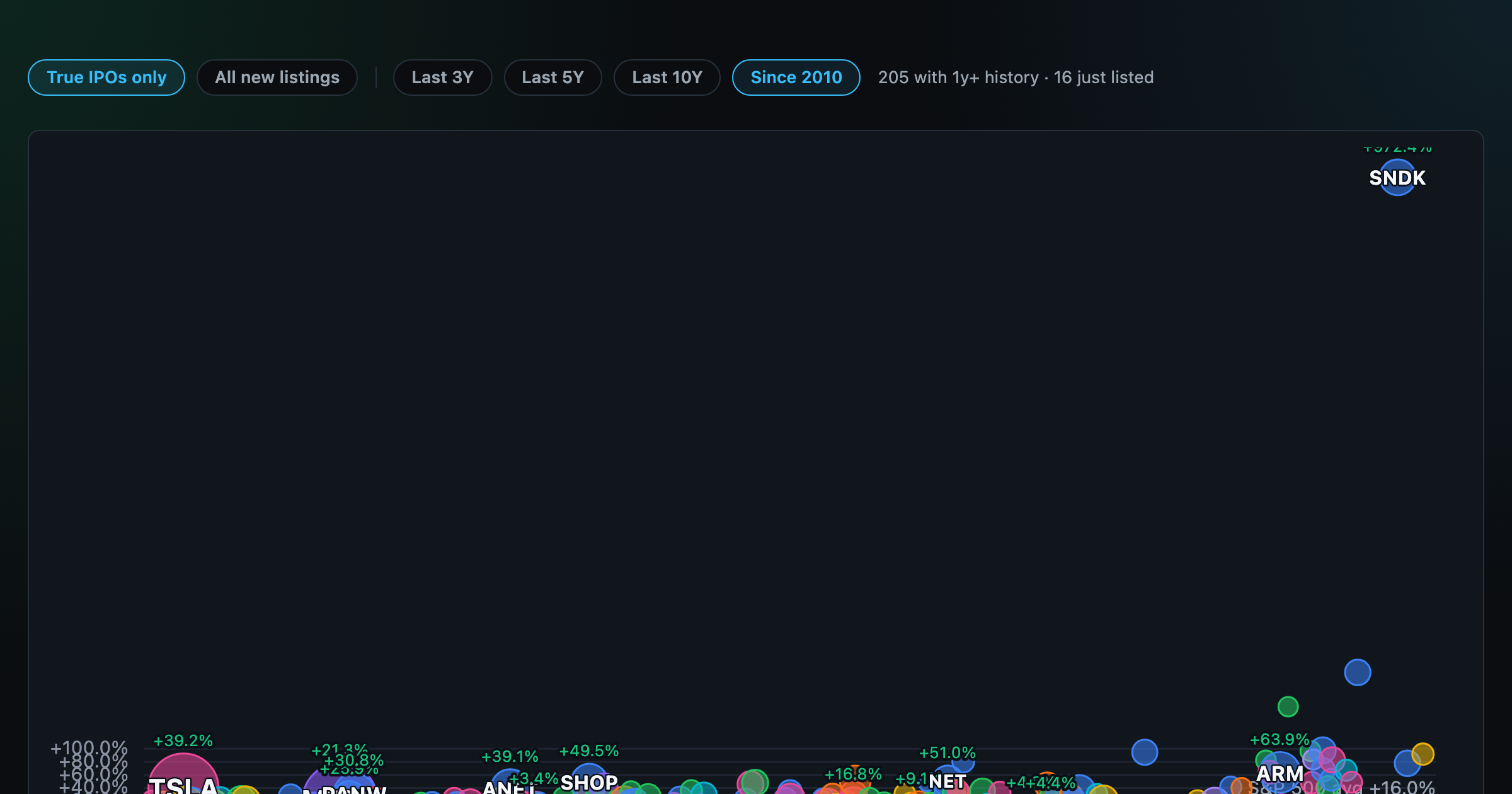
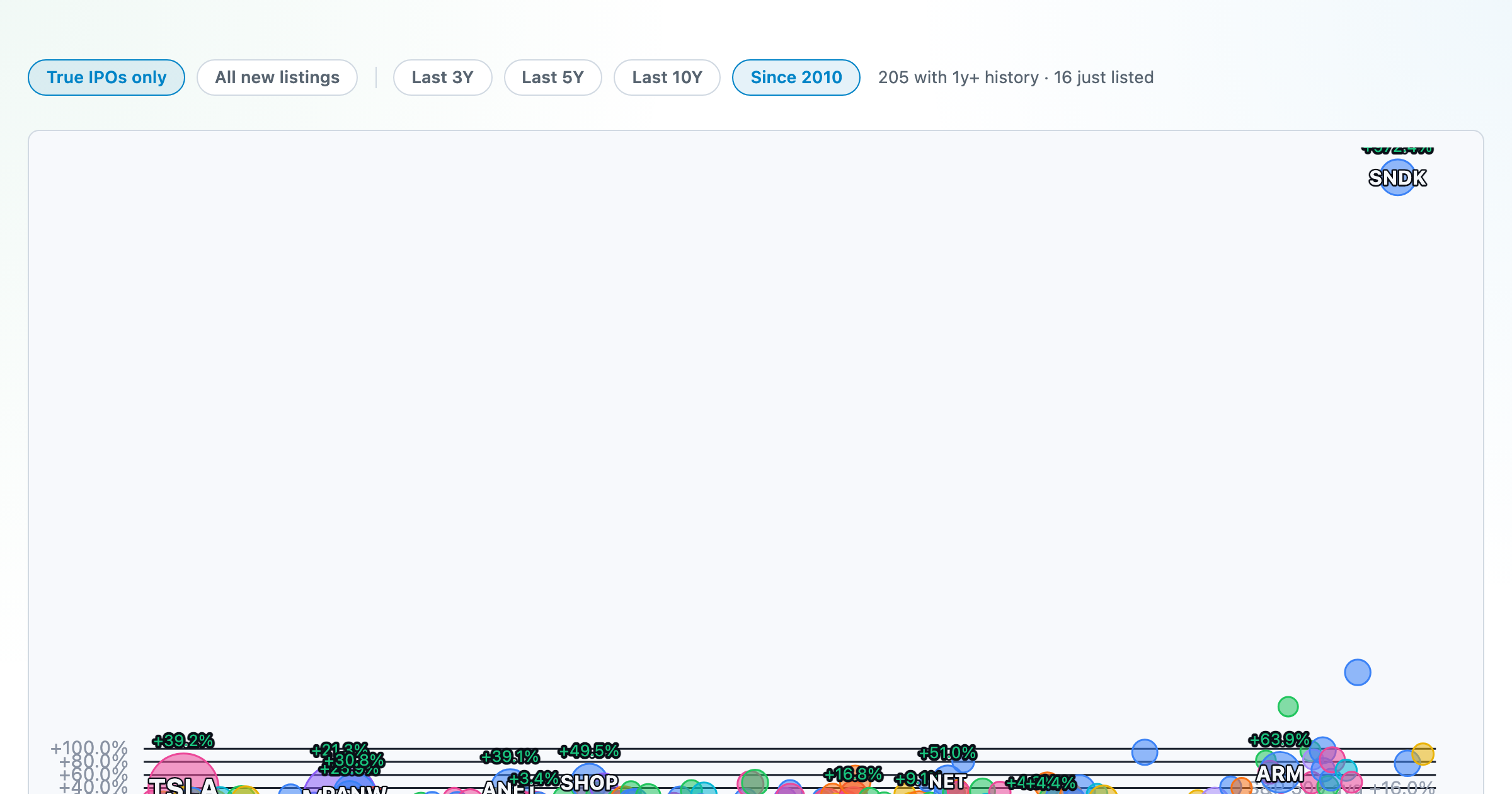
How recent stock-market debuts have performed since listing — annualized, vs the S&P 500, by IPO vs spin-off.
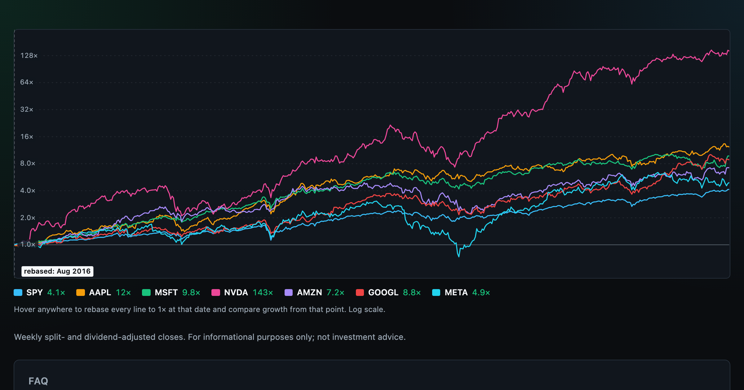
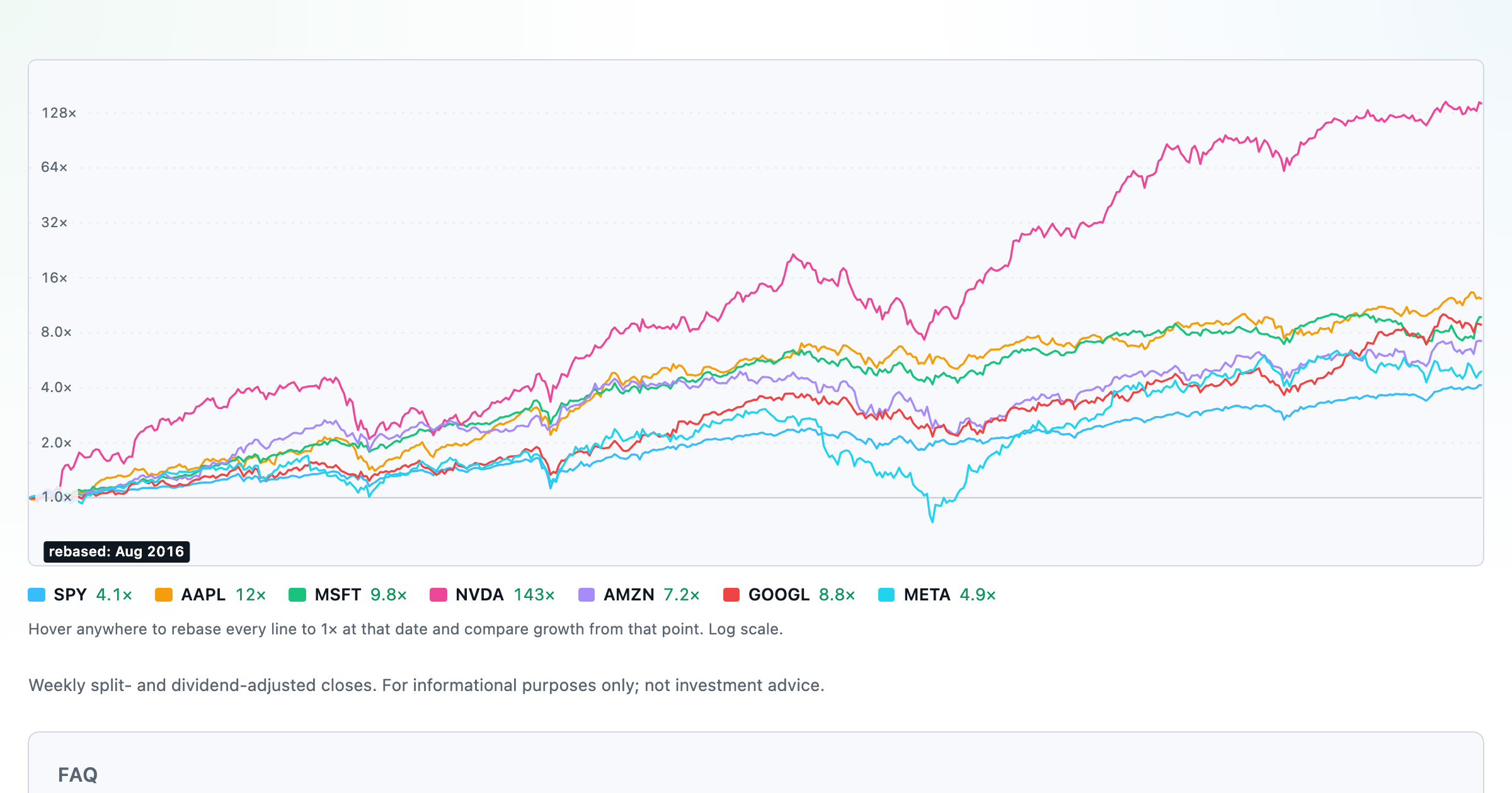
Compare megacaps vs the S&P 500, rebased to 1× at any date you hover.

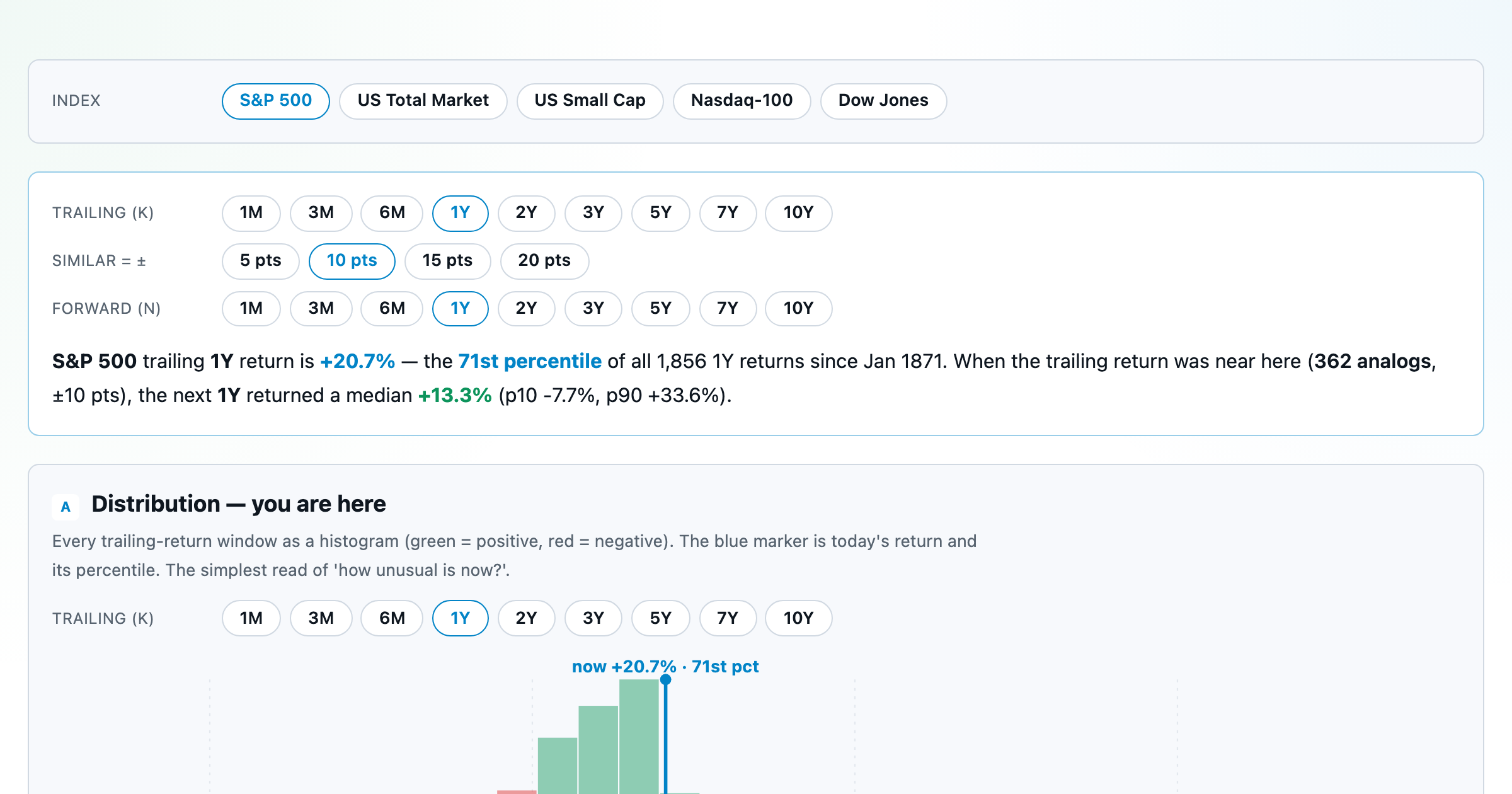
Where today's S&P 500 return ranks against all history — and the forward returns that followed similar moments.
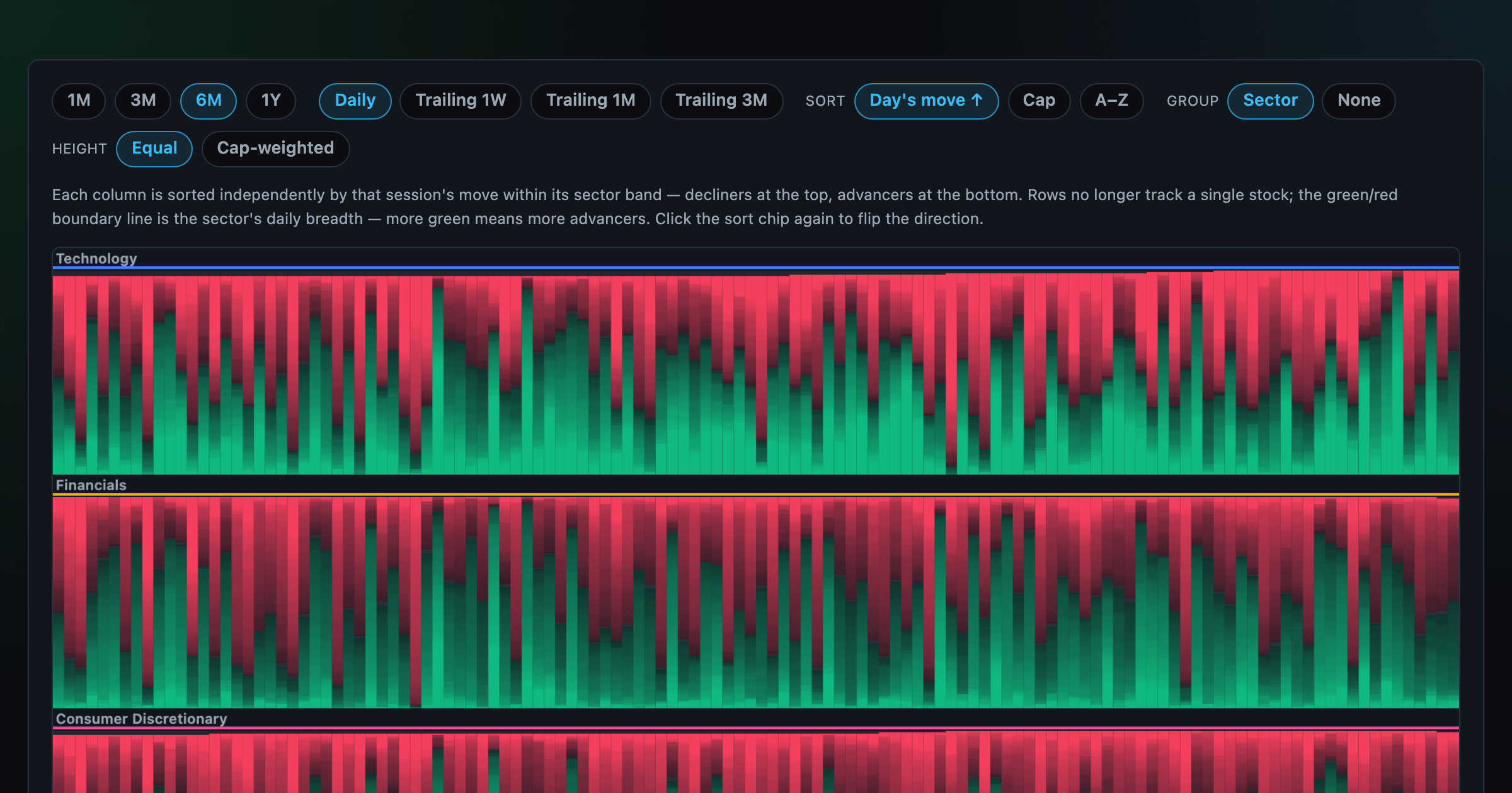
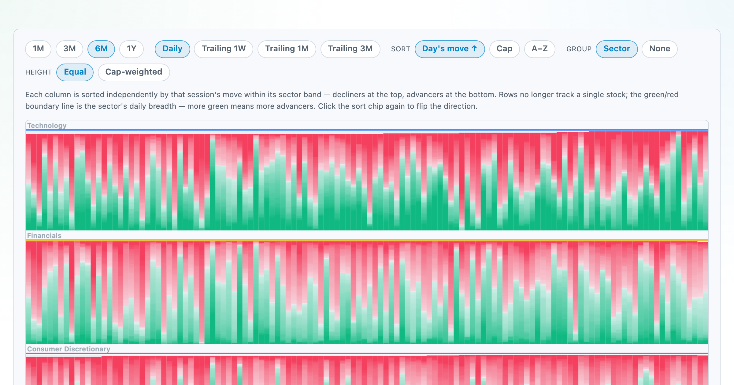
Every stock as a row, every day as a column — market selloffs are vertical stripes, sector routs are blocks.
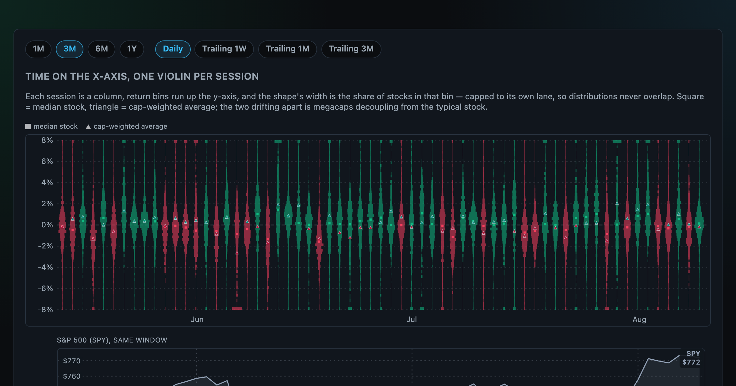
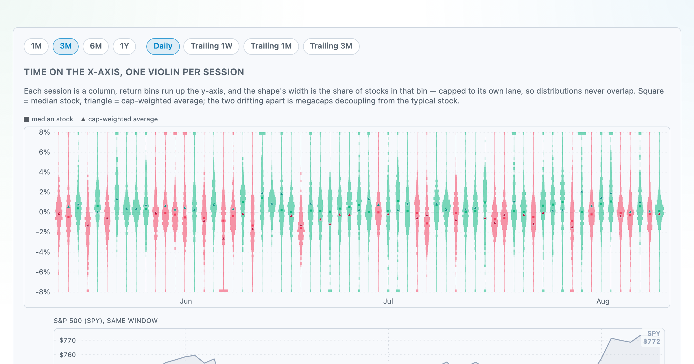
Each session's full distribution of stock returns as an upright violin, with the S&P 500 on the same axis — shifts, dispersion, and fat tails at a glance.
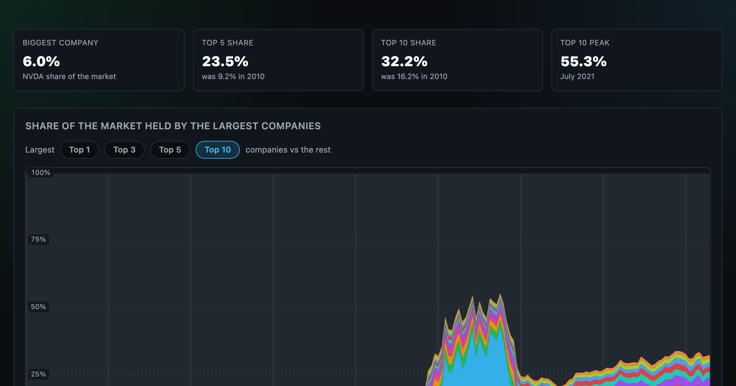
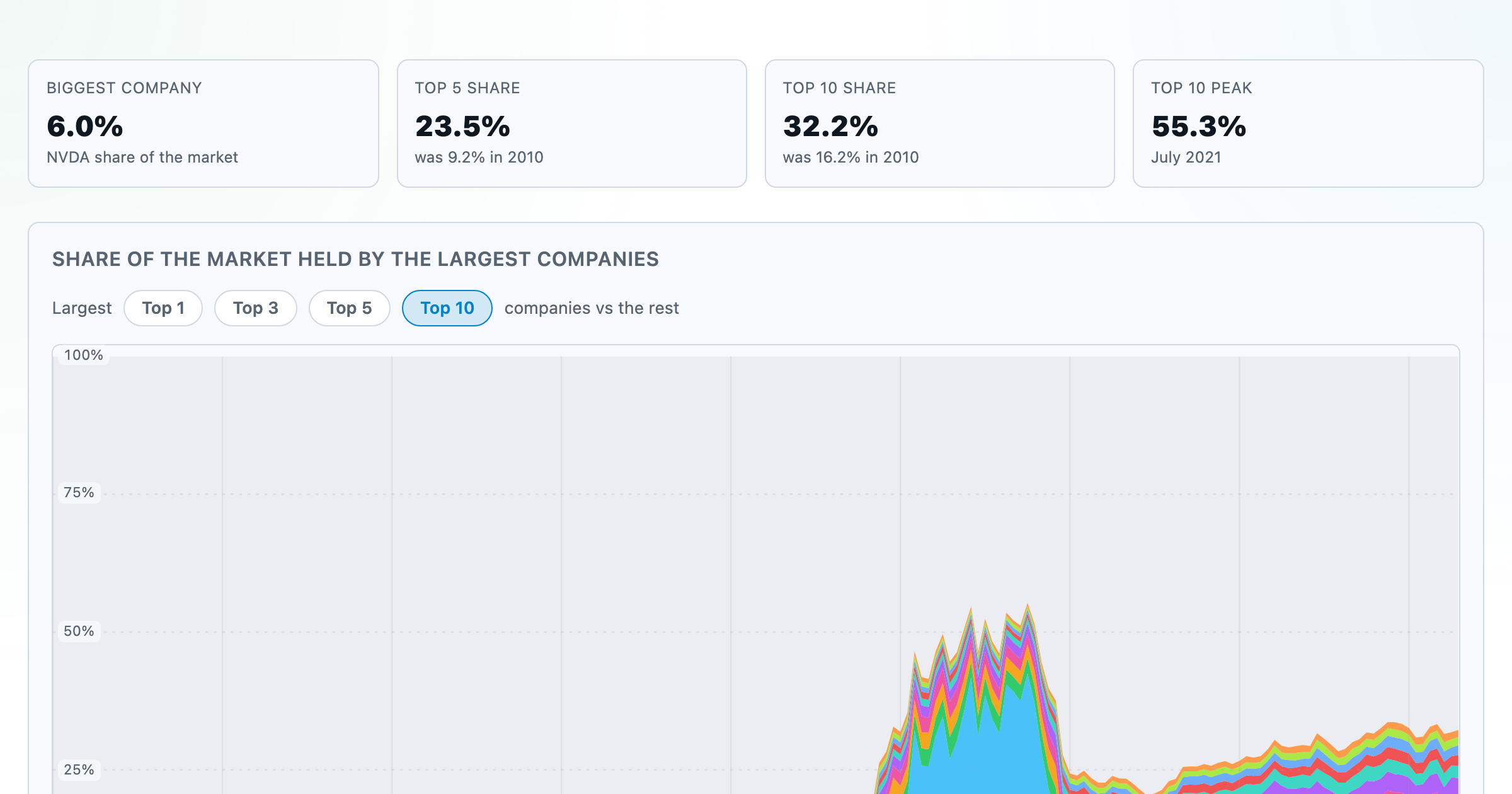
How top-heavy is the market? The top 1–10 companies' share of total market value, month by month since 2010.
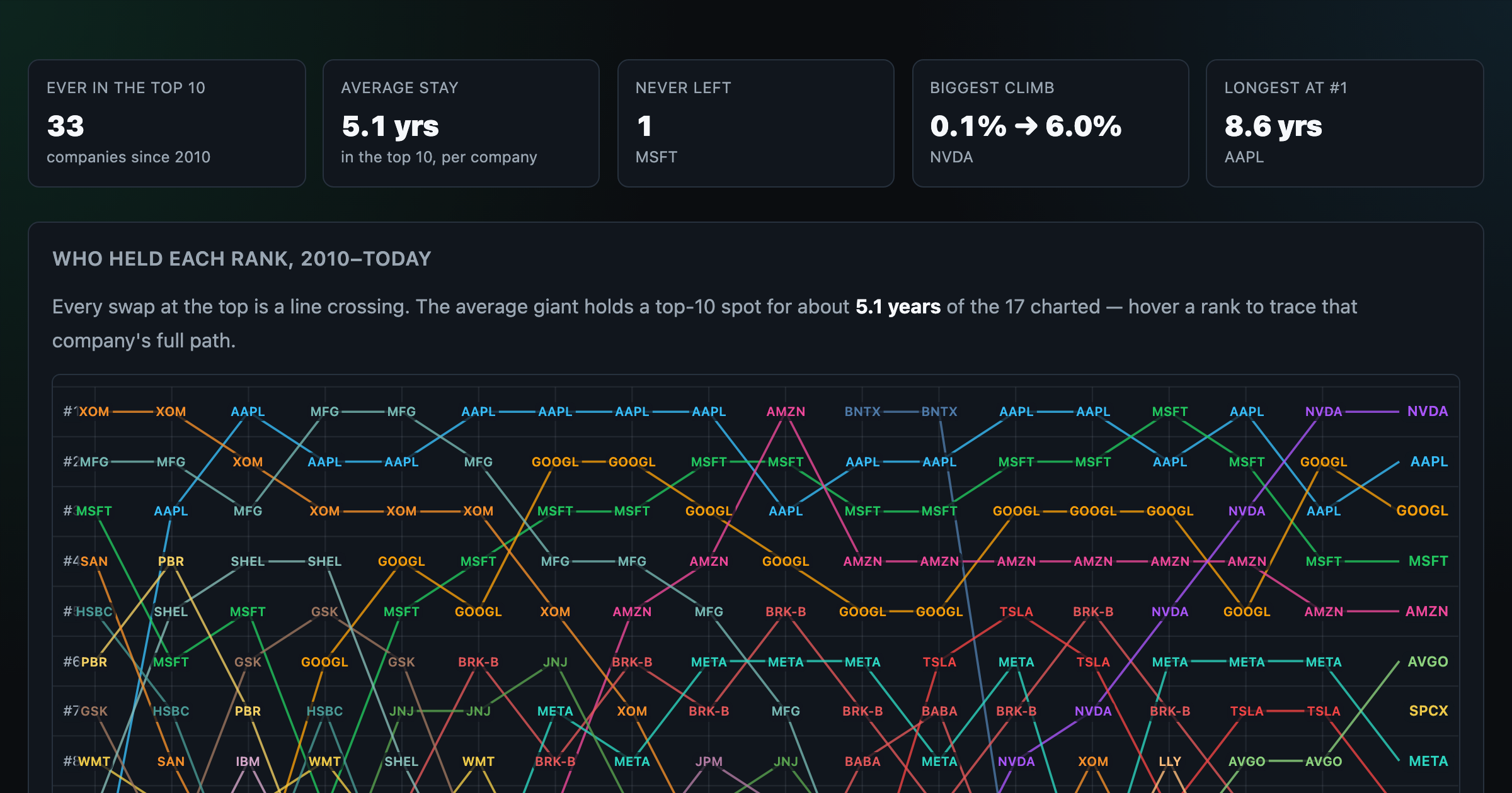
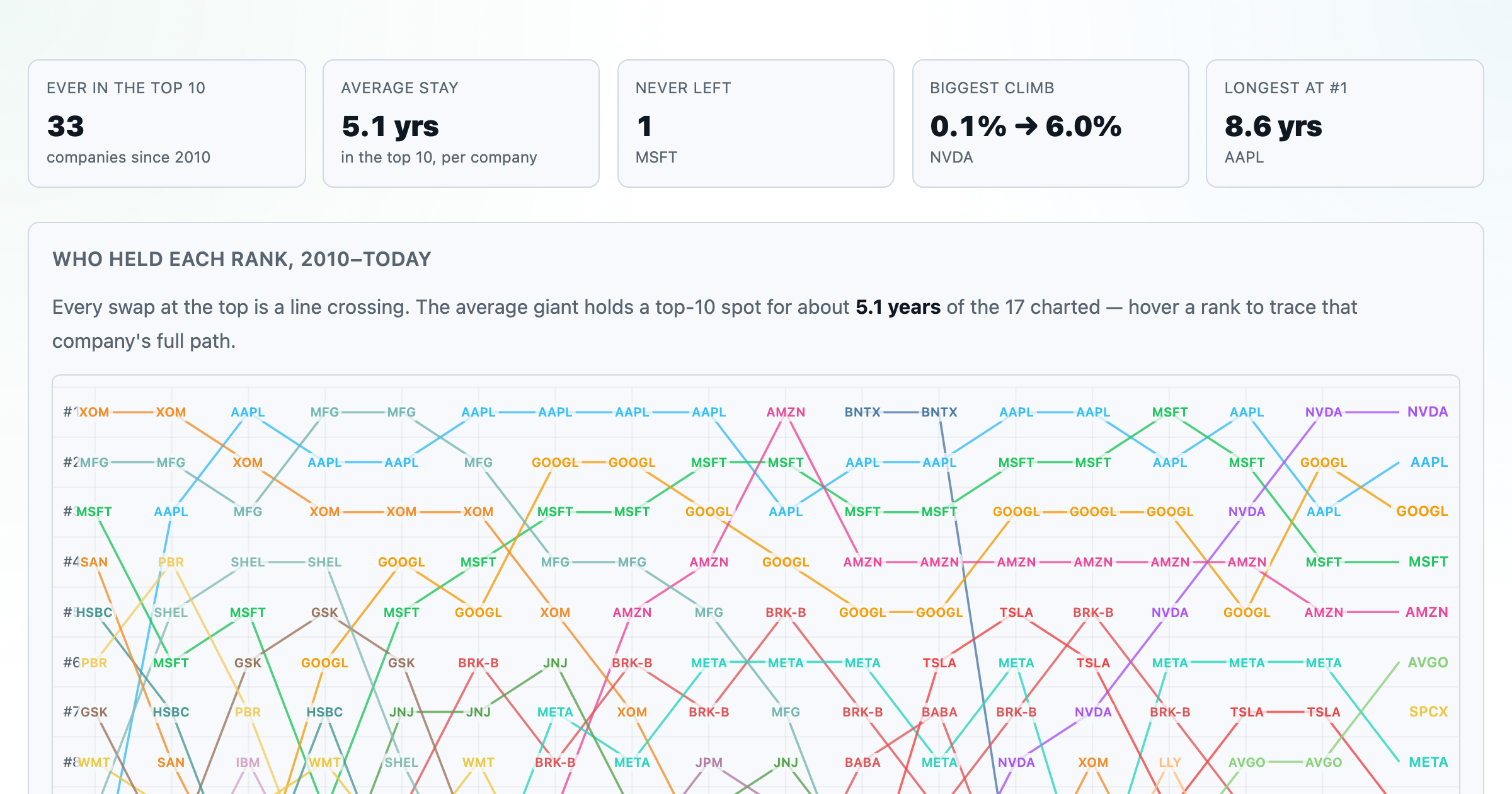
Every company that ever cracked the market's top 10 since 2010 — who climbed, who faded, who never left.
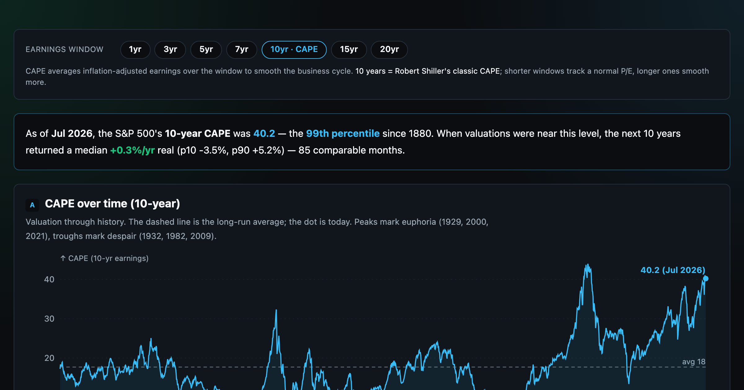
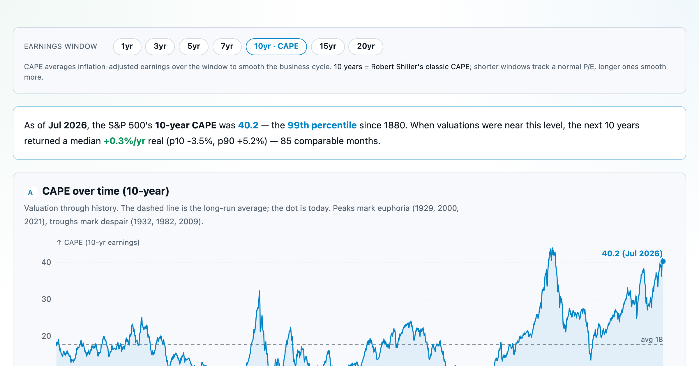
Is the market expensive? The Shiller CAPE back to 1871 and what valuations have meant for the next decade.
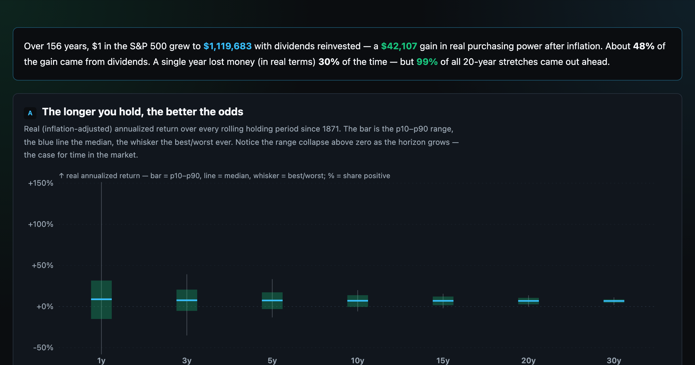
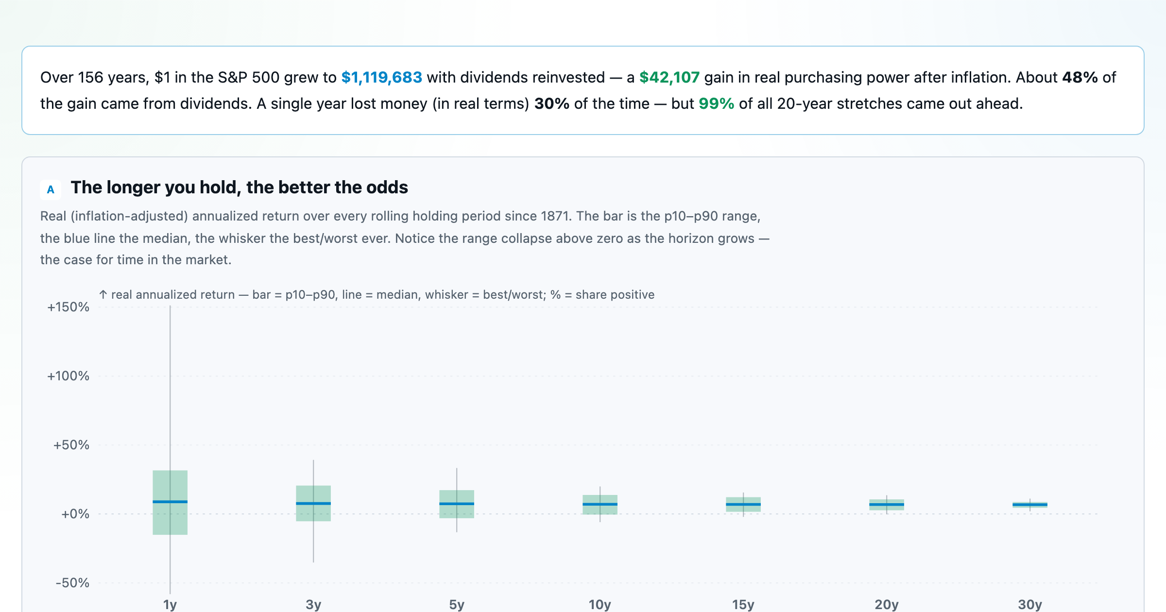
The S&P 500 since 1871 — odds of gain by holding period, real drawdowns, and the growth of $1.
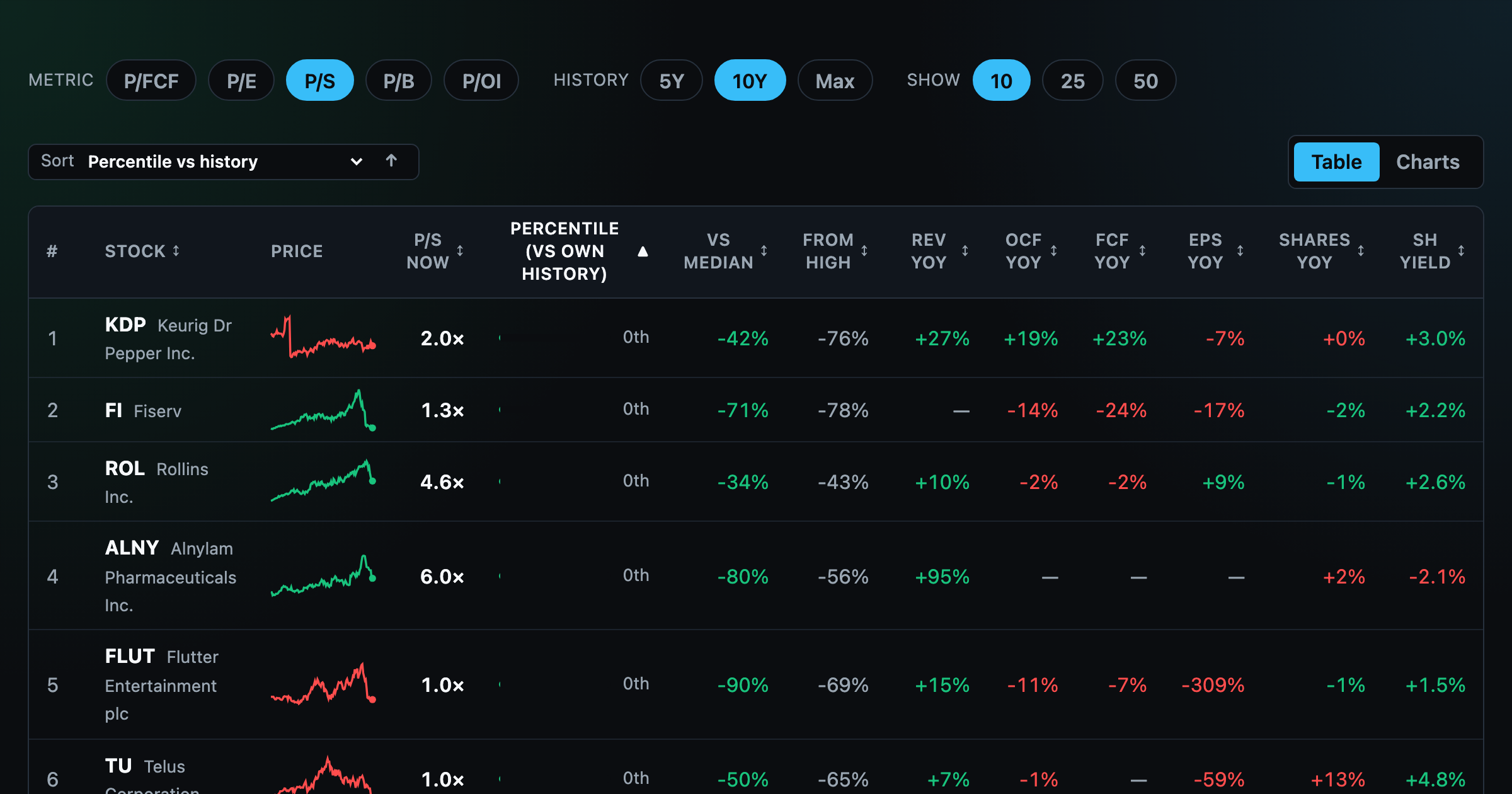
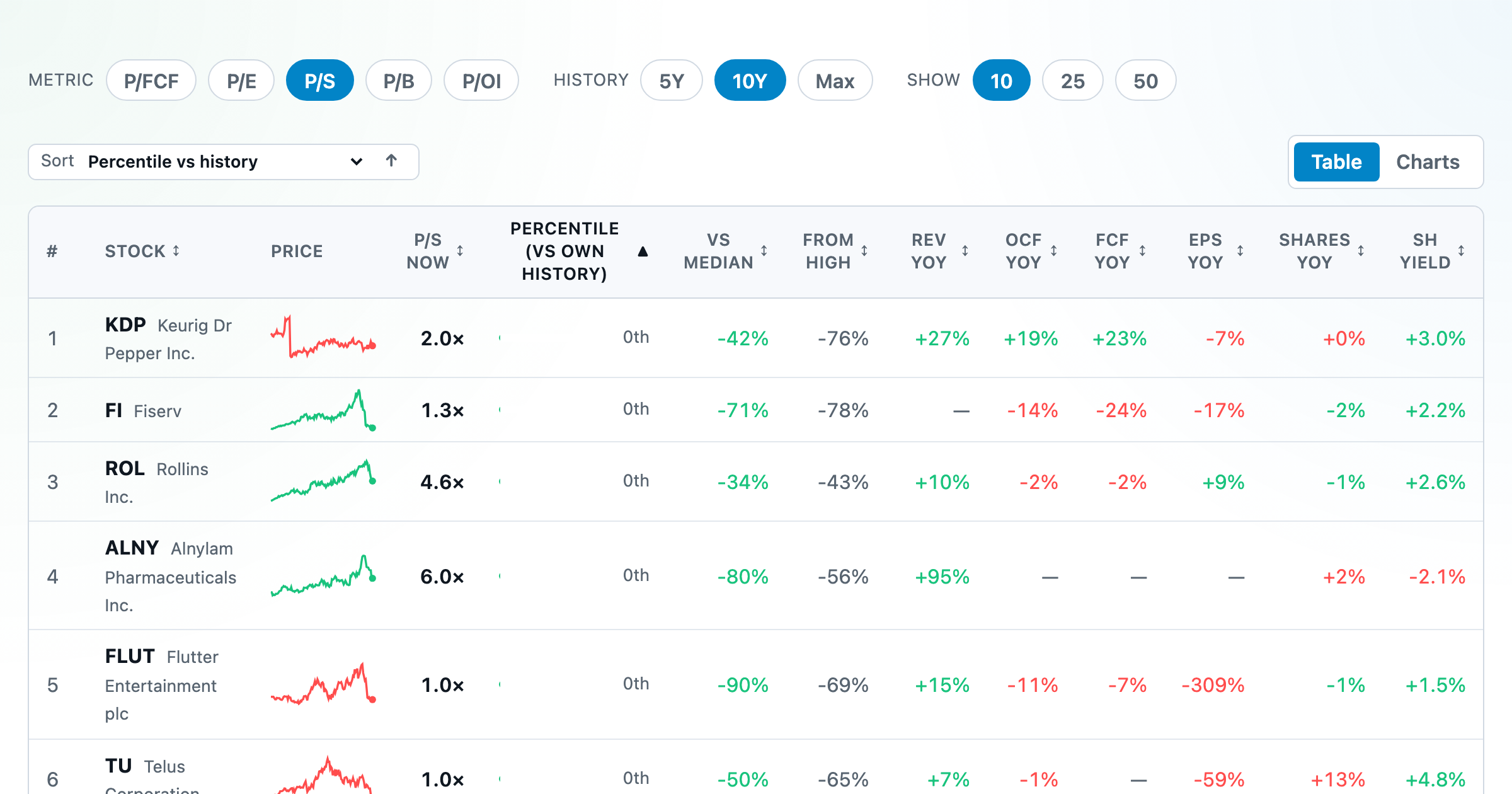
Stocks trading cheapest relative to their own P/E, P/FCF, P/S, or P/B history — with fair-value bands.
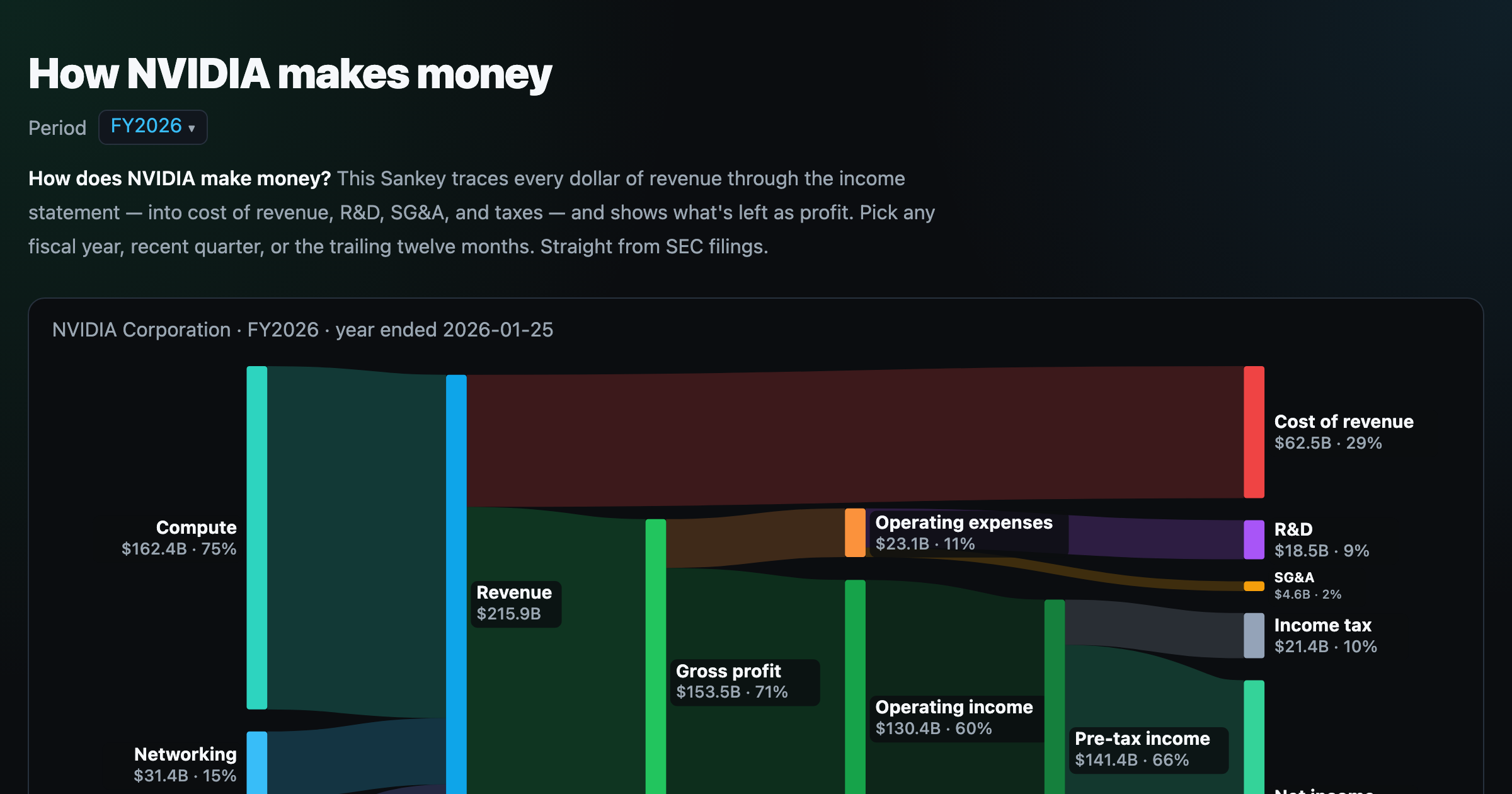
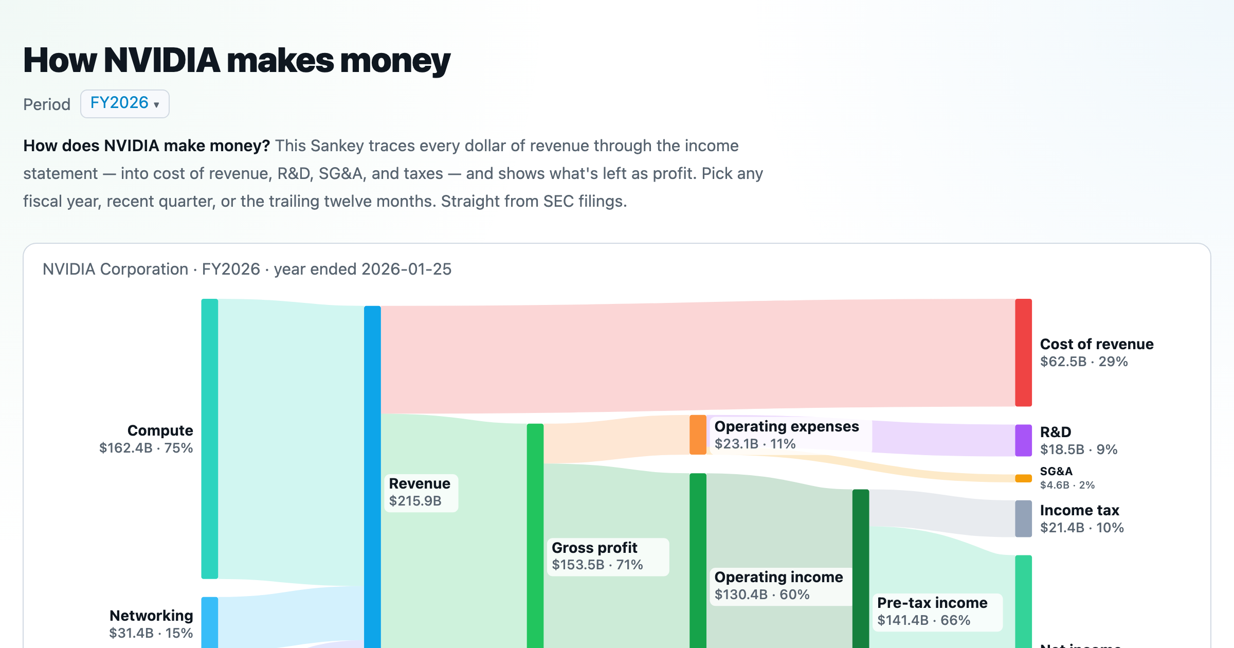
Follow a company's revenue through its income statement as a Sankey — costs, taxes, and profit.
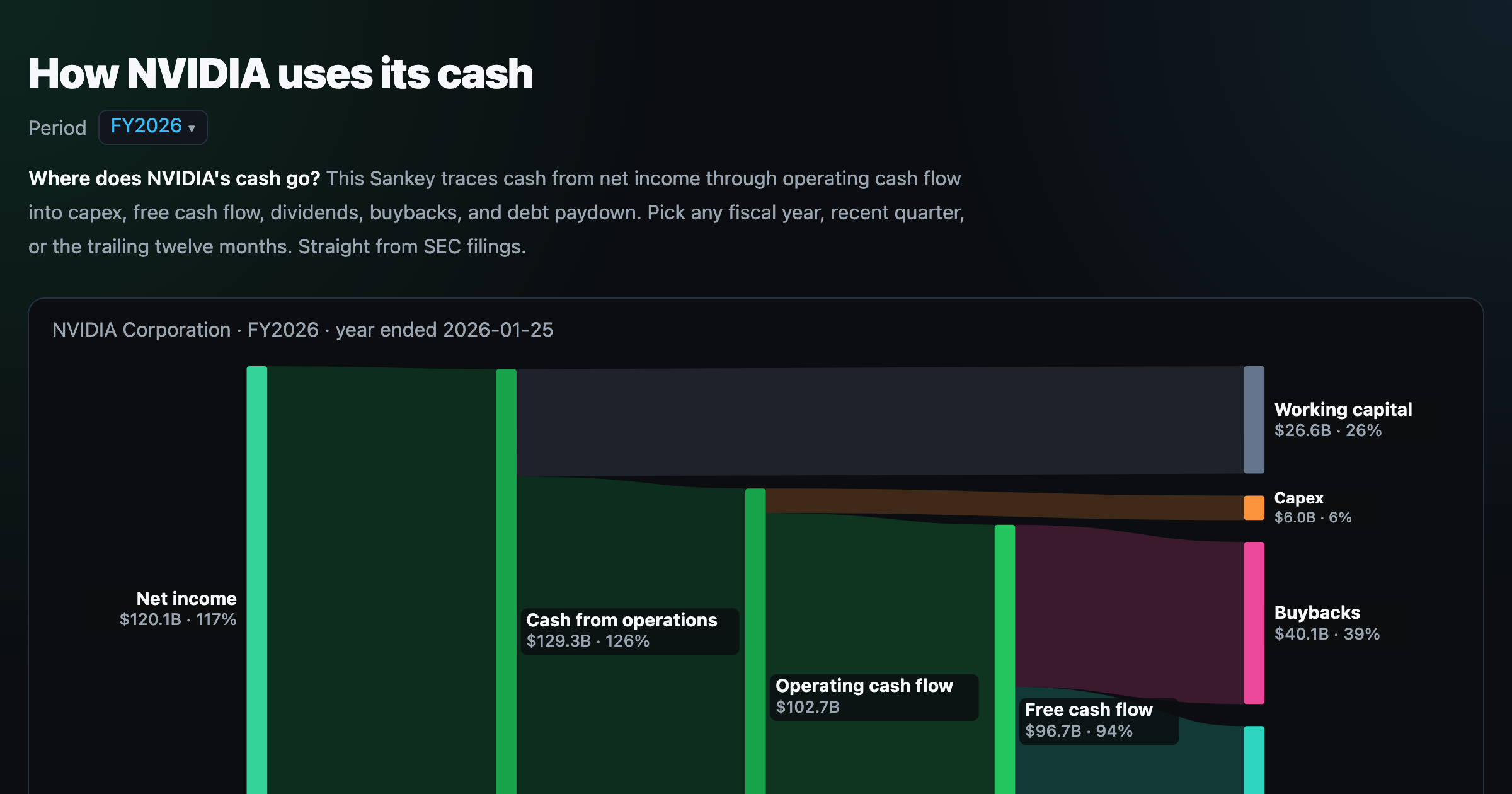
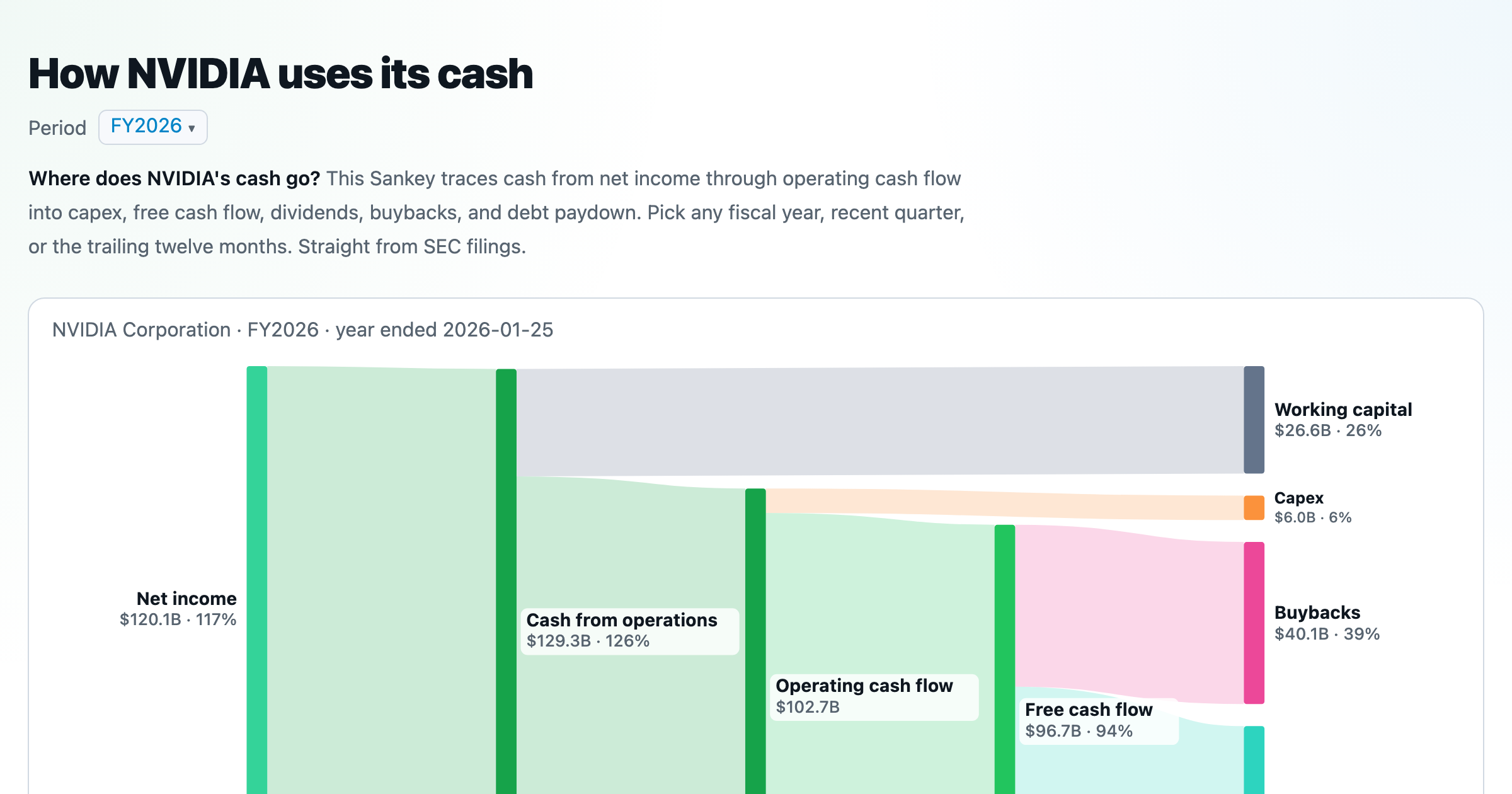
Follow a company's cash from net income through operating cash flow into capex, buybacks, and dividends.
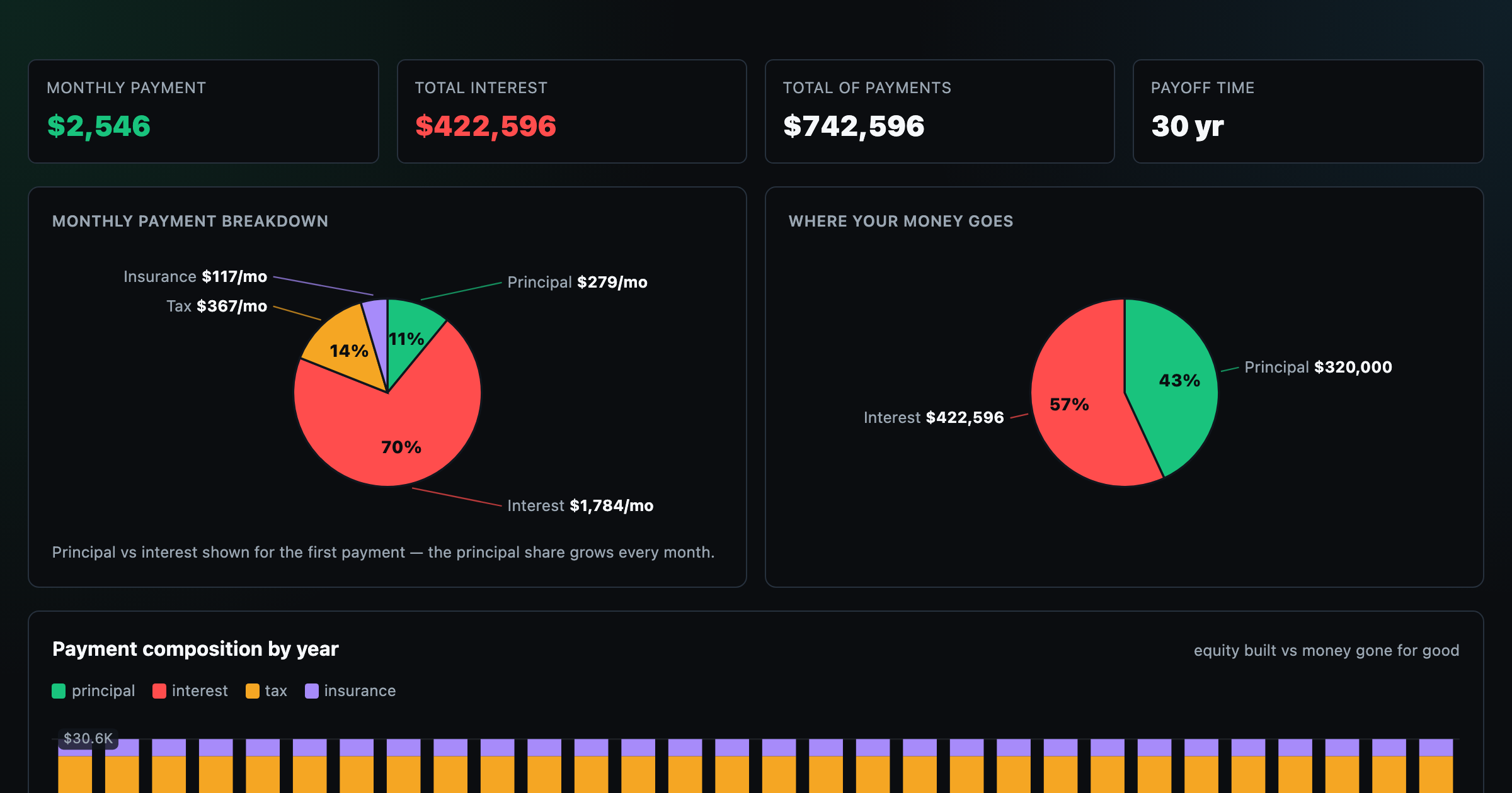
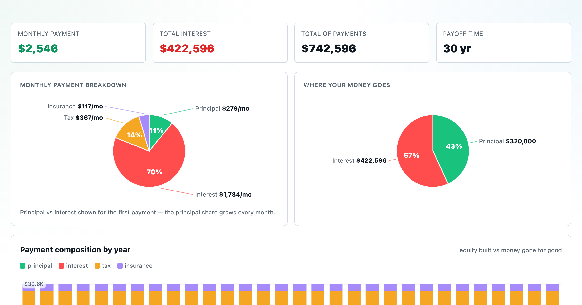
Monthly payment, principal vs interest by year, and the balance paydown — with extra-payment savings.
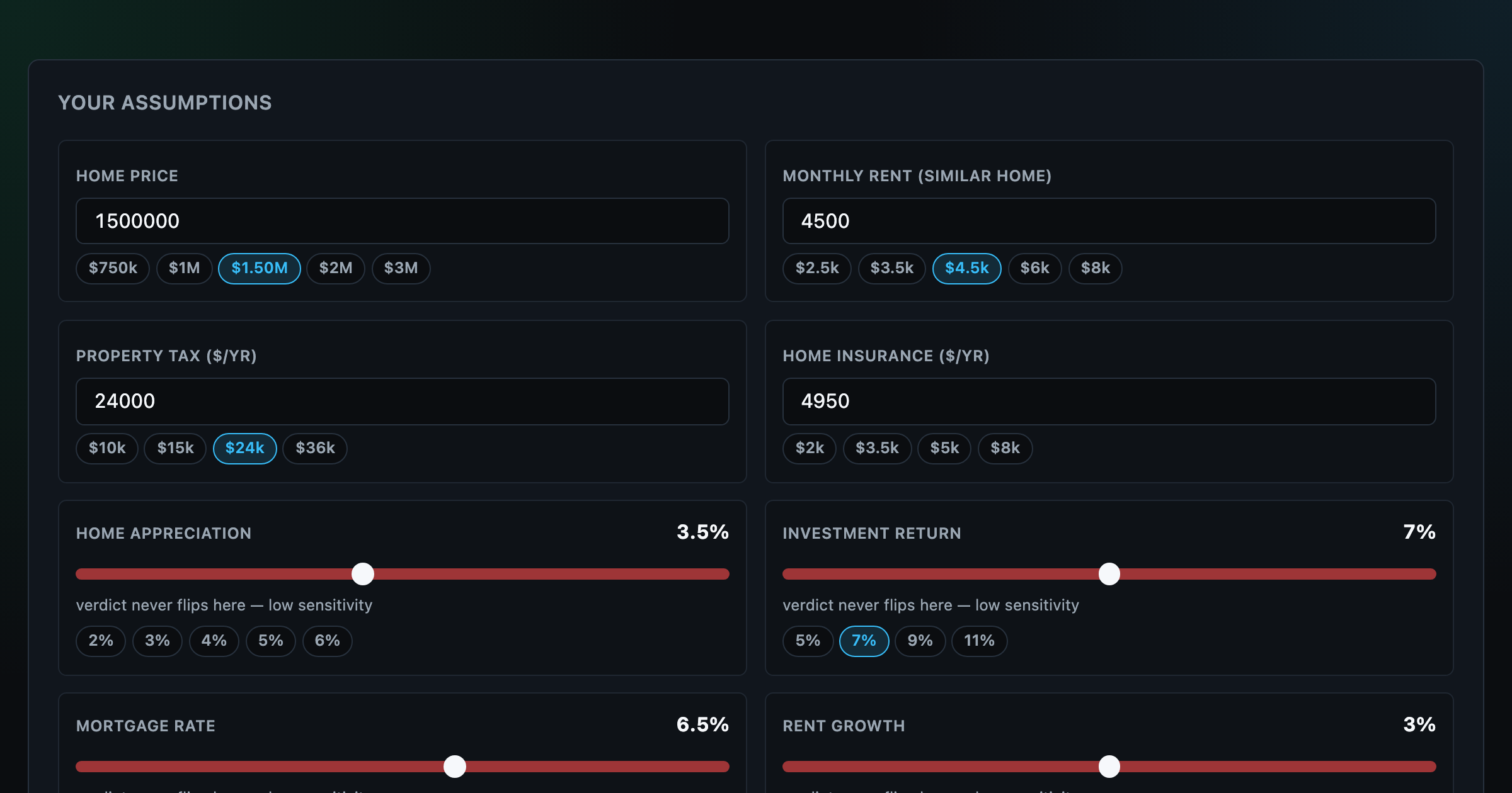
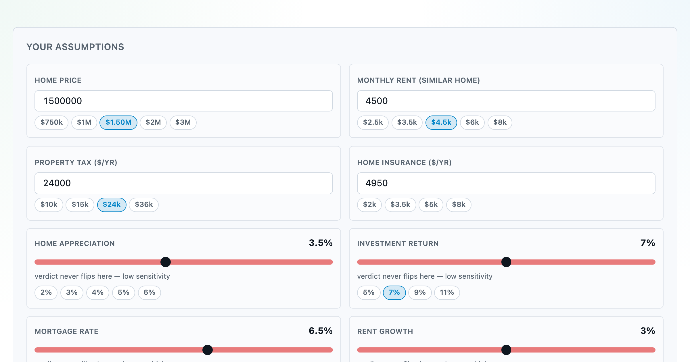
Should you rent or buy? Net-wealth verdict with sensitivity analysis of every assumption.
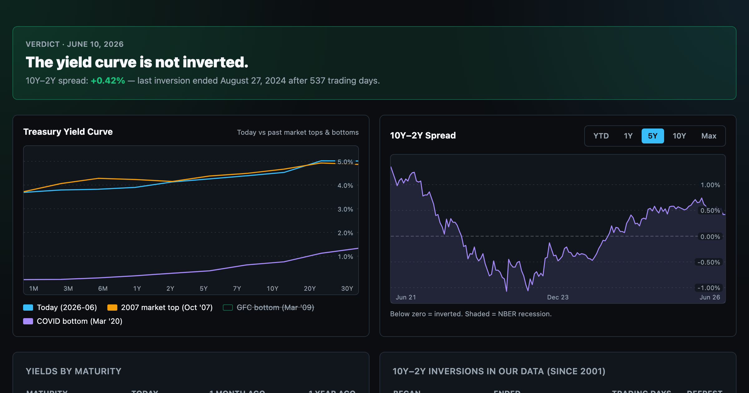
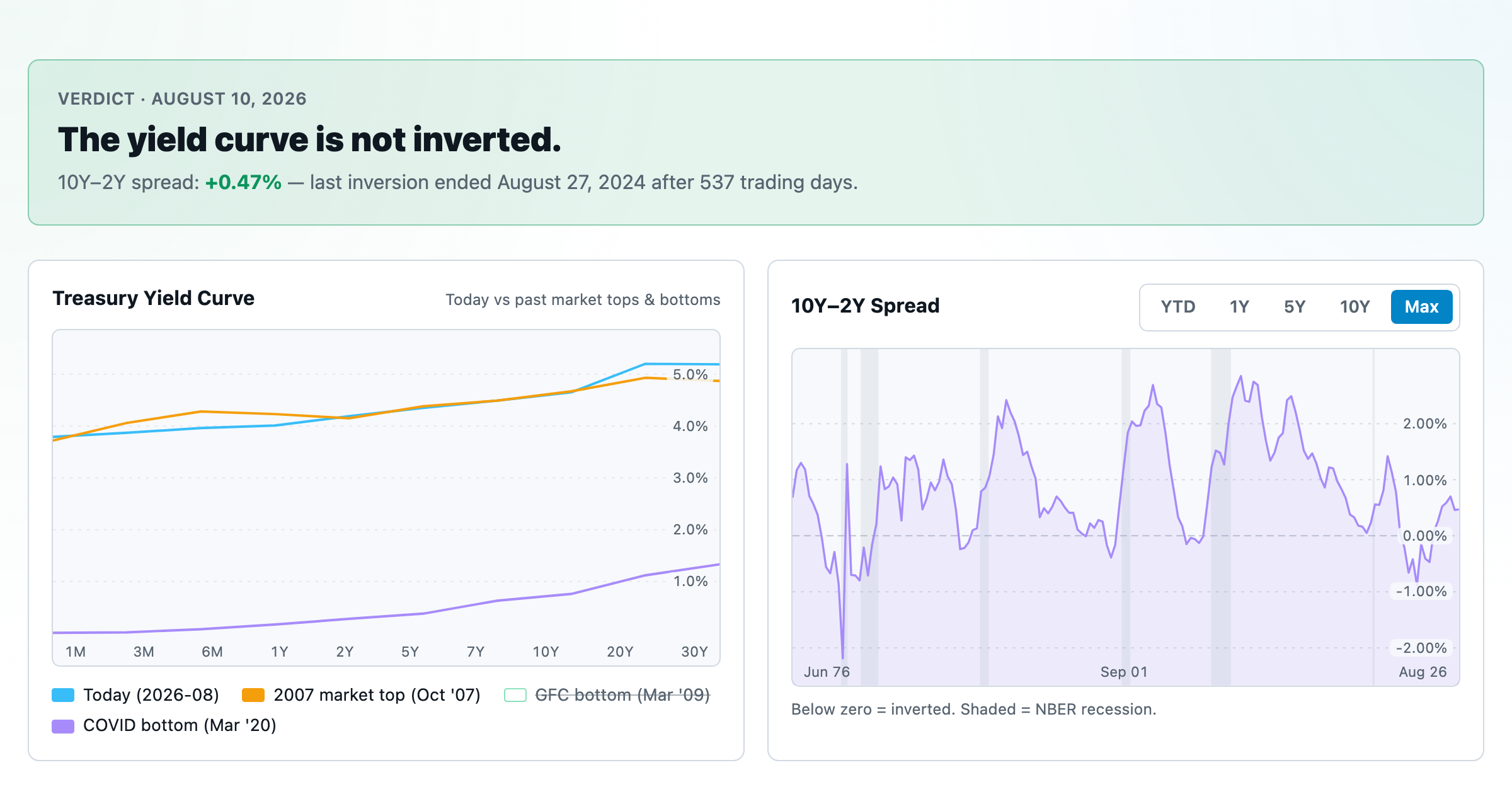
Live term structure, the 10Y–2Y spread, and every inversion episode.