
Valuation dip finder
Which big companies trade cheapest relative to their own valuation history? Every S&P 500 stock, ranked by how its current Price / Book (P/B) compares to its last 10Y — the lower the percentile, the cheaper it is versus how the market has normally priced it. Built using SEC filing data. Revenue and earnings growth are shown so discerning investors can avoid value traps.
| # | Price | P/B trend | ||||||||||
|---|---|---|---|---|---|---|---|---|---|---|---|---|
| 1 | CHTR | 0.9× | 0th | -74% | -85% | -1% | +8% | +1% | -6% | -14% | ||
| 2 | SNPS | 2.3× | 0th | -65% | -42% | +40% | +128% | +146% | -64% | +23% | ||
| 3 | CMCSA | 0.9× | 0th | -59% | -61% | +1% | +4% | +5% | -51% | -4% | ||
| 4 | CSGP | 1.4× | 0th | -70% | -72% | +21% | +73% | +361% | -79% | -3% | ||
| 5 | ROL | 13.0× | 0th | -32% | -41% | +10% | -2% | -2% | +9% | -1% | ||
| 6 | FI | 1.1× | 0th | -60% | -78% | — | -7% | -17% | -1% | -4% | ||
| 7 | NKE | 4.1× | 0th | -64% | -77% | +0% | -22% | -33% | -3% | -0% | ||
| 8 | PEP | 8.4× | 0th | -36% | -30% | +6% | +10% | +31% | +38% | -0% | ||
| 9 | CPRT | 2.9× | 0th | -61% | -56% | +1% | -6% | — | +5% | -4% | ||
| 10 | LULU | 2.6× | 0th | -79% | -78% | +4% | -4% | -3% | -19% | -5% |
Percentile = where today's multiple sits within the stock's own daily range over the selected window (0 = cheapest it's been, 100 = most expensive). Multiples use trailing-twelve-month fundamentals from SEC filings; only positive multiples are ranked. Cheap vs history is not a buy signal — always check whether the discount reflects a real change in the business. Not investment advice.
More visualizations
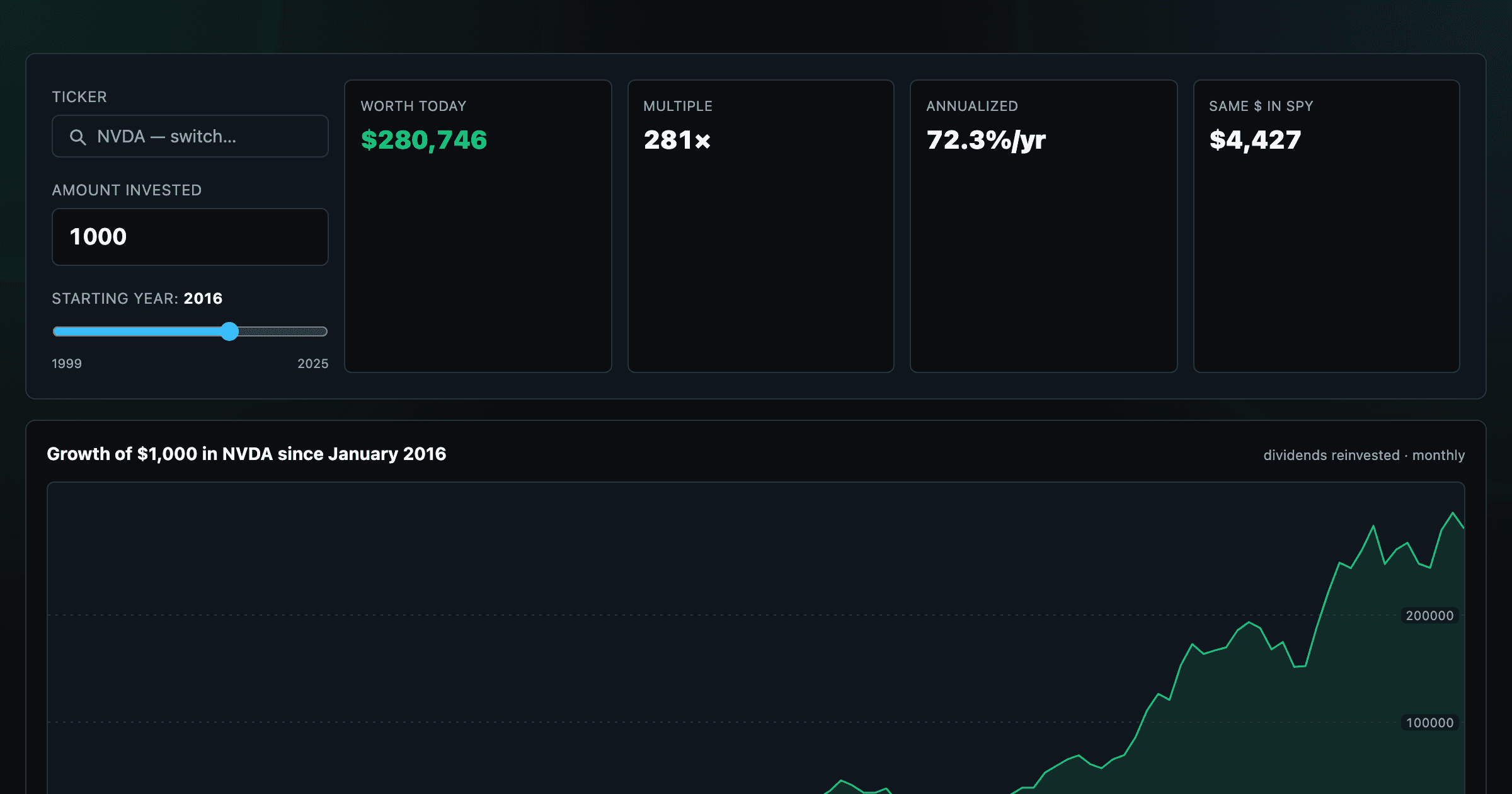
What $1,000 in any stock or ETF would be worth today.
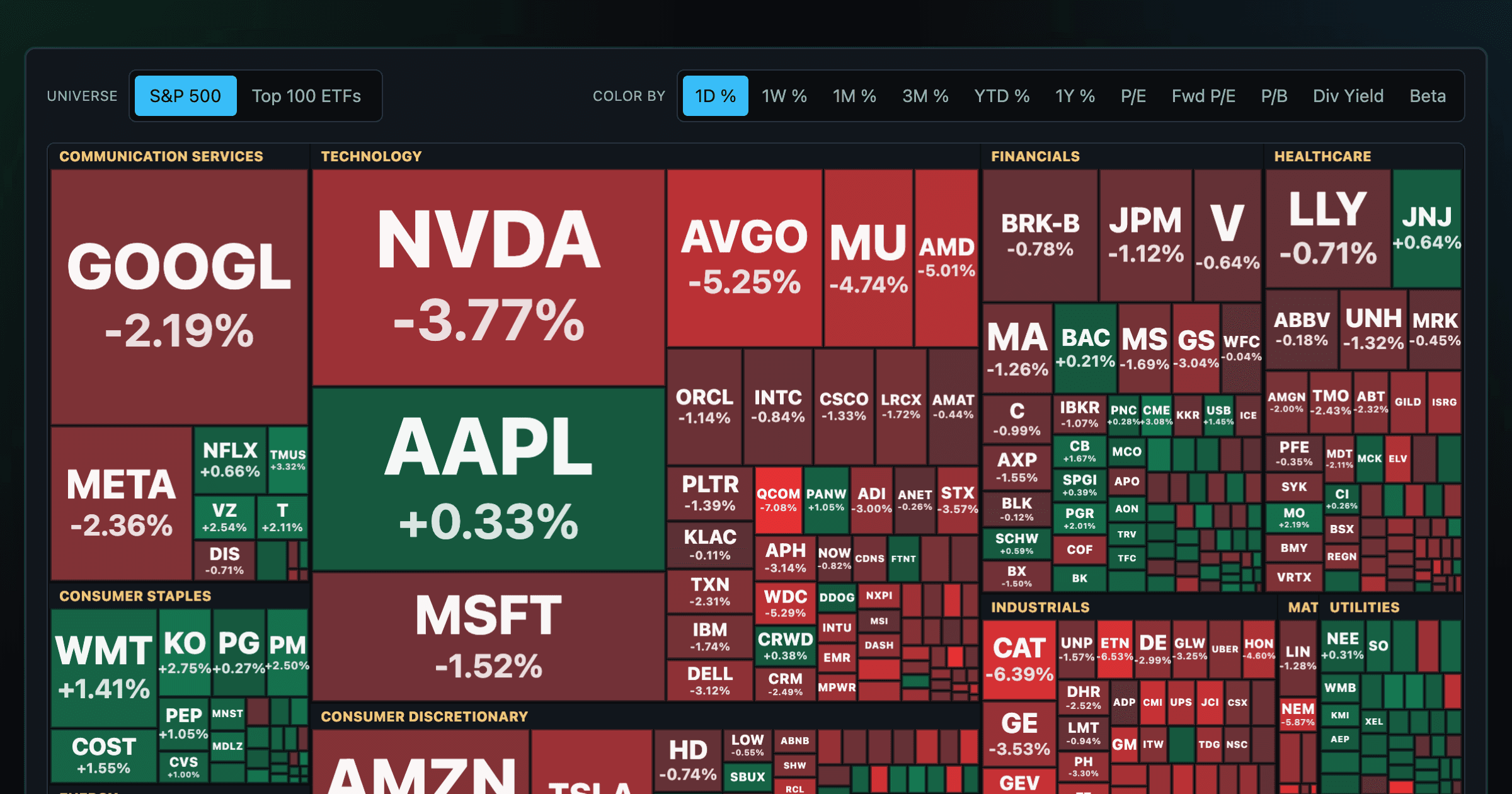
Every S&P 500 company sized by market cap — color by return or valuation.
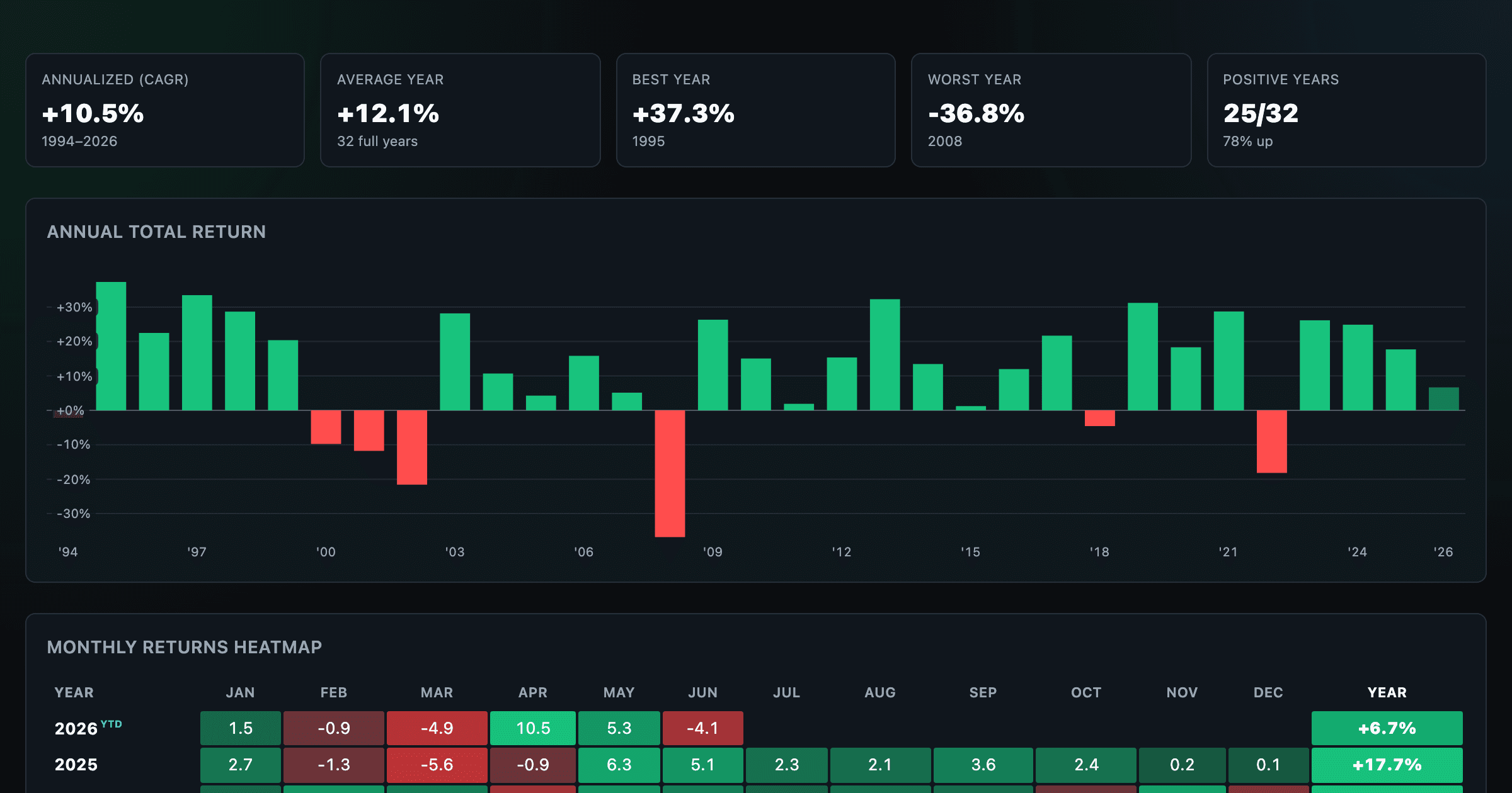
S&P 500 returns by year, month, week and trailing period — total or price return.
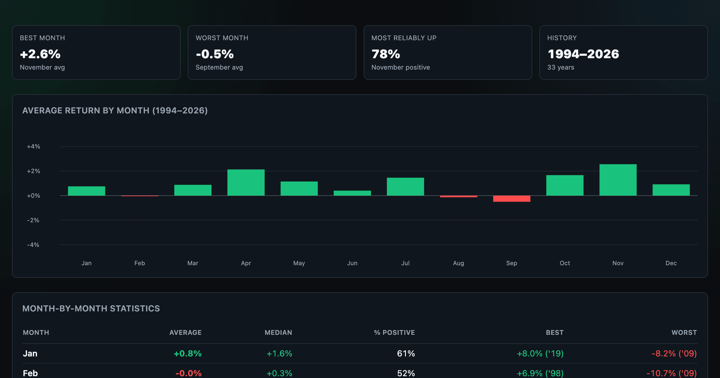
Which month is best for stocks? Average return of every calendar month, for any ticker.
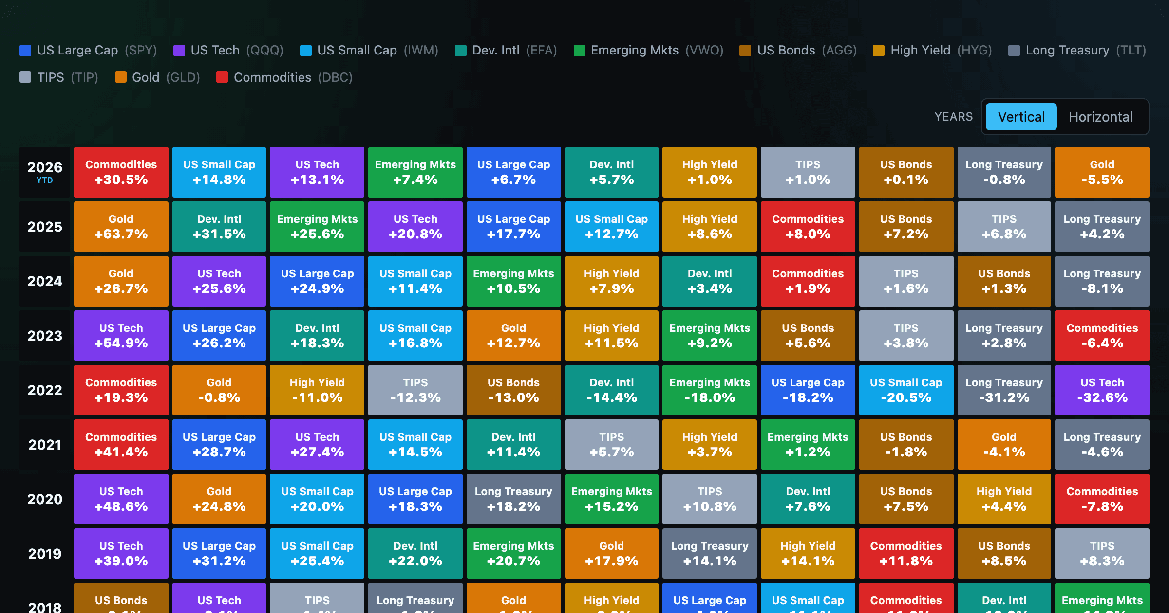
Asset-class returns ranked year by year — the Callan chart / asset allocation quilt.
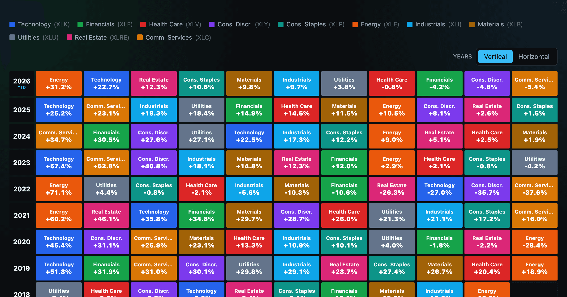
The 11 S&P 500 sectors ranked year by year — a sector quilt chart, back to 1999.
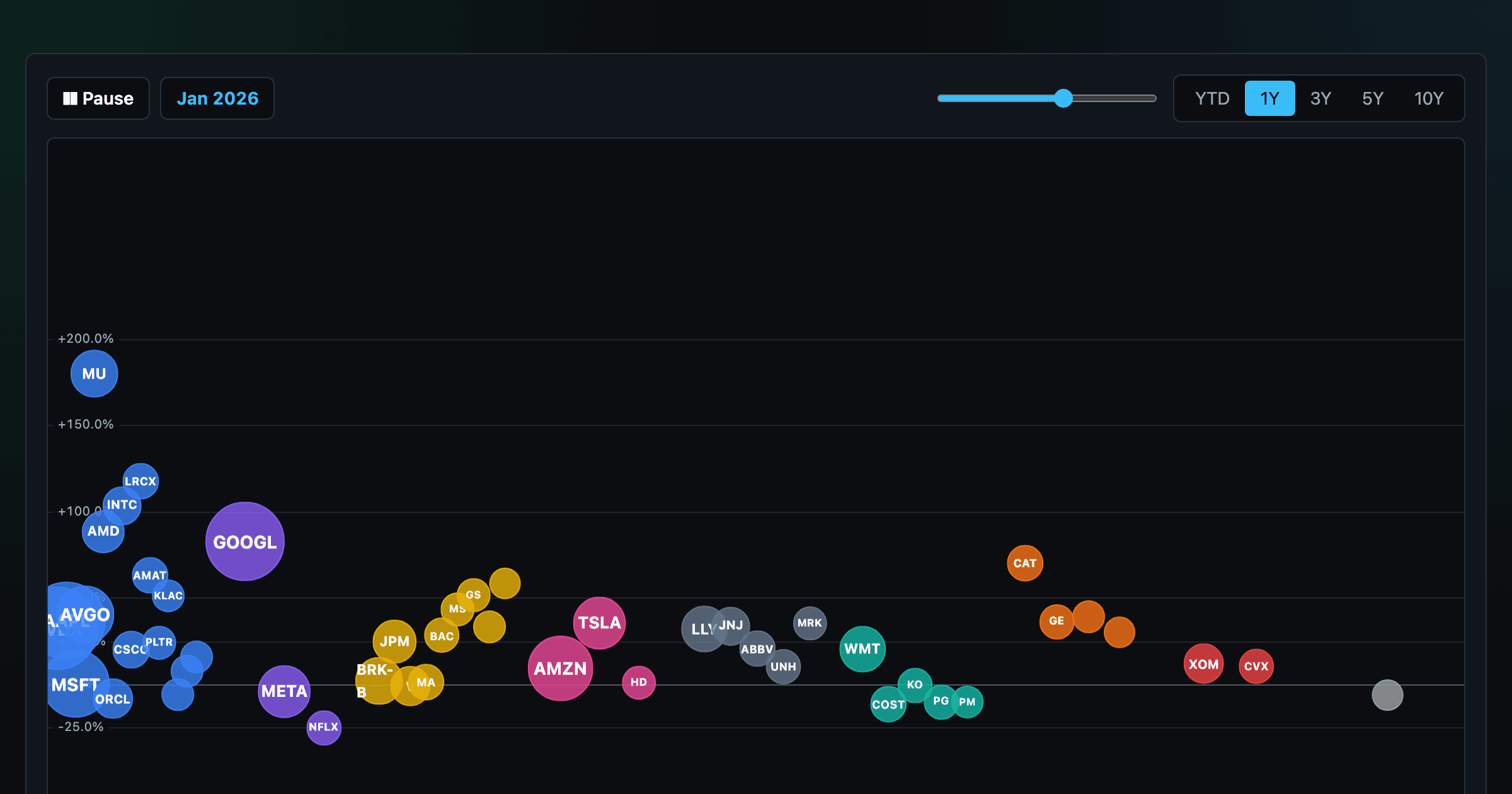
The biggest US companies as animated bubbles, rising and falling with their total return over time.
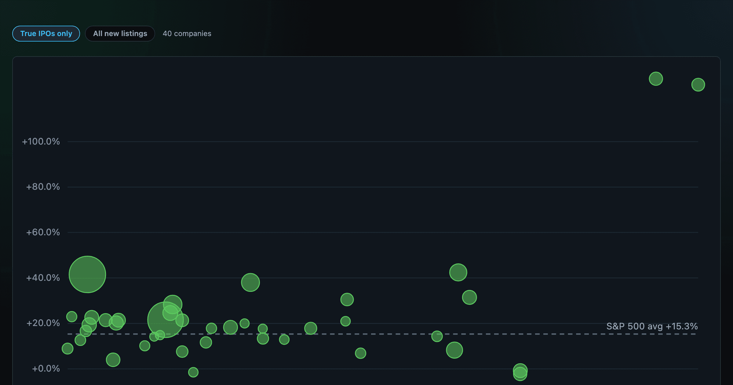
How recent stock-market debuts have performed since listing — annualized, vs the S&P 500, by IPO vs spin-off.
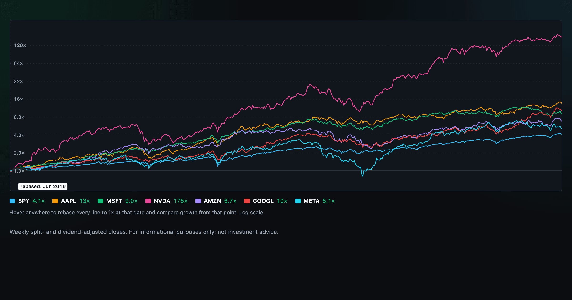
Compare megacaps vs the S&P 500, rebased to 1× at any date you hover.
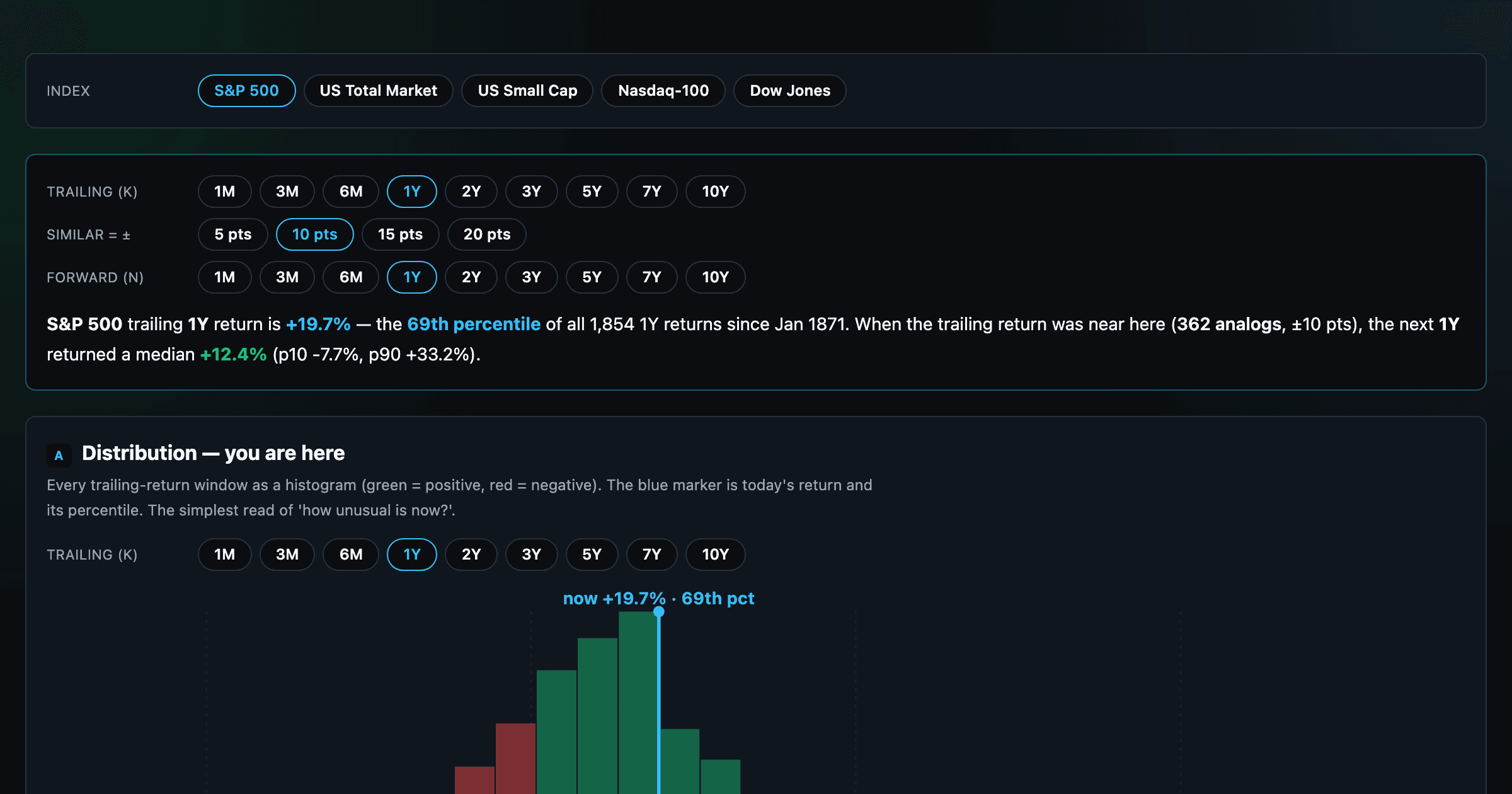
Where today's S&P 500 return ranks against all history — and the forward returns that followed similar moments.
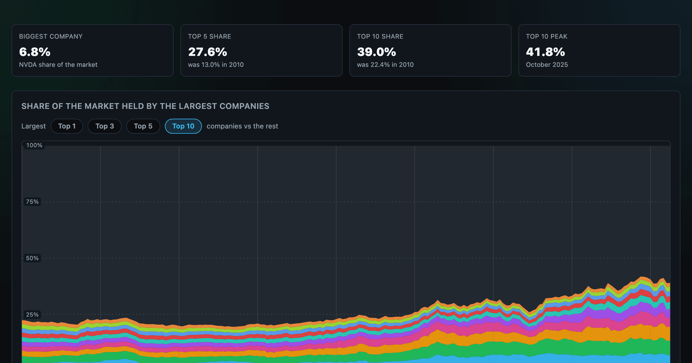
How top-heavy is the market? The top 1–10 companies' share of total market value, month by month since 2010.
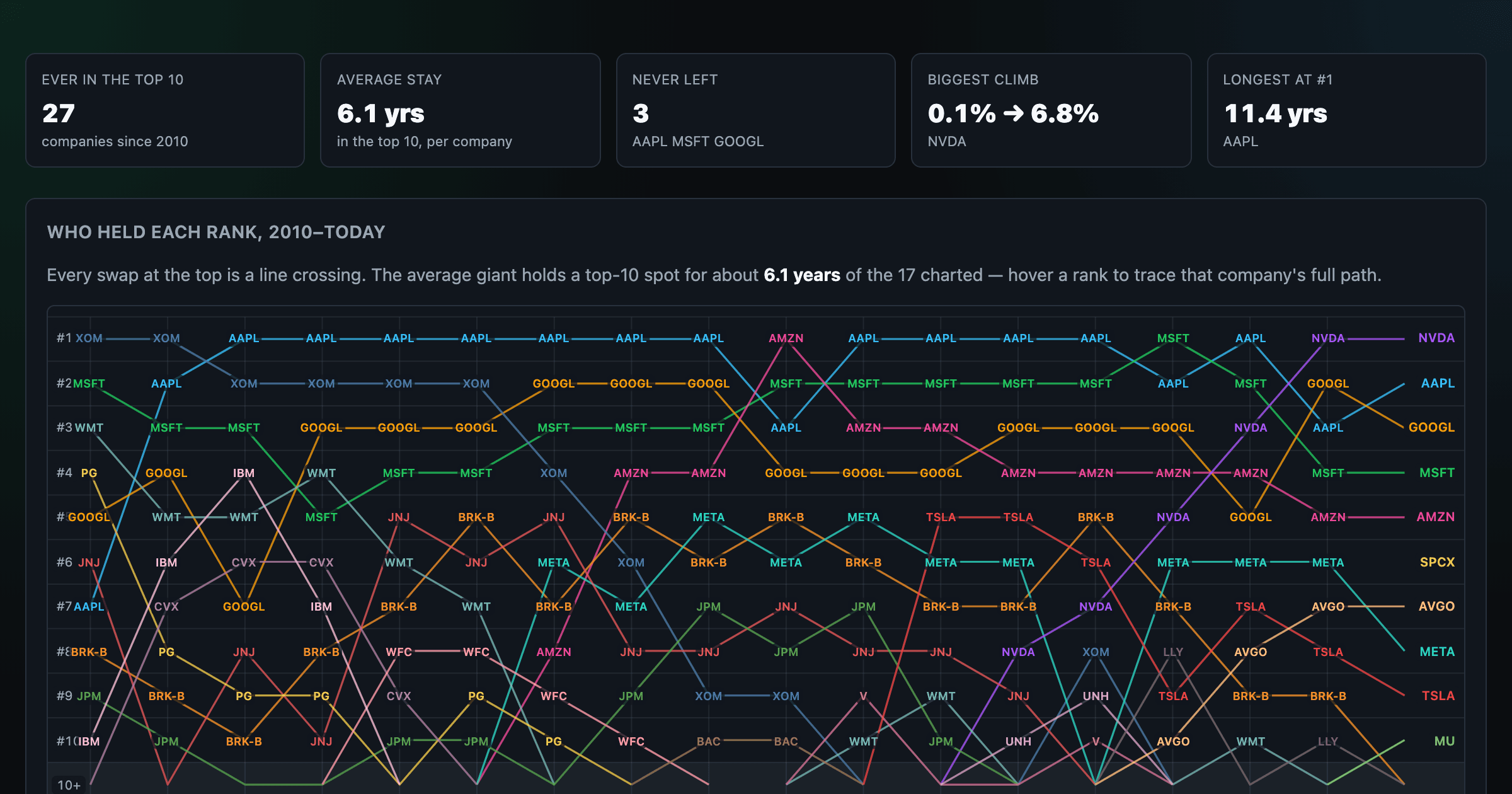
Every company that ever cracked the market's top 10 since 2010 — who climbed, who faded, who never left.
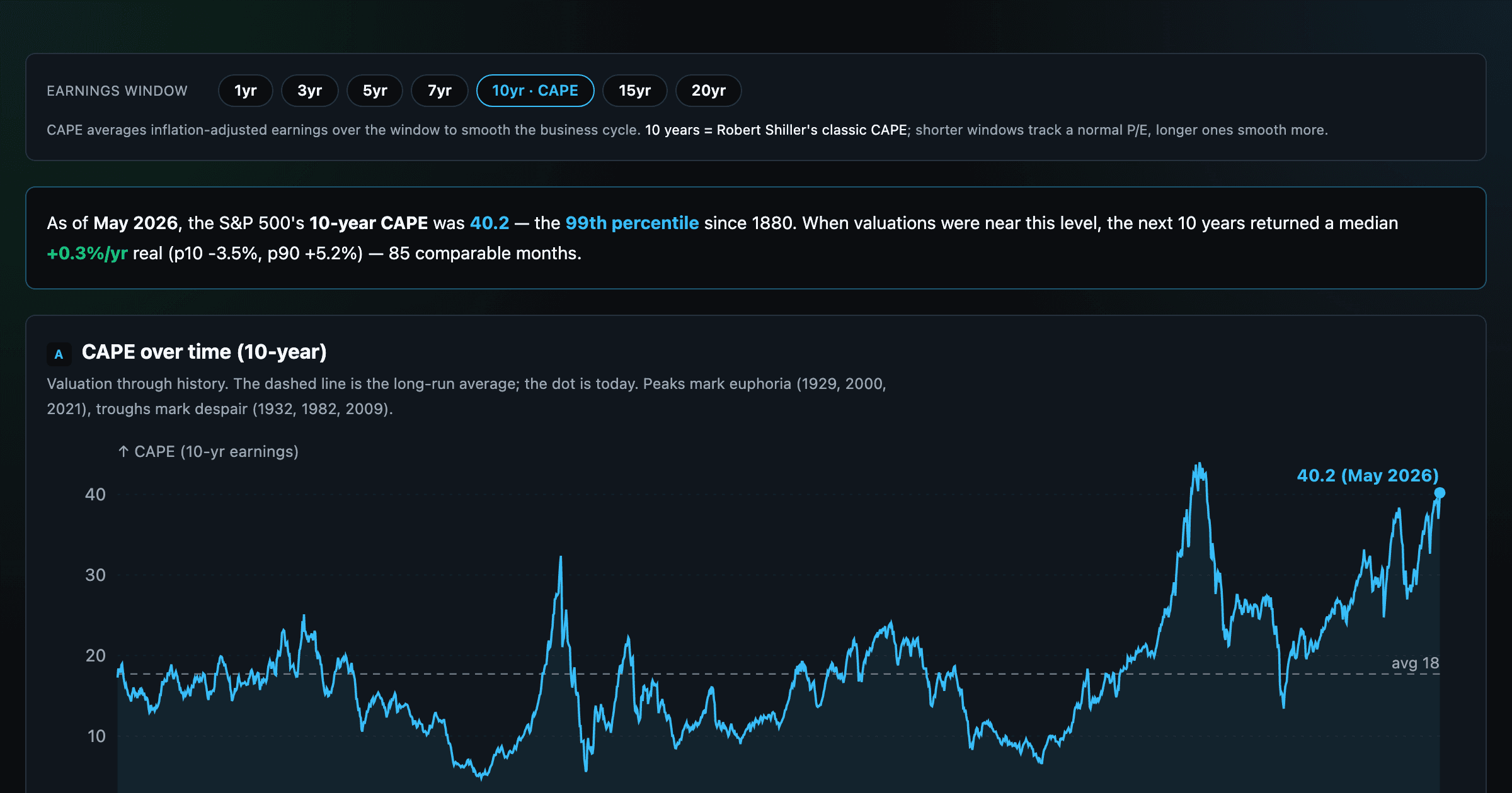
Is the market expensive? The Shiller CAPE back to 1871 and what valuations have meant for the next decade.
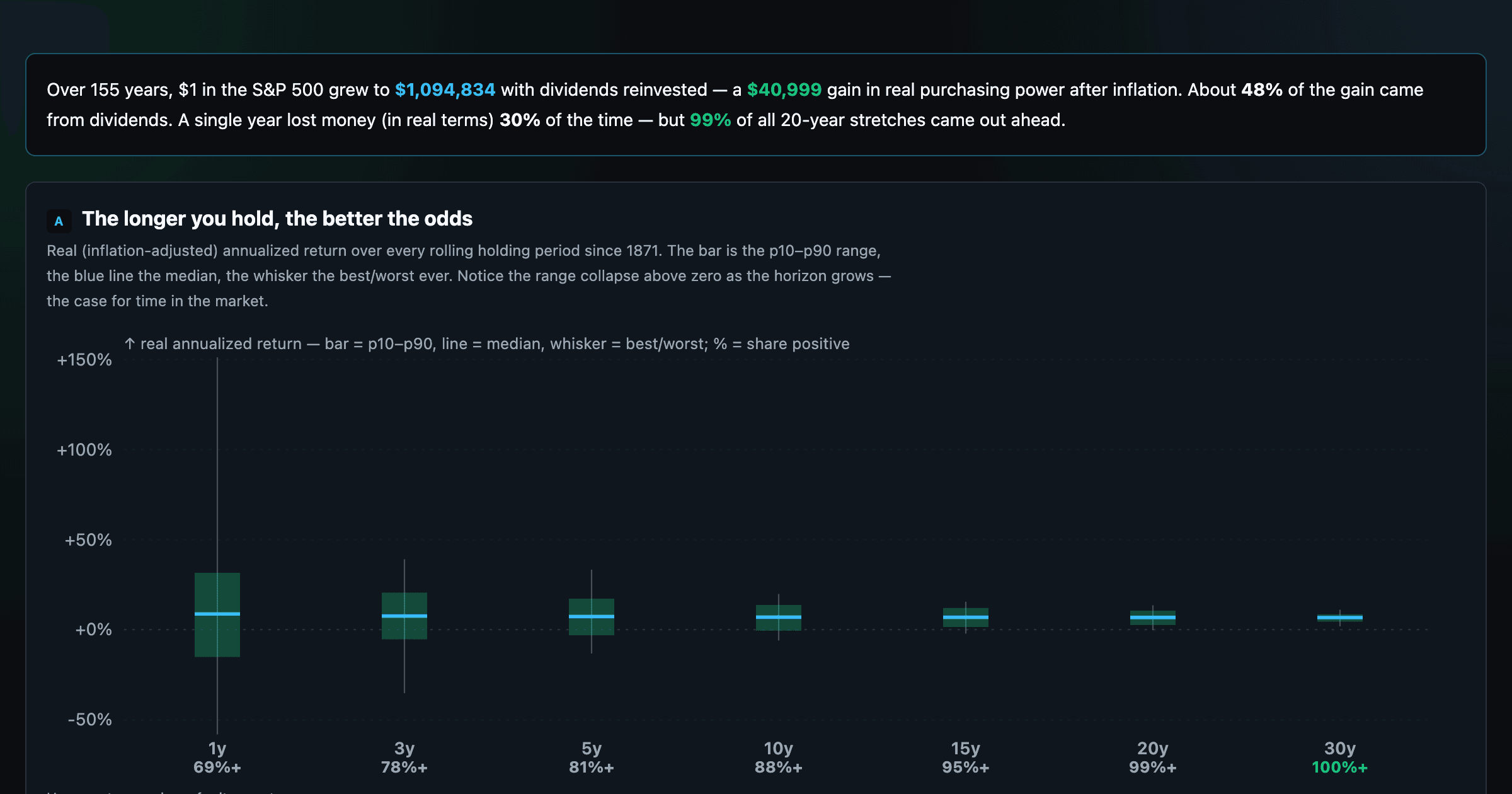
The S&P 500 since 1871 — odds of gain by holding period, real drawdowns, and the growth of $1.
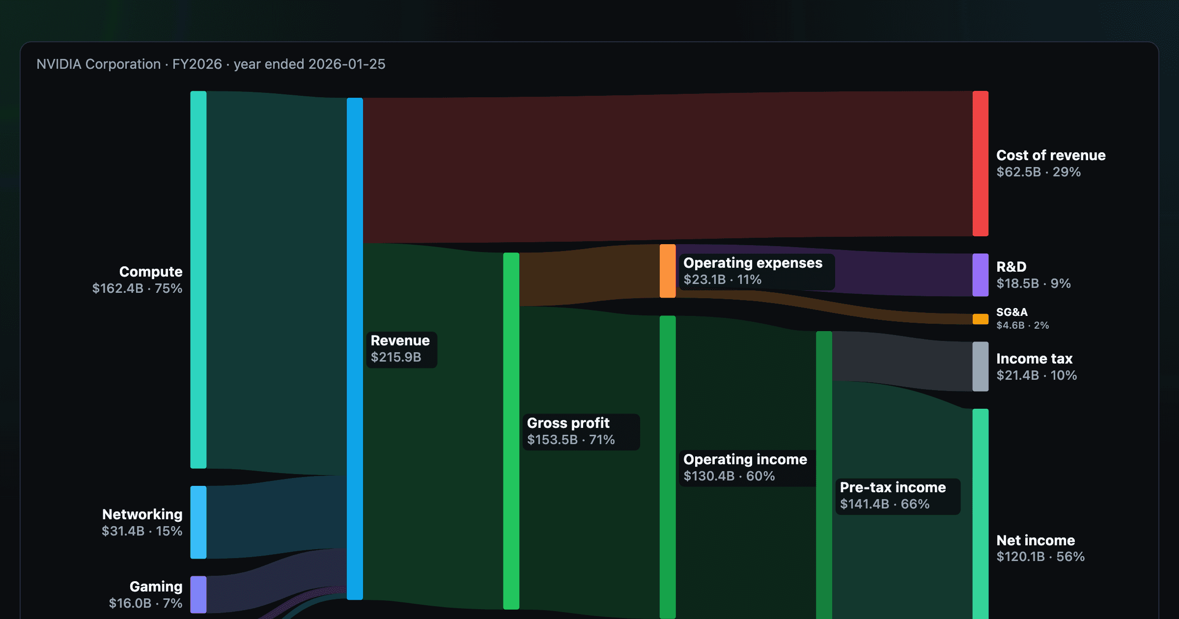
Follow a company's revenue through its income statement as a Sankey — costs, taxes, and profit.
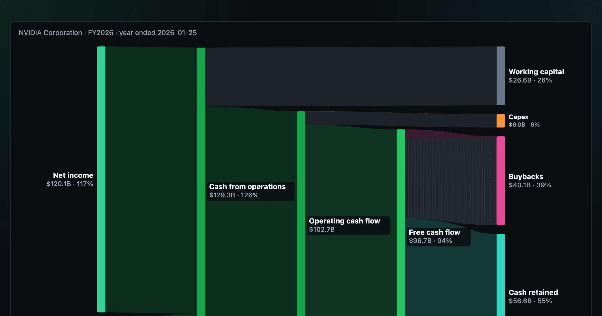
Follow a company's cash from net income through operating cash flow into capex, buybacks, and dividends.
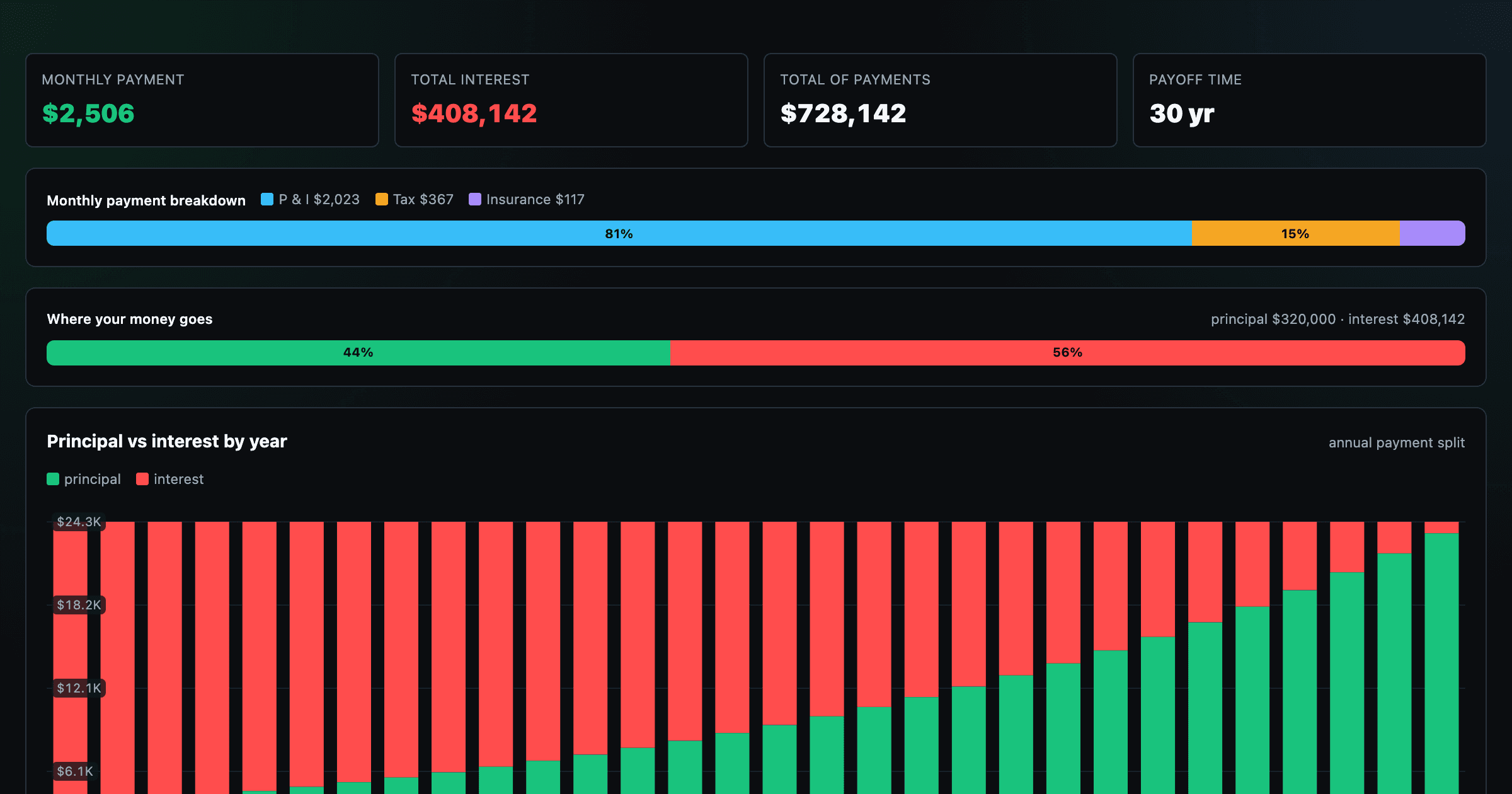
Monthly payment, principal vs interest by year, and the balance paydown — with extra-payment savings.
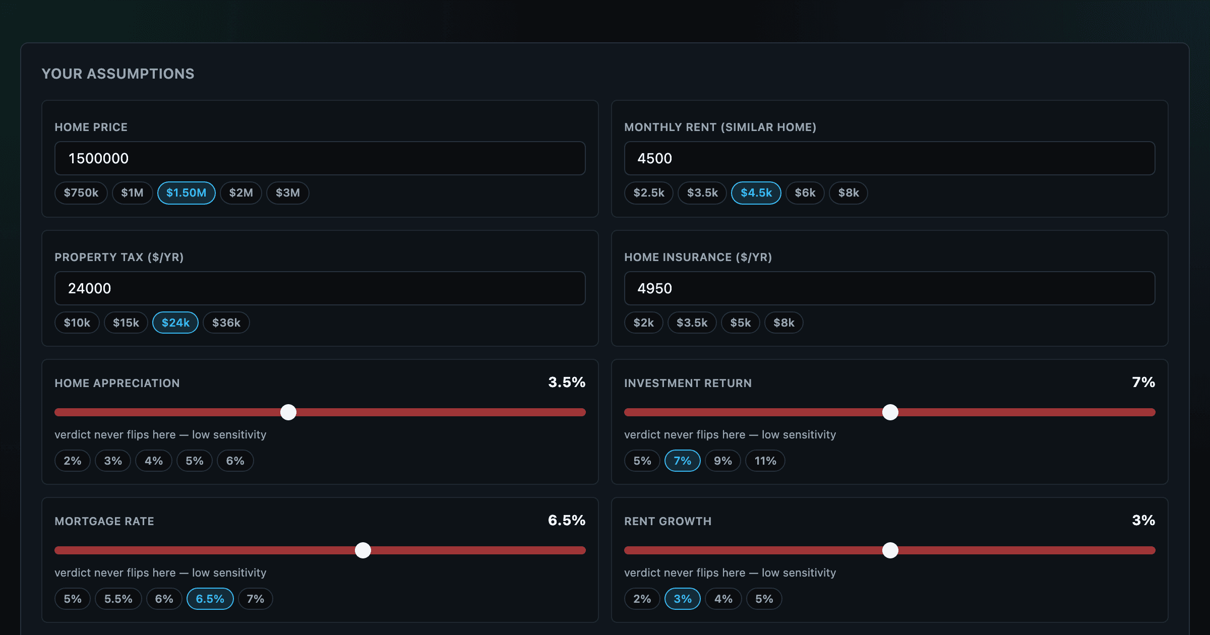
Should you rent or buy? Net-wealth verdict with sensitivity analysis of every assumption.
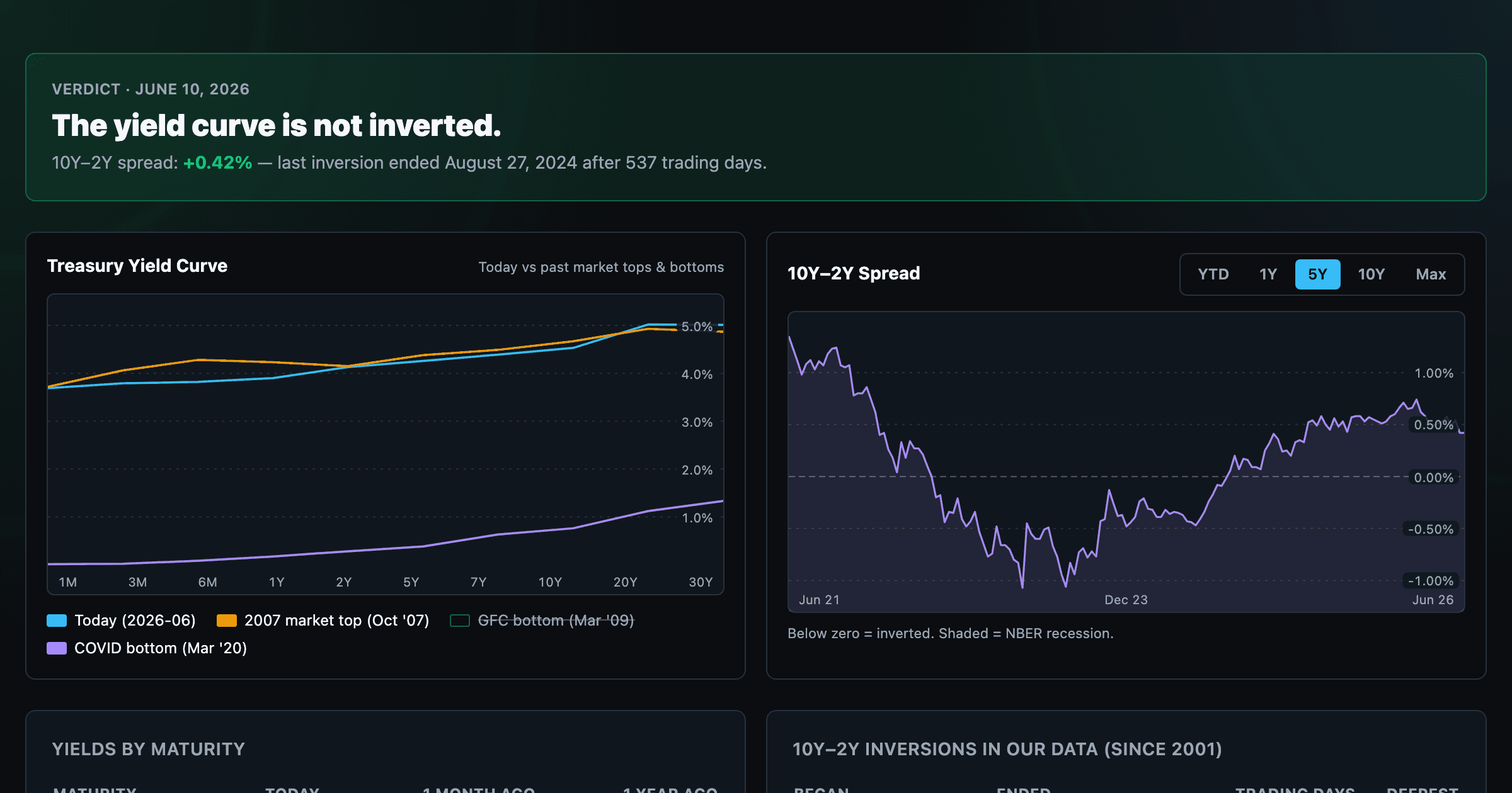
Live term structure, the 10Y–2Y spread, and every inversion episode.