
Market heatmap
Every company sized by market cap and grouped by sector. Switch the universe and choose what drives the color — period return or a valuation metric. Click any tile for its quote.
- SPY +0.09%
- QQQ -1.12%
- IWM -0.31%
- IVV +0.10%
- VOO +0.08%
- DIA +0.49%
- RSP +0.80%
- VTI +0.04%
- IJR -0.01%
- MDY +0.40%
- ITOT +0.07%
- VO +0.29%
- SCHB +0.03%
- VB +0.13%
- EEM -1.93%
- EFA +0.50%
- VEA -0.09%
- ACWI -0.03%
- VWO -0.51%
- VT -0.07%
- XLF +0.88%
- XLK -1.43%
- XLE +0.39%
- XLV +0.69%
- XLI +0.39%
- KRE +0.79%
- XLY +0.61%
- XLP +1.09%
- XLU +0.19%
- XLC +0.86%
- XLB +1.92%
- XLRE +2.20%
- KBE +0.86%
- IYT -0.19%
- SMH -3.28%
- SOXX -4.36%
- XBI -1.12%
- ARKK -2.64%
- IBB -0.44%
- ITA +0.84%
- CIBR +0.78%
- ICLN -3.21%
- TAN -2.78%
- BOTZ -1.37%
- LIT -1.75%
- GLD +0.10%
- SLV +1.06%
- USO -2.03%
- IAU +0.11%
- UNG -0.57%
- DBC -0.73%
- DBA +0.00%
- LQD -0.02%
- HYG -0.01%
- TLT +0.10%
- SGOV +0.03%
- BIL +0.03%
- VCIT +0.09%
- AGG +0.12%
- BND +0.09%
- IEF +0.19%
- MUB +0.28%
- VCSH +0.08%
- SHV +0.03%
- SHY +0.08%
- JNK -0.02%
- TIP +0.01%
- BSV +0.08%
- SCHD +1.49%
- JEPQ -0.98%
- JEPI +0.71%
- VYM +0.60%
- HDV +1.23%
- QYLD -0.45%
- DVY +1.31%
- SPYD +1.35%
- XYLD +0.10%
- BITO -0.86%
- IBIT -0.83%
- ETHA -0.43%
- FBTC -0.99%
- EWY -6.27%
- FXI +0.35%
- EWZ -1.19%
- EWT -1.86%
- EWJ +0.14%
- INDA +0.82%
- EWC +0.43%
- EWW +0.61%
- EWU +1.13%
- EWG +1.31%
- SOXL -13.15%
- TQQQ -3.48%
- SOXS +13.15%
- SQQQ +3.49%
- TZA +1.16%
- SPXL +0.13%
- TNA -0.98%
- UPRO +0.11%
- SPXS -0.11%
Tiles sized by market cap (ETFs: net assets). Font size scales with size; color shows 1D %.
Data refreshed daily; intraday moves use delayed bars. For informational purposes only; not investment advice.
FAQ
- What is a stock market heatmap?
- A stock market heatmap shows every company as a tile sized by market cap and grouped by sector, with color encoding a chosen metric — so you can scan the whole market at a glance and see which sectors and megacaps are driving it.
- What do the tile colors and sizes mean?
- Tile size is market capitalization — bigger companies are bigger tiles. Color is the metric you pick: green-to-red for gains and losses on a return view, or a scale for dividend yield, beta, or valuation percentile. Valuation percentiles compare each stock with its own 10-year P/E, P/S, P/B, or P/FCF history.
- Which stocks are included?
- You can switch the universe: the top 500 US stocks by market cap, all US stocks we track, the S&P 500, the Nasdaq 100, or the top 100 ETFs. Click any tile to open that company's quote page.
More visualizations
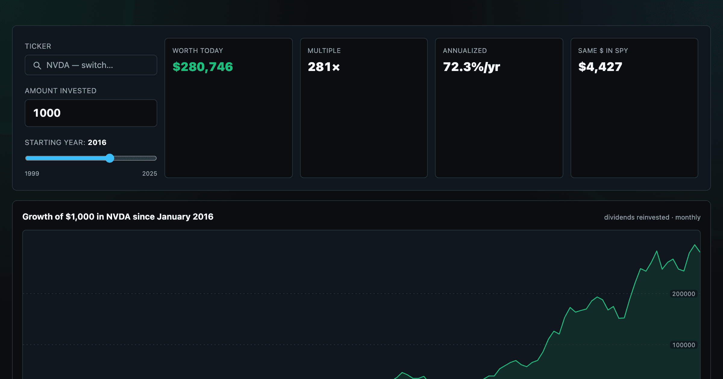
What $1,000 in any stock or ETF would be worth today.
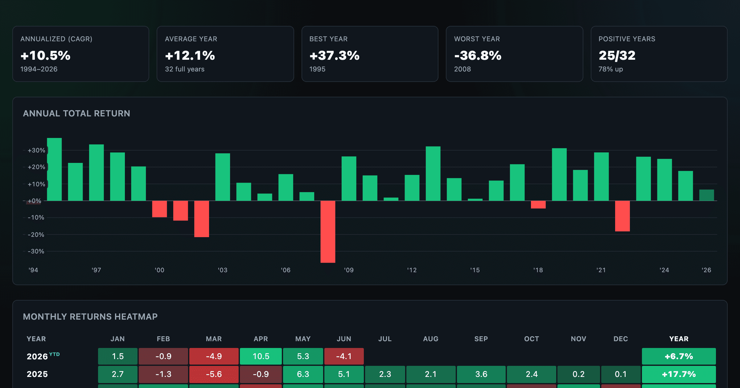
S&P 500 returns by year, month, week and trailing period — total or price return.
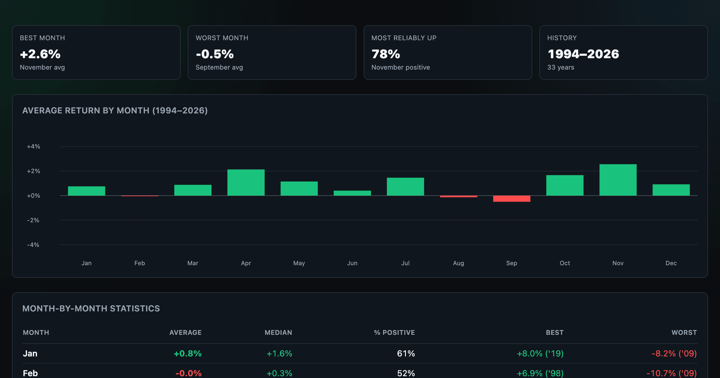
Which month is best for stocks? Average return of every calendar month, for any ticker.
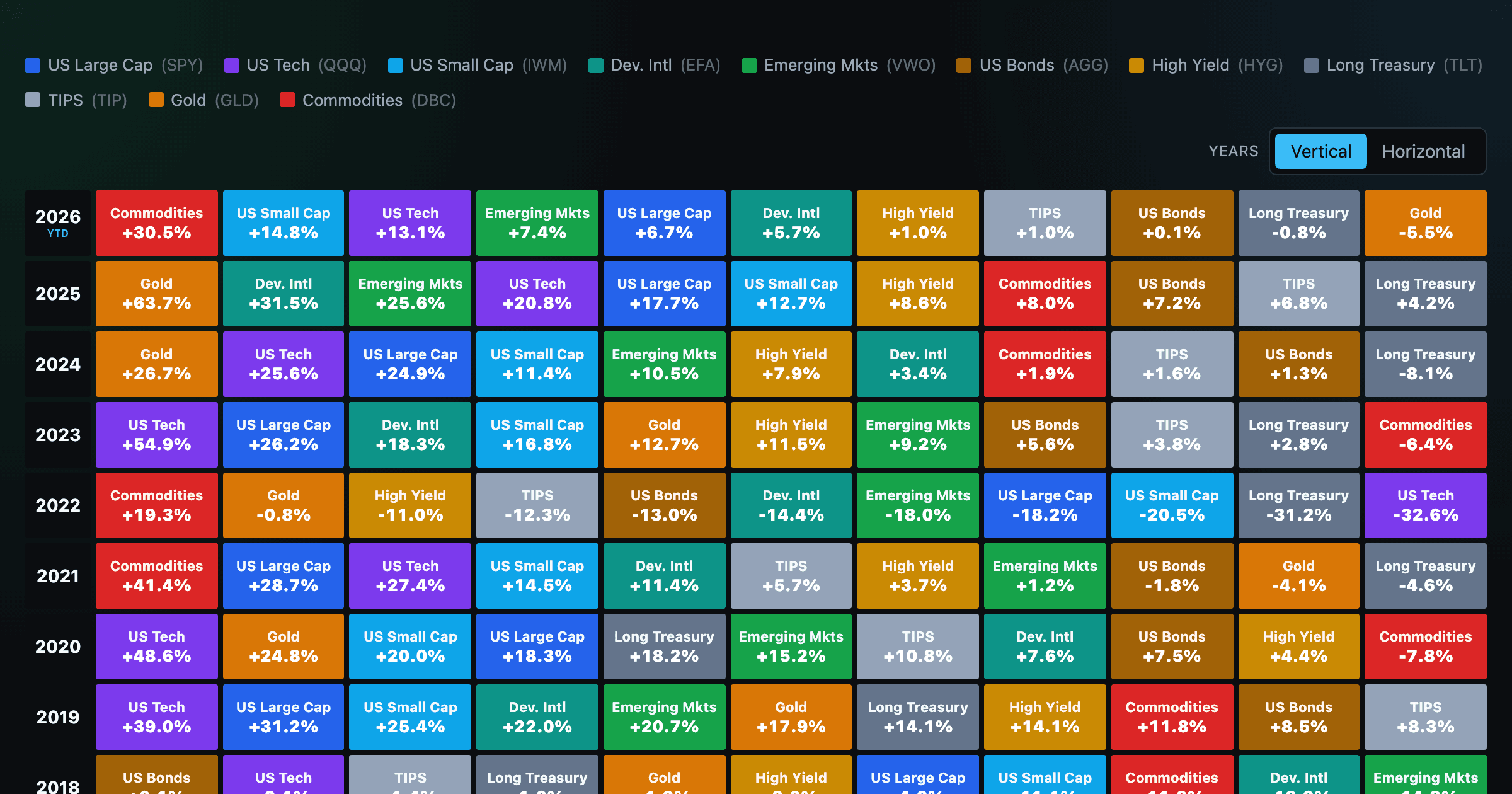
Asset-class returns ranked year by year — the Callan chart / asset allocation quilt.
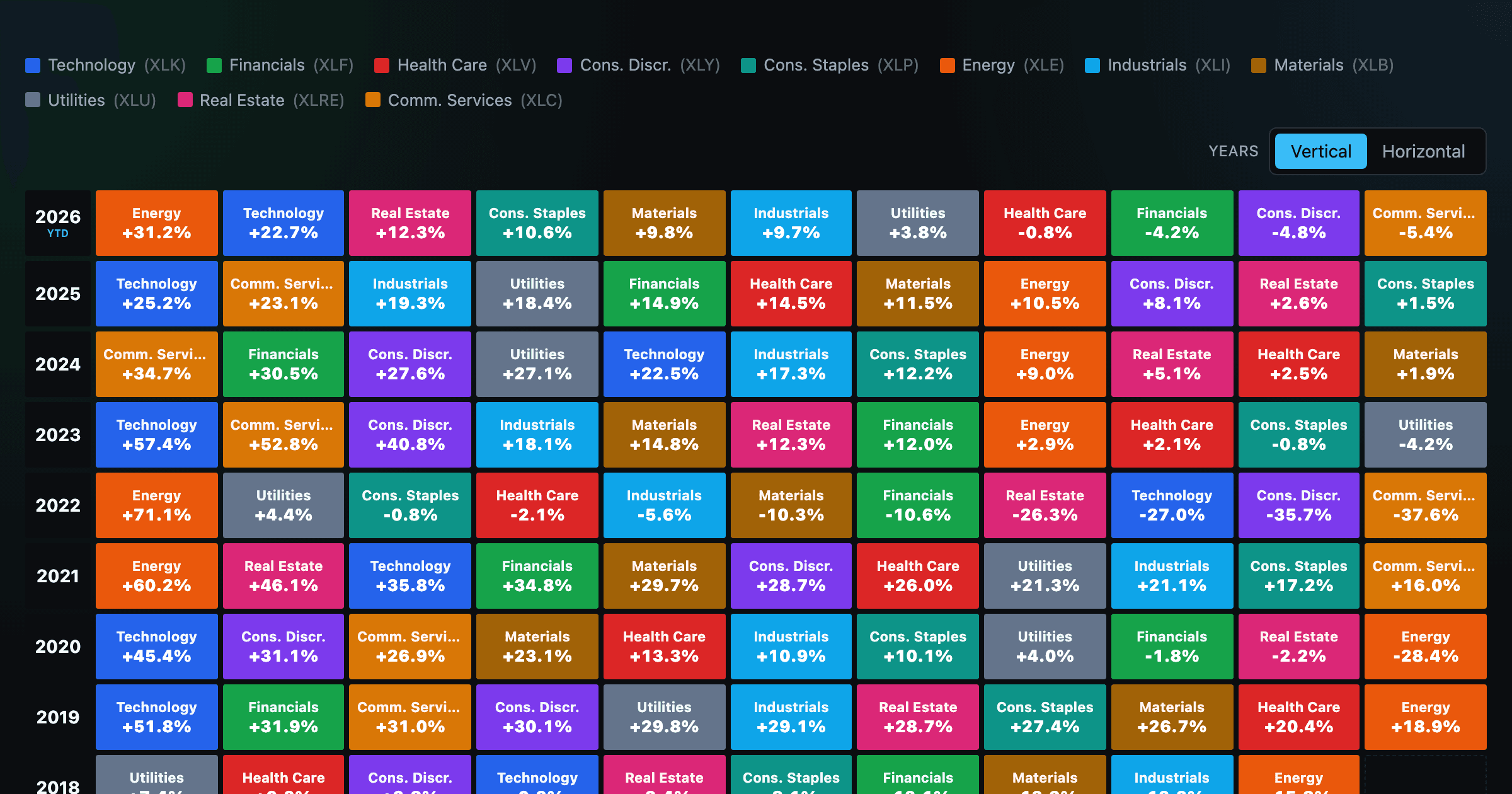
The 11 S&P 500 sectors ranked year by year — a sector quilt chart, back to 1999.
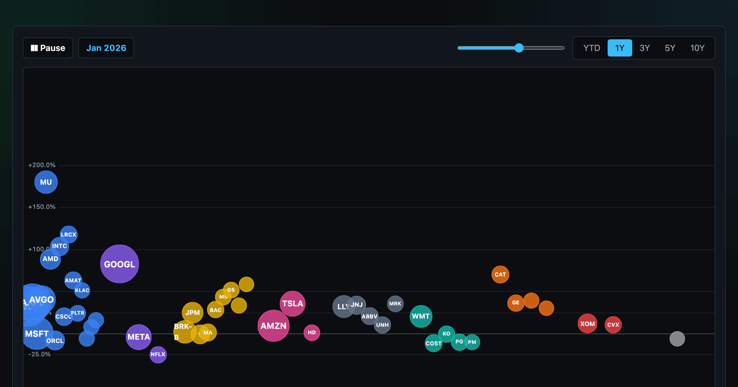
The biggest US companies as animated bubbles, rising and falling with their total return over time.
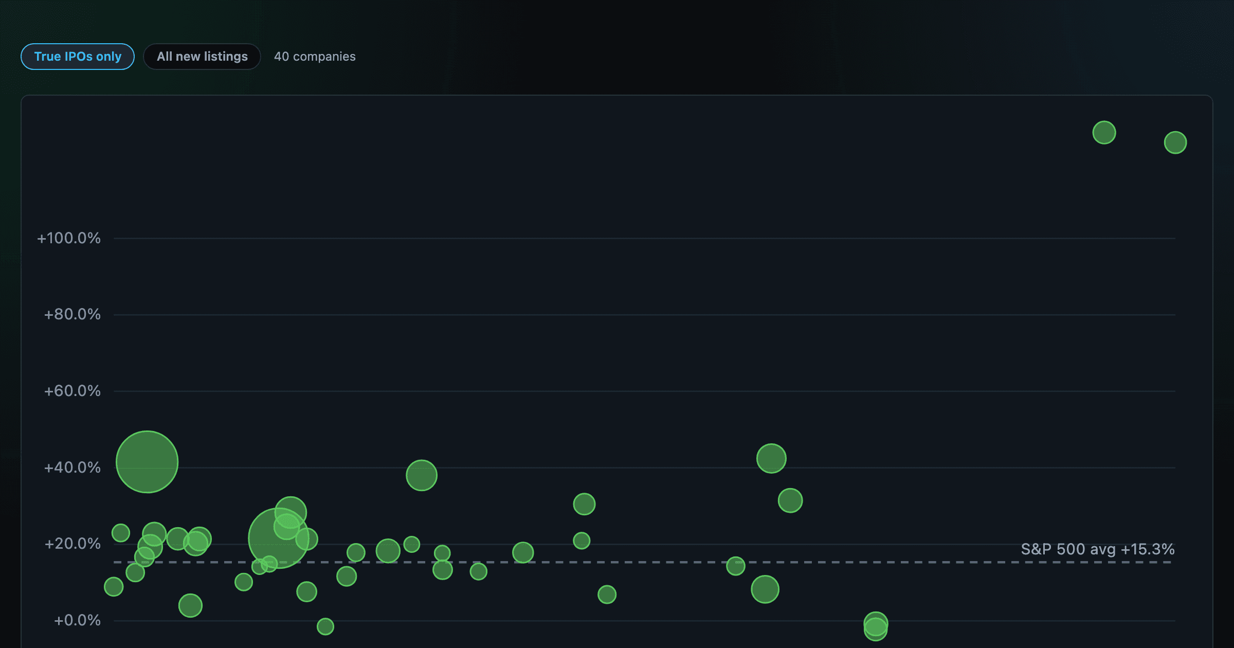
How recent stock-market debuts have performed since listing — annualized, vs the S&P 500, by IPO vs spin-off.
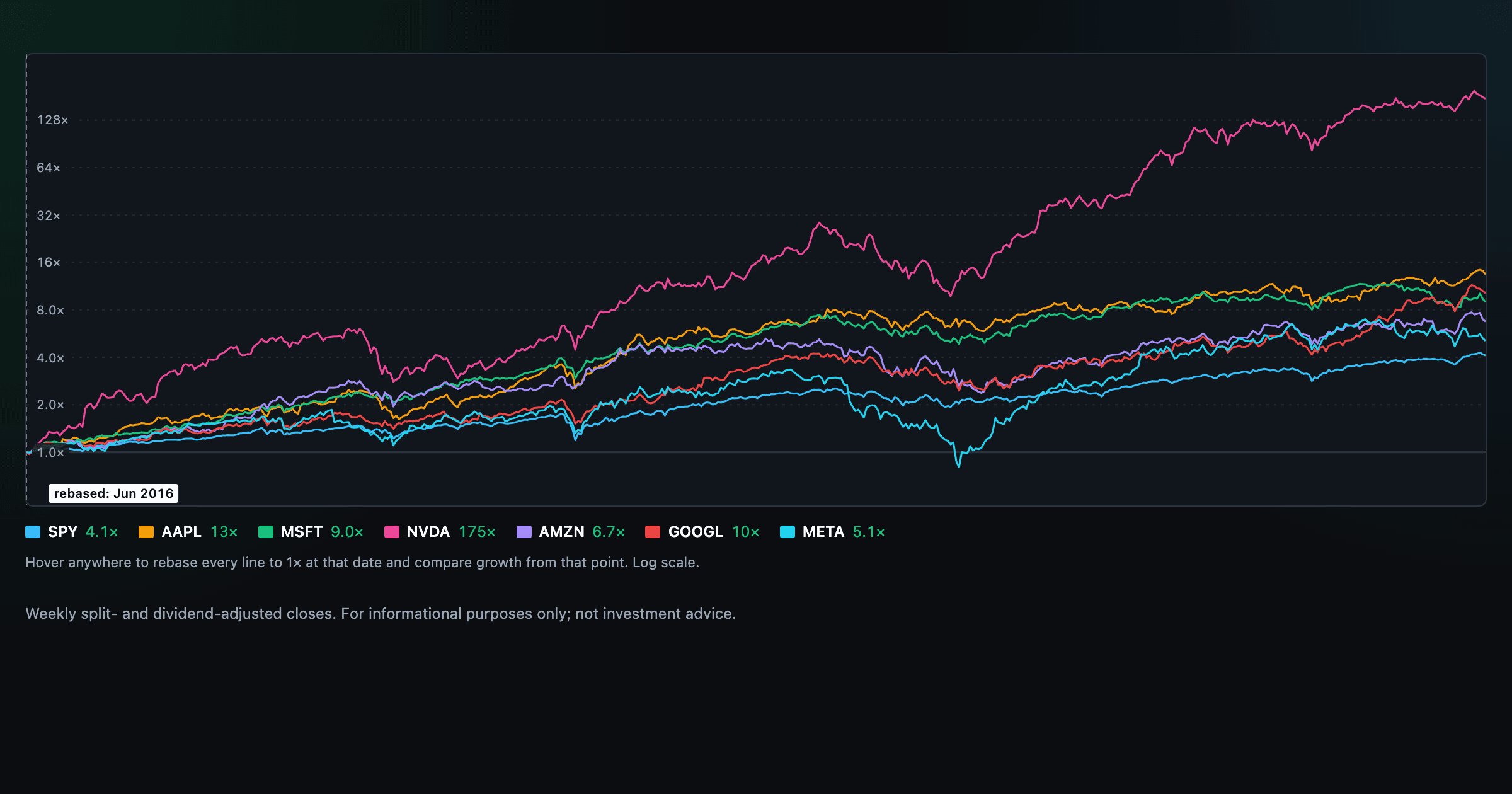
Compare megacaps vs the S&P 500, rebased to 1× at any date you hover.
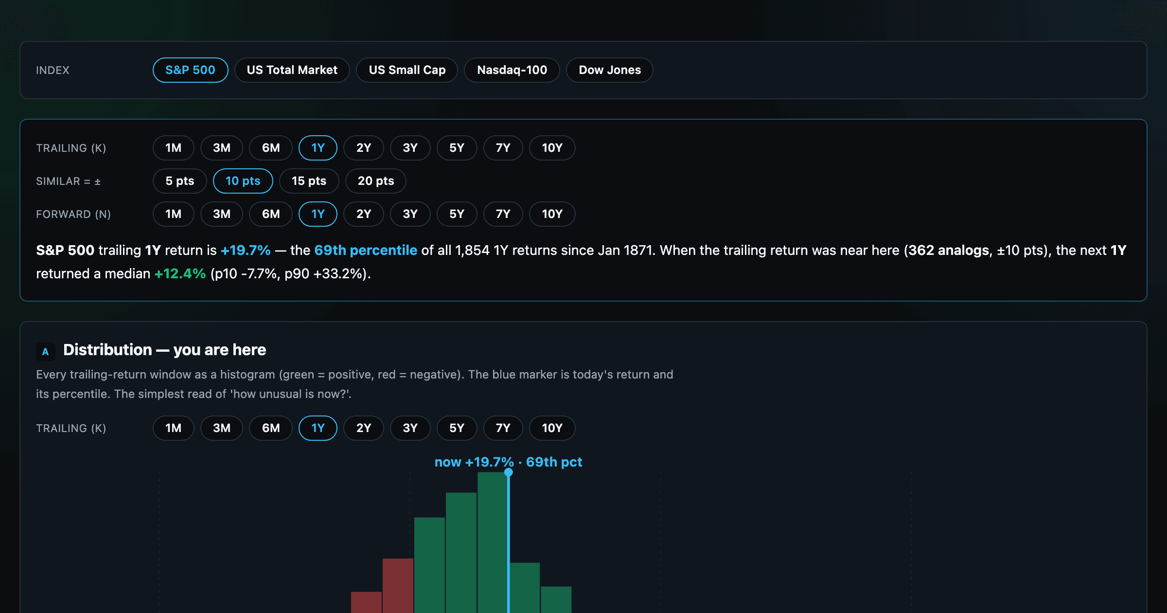
Where today's S&P 500 return ranks against all history — and the forward returns that followed similar moments.
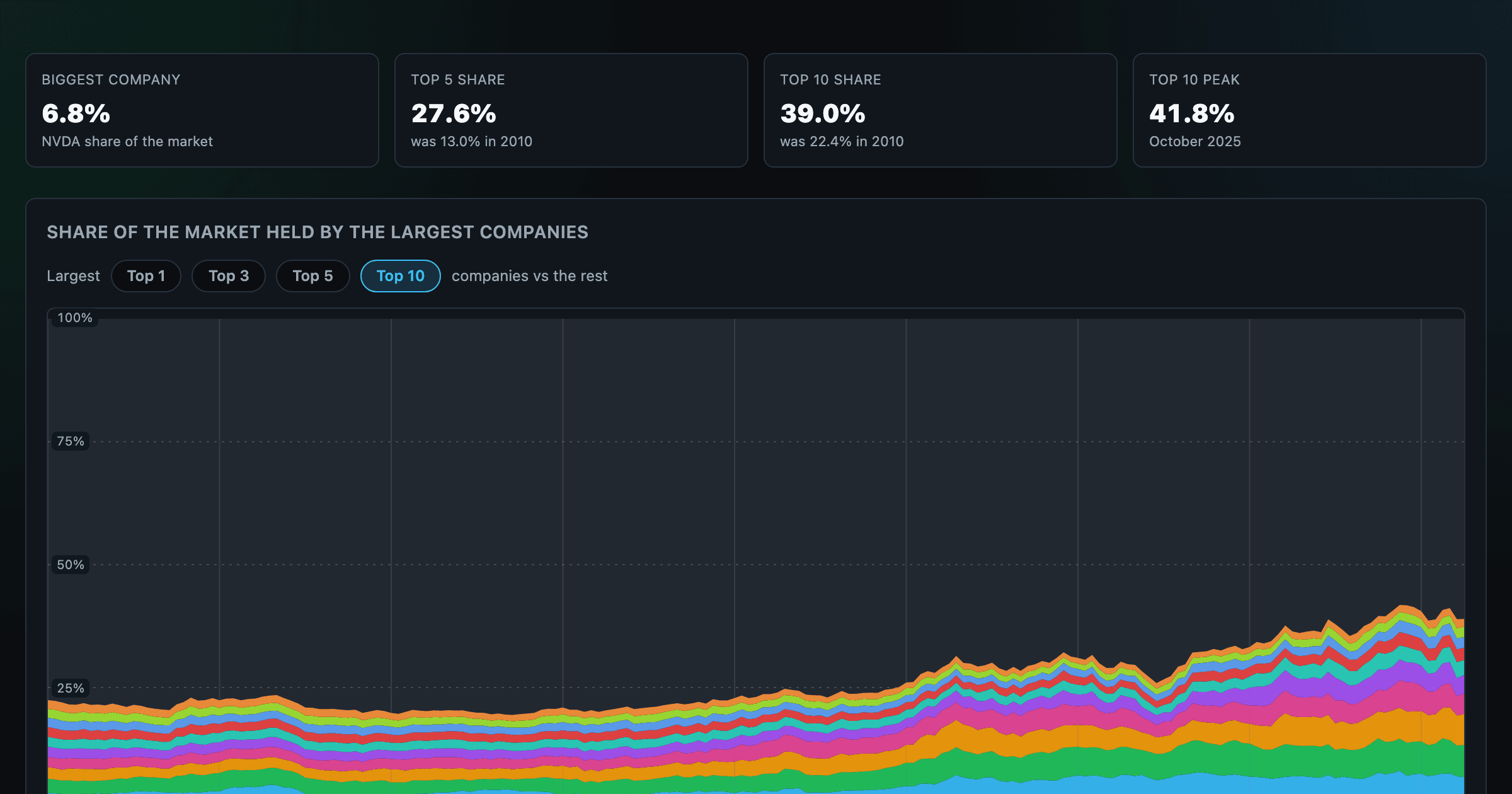
How top-heavy is the market? The top 1–10 companies' share of total market value, month by month since 2010.
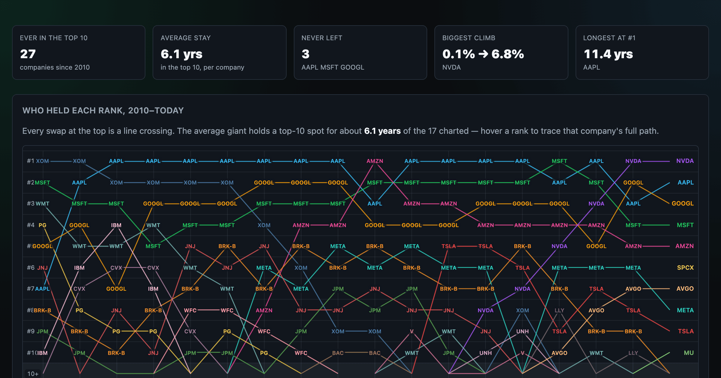
Every company that ever cracked the market's top 10 since 2010 — who climbed, who faded, who never left.
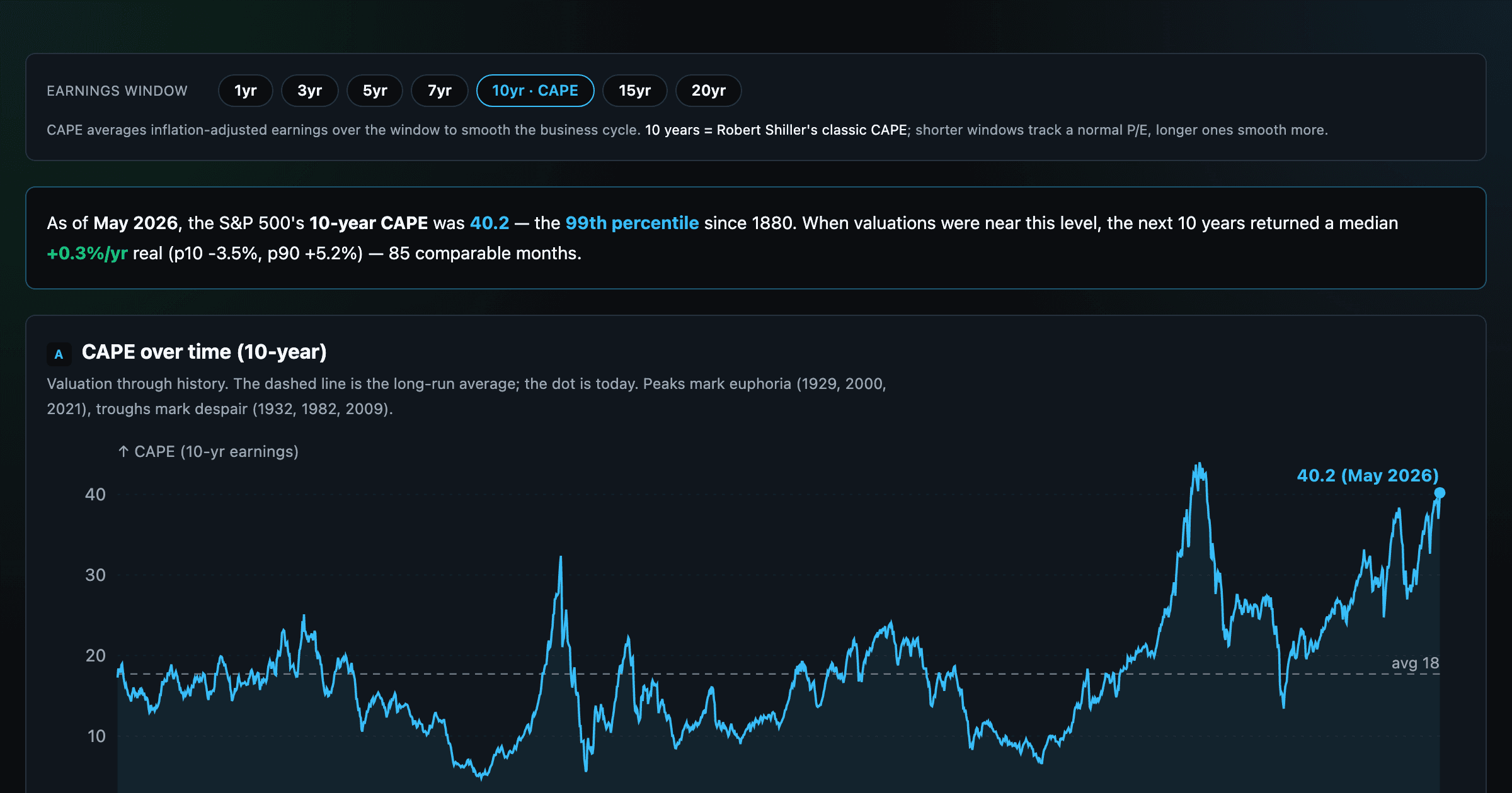
Is the market expensive? The Shiller CAPE back to 1871 and what valuations have meant for the next decade.
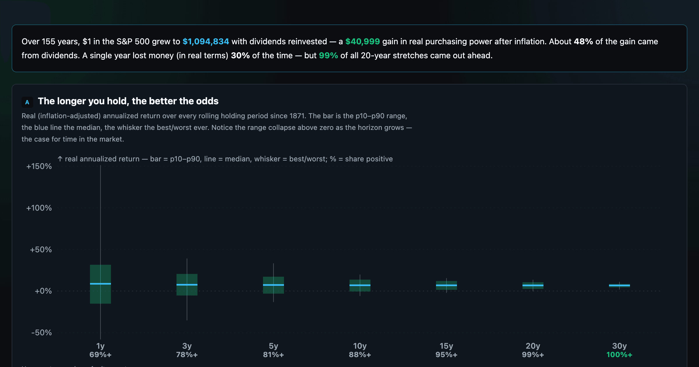
The S&P 500 since 1871 — odds of gain by holding period, real drawdowns, and the growth of $1.
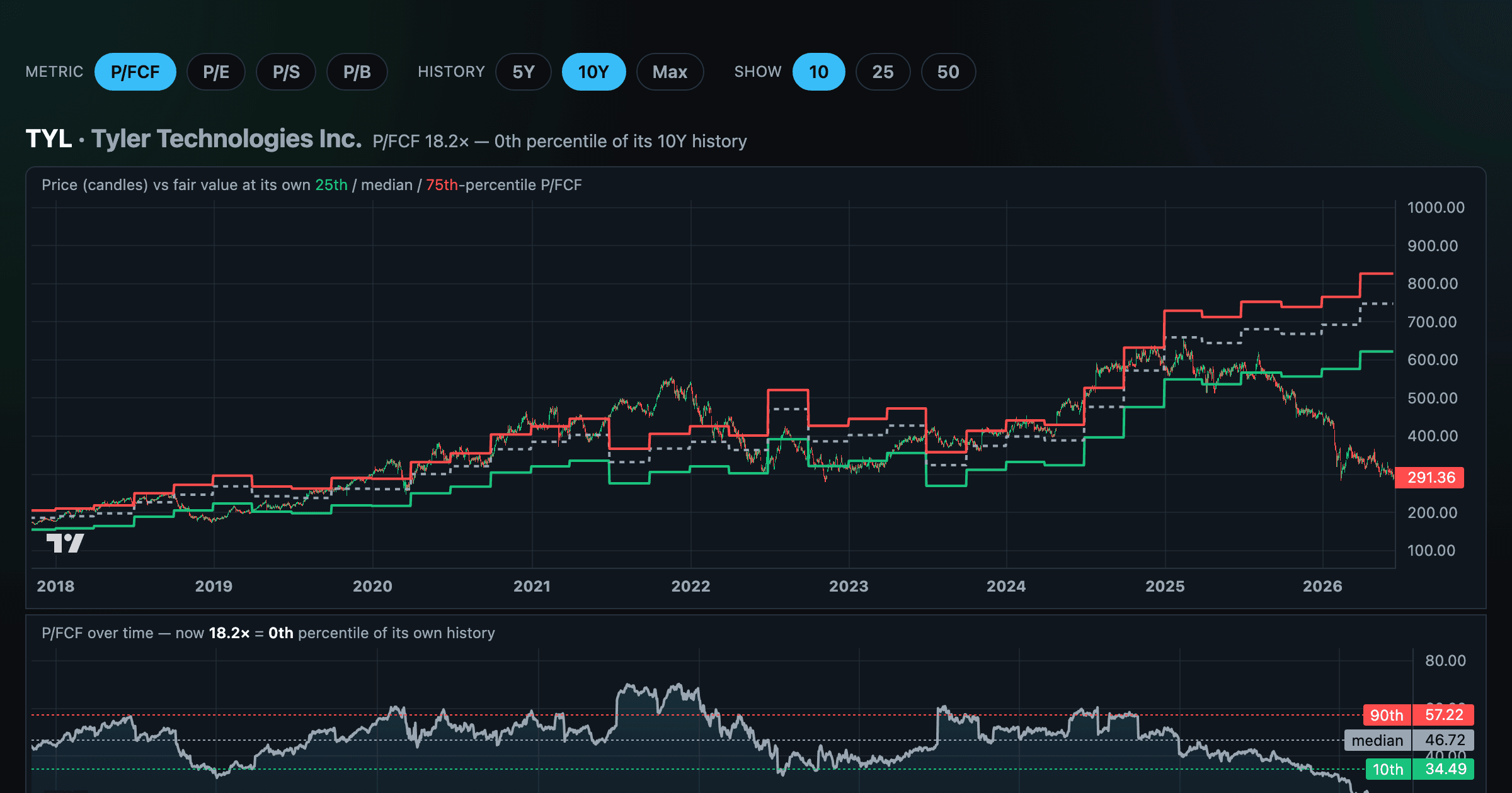
Stocks trading cheapest relative to their own P/E, P/FCF, P/S, or P/B history — with fair-value bands.
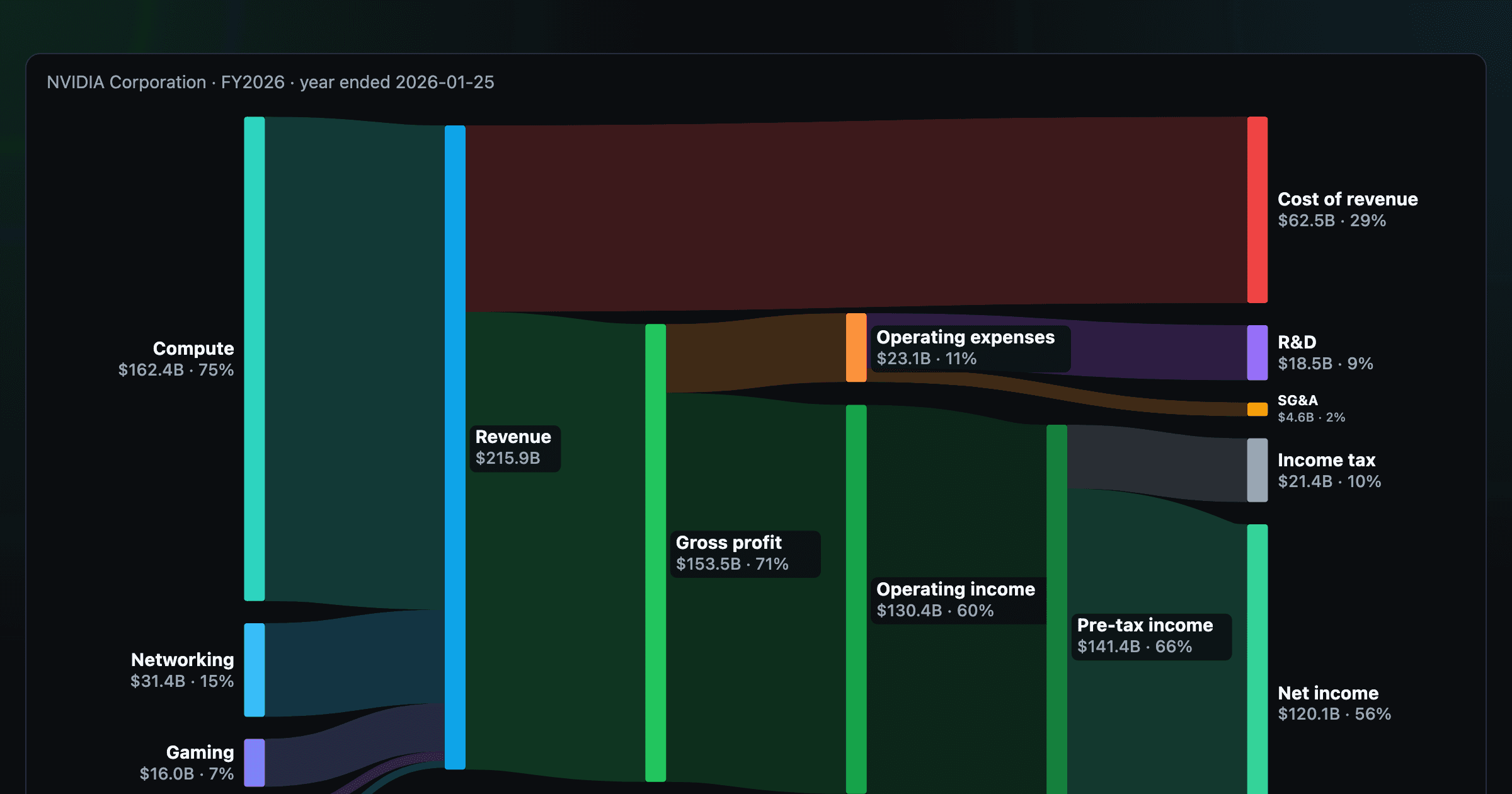
Follow a company's revenue through its income statement as a Sankey — costs, taxes, and profit.
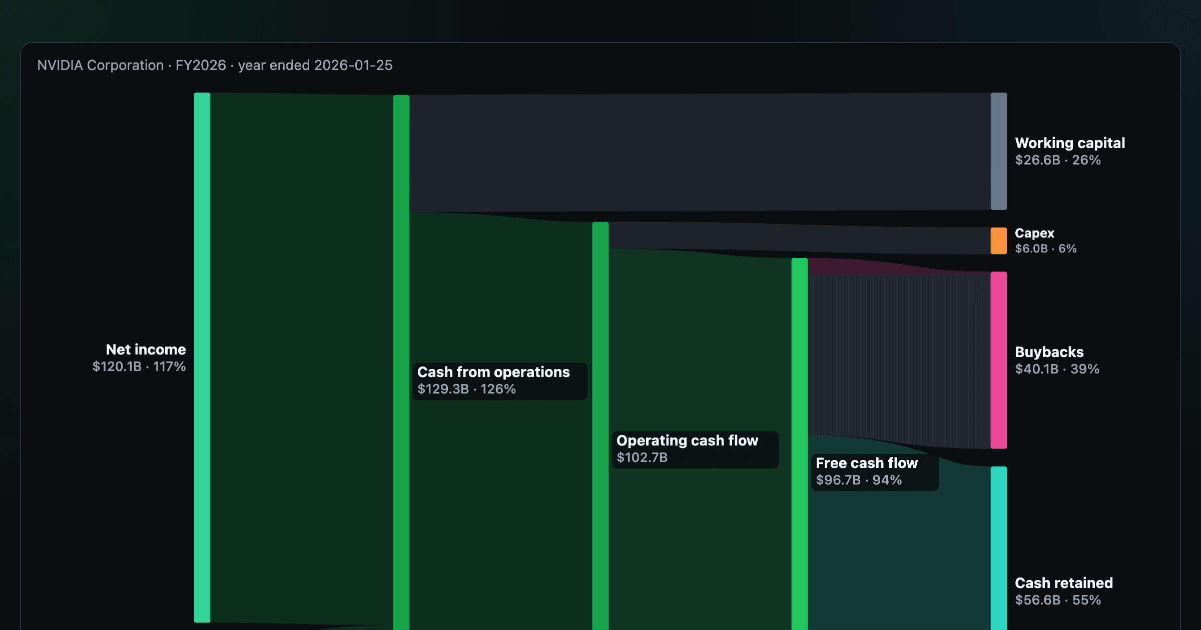
Follow a company's cash from net income through operating cash flow into capex, buybacks, and dividends.
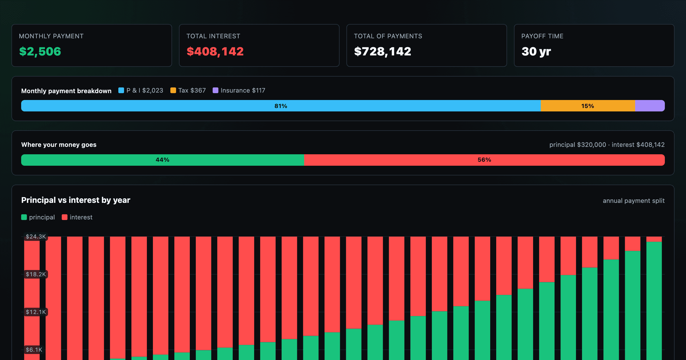
Monthly payment, principal vs interest by year, and the balance paydown — with extra-payment savings.
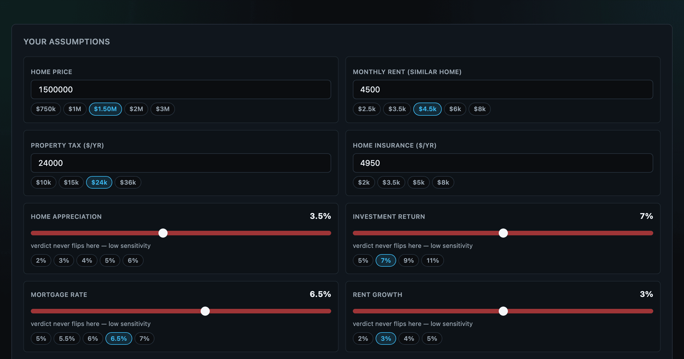
Should you rent or buy? Net-wealth verdict with sensitivity analysis of every assumption.
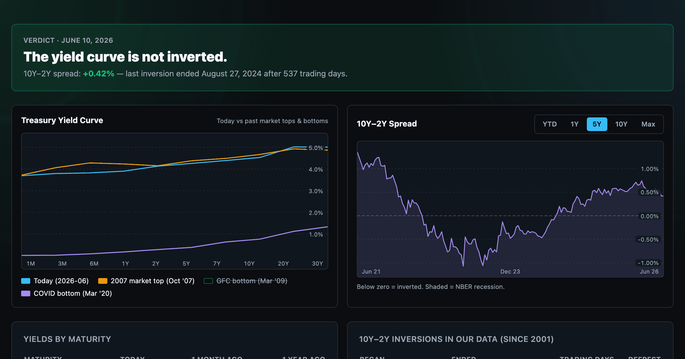
Live term structure, the 10Y–2Y spread, and every inversion episode.