
trailing returns
Dow Jones's 10-year annualized return is +13.6% per year (+256.7% cumulative). How the Dow Jones (proxied by DIA, dividends reinvested) has performed over the last day, week, month and year, over 5, 10 and 20 years, and since inception — cumulative and annualized, with dividends on or off.
Updated July 2, 2026
Trailing returns by period#
To 2026-07-02. Annualized (CAGR) for windows of a year or more.
| Period | Path | Annualized | Cumulative |
|---|---|---|---|
| 1 day | — | +1.0% | |
| 1 week | — | +1.7% | |
| 1 month | — | +2.7% | |
| YTD | — | +10.4% | |
| 1 year | +20.1% | +20.1% | |
| 5 years | +10.7% | +65.9% | |
| 10 years | +13.6% | +256.7% | |
| 20 years | +10.4% | +624.8% | |
| Since inception (1998) | +9.1% | +1094.6% |
Growth of DIA#
Actual index level (solid); dashed lines are each window's constant-rate path from start to today.
Methodology#
Trailing returns measure from the closest close about N years before the latest close (2026-07-02). Cumulative return is the total change over the window; annualized return is the compound annual growth rate (CAGR), shown for windows of a year or more. Total return reinvests dividends (from DIA's split- and dividend-adjusted closes); price return excludes them. See the year-by-year returns for the calendar breakdown. Past performance does not predict future returns; not investment advice.
FAQ
- What is Dow Jones's 10-year return?
- Over the last 10 years, the Dow Jones (proxied by DIA, dividends reinvested) returned about +13.6% a year annualized (+256.7% cumulative total return).
- What is Dow Jones's 20-year annualized return?
- Over the last 20 years, the Dow Jones (proxied by DIA, dividends reinvested) compounded at about +10.4% a year (+624.8% cumulative).
- What is Dow Jones's return since inception?
- Since 1998, the Dow Jones (proxied by DIA, dividends reinvested) has compounded at about +9.1% a year — +1094.6% in total.
More visualizations
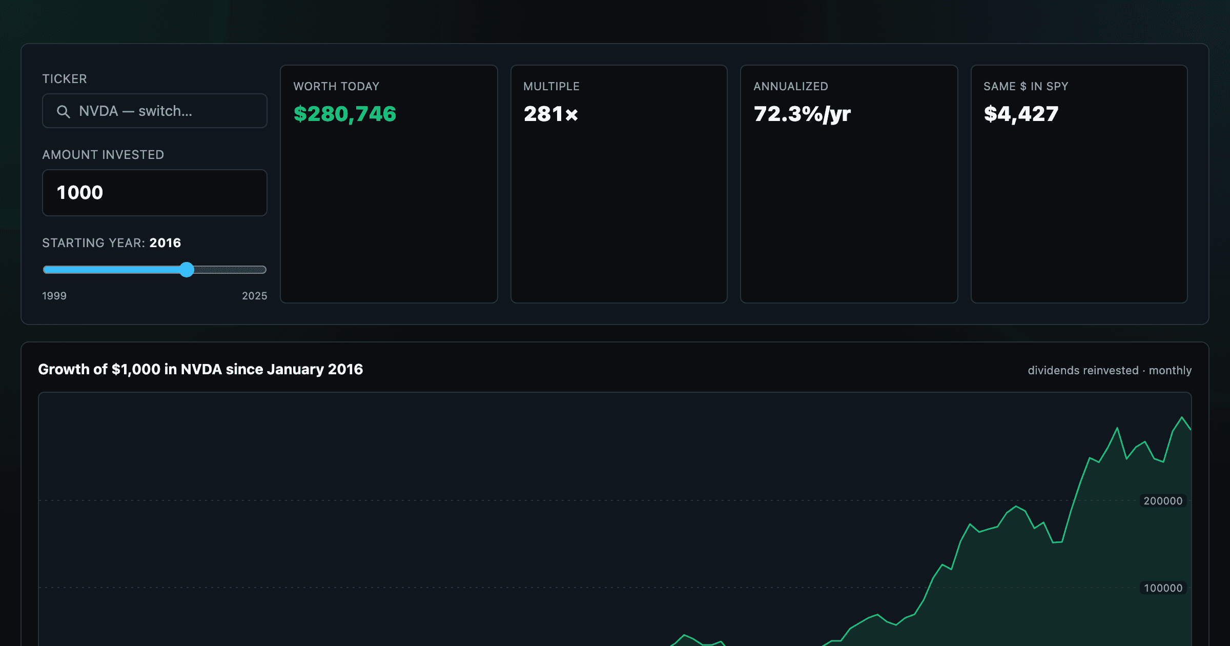
What $1,000 in any stock or ETF would be worth today.
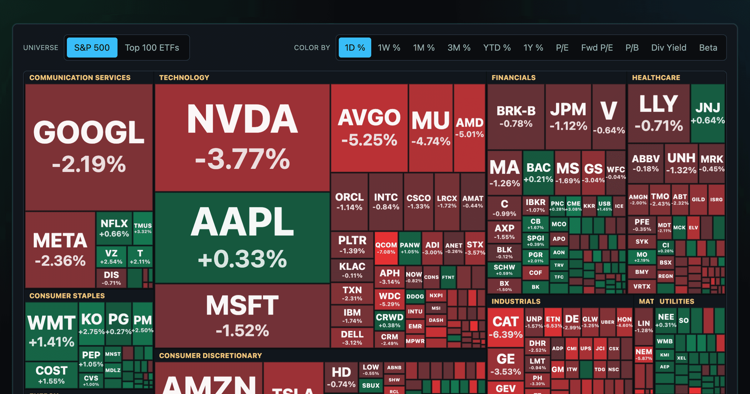
Every S&P 500 company sized by market cap — color by return or valuation.
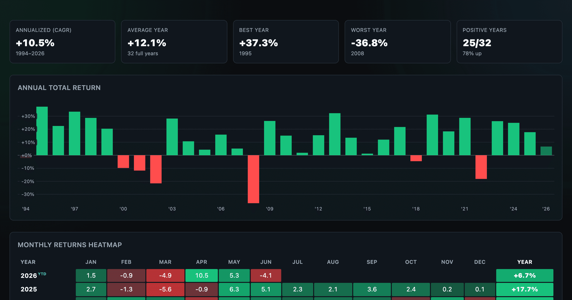
S&P 500 returns by year, month, week and trailing period — total or price return.
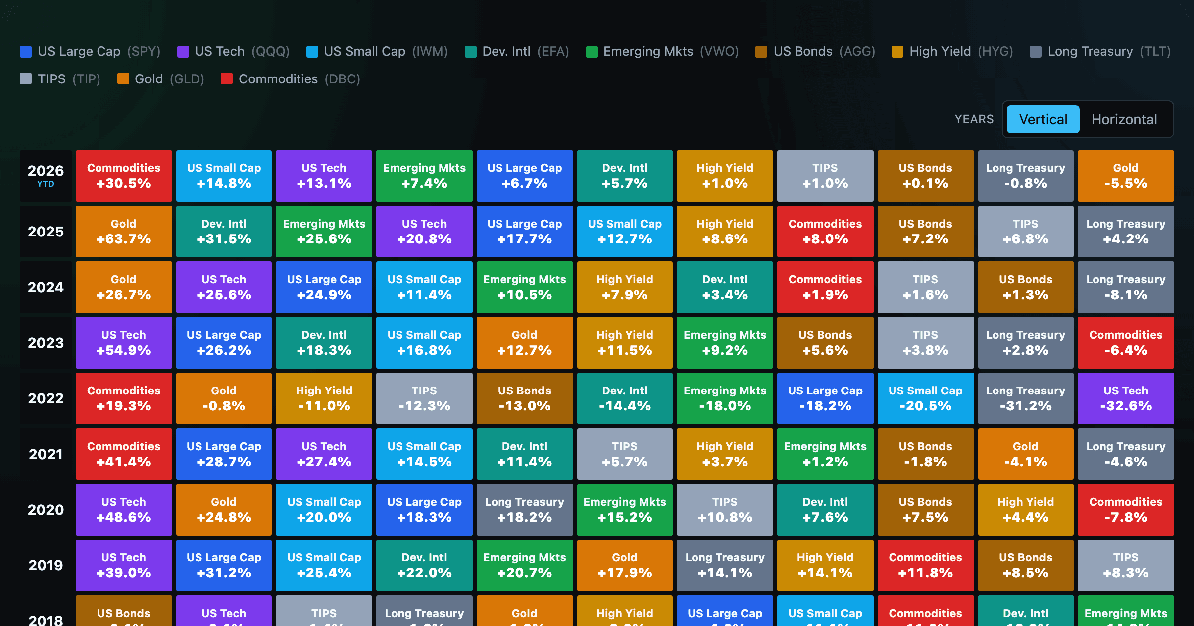
Asset-class returns ranked year by year — the Callan chart / asset allocation quilt.
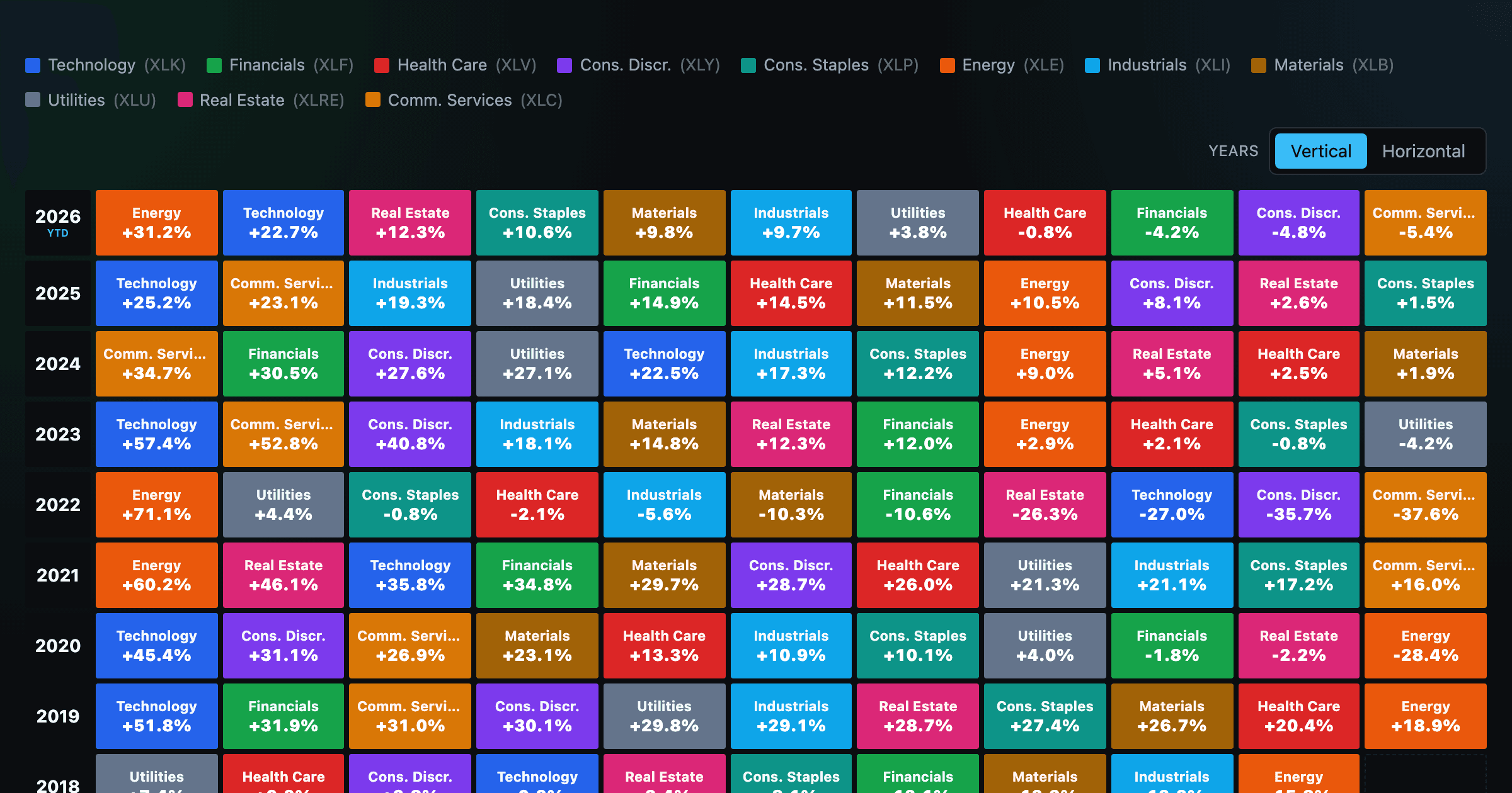
The 11 S&P 500 sectors ranked year by year — a sector quilt chart, back to 1999.
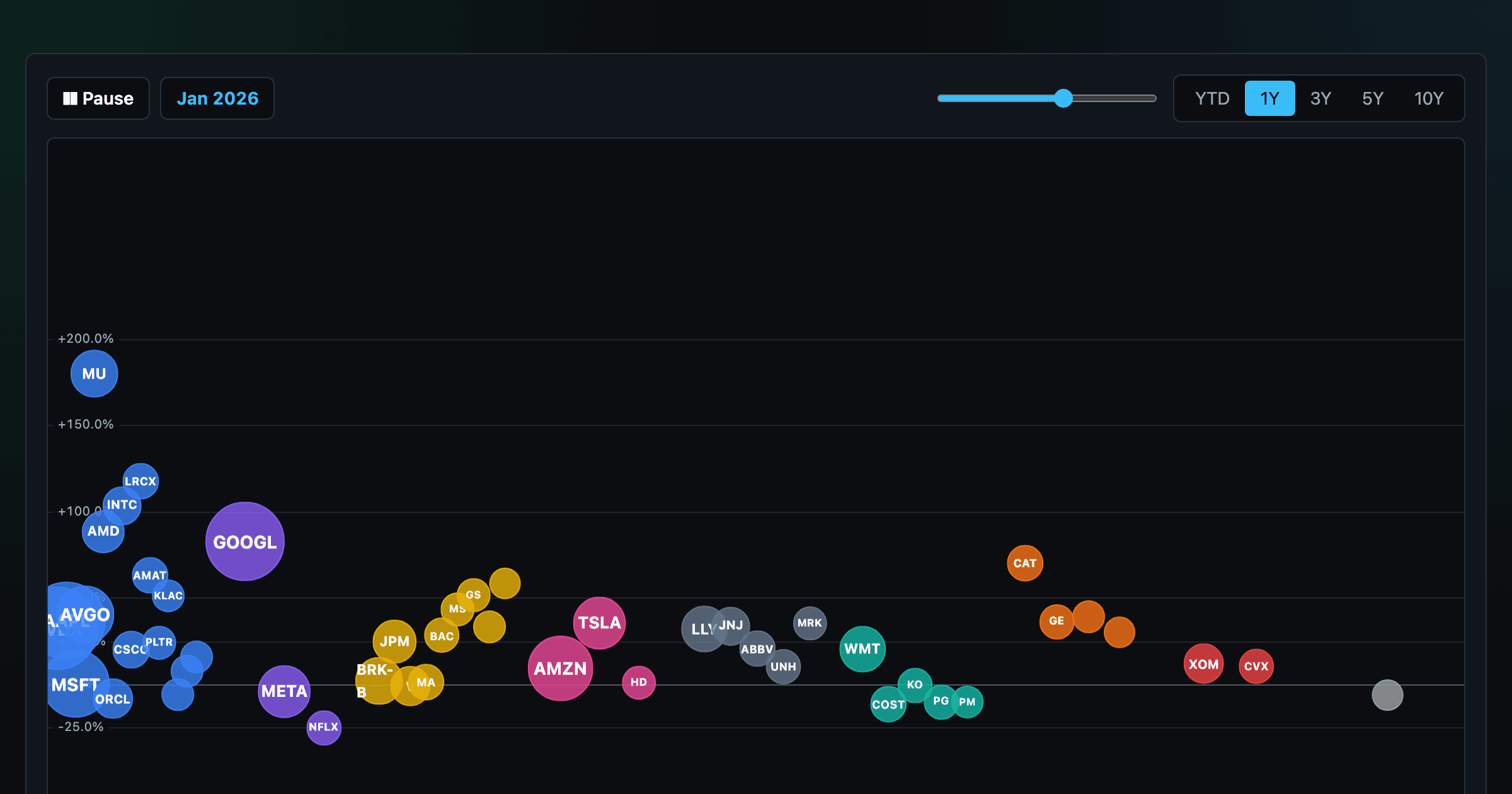
The biggest US companies as animated bubbles, rising and falling with their total return over time.

How recent stock-market debuts have performed since listing — annualized, vs the S&P 500, by IPO vs spin-off.
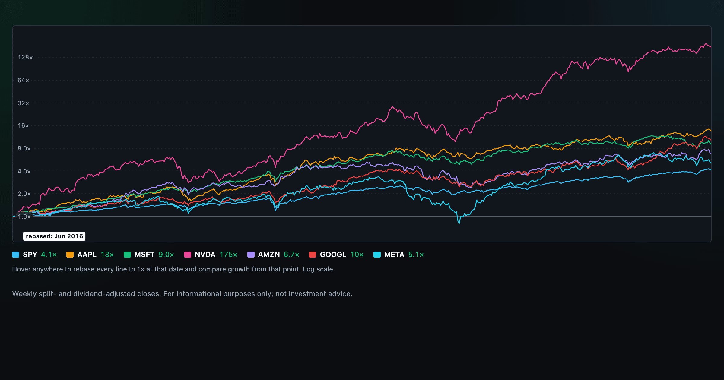
Compare megacaps vs the S&P 500, rebased to 1× at any date you hover.

Where today's S&P 500 return ranks against all history — and the forward returns that followed similar moments.

Is the market expensive? The Shiller CAPE back to 1871 and what valuations have meant for the next decade.

The S&P 500 since 1871 — odds of gain by holding period, real drawdowns, and the growth of $1.

Stocks trading cheapest relative to their own P/E, P/FCF, P/S, or P/B history — with fair-value bands.

Follow a company's revenue through its income statement as a Sankey — costs, taxes, and profit.

Follow a company's cash from net income through operating cash flow into capex, buybacks, and dividends.

Monthly payment, principal vs interest by year, and the balance paydown — with extra-payment savings.
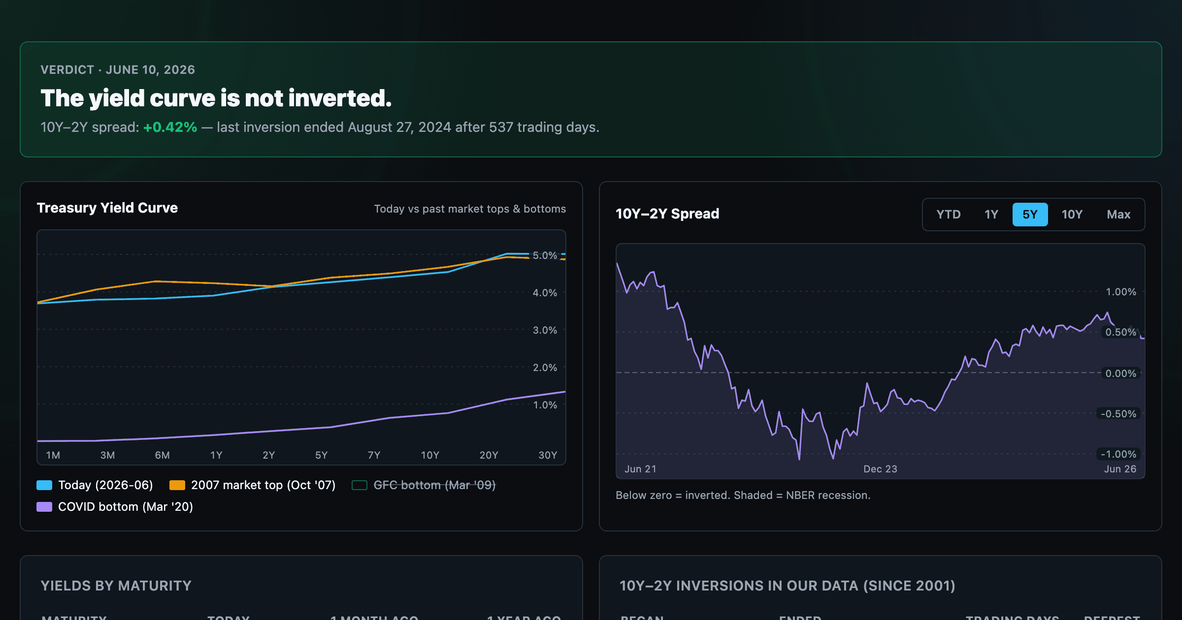
Live term structure, the 10Y–2Y spread, and every inversion episode.