
returns by year
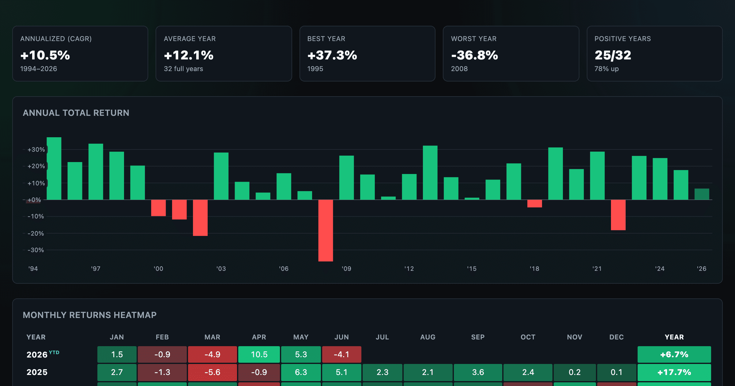
US Bond Market has returned +3.0% annually (CAGR) since 2004. Calendar-year, monthly and weekly total returns for the US Bond Market (proxied by AGG, dividends reinvested) below — the most recent year is year-to-date.
Updated July 2, 2026
US Bond Market returns by year (2004–2026)#
Calendar-year returns with each year's path and its dividend contribution (dividend return = total minus price return).
| Year | Path | Dividend | Total return |
|---|---|---|---|
| 2026YTD | +1.6% | +0.4% | |
| 2025 | +4.1% | +7.2% | |
| 2024 | +3.7% | +1.3% | |
| 2023 | +3.3% | +5.6% | |
| 2022 | +2.0% | -13.0% | |
| 2021 | +1.7% | -1.8% | |
| 2020 | +2.3% | +7.5% | |
| 2019 | +2.9% | +8.5% | |
| 2018 | +2.7% | +0.1% | |
| 2017 | +2.4% | +3.5% | |
| 2016 | +2.4% | +2.4% | |
| 2015 | +2.2% | +0.3% |
Total return by period
Methodology#
Returns are total returns (dividends reinvested), computed from AGG's split- and dividend-adjusted closes — a standard proxy for the US Bond Market. The bar chart switches between annual and monthly periods. Annualized return is the compound annual growth rate over the full period. The current year is year-to-date. See also the periodic table of returns. Past performance does not predict future returns; not investment advice.
FAQ
- What is US Bond Market's average annual return?
- Since 2004, the US Bond Market (proxied by AGG, dividends reinvested) has returned about 3.0% a year (the compound annual growth rate) and an average calendar-year return of 3.2%.
- What were US Bond Market's best and worst years?
- Over 2004–2026, the best year was 2019 (+8.5%) and the worst was 2022 (-13.0%).
- How often is US Bond Market up in a year?
- 19 of the 22 full years since 2004 were positive — about 86% of the time.
More visualizations
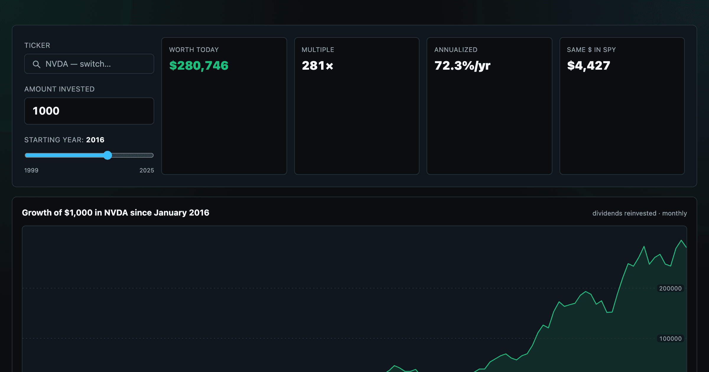
What $1,000 in any stock or ETF would be worth today.
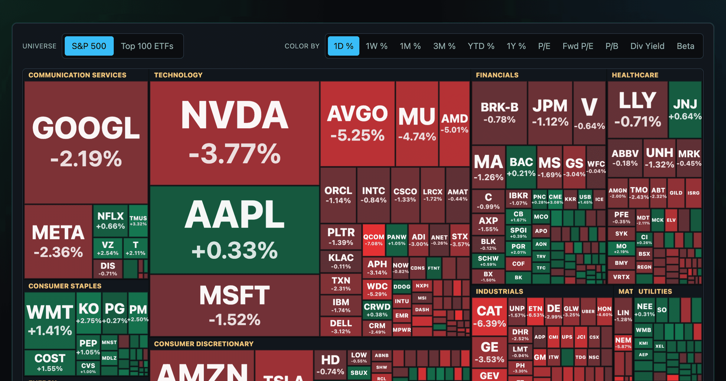
Every S&P 500 company sized by market cap — color by return or valuation.
S&P 500 returns by year, month, week and trailing period — total or price return.
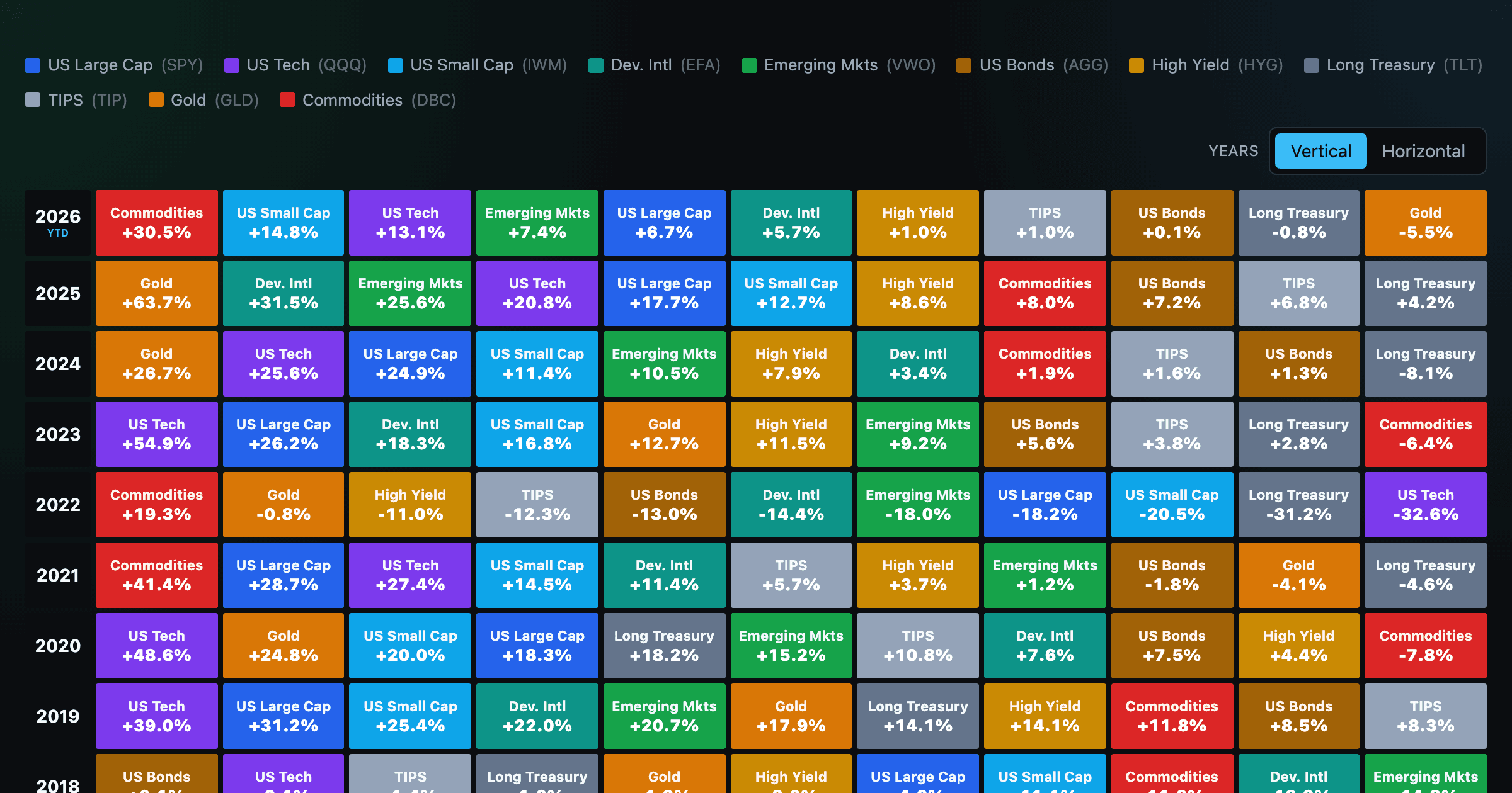
Asset-class returns ranked year by year — the Callan chart / asset allocation quilt.
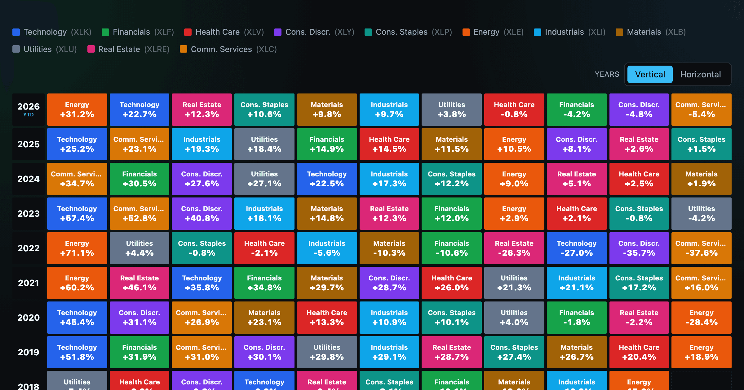
The 11 S&P 500 sectors ranked year by year — a sector quilt chart, back to 1999.
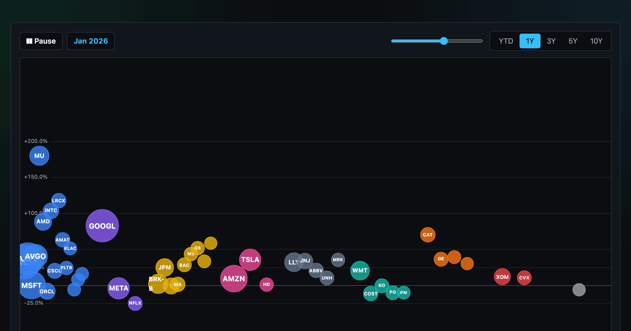
The biggest US companies as animated bubbles, rising and falling with their total return over time.

How recent stock-market debuts have performed since listing — annualized, vs the S&P 500, by IPO vs spin-off.
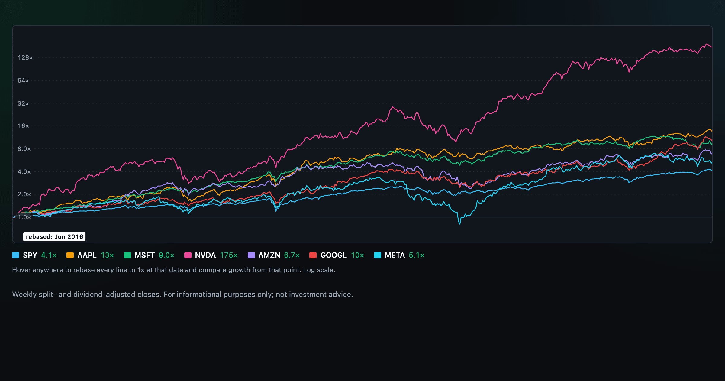
Compare megacaps vs the S&P 500, rebased to 1× at any date you hover.

Where today's S&P 500 return ranks against all history — and the forward returns that followed similar moments.

Is the market expensive? The Shiller CAPE back to 1871 and what valuations have meant for the next decade.

The S&P 500 since 1871 — odds of gain by holding period, real drawdowns, and the growth of $1.

Stocks trading cheapest relative to their own P/E, P/FCF, P/S, or P/B history — with fair-value bands.

Follow a company's revenue through its income statement as a Sankey — costs, taxes, and profit.

Follow a company's cash from net income through operating cash flow into capex, buybacks, and dividends.

Monthly payment, principal vs interest by year, and the balance paydown — with extra-payment savings.
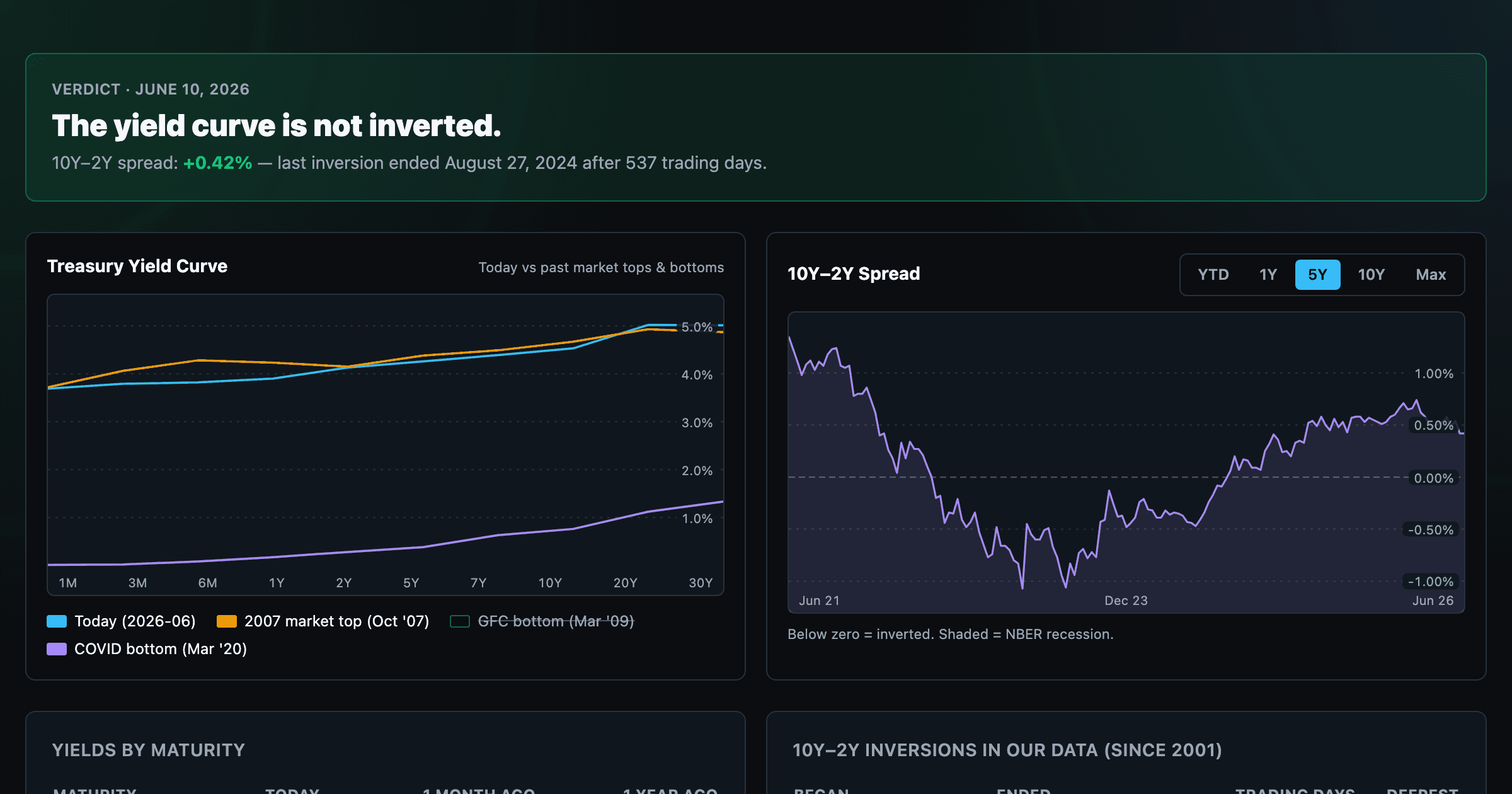
Live term structure, the 10Y–2Y spread, and every inversion episode.